Not Boring At All: Rejected DC United 2019 Away Kit Designs Leaked
A lot has been said about Adidas' seemingly uninspired MLS kits of late. Now, The Athletic's Pablo Maurer got access to some of the rejected designs for DC United, who unveiled a nondescript white away kit ahead of the 2019 season, giving us an intriguing look behind the scenes.


Included among the rejected concepts are this drool-worthy cherry-blossom inspired getup. Would've been strange to see #DCU in pink, but I gotta say - I absolutely adore this kit: pic.twitter.com/kGntu6jpIB
— Pablo Maurer (@MLSist) 26. Februar 2019
Amongst the rejected designs is one that combines a white base with cherry blossom prints and pink shorts, but also some that are completely cherry pink.

According to the report, "club official nixed those, said one source, after expressing concerns about how a kit with that much pink in it would be received by the public".


There you have it, guys. In many cases it's the MLS clubs that are to blame for unimaginative designs and not Adidas. It definitely wouldn't have hurt to have a bit more color in the many white kits, or even a few light-colored kits.

Would you have preferred one of the rejected designs to the one chosen by the club? Comment below, and check out all new MLS kits in the Overview.

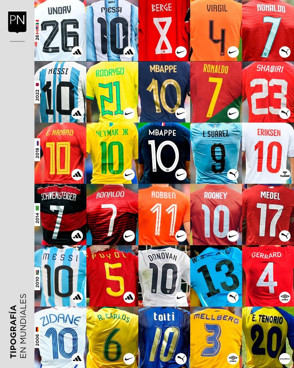
A Look Back at World Cup Shirt Number Typography
Football kit design account @PaladarNegroWeb has shared an interesting retrospective on the typography used for shirt numbers in recent World Cups. The visual language of football kits is often defined by these details, with fonts becoming instantly recognizable symbols of specific tournaments and eras.
The collage highlights various iconic typefaces worn by national teams on the biggest stage. spanning from the 2006 World Cup to the FIFA World Cup.
This overview is part of an ongoing series by the account exploring the visual elements of football. It serves as a great reminder of how deeply typography impacts the overall aesthetic and legacy of a football shirt.


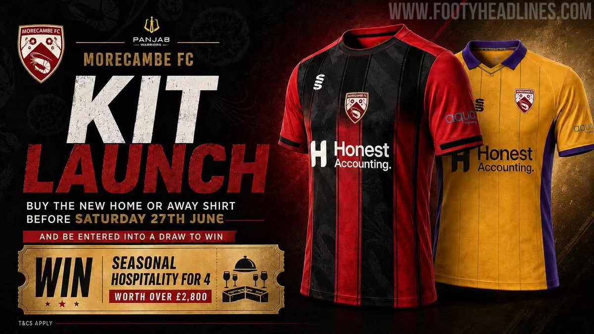
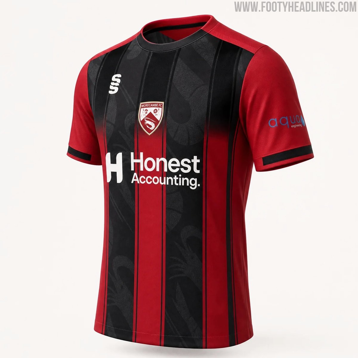
Morecambe 26-27 Home & Away Kits Released
Morecambe FC have officially launched their new 26-27 home and away kits, produced by Surridge Sports. The club received massive backlash for posting AI images for the launch, and later posted a clearer CAD of the home shirt.
The home shirt features the club's traditional red color palette with black detailing, while the away kit introduces a bold combination of purple and yellow. Both designs incorporate modern elements to provide a fresh look for the upcoming National League North campaign.
The new Surridge Sports Morecambe 2026-27 jerseys are currently available for pre-order through the club's official online store.