
5 Final Watford FC Logo Options Revealed
 Oct 26, 2019, by Chris
Update: Watford FC announced the five shortlisted entries for the new Watford badge. All WFC fans have one vote - the winner goes forward for a head-to-head vote with the current club logo.

Watford FC New Logo - 5 Shortlisted Entries - Winner To Be Voted Against Current Logo


In June 2019, English Premier League club Watford FC announced that they give all fans and designers worldwide the chance to submit a design for the new Watford FC logo to be used from the 2020-2021. Submissions were closed in late July 2019 - now the 20 final designs chosen by a panel of fans have been revealed.


Watford FC New Logo - 20 Final Designs Chosen By Fan Panel
The 20 crests than can be seen above have been selected by Watford FC and a fan panel. They include a wide range of designs and looks that all have one thing in common - the hornet takes a center stage instead of the deer hart, a type of deer included in the official Watford FC logo since 1978 until today.
So, as 20 crests have been selected, what will happen from now?

First, every Watford supporter registered on the club's database will be asked to select the winning design.
Second, the winning design will be put to a vote against the current design, with the winner becoming next season's crest.


Which of these 20 logos do you like the most? Which would you would not like to see becoming the new Watford FC logo? Share your thoughts in the comments below.
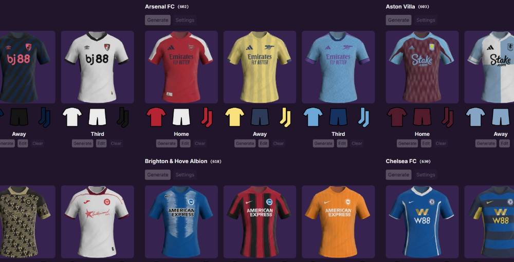



Chelsea 26-27 Home Kit Leaked
Based on leaked details from myach_lab, our partner @whatthekit_x have created a mockup of the Chelsea 2026-27 shirt. The design combines a blue base with yellow details and a distinctive checkered sleeve pattern, while the Nike and Chelsea logos are placed centrally. The simplified lion crest from this season is also retained.

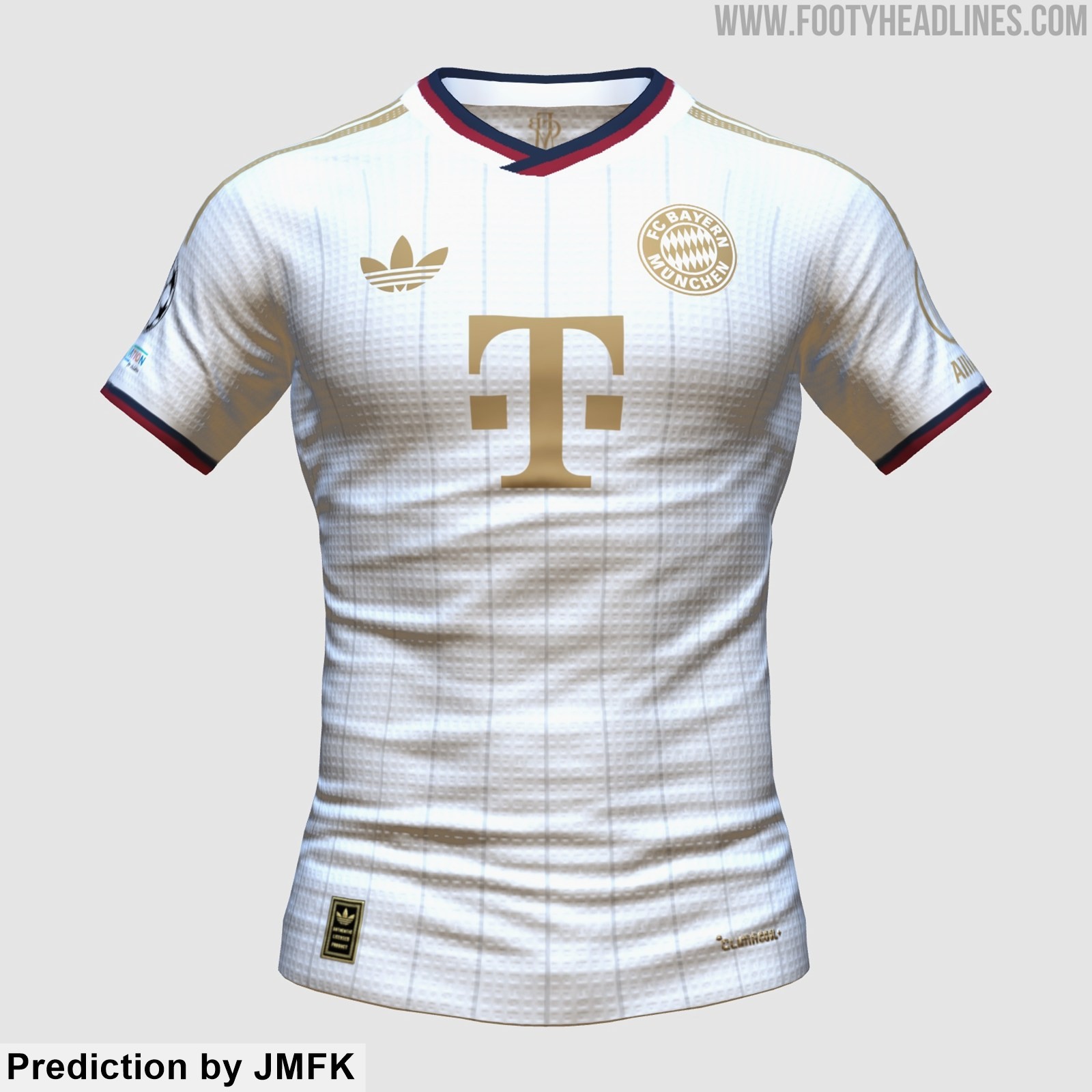
Bayern München 27-28 Away Kit New Prediction
Based on the leaked information, the kit designer JMFK have created the another prediction of the Adidas FC Bayern München 2027-2028 away kit. Please note that this design remains highly speculative.



No More Volt: Reebok Santa Cruz 26-27 Third Kit Released
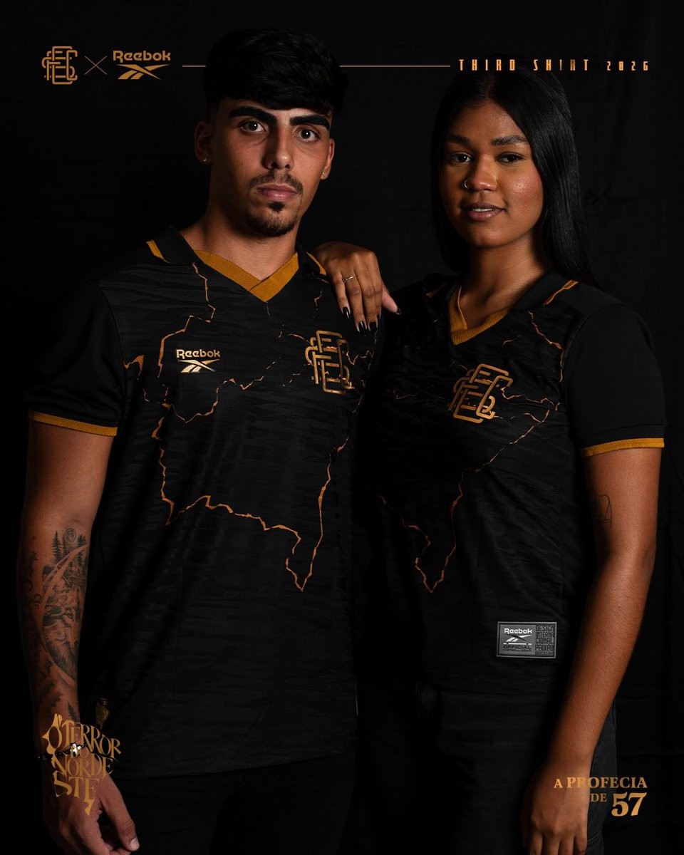
Brazilian club Santa Cruz FC and Reebok have officially unveiled the team's new third kit for the 26-27 season. Titled "A Profecia de 57", the special-edition release celebrates two defining moments in the club's history: the 1957 anthem written by Capiba that coined the nickname "O Terror do Nordeste", and the 2016 Copa do Nordeste title that fulfilled the prophecy ten years ago.
The Reebok Santa Cruz 26-27 third jersey introduces an elegant black and gold design. Across the black base, intricate golden fractured lines trace the geographical outline of Brazil's Northeast region. The front of the shirt features Santa Cruz's classic interlocking SCFC monogram badge rendered in metallic gold, mirrored by Reebok's vector logo on the opposite side. A sharp v-neck collar with gold trim and matching sleeve cuffs complete the look.
Subtle commemorative emblems highlighting "A Profecia de 57" and "O Terror do Nordeste" decorate the release alongside gold numbering on the reverse. Matching black shorts and socks with gold accents complete the new Santa Cruz third uniform.


