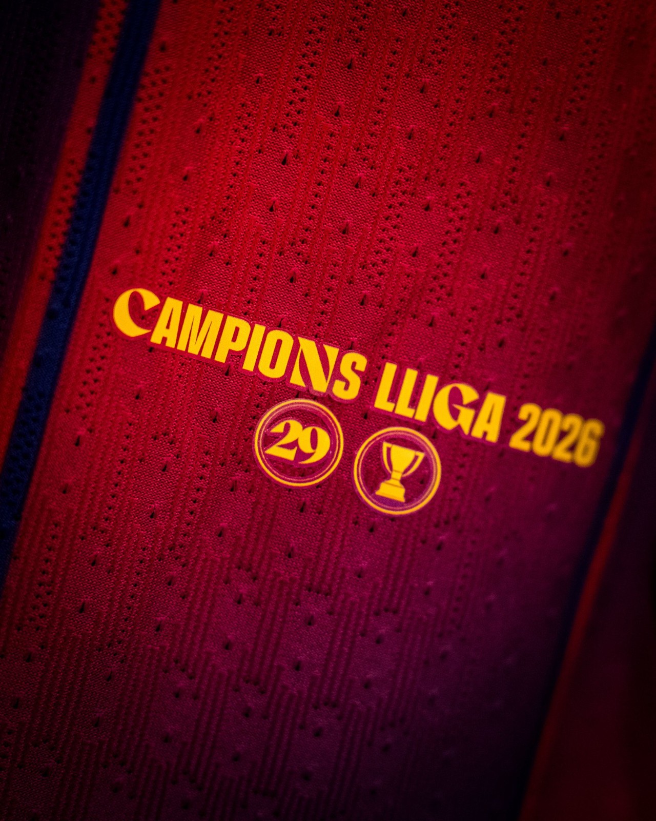
Abstract Cagliari Cagliari Centenary Logo Revealed - "Looks Like a Stamp"
Founded on 30 May 1920, Italian club Cagliari today presented its official centenary crest, which is a bit special.
Cagliari Centenary Logo
Created by Sardinian designer Antonio Marras, the Cagliari centenary crest is a very stylized version of the contemporary crest, including the Flag of Sardinia, the club's principal colors blue and red as well as the number 100. It looks a bit like a stamp.
Surprisingly, the Cagliari centenary logo was unveiled at the 'Pitti Uomo' international fashion show in Florence, together with the new official suits designed by Marras and produced by Lubiam.
The designer had the following to say about his creation: "“I like challenges and I clearly felt that collaborating with Cagliari Calcio could have been an unmissable opportunity", said Antonio Marras. "I love Cagliari and its people, I love the tenacity, the courage and the generosity of Cagliari Calcio that tie them. The logo comes from the colours and the strength!"
Local sources have stated that we will likely also see the logo appear on Cagliari's match uniforms shortly.
What do you think about the "stamp-like" Cagliari centenary logo? Comment below.
Vintage Football Shirts
from Cult Kits
1995/97 Nike *BNWT* Template Shirt (Multiple Sizes)

1995/96 Tanjong Pajar Boys Club #3 Tartan Shirt (L) Umbro

2008/10 Senegal Faye #6 Home Shirt (M) Puma

2005/06 Piacenza #1 GK Shirt (XL*) Macron

2001 Real Madrid Zidane #5 Third Shirt (L) Adidas

1995/96 Torino #3 L/S Home Shirt (S) Lotto

2015/16 Orlando City Kaka #10 Home Shirt (XXL) Adidas

1998/99 Real Madrid Bench Coat (M) Adidas

2002 FC Tokyo Away Shirt (S) Adidas

2019/20 AC Milan Puma Iconic T-Shirt (L)

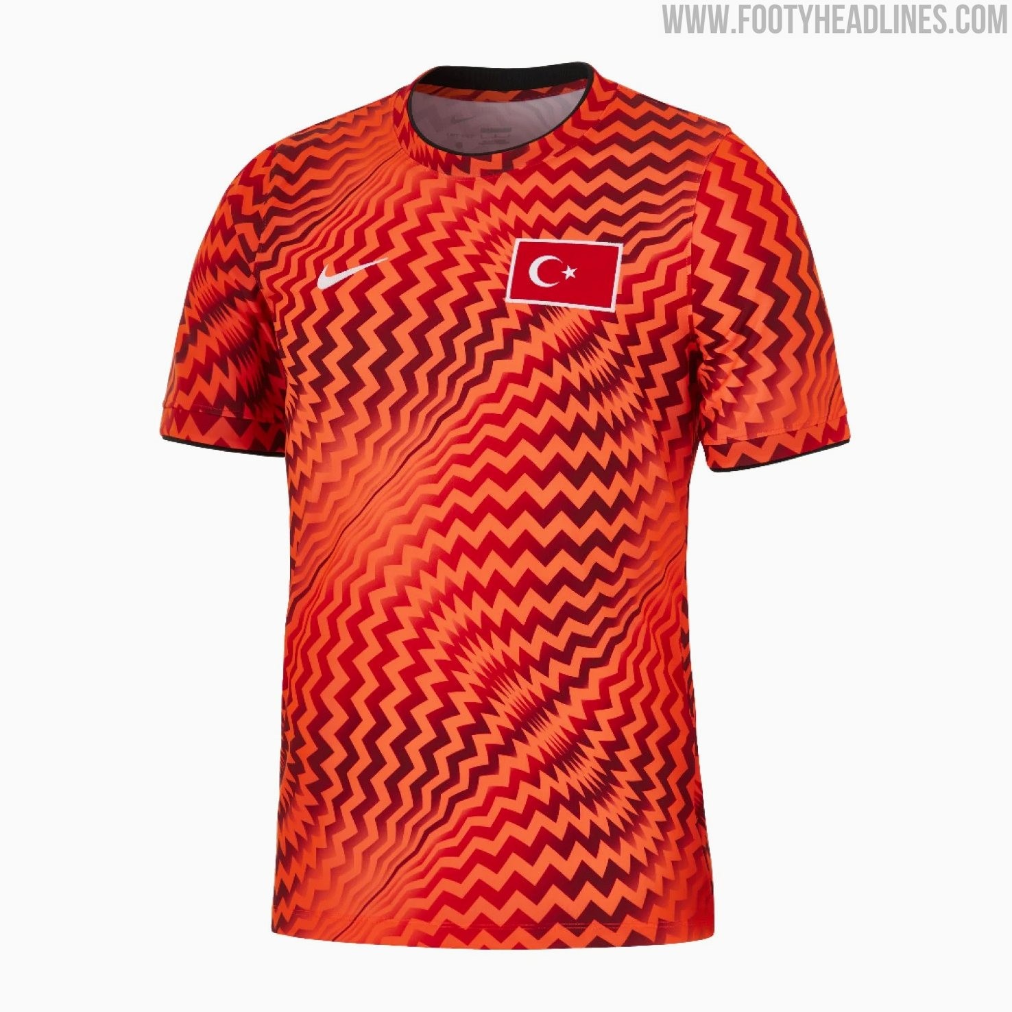
Turkey 2026 World Cup Pre-Match Shirt Revealed - Streamlined Nike Template for Smaller Nations
Nike's preparations for the 2026 World Cup are being finalized with the reveal of the new Turkey pre-match shirt.
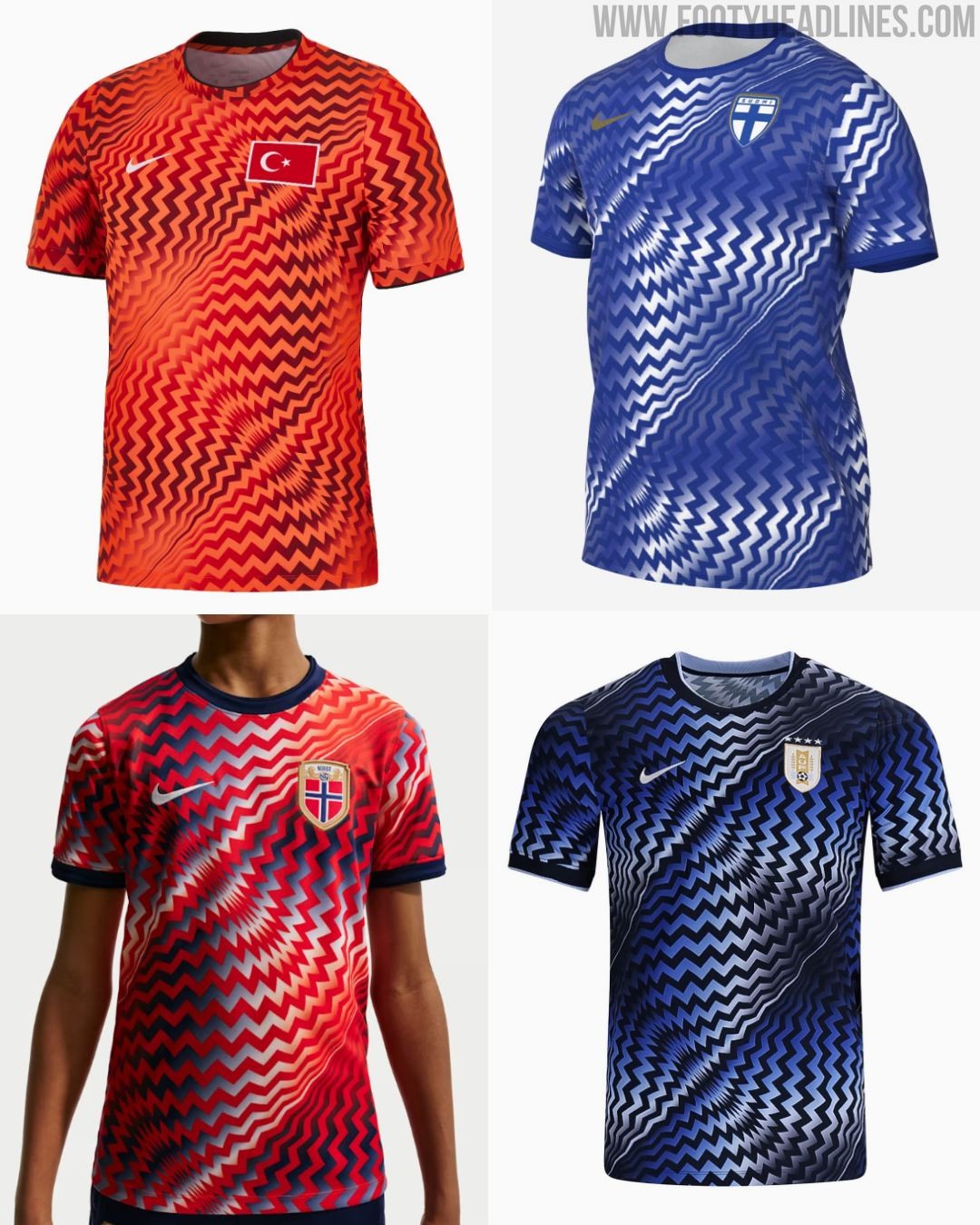
Rather than receiving a bespoke design, the new Nike Turkey 2026 World Cup pre-match jersey utilizes a highly visible, streamlined template that the American sportswear brand will be rolling out across its wider portfolio of sponsored national federations.
The defining feature of the Turkey 2026 pre-match shirt is its bold, all-over geometric graphic. The template consists of tightly packed, wavy zig-zag lines that warp and curve to create a dynamic optical illusion across the entire torso and sleeves. For the Turkish national team, this busy pattern is executed in vibrant, contrasting shades of red and dark orange.
Nike is applying this exact same streamlined template to several other national teams, simply adjusting the color palettes to suit each country. European sides like Norway and Finland, alongside South American heavyweights Uruguay, will all sport identical pre-match designs featuring their respective national colors applied to the same wavy graphic.
What are your thoughts on Nike utilizing a shared, streamlined template for its 2026 national team pre-match shirts? Let us know in the comments below.


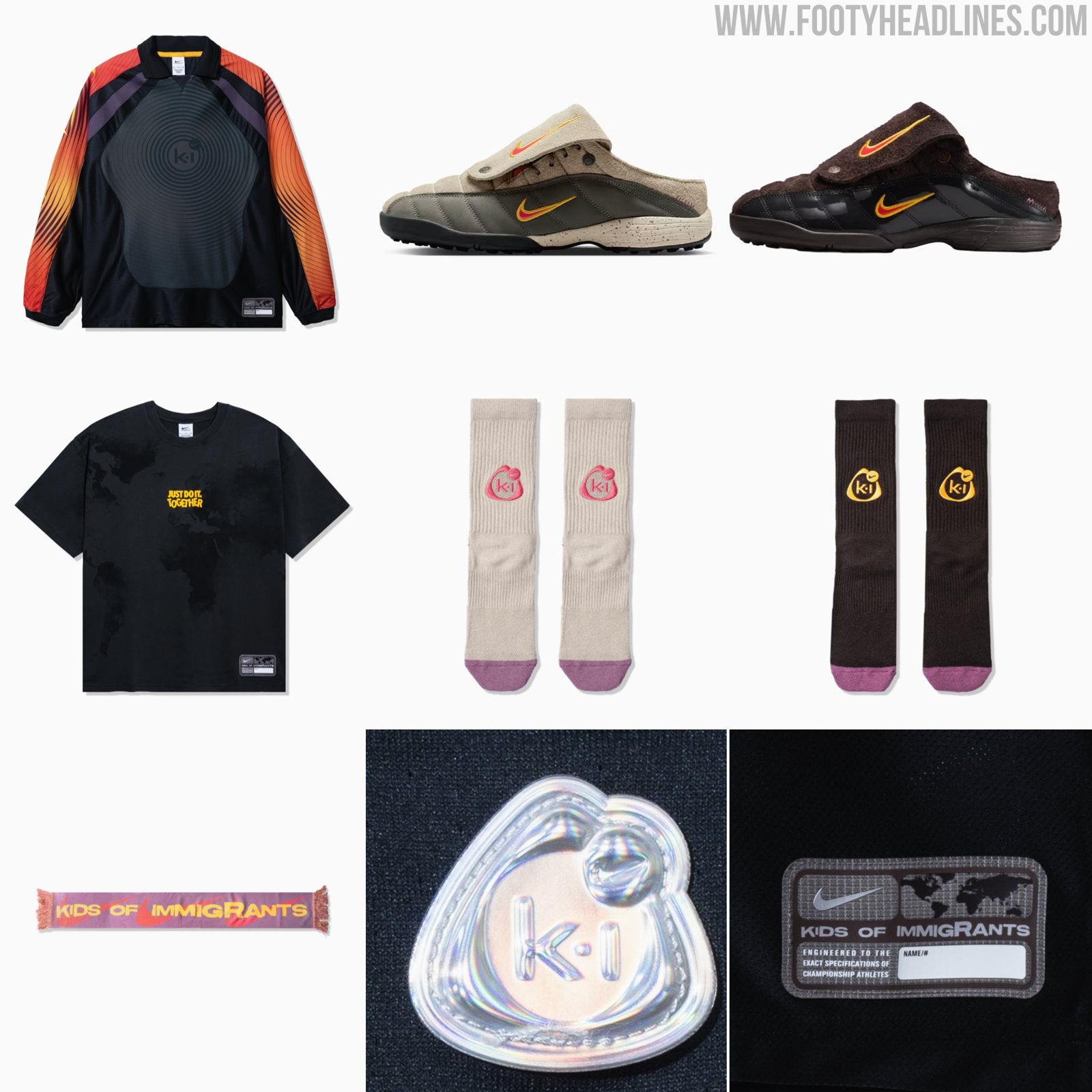
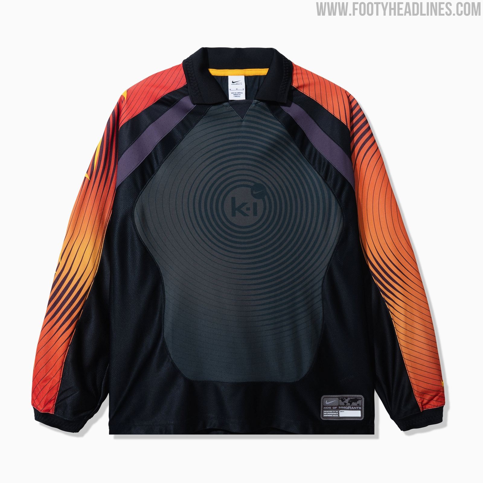
Nike and Kids of Immigrants Goalkeeper Jersey + Total 90 Shoes Released
Nike and streetwear label Kids of Immigrants have officially unveiled a comprehensive collaborative capsule collection. This wider release expands significantly upon the retro football aesthetic, offering a full range of apparel, accessories, and highly unique modified footwear.
The undeniable centerpiece of the expanded collection is the introduction of two bespoke slip-on mules, which draw heavy inspiration from the iconic Nike Total 90 football boot. The mules arrive in two distinct colorways: a muted beige and olive green iteration featuring a speckled sole, alongside a darker, glossy black and rich brown patent leather version. Both pairs are unified by a striking red and yellow outlined Swoosh on the midfoot and tongue, matching the vibrant accents found on the collection's primary jersey.
Rounding out the collaborative effort is a selection of matching apparel and accessories designed to complete the capsule. The standout piece of these other items is a special 1990s keeper kit.
Which item from the Nike x Kids of Immigrants collection is your favorite? Let us know your thoughts in the comments below.
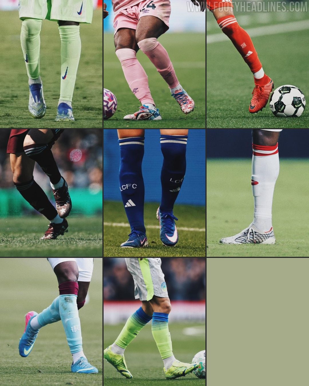
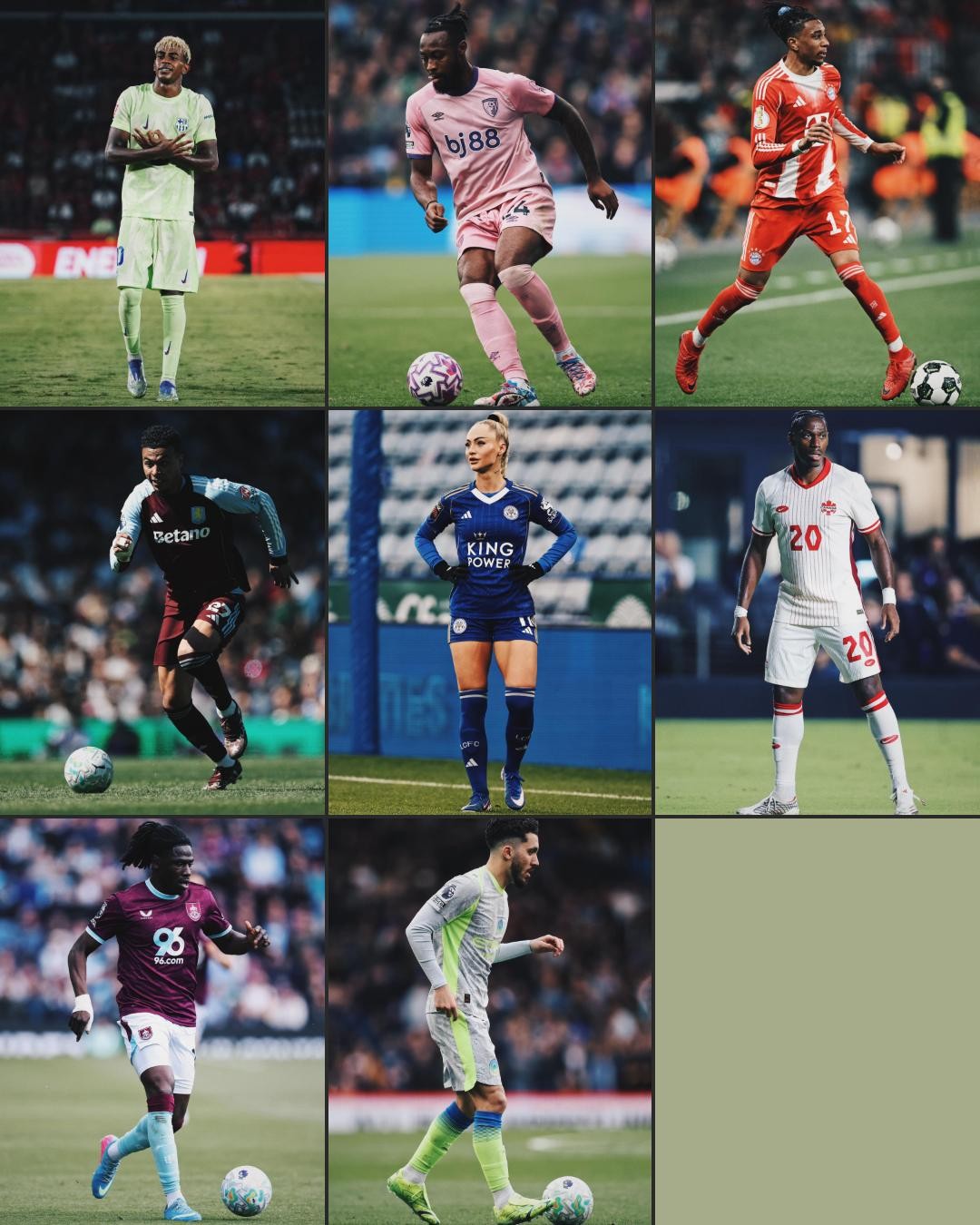
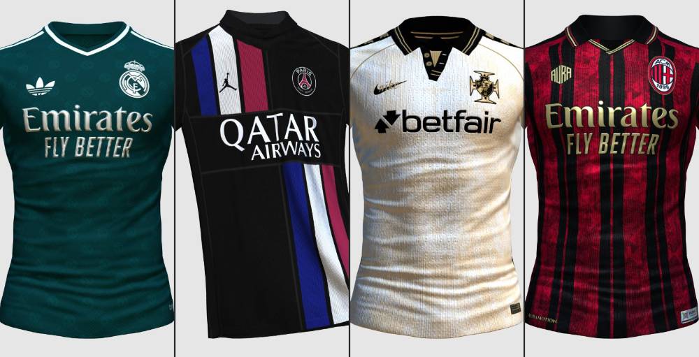
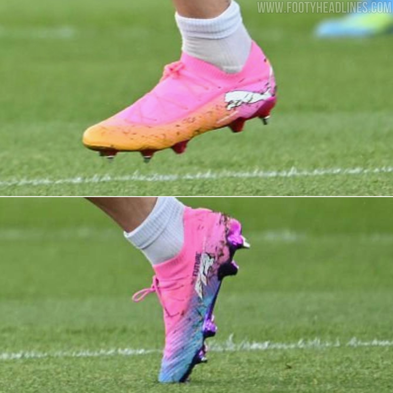
The Nicest Boot Combos of the 2025-26 Season
The 2025-2026 season saw some great boot x kit combos. Huge thanks to Unisport for the great round-up.
