Same Designer as Nantes: New Stade Reims Logo Revealed
French club Reims today unveiled its new logo, which brings a clean and modern look in line with a few recent football rebrandings like Juventus and Nantes.
It's no surprise that the new Stade Reims emblem was designed by the same agency, Leroy Tremblot, that did last year's Nantes rebranding - which definitely has a similar vibe.
This redesign aims to bring modernity to France's first major club - Reims won six Ligue 1 titles between 1949 and 1962.
Instead of the previous roundel design, the new logo is free-flowing and features the club's initials at the center. A crown can be seen above the 'SR', while the team name is written below it.
Jean-Pierre Caillot, President of the Stade de Reims: "The creation of a new graphic identity meets several objectives for the club. First of all, it was a question of modernising a logo that dates back twenty years or so and whose markers have aged. Then, at the dawn of the 2020-21 season, which marks the 90th anniversary of the Stade de Reims, the challenge was to display an iconic coat of arms on the background and an avant-garde design that takes up historical and cultural codes and allows the Stade de Reims to stand out in its universe. For a long time, we dreamed of updating the logo that made the reputation of the Grand Reims with the bottle of champagne, but the legal exploratory work led us to rule out this possibility. The teams then endeavoured to start from a blank page, while drawing on the club's roots. I'm thinking of the crown, the letters S and R, which echo the original club coat of arms, the first one worn in the 1930s. In that sense, this emblem is meant to be the link between our history and our future. A future embodied by the new generations who will be able to appropriate a logo that resembles them through its modernity. »
Mathieu Lacour, General Manager of the Reims Stadium: "Beyond a logo, we have built a brand territory. From the Raymond Kopa lifestyle centre to the Academy, the club now relies on a coherent and transversal brand universe. The approach of the project group, which worked on this strategic project for a year and a half, was to come up with a modern logotype, but with a symbolic touch. The integration of the main portal of Reims Cathedral as the base for this new emblem is an illustration of this. This graphic ensemble combines the historical dimension of a club anchored in its city, while spreading the idea of modernity that characterizes the Stade de Reims. A "House of Football" that cultivates tradition and ambitions. »
"While the graphic design is undeniably more modern, we wanted the elements that make it up to convey the same symbols. The colour remains unchanged, the acronym SR remains the symbol of the club's name and the cathedral the inspiration for the curves. From the ball we kept the pentagon, the central jewel in the crown and an emblematic figure of the sport," explains Dominique Jubert, General Manager of Leroy Tremblot.
Concepts by Saintetixx
French graphic artist Saintetixx already produced a set of Reims 20-21 kit concepts.
Are you a fan of the new Stade Reims logo? Comment below.
Vintage Football Shirts
from Cult Kits
2003/05 Chelsea Veron #20 Home Shirt (L) Umbro

2009/10 Spain A.Iniesta #6 Home Shirt (L) Adidas

2018/19 Colombia James #10 Home Shirt (XL) Adidas

2018/19 Barcelona Messi #10 Home Shirt (L) Nike

2020 Mufc '92 Schmeichel – Knitted Sport Socks

1993 Yokohama Flugels Home Shirt (M) Puma

2019/20 AC Milan *BNWT* Black Stadium Jacket (Multiple Sizes) Puma

2011/12 Italy FIGC Referee L/S Shirt (S*) Diadora

1992/94 Spain Home Shirt (L) Adidas

2008/09 Juventus Del Piero #10 Away Shirt (M) Nike
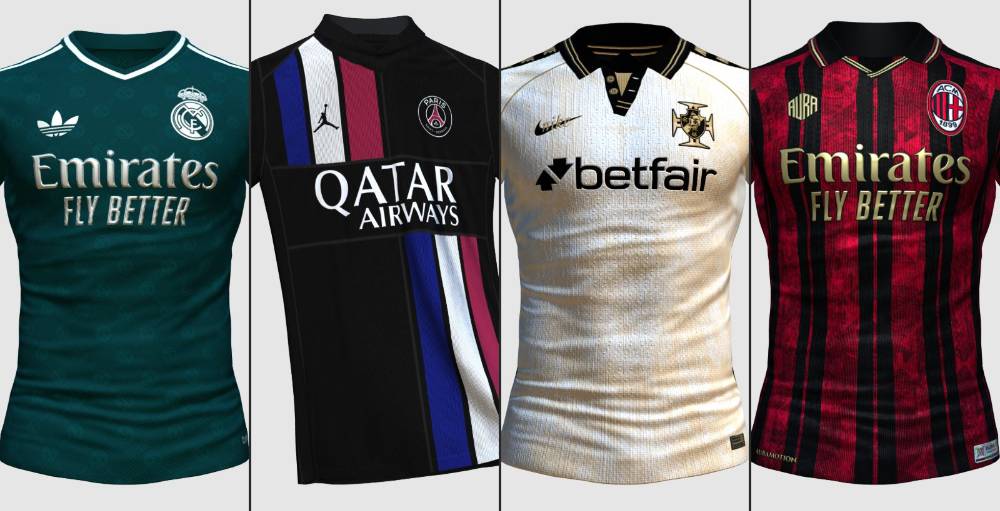
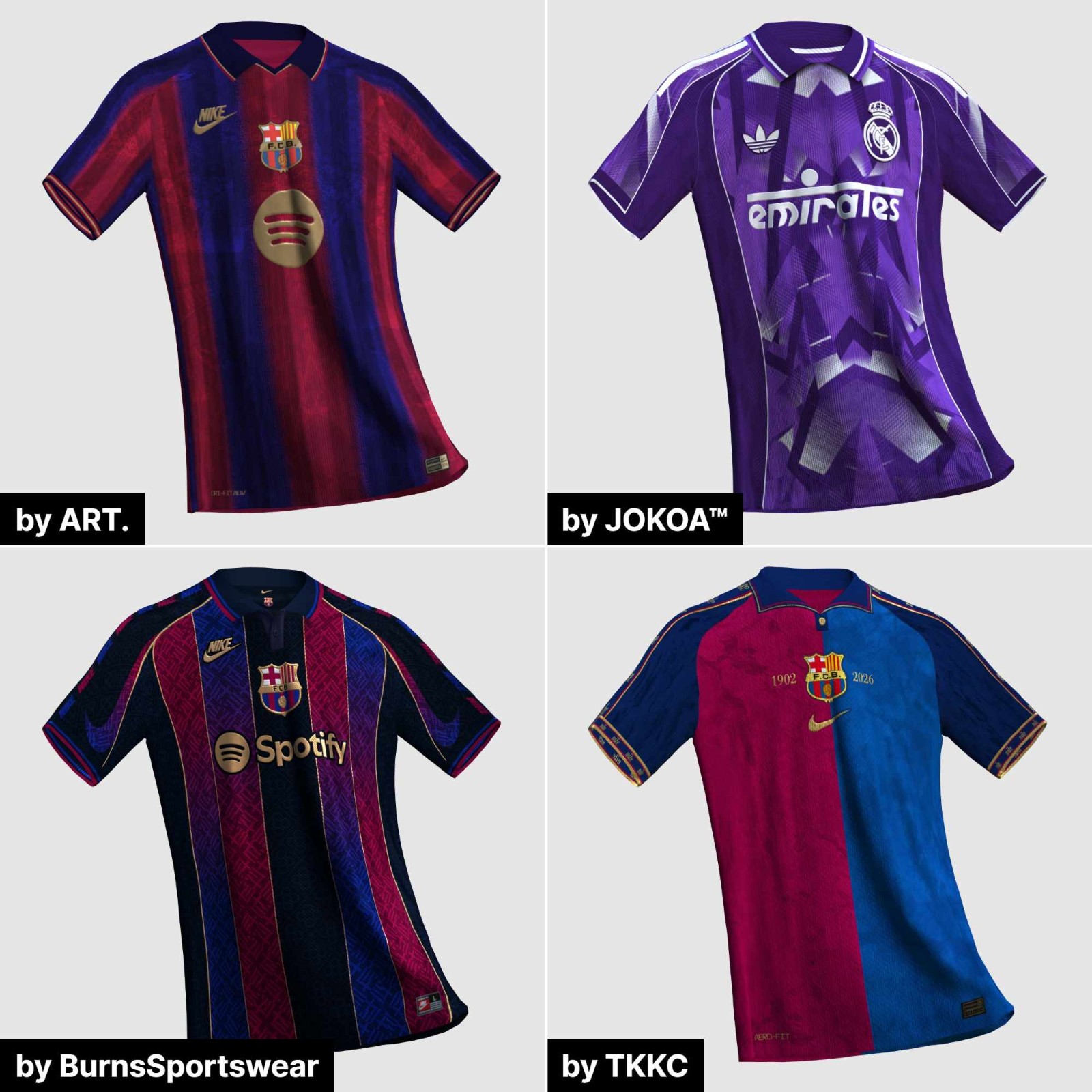
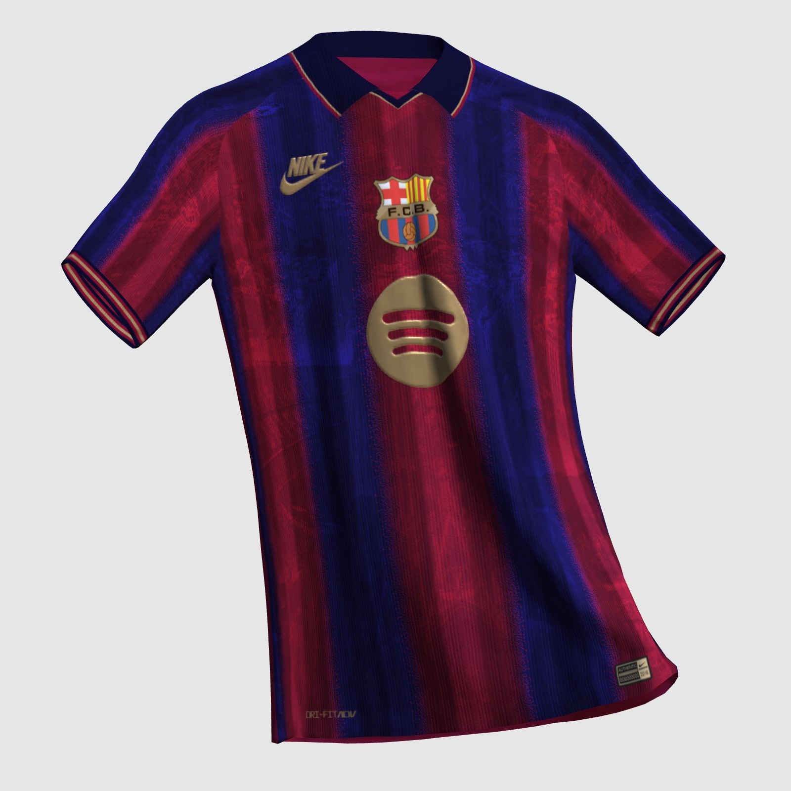
El Clásico Retro Kit - Semi-finals
Four kits are remaining in the El Clásico retro kit competition by Kit Creator. You can vote now here: https://fifakitcreator.com/showcase/competition/227

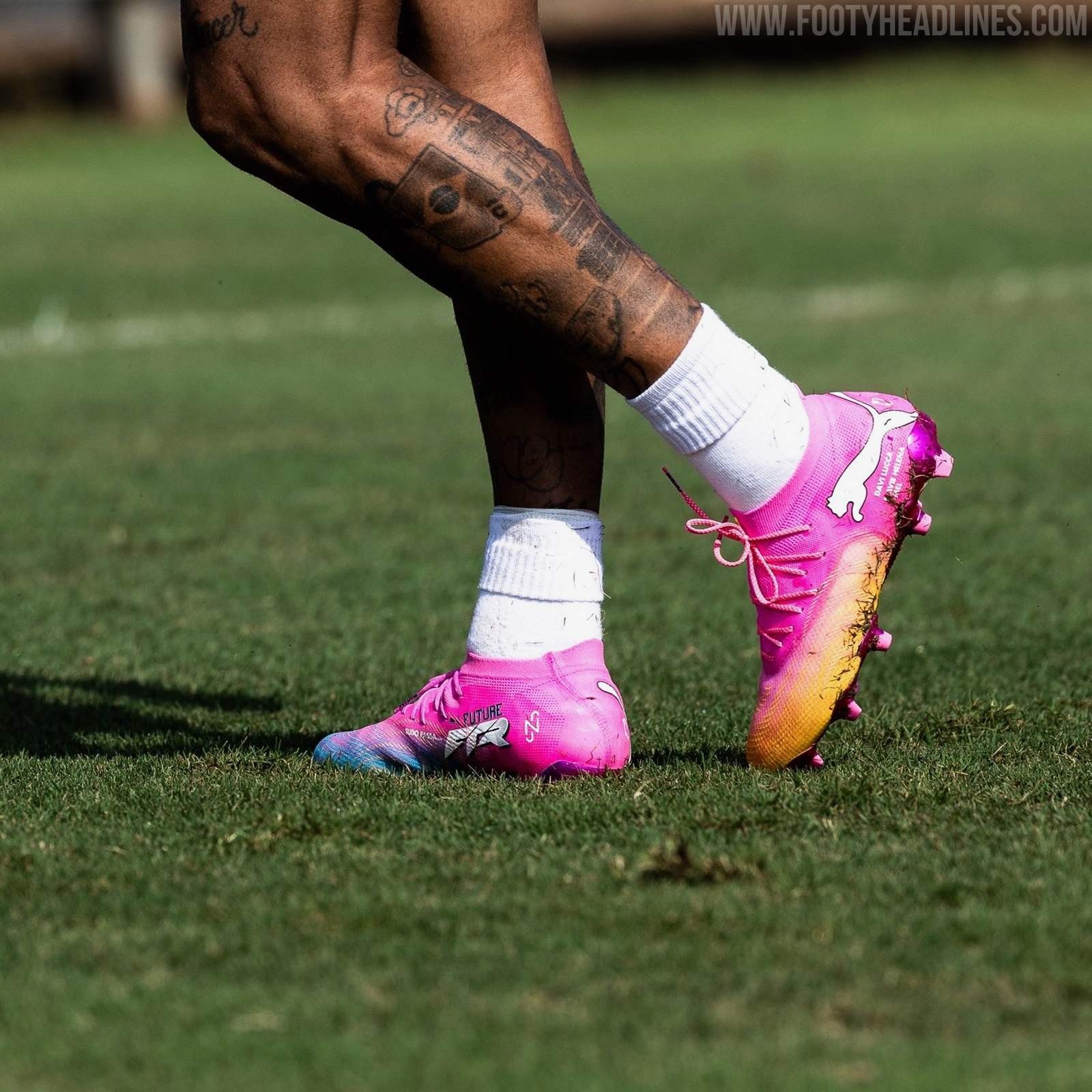
Neymar Gives First Look at Puma 2026 World Cup Boots
Neymar has trained in the World Cup edition of the Puma Future football boots, called Showtime. The Puma 'Showtime' 2026 World Cup soccer cleats pack is set to release on Thursday, May 28, 2026.
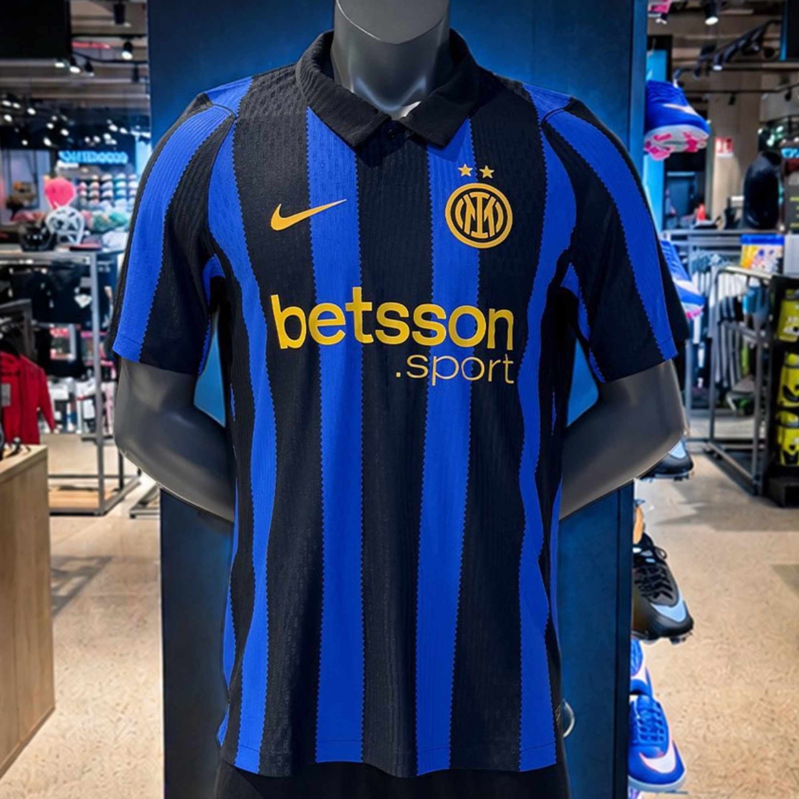
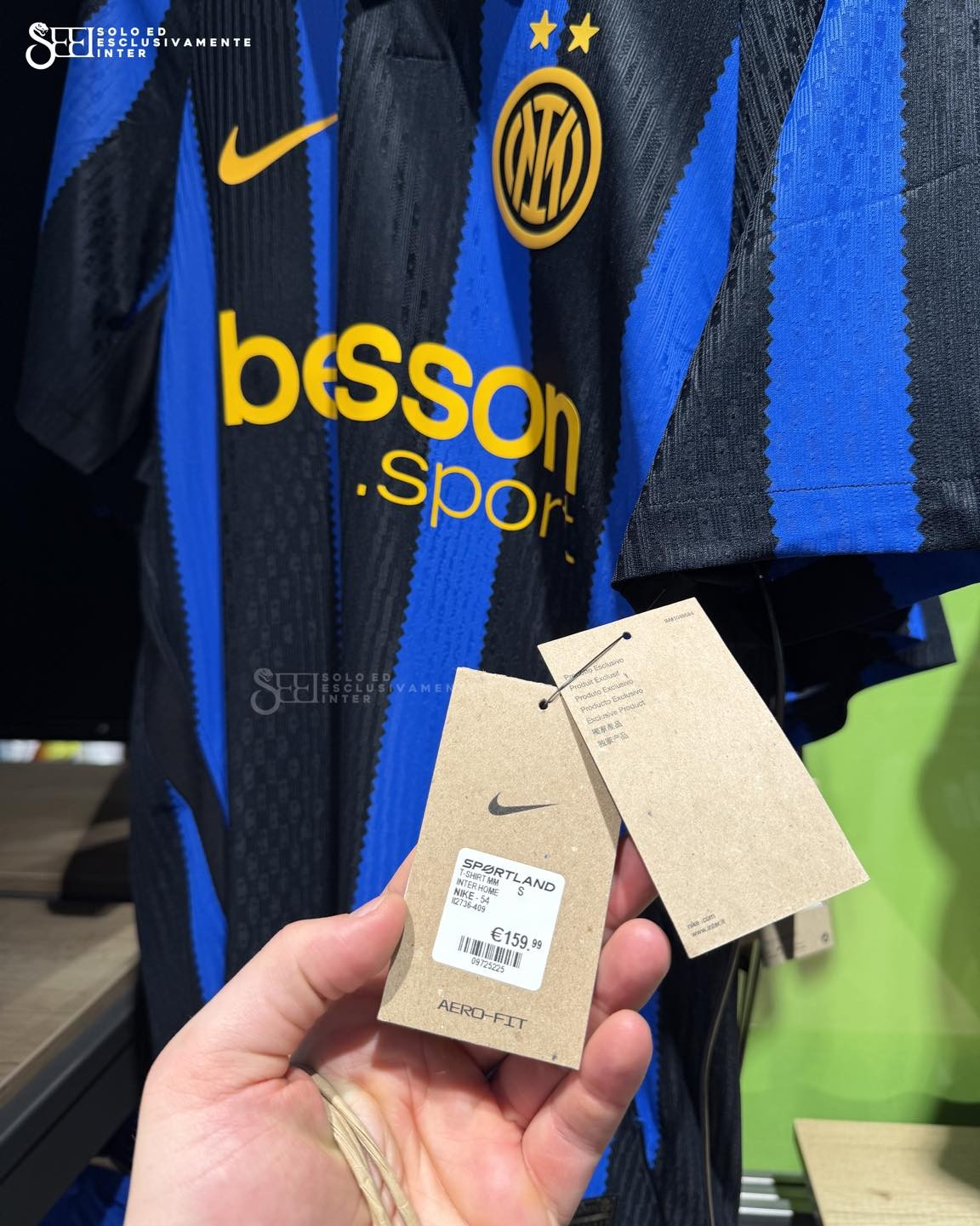
Inter Milan 26-27 Home Kit Spotted for Sale
The new Nike Inter 2026-2027 home shirt is set to launch soon. Thanks to Solo ed esclusivamente Inter for the images.


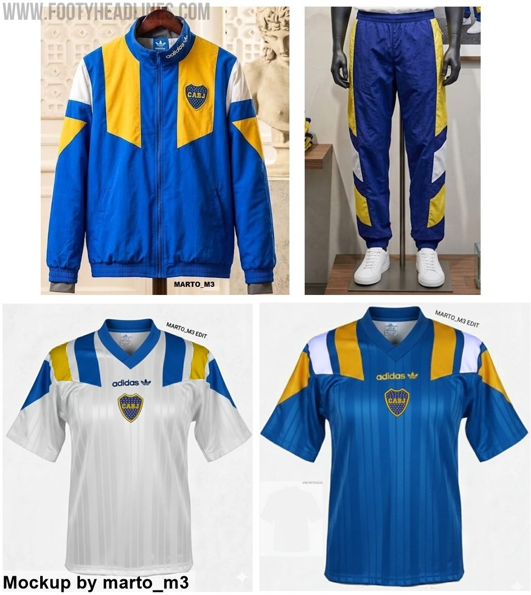

Adidas Boca Juniors 1992 Retro Collection Leaked
According to reliable club apparel source @marto_m3, the German brand is preparing to launch a full line of vintage garments for the Argentine giants Boca. The leaked mock-ups showcase a four-piece capsule that accurately revives the bold aesthetic of the early 1990s, consisting of a classic track jacket, matching track pants, and two distinct retro t-shirts.
The standout pieces of the collection are the two jerseys, which feature the famous 1992 template, A central placement for both the vintage Adidas Trefoil logo and the historic Boca Juniors crest completes the authentic 1992 look. Complementing the shirts is a vibrant tracksuit, with the blue jacket sporting a striking yellow angled panel across the chest and the pants featuring oversized yellow and white geometric color-blocking down the sides.
This upcoming release is part of a 1992 retro collection for many Adidas teams.
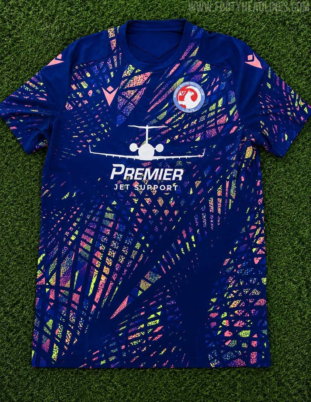
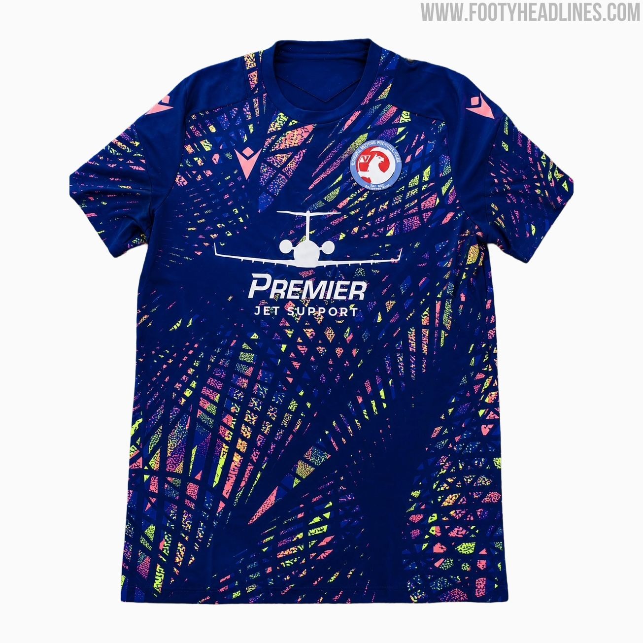
Vauxhall Motors FC 26-27 Away Kit Releasedmacr
The the striking new Vauxhall Motors FC 2026-2027 away kit has been revealed, introducing a highly vibrant aesthetic for the upcoming campaign.
The shirt features a dark navy base that is heavily contrasted by an intricate, retro-inspired geometric pattern applied in neon pink, yellow, and light blue across the torso and sleeves. Pink Macron 'Hero' logos sit on the right chest and both shoulders, perfectly complementing the colourful graphic elements, while the traditional club crest rests on the left breast.
Right in the centre, the logo of front-of-shirt sponsor Premier Jet Support, complete with an aeroplane motif, is printed in crisp white to stand out against the busy background design.
What are your thoughts on this bold, colourful pattern for the new Vauxhall Motors away strip? Let us know in the comments below.
