All-New Iceland Crest Explained

The KSÍ (Football Association Of Iceland) yesterday revealed their new Puma 2020 home kit and their all-new visual identity. Today we take an in-depth look at the all-new Iceland football branding.


Unlike before, the KSÍ will have two distinctive trademarks, one for the association and one for the national team.
Our new national team crest. pic.twitter.com/6Bk17WeO5u
— Knattspyrnusambandið (@footballiceland) July 1, 2020
The new KSÍ branding has been created by Icelandic design agency Brandenburg, who are based in Reykjavík, the capital of Iceland.
Football Association of Iceland Logo

Already launched in February 2020, the new KSÍ logo features a more modern and powerful look than the previous one. The colors are also much more saturated - all to "adapt better to KSÍ's varied contact surfaces and stand strong on the field in any digital use that becomes increasingly cumbersome".
Iceland National Football Team 2020 Logo

The new Iceland crest boasts a unique yet modern and remarkable look. The elements of the Iceland crest looks pretty randomly at first glance, but they are indeed not.

Instead, the new Iceland kit crest is made upon four mythical creatures from folklore that protect Iceland - it features stylised representations of a dragon, a bull, a griffin and a giant within a diamond shaped design.

The Bull: (Griðungur) : protector of northwestern
The Eagle: (Gammur) : protector of northeastern
The Dragon: (Dreki) : protector of southeastern
The Rock- Giant (Bergrisi): protector of Southwestern
The 4 figures are spirits described in Old Norse sagas and pagan tradition known as Landvættir (Land Wights) that feature prominently on the Icelandic coat of arms and can also be found on the back of their coins.
Traditionally, football logos are based on a shield. Iceland's is not.
Traditionally, football logos are based on a shield. The tradition originates from a time when knights carried their coat of arms. Iceland national teams’ logo does not refer to knightship but our history, nature and heritage.


The new Iceland 2020 national team logo is set to feature on all football kits and other merchandising/ stuff of the Iceland national soccer team.


Together with the all-new crest, the Football Association of Iceland Logo also launched a new typeface.


"To strengthen the trademark, a bespoke typeface was created, with unique lower case letters. The typeface draws inspiration from Icelandic crafts and the result is a distinctive blend of old traditions and modern styles. The font will play a key role in implanting our logo and image in the minds of people around the globe."


Share your thoughts in the comments below and find out all about the new Iceland 2020 national team crest on the dedicated website of the KSÍ.
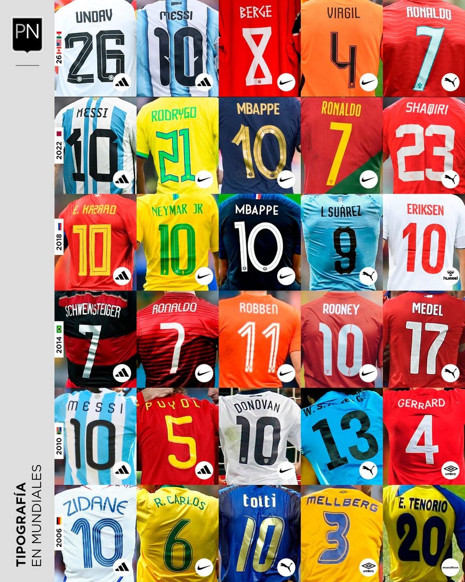
A Look Back at World Cup Shirt Number Typography
Football kit design account @PaladarNegroWeb has shared an interesting retrospective on the typography used for shirt numbers in recent World Cups. The visual language of football kits is often defined by these details, with fonts becoming instantly recognizable symbols of specific tournaments and eras.
The collage highlights various iconic typefaces worn by national teams on the biggest stage. spanning from the 2006 World Cup to the FIFA World Cup.
This overview is part of an ongoing series by the account exploring the visual elements of football. It serves as a great reminder of how deeply typography impacts the overall aesthetic and legacy of a football shirt.


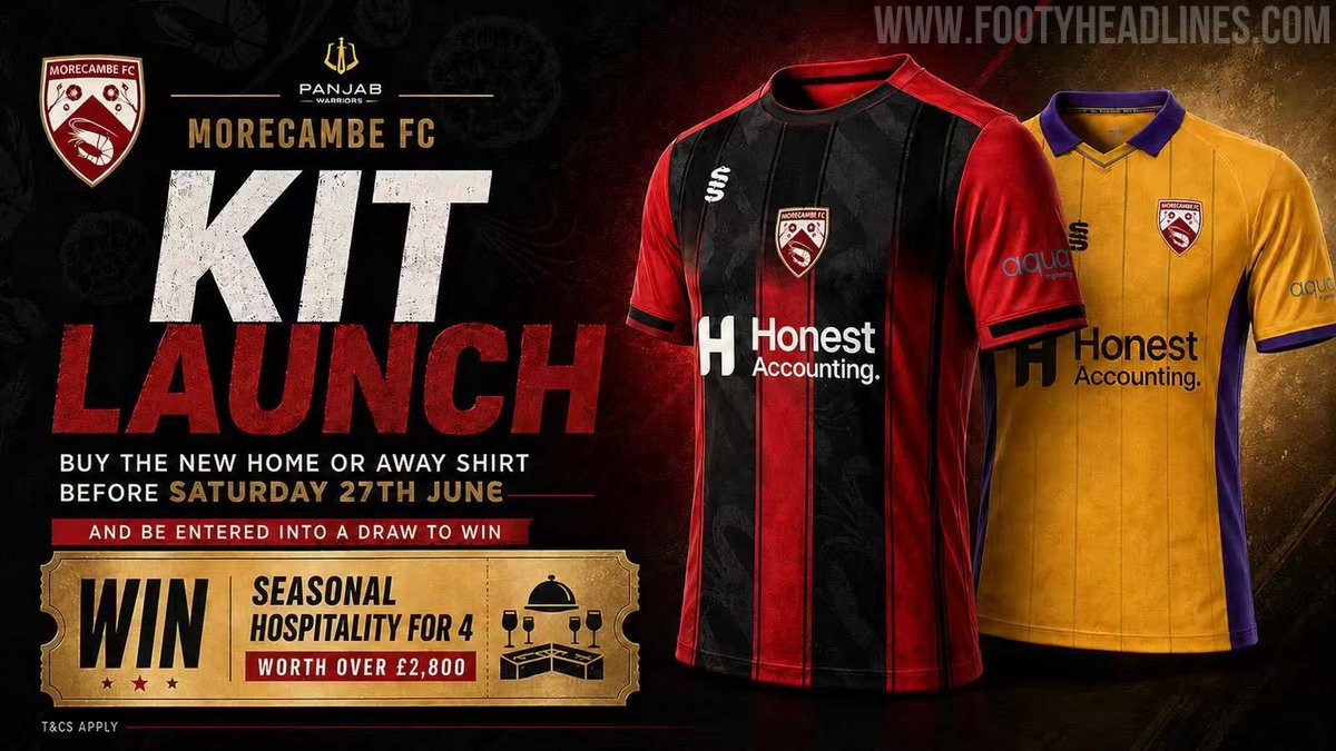
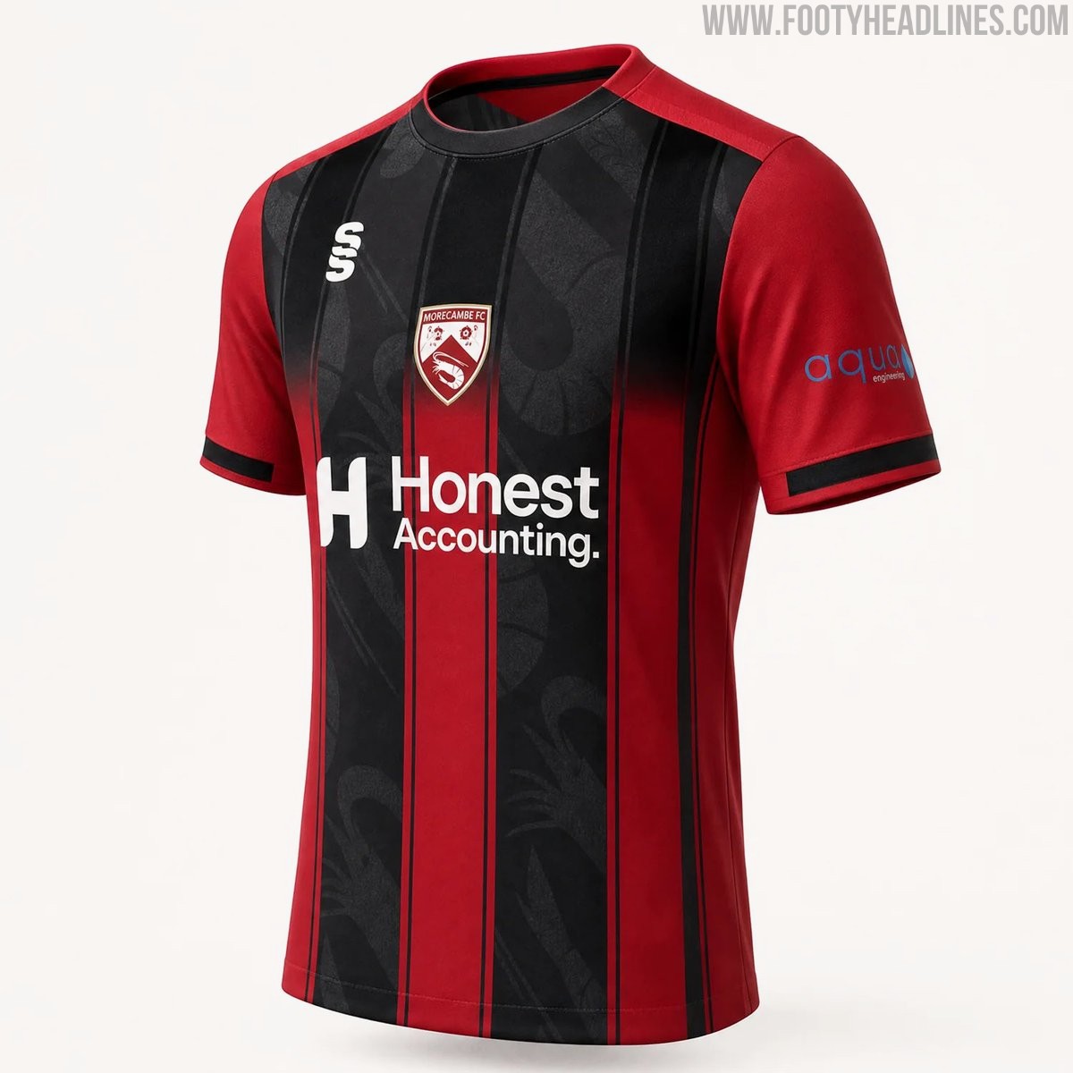
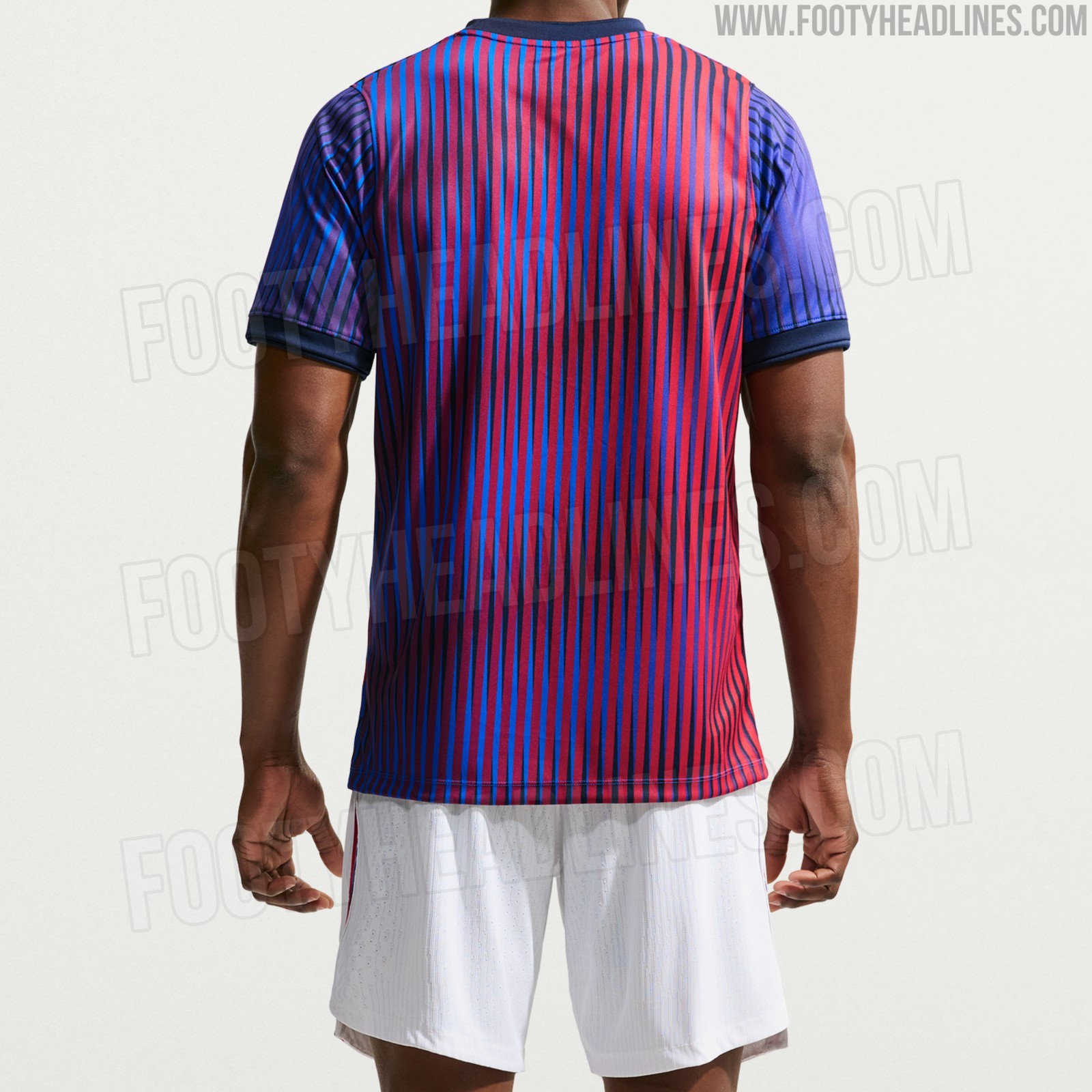
Morecambe 26-27 Home & Away Kits Released
Morecambe FC have officially launched their new 26-27 home and away kits, produced by Surridge Sports. The club received massive backlash for posting AI images for the launch, and later posted a clearer CAD of the home shirt.
The home shirt features the club's traditional red color palette with black detailing, while the away kit introduces a bold combination of purple and yellow. Both designs incorporate modern elements to provide a fresh look for the upcoming National League North campaign.
The new Surridge Sports Morecambe 2026-27 jerseys are currently available for pre-order through the club's official online store.


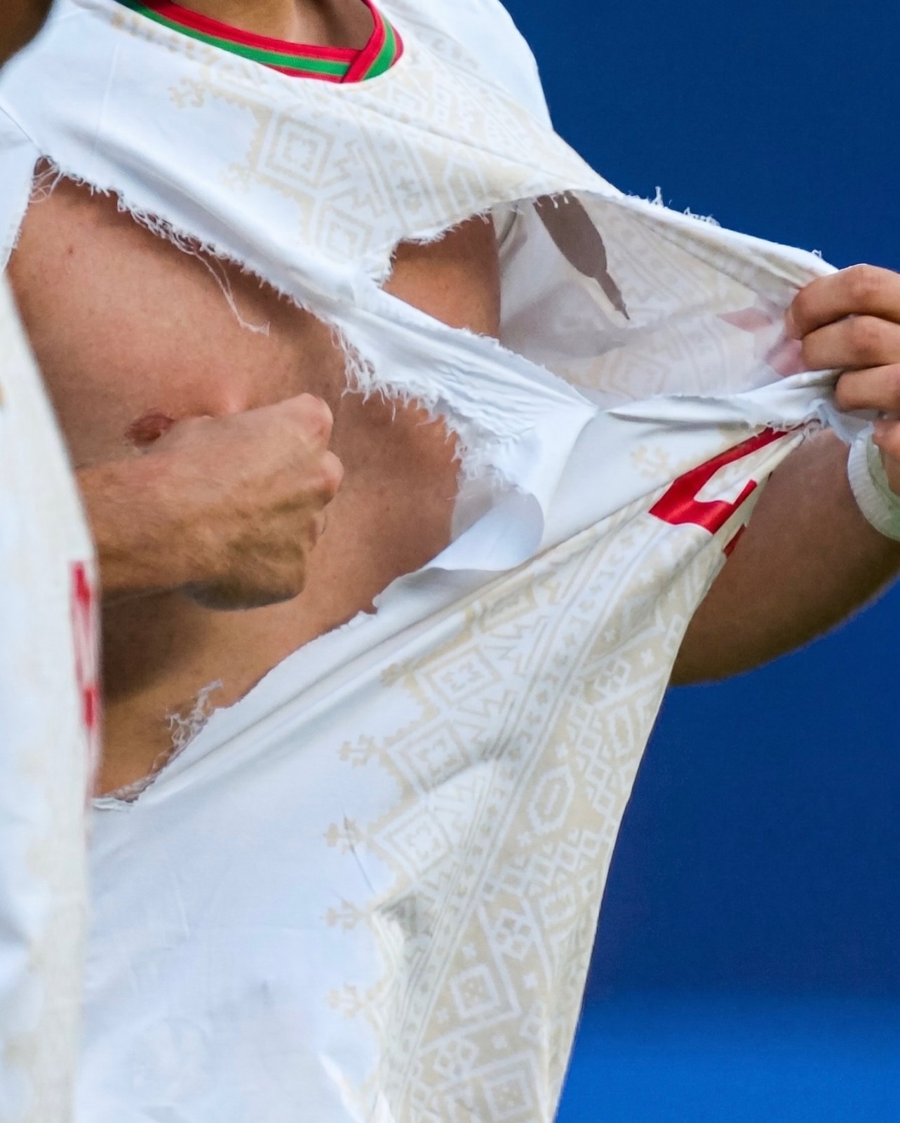
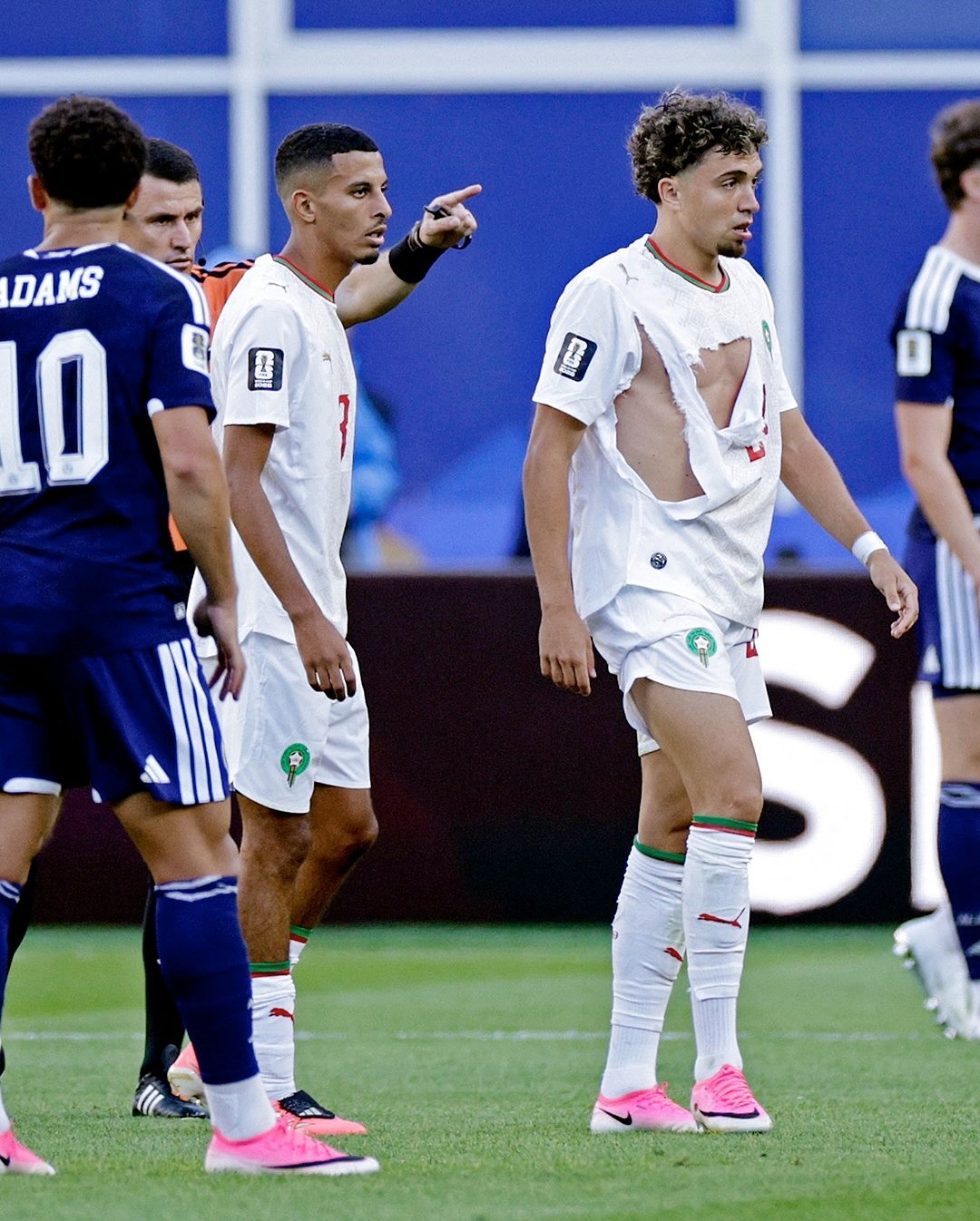
Puma Kits Keep Ripping at the 2026 World Cup
Puma is facing significant criticism at the 2026 World Cup as multiple national team jerseys have easily ripped during matches.
Incidents involving players from Czechia, Morocco, Egypt, and Paraguay have highlighted an ongoing durability issue with the brand's latest kits - every torn shirt in the tournament so far belongs to a Puma-sponsored team.
The Puma 2026 World Cup kits incorporate the latest version of PUMA's ULTRAWEAVE “Thermoadapt” technology, which obviously is not tear-resistant enough.
The recurring wardrobe malfunctions have resulted in terrible PR for the German sportswear manufacturer and even prompted the viral resurgence of Xherdan Shaqiri's infamous quote from Euro 2016, where he joked that he hopes Puma does not produce condoms.