New Deportivo Alavés Logo Unveiled
Spanish club Deportivo Alavés just unveiled its new logo, with which the club attempts to simplify the look and also introduce a new shape.
Trying to maintain the essence of the previous crest, the new Deportivo Alavés Logo still relies on the famous pennant, however the triangular flag is now implemented within a white circular shape. The words 'Deportivo' and 'Alavés' grace the outer blue shape together with the founding year 1921. In this sense, the rebranding does not take any design elements away, except for the flagpole.
Colours-wise, the new Deportivo Alavés 2020 Logo simplifies the appearance as the colour sky blue is scrapped in favour of a solely blue / white design.
Additionally, the club now has 3 different logos for various occasions of using the brand to allow for a wide variety of virtual applications and solutions. One logo even consists of two plain letters with a fancy font.
The whole rebranding process is characterized by the club's imminent centenary in 2021 as Alavés is looking to lay the foundation of a prolific future.
Are you a fan of the new Deportivo Alavés logo? Comment below.

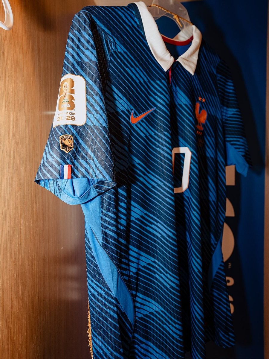
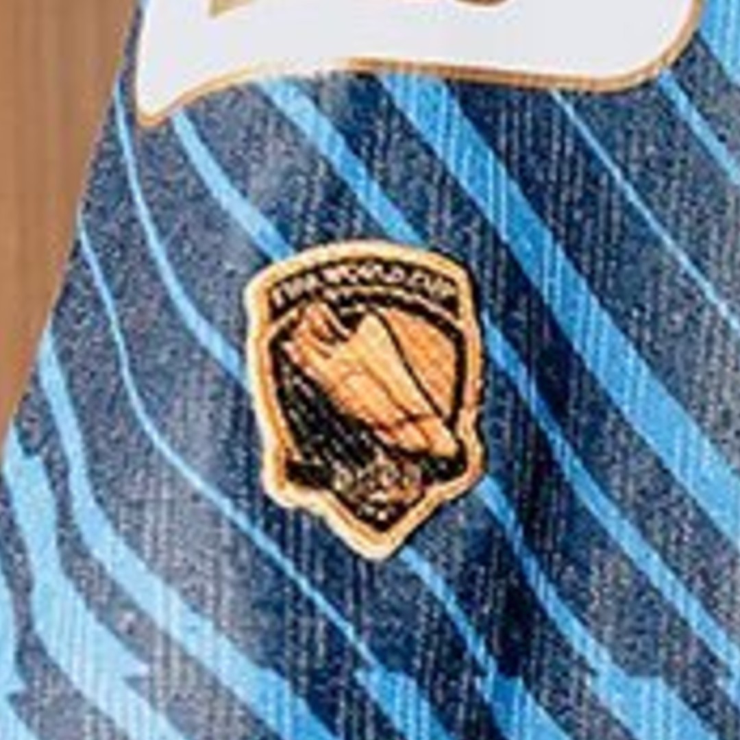
Kylian Mbappe to Wear Special World Cup 'Top Scorer' Patch
Kylian Mbappe will wear a special insignia on his France kit to commemorate his achievement as the top scorer of the 2022 World Cup. Following his Golden Boot win in Qatar, where he scored eight goals, the French captain's jersey now features a dedicated patch recognizing this individual accolade.
This addition comes as part of a wider trend of specialized badges seen on national team kits during the 2026 World Cup. Alongside standard tournament patches, various players have been spotted wearing insignias denoting their debut or legacy status.


New Al Khulood Logo Revealed
Saudi Pro League club Al Khulood have officially unveiled their new logo following a public fan vote. The updated crest, which forms part of a broader visual identity refresh for the team, incorporates elements inspired by the club's home city of Ar Rass into the previous shield design. This marks the second time the club's visual identity has been updated since Ben Harburg's acquisition of the team.