RB Leipzig Updates Logo
 Jul 6, 2020, by Chris

German club RB Leipzig yesterday announced that they changed the official club crest.


Updated RB Leipzig 2020 Logo
The modification of the RB Leipzig logo aims at an improved visibility in the digital area - The logo should appear more compact and at the same time increase the size awareness.
The updated Leipzig logo maintains all important elements but is more compact - the Bulls are not as dynamic as before and there are less lines.

"The aim of the adaptation is to make the logo appear more compact and at the same time to increase the perception of size. Above all when displaying the logo in the digital area on smartphones and tablets, in online media, tables, social media profiles or as a derived icon, the changes made to the proportions contribute to a higher visibility and perception of the logo with the same use of space. The result is that the logo is larger than before while taking up the same amount of space."
The 'old' logo is still used on the club's 2020-2021 kits.

Leipzig was forced to change their logo in 2013 to align with the rules of DFL.

The RB Leipzig 20-21 home kit, the club's first-ever since joining Nike's 'Elite' ranks, was released today. RB Leipzig confirmed that the team will debut the new 2020-21 home kit in the Bundesliga match against Dortmund on Saturday.


In fact, everyone who ever tried to put RB Leipzig's logo on a product or a graphic knows that the old logo (introduced in 2014) was not perfect in format. This can be seen on below Nike 2020-21 RB Leipzig product, which has a 'very small' logo.
What do you think of the updates Leipzig made to its logo? Comment below.

Tanjong Pagar United Reveal Controversial New AI Logo
Following a recent change in club management, Singapore Premier League side Tanjong Pagar United have introduced a new club crest for the 2026-27 season. First spotted in an AFC licensing document earlier this month, the updated emblem replaces the club's traditional hand-drawn badge with a modernized design that has quickly drawn criticism from fans for looking overly generic and being AI-generated (it probably was).
The new management took charge on June 1, but there is currently no official confirmation on whether the team's kit colors will also be altered to complement the newly introduced visual identity.
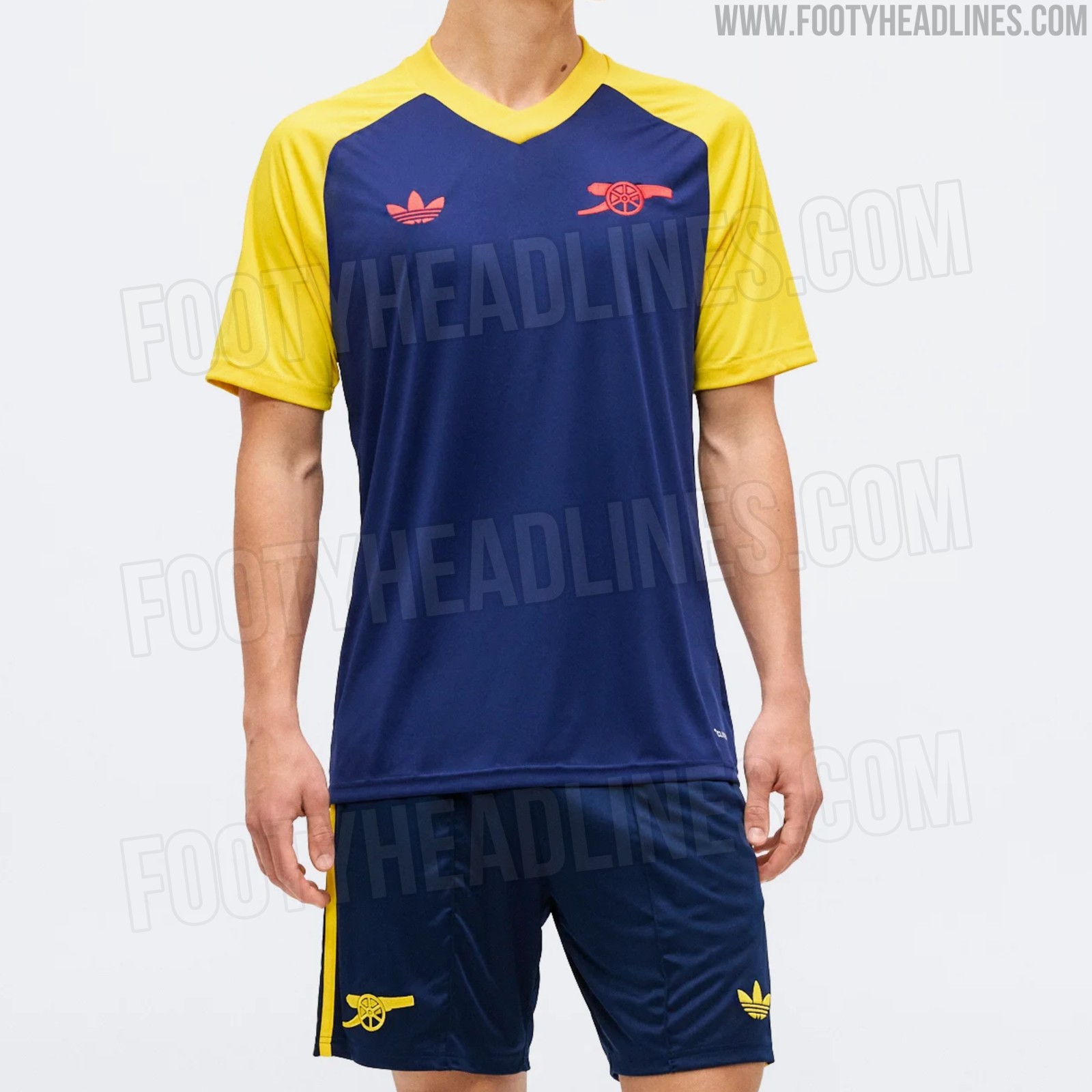
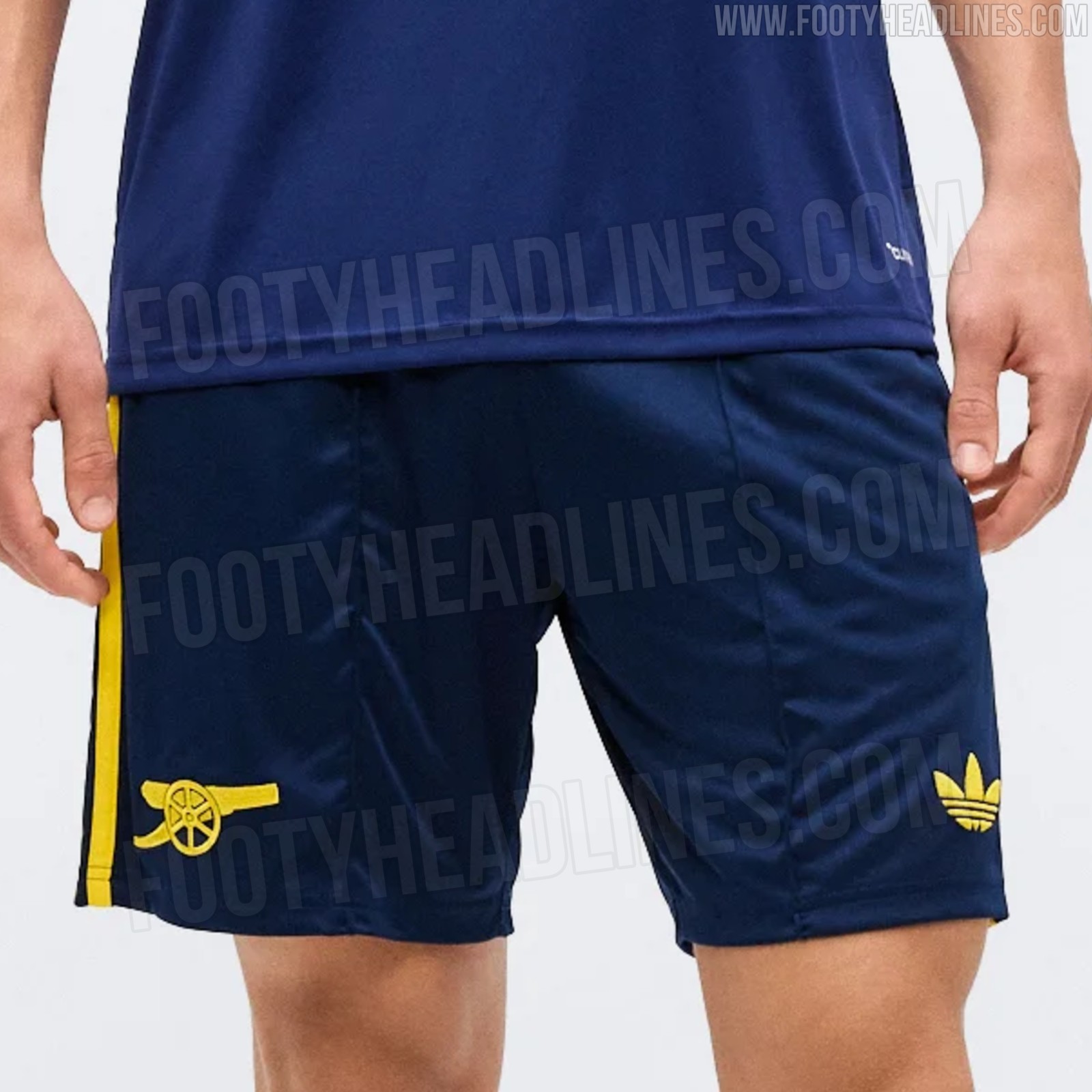
Arsenal 26-27 Away Pre-Match Shirt & Shorts Leaked
We have new images of the Arsenal 2026-27 away pre-match shirt and the away shorts.
The Adidas Arsenal 2026-27 away pre-match shirt introduces a retro-inspired design with a navy blue base and contrasting yellow raglan sleeves. Both the Adidas Trefoil logo on the right chest and the iconic Arsenal cannon on the left chest are colored in striking red.
This pre-match shirt is part of the wider Adidas Originals away collection designed to complement Arsenal's upcoming 2026-27 away jersey. The full range, which is also expected to include lifestyle items such as jackets and hoodies, is anticipated to launch in late July or early August 2026.
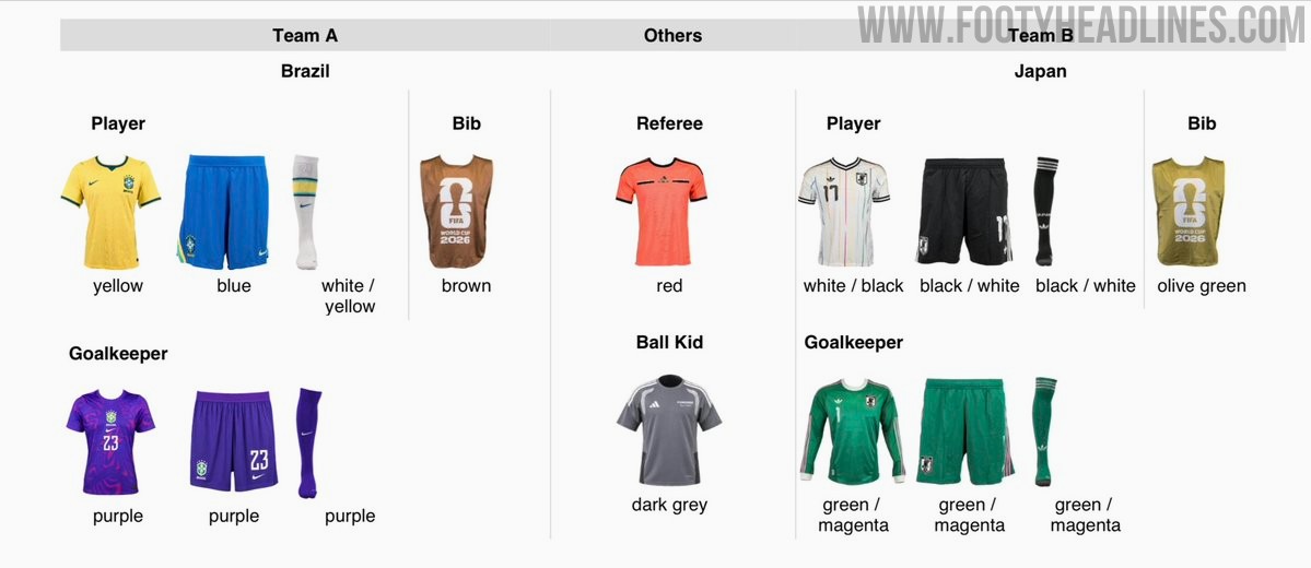
Brazil and Japan 2026 World Cup Round of 16 Kits Confirmed
FIFA has confirmed the kits for the 2026 World Cup round of 16 match between Brazil and Japan. Brazil will wear their traditional primary uniform consisting of yellow shirts, blue shorts, and white socks, with the goalkeeper in purple. Japan will play in their reserve kit, featuring an off-white shirt paired with black shorts and socks, while their goalkeeper will wear green.
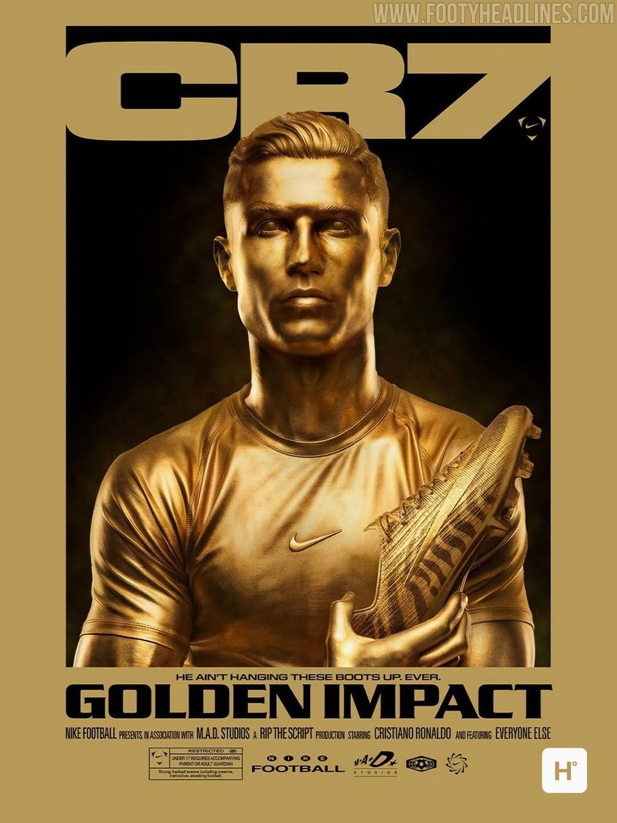
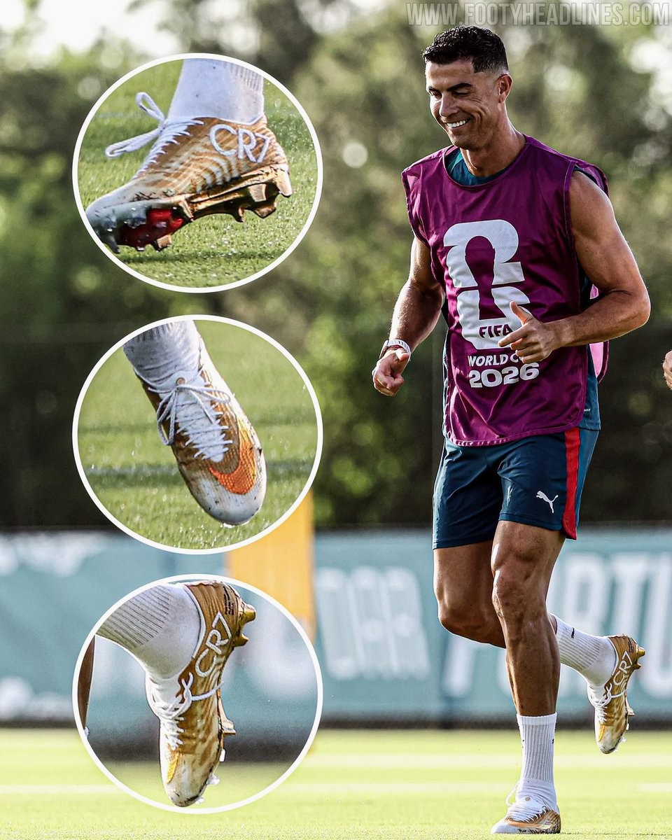
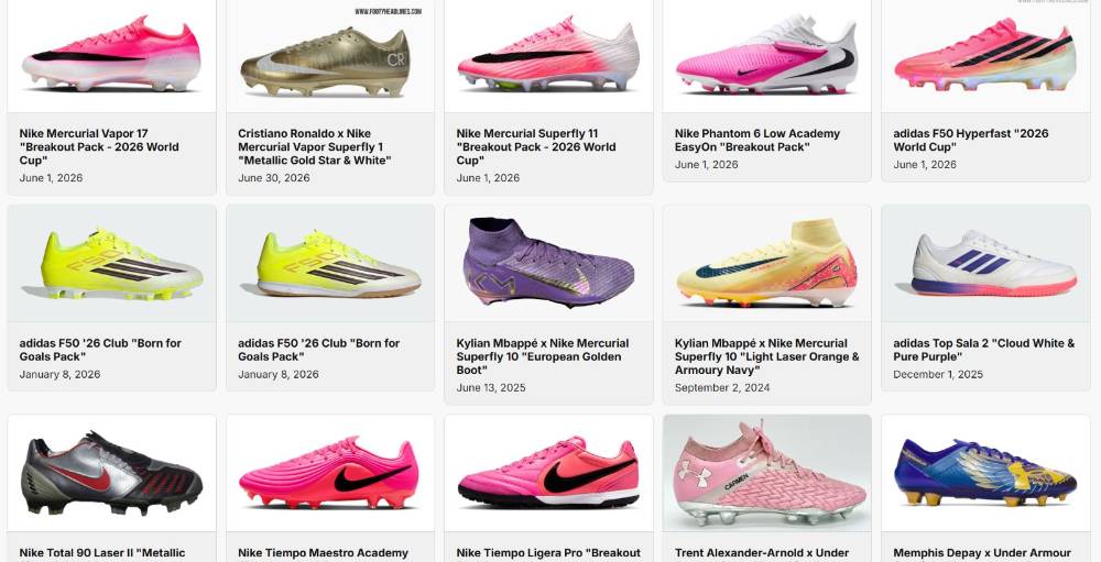
Cristiano Ronaldo to Wear Nike Mercurial Superfly 11 'Gold Scorpion' Boots Tonight
Cristiano Ronaldo is set to debut the special-edition pair of Nike Mercurial Superfly 11 Elite 'Gold Scorpion' boots against Colombia.
The exclusive gold boots, featuring a distinct scorpion motif, commemorate his historic achievement of becoming the first player to score in six consecutive World Cup tournaments.
We do not expect Cristiano to wear the Regen edition Mercurial in a match, even though he might give them a go in training.
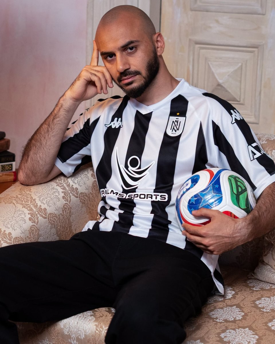
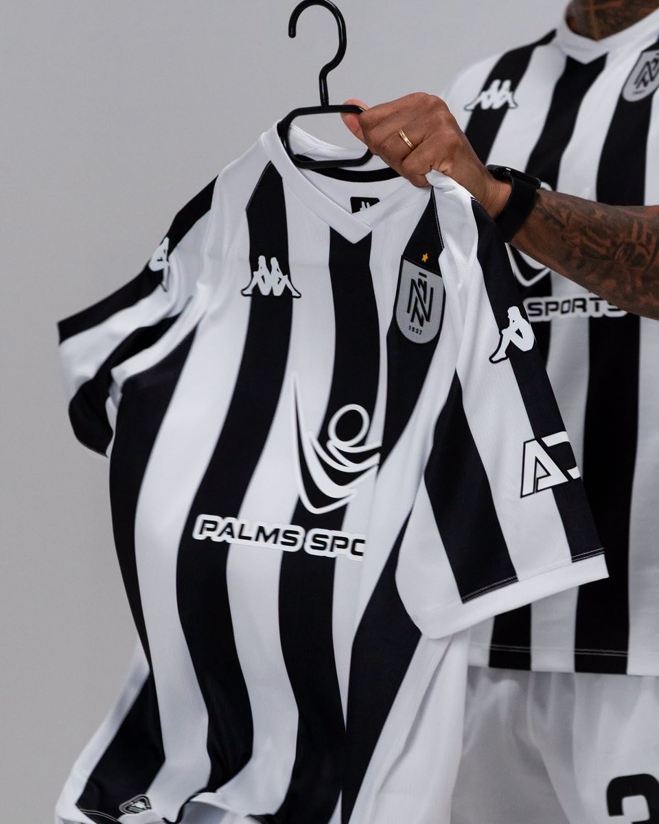
Neftçi PFK 26-27 Home Kit Released
The Neftçi PFK 2026-27 home kit has been officially released today. Made by Kappa, the new Neftçi PFK 2026-27 home shirt introduces a classic design that brings back the club's traditional black and white stripes.
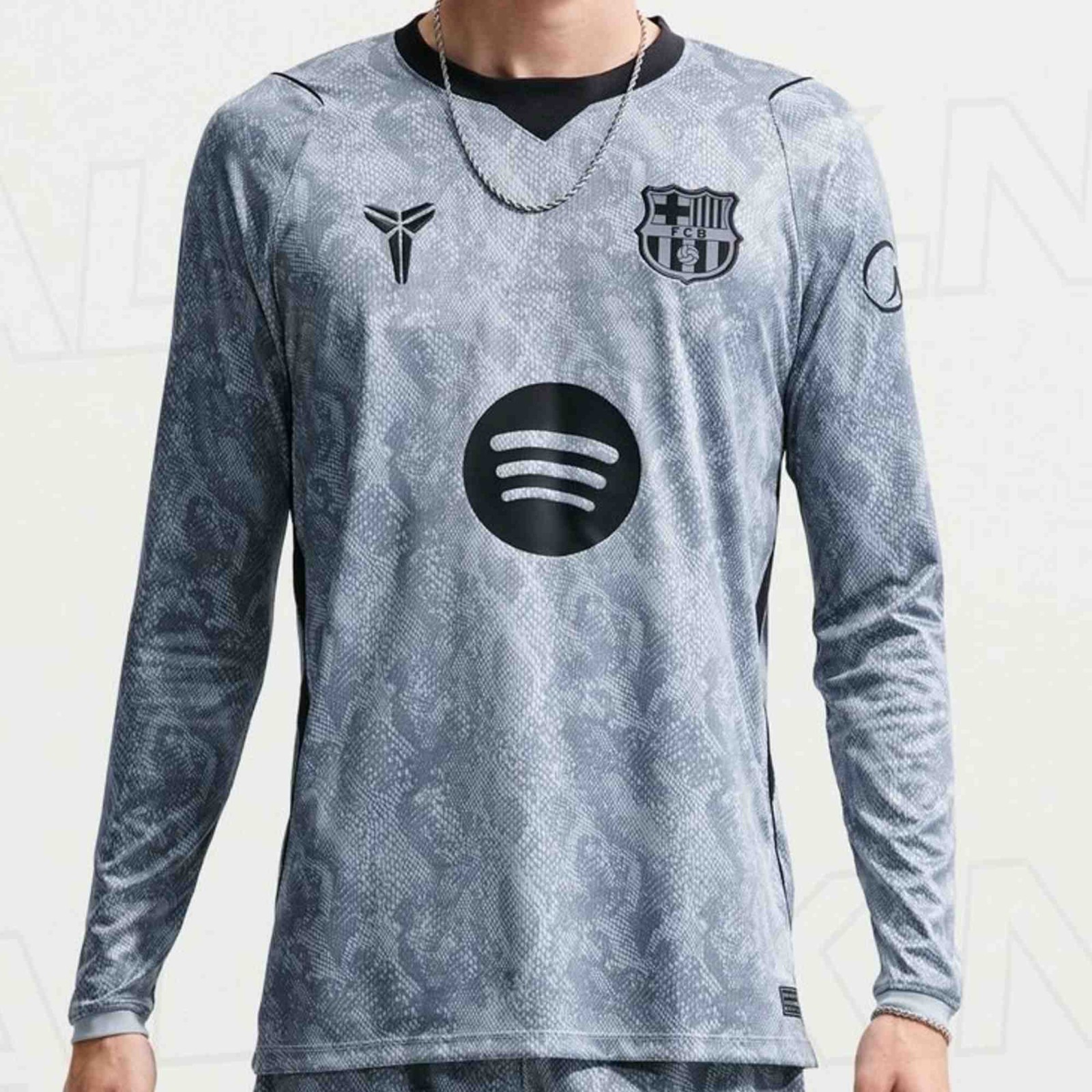
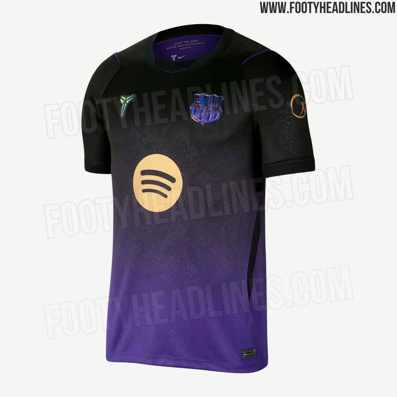
FC Barcelona 26-27 Away Goalkeeper Kit Leaked
Official pictures of the FC Barcelona 2026-27 away goalkeeper kit have been leaked online courtesy of @opaleak. The design perfectly complements the recently revealed player version of the away uniform, featuring the same pattern.

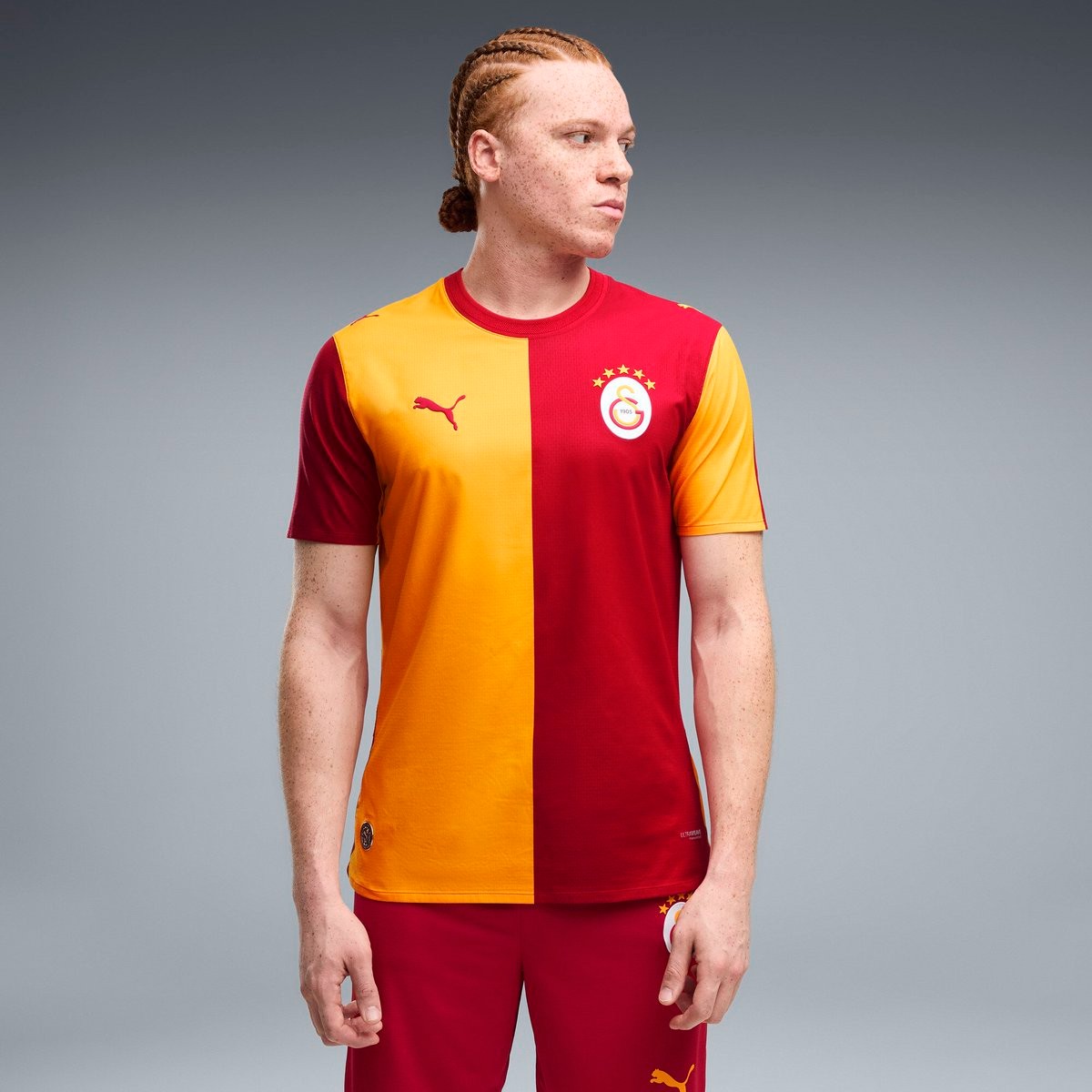
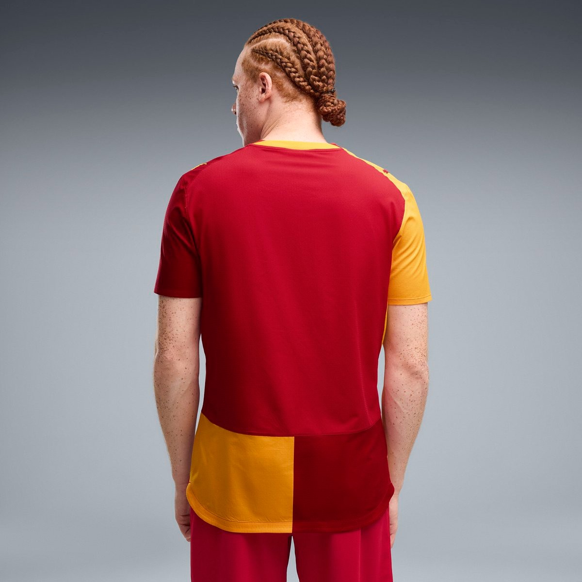
Galatasaray 26-27 Home, Away & Third Kits Leaked
New pictures of the new Galatasaray 2026-27 home, away and third kits have been leaked online by Turkish kit experts @esvaphane.
The official launch of the new Galatasaray 2026-27 kits is expected to take place in July 2026 following a recent delay.
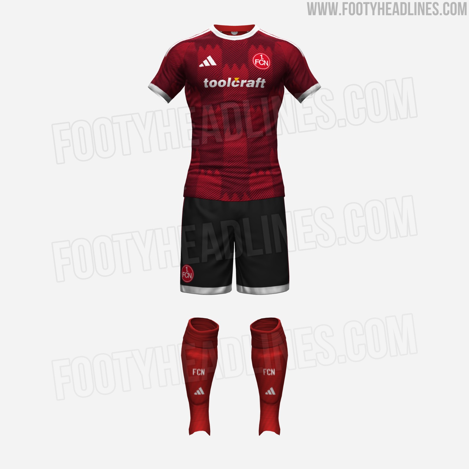
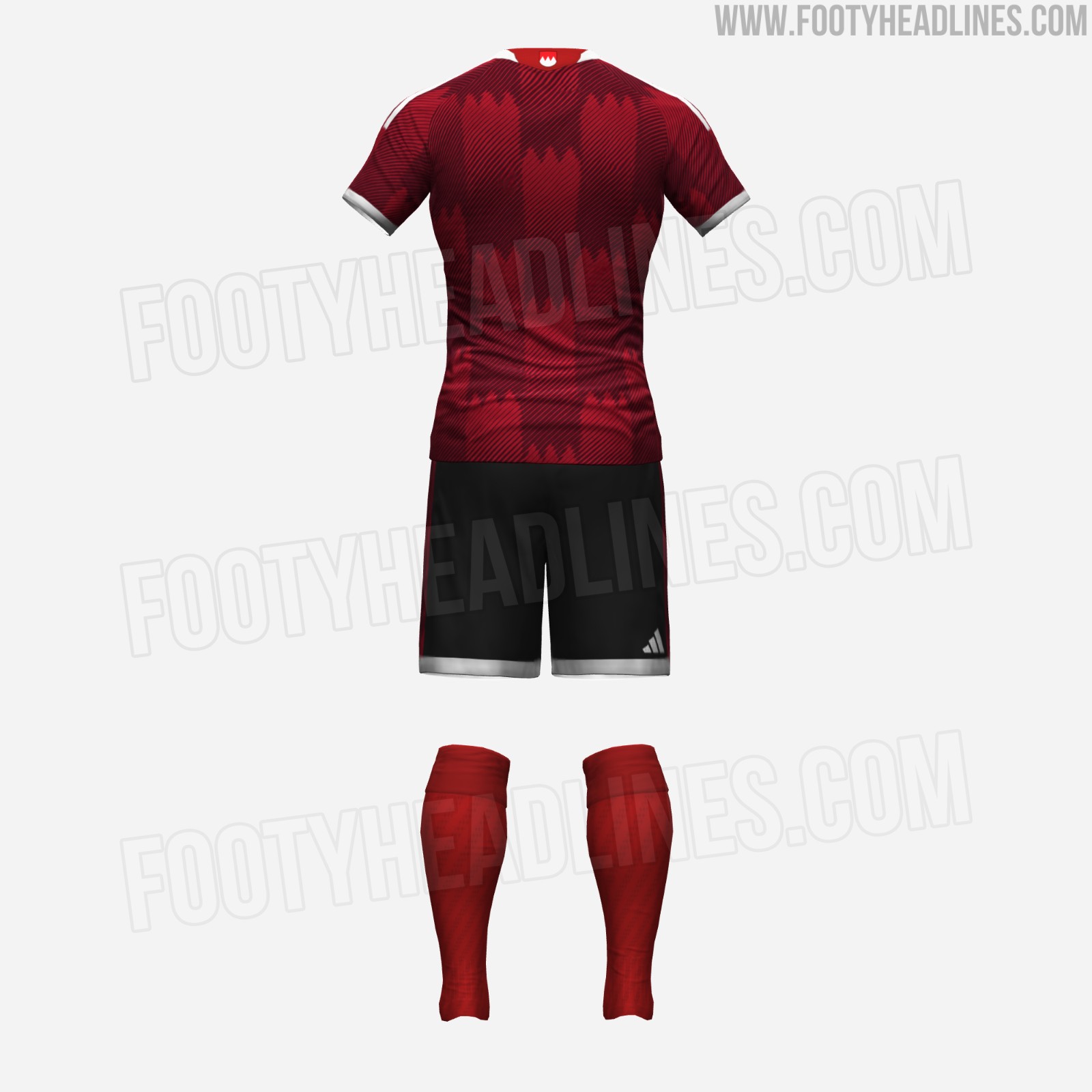
Nürnberg 26-27 Home Kit Leaked - Full Look
We can give you a full look at the Nürnberg 2026-27 home kit. The three stripes on the shorts nicely feature the pattern of the home kit.

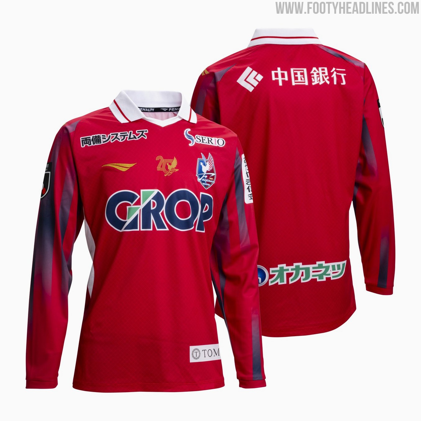
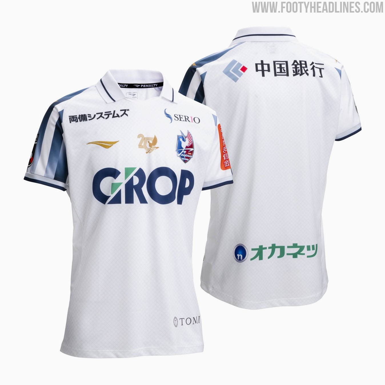
Fagiano Okayama 26-27 Home & Away Kits Released
Japanese J1 League club Fagiano Okayama have officially unveiled their new Penalty home, away, and goalkeeper kits for the 2026-27 season. Branded under the concept "Solid Core," the new collection features bespoke designs for the club's upcoming campaign. Notably, these will be the final kits produced by Penalty for Fagiano Okayama, as the club recently announced that their long-standing supplier contract with the brand will conclude at the end of the 2026-27 season.
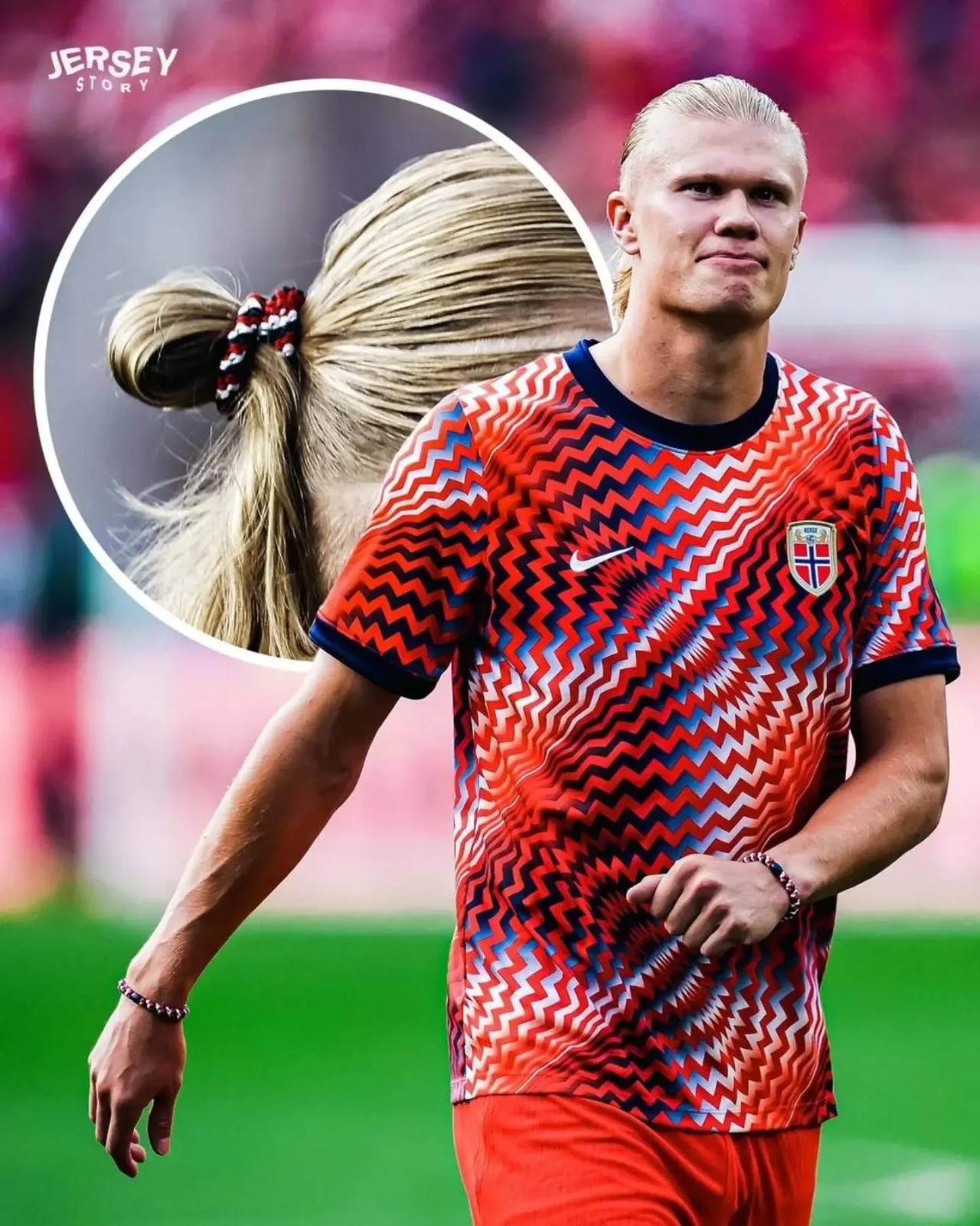
Erling Haaland Matches Hair Tie Color to Norway Kits
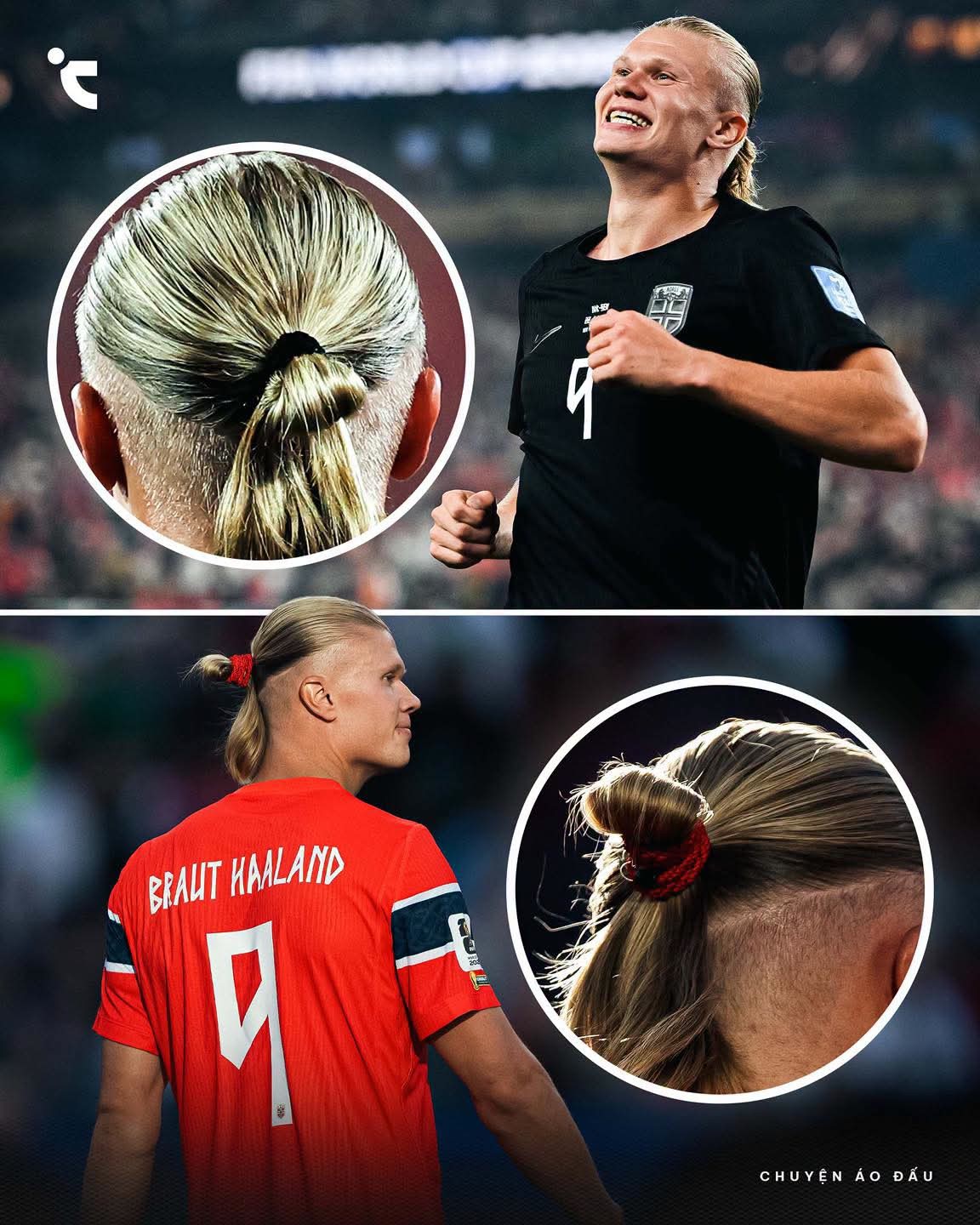
Update - Saturday, June 27, 2026: Haaland even matched the look of his hair ties to Norway's 2026 World Cup pre-match jersey.
Erling Haaland has brought a unique level of coordination to the 2026 World Cup by matching his Kknekki hair ties to Norway's matchday uniforms.
The striker opted for a black hair tie to perfectly complement Norway's black away shirt, following up on a previous match against Iraq where he paired a red hairband with the nation's traditional red home kit.
The accessory, made by the Norwegian brand Bon Dep in which Haaland holds a financial stake, has proven highly effective at keeping his signature hairstyle intact and has quickly gone viral online, driving significant sales and search interest.
