Top 10 - Worst 20-21 Kits
Following our article about the best kits of the 2020-21 season, it's time to look at the other side of the spectrum... Here are the ten worst 20-21 kits as chosen by the Footy Headlines team. As always, let us know your thoughts in the comments below.

'Honorable' Mentions


10 - Granada Third

Granada's third is not the only teamwear shirt based on the garish and awful turquoise-volt colorway of Nike's Trophy IV template, but given that the team play in Spain's top flight as well as in the Europa League, it's the most high-profile one.
Other cases include AZ and Kaiserslautern. You'd be hard-pressed to find a fan of either team who likes their version of the shirt.
Granada CF 20-21 Home, Away & Third Kits Released
9 - Betis Third

Kappa x Betis has produced a number of bangers of the last few years but they've always had a shocker in them, too. The latest example for that is the new third, which pays homage to the origins of the club's name, which is interesting, but the execution is simple off here.
Real Betis 20-21 Third Kit Released
8 - Real Madrid Away

Between the awkward pale pink base color and the overly simplistic design following a late design change, the Real Madrid 20-21 away kit will certainly not become a classic.
Real Madrid 20-21 Away Kit Released

7 - Chelsea Third

Chelsea FC's 2020-21 third jersey has a light red, almost pinkish base color, combining it with a dark and saturated blue. It's been unpopular pretty much ever since it first got leaked and even led to Crystal Palace making fun of Chelsea.
Chelsea 20-21 Third Kit Revealed
6 - Fulham Away

Teamwear at its worst, the Fulham 20-21 away kit pairs a white base with white logos in the subpar Regista 20 template.
Fulham 20-21 Home & Away Kits Released - Premier League Home Kits Complete
5 - West Bromwich Albion Third

Although the inspiration is interesting - the whole 20-21 range derives from the 1992-93 kits - the WBA third shirt looks absolutely awful due to the overly saturated and contrastin colors.
West Bromwich Albion 20-21 Third Kit Released

4 - Wolves Away

A lot has been said about the "unique and urban" Wolves 20-21 away shirt but almost none of it has been positive. It's another case of a club trying too much and a a very bad combination of colors. Hey, at least the home and away are much nicer.
On the plus side, the Wolves third has provided us with one of the more interesting kit-related stories this summer.
Wolves 20-21 Away Kit Released

3 - Hoffenheim Third

Hoffenheim's 20-21 third shirt is bad in a number of ways, from the strange colors to the monochrome club crest.
1899 Hoffenheim 20-21 Away & Third Kits Released
2 - Crotone Third

Italian brand Zeus has come up with a lot of fresh and unique kits this season, courtesy of designer @AmilcareElvo, but the Crotone third is definitely not among them. The color combination isn't the best to start, but what destroys this design for me is the pixelated graphic on the front.
FC Crotone 20-21 Home, Away & Third Serie A Kits Revealed
1 - Mainz Third

Pulling off a gold shirt is no simple feat, and Kappa's Mainz 20-21 third shirt isn't one to prove otherwise. While it looks fairly decent on the shop images, it was much worse when Mainz debuted it in the league a few weeks ago.
Mainz 20-21 Third Kit Released
What do you think of this selection? Who would have made your "top 10 worst"? Comment below.


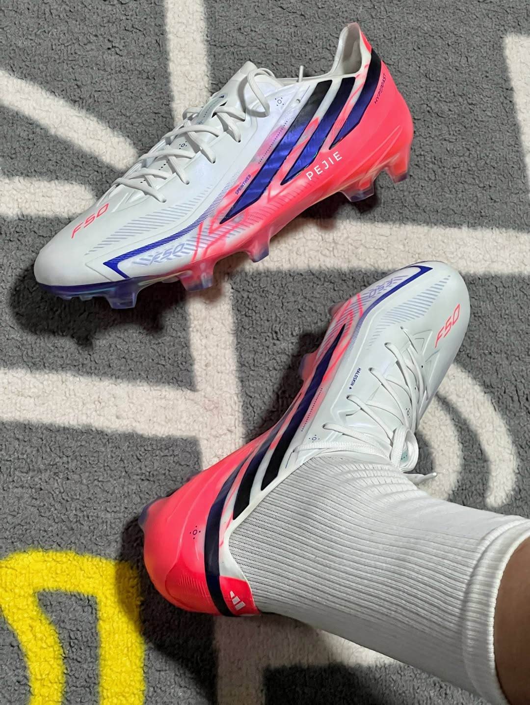
Adidas F50 Hyperfast '26-27 New Season' Boots Leaked - New Picture
Footy Headlines can now leak the new Adidas F50 Hyperfast boots, laces version, part of '26-27 New Season'. Thanks to Pejie & mercurially.
The boots feature a white upper with blue stripes and pink accents, including an F50 logo and a white-to-pink gradient on the soleplate.


Spotted: Ronaldo Wears Next-Gen Nike Mercurial Superfly 11 Boots
In Portugal's recent training session ahead of the 2026 World Cup, captain Cristiano Ronaldo was spotted wearing the next-generation Nike Mercurial Superfly 11 boots from the newly released "Breakout" collection.
Portugal has been drawn into Group K, where they will face Congo, Uzbekistan, and Colombia as they pursue their first-ever World Cup title.
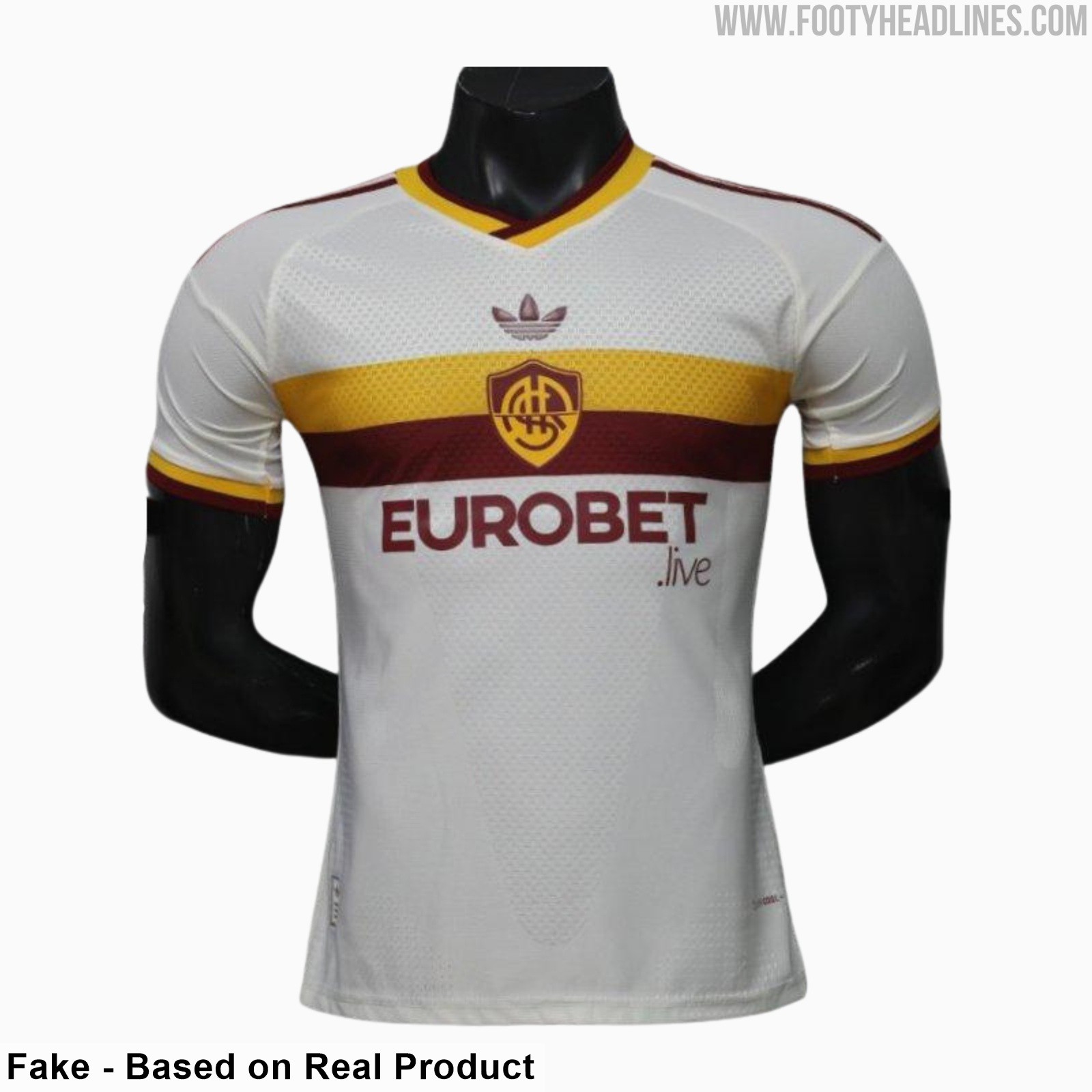
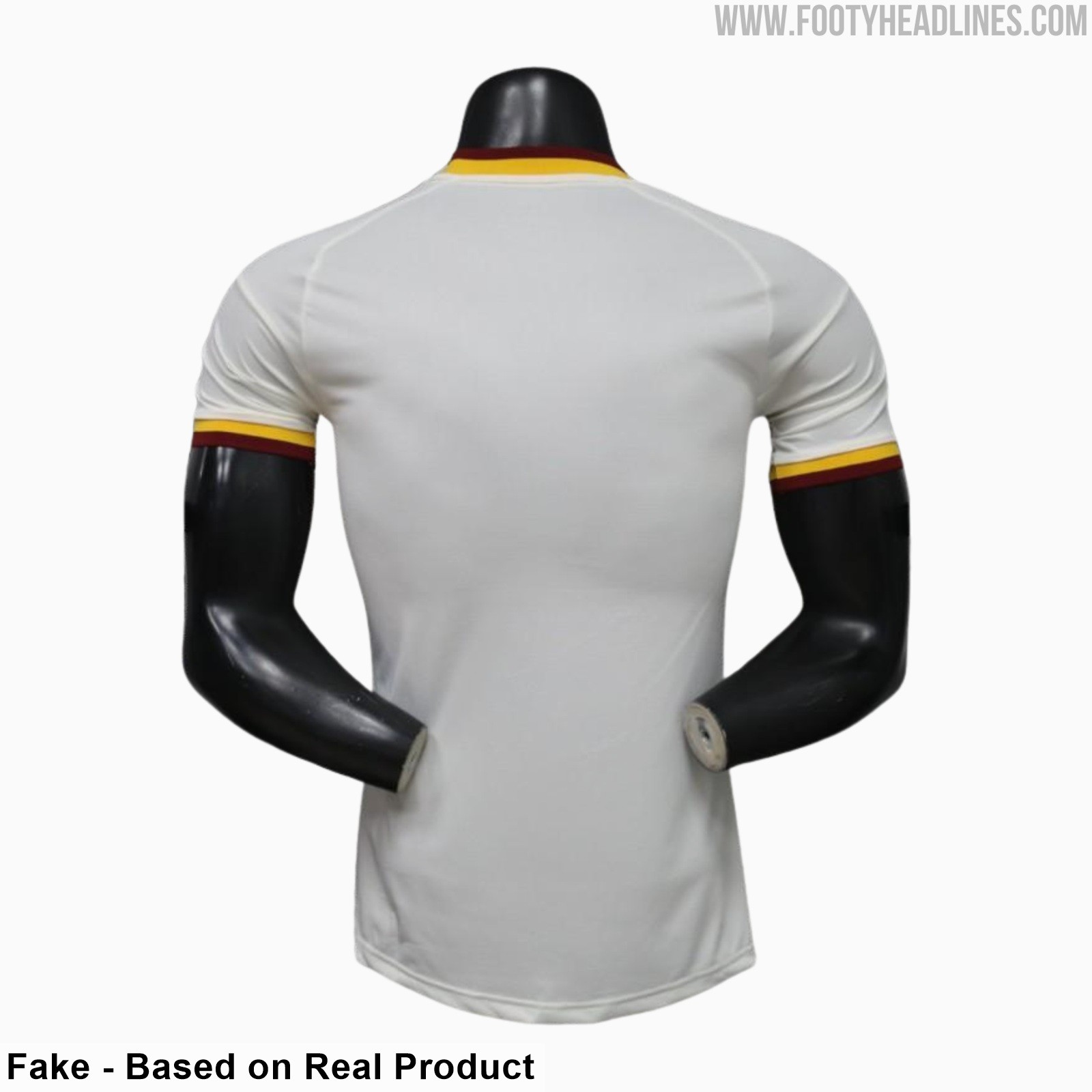
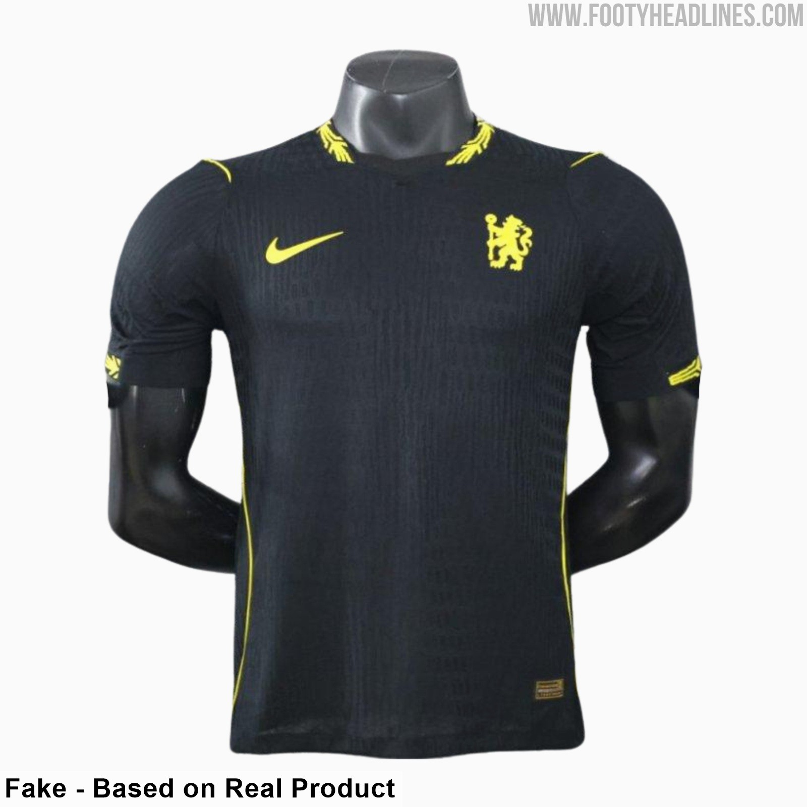
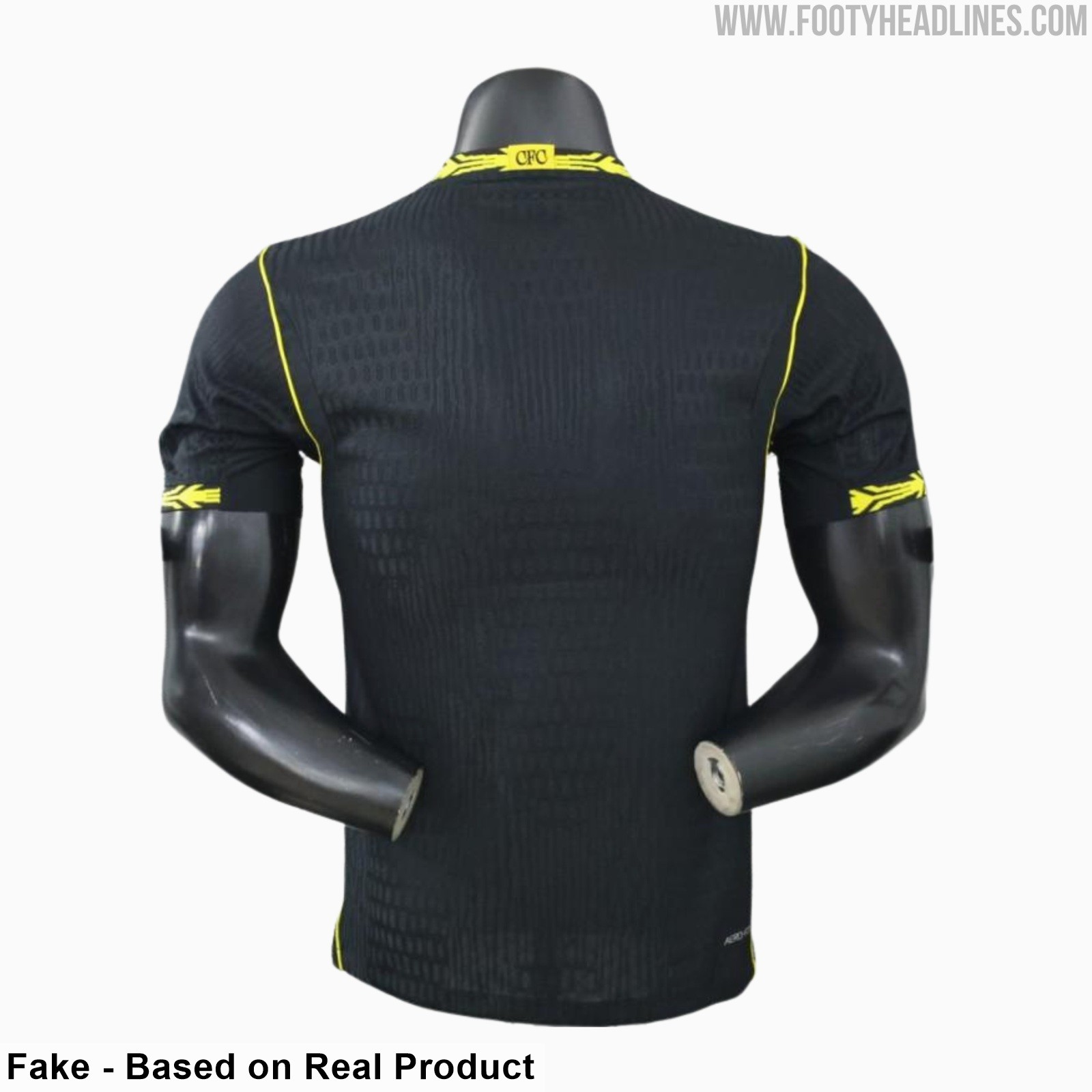
Chelsea 26-27 Away Kit Leaked - 9 New Pictures
Footy Headlines can now leak 9 new pictures of the Chelsea 26-27 away kit, authentic version. Although it is a fake, the design is identical to the real one.
The Chelsea 2026-2027 away kit features a solid black base with 'Midwest Gold' Nike logos and graphic patterns on the collar and sleeve cuffs.
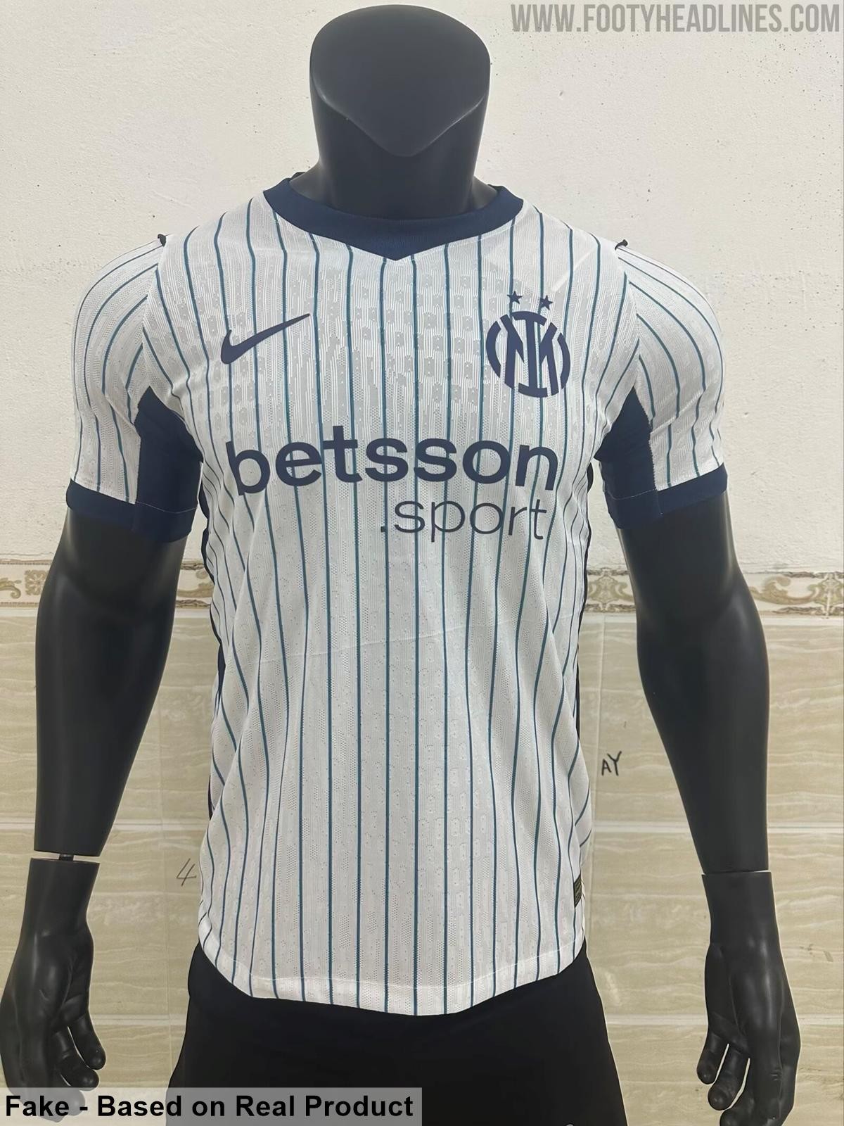
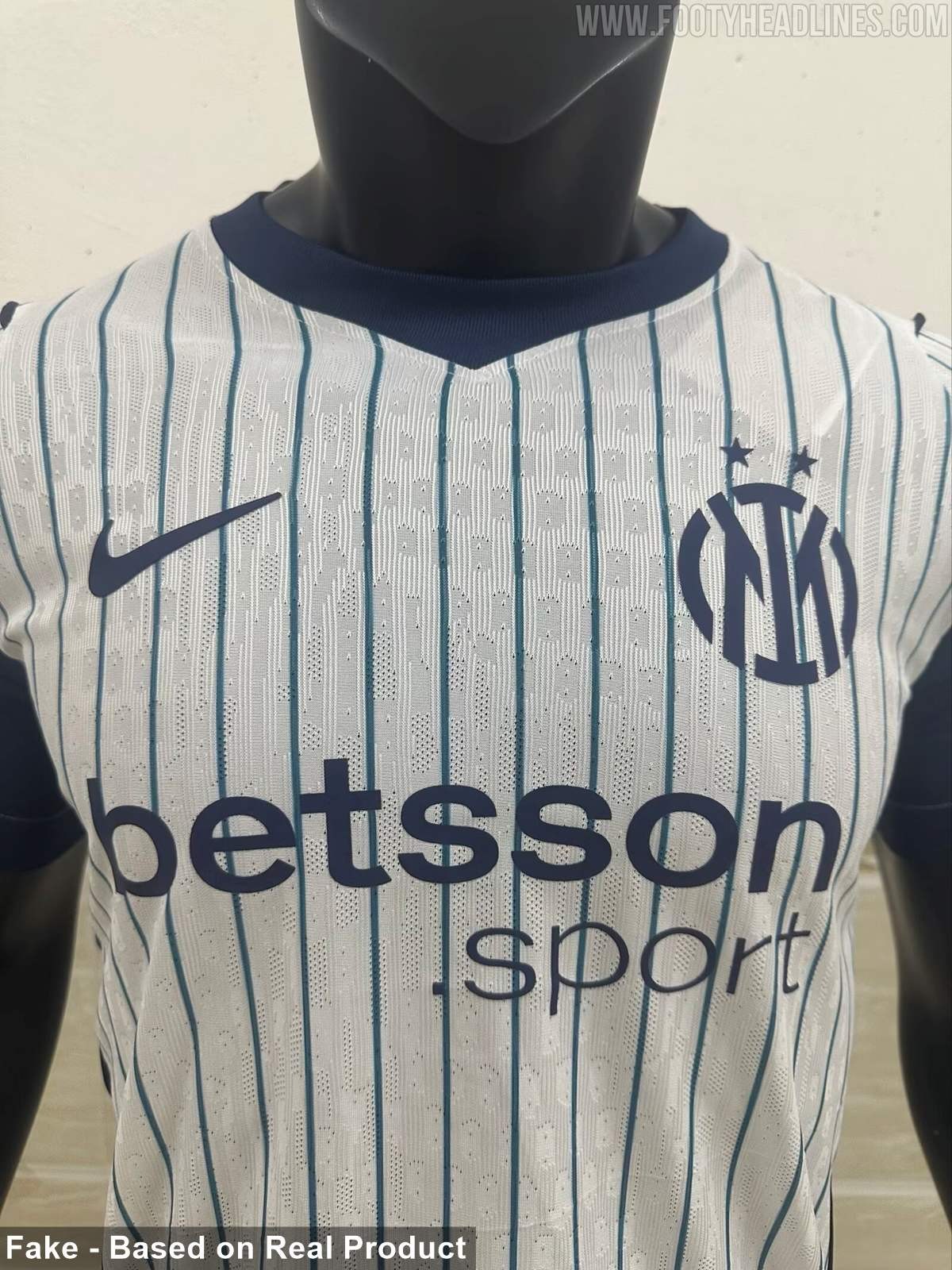
Inter Milan 26-27 Away Kit - 3 New Pictures
Footy Headlines can now leak 3 new pictures of the Nike Inter Milan 26-27 away kit. Although it is a fake, the design is identical to the real one.
The new Inter Milan 2026-2027 away kit is inspired by classic baseball jerseys, featuring a white base with navy pinstripes.


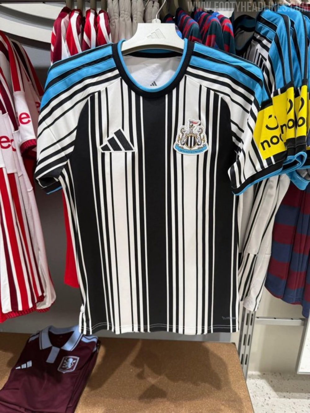
Newcastle United 26-27 Home Kit Spotted for Sale Again
The Adidas Newcastle United 2026-27 home kit has once again been spotted on sale in stores, suggesting that its release date is fast approaching. Thanks to @NUFCgallowgate.