
All-New, "Odd" Acorn Thomas Müller Logo Launched - What It Means
 Nov 18, 2020, by Chris

German FC Bayern Munich striker Thomas Müller has launched a completely new logo.


Thomas Müller 2020 Logo - Acorn - Inspired By Traditional Bavarian Card Game
The new Thomas Müller logo is different to those of other players - it boasts an acorn, without any other elements. Why? Is is inspired by his Bavarian origin and a classic Bavarian card game.

"The acorn as my new esmüllert-logo symbolizes strength, playfulness and my Bavarian origin. Playing a round of Schafkopf in the beer garden is Bavarian quality of life and exactly my thing. It is not for nothing that the acorn is the highest card that beats everything. That is also my claim and my motivation on the soccer field."


The previous Thomas Müller logo was a ball within a target and TM (Trademark) on the top right, inspired by his namesake Gerd Müller, Germany's and Bayern's other legendary striker called Müller.

The new EsMüllert logo beats everything

According to the website, the "new EsMüllert logo beats everything".
What do you think of the new Thomas Müller logo? Comment below.



Newcastle Jets 26-27 Home, Away & Goalkeeper Kits Released
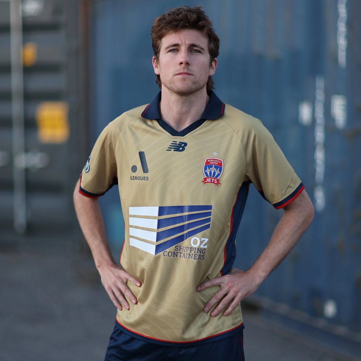
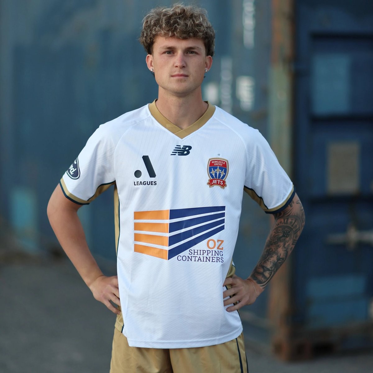
Newcastle Jets and New Balance have officially revealed the club's new home, away, and goalkeeper kits for the 26-27 A-League season. The launch completes the kit rollouts for all 13 clubs ahead of the league's kickoff on October 16. The release also marks the debut of Oz Shipping Containers as the men's team's new principal front-of-shirt partner.
The Newcastle Jets 26-27 home jersey arrives in the club's traditional gold, embellished with an understated tonal wave texture woven into the fabric. The shirt features a refined navy polo collar with a v-neck insert, bordered by subtle red and navy accents that continue down the sides and sleeve cuffs, and is worn with navy shorts. Meanwhile, the away kit opts for a clean white base paired with a champagne gold v-neck collar, side trim, and sleeve detailing, completed with gold shorts and white socks.
New Balance has also unveiled two goalkeeper strips to round out the collection. The first option is finished in vibrant teal, while the alternative is delivered in light blue, both showcasing bold geometric patterns and halftone gradients across the front. These strips complete the club's domestic wardrobe alongside their previously launched AFC Champions League Elite retro kits.


Raja Club Athletic 26-27 Home & Away Kits Released
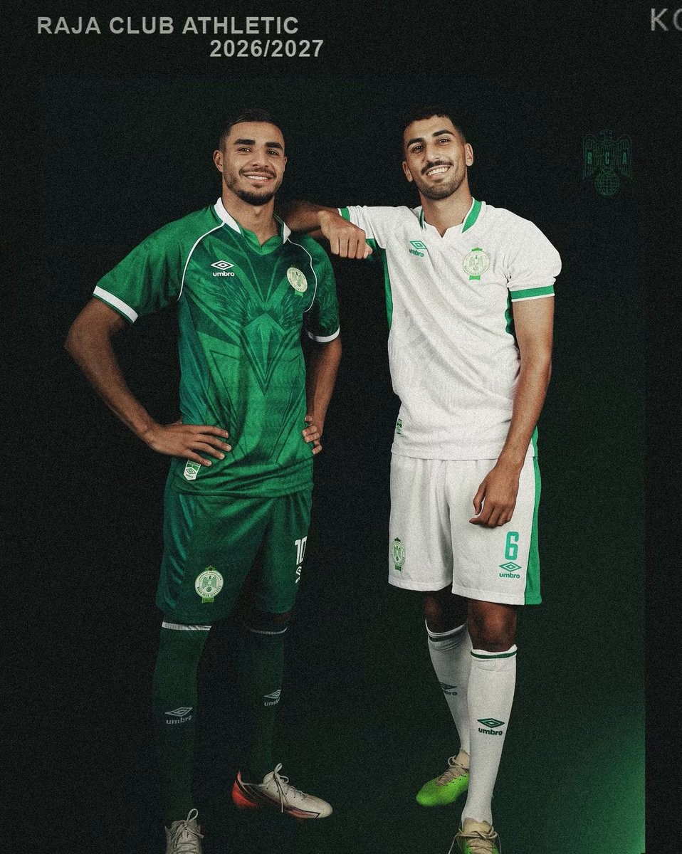
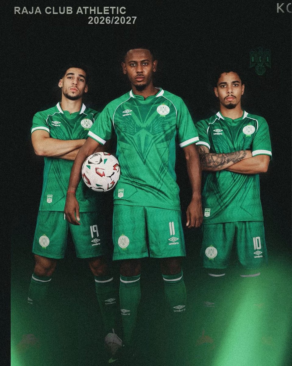
Moroccan heavyweights Raja Club Athletic have officially unveiled their new home and away kits for the 2026-27 season, produced by long-term technical partner Umbro.
The Umbro Raja CA 26-27 home jersey comes in the club's traditional emerald green, distinguished by a striking geometric eagle graphic across the chest that nods to their 'Green Eagles' moniker. White piping traces the raglan sleeves and frames the collar and cuffs, paired with the iconic Umbro diamond and the club's crest on the chest. The home strip is finished with green shorts and matching socks.
Contrasting the home look, the Raja Casablanca 26-27 away jersey is built on a clean white base highlighted by bold green side panels. The shirt features an overlapping green-and-white collar, matching sleeve trim, and monochrome green branding, worn with white shorts and socks. Umbro has also introduced a distinctive goalkeeper jersey featuring a beige and orange chevron pattern.

Limited-Edition Umbro Inter Bogotá x Tres Coronas Kit Released
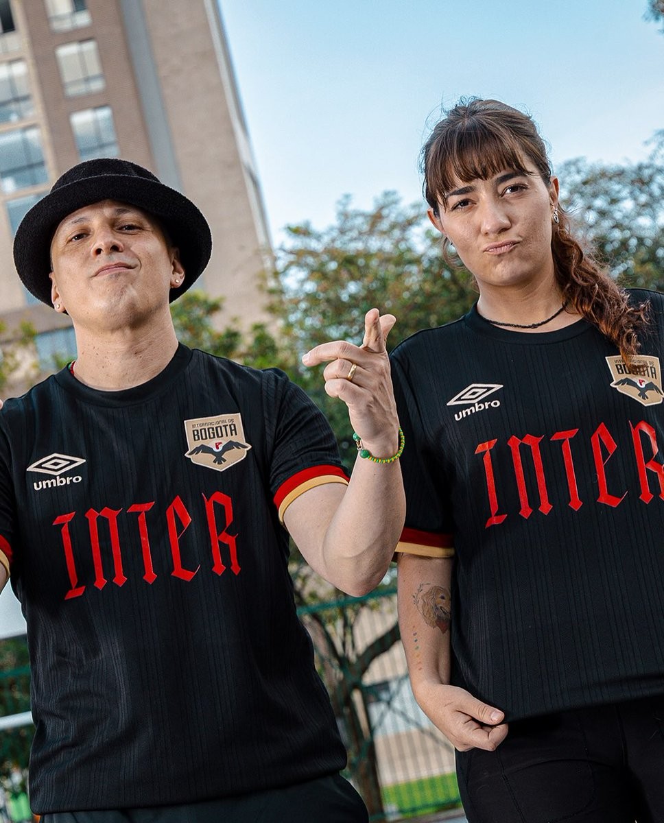
Colombian side Internacional de Bogotá and kit supplier Umbro have teamed up with iconic Colombian hip-hop duo Tres Coronas to launch a special-edition shirt. The collaboration celebrates the release of the rap outfit's latest studio album, titled "INTER", blending the worlds of Colombian football and Bogotan underground music culture through their shared name.
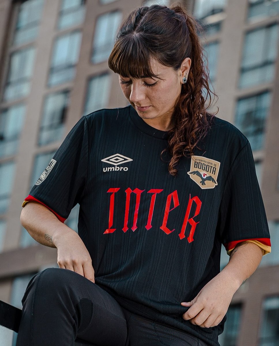
Reimagining the club's 2026 away jersey, the shirt features a sleek black base adorned with subtle tonal vertical striping. The centerpiece is the album's title, "INTER", boldly rendered across the chest in gothic blackletter typography in a striking red tone. The chest also hosts Umbro's double diamond branding and the Inter Bogotá crest in gold, which is echoed on the sleeves alongside contrasting red and gold cuffs.
Custom details complete the collector's item, including a collaborative Inter x Tres Coronas globe badge on the right sleeve and the duo's official logo positioned below the Inter Bogotá name on the upper back. The special-edition Umbro Inter Bogotá x Tres Coronas shirt was strictly limited to just 100 individually produced units, released exclusively via the club's official online store.
Chesterfield FC 26-27 Home and Away Kits Released
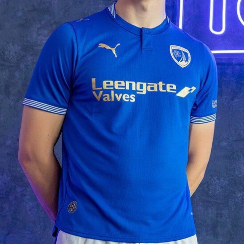
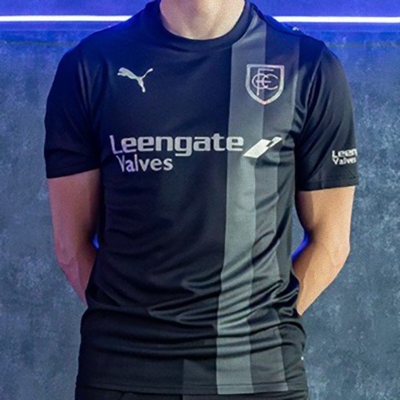
Chesterfield FC and technical sponsor Puma have introduced the club's new home and away kits for the 26-27 campaign. Commemorating the 160th anniversary of the club's founding in 1866, the designs incorporate celebratory elements and feature the logo of long-standing front-of-shirt sponsor Leengate Valves.
The Chesterfield 26-27 home shirt is rendered in the club's classic royal blue, accented by gold detailing across the Puma branding, front sponsor, and a special anniversary badge. Subtle pinstripe ribbing in blue and white decorates the sleeve cuffs and the button-up henley collar, while traditional white shorts and blue socks complete the first-choice look.
For the away kit, the Spireites step out in a predominantly black design distinguished by an offset vertical stripe in two tones of grey running directly through the crest. Metallic silver is used for all brand and partner markings, which is complemented by a stylized retro CFC monogram crest alongside matching black shorts and socks.