New Inter Milano 2021 Logo Unveiled
Following the earlier unveiling, let's take a closer look at the complete Inter Milano rebranding, which includes a lot more than just the new logo.
According to the club, the new identity is rooted in style and expression. The club hopes that it "opens up new perspectives" with innovation, passion and inclusivity being the key values.
Inter 2021 Logo
This is the new Inter Milan badge.
The new logo is closely inspired by the current design, simplifying the overall look and placing the letters I and M in its center. The circle is blue with the letters appearing in white, combined with a thick black outline.
Old vs New Inter Milan Logo
Inspiration
With the new logo, the club focuses on the two main elements - the I of Internazionale and the M of Milano. The general design and roundel shape is based on the original logo design from 1908 and the various designs that followed it.
Application
Font
As part of the visual identity the club will use two different fonts - 'Giorgio Bold' is the primary one that is used in the logo. For texts, Inter will use 'Univers Roman 55'.


Colors
The colors are much more modern and bold, especially the blue is very saturated. Black and blue are the primary colors, used alongside white in the standard application of the logo. But yellow will also be used, in monochrome applications.
Logo History
I M FC Internazionale Milano.
— Inter (@Inter_en) March 30, 2021
What I M comes from what I have always been.
I M open to the whole world and rooted in one city. #IMInter pic.twitter.com/iQVzmyrE3u
Do you like the new look for the Inter Milan logo? Comment below.

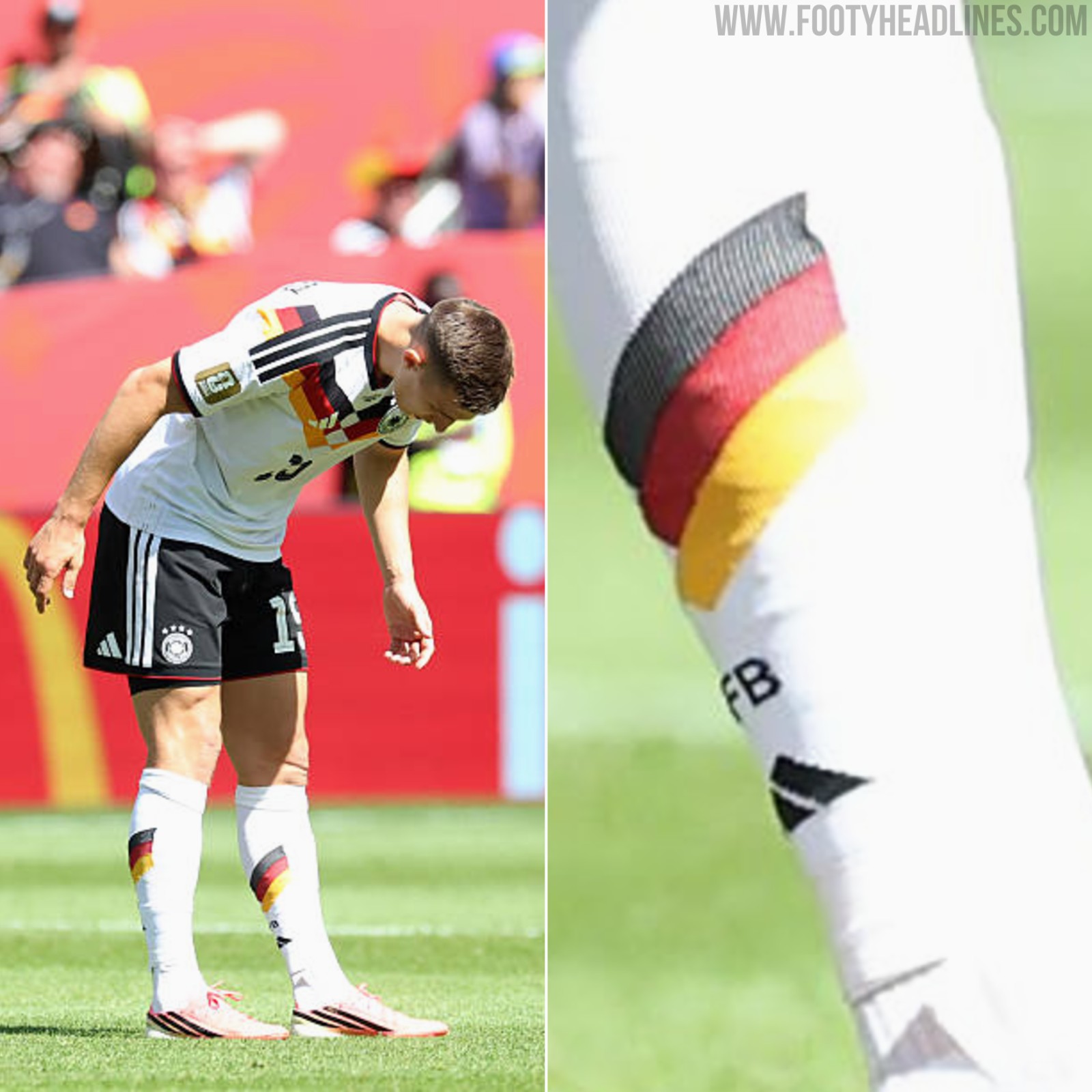
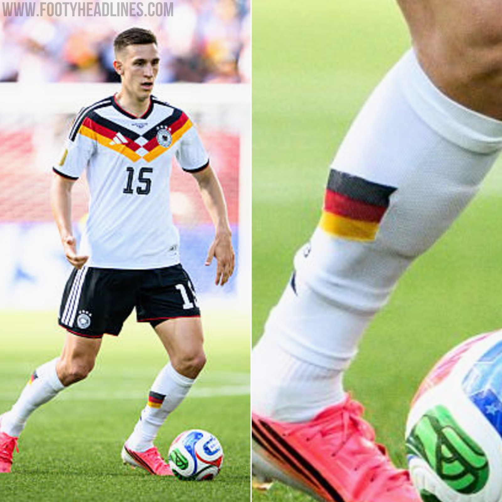
Schlotterbeck Deliberately Wears His Football Socks the Wrong Way Round
Borussia Dortmund and Germany defender Nico Schlotterbeck has a very specific habit regarding his matchday attire. The centre-back deliberately wears his football socks the wrong way round - the back is on the front, and the front is on the back.
In 2025, the Borussia Dortmund & Germany center back once told SPORT1 that this was one of his unique habits.

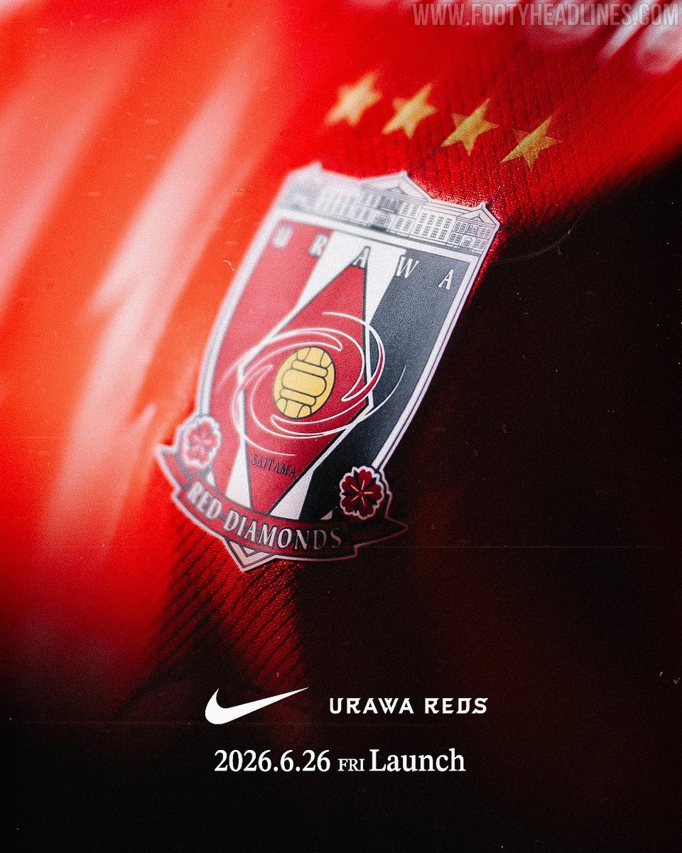
Urawa Red Diamonds 26-27 Home Kit Teased - Launch Next Week
Japanese J1 League club Urawa Red Diamonds have officially teased their new 26-27 kit. The club announced through their official social media channels that the full details and design of the new uniform will be revealed on June 26, 2026.
The teaser image released by the club gives very little away regarding the actual design of the shirt, but it confirms the continuation of their long-standing partnership with American sportswear brand Nike.

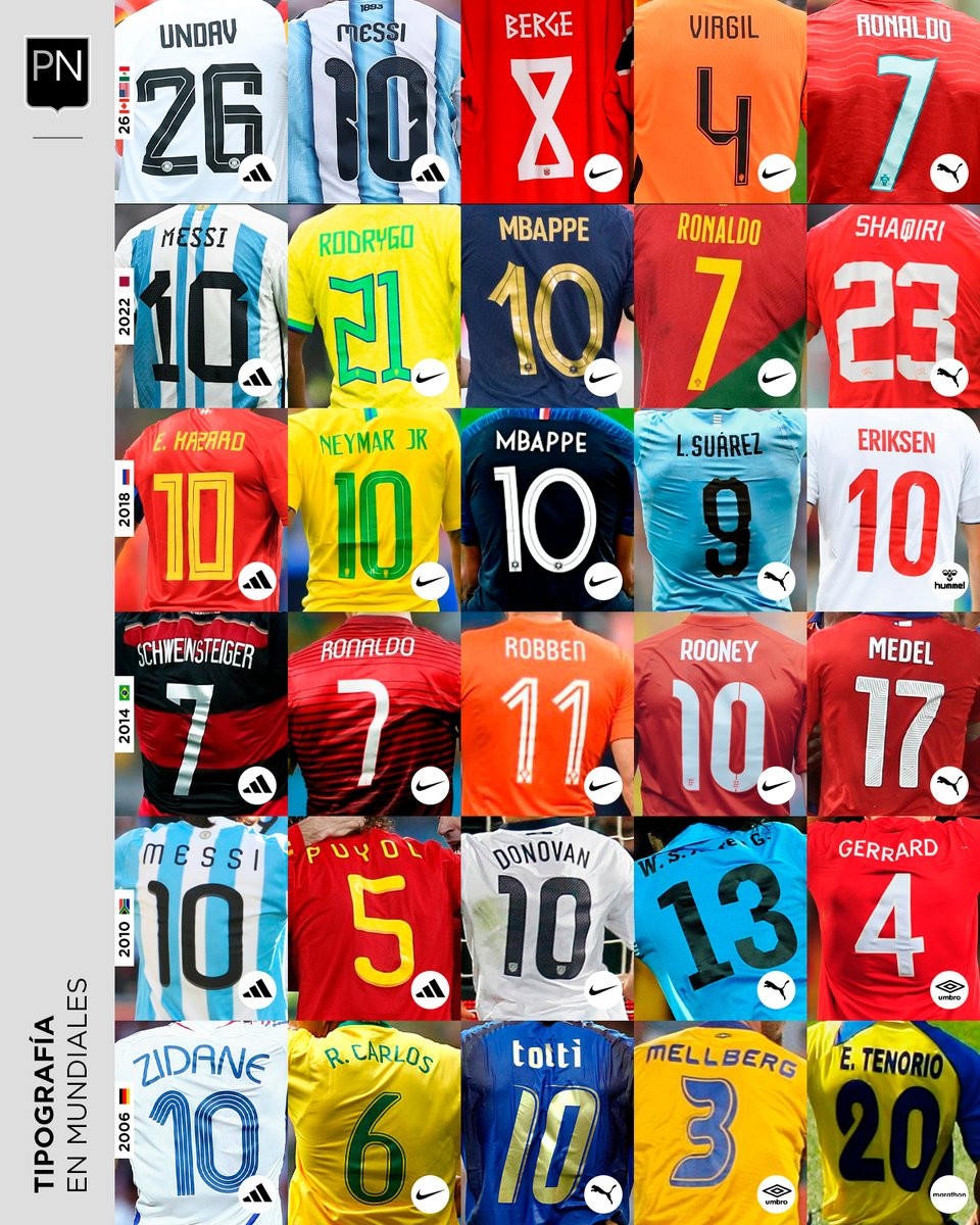
A Look Back at World Cup Shirt Number Typography
Football kit design account @PaladarNegroWeb has shared an interesting retrospective on the typography used for shirt numbers in recent World Cups. The visual language of football kits is often defined by these details, with fonts becoming instantly recognizable symbols of specific tournaments and eras.
The collage highlights various iconic typefaces worn by national teams on the biggest stage. spanning from the 2006 World Cup to the FIFA World Cup.
This overview is part of an ongoing series by the account exploring the visual elements of football. It serves as a great reminder of how deeply typography impacts the overall aesthetic and legacy of a football shirt.


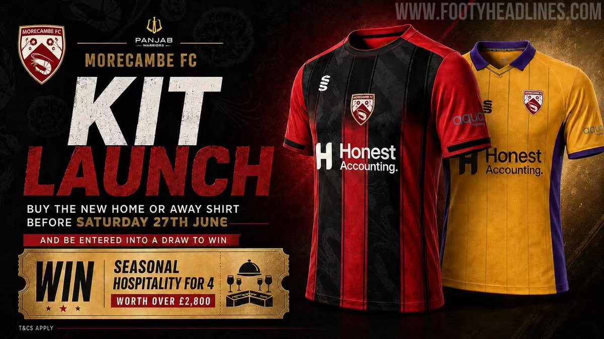
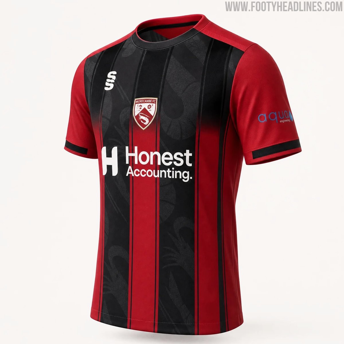
Morecambe 26-27 Home & Away Kits Released
Morecambe FC have officially launched their new 26-27 home and away kits, produced by Surridge Sports. The club received massive backlash for posting AI images for the launch, and later posted a clearer CAD of the home shirt.
The home shirt features the club's traditional red color palette with black detailing, while the away kit introduces a bold combination of purple and yellow. Both designs incorporate modern elements to provide a fresh look for the upcoming National League North campaign.
The new Surridge Sports Morecambe 2026-27 jerseys are currently available for pre-order through the club's official online store.