
KV Oostende 2021 Anniversary Kit Released - All-New Logo Designed By Sporting Goods Retailer Decathlon
 Jun 4, 2021, by Chris

Belgian football club Koninklijke Voetbalclub Oostende, also called KV Oostende or KVO, released an all-new logo. Together with it, the club revealed a special shirt, called anniversary jersey.


In 1981, two football clubs in the city of Ostend decided to merge, A.S. Oostende and V.G. Oostende, into K.V. Oostende.

What makes this jersey and crest redesign special is that it was made by their supplier Kipsta, the soccer brand of large French sporting goods retailer Decathlon.
"There were some good ideas among them, but the designs were mainly based on old crests and logos. The history of the club is important, but with our new logo, we really want to enter a new era. It had to be clean, innovative and modern," said Executive President Gauthier Ganaye. A situation that Kipsta is addressing as the official technical partner of the club.
Decathlon also has a particularly extensive and high-quality graphics department
"You might expect a graphic marketing company to design this, but at Decathlon we also have a particularly extensive and high-quality graphics department," says Vincenzo Verhoeven, who is responsible for the collaboration with the soccer clubs.
Kipsta KV Oostende 2021 Anniversary Shirt
Check out Kipsta's KV Oostende 2021 anniversary jersey below.
The Kipsta Oostende 2021 anniversary football shirt boasts a clean look in white with a unique fading center stripe in the club's green, red and yellow colors.

The three colors can be also seen on the sleeve cuffs.

On the left chest is the club's new logo, while the Kipsta brand is on the right chest.
Kipsta KV Oostende 2020-2021 Kits


Made by Kipsta. What's your verdict on KV Oostende's anniversary kit? Comment below.
Retro 1980s Aesthetic: Newcastle United 26-27 Originals Retro Collection Released
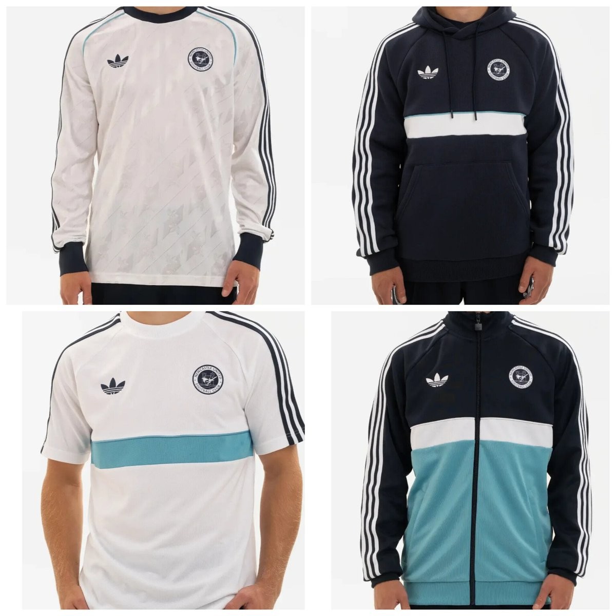
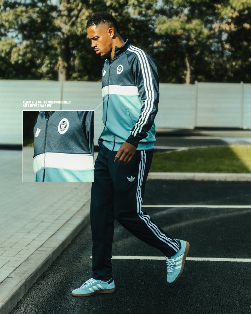
Adidas and Newcastle United have officially released their latest retro lifestyle capsule, dubbed the adidas Originals Culturewear collection. Taking heavy inspiration from the club's classic 1980s training wear, the collection was first showcased on first-team players arriving ahead of Premier League action before rolling out for Mags+ members and hitting general sale.
The range adopts a clean color palette of dark navy, white, and subtle light blue accents. A defining highlight across every piece is the use of Newcastle United's iconic circular 1980s crest—originally seen between 1983 and 1988—paired alongside the classic embroidered adidas Trefoil emblem. The capsule features a standout long-sleeve white jersey boasting a tonal jacquard pattern, a color-blocked zip-up track top, a matching navy hoodie, a chest-band graphic t-shirt, and straight-leg track pants. The lineup is completed by a matching pair of adidas Handball Spezial sneakers crafted in light blue suede with a gum sole.
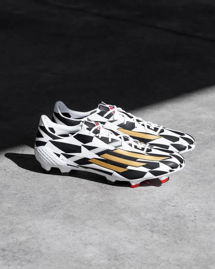
Arnaut Danjuma Still Wearing Adidas F50 Adizero IV 'Battle' Remake Boots
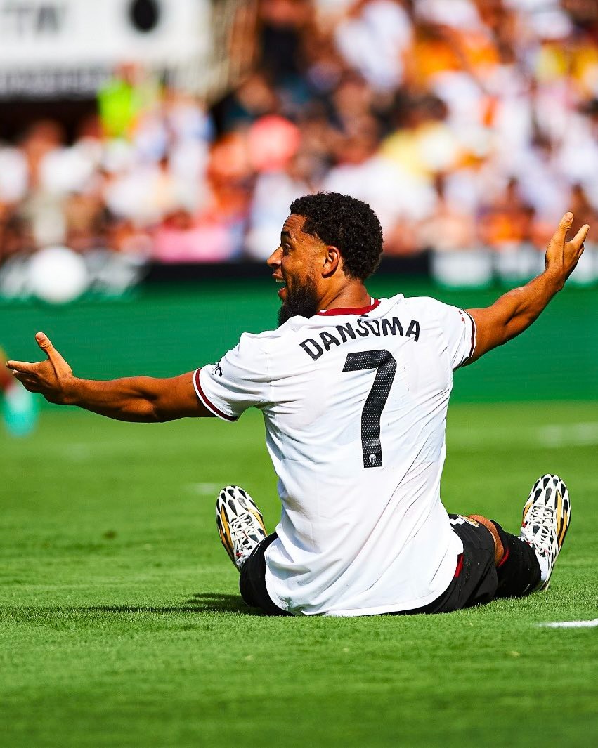
Dutch attacker Arnaut Danjuma is proving that great boots never go out of style, as he continues to lace up in the reissued Adidas F50 Adizero IV from the 2014 World Cup Battle Pack. While most professional players frequently rotate into the newest generation speed models, Danjuma has maintained an impressive loyalty to the limited-edition retro release years after its drop.
The boot in question is the 2022 Speed Legacy Pack remake of the legendary F50 Adizero IV, which originally dominated the 2014 FIFA World Cup in Brazil on the feet of top scorers like James Rodríguez, Robin van Persie, and Thomas Müller. The reissue faithfully revived the distinctive black-and-white geometric upper pattern with metallic gold three stripes, while modernizing the underfoot tech with the lightweight Carbitex Speedframe tooling borrowed from the X Speedflow.

Rosario Central 26-27 Third Kit Released
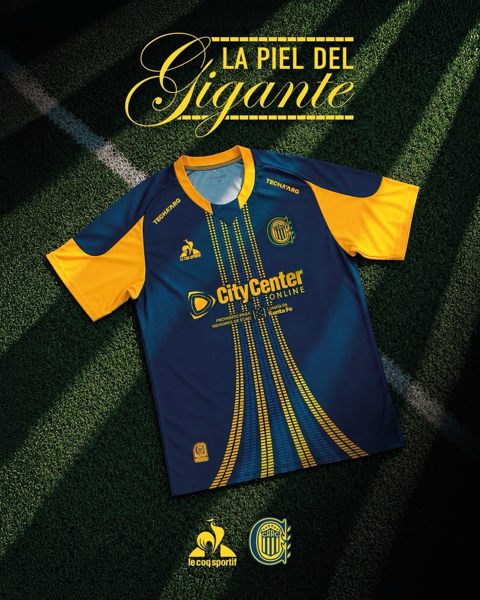
Rosario Central and Le Coq Sportif have officially launched the club's new third kit for the 26-27 campaign. Named "La Calesita," the jersey completes a special collection celebrating the centenary of the Estadio Gigante de Arroyito, paying tribute to the ground's architecture and the vibrant atmosphere created by the club's supporters.
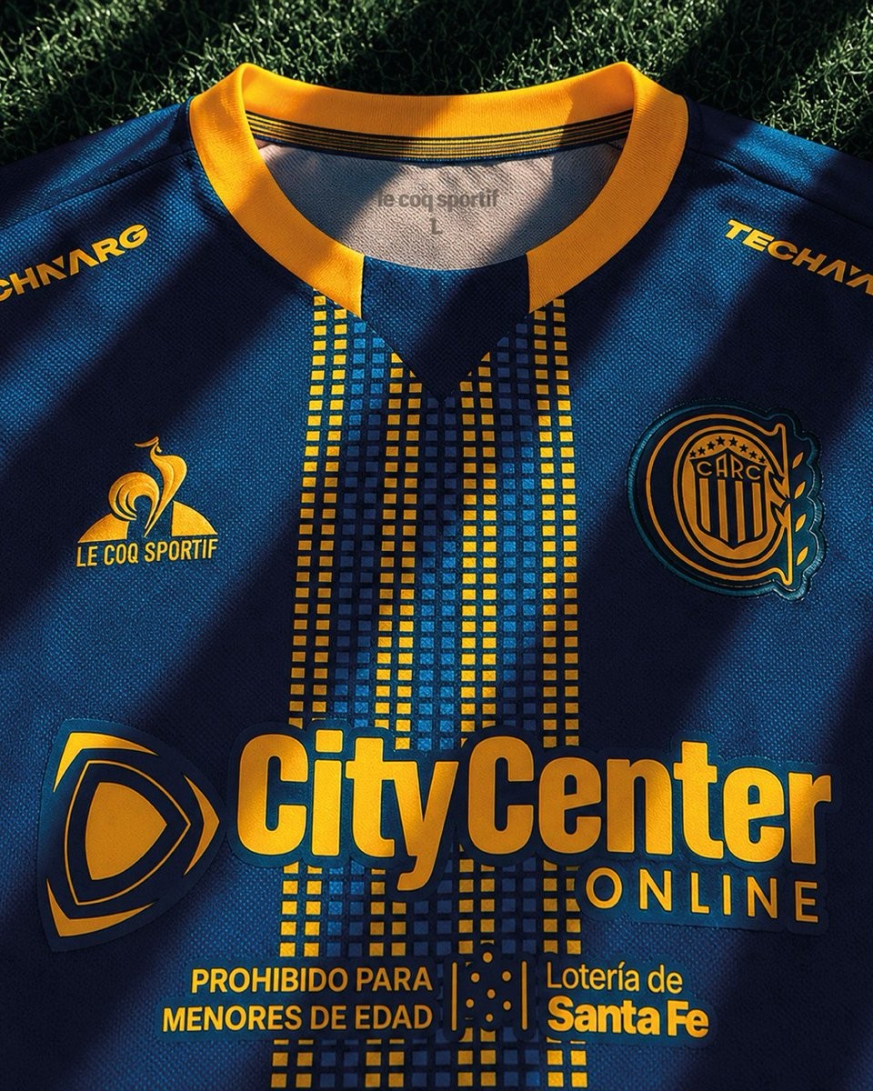
The Le Coq Sportif Rosario Central 26-27 third shirt moves away from traditional blue and yellow stripes in favor of a deep dark petrol base, accented by bright yellow paneling along the shoulders and sleeves. Running vertically down the front is a perspective graphic inspired by stadium seating, creating an expanding vanishing point that evokes the scale of the Gigante de Arroyito and the sweeping movement of the famous "calesita" banners hung by the fans.
Crafted from Jacquard polyester fabric, the jersey is finished with a two-tone V-neck collar, high-definition embroidered club crests, and a specialized authenticity seal that reveals UV-reactive Le Coq Sportif details. Dark petrol shorts and vibrant yellow socks complete the new Rosario Central 26-27 third kit.
Reggina 26-27 Home & Away Kits Released
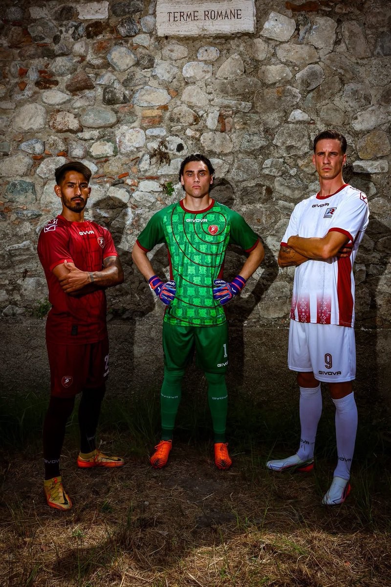
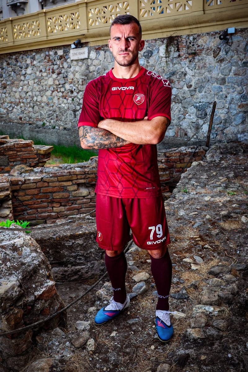
Italian club AS Reggina 1914 and technical partner Givova have officially unveiled the club's new home, away, and goalkeeper kits for the 26-27 season. Drawing profound inspiration from the historical landmarks and archaeological heritage of Reggio Calabria, each shirt tells a distinct story rooted in local identity.
The Reggina 26-27 home kit arrives in the club's traditional amaranto shade, decorated with an intricate geometric graphic on the front panel inspired by the ancient Roman Baths of Reggio Calabria. Givova's white logos sit on the chest and sleeves, matching the kit's clean numbering and completing an all-amaranto look with coordinating shorts and socks.
For the away strip, Givova delivers a predominantly white design accented by an amaranto collar, side panels, and sleeve trim. The front of the shirt features subtle vertical band patterns drawn from the ornate mosaics at the Roman Villa of Casignana, accompanied by a retro 1990s-style club badge. Completing the set, the goalkeeper kit stands out in vibrant green, adorned with claret details and a striking circular motif portraying Calabria's traditional apotropaic masks.

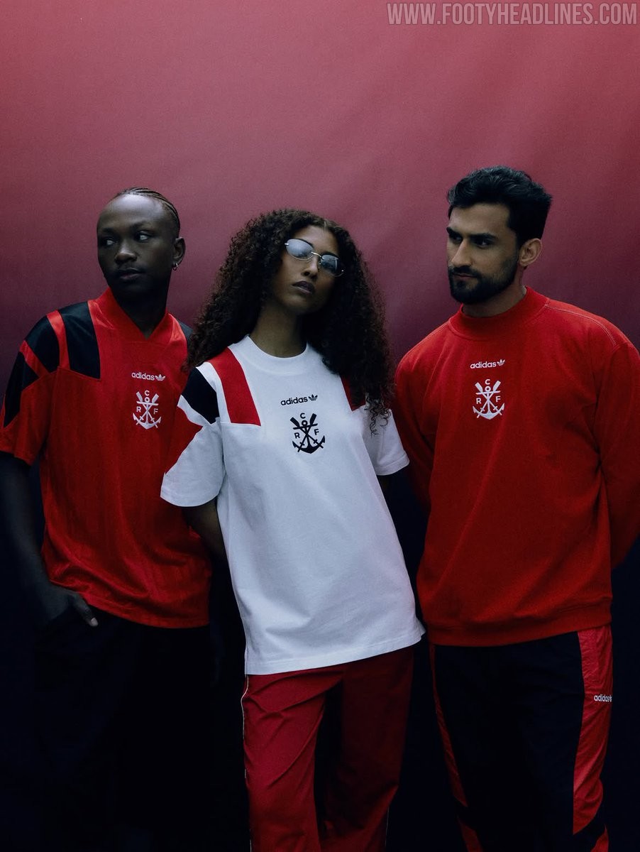
Adidas Flamengo 26-27 EQT Collection Released
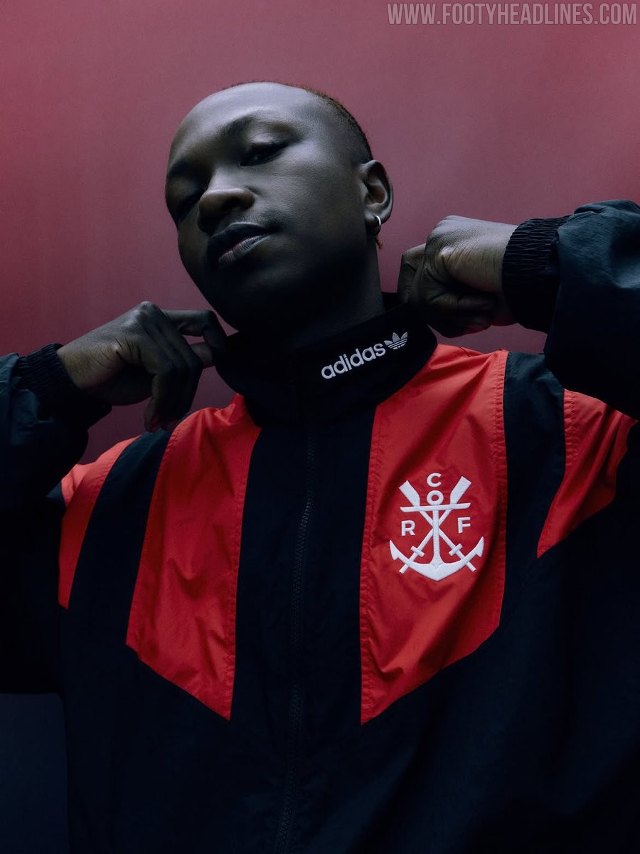
Adidas and Flamengo have officially launched the club's new Equipment (EQT) retro collection, making the Rubro-Negro the first Brazilian club to receive the iconic line. Inspired by the brand's seminal 1991 and 1992 aesthetics, the 1990s-themed capsule ditches the modern CRF monogram in favor of Flamengo's historic rowing crest with crossed oars and an anchor, placed alongside the classic Adidas Trefoil text logo. The lifestyle collection features five pieces including a color-blocked windbreaker jacket, crewneck sweatshirt, track pants, and graphic t-shirts in the club's signature red, black, and white color scheme.
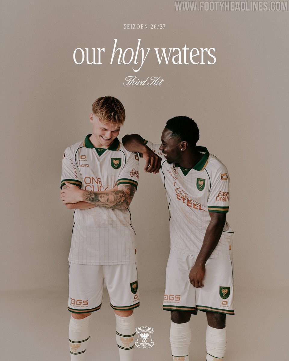
Go Ahead Eagles 26-27 Third Kit Released
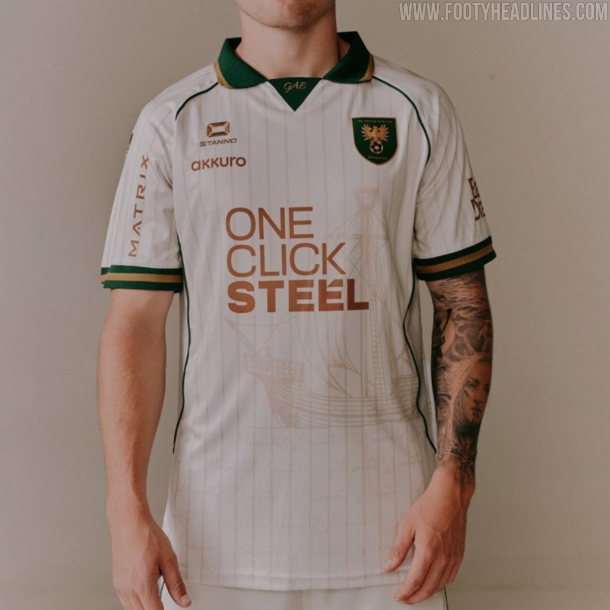
Dutch Eredivisie club Go Ahead Eagles and technical sponsor Stanno have officially unveiled their new third kit for the 2026-27 season. Named "Our Holy Waters," the design serves as a thematic companion to this season's "Our Holy Ground" home and away jerseys, shifting the focus to the club's deep connection with the IJssel river.
The Stanno Go Ahead Eagles 26-27 third shirt is built around an off-white base with fine vertical pinstripes running down the front. The centerpiece of the design is a detailed historic cog ship illustration across the torso, celebrating the Hanseatic maritime history of Deventer. Rich forest green decorates the folded collar and sleeve cuffs, complemented by gold trim and "GAE" lettering embroidered on the collar insert. Sponsor logos and branding appear in a metallic copper-bronze shade, alongside a recolored green and gold club crest.
Matching off-white shorts with green side piping and socks featuring the club's eagle crest complete the full kit. The Go Ahead Eagles 2026-27 third kit is available to purchase immediately through the club's official online store.
EFL Trophy Set to Become 'Jersey Mike's Trophy'
The EFL Trophy is set for another commercial rebrand, with American fast-food chain Jersey Mike's Subs closing in on a record-breaking title sponsorship agreement. The English Football League is finalizing a five-year contract worth approximately £5 million to officially rename the competition the Jersey Mike's Trophy.
The landmark partnership represents the most lucrative commercial deal in the history of the tournament. Participating clubs from League One and League Two, alongside invited Category One academy sides, will benefit from boosted prize money, starting with an initial pool of around £900,000 this season. The agreement directly supports Jersey Mike's major expansion into the UK and Ireland, where the US brand plans to roll out up to 400 store locations.
This move adds yet another chapter to the competition's long lineage of commercial title sponsors. Most recently titled the Vertu Motors Trophy, the tournament has previously operated under numerous memorable names, including the Papa Johns Trophy, Checkatrade Trophy, Johnstone's Paint Trophy, and the nostalgic LDV Vans Trophy.
No More Predator? Pedri Spotted in Next-Gen Adidas adiPURE Whiteout Prototype Boots
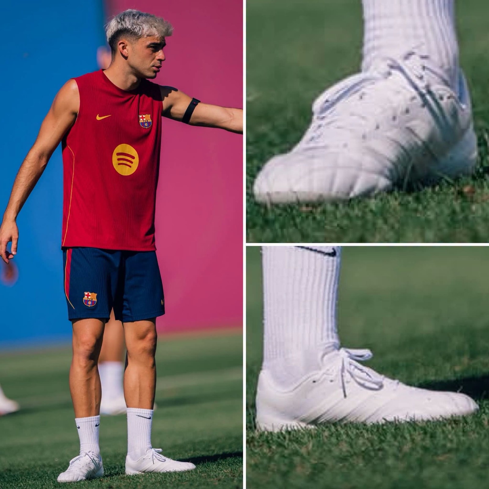
FC Barcelona and Spain midfield maestro Pedri has been spotted testing a whiteout prototype of the all-new Adidas adiPURE boots. Following Bayern Munich center-back Jonathan Tah, who stepped out in test pairs earlier this month, Pedri is now the most high-profile Adidas athlete seen taking the unreleased silhouette out onto the pitch.
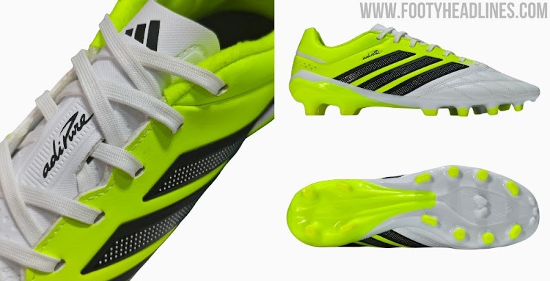
The sighting comes as Adidas prepares to bring back the revered adiPURE silo for 2027, officially phasing out the Copa series to establish adiPURE as the brand's primary touch-and-leather boot alongside the Predator and F50. The next-generation adiPURE is engineered to combine classic heritage with modern speed, incorporating a plush Pureleather forefoot, a lightweight technical mesh quarter, a free-floating tongue, and a redesigned Adiframe soleplate.
While Pedri has been one of the central figures representing the Predator line, even rocking his personalized "Predri" signature branding, he has occasionally flirted with Copa models during training in previous seasons. Testing the whiteout prototype strongly indicates that Adidas might be positioning the Spanish technician as the premier ambassador to spearhead the revived adiPURE range ahead of its official debut in early 2027.