
England Football Kit History: 1872-2022
 Feb 28, 2022, by Simon
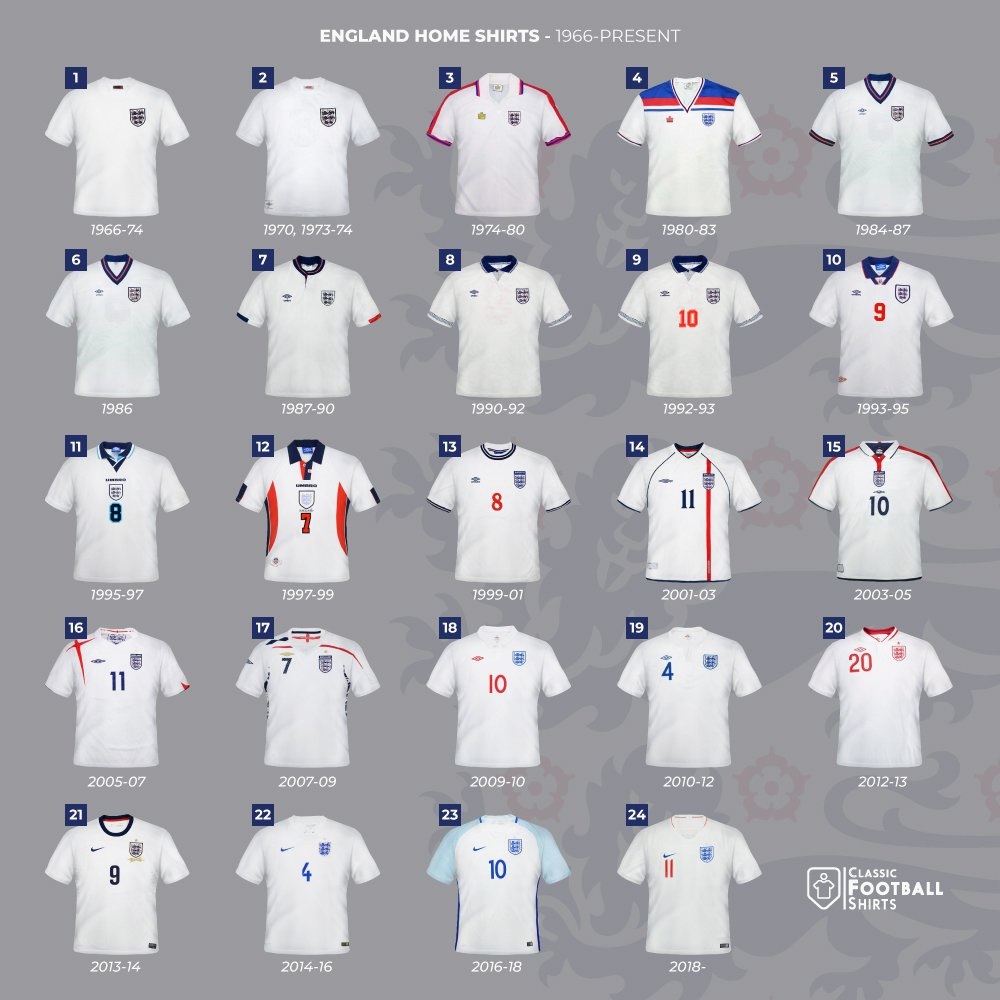
Yesterday, England's football association announced that they will not play against Russia in international football "for the foreseeable future". Today, we want to take a look at the FA's kit history that is highlighted by some truly unique and remarkable looks.
Obviously, the most famous England shirt is the England 1966 away shirt that was worn in the World Cup final against Germany (4-2). Otherwise, the England Admiral 1980-83 home kit stands out since it incorporates red and blue effortlessly with a colour-block design on the chest, a timeless classic.
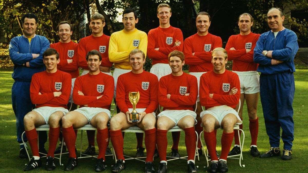
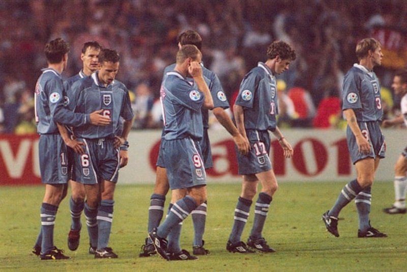
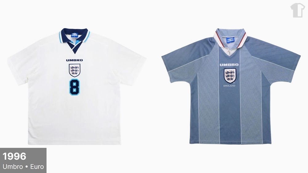
Unsurprisingly, England's most experimental shirts were created during the 1990s when Umbro sponsored the FA. One of the biggest anomalies was a grey away shirt during Euro 1996 that was ditched after a loss to Germany in the semi-final.

Another interesting idea by Umbro were the pale blue third shirts during the late 80s and early 1990s. The most memorable one is probably the England 1990 third kit that also featured in the music video for the song "World In Motion" by New Order.
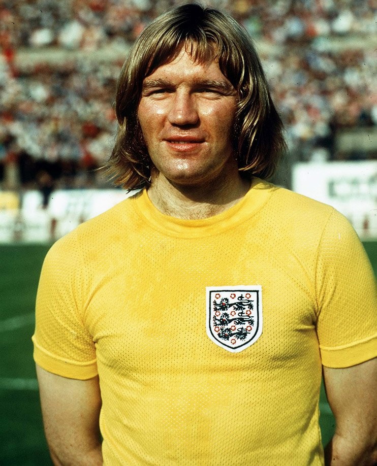
The most unique and intriguing England jersey is the yellow alternative shirt during the 1970s reminiscent of the Brazilian national team. It was only worn three times and ditched immediately after two losses and one draw.
Generally speaking, England's home shirt combines a white base with red and / or blue accents, while the away shirt is traditionally red. However, the current England away jersey is blue. Interestingly, the England 2020-21 away shirt was never worn during Euro 2021.
England Kit History | 1872-2022
via @classicshirts
1872-1954 - In-House & Small Manufacturer


1954-1974 - First Umbro Era & Short Bukta Intermezzo


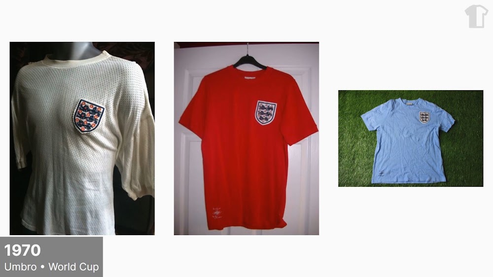
1974-1984 - Ten Years Under Admiral


1984-2013 - Umbro Returns




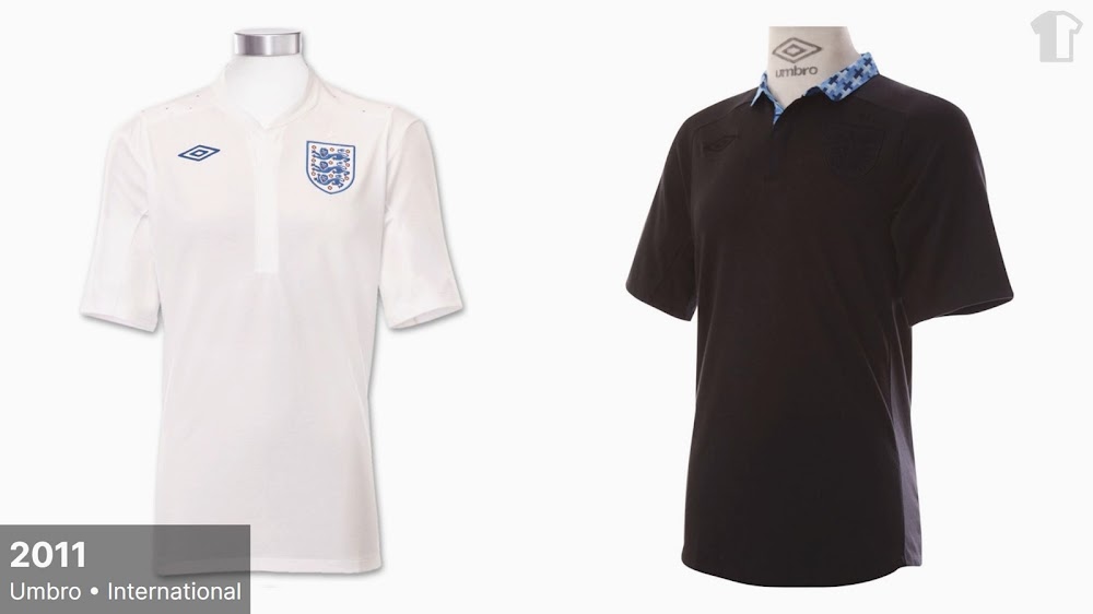

2013-? - Nike Takes Over
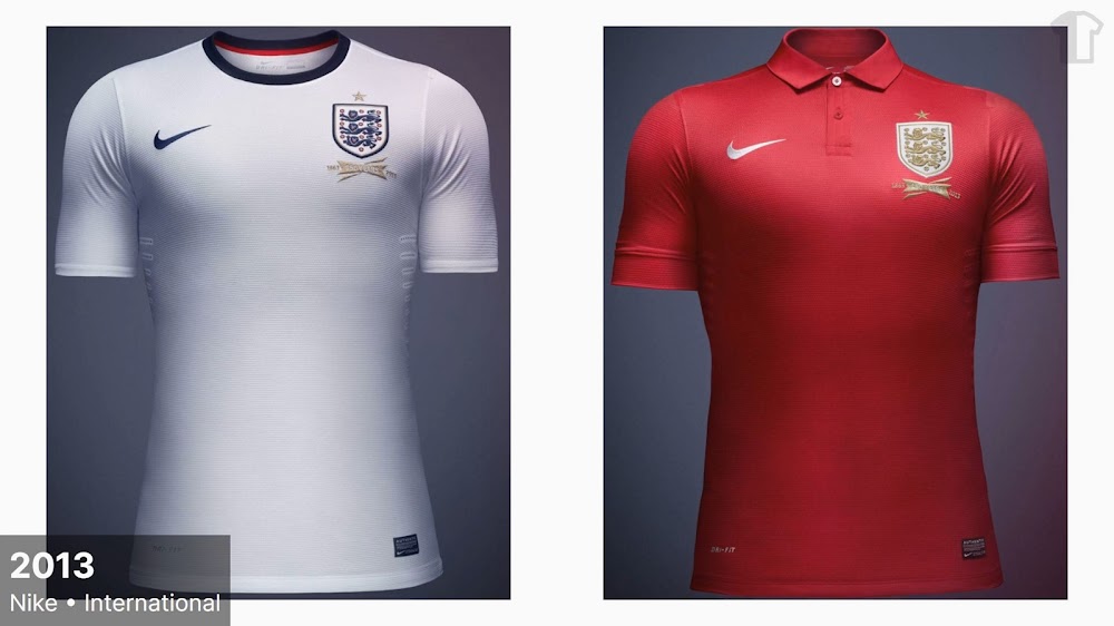


Regarding the future we can already leak that England will receive four new kits this summer, two for both the men's and women's national team. England's World Cup 2022 home kit will combine a white base with a light and a dark tone of blue, while the away jersey returns to red.
Which is your favorite England football kit of all time? Drop us a line below, and make sure to check out Football Kit Archive for more teams.
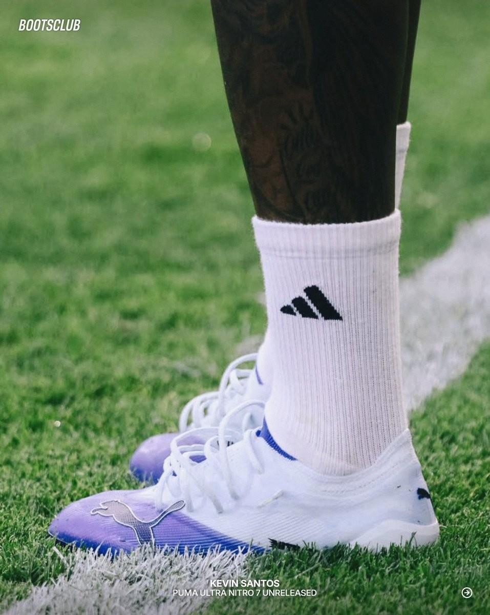
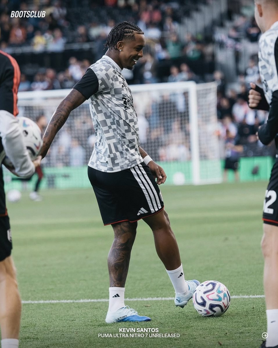
Unreleased Puma Ultra Nitro 7 Boots Spotted On Pitch
A brand-new colorway of the next-generation Puma Ultra Nitro 7 football boots has been spotted on the pitch, laced up by Kevin Santos during a recent pre-match warm-up. The unreleased pair gives us our first look at what Puma has in store for its flagship speed silo in the upcoming autumn collection. Thanks to rkidfootball & bootsclub.
The spotted boots feature a clean white base highlighted by an eye-catching purple and blue gradient that wraps around the toe box and lower lateral section. Puma completes the aesthetic with dark Cat branding outlined along the upper and subtle light blue accents across the collar and soleplate, offering a sharp contrast to the bold launch edition.
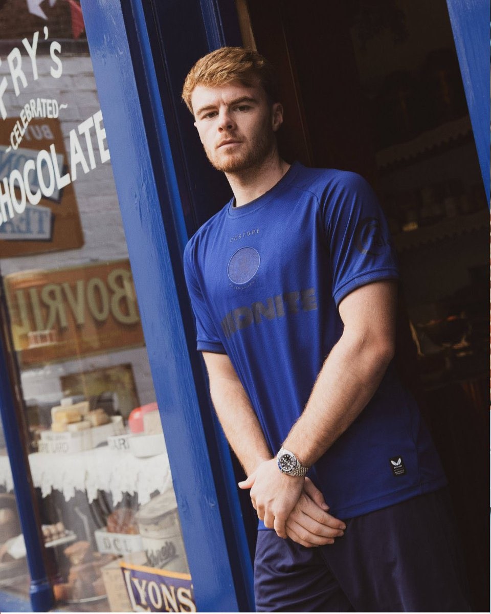
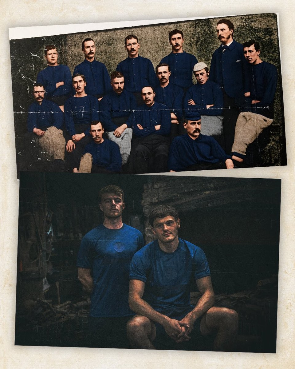
Middlesbrough 26-27 150th Anniversary Kit Available Today
Middlesbrough have announced that their special 2026–27 150th anniversary shirt will be available to pre-order at 12 noon today, September 23.
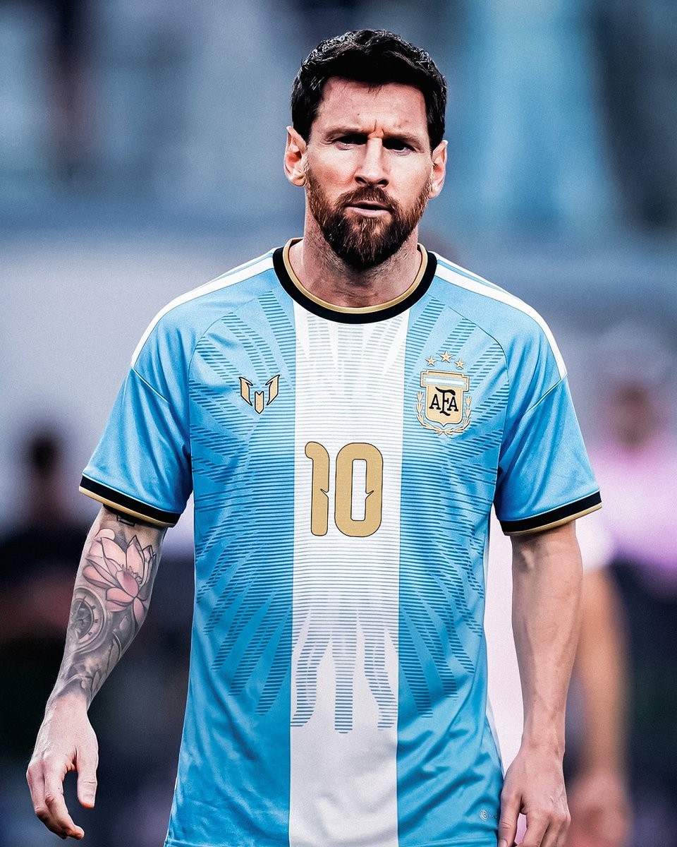
Special Adidas Argentina 2026 Lionel Messi Farewell Kit Leaked
Based on the leaked images, @whatthekit_x created a mock-up of Messi wearing a special Argentina jersey, designed to honor his legendary career with the national team.

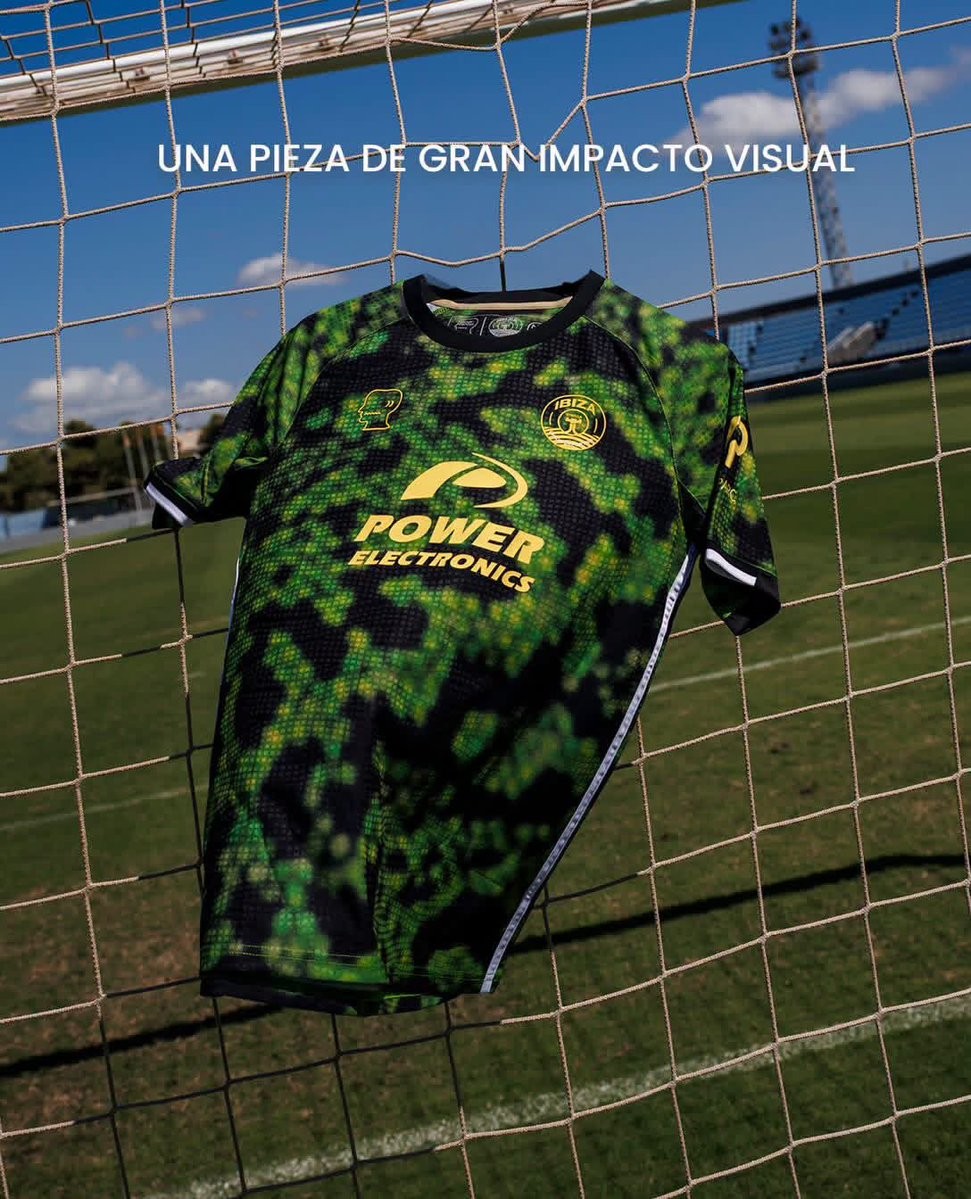
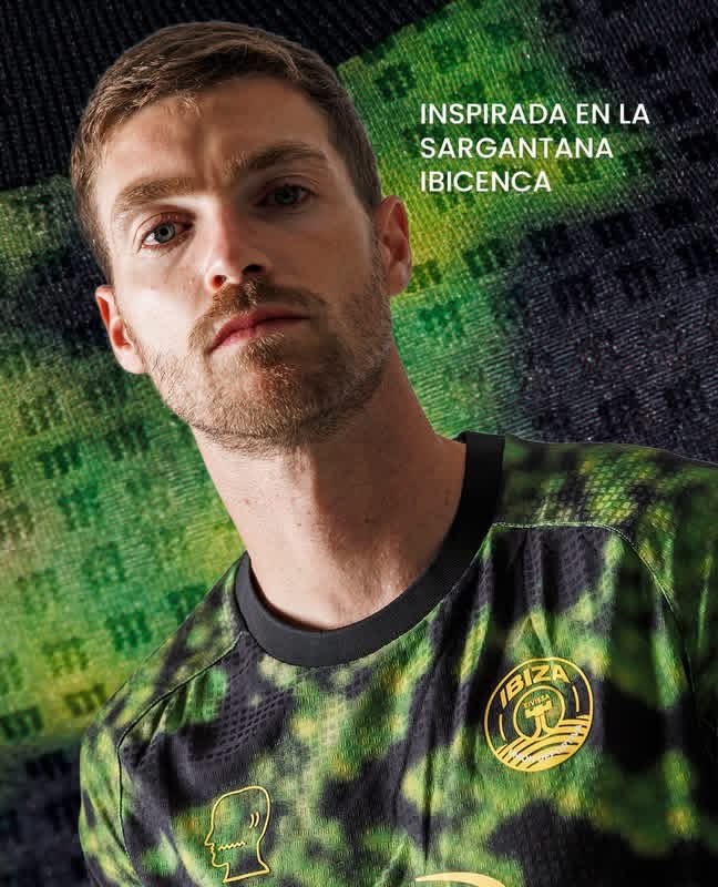
No More Puma: Brain Dead UD Ibiza 26-27 Away Kit Released
Spanish club UD Ibiza has officially released its new away kit for the 26-27 season, crafted by creative collective and technical sponsor Brain Dead. Following the takeover from Puma earlier this summer and the previous unveilings of their home and third shirts, this release completes the island club's match collection for the campaign.
The Brain Dead UD Ibiza 26-27 away jersey delivers a bold aesthetic inspired directly by the sargantana ibicenca (the Ibiza wall lizard), an enduring symbol of the island's natural identity. The kit channels the reptile's distinct scales into a contemporary camouflage pattern, blending blurred digital textures in shades of toxic green, moss, and deep black across the entire front, back, and sleeves.
Contrasting the chaotic camouflage base, all accents and club emblems are rendered in a striking electric yellow monochrome, including the UD Ibiza crest, Brain Dead's signature head profile logo, and sponsor branding. The design is finished with a neat black crew-neck collar, matching black sleeve cuffs tipped with white piping, and clean white stripes tracing down each flank.
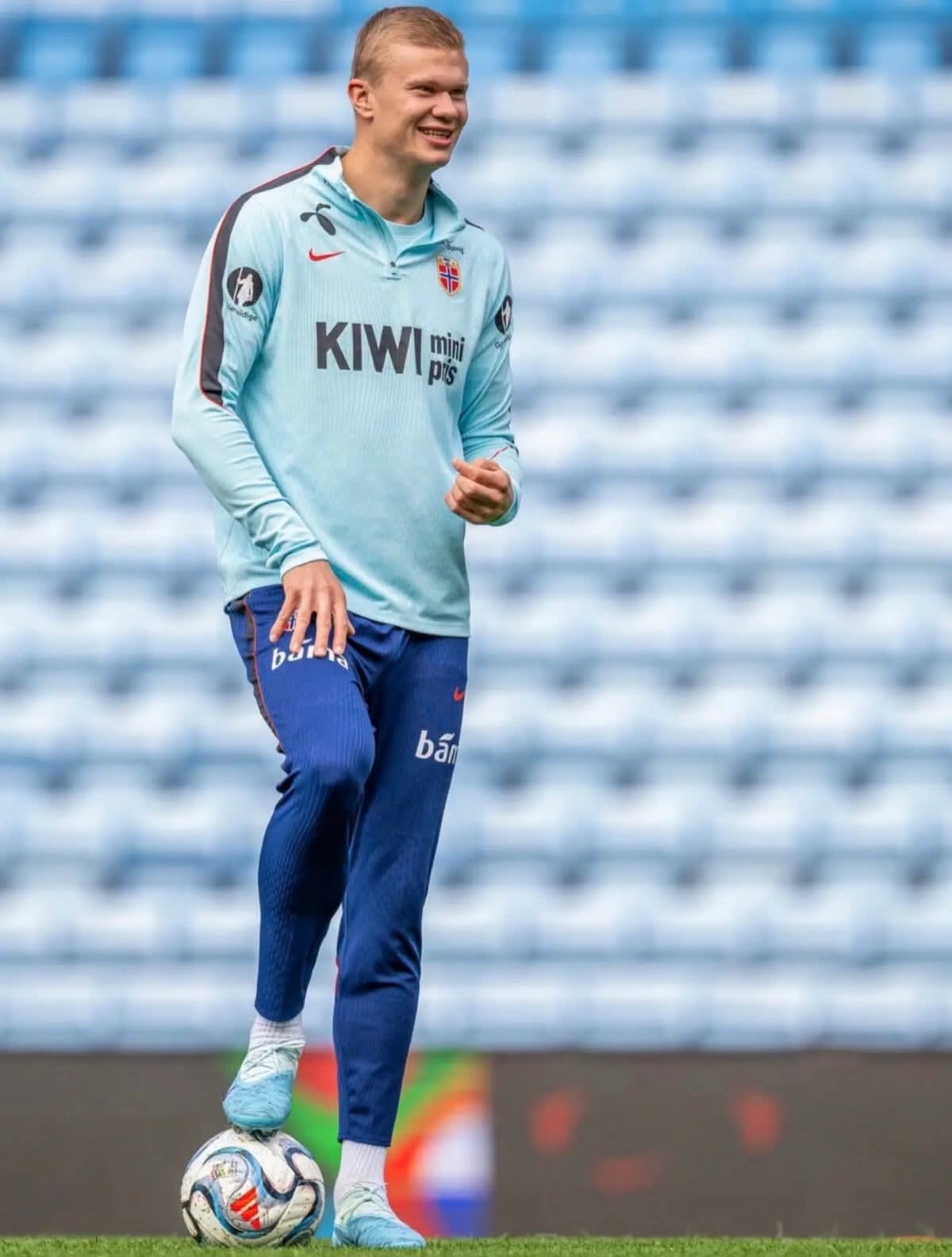
Haaland Trains in Leaked Nike Phantom 26-27 Signature Boots
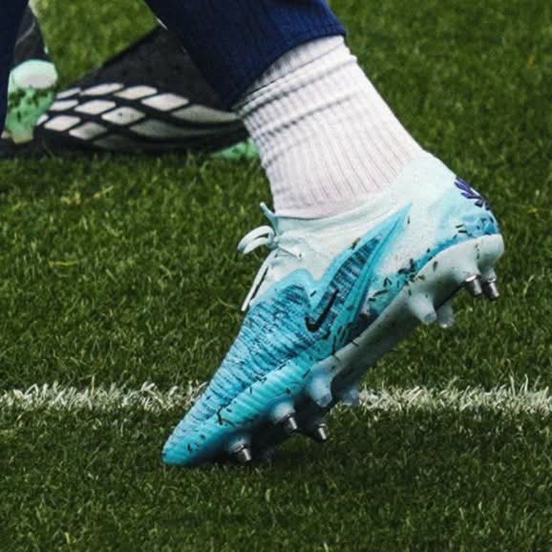
Manchester City striker Erling Haaland has been spotted wearing his upcoming Nike Phantom 6 signature boots in training with the Norwegian team, confirming the exclusive leak from Footy Headlines. Created for the 26-27 season, the custom pair provides the first look yet at the high-end edition of the Norwegian star's next official on-pitch release.
The new signature boots feature a light blue base. A standout cloud-like graphic wraps around the heel and rear portion of the boot, adding a unique personalized touch to the design. Built on the Phantom 6 framework, the cleats boast Nike's Gripknit material across the upper for optimal ball control alongside the Cyclone 360 soleplate for rotational traction.
Nike is set to launch the Erling Haaland 26-27 signature boots on October 1.
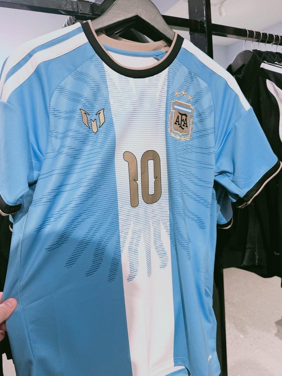
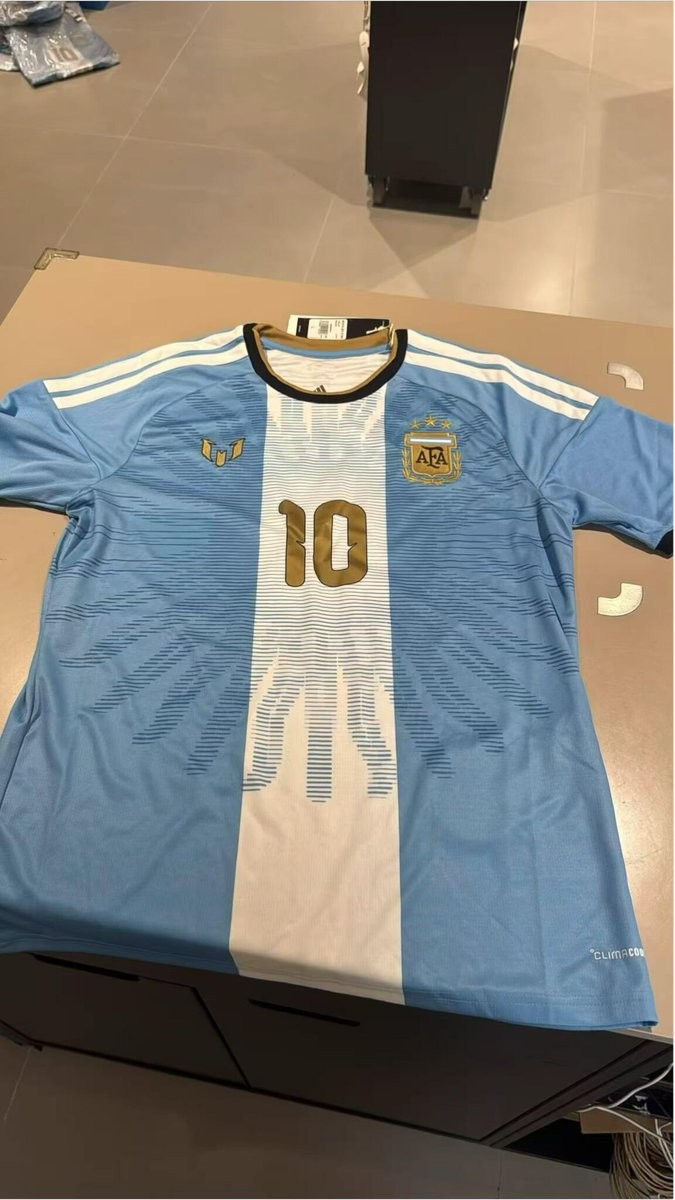
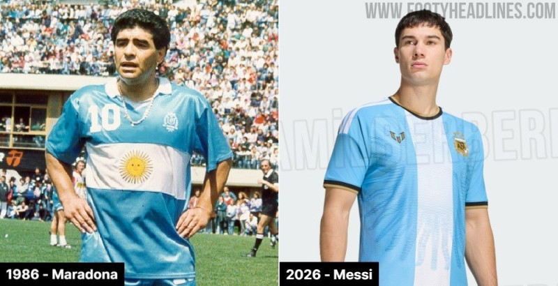
Adidas Argentina Messi Farewell Kit Leaked - 3 New Images
New images of the special commemorative Adidas Argentina kit created for Lionel Messi's final international appearance have been shared by the @TheShirtUnion. The legendary playmaker is scheduled to wear this tribute shirt in his farewell game for the national team against Benin at the Estadio Monumental on October 6, 2026.

Nigeria to Leave Nike and Return to Adidas in Record 2027 Kit Deal
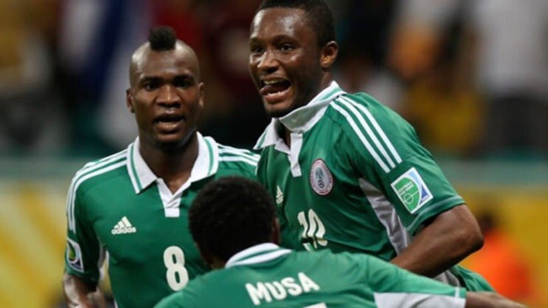
The Nigeria Football Federation (NFF) is set to part ways with Nike after an 11-year partnership and make a high-profile return to Adidas starting in January 2027. The switch will conclude an era with the Swoosh that began in 2015 and produced some of the most iconic and culturally celebrated football shirts of recent times, headlined by the viral 2018 World Cup collection.
The new agreement with Adidas is worth an estimated $8.5 million per year, making it the largest publicly disclosed kit deal in African football history. The contract breaks down into $4.5 million in cash alongside $4 million in kits, equipment, and apparel annually, accompanied by a 20% royalty on official merchandise sold in Nigeria. Nike's long-standing contract had remained static at around $1.5 million in total annual value, and the US brand ultimately declined to exercise its right to match Adidas' significantly enhanced proposal.
This marks a return to the Three Stripes for Nigeria for the first time since 2014. Adidas famously outfitted the Super Eagles during key eras of their history, including their World Cup debut in 1994 and their Africa Cup of Nations triumph in 2013. In tandem with the team sponsorship, Adidas plans to expand its retail footprint across Nigeria to over 30 stores, ensuring vastly improved distribution and accessibility of official gear for supporters.


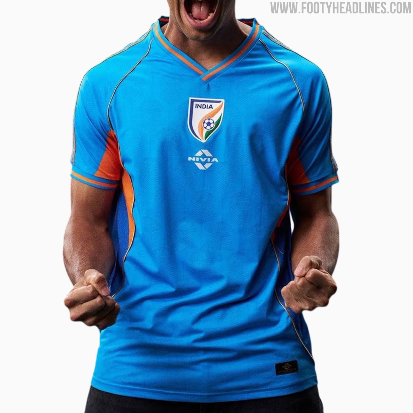
India 26-27 Home, Away & Third Kits Released
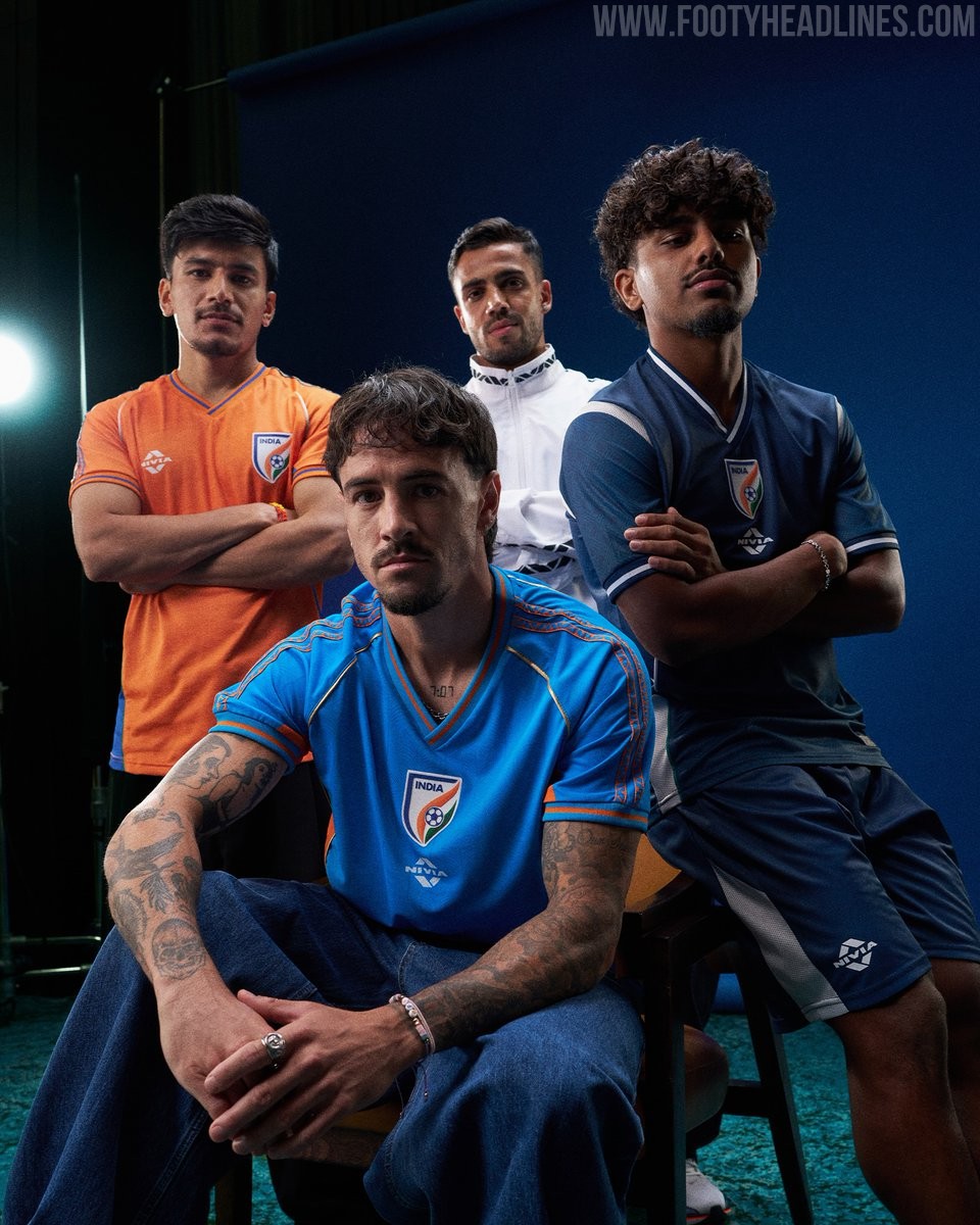
The All India Football Federation (AIFF) and technical sponsor Nivia Sports have officially launched the new India 26-27 home, away, and third kits. The new collection will be worn in the high-profile series of international friendlies against Panama, Brazil, and Uruguay.
The India 26-27 home shirt features a vibrant light blue base combined with bright orange accents on the side panels, V-neck collar, and sleeve cuffs. Subtly woven into the fabric is a peacock feather jacquard pattern, complemented by patterned ethnic-inspired taping running down the shoulders and golden piping framing the front. In line with the rest of the collection, the AIFF crest is centrally aligned on the chest, with the Nivia logo situated just below.
Completing the range, the away jersey arrives in dark blue with clean white contrast piping along the collar, cuffs, and shoulder inserts for a classic aesthetic. The third kit switches to an energetic saffron orange look accented by rich blue side panels and sleeve trim, mirroring the shoulder pattern details from the primary strip.