Fiorentina's Full Logo History: 1927-2022

Last week, Italian club AC Fiorentina presented their new crest for the 2022-23 season onward. This is by no means their first logo change, and definitely not the most jarring. We want to look at what came before ACF's new 2022 badge, with 10 others being used over the course of the past 80 years.

Fiorentina's Logo History
Founded in August of 1926 through a merger, Fiorentina had no violet on their first-ever club logo. The iconic red lily that represents the city of Florence was used for the club, which wore white and red until 1928.
Starting in 1951, ACF simplified the red lily and placed it inside a purple-outlined diamond shape. This shape has since featured in many of the designs to come, and in fact provides the basis for the new 2022 crest.


1963 saw Fiorentina introduce their first rhombus-shaped crest. There have been multiple iterations of this design over the years, with the current ACF logo belonging to this group as well.

In 1967, Fiorentina's crest finally featured more colors than just red and white. An odd, round blue box was placed behind the diamond containing the red lily, with everything outlined in gold. 1967 was also the only design that had the name 'Fiorentina' inscribed on it.

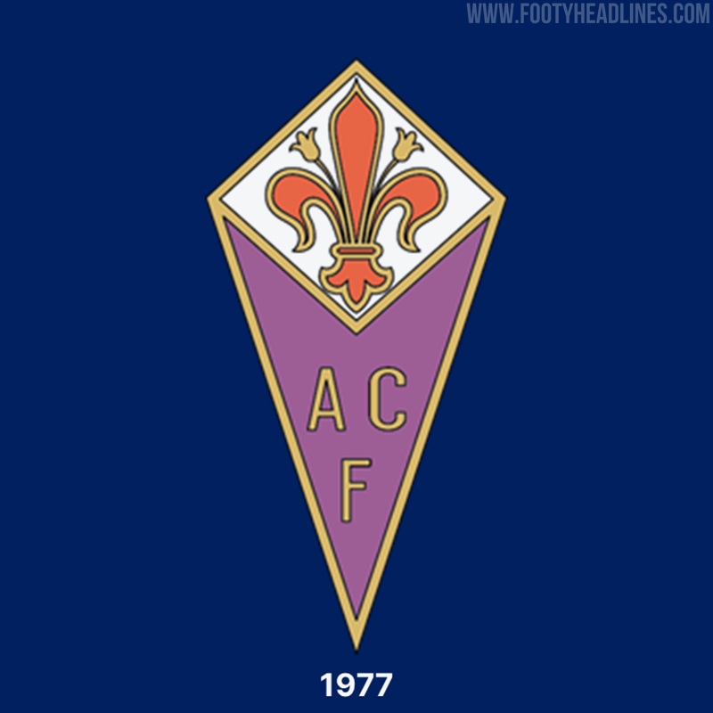
The 1974 and 1977 logos both utilized the rhombus shape as well as the diamond containing the red lily. 1974's look introduced the initials 'ACF' being written on the crest, also adding violet under the diamond.

1981's Fiorentina crest is one of the more unique, being the only circular design. The club attempted to integrate the letter 'F' into the red lily, an aspect that was not maintained in later years.

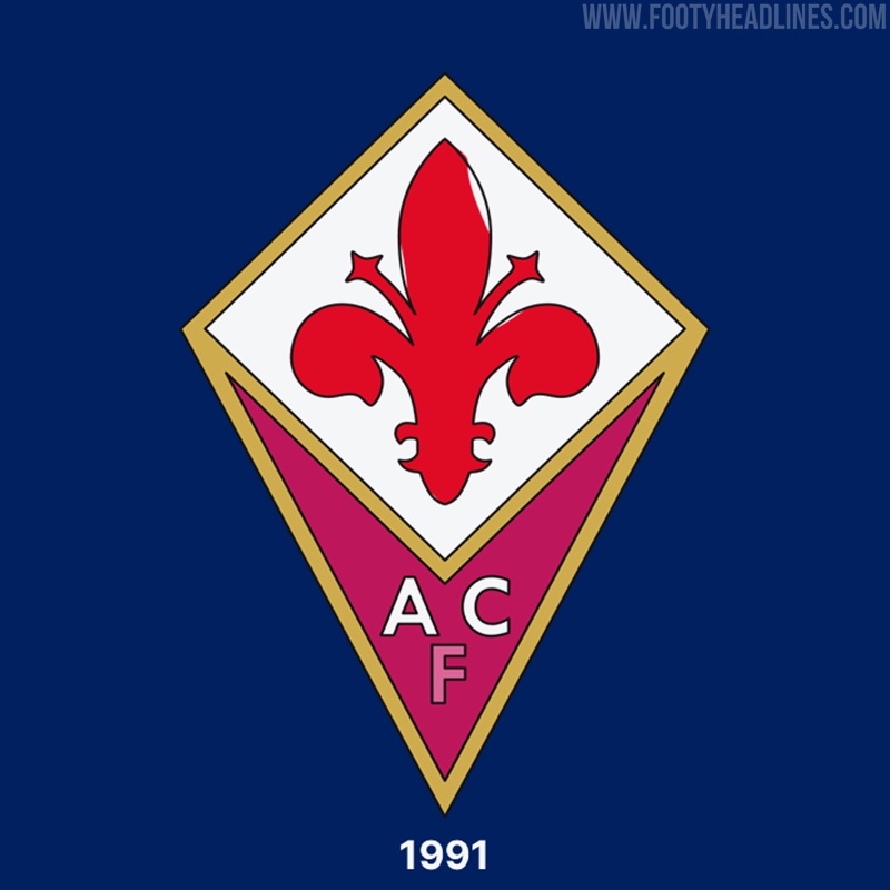
1991 saw the emergence of the predecessor for the current Fiorentina logo. Again reusing the rhombus and diamond shapes, we see the initials 'ACF' appear on top of a red background.

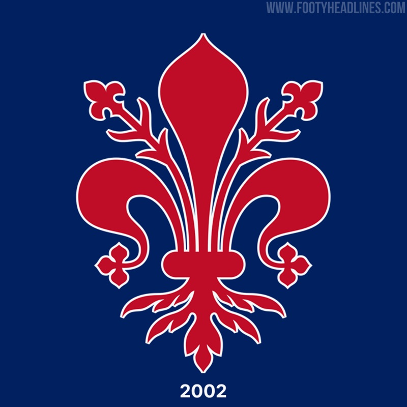
In 2002, the club had a brief stint where the original 1927 logo reappeared, celebrating their 75th anniversary.

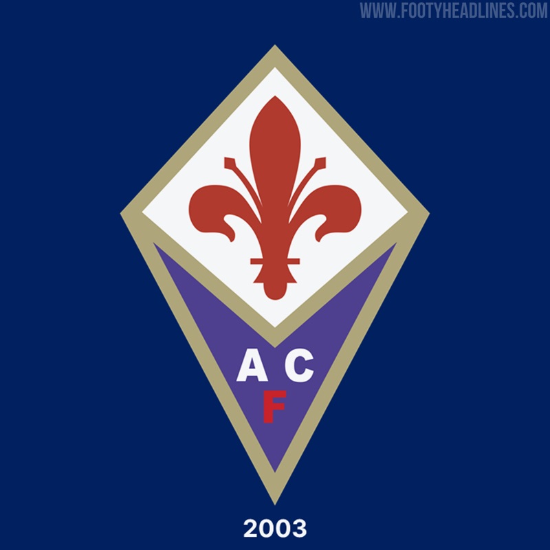
The 2003 Fiorentina crest is seeing the last days of its use, featuring a gold outline for both the rhombus and diamond shapes. Violet is used to fill the lower section, over which 'ACF' is inscribed in white/red.

The new Fiorentina logo celebrates the club's root and glorious past by keeping the iconic red lily at the core of its design. Gold is fully removed, with the rest of the logo either violet or white.

What do you think of Fiorentina's many logos? Which one is the best? Comment below.


Nike Confirms Release of Gold Mercurial CR7 2026 World Cup Boots
Nike has officially confirmed the upcoming release of the highly anticipated, special-edition signature boot for Cristiano Ronaldo.
Ahead of the 2026 FIFA World Cup, the American sportswear giant will launch a spectacular all-gold Mercurial specifically designed for the Portuguese superstar. This exclusive release is scheduled to drop just before Portugal kicks off their opening group-stage match.
The decision to equip the forward in a striking all-gold colorway is a deliberate and symbolic tribute by the brand's design team. Speaking on the upcoming launch to The Athletic, Nike representative Odinga Nimako, a senior figure at Nike’s global football footwear team, explained the specific reasoning behind the glamorous aesthetic. "The fact that Ronaldo is playing his sixth World Cup, we wanted to celebrate the legacy he has set and the way he continues to add to his legacy," Nimako stated. "And there is no better color than gold to help do that."
It remains to be see if Cristiano Ronaldo will wear the golden boots in a match - we expect him to wear them in training only.