
10 Controversial Football Kit Opinions
Prominent member of the Twitter football shirt community @The_Kitsman asked his followers for their controversial opinions on football shirts recently. As usually happens when this question is asked about any topic, many people seemed to confuse the meaning of the word “controversial” with that of “very commonly held and in no way controversial”.
😲👕 Give me your controversial football shirt opinion.
— The Kitsman (@The_Kitsman) April 27, 2022
However, there were still a few interesting takes among the replies. We’ve put together ten of them and given our thoughts on each one. Feel free to tell us how wrong you think we are in the comments.
1 - Too Many Shirts, Not Enough Time

Agreed. Nowadays shirts don’t have the airtime to have any real cultural impact, as opposed to in the past when clubs would use the same couple of kits for two or three seasons, therefore hugely increasing the shirt’s chances of being involved in a significant match or campaign.

The constant release of new jerseys combined with the social media hype mean there is always something new to take the spotlight off the most recent flavour of the month. It’s much harder for even the best designs to develop a strong association with a club or player in the minds and subconscious of the fans because of these constant changes.
2 - Smaller Brand = Better Shirt

This is an exaggeration, or perhaps just put too bluntly, but there is some element of truth in this statement. Brands like Hummel and Macron have been producing excellent kits over the last few years, but in reality they sit just below the highest of high end kit makers. The same goes for Kappa and Umbro.

Of course smaller brands are also capable of great work, take Paraguayan sportswear company Kyrios for example, or Salernitana’s current kits made by Zeus, but less established brands can also sometimes lack originality or production/design quality. A better way of wording this one might be “Smaller brands can design kits just as good as the ones from the big names”.
3 - Serial Offenders

While it may be true that Dortmund kits haven’t come near the heights of their mid 90s Nike days, Napoli have had some great kits since the turn of the century. The Diadora shirts with Peroni sponsor from the early 00s spring to mind as some of their more under-appreciated jerseys.

Macron had a few solid efforts and Kappa gave them some simple but effective shirts during their stint too. Even some of the current EA7 gear has something of a cool factor about it, if you can ignore the ridiculous number of releases.
4 - "Grail"

No arguments about the cringiness of the word “grail”, but the same can be said of every other word that has been popularised - or even coined - on the internet. Also, the football shirt community are hardly the only ones to blame in the case of the word “grail”.
5 - Stick To Your Own Club

Strongly disagree here, there are too many amazing shirts out there to limit yourself to one club. Even narrowing it down to one league would be tough (if it wasn’t for the existence of Serie A, surely the home of the greatest proportion of beautiful jerseys).
6 - No Sponsor Is No Fun

We’re going to have to disagree with this one, at least with the use of the word “usually”. Chest sponsors have been a staple of club shirts for more than 40 years now, so in modern times it can be refreshing to see a jersey free of logos. It can be an especially good look if the kit has a design strong enough to stand up on its own without the need for any distractions, and there are probably plenty of fans who’d prefer a blank space over their club’s ugly crypto or betting sponsor.

On the other hand, a run of the mill design can look boring without a sponsor. And then there are those cases of good looking logos that compliment or even complete the look, or the longstanding partnerships that see the sponsor logo become a part of the visual identity of the club. Definitely pros and cons of both.
7 - In It For the Money

Again, some truth in this one, but we don’t agree with everything here. Are club’s robbing their fans for financial gain? Absolutely, no doubt about that. Do fans accept high prices because they want to help their club? In some cases, maybe, but rampant consumerism is responsible for the majority of shirt sales. Most shirt buyers are more concerned with their own appearance and the status that the shirt carries rather than financially contributing to their club.
8 - Modern Shirts vs 90s Shirts

The 90s are considered the golden age of football shirts for many, as the decade saw a lot of experimentation, wild patterns and baggy fits, before the 00s and 2010s saw a more “back to basics” approach to kit design in comparison. The last few years have seen a revival in the use of colour, patterns and outside the box thinking, resulting in a lot of impressive shirts. Maybe in twenty years time, the rose-tinted glasses through which we look back at those 90s kits will allow us to see the current crop of kits in a similar light.

Then again, there is the association of the kits with the era they are from and the way football was experienced and even played at the time, so the nostalgia factor will probably still work in favour of the 90s in that regard. Also, see number one on this list.
9 - Let The Goalies Fit In

For practical reasons, we’re going to say no to this one. Goalkeepers need to stand out from the outfield players and their very different role in the team also warrants a different look, if you ask us.
10 - Keep It Simple

To finish, this gets a hard no (apart from the bit about lasting two seasons, no complaints there). Variety is the spice of life and if clubs insist on pushing out so many new kits so frequently, they can at least try and offer something different each time. The overuse of templates is one of peoples’ biggest gripes with football shirts and a stick that has been used to beat many a manufacturer.

Although, that’s not to say having the same design with different colour combos for home and away kits could never work out well, we’d just vote against it as a general rule.
Now its your turn. What do you think of these Twitter opinions? What about ours? Have you got any more you’d like to share? Comment below.
Marathon Universitario 2026 Señor de los Milagros Kit Released
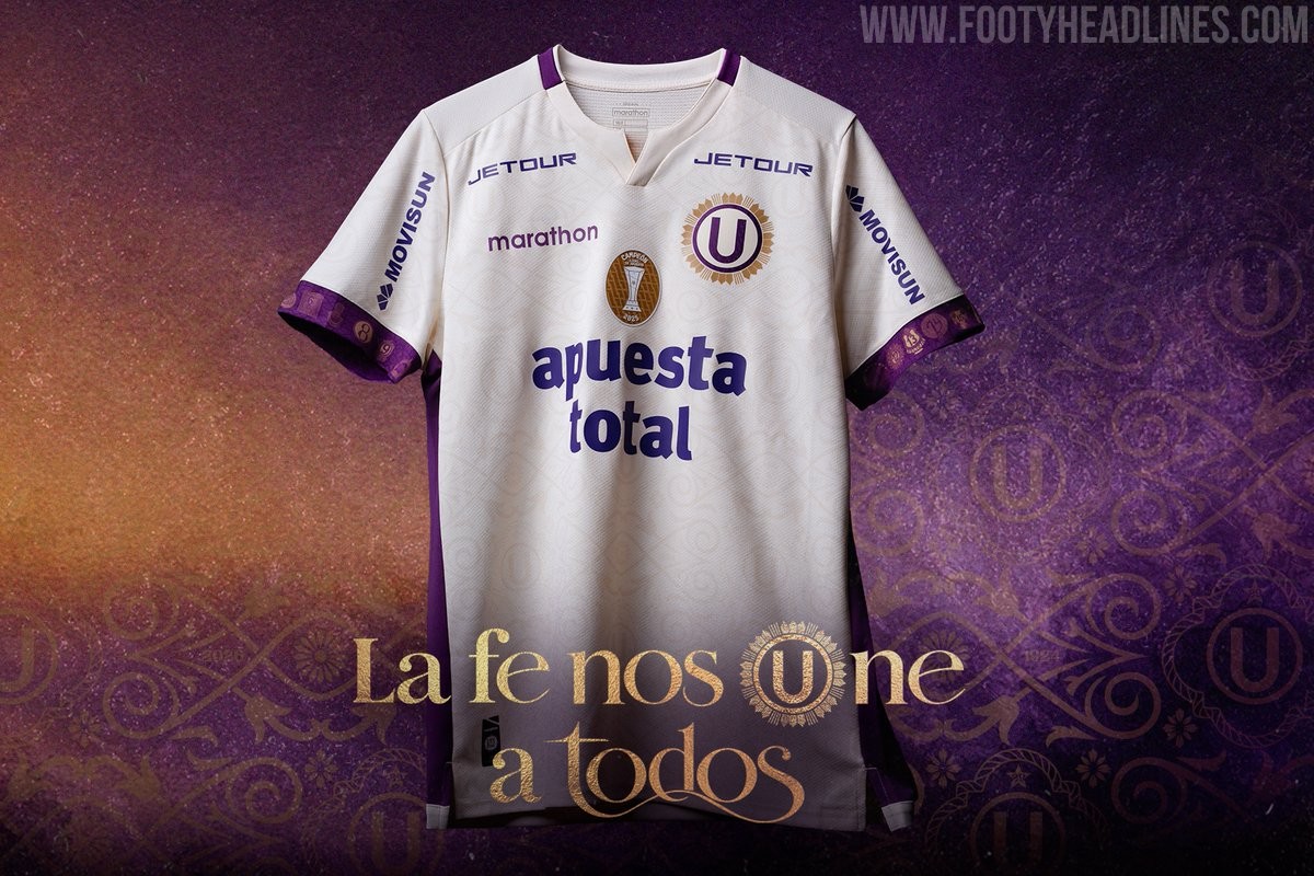
Peruvian champions Universitario de Deportes and Marathon Sports have officially unveiled a special-edition kit honoring the Señor de los Milagros (Lord of Miracles) for the second consecutive year. The commemorative release arrives just in time for October, the month traditionally associated with the religious devotion across Peru.
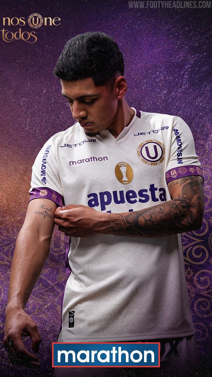
The Universitario 2026 Señor de los Milagros shirt retains the club's iconic cream base color, pairing it with deep purple and radiant gold detailing. An intricate, tone-on-tone graphic pattern covers the front and sleeves, inspired by religious stained glass windows and the embroidery found on traditional garments. The club crest has been given an ornate overhaul, outlined in purple with an elaborate golden sunburst surrounding it, while a dedicated Lord of Miracles patch adorns the upper back.
One of the most notable design features is on the sleeve cuffs, where purple bands display the logos and numbers of all the cuadrillas, the brotherhood groups responsible for carrying the procession litter during celebrations. The collection includes short-sleeve, long-sleeve, and purple goalkeeper editions alongside matching pre-match apparel.

Racing Santander 26-27 Third Kit Released
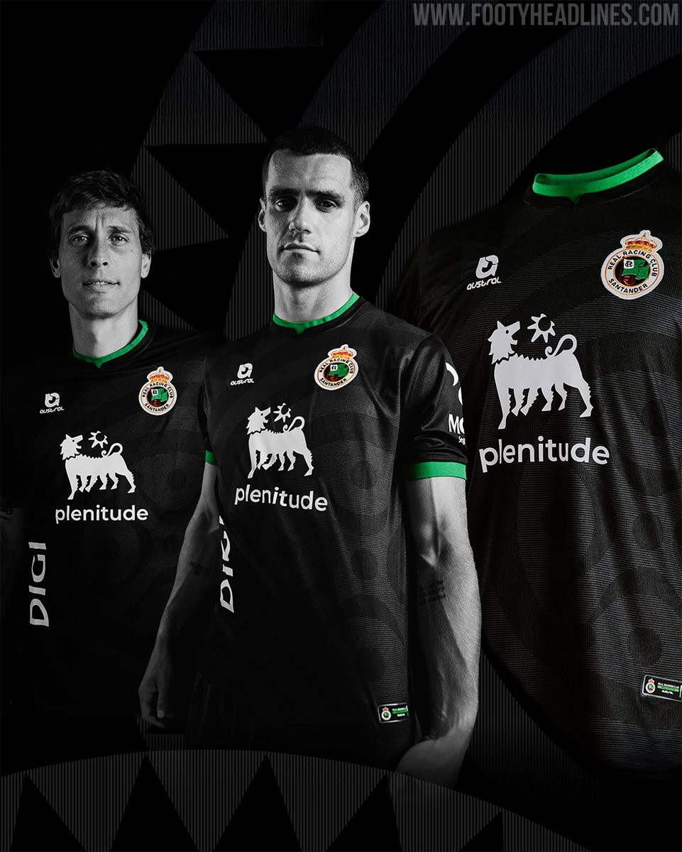
Spanish club Real Racing Club de Santander has officially unveiled its new third kit for the 26-27 season. Designed and produced by local Cantabrian sports brand Austral, the new strip brings back a stealthy black look accented with the club's signature green detailing.
The Austral Racing Santander 26-27 third jersey has a predominantly black base adorned with a tonal graphic pattern inspired by the lábaro cántabro, rendered in varying intensities across the front. Vivid green accents trim the collar, sleeve cuffs, and lower hem, while the sponsors and Austral logo appear in crisp white alongside the full-color club crest. Green shorts and black socks with green turnovers complete the uniform.
As a special tribute to the fanbase, the interior of the shirt is sublimated with the names of all 18,804 club season ticket holders for the 26-27 campaign. The kit debuted with a limited initial release of 500 units on the club's online store before rolling out to the physical shop at El Sardinero.
Giugliano 26-27 Home & Away Kits Released
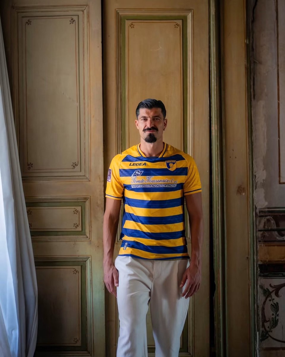
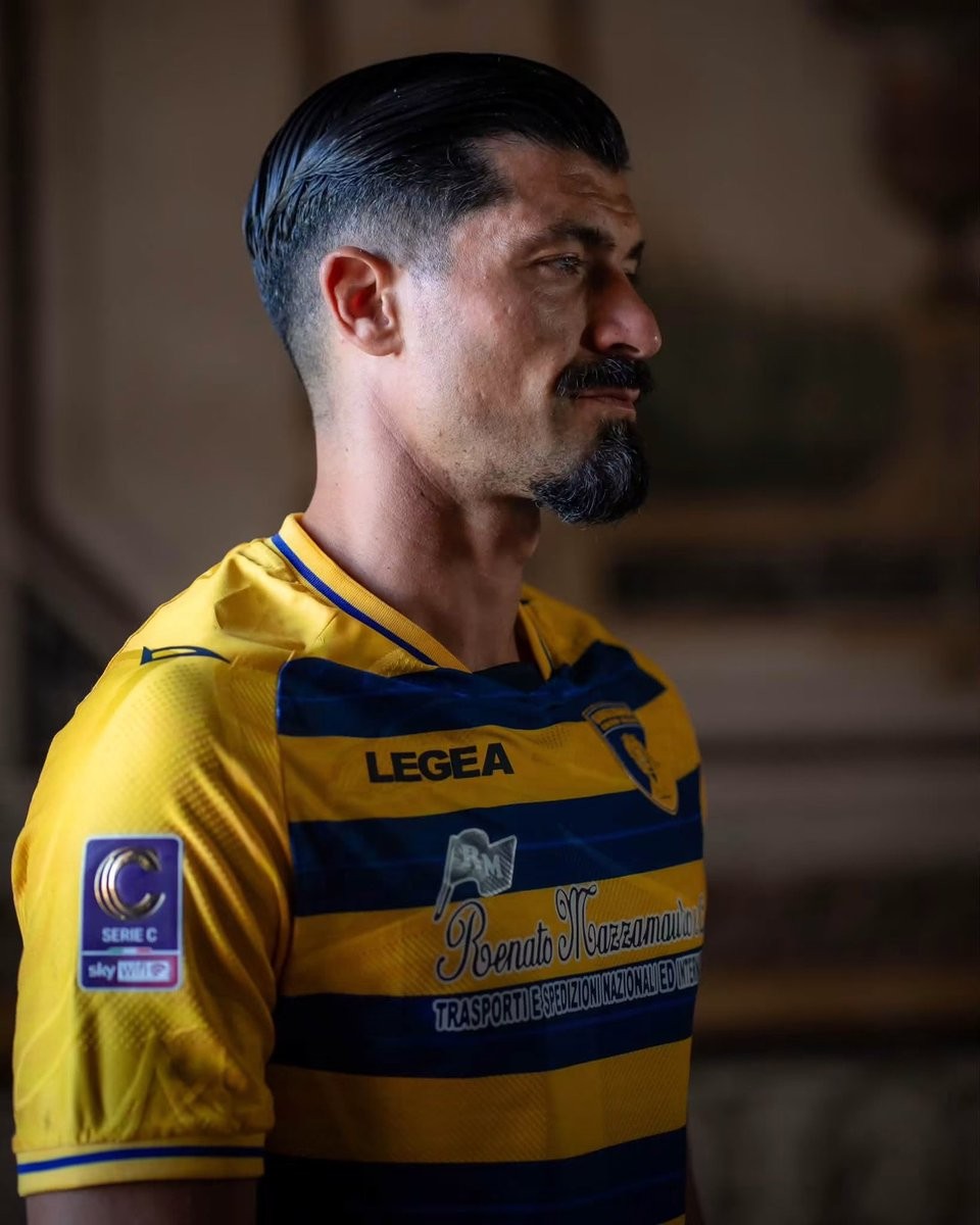
Italian Serie C club Giugliano Calcio 1928 and technical partner Legea have officially unveiled their new home and away kits for the 26-27 season. The Campania-based club, nicknamed the Tigrotti, continue their collaboration with the domestic sportswear brand for the upcoming league campaign.
The Legea Giugliano 26-27 home shirt embraces the club's traditional gialloblù identity with a classic horizontal striped design. Bold blue hoops run across the bright yellow torso, complemented by solid yellow sleeves, subtle blue trim on the cuffs, and a matching crew collar. The chest features the club's tiger crest alongside Legea branding and local principal sponsor graphics.
The Legea Giugliano 26-27 away shirt delivers an ornate design inspired by local classical architecture. Set on an off-white base, the jersey showcases subtle fresco-style illustrations in warm sand tones, highlighted by classical columns, intricate motifs, and the Roman numerals MCMXXVIII honoring the club's founding year of 1928. Matching sand-colored trim on the V-neck collar and sleeve cuffs rounds off the look.
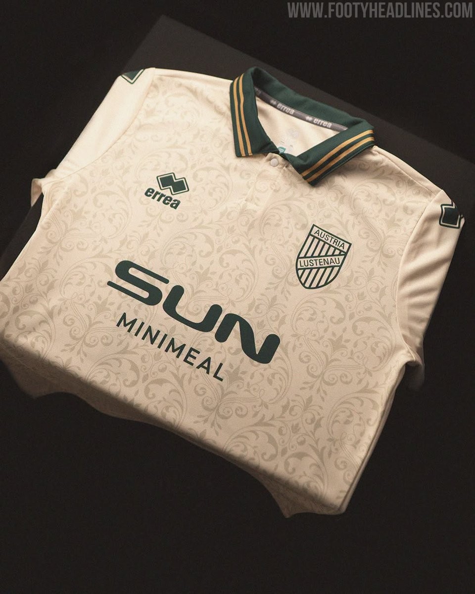
Austria Lustenau Release Special-Edition 26-27 "Vintage" Kit
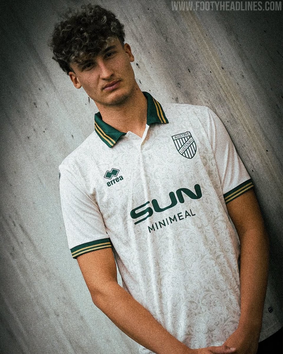
Austrian club SC Austria Lustenau has unveiled a special-edition jersey, dubbed the "Vintage" kit, created in collaboration with Italian brand Erreà. The limited-edition shirt was launched for the friendly match against German giants FC Schalke 04 at the Sun Minimeal Arena.
The Erreà Austria Lustenau 26-27 "Vintage" jersey comes in an off-white cream base adorned with a subtle all-over floral damask pattern. It is complemented by a dark green polo collar with dual gold pinstripes, an aesthetic echoed on the matching ribbed sleeve cuffs. To complete the clean retro look, the club crest, Erreà chest logo, and Sun Minimeal front sponsor are all rendered in monochrome dark green.
On the back, the retro styling continues with an elegant serif typeface in green for the player names and squad numbers. The release represents another custom design from Erreà in their first season outfitting the Austrian side, after taking over the club's technical contract ahead of the 26-27 campaign.
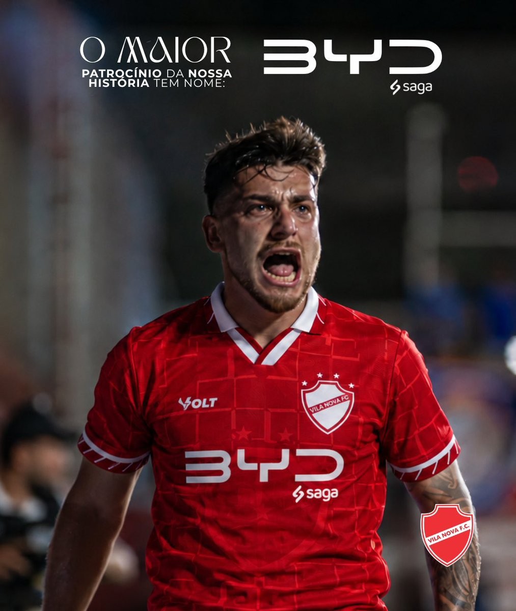
Betting Ban: Brazilian Club Vila Nova Announce BYD Main Shirt Sponsor Deal
Brazilian club Vila Nova FC has officially announced Chinese electric vehicle giant BYD as its new primary front-of-shirt sponsor. Described by the club as the largest commercial partnership in its history, the agreement places the BYD logo prominently on the chest of the team's Volt Sport kits through the end of 2026, with an option to extend into 2027.
The sponsorship is executed in collaboration with Saga, an authorized dealership network representing BYD in Brazil, whose small logo appears directly underneath the main BYD mark. The automotive manufacturer replaces previous shirt sponsor Bet da Sorte, following a wave of regulatory restrictions on betting companies operating in Brazilian football.
Currently fighting at the top of the Campeonato Brasileiro Série B table and chasing promotion to the top flight, Vila Nova is set to debut the redesigned shirts immediately. The landmark agreement secures vital financial stability for the club's promotion push while expanding BYD's growing footprint across South American football.



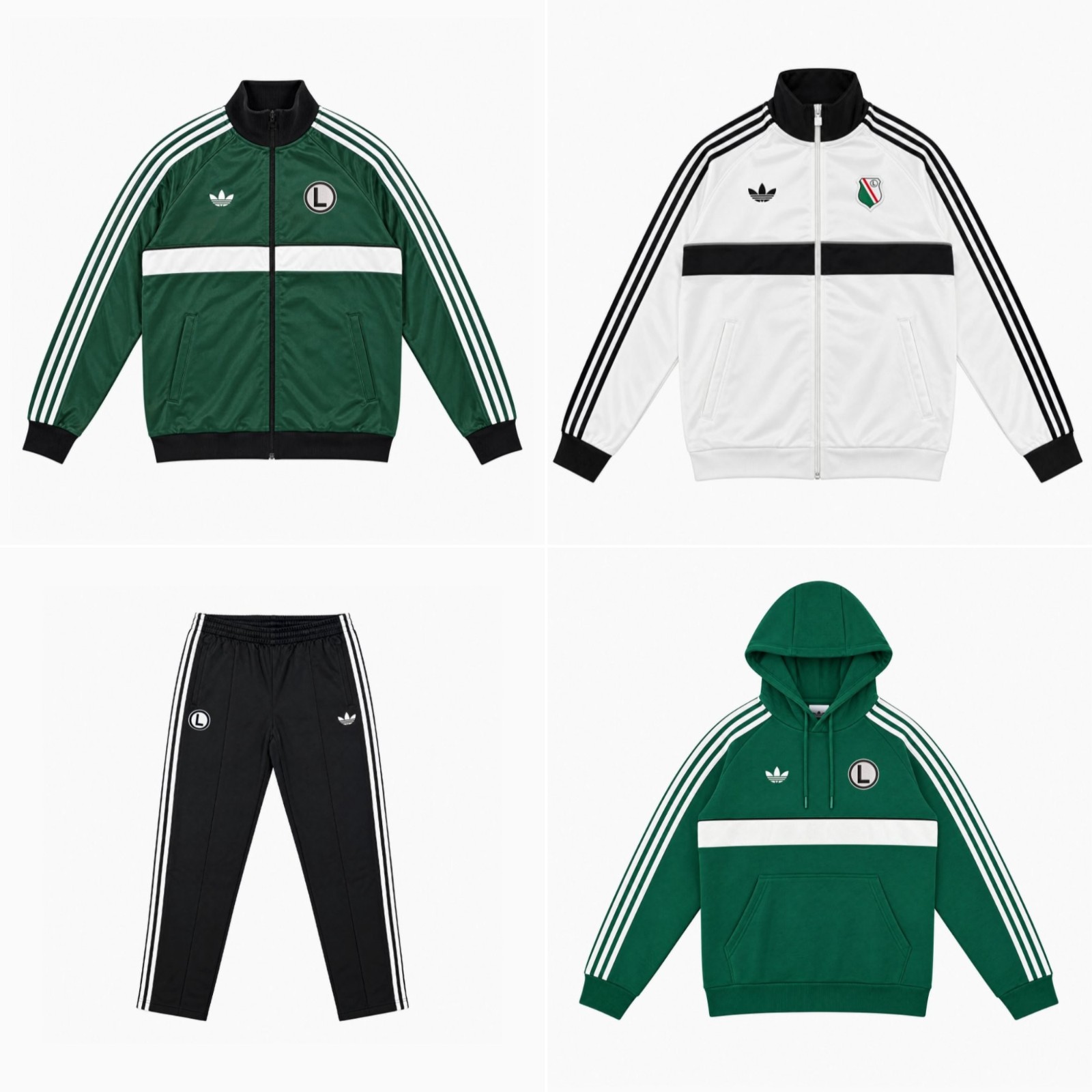
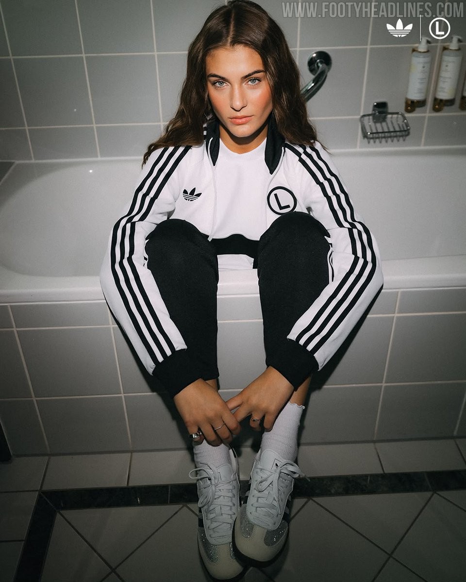
Legia Warsaw Release First Adidas Originals Collection in Decades
Legia Warsaw and Adidas have officially launched an all-new Originals lifestyle collection, marking the club's first dedicated project under the iconic Trefoil banner in decades. The retro-infused streetwear range draws heavily on vintage terrace fashion and archival sportswear aesthetics.
Rendered in Legia's traditional palette of green, white, and black, the drop includes classic full-zip track jackets, hoodies, track pants, and t-shirts. Every piece is detailed with Adidas' signature Trefoil logo and prominent Three Stripes down the sleeves and legs. Fans are also treated to two distinct badge options across the garments, with items arriving with either the club's modern crest or the iconic circular 'eLka' emblem.
The Adidas Originals Legia Warsaw collection is available now through the club's official online fan store and selected physical locations. Prices range from 259 PLN for t-shirts to 419 PLN (60-95 EUR) for the full-zip track tops.
