New Malta Badge Revealed - Huge Improvement?

One week ago, the Maltese football association presented their brand-new logo. It sees them refine their look and simplify the crest.
New Malta Logo
The Maltese football association took part in UEFA's annual UEFA Grow program, where all European federations are invited. This is a program intended for business development support.
Malta introduced the world to their new football crest, which places more emphasis on the eight-pointed cross than before. The football in the center has also been removed, with the colors being limited to only red and white.

'Malta FA' is written at the top of the roundel logo, using a new font compared to the old badge and choosing to abbreviate the words 'Football Association'. The founding year, 1900, is once again placed at the bottom.
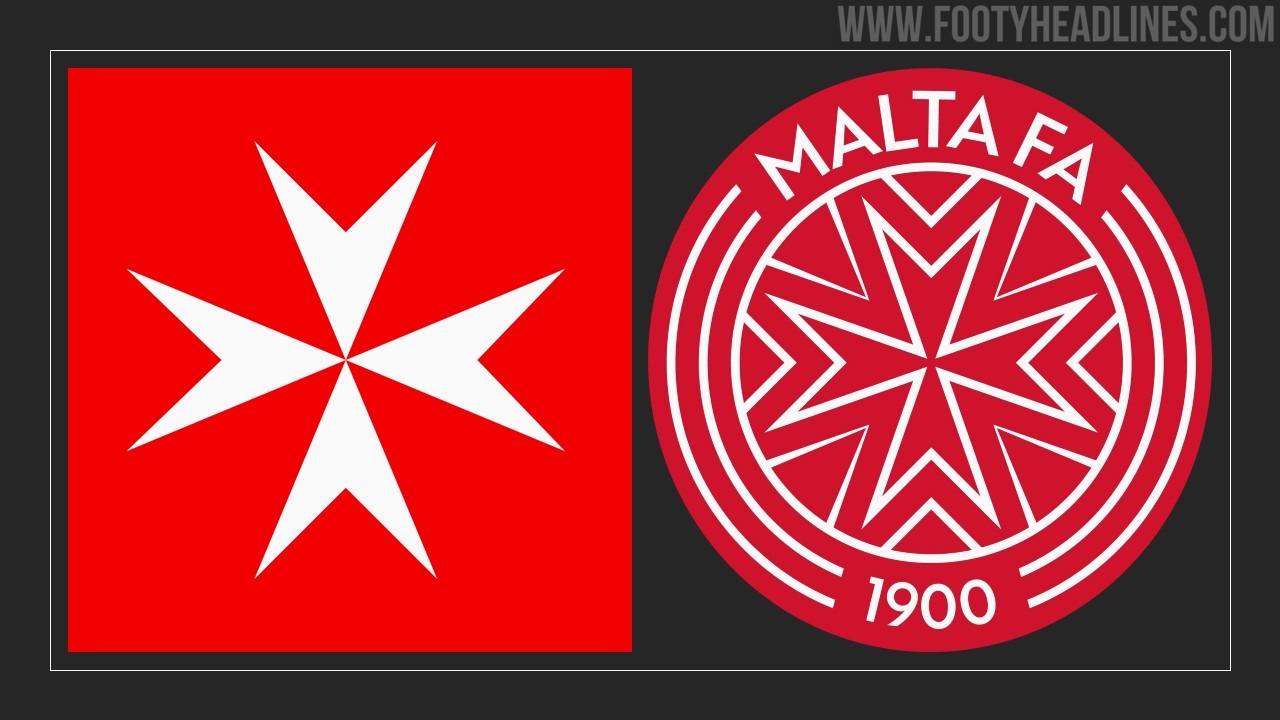
We consider the new logo to be a massive improvement, as it reduces the amount of text and color variety. The new crest clearly focuses on the recognizable Maltese cross and does so quite successfully.
What do you think of Malta's new logo? Comment below?
Vintage Football Shirts
from Cult Kits
2000/01 Italy Totti #20 Home Shirt (L) Kappa

2011/12 Arsenal Henry #12 *125 Year* Home Shirt (XL) Nike

2017/18 Boca Juniors Home Shirt (S) Nike

2012 Great Britain Adidas Olympics Training Polo (XL)

2010/11 Denmark *Player Issue* GK Shirt (XL) Adidas

1992/94 Blackburn Rovers Windbreaker (M) Asics

2014/15 Newells Old Boys Special Shirt (L) Topper

1994/96 Italy Home Shirt (L) Nike

2003/04 Juventus Del Piero #10 L/S Home Shirt (XL) Nike