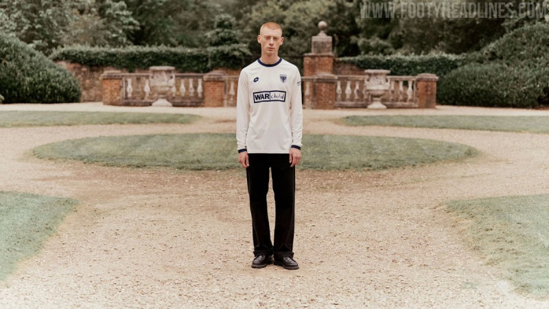
12 Submissions from the Red Star Paris Kit Design Contest

Submissions for the Red Star Paris 125th Anniversary kit design contest closed last night at midnight, so the judging will commence very soon. Amongst the entries submitted were the following 12, all done by Argentinian graphic designer @ramitalt.

Red Star Paris Kit Designs by @ramitalt
Check out the first batch below.
Three quite simple designs here, with the one standout being number three. The Red Kappa logo placed in a white circle is a really clever way of referencing the club badge and bringing something close to symmetry to the chest area of the shirt. The graphic pattern is reminiscent of Mizuno's amazing Tokyo Verdy shirt from the 93-94 season.

Two more striped efforts here plus one light and one dark shirt. Cream is not seen too often on football shirts but has been used to great effect for some Roma, Liverpool and AC Milan away shirts over the last few years. The red and green accents compliment the base nicely.

Probably the strongest grouping here, with numbers nine, ten and eleven having the hallmarks of Kappa's shirts from the 90s. The sleeve taping and collars work extremely well together. Number eleven probably just edges this one thanks to its darker colour palette.
Which shirt is your favourite of these designs? Tell us why in the comments.
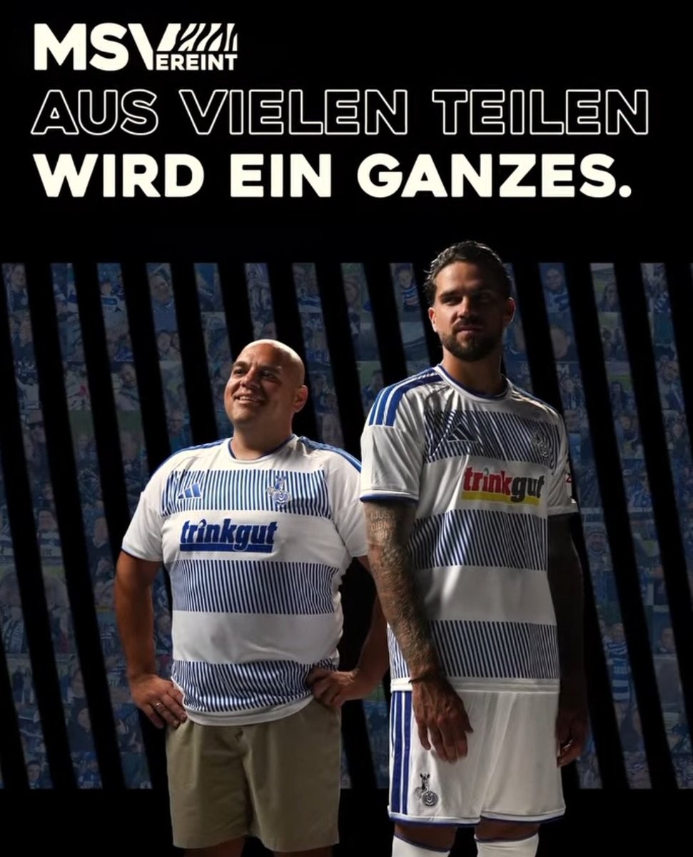
Adidas MSV Duisburg 26-27 Home Kit Released
The new MSV Duisburg home kit for the 2026-27 season has been released, introducing a controversial take on the club's traditional look. Made by Adidas in collaboration with 11teamsports, the shirt replaces the classic solid blue and white zebra stripes with a pattern of jagged, individual lines.
According to the 3. Liga club, this modern design choice is intended to symbolize the many people and connections that make up the club's fan base as MSV Duisburg approaches its 125th anniversary in 2027.
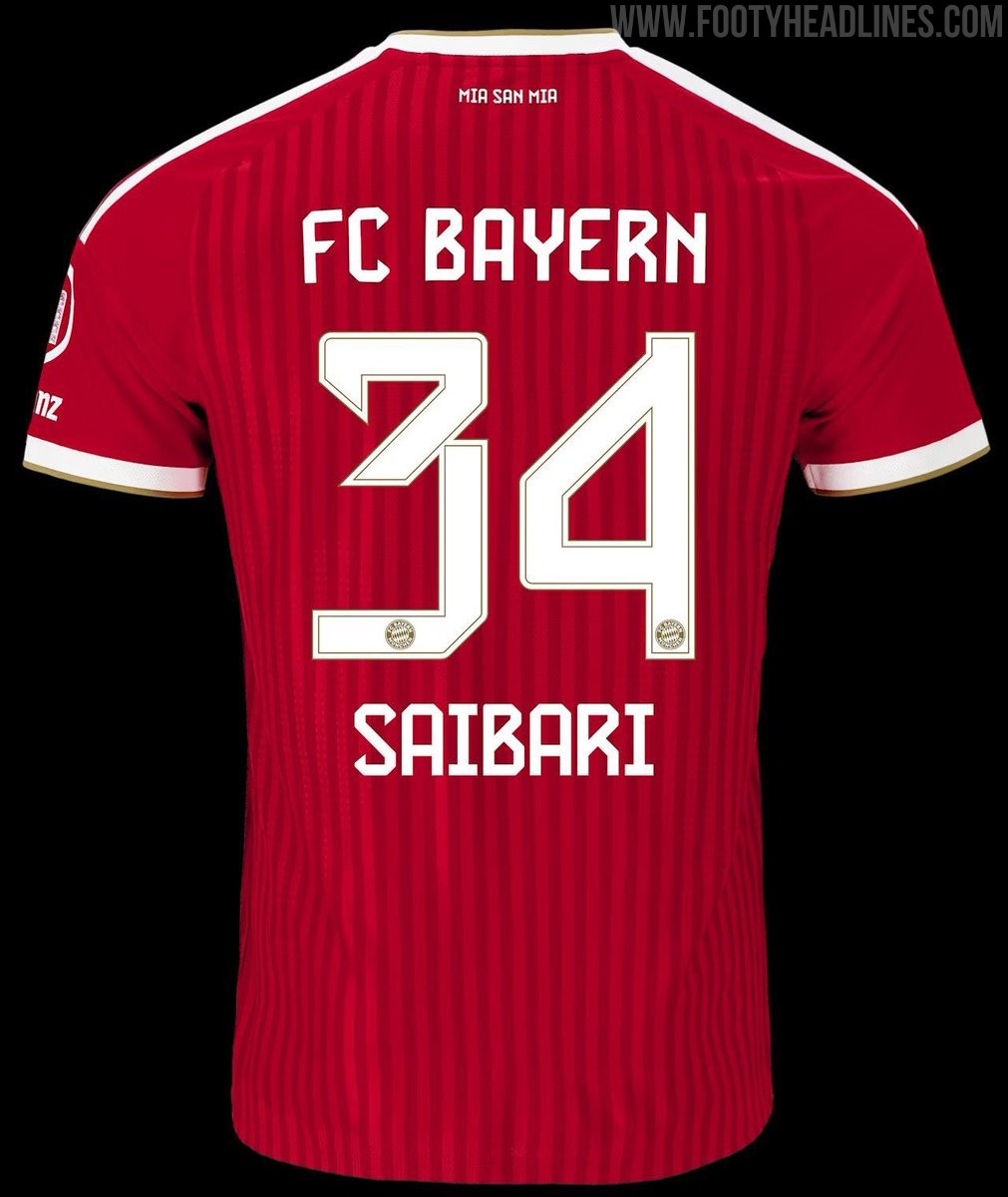
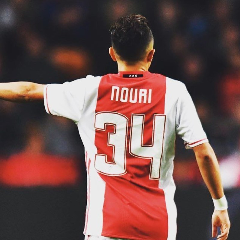
Ismael Saibari to Wear Number 34 at Bayern Munich in Tribute to Abdelhak Nouri
Newly signed FC Bayern Munich midfielder Ismael Saibari has chosen to wear the number 34 shirt for the 2026-27 season as a heartfelt tribute to his friend Abdelhak Nouri. Nouri, who wore the number 34 during his time at Ajax, suffered a cardiac arrhythmia on the pitch in 2017, leaving him with severe and permanent brain damage. Explaining his choice, Saibari stated that he wants to support Nouri, noting that while he survived, he has been unable to move without assistance since the tragic incident. By taking on Nouri's final squad number, Saibari joins a list of players across Europe who have honored the former Ajax talent.

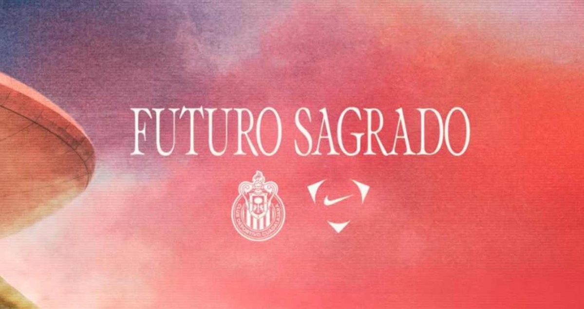

Official: Chivas Announces Nike Kit Deal
Mexican powerhouse Chivas has officially announced that Nike will become the club's new kit supplier, starting from the Apertura 2026 tournament (2026-27 season). The announcement was made under the slogan "Futuro Sagrado" and marks the end of Chivas' decade-long partnership with Puma. This deal also sees Nike return to sponsoring a major club in the Mexican Liga MX.
Fans will not have to wait long to see the first designs from the new partnership. The inaugural Nike Chivas 2026-27 uniforms are scheduled to be officially presented on July 18, 2026, just ahead of the team's match against Toluca. The announcement has already generated significant excitement among the fanbase, who are eager to see the iconic Swoosh featured alongside the famous red and white stripes.

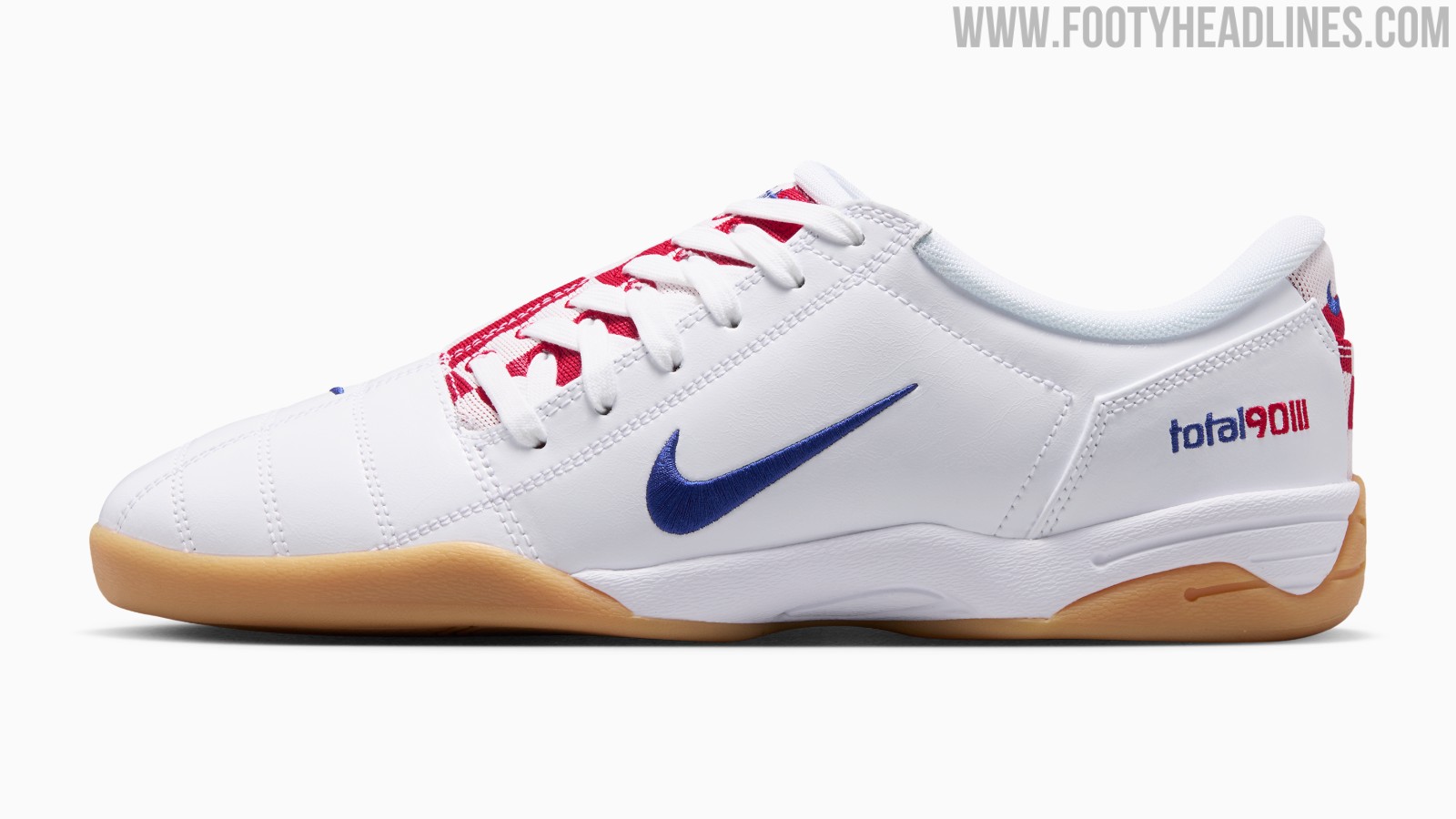
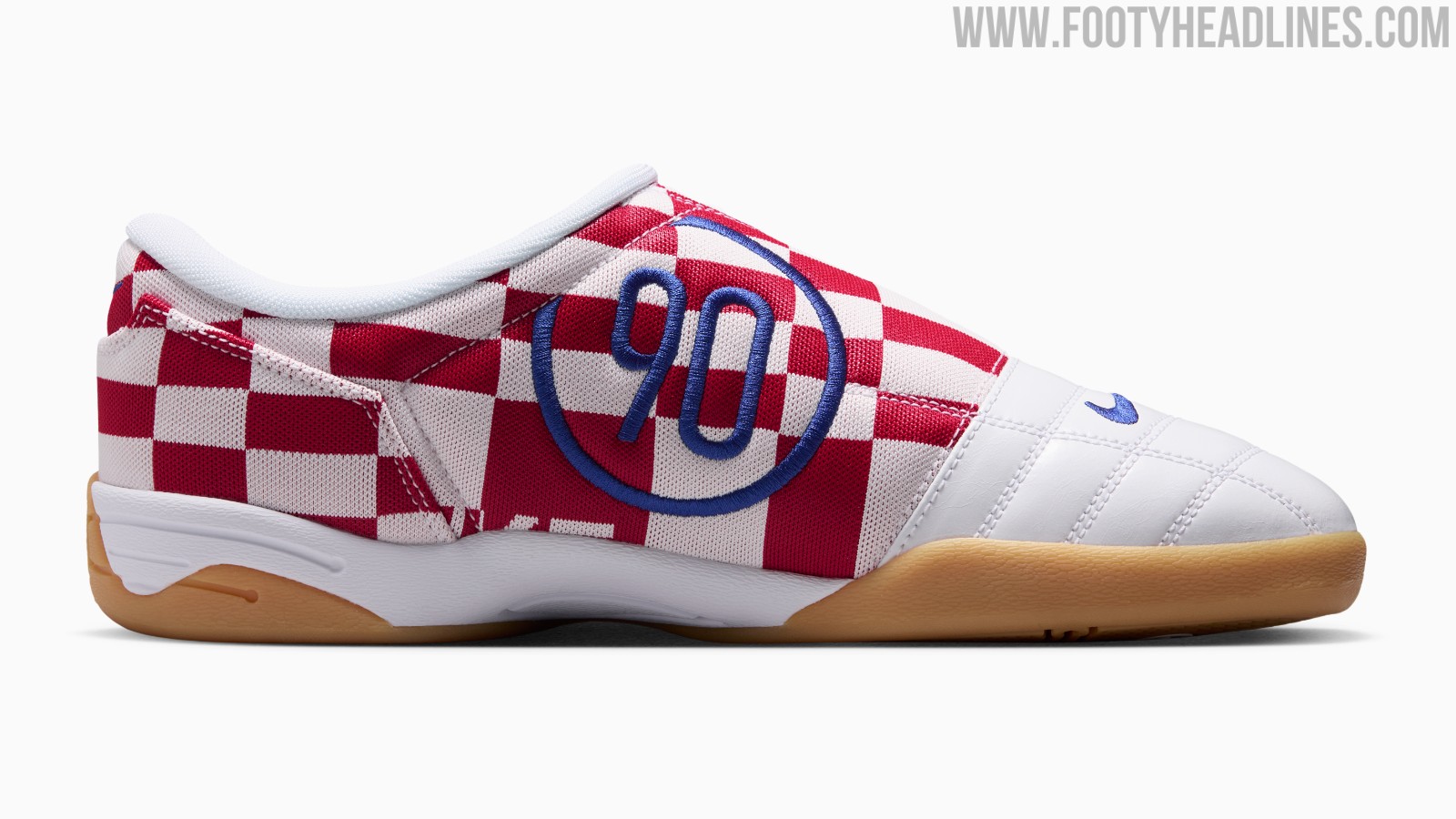
Nike Total 90 III 'Croatia' Shoes Released
Nike has released a special edition of the iconic Total 90 III silhouette, dedicated to the Croatian national team.
The Nike Total 90 Checkered 'Croatia' features a striking red and white checkered design across the upper, directly inspired by the famous home kits of the Croatian national team. The classic T90 branding remains prominent on the shoe, maintaining the distinctive look of the original football boot. This release transforms the classic silhouette into a lifestyle sneaker, capitalizing on the ongoing trend of retro football footwear.
The Nike Total 90 III 'Croatia' sneakers have been available on Nike.com and select retailers since late June 2026.
This launch is part of a broader revival of the Total 90 line throughout 2026, which has included various re-releases and high-profile collaborations.
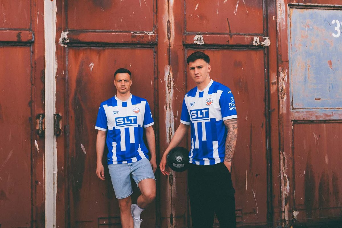
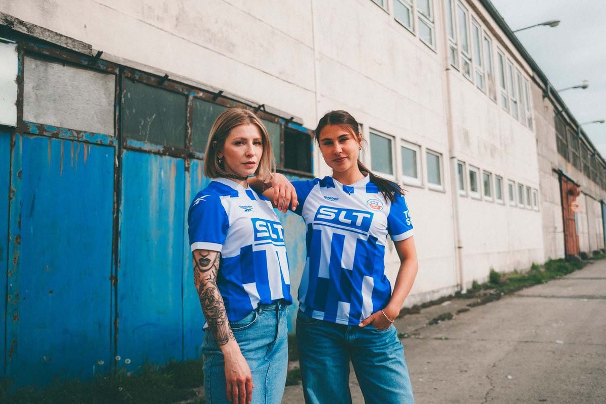
Reebok's First German Kit: Hansa Rostock 26-27 Home Kit Released
Following the announcement of their new partnership back in March, Hansa Rostock and Reebok have officially unveiled the club's new 2026-27 home kit. This release is particularly notable as it marks Reebok's first-ever stint as a kit supplier for a German football club, taking over from previous supplier Mizuno.
The Reebok Hansa Rostock 2026-27 home shirt draws heavy inspiration from the club's history, specifically the legendary "Travimpex" kit from the 1993-94 season. It features the traditional blue and white vertical stripes, interrupted by a distinct white chest block that houses the main sponsor logo. The classic Reebok vector logo is placed on the right chest, complementing the traditional club crest on the left.
Designed in collaboration with club members and fans, the Hansa Rostock 2026-27 home kit successfully combines a retro aesthetic with modern details. The new kit is available to purchase starting July 1, 2026.
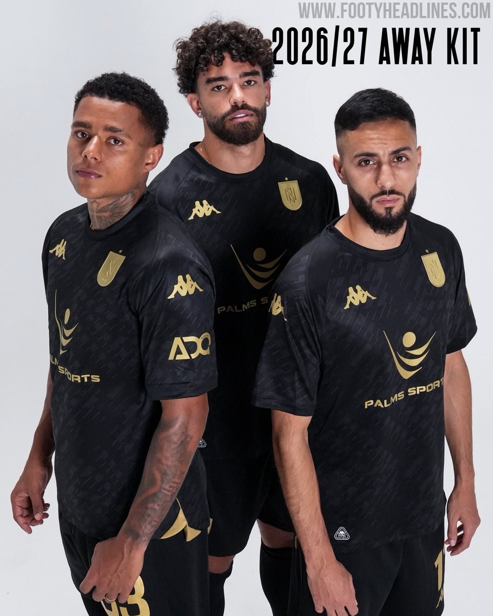
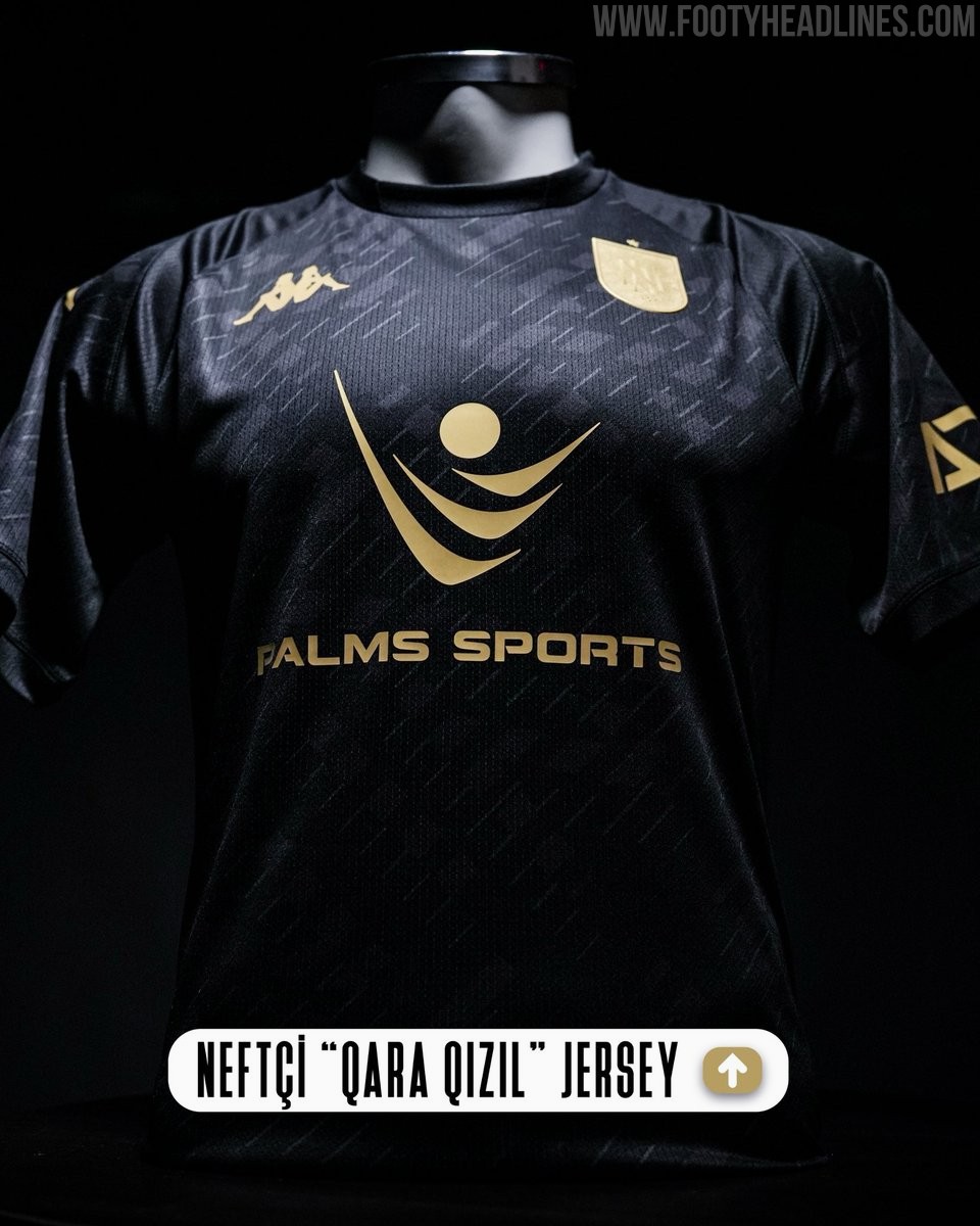
Neftci PFK 26-27 Away Kit Released
Following the release of their classic black and white striped home shirt in late June, Azerbaijan Premier League side Neftci PFK have now unveiled their new Kappa away kit for the 2026-27 season. The new Neftci PFK 2026-27 away jersey introduces an often seen black and gold look.
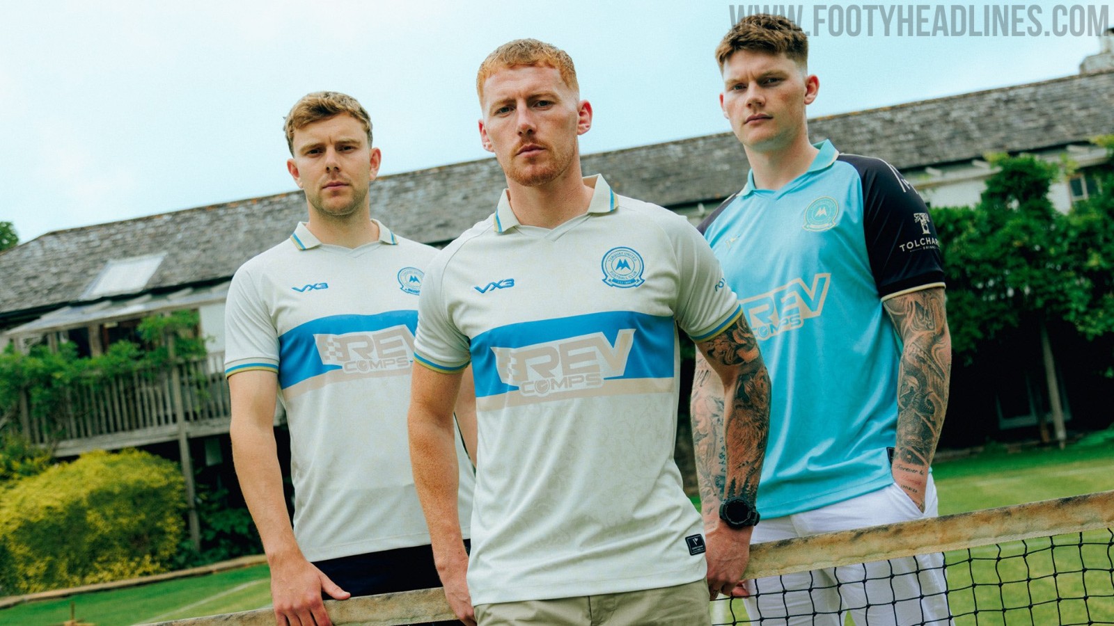
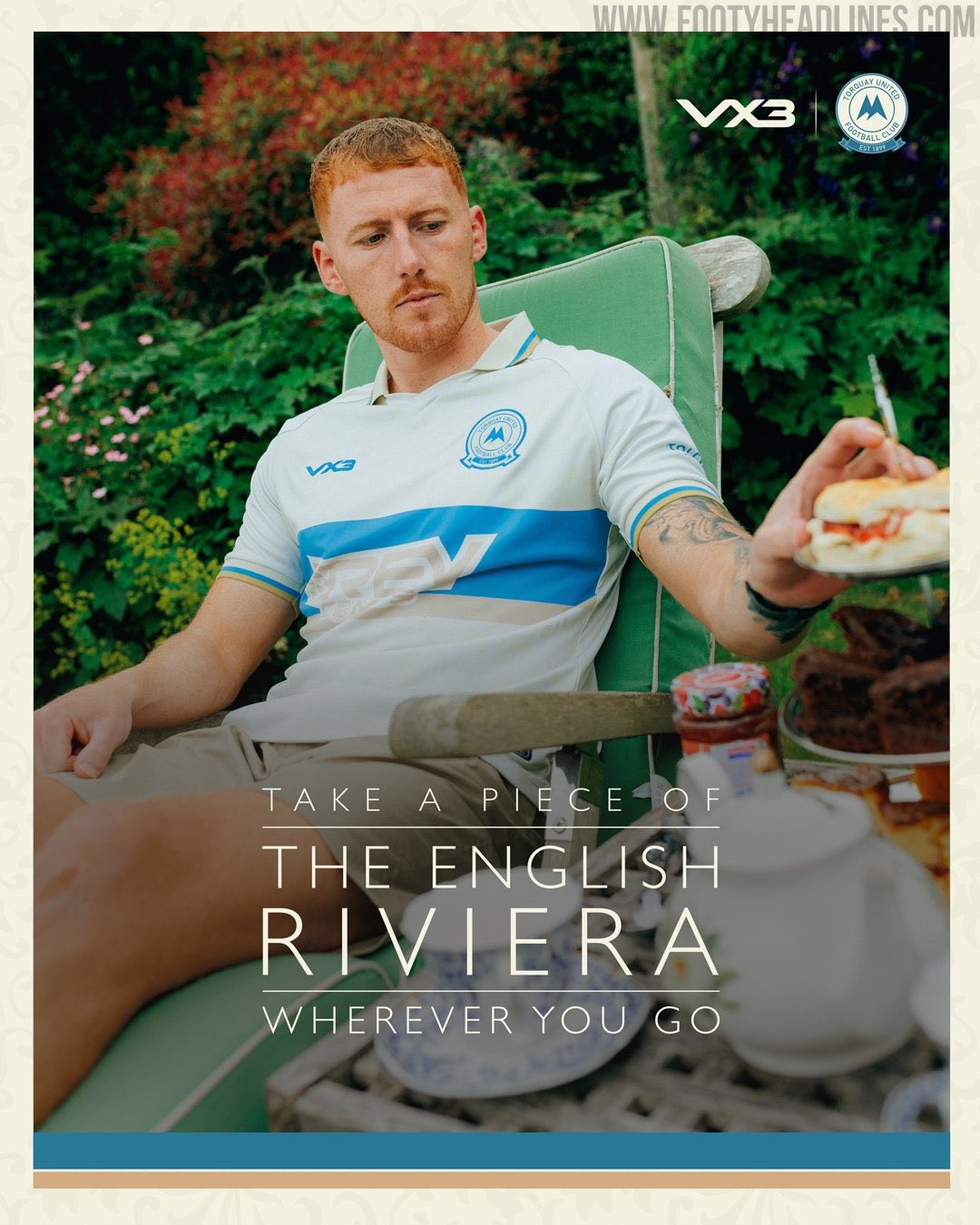
Torquay United 26-27 Third Kit Released
Torquay United have officially launched their new 2026-27 third kit, manufactured by VX3. The shirt features an "English Riviera" theme, paying homage to the club's coastal location and encouraging fans to take a piece of the local area wherever they go.
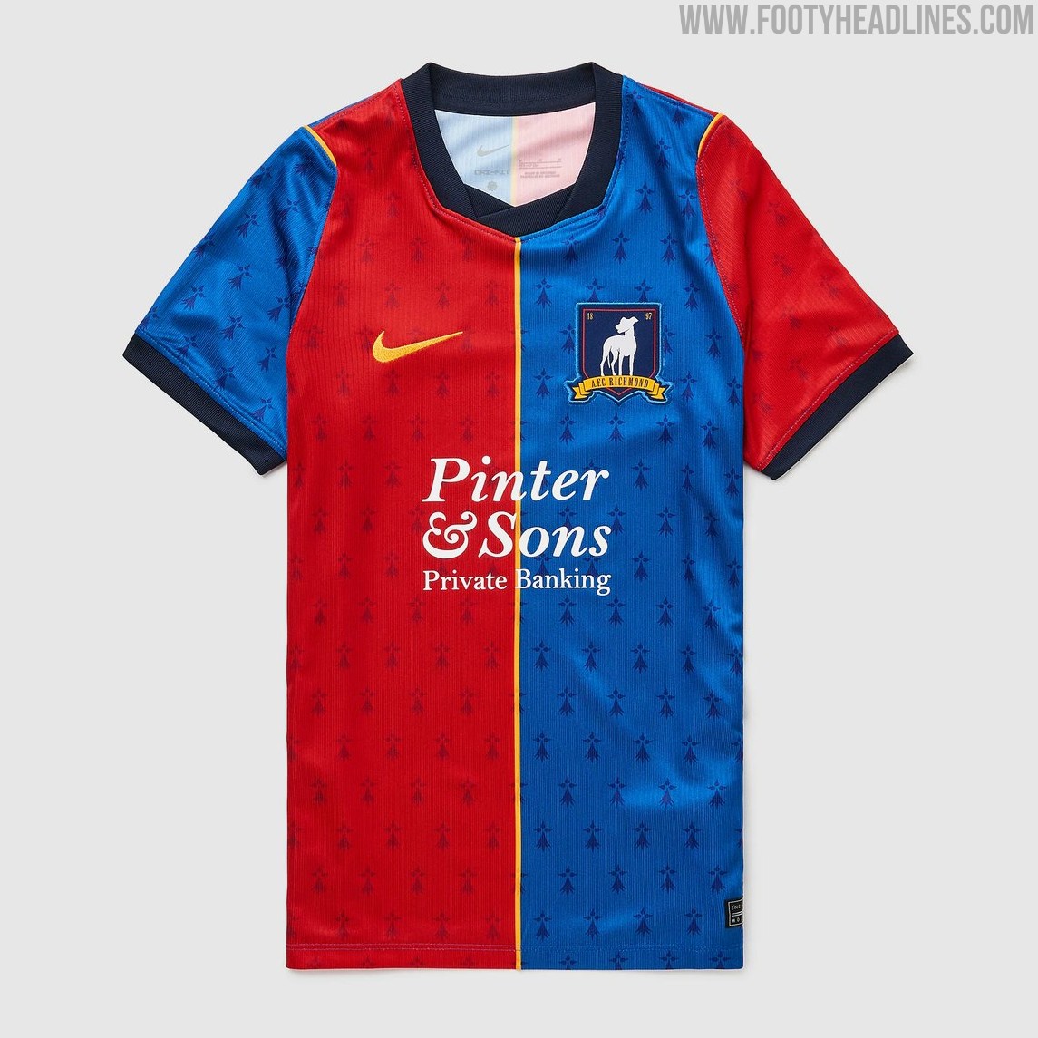
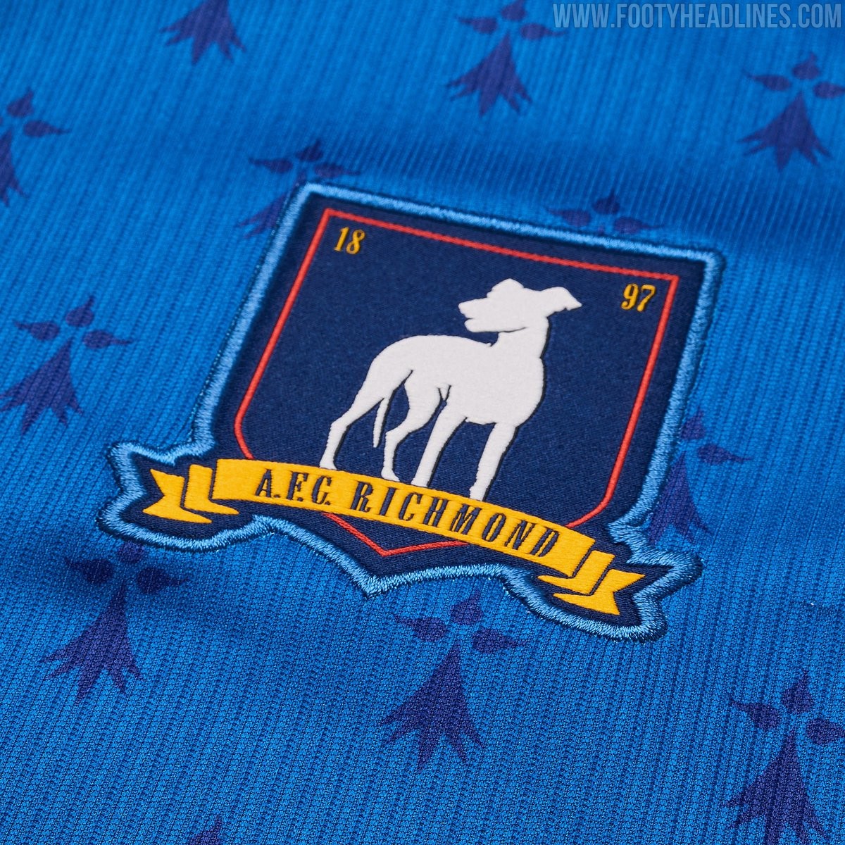
Nike AFC Richmond Ted Lasso Season 4 2026 Kit Released
AFC Richmond will get a new kit for the highly anticipated fourth season of Ted Lasso. The design imagines how the fictional club's gear could evolve while staying true to its established identity and its partnership with Nike.
The Richmond 2026 kits features AFC Richmond's traditional blue and red color scheme, applying it in a half-and-half design separated by a thin yellow line.
A subtle all-over logo pattern rounds off the look.