FC Zürich Update Club Crest

FC Zürich have updated their club crest, keeping the central circle but removing the lions from each side.


FC Zürich Update Crest
The updated crest features on the club's 22-23 shirts, occupying less space than previously after the removal of the lions. The colours have been darkened, with the light blue replaced with navy and the gold outer ring now more caramel than yellow. The gold ring also now sits tightly against the edge of the circle.

Zürich's new crest has all the hallmarks of a modern update: minimalised styling, a more bland font and a loss of character that was in this case provided by the lions. They have dropped the lions on occasion in the past, and last season on they wore a lion-less 125 year anniversary crest.

Zürich shirts with a simplified badge.
A better option from an aesthetic point of view, would have been to mix old and new, by modernising this version of the crest which incorporated the lion into the roundel, worn on their kits from 95-97 (seen below).

Crest updates which combine modernisation with reference to the club's history and identity seem to go down best with fans, rather than the ultra-minimalistic, corporate style logos that we have seen plenty of recently.
What do you think of Zürich's updated crest? Let us know in the comments.

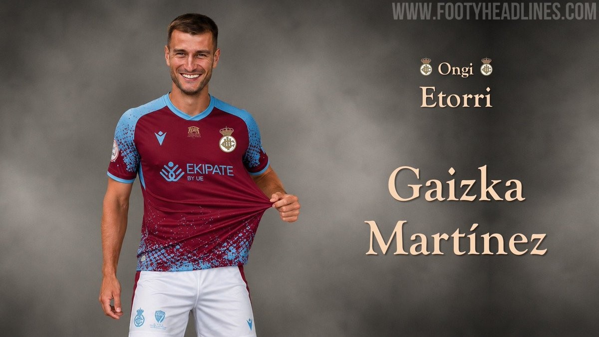
Real Unión 26-27 Home & Away Kits Released
Spanish Primera Federación side Real Unión (third division) have officially unveiled their new 2026-27 home and away kits, produced by Macron. The new shirts feature the logo of their new main sponsor, Ekipate, prominently on the front. Both the home and away jerseys also include a special logo celebrating the centenary of their home ground, Stadium Gal, launched under the club's campaign slogan Azal berria sentimendu berdina (new skin, same feeling).
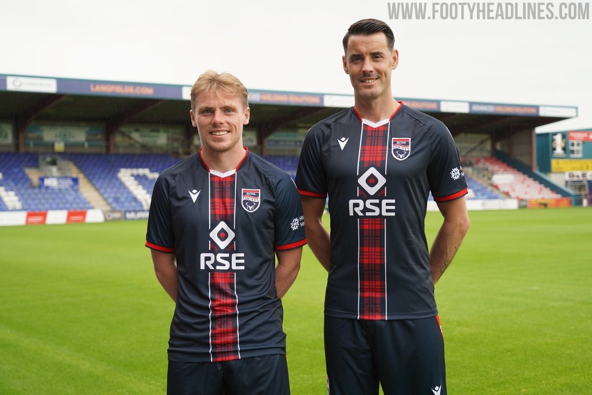
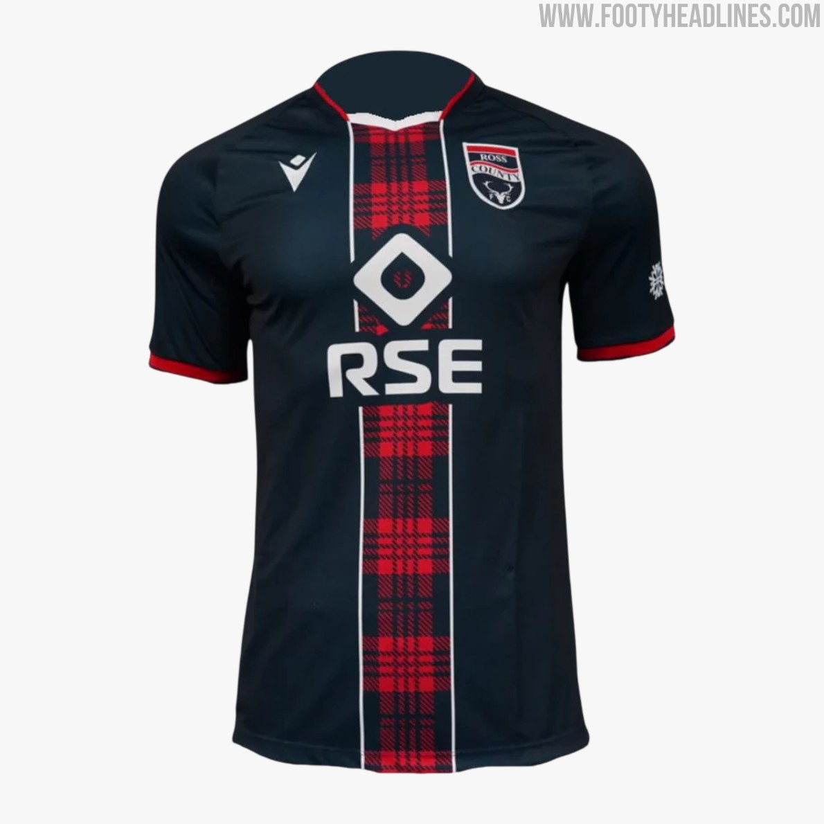
Ross County 26-27 Home Kit Released
Scottish club Ross County has officially revealed its new Macron home kit for the 2026-27 season. Celebrating the club's regional heritage, the new shirt features a prominent tartan design inspired by the Scottish Highlands. Emphasizing its local roots, the kit's launch video was filmed at the Hector Macdonald Monument in Dingwall with views over the Moray Firth. The Ross County 2026-27 home strip is available to purchase both in the club shop and online.
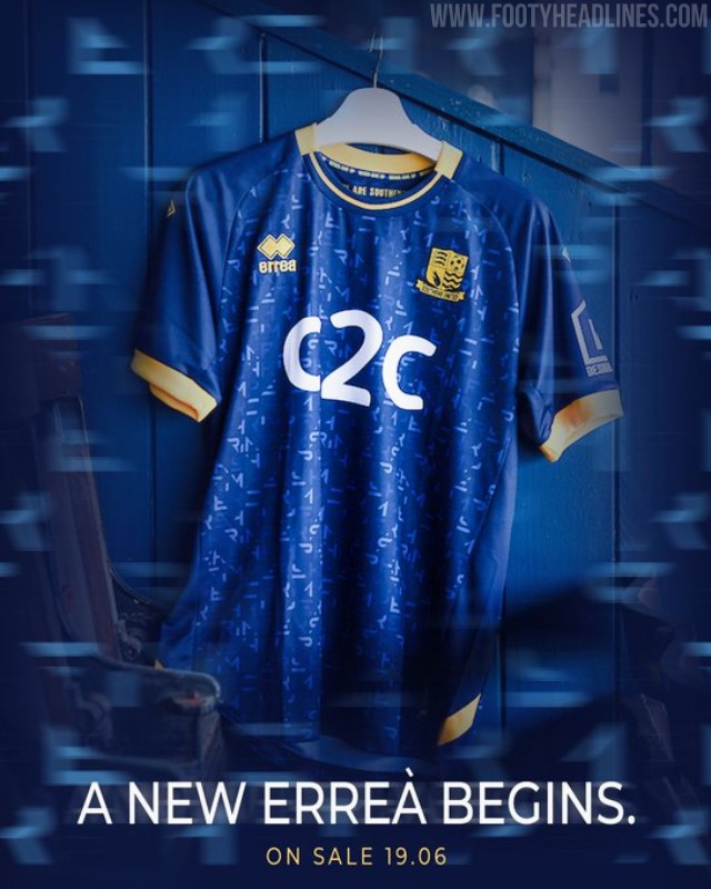
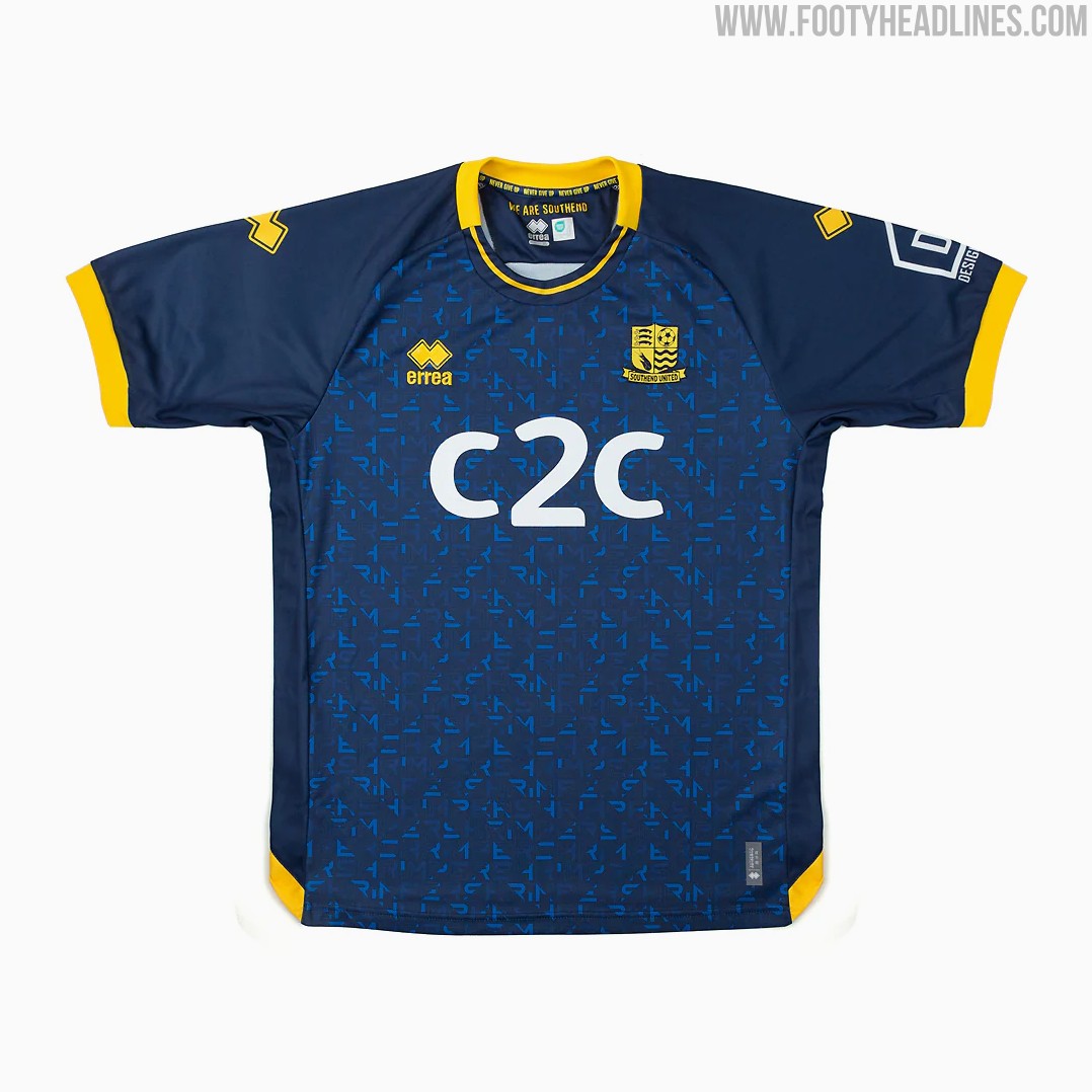
Erreá Southend United 26-27 Home Kit Released - No More Macron
The new Southend United 2026-27 home kit was officially released yesterday and went on sale this morning. Produced by Erreà, the National League club's new home shirt features a bespoke geometric pattern subtly inspired by the word 'Shrimp', paying tribute to Southend United's iconic symbol.
The dark blue base is complemented by white logos and the bespoke pattern, creating a smart and unique look for the upcoming season.

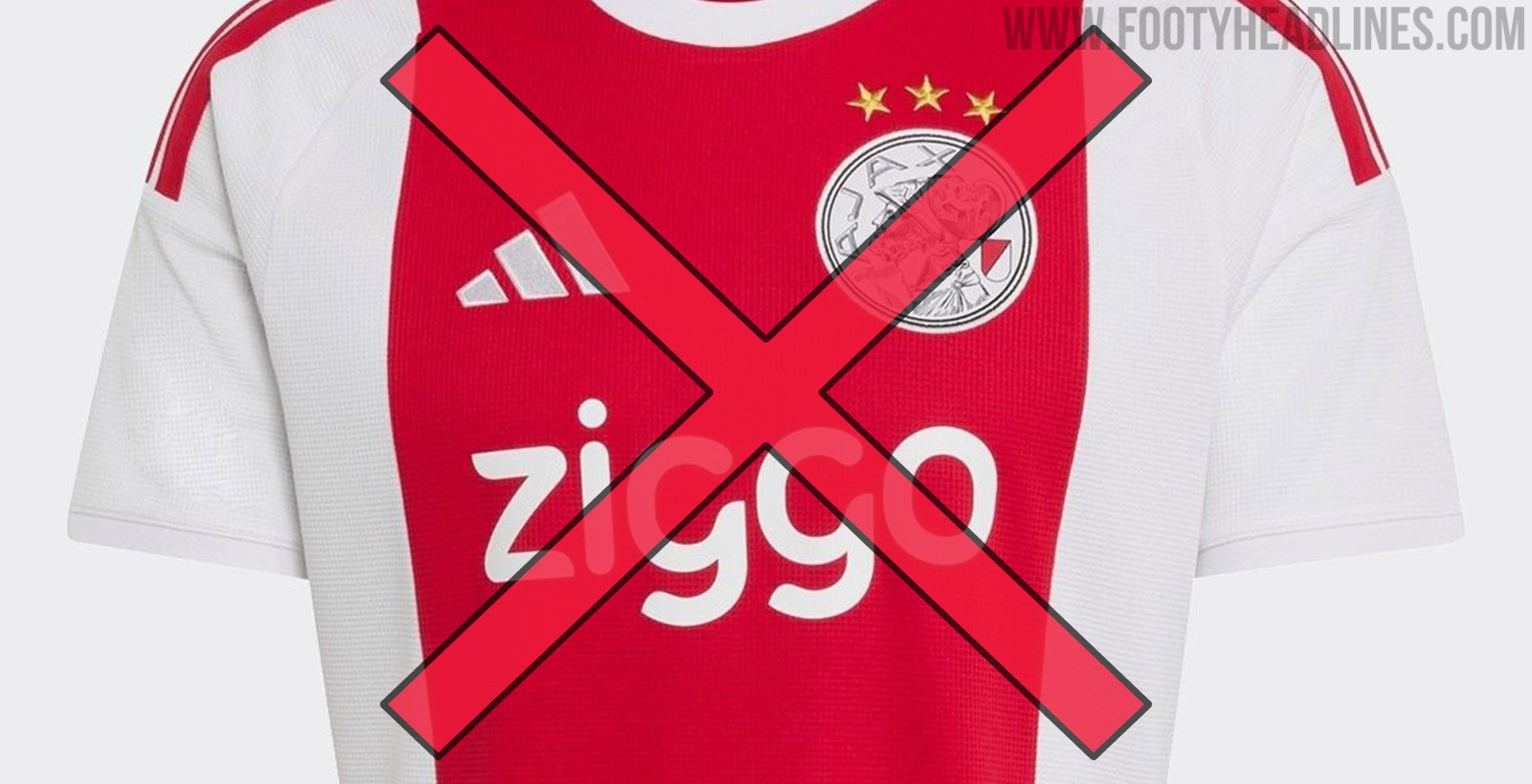
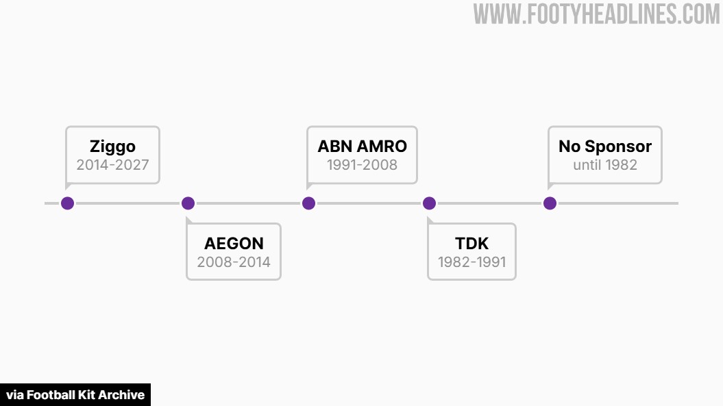
Ajax to Lose Ziggo as Main Shirt Sponsor
Dutch telecommunications company Ziggo has announced it will step down as the main shirt sponsor of Ajax following the conclusion of the 2026-27 season. This decision will bring an end to a long-standing partnership that first began in January 2015, marking a 12.5-year run on the front of the iconic Amsterdam kits.
VodafoneZiggo stated that the decision not to extend the current agreement stems from a strategic shift to focus on new brand initiatives and partnerships outside of football. The current deal, which is reportedly valued at around €10 million to €12 million per year, leaves a significant commercial spot to fill on the Ajax jersey.
Ajax is now actively searching for a replacement main sponsor to take over the front-of-shirt rights starting from the 2027-28 season. Fans will see the familiar Ziggo logo on the club's shirts for one final campaign before a new era begins for the Dutch giants.
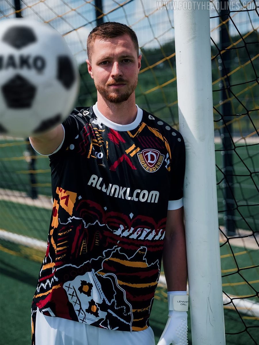
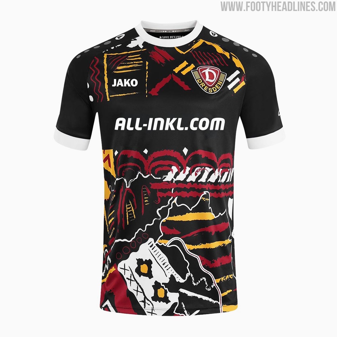
Dynamo Dresden 26-27 Goalkeeper Kit Released
The new SG Dynamo Dresden goalkeeper kit for the 2026-27 season was officially unveiled today.
Manufactured by Jako, the shirt introduces a highly unique look for the German club's shot-stoppers. The Jako Dynamo Dresden 2026-27 goalkeeper shirt features a striking design in the club's traditional black, yellow, white, and maroon colors.
It serves as a direct homage to the Aufstiegsfischerhut, a promotion fisherman's hat, and incorporates various 90s cult design elements into a collage-like pattern across the front. The unconventional aesthetic of the kit has drawn mixed reactions from the fanbase. While some supporters appreciate the bold 90s-inspired uniqueness, others feel the busy pattern is somewhat overwhelming.
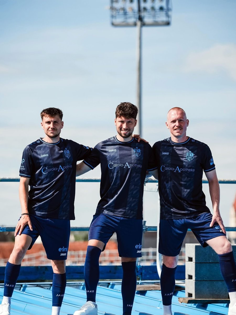
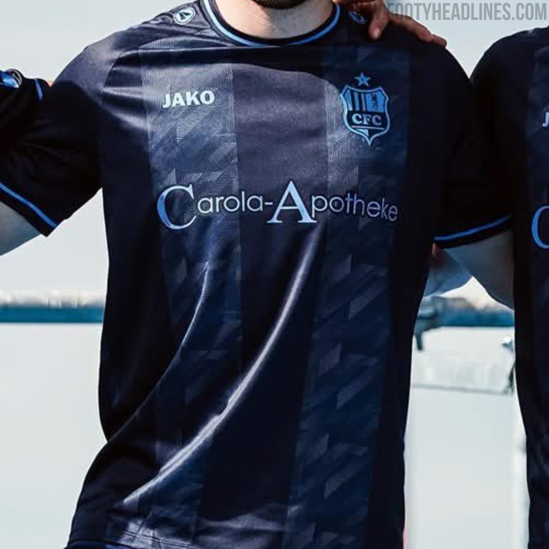
Chemnitzer FC 26-27 Away Kit Released
German Regionalliga Nordost club Chemnitzer FC has officially revealed their new 2026-27 away kit. Manufactured by Jako, the new Chemnitz shirt will be worn by the team during the upcoming season as they compete in Germany's fourth tier.
The Jako Chemnitzer FC 26-27 away shirt is built upon a dark navy blue base, which is elevated by a subtle, repeating textured stripe pattern woven directly into the front of the fabric.
To provide a striking and highly customized contrast against the dark background, all of the primary applications are executed in a vibrant sky blue. This includes a premium 3D silicone club crest, the Jako manufacturer branding, and the logos of all current sponsors, who agreed to alter their corporate colors to match the kit's cohesive aesthetic.
Subtle contrasting sky blue stripes on the collar and sleeve cuffs complete the clean design. The jersey also features the club's founding date, "15. Januar 1966," printed on the back of the neck as a nod to their history.
The new Chemnitzer FC 26-27 away kit is available to purchase soon for 74,95 Euro.
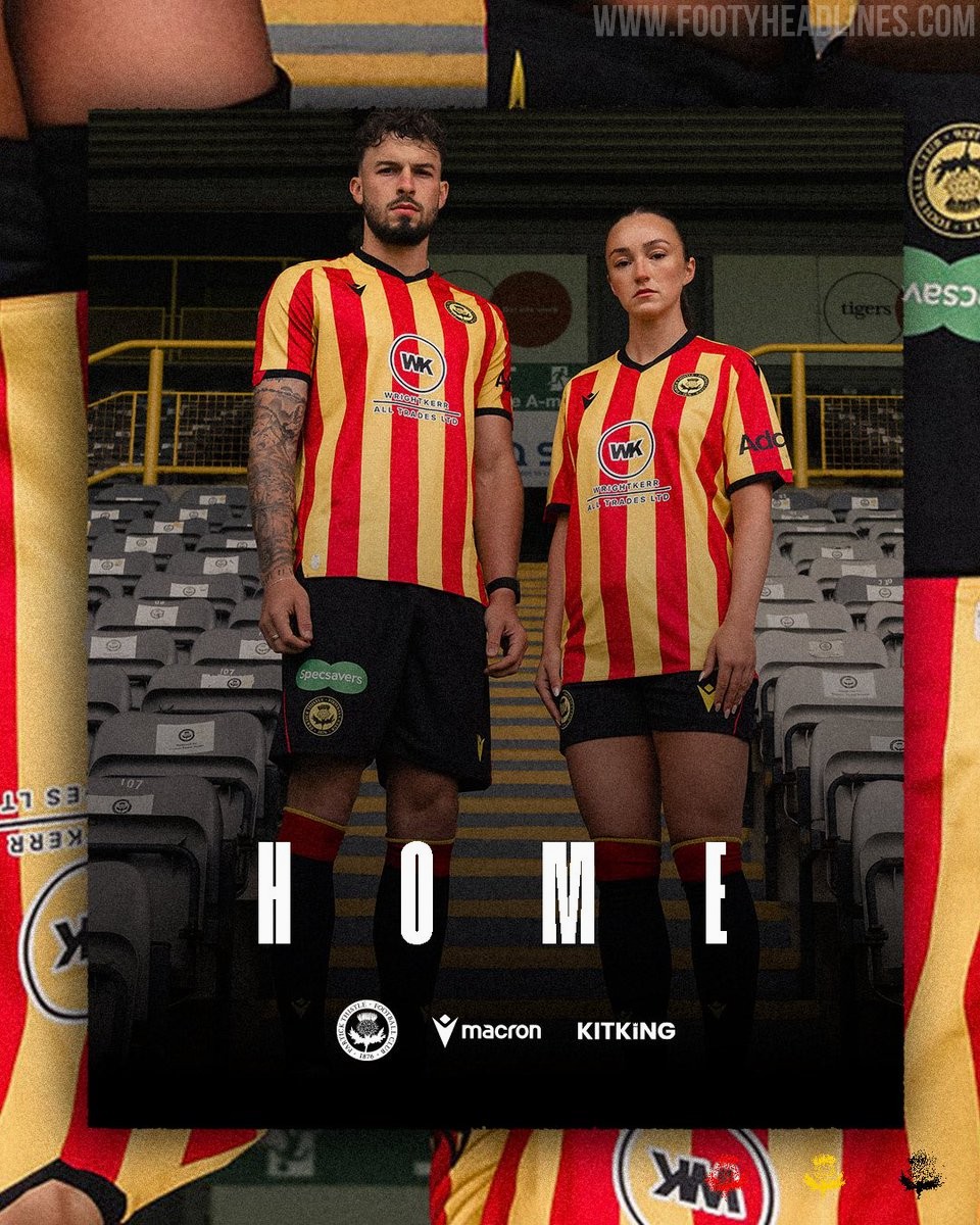
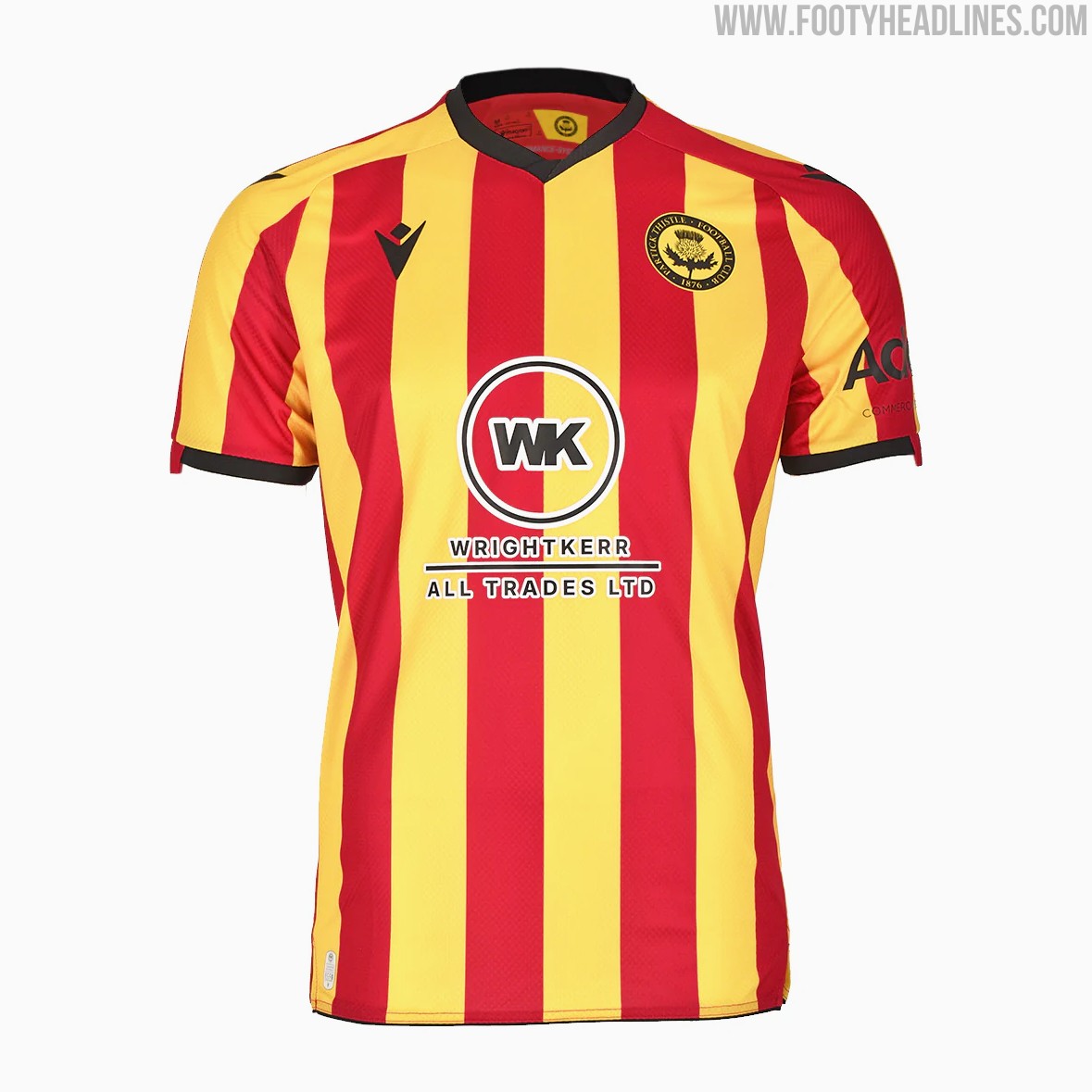
Partick Thistle 26-27 Home Kit Released
Scottish Championship club (second division) Partick Thistle have officially launched their new home kit for the 2026-27 season. Produced by Macron in partnership with KitKing, the new strip will be worn during the club's upcoming William Hill Championship campaign.
The Macron Partick Thistle 2026-27 home shirt features the club's traditional red and yellow vertical stripes. Launched under the theme 'Red and yellow, forever and always', the design offers a classic and straightforward look.
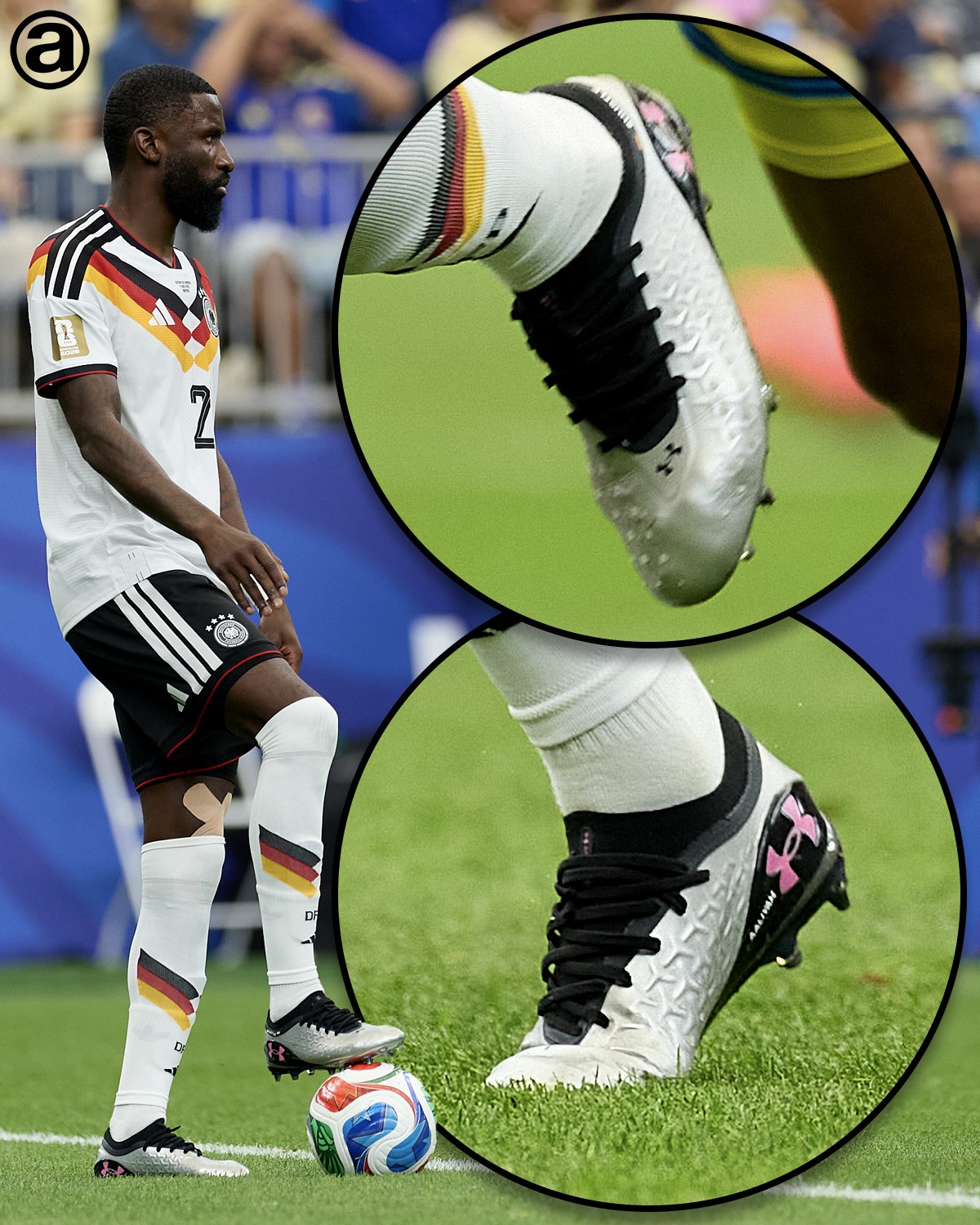
Rüdiger Wears Unreleased Next-Gen Under Armour Magnetico 6 Boots at 2026 World Cup
During Germany's opening fixture, towering defender Antonio Rüdiger has been spotted wearing the unreleased sixth generation of the brand's flagship control boot: the Under Armour Magnetico 6. Story via abcdefutbol.
The Under Armour Magnetico 6 soccer cleats feature a striking metallic silver base. To provide a sharp contrast, the boot utilizes a solid black heel counter, collar, and lacing system. The standout design element is the iconic Under Armour logo on the heel, which is filled with a vibrant, bright pink.
The Magnetico 6 appears to retain the silo's focus on a flexible, form-fitting upper designed for close control and comfort.
What are your thoughts on this silver, black, and pink colorway for the upcoming Under Armour Magnetico 6 football boots? Let us know in the comments below.
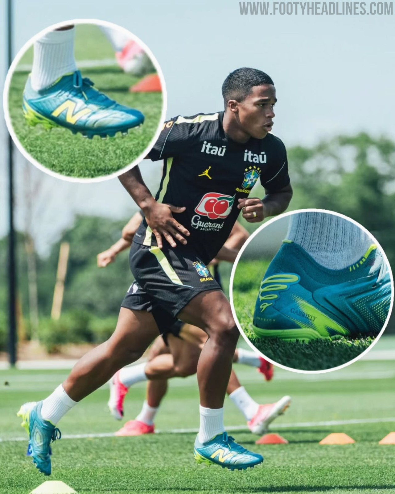
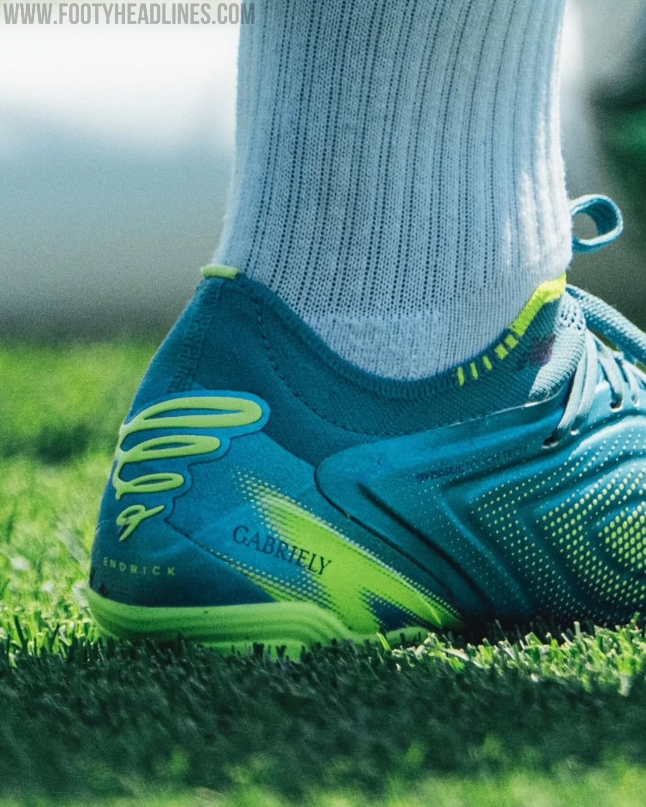
Endrick Wears Unreleased New Balance Tekela Boots in 2026 World Cup Training
Brazil youngster Endrick has worn an unreleased teal and lime green colorway of the New Balance Tekela V5 football boots. On the heel is the Brazilian's signature logo.