
Anything But a Revolution: Swedish Club AIK Update Logo
 Nov 19, 2022, by Chris
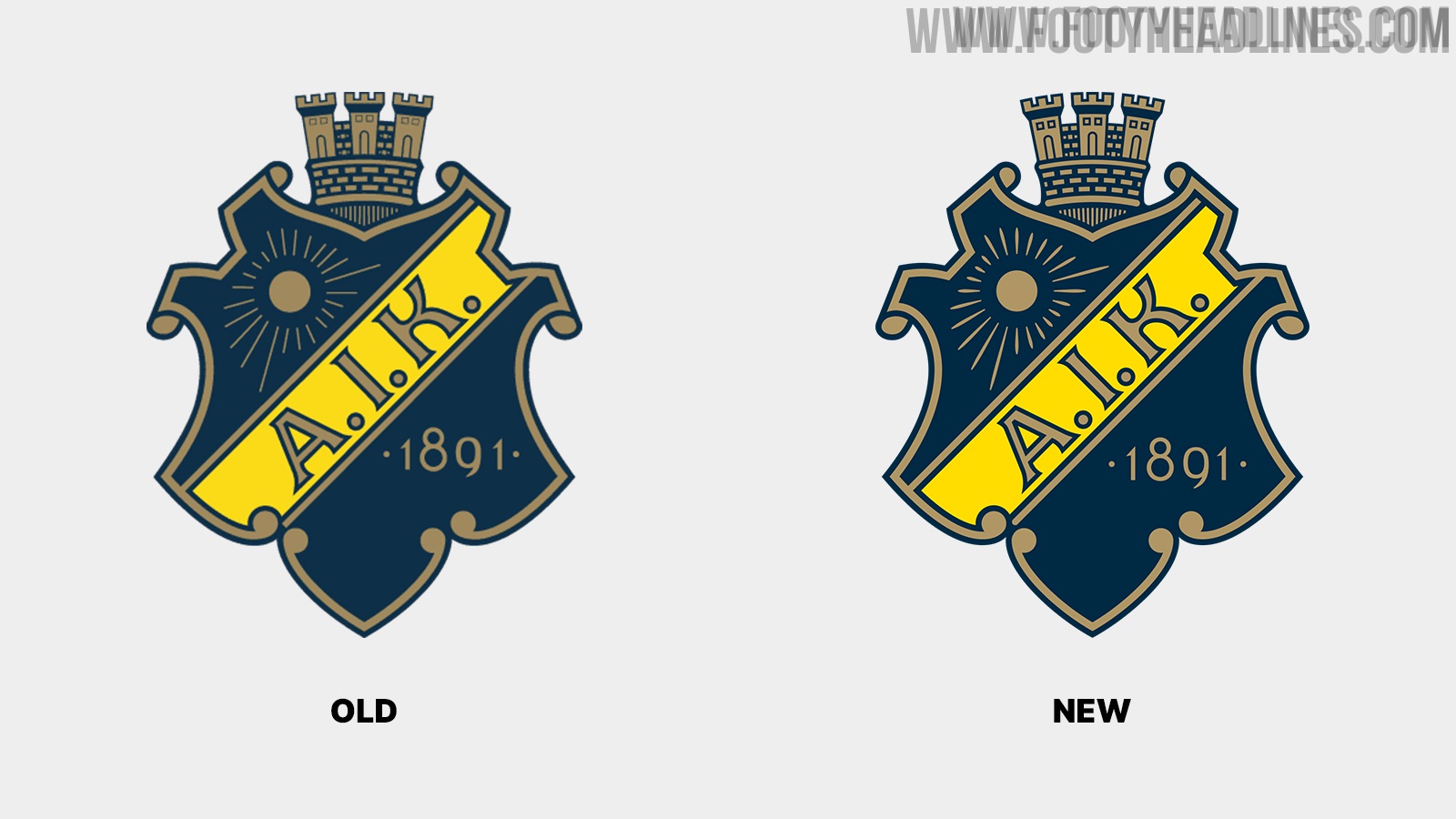
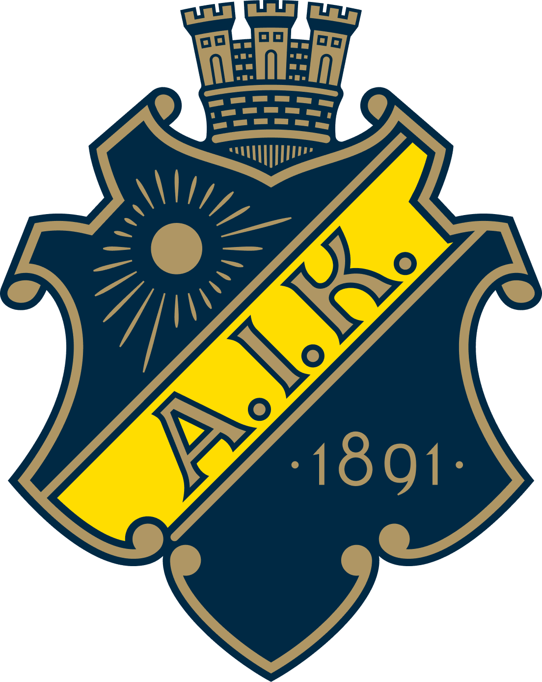
Swedish club AIK Fotboll have updated their club crest. The new AIK logo is a small update of the previous crest that has been more or less the same since 1975. Thanks to @WorldClubCrests for making us aware.

AIK's minimal update stands in stark contrast to Juventus, Gamba Osaka, and many other teams
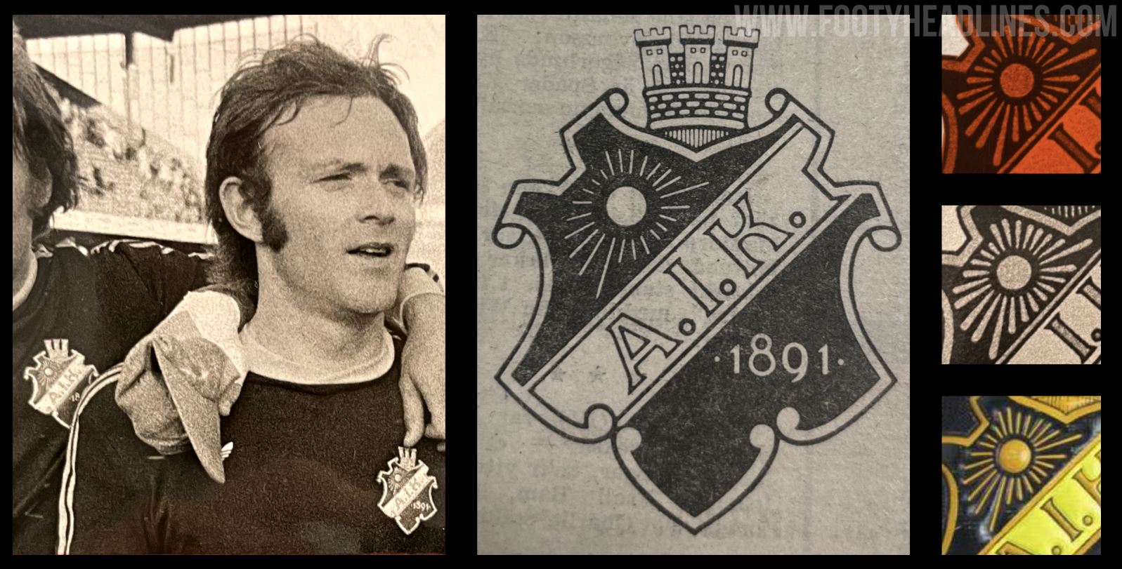
AIK subtle crest restoration stands in stark contrast to the logo changes of various other teams in recent years, including Juventus, Gamba Osaka, and Inter Milan.
AIK Fotboll 2022 Logo
The new AIK logo is based on the original version from 1975. AIK decided to update their logo because the "previous original had details that were too fragile for print, difficult to see on a small screen and also some illogical execution of line widths and spacing".
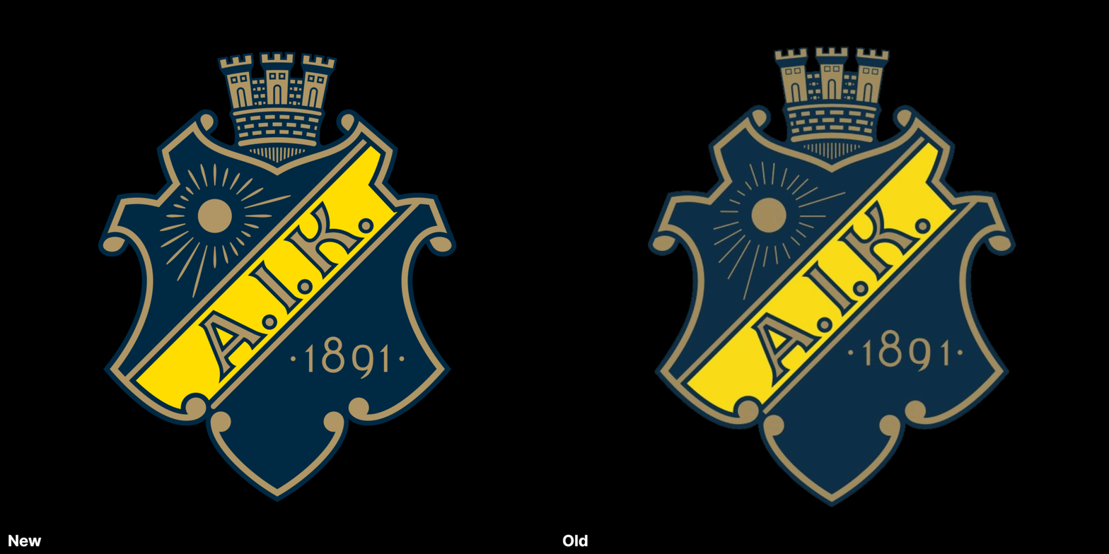
AIK's goal with the club redesign was to have a new crest that fits the modern requirements while "being as close to the original from 1975".

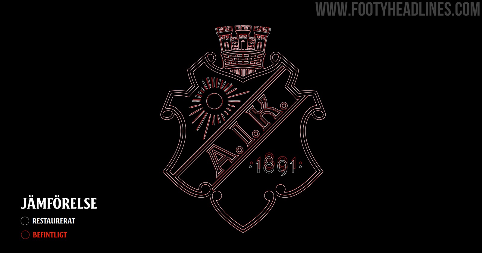
Indeed, the new AIK logo looks almost identical to the previous crest if seen alone. The club also highlighted which elements have been updated, and why the club did so.
New AIK Logo - Changes

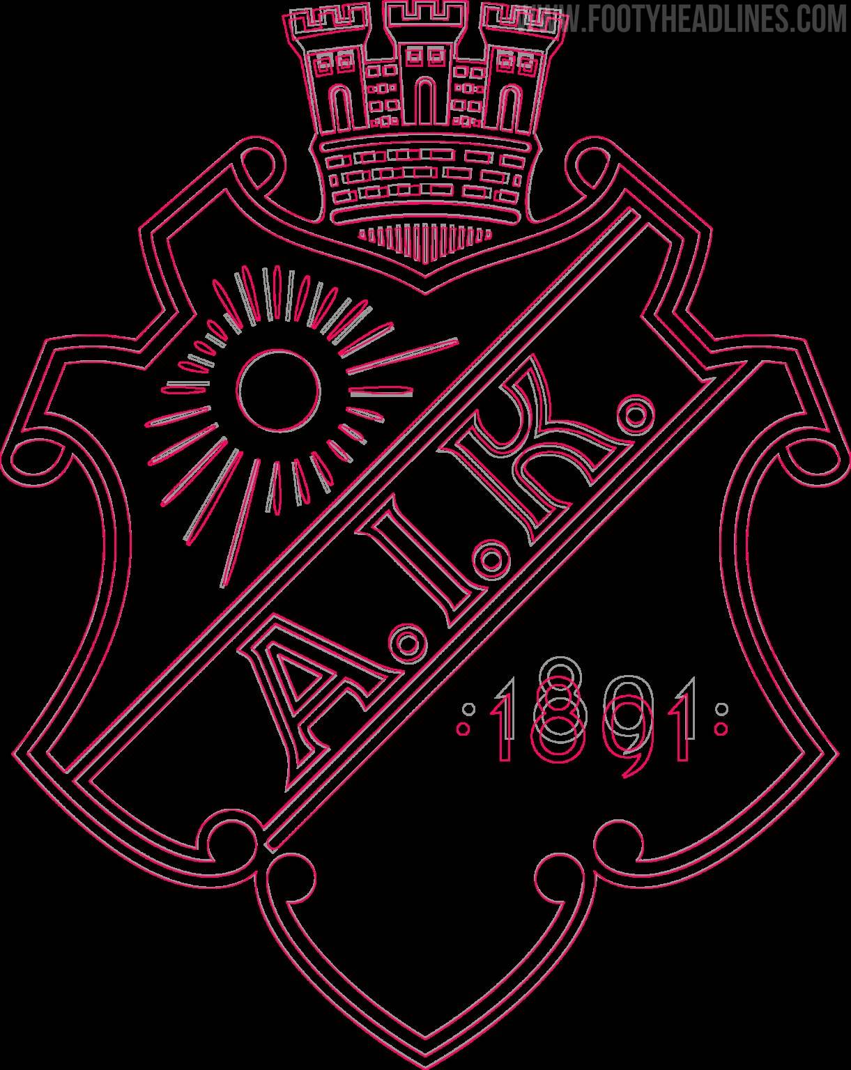
- Tower elements should have the same line width, roundings and spacing. Start from a circular grid that gives all the different parts the same perspective
- The sun's rays should become clearer, emanate from the center of the sun and be evenly distributed
- The end of the beam at the bottom left should be rounded
- The typography of the year is changed to AIK Numbers (they are the same numbers but fine-tuned by the font experts at Familjen)
- The blue and yellow colors become clearer
- Letters and spaces in the word picture AIK are fine-tuned
- The background is adjusted so that it is perceived as wide all around
- The scrollwork is adjusted so that it is not perceived as angular, but more teardrop shaped
You can find all about the restoration of the AIK logo on their website.


Do you like that AIK decided to only update their iconic crests instead of launching an all-new logo? Comment below.
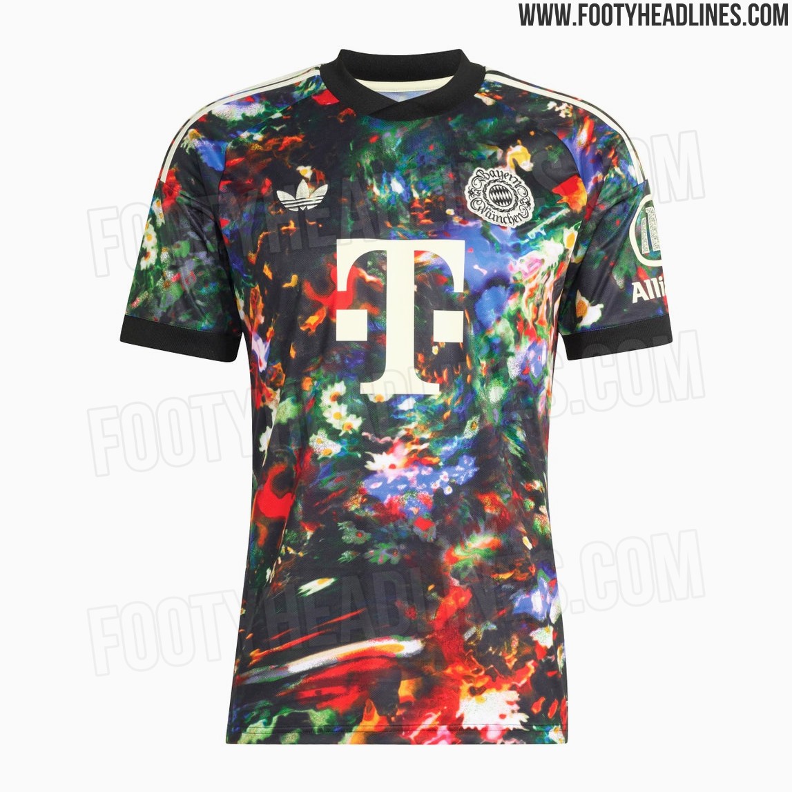
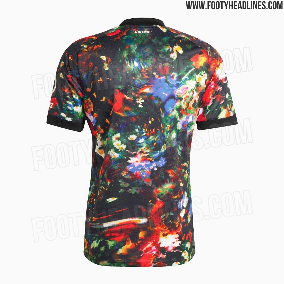
Bayern München 26-27 Oktoberfest Kit Leaked - Full Look - 9 New Official Pictures
We can reveal the full Bayern Munich 2026-2027 Oktoberfest kit, including the shirt, shorts, and socks. The Three Stripes on the shorts use the pattern of the kit.
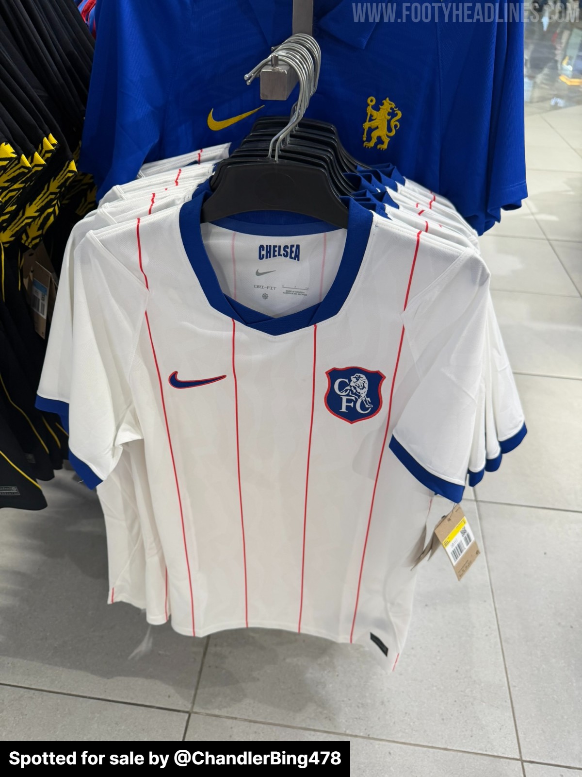
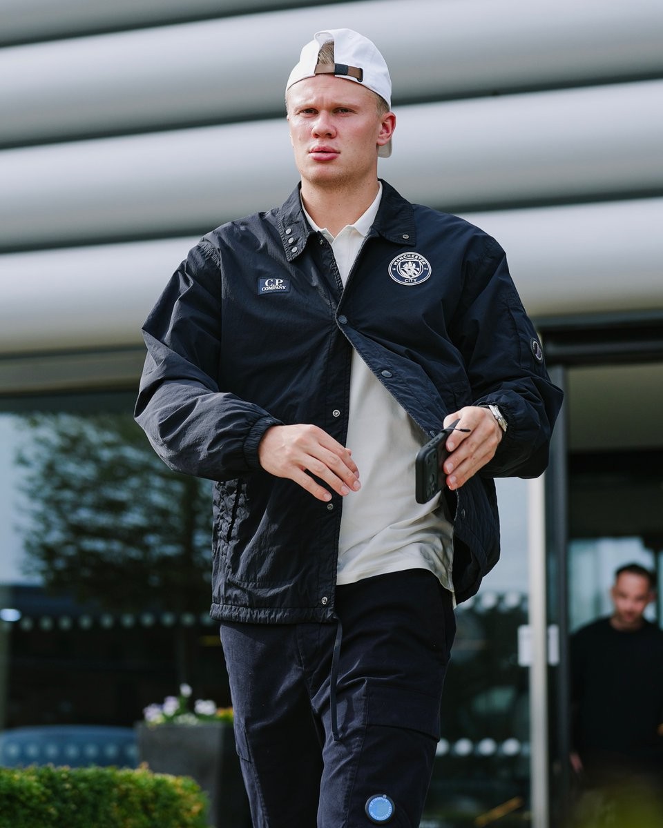

Manchester City Wear C.P. Company for European Travel
Manchester City have worn exclusive C.P. Company travelwear for their first UEFA Champions League away trip of the 2026-27 season, travelling to face Porto.
C.P. Company has been City's Official Fashionwear Partner since 2024, providing customised off-pitch clothing for European trips and high-profile arrivals. The new “Blue Moon Lens” collection blends C.P. Company's signature black with City's traditional light blue across pieces including the Coach Jacket, Puffer Jacket, polo shirts,...
The collaboration will soon extend from travelwear to the pitch, with Puma and C.P. Company set to release a special Manchester City 2026-27 fourth kit, bringing the Italian label's distinctive design identity to a City shirt.
What do you think of Manchester City's latest C.P. Company travelwear? Let us know your thoughts in the comments below.
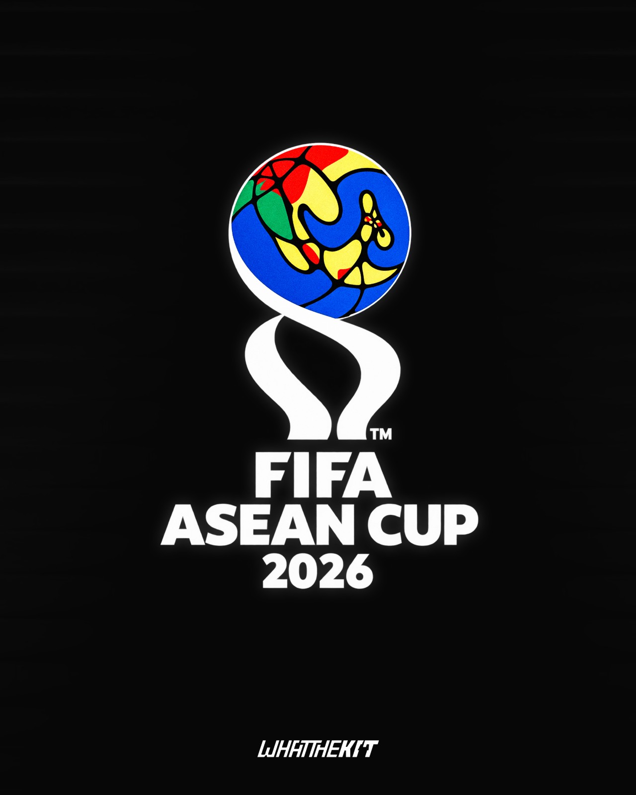
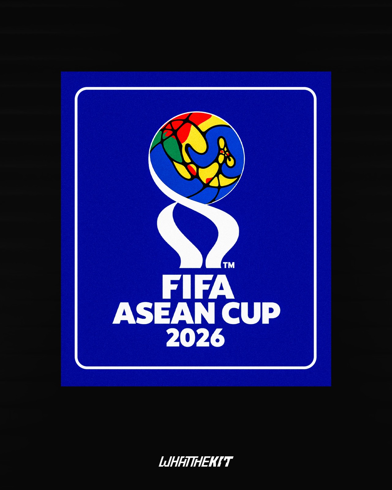
All-New FIFA ASEAN Cup Logo Revealed
The logo for the first FIFA-organized Southeast Asian tournament has been revealed. The design incorporates a colorful, stylized globe depicting the Southeast Asian region.
Our partner, What The Kit, has created a prediction concept mockup of the 2026 FIFA ASEAN Cup patch, featuring a prominent blue background.
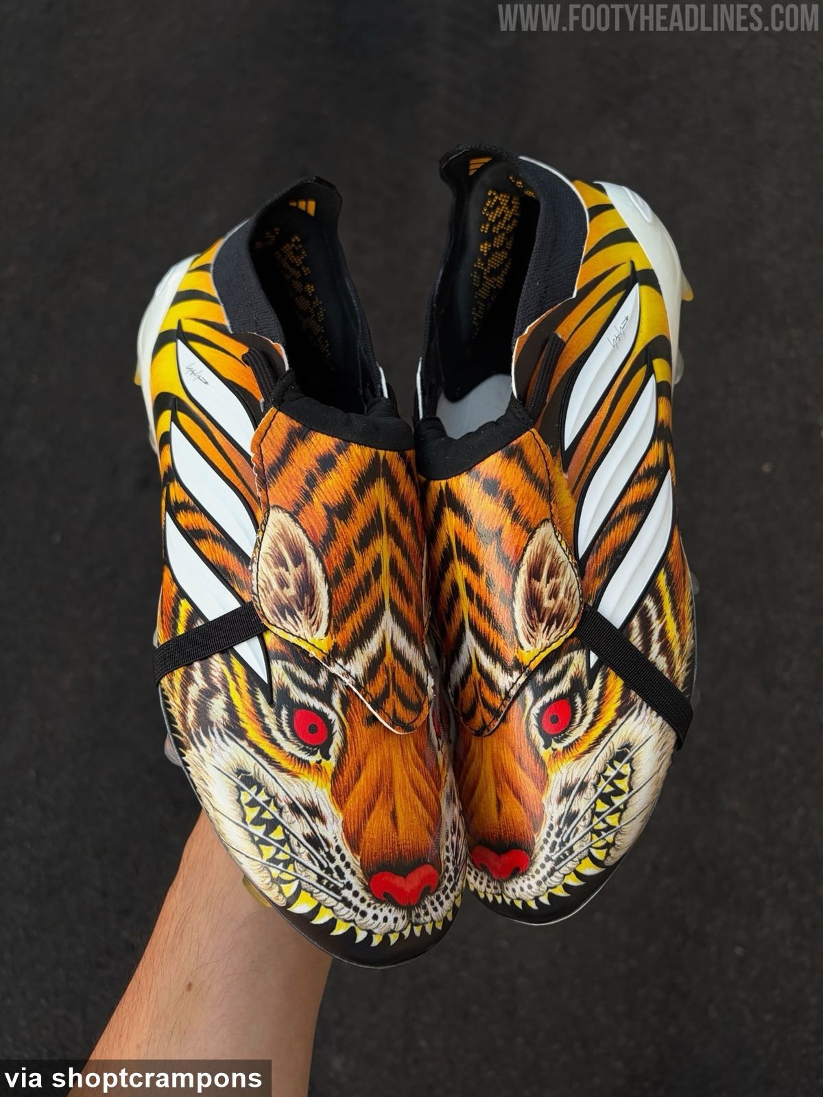
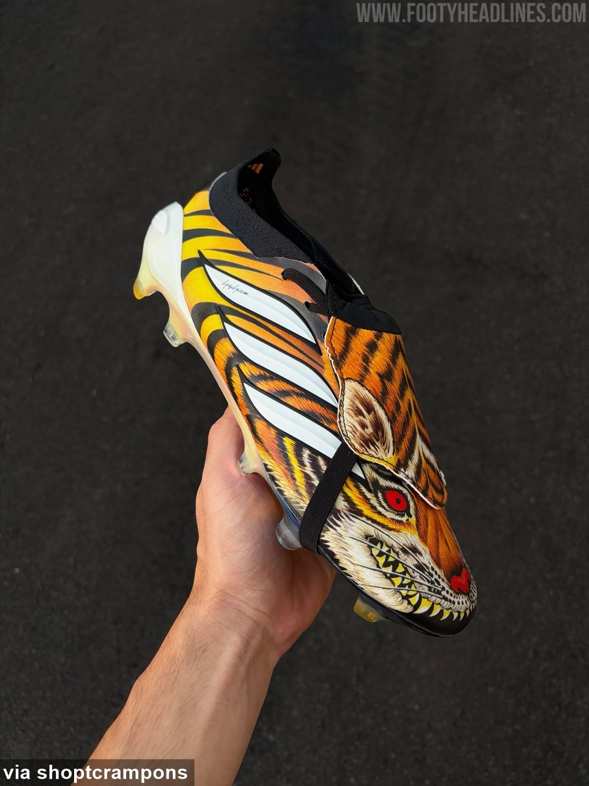
Adidas Predator Y-3 'Tiger' 2026 Boots Leaked - 6 New Images
Footy Headlines can now leak 6 new images of the special Adidas Predator Y-3 'Tiger' 2026 boots. Big thanks to shoptcrampons.
The boots feature an incredibly aggressive and bespoke aesthetic, dominated by a highly detailed, hand-painted-style graphic of a snarling tiger with bared teeth and glowing red eyes across the upper.
Cittadella 26-27 Third Kit Released
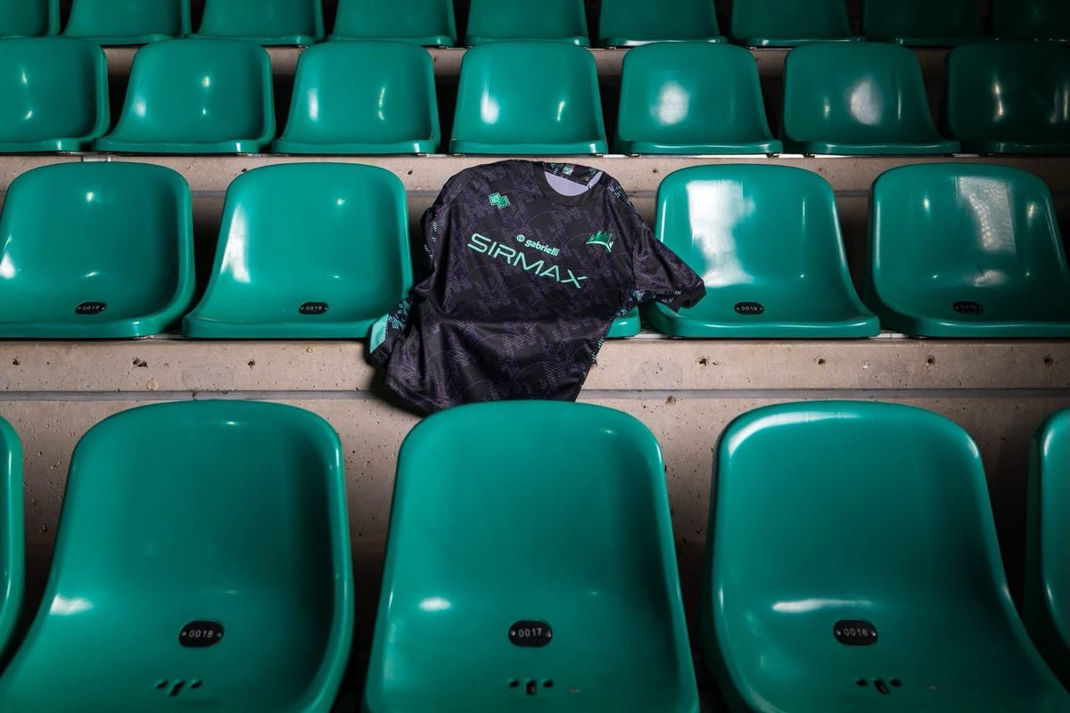
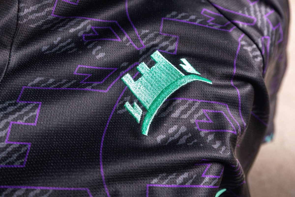
Italian side AS Cittadella and technical sponsor Erreà have officially unveiled the club's new third kit for the 2026-27 campaign. Conceived by Erreà Creative Lab, the strip draws its inspiration directly from the iconic medieval defensive walls that surround the historic city.
The Erreà AS Cittadella 26-27 third shirt combines a predominantly black base with an irregular, lived-in texture that mimics the surface of ancient stone. A striking mix of purple, aqua green, and granata accents enlivens the textured graphic across the front, back, and sleeves. The club's crest is rendered in vibrant aqua green embroidery on the chest, complemented by matching Erreà branding and sponsor detailing, while the club's founding year, 1973, is stitched onto the upper back.
Completing the outfield range alongside the previously launched home and away jerseys, the new third kit is now available through the club's and Erreà's official channels.
Isco Makes Champions League History With Fifth Different Spanish Club
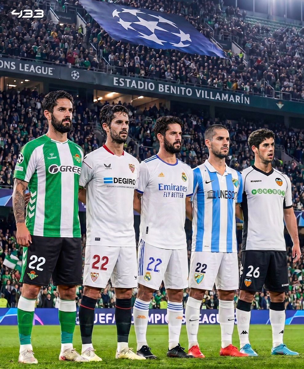
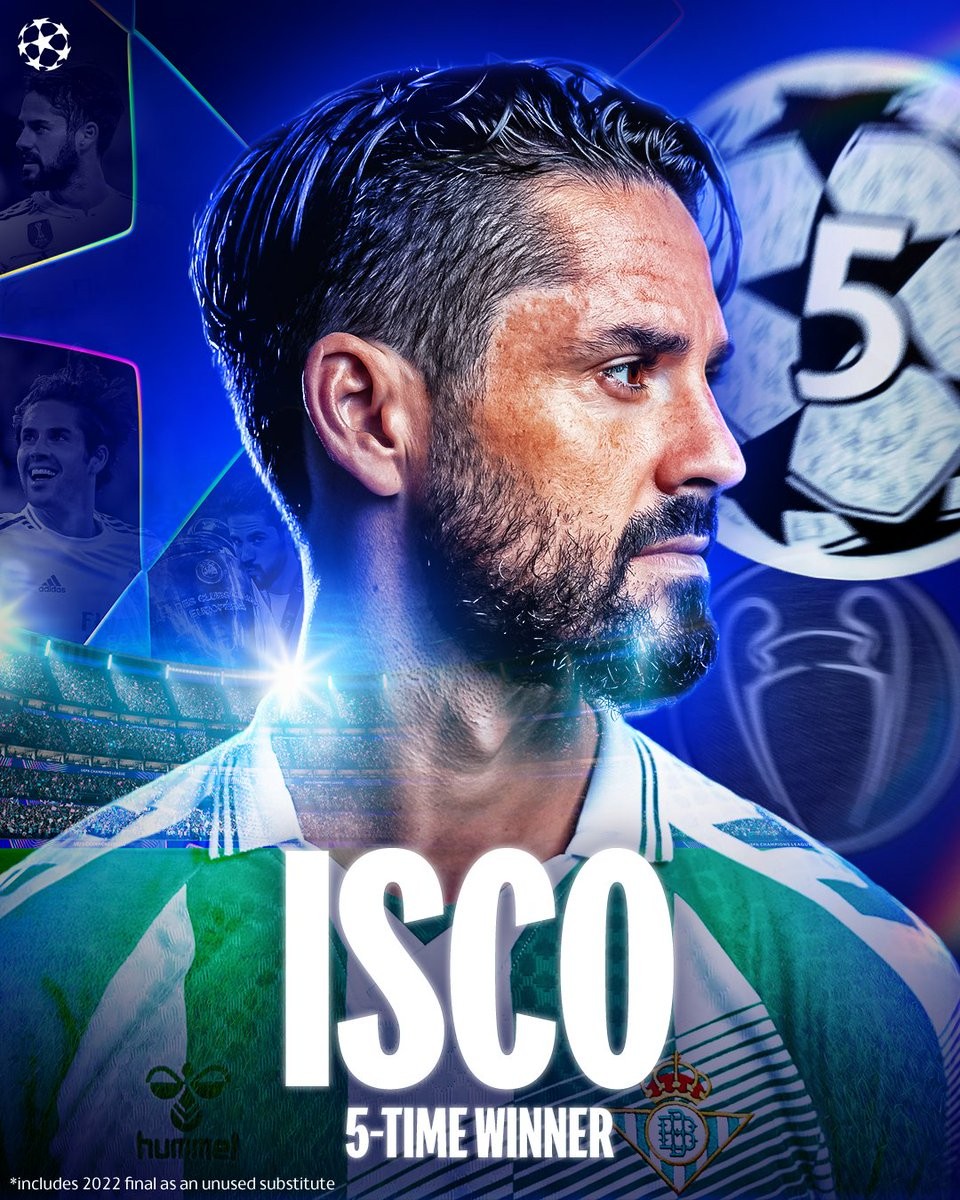
Real Betis captain Isco made European history during his side's return to the UEFA Champions League, inspiring Los Verdiblancos to an exciting 3-2 away victory against Lille. By taking the pitch in Betis' opening fixture, the veteran playmaker became the first footballer in history to appear in the Champions League with five different Spanish clubs, having previously featured in the competition for Valencia, Málaga, Real Madrid, and Sevilla.
Beyond his unique journey across Spanish football, Isco enters the 26-27 campaign holding an unmatched distinction: no active player in this season's competition has won more Champions League titles. The midfielder lifted Europe's most coveted trophy five times during his spell with Real Madrid, triumphing in 2014, 2016, 2017, 2018, and 2022. Betis qualified for the Champions League for the first time in 21 years, and their talisman marked the milestone occasion in style by registering an assist in France to cement his enduring European pedigree.



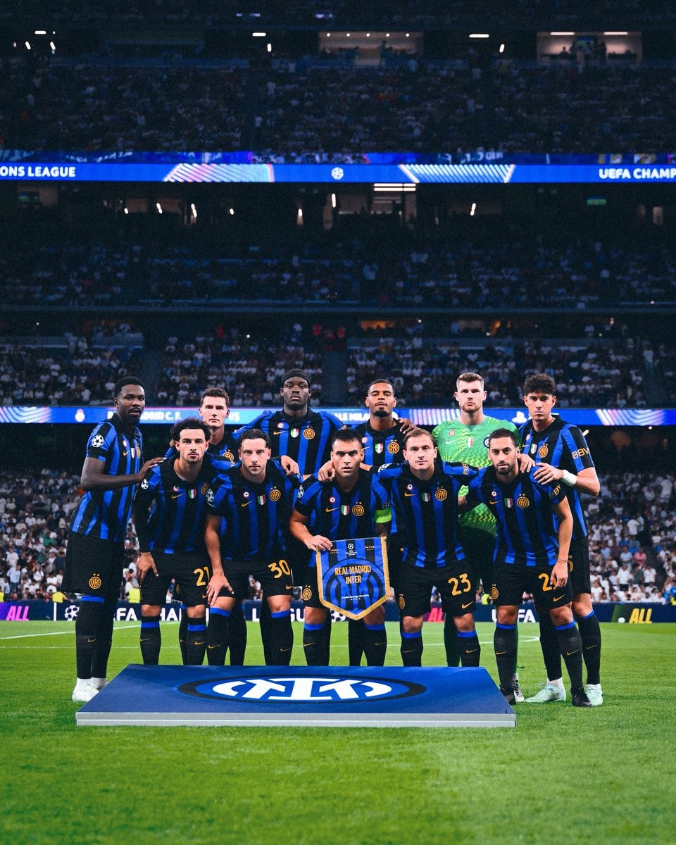
Inter Milan Wears Sponsorless Kit Against Real Madrid Due to Spanish Gambling Ban
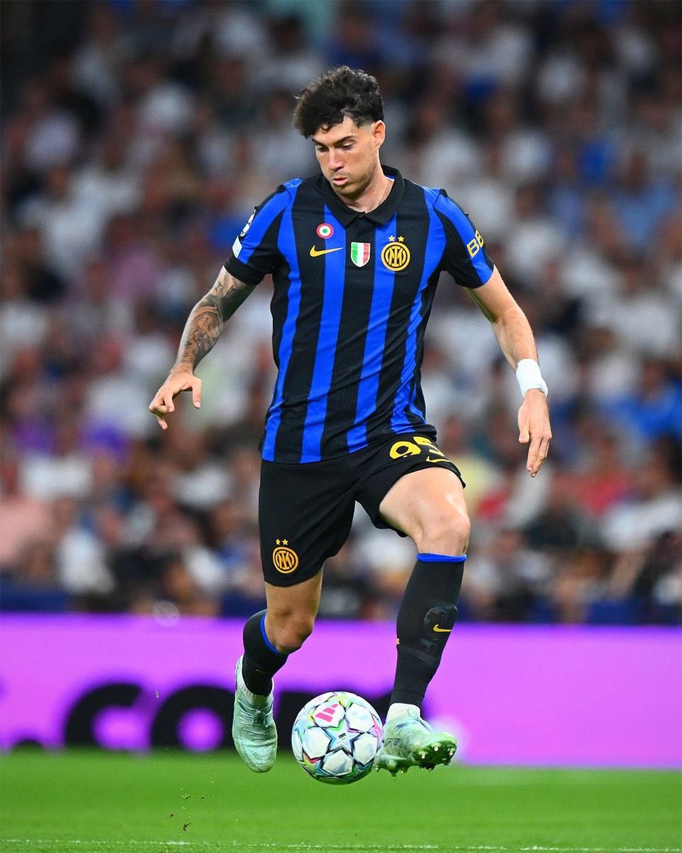
Inter Milan took to the pitch at the Santiago Bernabéu for their UEFA Champions League clash against Real Madrid wearing a completely clean, sponsorless version of their 26-27 home shirt. The usual Betsson.sport logo was entirely missing from the chest, providing fans with a rare and striking old-school look for the Nerazzurri's iconic black and blue stripes.
The temporary alteration was made to comply with Spain's strict advertising laws. Under Royal Decree 958/2020, Spain prohibits gambling and betting operators from featuring on sports jerseys or engaging in promotional partnerships with sports teams. While Betsson operates in Italy under the Betsson.sport label as an infotainment platform to navigate the Italian Dignity Decree, Spanish regulatory authorities enforce a much broader interpretation that disallows the brand entirely. Under UEFA equipment regulations, visiting clubs are required to follow host country laws.
Because of the regulation, Inter prepared a sponsor-free run of shirts specifically for their trip to Madrid, leaving only the Nike Swoosh, club crest, and competition sleeve patches in place. The Betsson.sport branding will return to Inter's kits for their upcoming domestic and European matches where local laws permit it.
