This is Bad: Argentine Football Association Update Logos, but They Are Different From Those of Adidas
 Dec 22, 2022, by Chris

The Argentine Football Association (AFA) have updated their visual identity following the country's third FIFA World Cup triumph, but some inconsistencies exist. Thanks to Paladar Negro for the pictures.

AFA (Argentine Football Association) 3-Star Logo
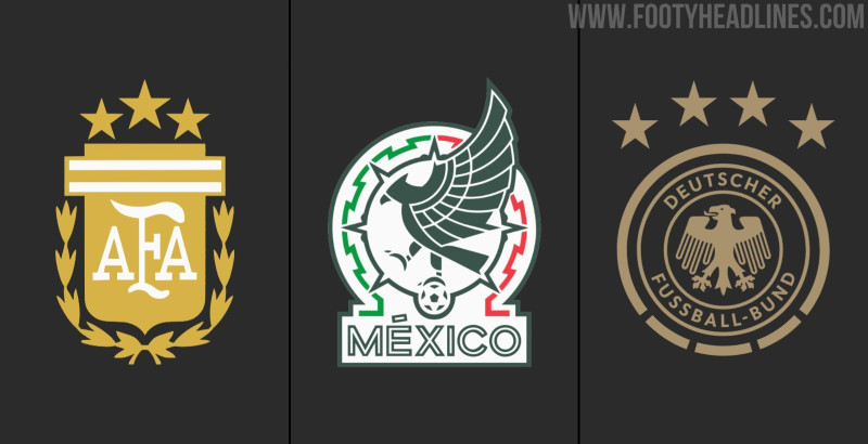
The new visual identity of the AFA does not only bring us one new logo but several different logotypes. In total, there are three different logotypes.
AFA 3-Star Logo - Institution

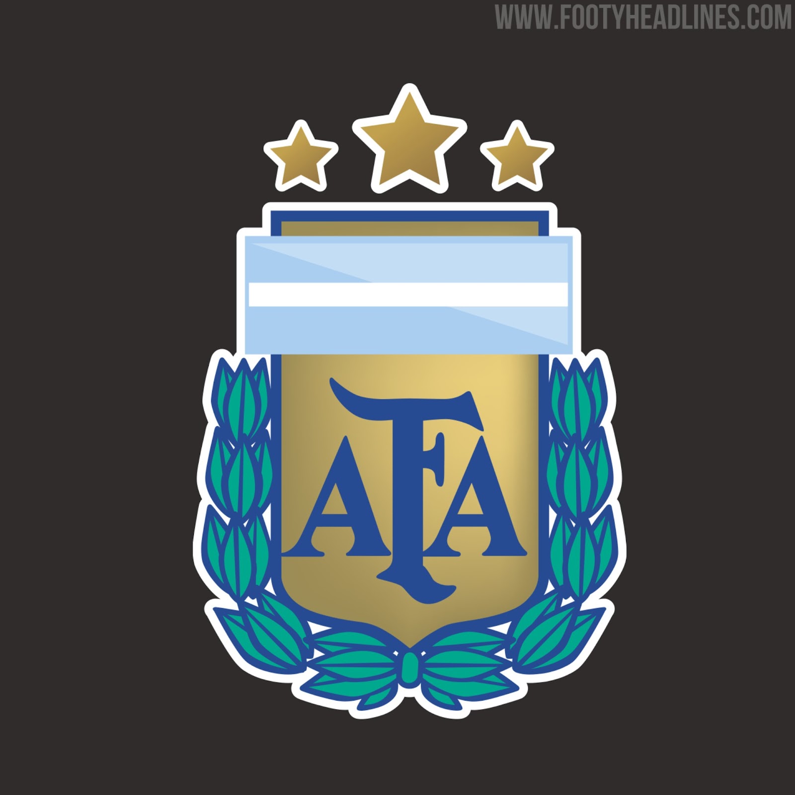
The first logo is the one of the institution. it is made to represent the AFA on their website, social media, and other documents but is not meant for the kits.
"No World Cup triumph is more important than another": Argentines don't like that the third star is bigger than the others
What has changed from the previous design is the third star. The third star has been added in the middle. Oddly, the third star is bigger than the other two, which was hated by many Argentines. They say that no World Cup is more important than another, and there are very good arguments for their position.
AFA 3-Star Logo - 'Clothing'

The second, and possibly most important, is the national football team logo. It comes without any 3D effects, simplified laurel wreaths, and other changes.
The third star in the middle is also bigger here. This also stands in contrast to Adidas' 3-star Argentina logo.
AFA 3-Star Logo - Icon

The third logo is less known and not used very often. It just comes with the AFA text and three stars on the top. What is inconsistent here is that the AFA text is thicker than in the "Clothing" logo. it has the same size as the logo of the Institution.
Institution vs "Equipment"
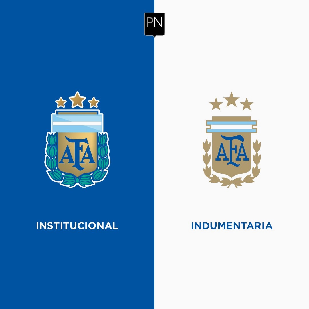
There are too many inconsistencies and too many different versions
New AFA 3-Star Logos - What Fans Criticize
- The added star is bigger, but "the 2022 World Cup title is not more important than the other two"
- Too many slightly different versions
- Different from the one used by Adidas
Many Argentine football fans have criticized quite a few things about the new AFA branding, and many demand a whole rebrand.

Three at least suboptimal things stand out. the added third star is bigger than the other two, there are too many different versions, and Adidas use a different 3-star logo for the Argentina kit.
Is a whole rebrand of the AFA logo needed? What do you think of the different logos of the Argentine Football Association? Let us know in the comments below.

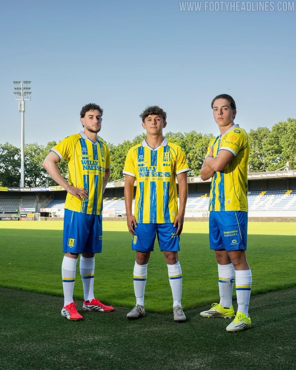
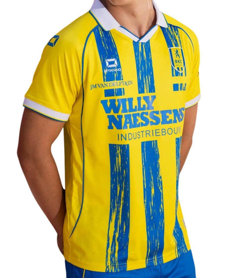
RKC Waalwijk 26-27 Home Kit Released
The new RKC Waalwijk home kit was officially released today. Made by Stanno, the new RKC Waalwijk 2026-27 home shirt will be worn in the upcoming Dutch second divison football season.
The Stanno RKC Waalwijk 2026-27 home jersey was launched under the campaign slogan Gedragen door de toekomst, which translates to Worn by the future. It boasts a striking design in yellow with blue brushstroke stripes.

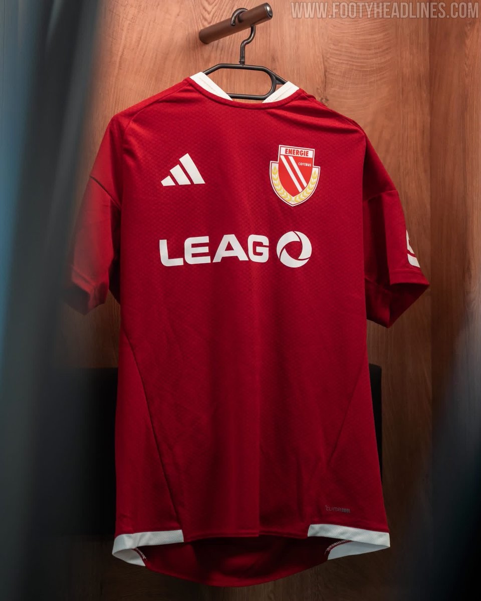
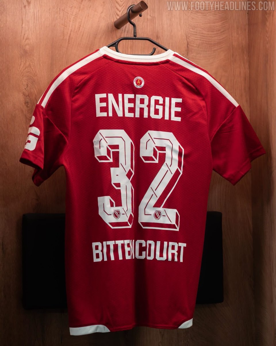
Adidas Energie Cottbus 26-27 Home & Away Kits Released - No More Macron
Following their promotion to the 2. Bundesliga and the announcement of a new long-term supplier deal with Adidas until at least 2031, the Energie Cottbus 2026-27 home kit has been released, while the away kit was spotted. The new shirt marks the club's transition to the Three Stripes for their upcoming campaign in Germany's second tier.
Cottbus' 26-27 kits are based on standard Adidas teamwear, the Adidas 26 Tiro Competition.
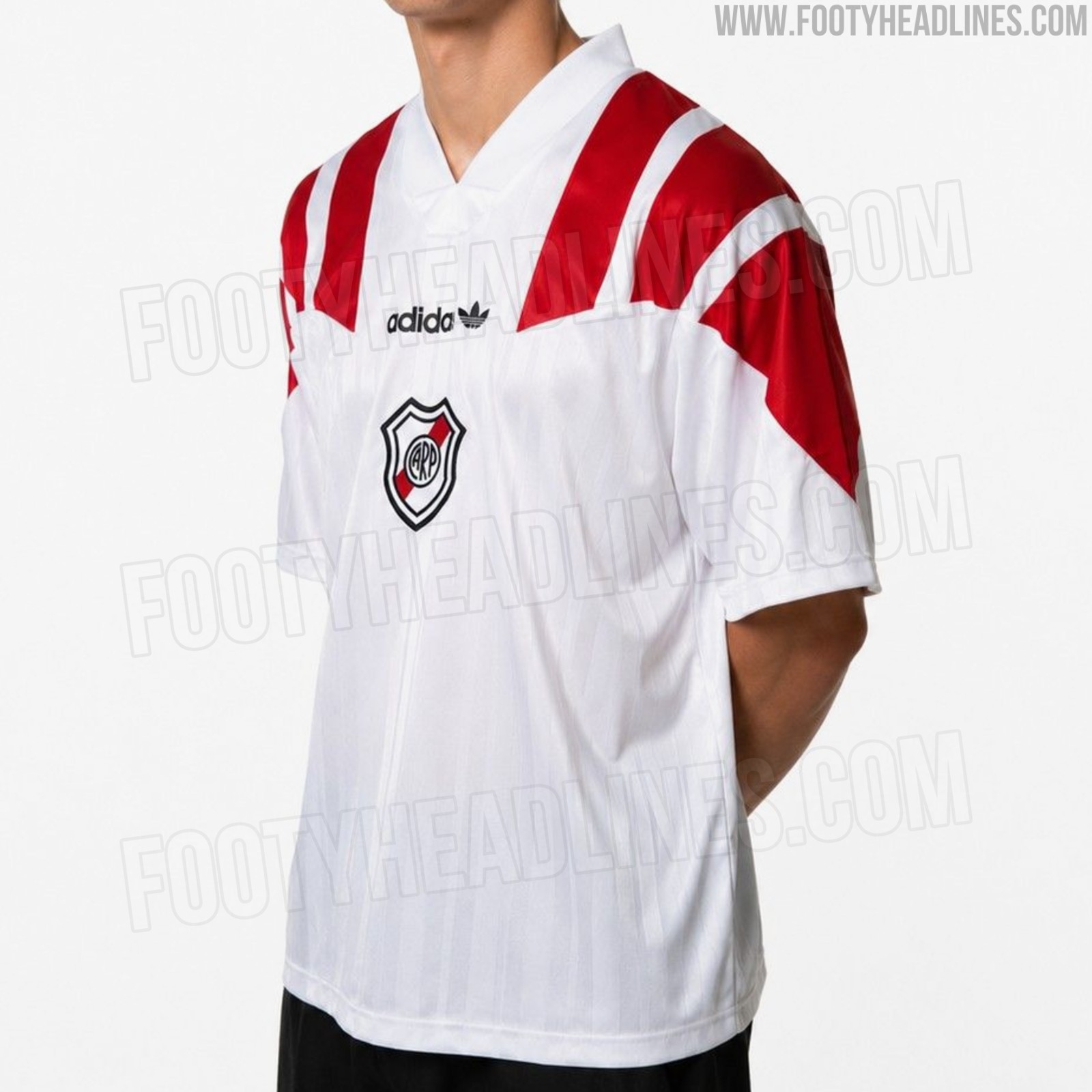
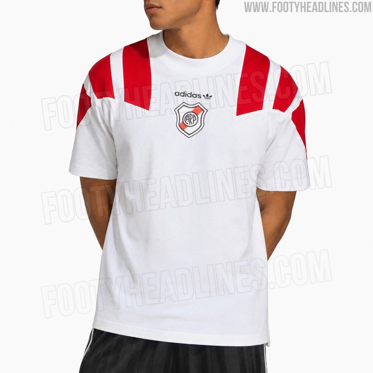
River Plate Adidas EQT Jersey Leaked
We can exclusively leak the upcoming Adidas River Plate EQT lifestyle jersey. Inspired by the brand's iconic early 1990s Equipment era, the shirt features a clean white base highlighted by oversized red EQT stripes over the shoulders. Both the classic black Adidas Trefoil logo and the River Plate crest are positioned centrally on the chest, completing the retro aesthetic.
There will also be a fitting t-shirt plus a tracksuit.


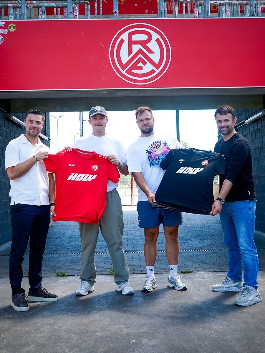
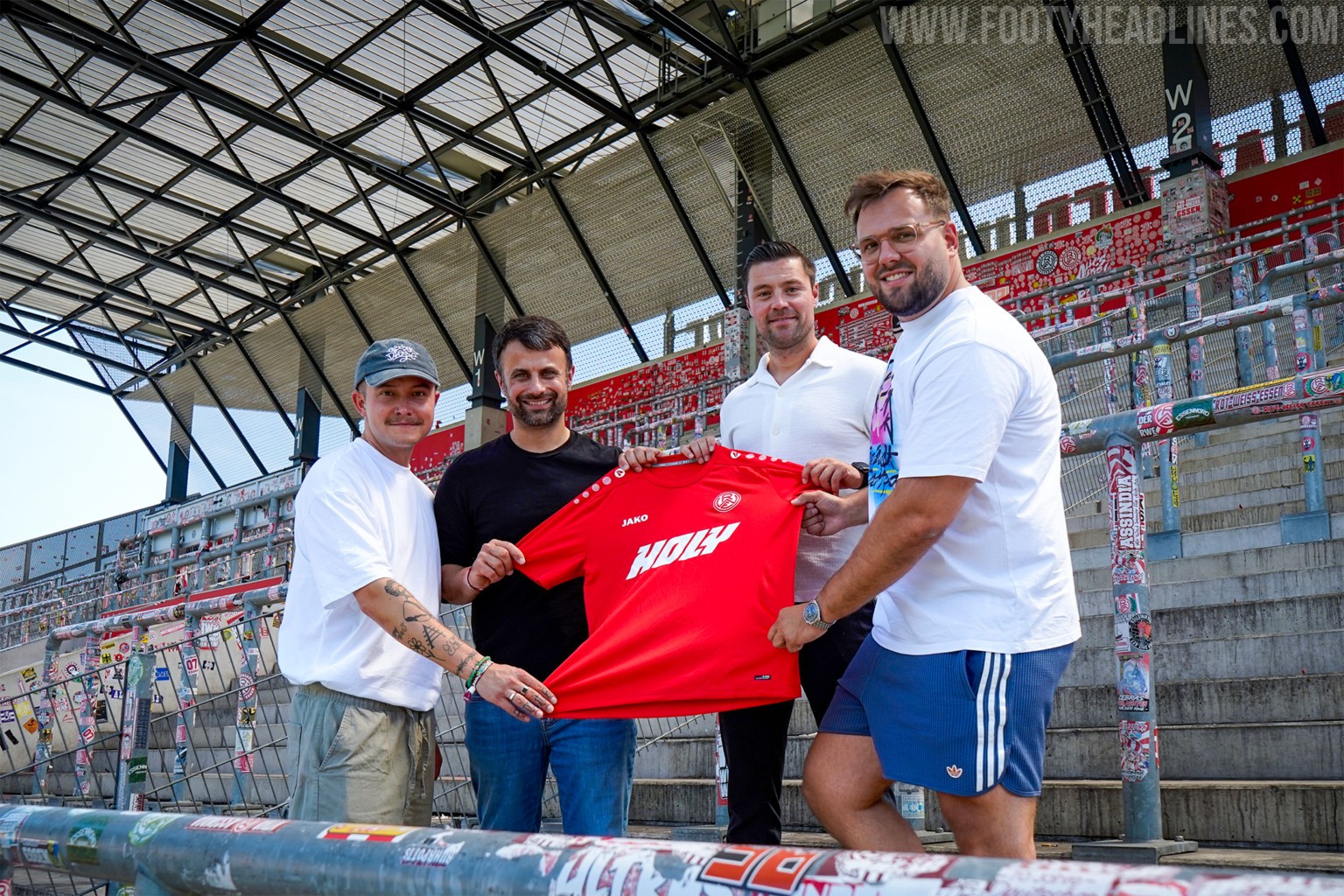
Rot-Weiss Essen Announce HOLY as 2026-27 Training Kit Sponsor
German 3. Liga side Rot-Weiss Essen has announced an expanded partnership with soft drink brand HOLY for the 2026-27 season.
Having served as an official partner during the previous campaign, the brand will now see its logo prominently displayed on the chest of the first team's warm-up and training kits.
While this development increases the sponsor's visibility within the club environment, fans and local media note that the highly anticipated announcement of Rot-Weiss Essen's new main match kit sponsor is still expected to take place later this month.
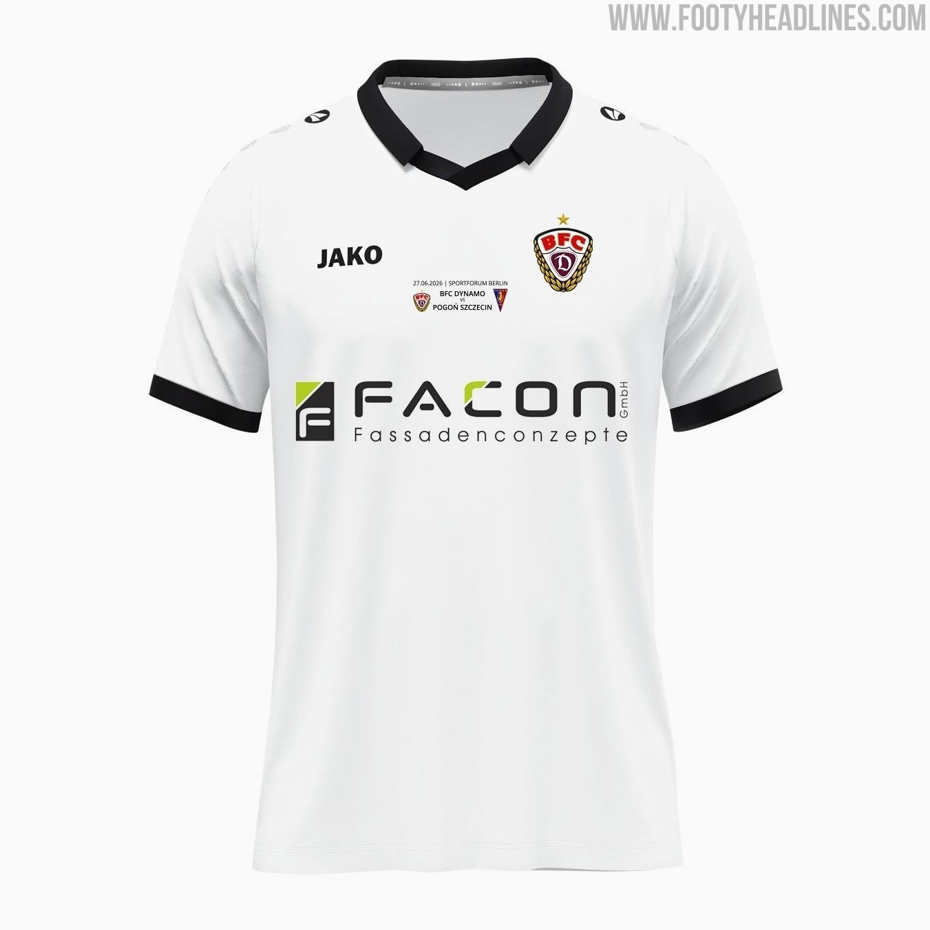
Berliner FC Dynamo 26-27 Special Pre-Season Kit Released
Berliner FC Dynamo has quietly unveiled a special pre-season kit for the 2026-27 campaign. Produced by Jako, the new shirt is designed specifically for the club's preparation matches ahead of the upcoming season.
The Jako Berliner FC Dynamo 2026-27 special pre-season jersey introduces a distinct design tailored for the team's summer exhibition games. As a dedicated pre-season release, it provides the club with an alternate aesthetic on the pitch before their standard home and away kits are officially introduced.


Fans Criticize Disappointing 26-27 Bundesliga Kit Designs
The 2026-27 Bundesliga season is approaching, and early kit releases have sparked widespread dissatisfaction among supporters. A recent viral discussion on social media highlighted the negative reception, with some fans suggesting that this could be an all-time bad year for German football jersey designs as multiple clubs unveil their new looks.
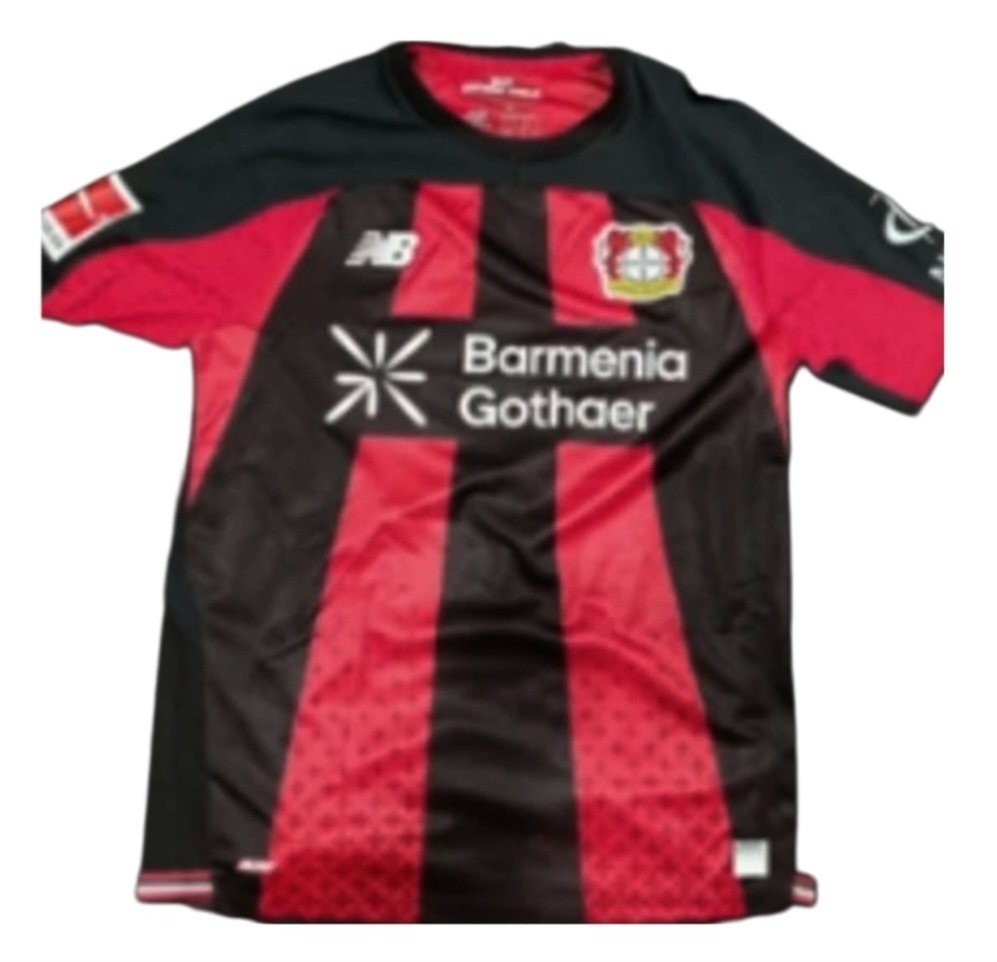
Specific complaints have been directed at several major teams across the league. Bayer Leverkusen's new kit has been heavily criticized and described by some as a black and red monstrosity. Schalke also drew mixed reactions; although some fans appreciated the general aesthetic, others were quick to point out the non-white Adidas stripes and compared the overall pattern to a copy of Croatia's national team shirts.
Despite the overwhelming criticism, not every release has been universally panned, as Borussia Monchengladbach's new shirt managed to earn a relatively positive reception from some supporters. With several clubs, including Freiburg, still yet to officially present their 2026-27 kits, fans are left hoping for better designs to salvage what has been a largely disappointing release cycle so far.