No to Tradition: When Teams Change Their Colours
With New York Red bulls possibly ditching their regular white and red home kit for something different in the upcoming MLS season, here are some other instances of clubs switching up their traditional home colours.

When Clubs Change Their Home Colours

A team's colours are central to their identity and usually held dear by fans. Throughout history, some clubs have made permanent changes to their home colours, like when Bournemouth adopted black and red stripes in 1971 in honour of AC Milan. Today Leeds United are known for their white kits, thanks to the change made by legendary manager Don Revie in 1961, who wanted to emulate the all-conquering Real Madrid. These changes are now historical and the respective clubs have long since made the looks their own, but such major aesthetic overhauls are rarer to come by these days.


Leeds and Bournemouth before adopting the colours we know them by today.
We've seen fan outrage amplified by social media in recent years when manufacturers and clubs decide to experiment with home shirts, even when they maintain the key colours. While it's true that you can't please everyone, you can be sure that most will be unhappy with too radical of a change made without good reason. Here are a few short lived alternatives to traditional home colours, which were greeted with varying degrees of acceptance.
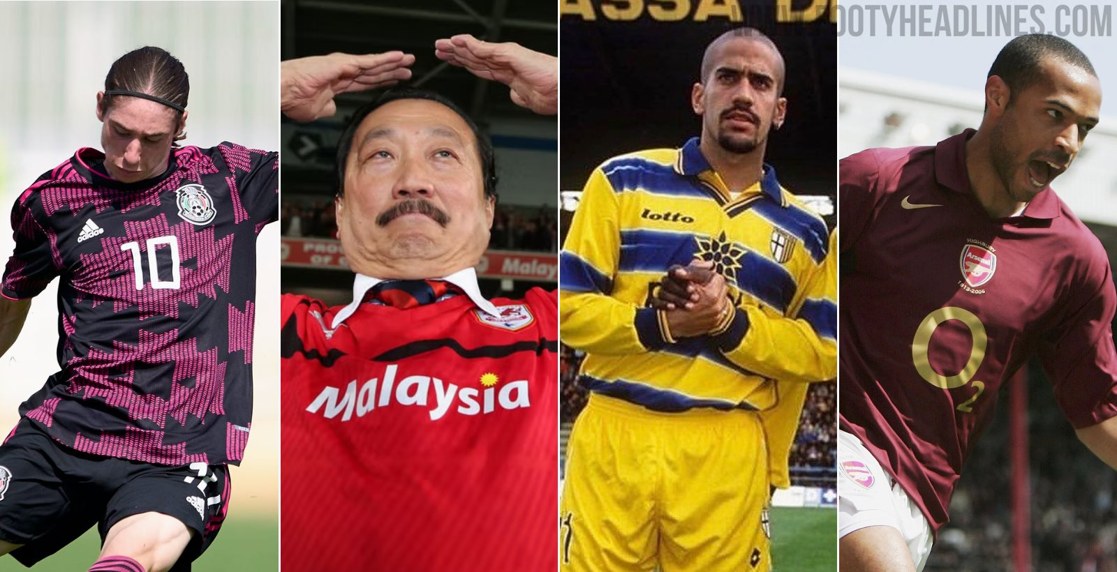
Parma 98-04


Lotto replaced Puma as Parma's kit maker in 1998 and would remain in the role for only one season, but it was certainly one to remember. White had been their traditional home colour for most of their history, while yellow and blue had appeared on plenty of away strips as well as some home detailing. Lotto installed a blue and yellow hooped design as their home shirt, which went on to gain iconic status thanks to the team's array of stars and UEFA Cup victory that season.


Their successors, Champion, decided that it certainly hadn't done the team any harm, so they kept the look until 2004, before reverting to the more traditional black cross on a white base. The blue and yellow hoops will always hold a special place in fans' hearts and have been revived for several away kits in recent years.
Arsenal 05-06


This one had some historical significance and proved extremely popular with fans and neutrals alike. Arsenal wore a redcurrant home shirt in their first season at Highbury all the way back in 1913, and so they decided a return to this colour would be a nice way to bookend their time at their famous home ground.


Gold accents and special embroidery around the crest added a touch of elegance, a very fitting way to mark the end of a long and significant period of the club's history. They returned to their classic red and white shirts the following season as they moved to the Emirates Stadium.
Inter 14-15


Inter's black and blue striped shirts have been a constant throughout their entire history. Their recent zig zag number and last season's snakeskin print provided modern takes on the theme and had their detractors, but in 14-15 Nike gave them a home shirt which provoked much more consternation from supporters. Yes it was black and blue, and yes, it had stripes, but to put it simply, it didn't look like an Inter shirt.

A black base was overlaid with very fine blue pinstripes, resulting in a much darker overall look when paired with their customary plain black shorts. An 8th place in Serie A means there aren't too many happy memories associated with the jersey either.
Cardiff City 12-15


Easily the most controversial entry on this list. Cardiff had always worn blue until new Malaysian owner Vincent Tan decided that a rebrand to red as their primary colour was in order to boost the club's appeal abroad. There was uproar when fans initially got wind of the plan, but it made little difference. Tan went ahead with the switch, also adding a red dragon to the club crest. Fans continually campaigned to get their colours back, but Tan's stance was “No way I will change it back to blue under my ownership.”


The fans didn't let up, and midway through the 14-15 season Tan finally gave in and the blue home kit was reinstated. Order was also restored to the crest and the bluebird took centre stage once more, although the red dragon remained on a much smaller scale.

Mexico 2015, 2019, 2020


International team colours reflect national identity and very often - but not always - reference the country's flag. Mexico's full kit of green shirt, white shorts and red socks recreates their full tricolour and was introduced in the 1950s. Before that, a maroon shirt was paired with black shorts for their home kit. In 2015, Adidas introduced a black home shirt for the first time in their history.


It was seemingly a marketing move, made on the back of strong sales of their previous black away kits. Their next two home shirts returned to green before two more successive black kits in 2018 and 2019, the latter of which had a bright pink pattern. Not bad looking shirts by any means, but a national team's home colours should not be changed on the basis of aesthetic appeal alone.

Can you think of any other teams who have dropped their classic home shirt in favour of a new look? Let us know in the comments.
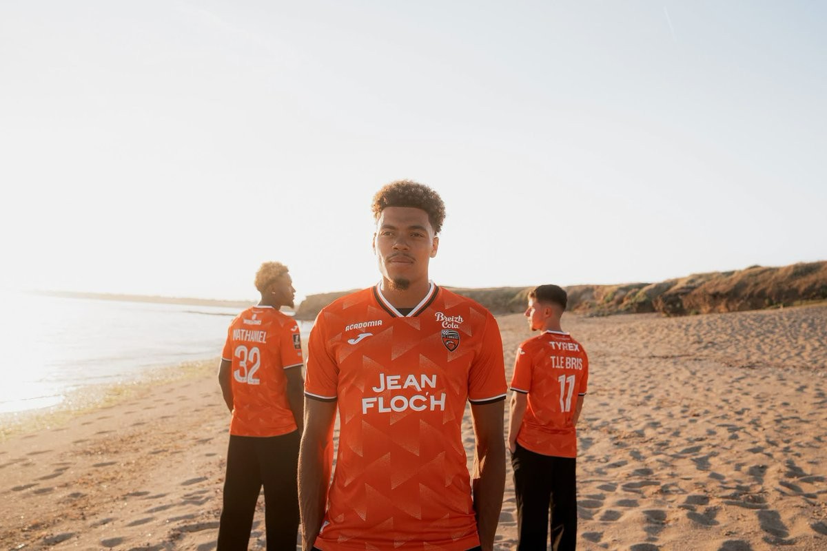
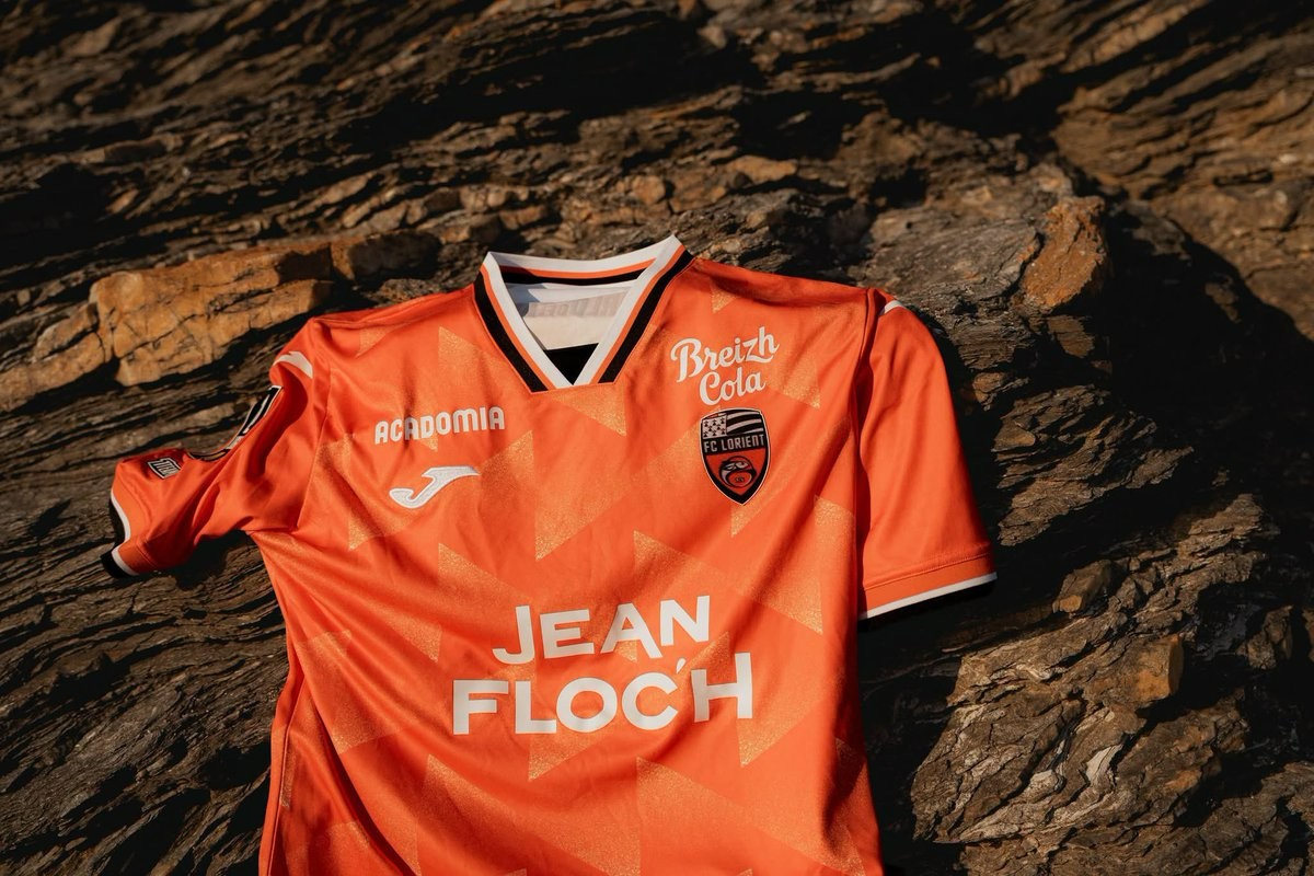
FC Lorient 26-27 Home Kit Released
The new FC Lorient 26-27 home kit was officially released today by Joma. It will be worn in the upcoming French football campaign and follows the launch of the club's white and black Breton-inspired away kit that debuted earlier in July.
The Joma FC Lorient 26-27 home shirt introduces a design that stays true to the club's identity. While the design itself is traditional, the release has sparked some debate online due to noticeable color differences between the promotional graphics on the Joma and Lorient websites and the physical kit images circulating on social media.
The FC Lorient 26-27 home kit is available to purchase through the club's official stores and Joma.
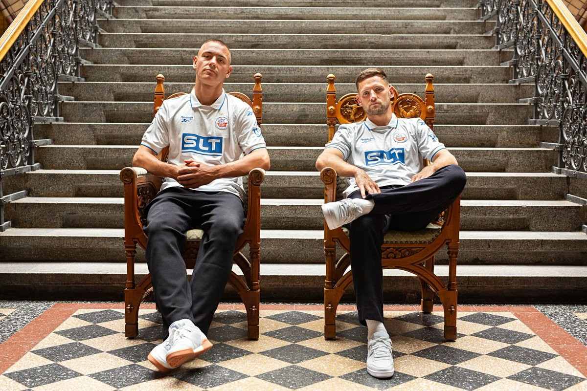
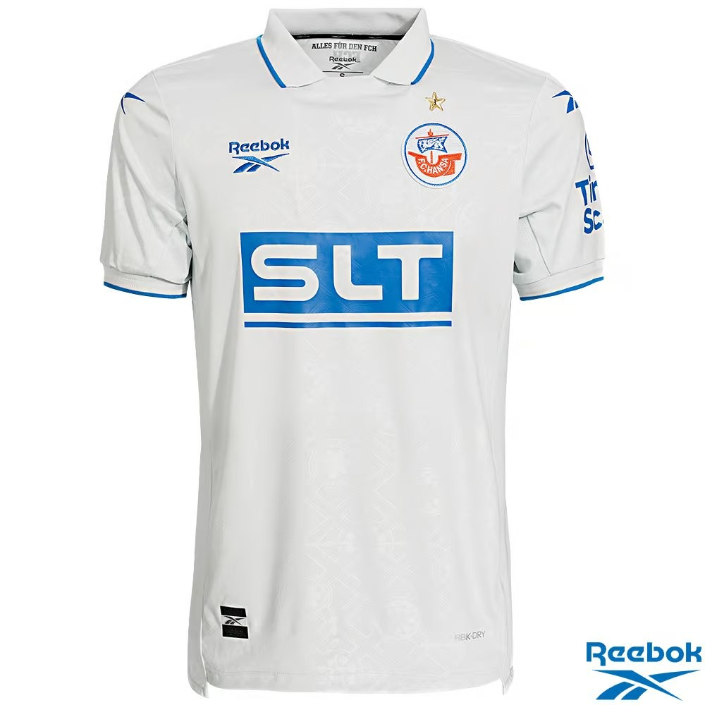
No More Mizuno: Reebok Hansa Rostock 26-27 Away Kit Revealed
Following the official launch of their historically inspired home shirt earlier this month, the new Hansa Rostock 26-27 away kit has now been revealed. Made by Reebok, the release is part of the sportswear brand's first-ever stint as a kit supplier for a German football club, having recently taken over the contract from Mizuno.
The new away kit provides a fresh alternative for the upcoming 3. Liga campaign, contrasting with the 26-27 home kit which features traditional blue and white vertical stripes inspired by the club's legendary 1993-94 design. The latest images showcase Reebok's distinctive approach, continuing to blend modern functional sportswear with a classic aesthetic.

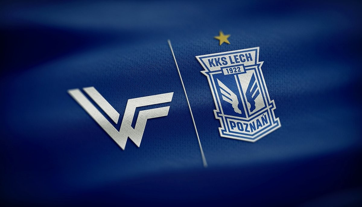

Lech Poznań 26-27 Home & Away Kits to Be Designed by Wonderkitz
Current Polish champions Lech Poznań will wear home and away kits designed by Wonderkitz for the 26-27 season. Wonderkitz officially announced the collaboration, confirming that the new designs will be revealed soon. The club's official account also acknowledged the announcement, expressing excitement about creating new history in the upcoming shirts.
A teaser image was shared alongside the news to build anticipation for the final release. This partnership adds to Wonderkitz's growing presence in Polish football. The brand recently announced their design work on the Warta Poznań 26-27 home kit and is rumored to be collaborating with a total of five Ekstraklasa teams for the new campaign.
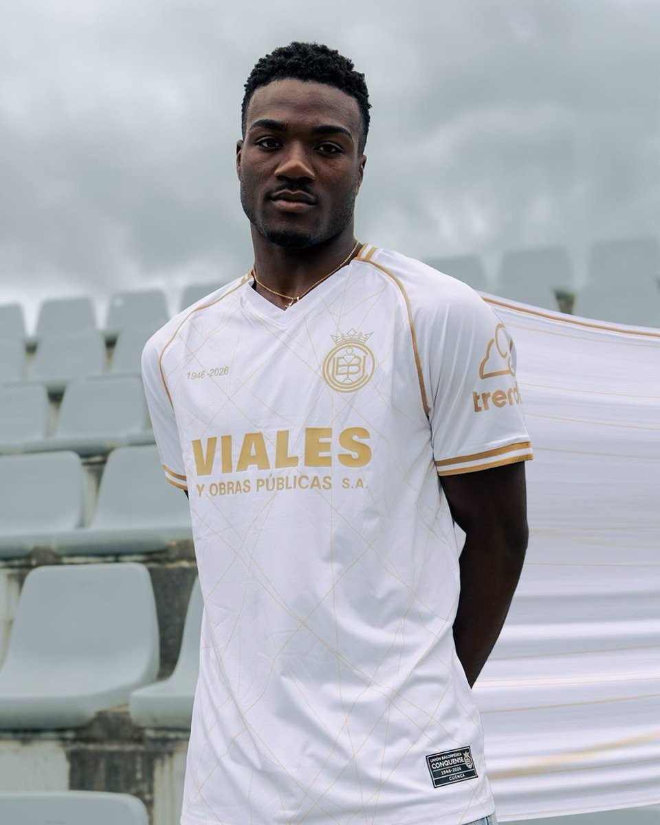
In-House UB Conquense 26-27 Kits Released
Spanish Segunda Federación club UB Conquense have unveiled their new kits for the 26-27 season. Notably, the team has opted to produce their uniforms entirely in-house rather than partnering with an external sportswear brand.
The release includes a full set of four distinct kits, giving the team plenty of options for their upcoming campaign in Spain's fourth tier. By manufacturing their own gear, UB Conquense maintains full creative control over their visual identity and kit designs for the 26-27 season.
What do you think of clubs producing their own kits without an external supplier? Drop a comment below with your thoughts on the new UB Conquense 26-27 in-house kits.
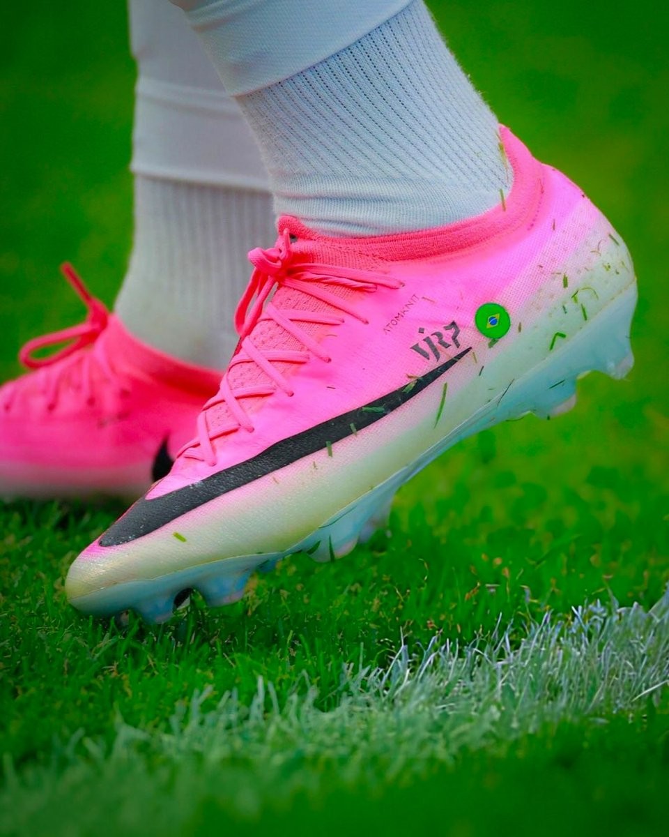
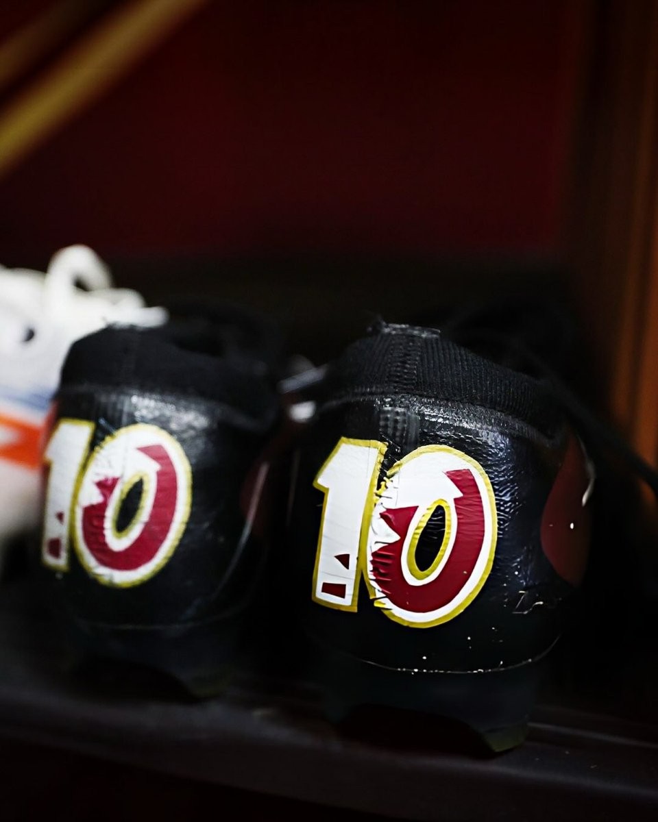
"All" Special Boots Spotted at the 2026 World Cup
The 2026 World Cup has provided a massive stage for the world's biggest sportswear brands to showcase their latest boot packs, but a closer look reveals a fascinating array of player-specific customizations. While retail versions of these boots are worn by the majority of players, high-resolution photography from the tournament has highlighted several special, heavily modified boots that differ significantly from what is available to the public.
Through close-up shots shared by boot enthusiast @bootsplug, we can see the intricate details and hidden modifications that often go unnoticed during regular match broadcasts. The close-up images reveal an impressive level of personalization. Players have taken to the pitch in boots featuring custom national flags, personalized text, and unique stitching patterns.
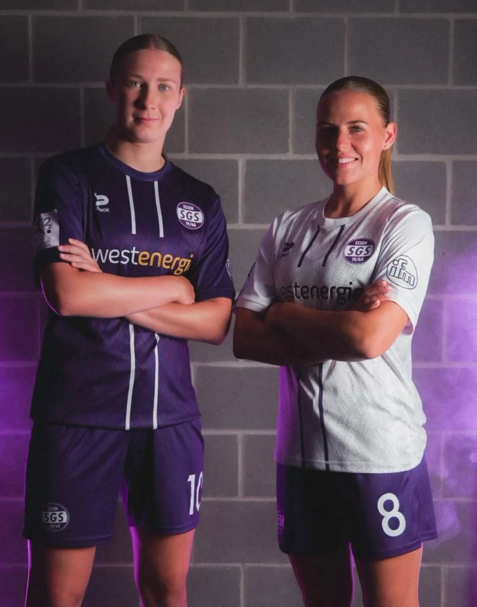
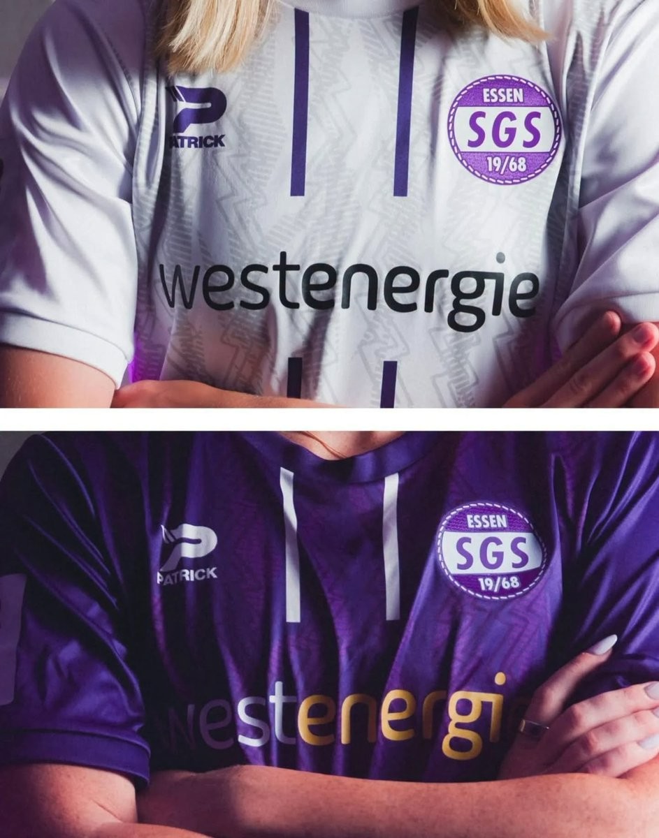
No More Puma: Patrick SGS Essen 26-27 Home & Away Kits Released
German club SGS Essen have officially unveiled their new home and away kits for the 26-27 season. The team will debut the new shirts in the 2. Frauen-Bundesliga, following their recent relegation from the top tier of women's football in Germany.
The SGS Essen 26-27 kits are made by Patrick, replacing previous kit supplier Puma. The launch was accompanied by a video showcase and a detailed look at the new designs through promotional photos, marking a fresh start for the club as they look to bounce back this season.

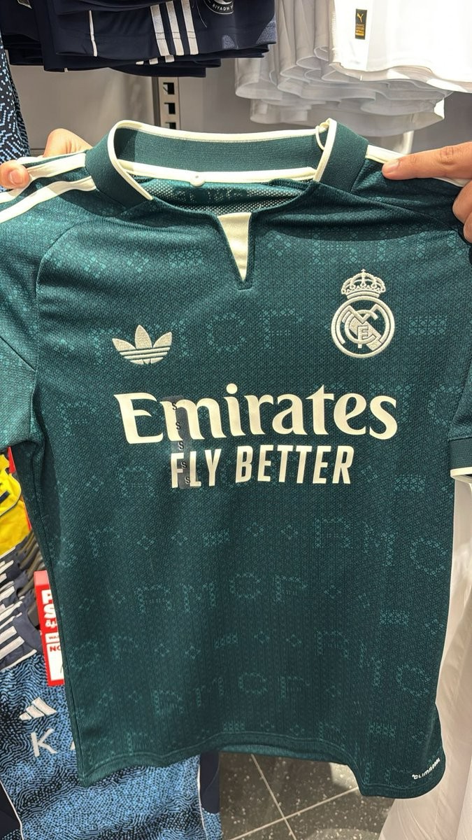
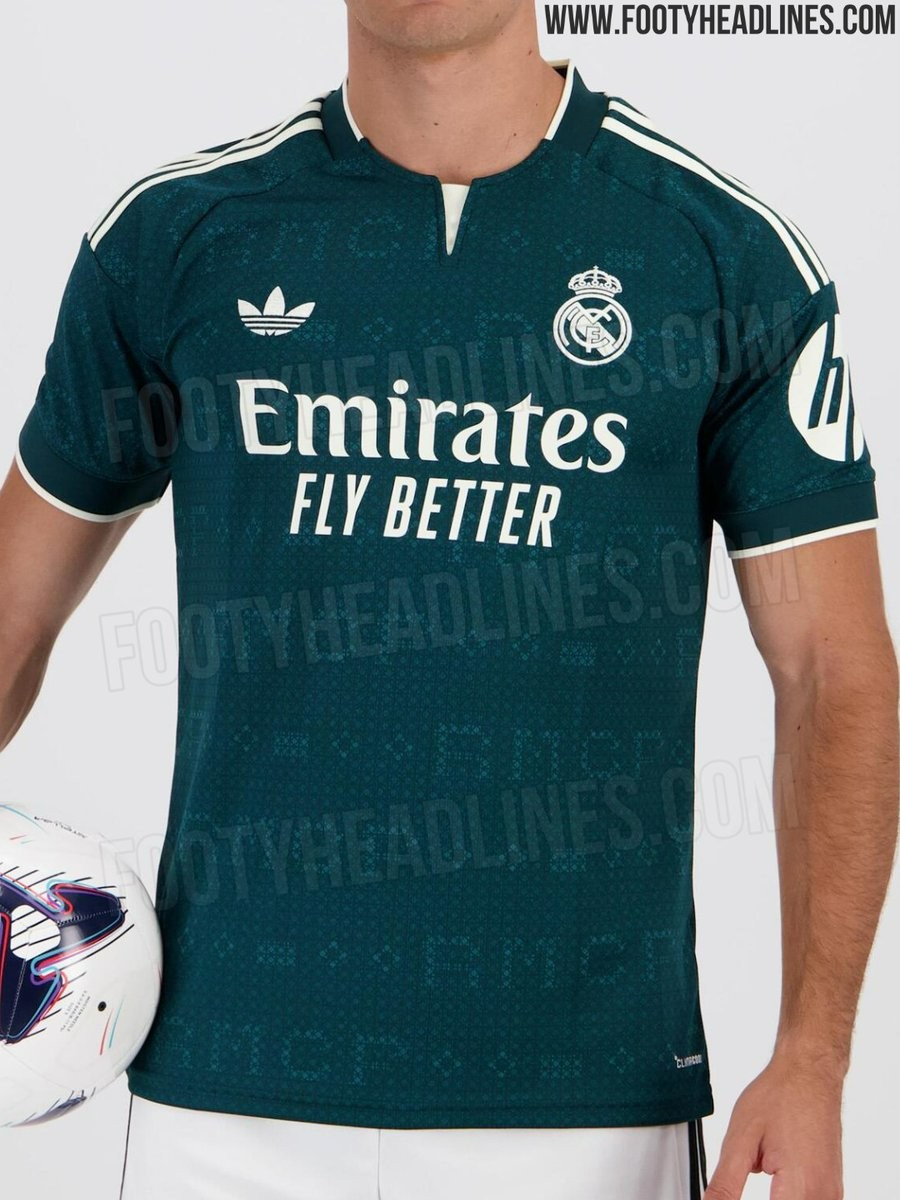
Real Madrid 26-27 Away Kit Spotted on Sale Ahead of Release
The Adidas Real Madrid 26-27 away kit has been spotted on sale prior to its official launch. Pictured by @zt4q_, the shirt is currently available to purchase at a JD Sports store in Riyadh, Saudi Arabia.
Official images of the Real Madrid 26-27 away kit leaked earlier in July, pointing to an expected release date of July 23. The Riyadh store has evidently placed the shirts on the racks a few days early, providing fans with an in-hand look at the retail product before Adidas' official announcement.
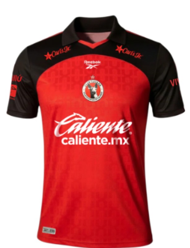
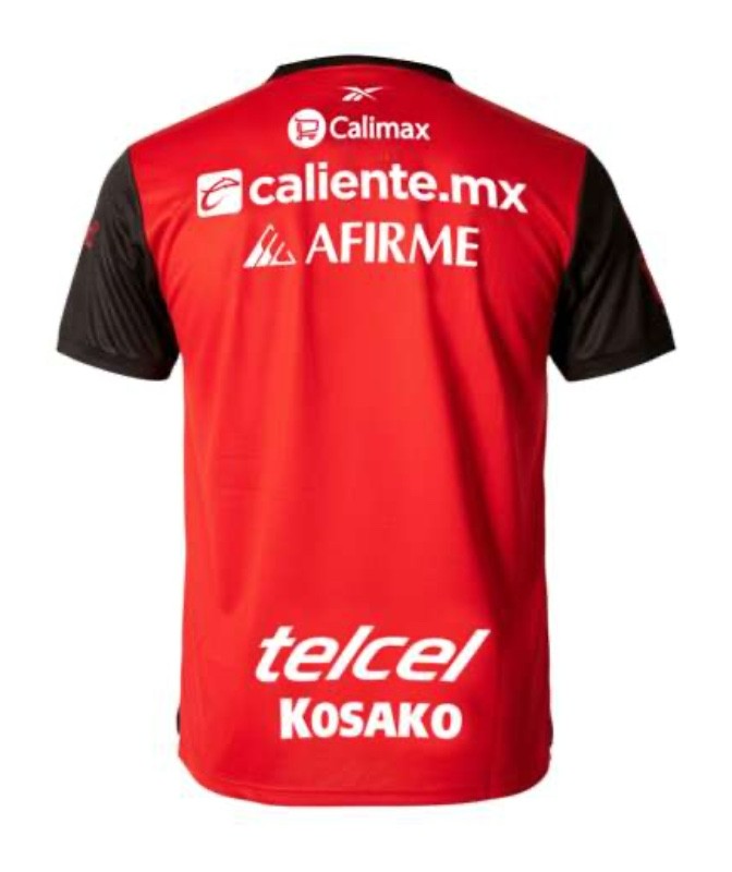
Club Tijuana 26-27 Home & Away Kits Released
The new Club Tijuana 26-27 home and away kits have been officially released. Made by Reebok, the new shirts will be worn in the upcoming Liga MX campaign.
What do you think about the Club Tijuana 26-27 home and away kits? Drop us a line below.
