
The 5 Best and 5 Worst Gold Kits of All Time

Gold is always a daring choice of colour for a football shirt. There are more cases of it being used than you might think, but we've picked out our five best and five worst.

Gold Football Shirts
Gold will forever be associated with luxury, wealth, status and success. It's a bold choice to use as a main colour on a football kit not only for the implications it carries, but also because it's a difficult look to pull off. Footballers have the advantage of wearing a full kit designed be balanced, but fans should probably steer clear as a rule of thumb. When done well, a gold jersey can look great, but not every effort comes out so polished. In no particular order, here are our picks of the best and worst ever gold kits.
5 Best Gold Kits - Arsenal 01-02 Away


Shiny is good when it comes to gold shirts. Brightly coloured accents are generally bad, but Nike limited the use of red to the shoulder piping and the badge so it doesn't interfere too much. Just the right amount of navy means it's well-balanced overall.
Marseille Third 98-99


Shiny is good, so very shiny is very good. A retro-looking OM badge is also a nice touch here, while the navy collar and underarms compensates enough for the white stripes on the shoulders.
Milan Special GK 22-23


Just released a couple of days ago, the goalkeeper shirt from Milan's Koché collaboration is a stunner and was the inspiration for this list. It's a real shame that it will only be worn once and likely forgotten by most. It's a wonder they didn't make it the outfield kit.
Venezia Away 22-23

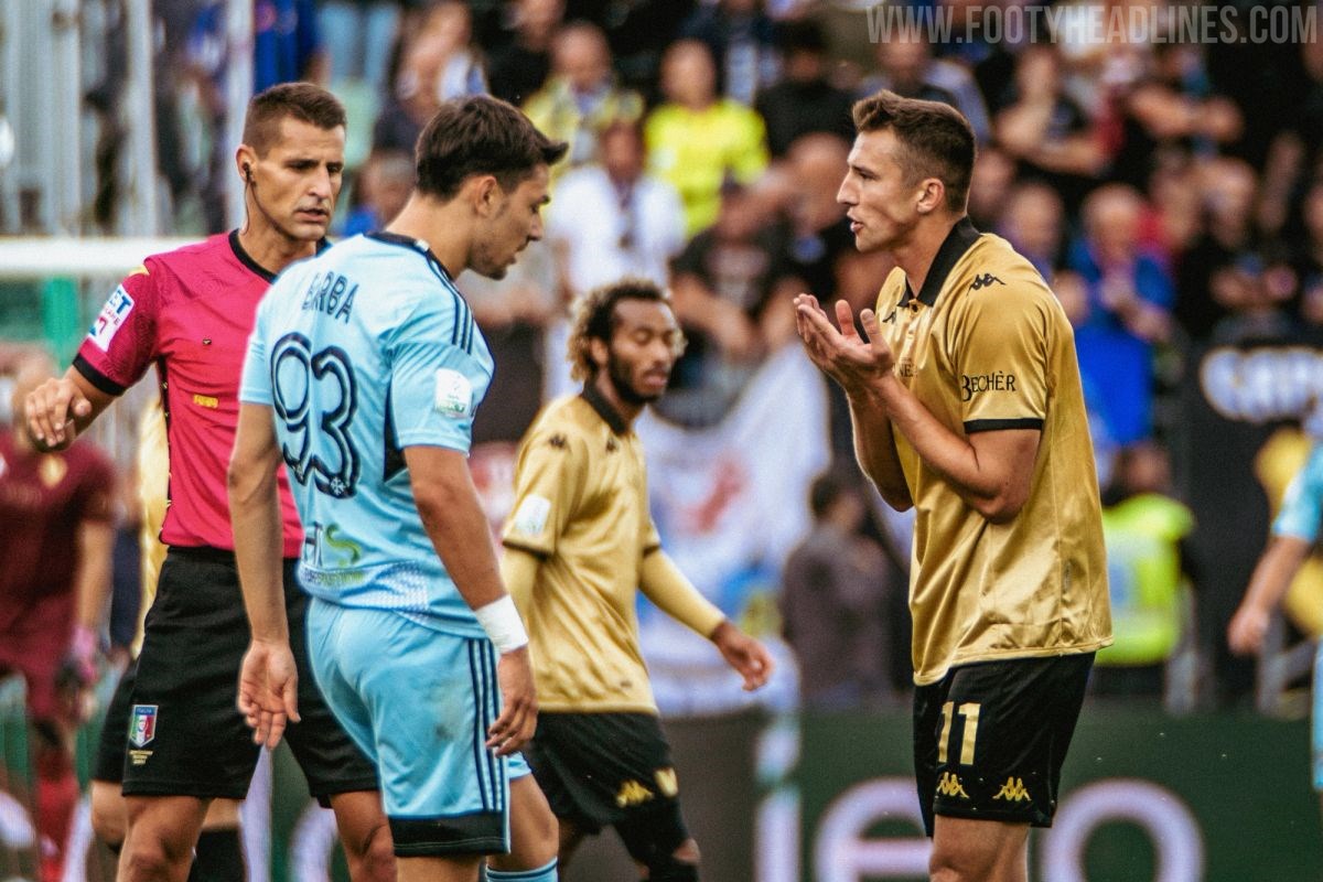

It's a ballsy move for a historically unsuccessful team to release a gold jersey, so this shirt needed to be a good one. And it was. Again, the sheen here is glorious. Spectacularly golden. The ratio of gold to black is also excellent, and the Kappa logo, blackout Venezia badge and text on the front are all stylish in their own right.
Milan Third 13-14


Maybe the shiniest jersey ever? You know what that means. The tricolour above the Adidas logo and the pocket-style stitching around it make it stand out too. Good work on the red accents being proportioned so well.
5 Worst Gold Kits - Arsenal Away 15-16


Too much navy. Strange shade of gold that fades in and out. The diamond pattern takes away from the shirt rather than adding to it. No positives here.
Copenhagen Special 12-13

To celebrate winning their 10th national championship, Copenhagen released a pair of kits, this one and another with the colours inverted. A white shirt with gold trim is fine. A gold shirt with white trim, especially this much white trim, not so much. Keep it dark.
Benfica Away 11-12 and 04-05


Two entries in one here from Benfica. A bad template is largely responsible for the 11-12 shirt's place on this list. The polo collar, and the amount and positioning of the black sections do nothing for it, while the shade of gold is a little washed out. The 04-05 shirt had red trim only with nothing darker to counteract it.
Marseille Third 08-09


Marseille foolishly scaled back on the shininess for their second gold number, and the result was this dull, uninspiring shade. It was also available with those three quarter length sleeves that Adidas experimented with around 2008. They did it no favours either. One of Adidas' stranger ideas.
Lyon Away 07-08
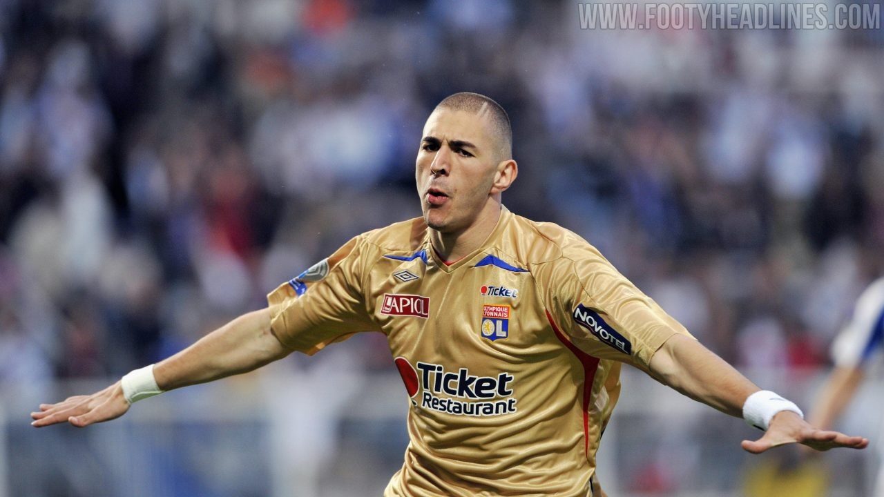

Kit makers, take note. If you're using a busy-looking, modern template, don't choose gold as a main colour. It should be reserved for more simple designs. Also, don't apply blue and red trim on a gold shirt together, ever.
(Dis)honourable Mentions - Barcelona Away 22-23


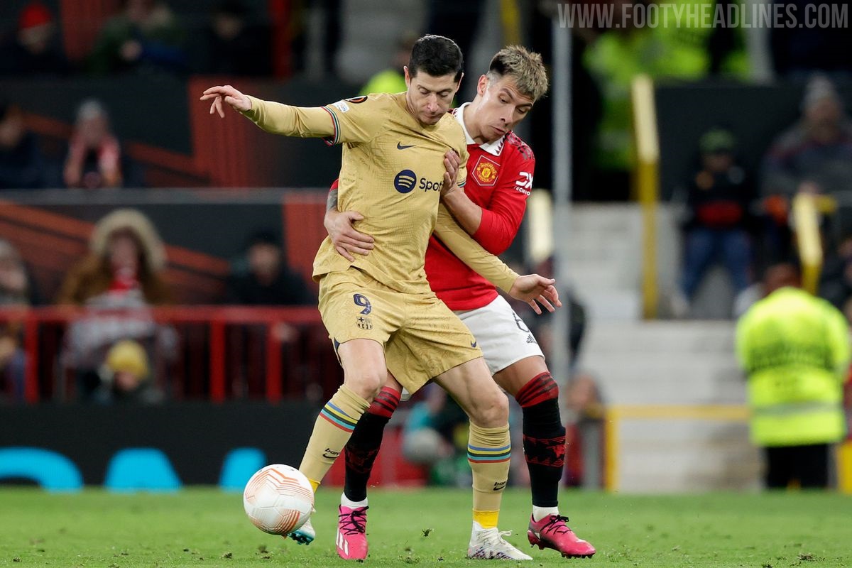
The Olympic ring coloured cuffs put a fresh spin on this one, and the city map in the weave looks good too. The matching socks and shorts are a little too much though.
Juventus Away 08-09


A nice simple template that's suited to such a statement colour. Switch the white v neck out for a black one and you're on to a winner.
Manchester United Third 01-02


This was two shirts in one, as it was reversible, with the away kit found on the inside. Umbro got the secondary colour right here, and it did have a bit of shine to it, but somehow the whole thing just looks tacky more than anything else.
What do you make of our selections? Are there any glaring omissions? Let us know what you think in the comments.
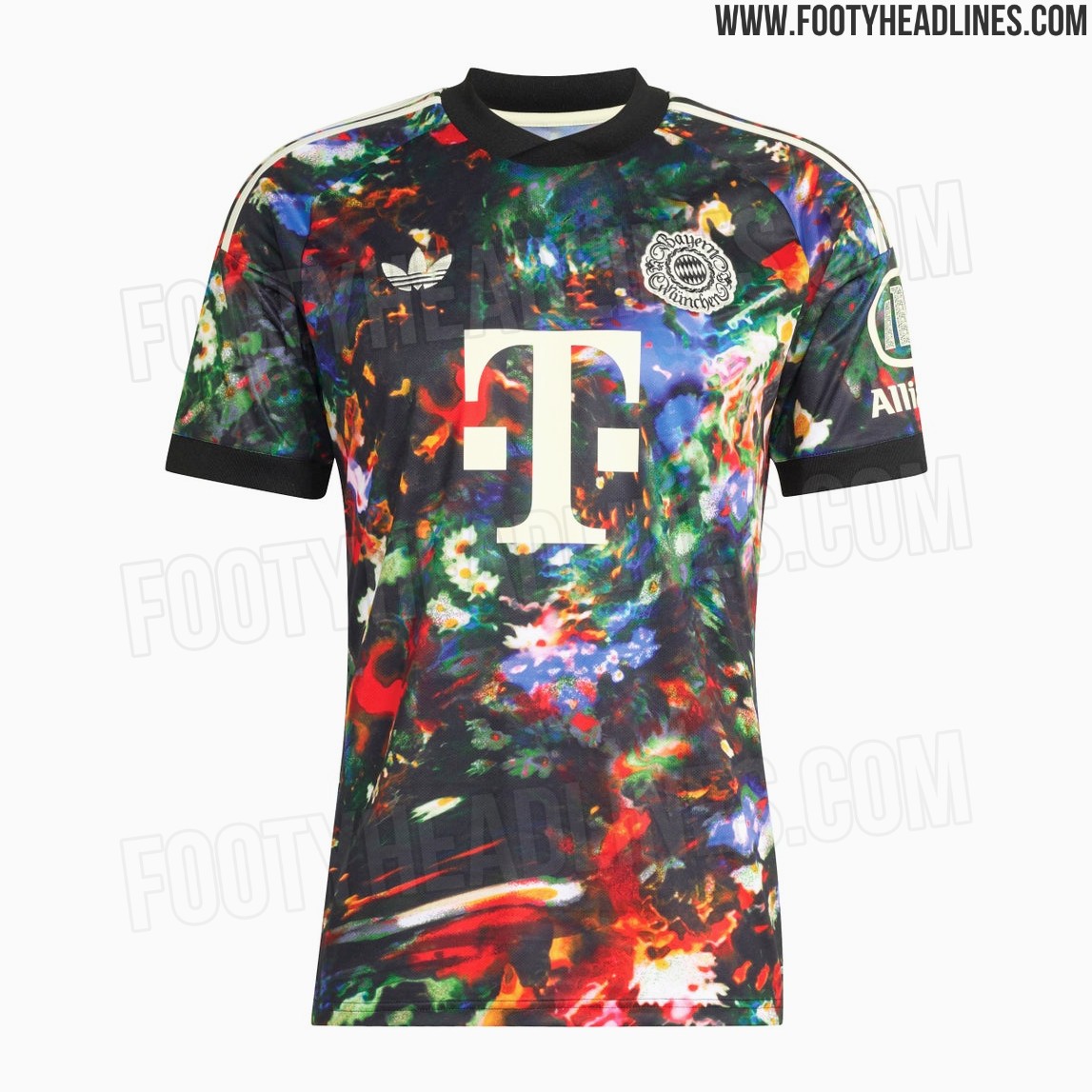
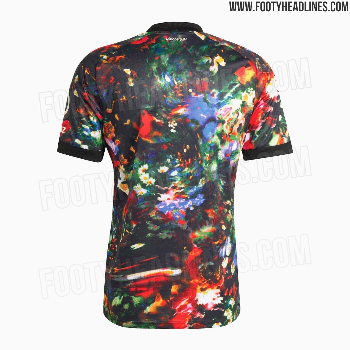
Bayern München 26-27 Oktoberfest Kit Leaked - Full Look - 9 New Official Pictures
We can reveal the full Bayern Munich 2026-2027 Oktoberfest kit, including the shirt, shorts, and socks. The Three Stripes on the shorts use the pattern of the kit.
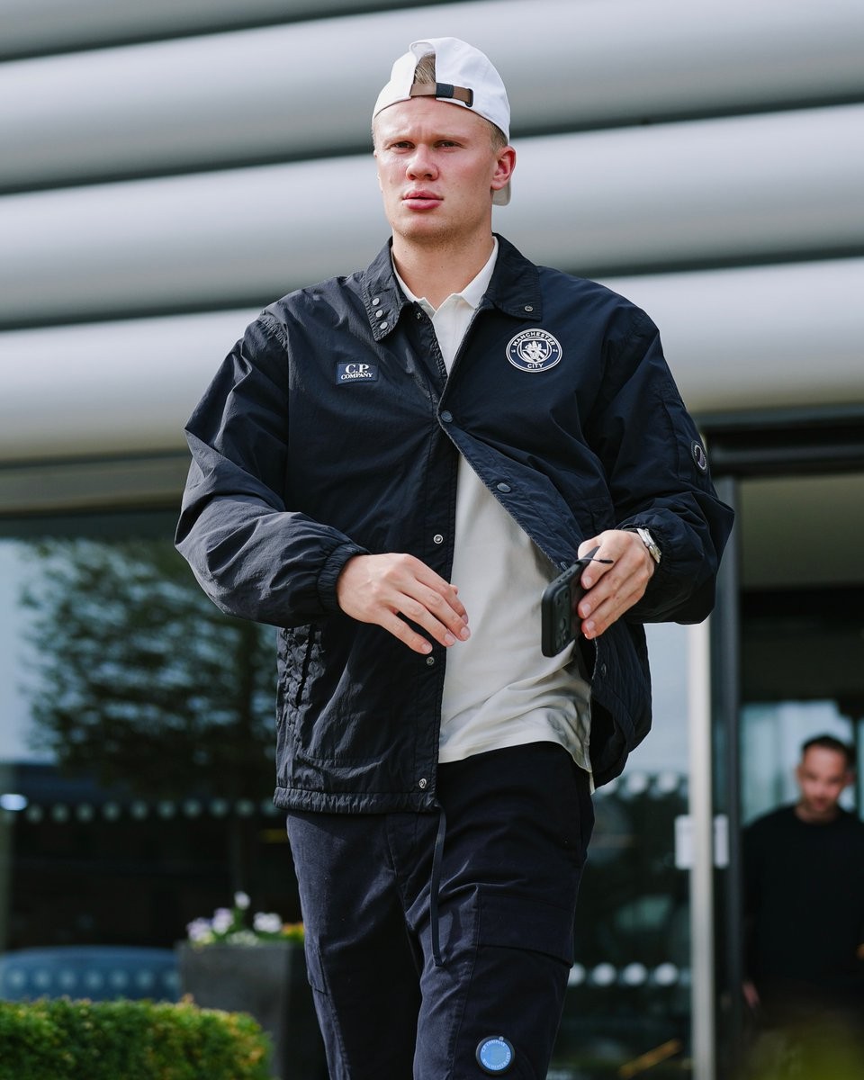
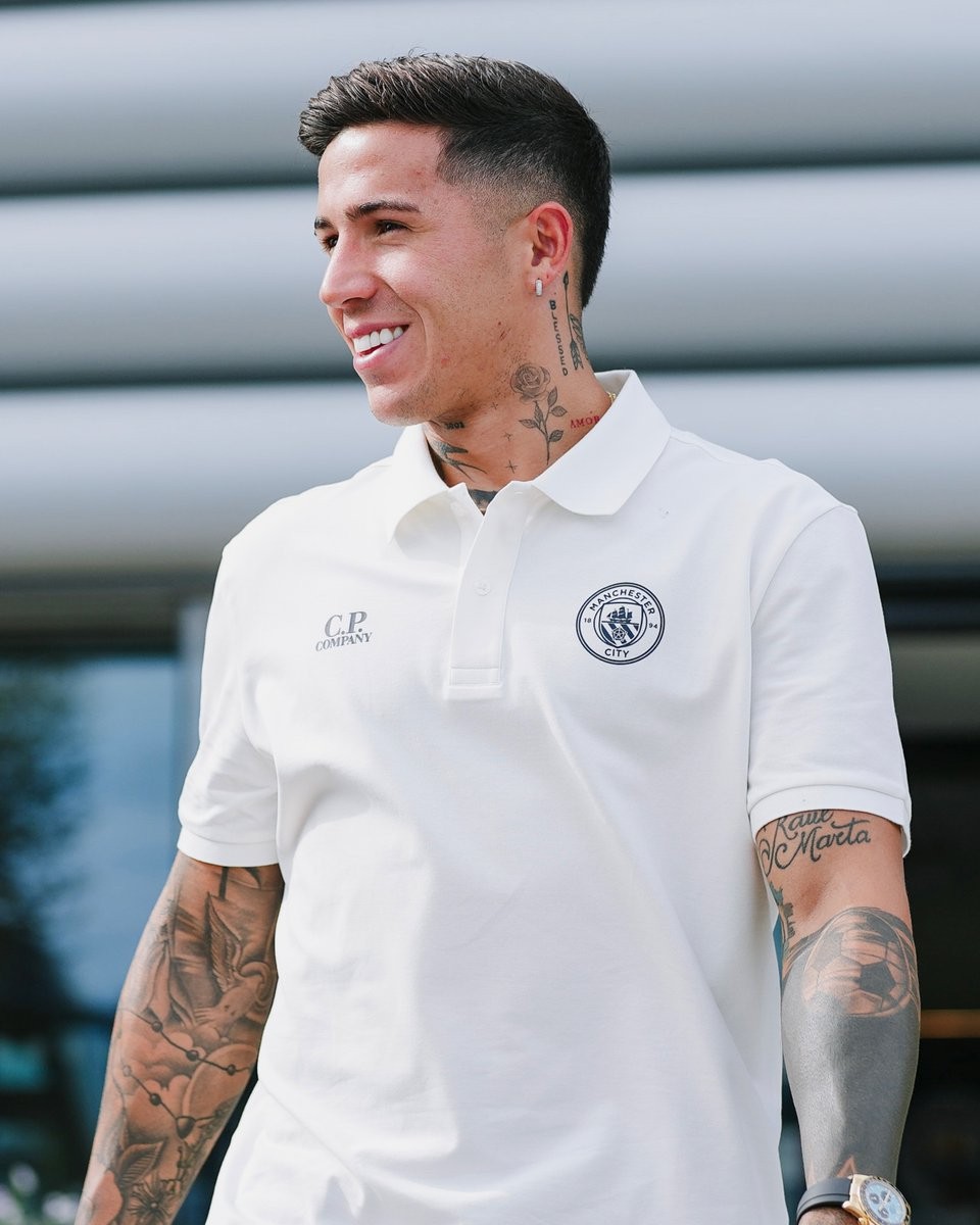
Manchester City Wear C.P. Company for European Travel
Manchester City have worn exclusive C.P. Company travelwear for their first UEFA Champions League away trip of the 2026-27 season, travelling to face Porto.
C.P. Company has been City's Official Fashionwear Partner since 2024, providing customised off-pitch clothing for European trips and high-profile arrivals. The new “Blue Moon Lens” collection blends C.P. Company's signature black with City's traditional light blue across pieces including the Coach Jacket, Puffer Jacket, polo shirts,...
The collaboration will soon extend from travelwear to the pitch, with Puma and C.P. Company set to release a special Manchester City 2026-27 fourth kit, bringing the Italian label's distinctive design identity to a City shirt.
What do you think of Manchester City's latest C.P. Company travelwear? Let us know your thoughts in the comments below.
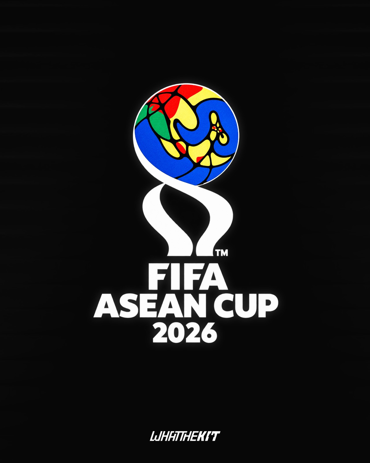
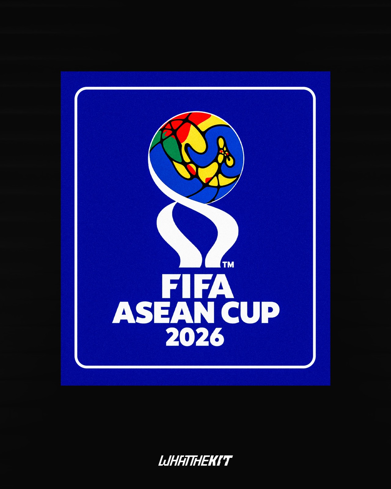
All-New FIFA ASEAN Cup Logo Revealed
The logo for the first FIFA-organized Southeast Asian tournament has been revealed. The design incorporates a colorful, stylized globe depicting the Southeast Asian region.
Our partner, What The Kit, has created a prediction concept mockup of the 2026 FIFA ASEAN Cup patch, featuring a prominent blue background.
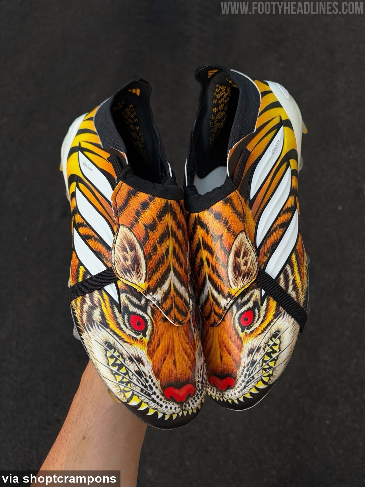
Adidas Predator Y-3 'Tiger' 2026 Boots Leaked - 6 New Images
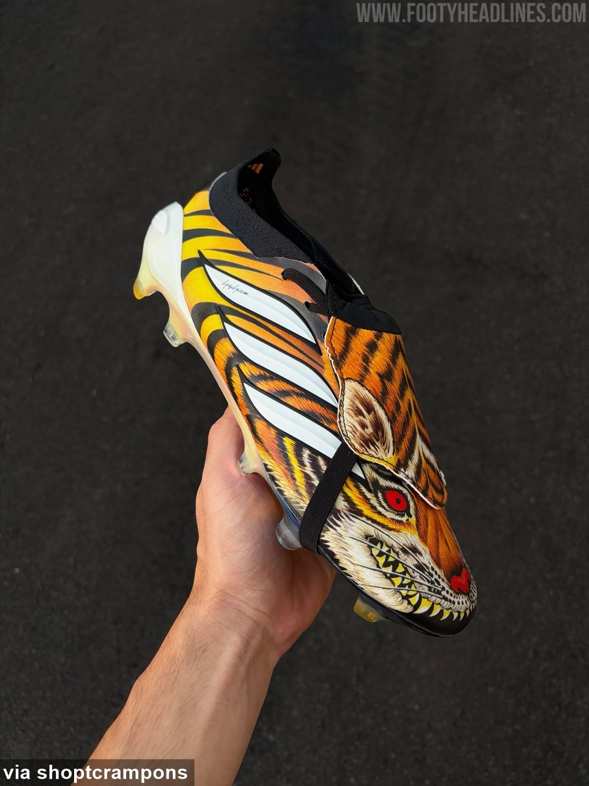
Footy Headlines can now leak 6 new images of the special Adidas Predator Y-3 'Tiger' 2026 boots. Big thanks to shoptcrampons.
The boots feature an incredibly aggressive and bespoke aesthetic, dominated by a highly detailed, hand-painted-style graphic of a snarling tiger with bared teeth and glowing red eyes across the upper.
Cittadella 26-27 Third Kit Released
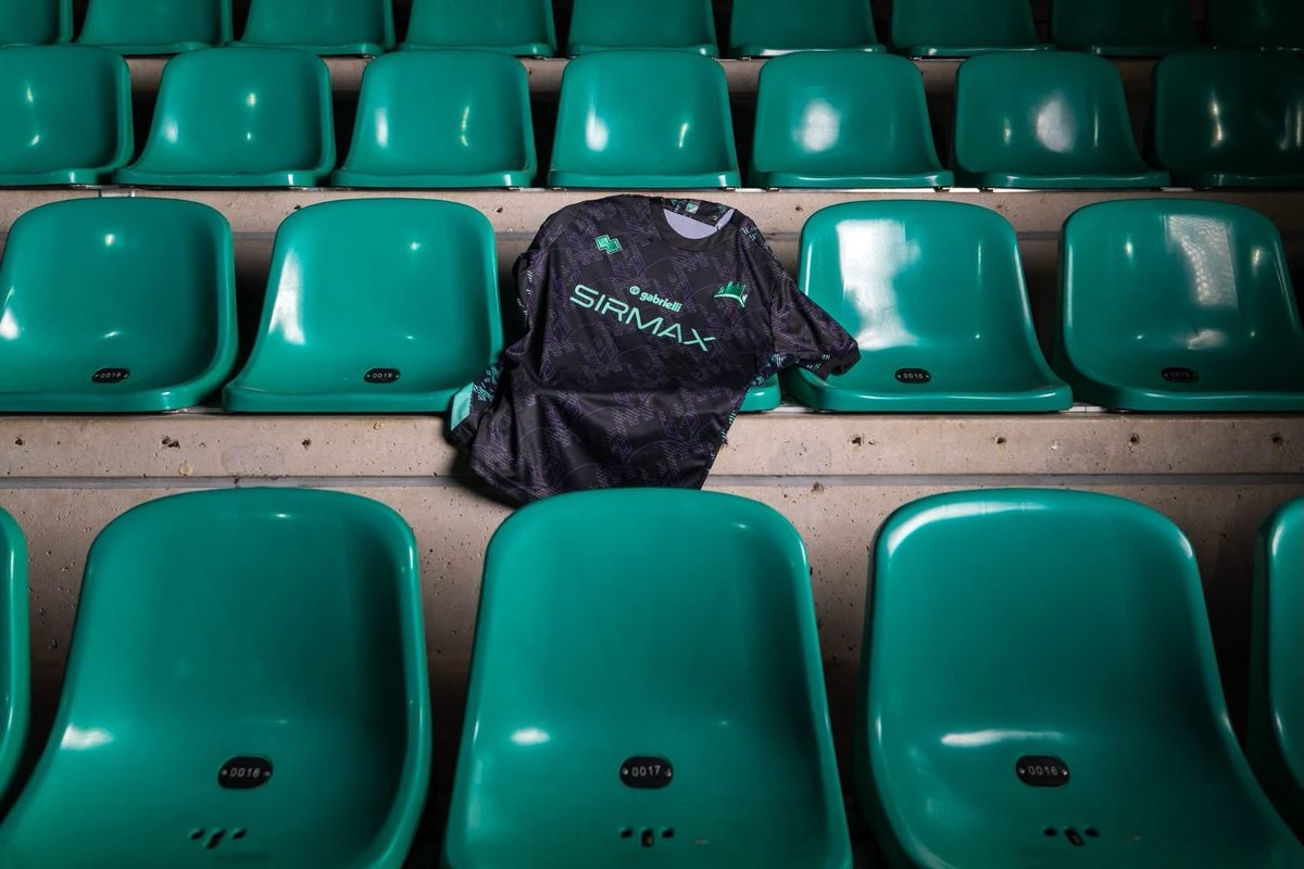
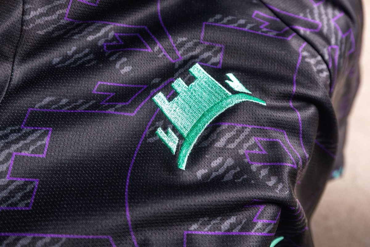
Italian side AS Cittadella and technical sponsor Erreà have officially unveiled the club's new third kit for the 2026-27 campaign. Conceived by Erreà Creative Lab, the strip draws its inspiration directly from the iconic medieval defensive walls that surround the historic city.
The Erreà AS Cittadella 26-27 third shirt combines a predominantly black base with an irregular, lived-in texture that mimics the surface of ancient stone. A striking mix of purple, aqua green, and granata accents enlivens the textured graphic across the front, back, and sleeves. The club's crest is rendered in vibrant aqua green embroidery on the chest, complemented by matching Erreà branding and sponsor detailing, while the club's founding year, 1973, is stitched onto the upper back.
Completing the outfield range alongside the previously launched home and away jerseys, the new third kit is now available through the club's and Erreà's official channels.
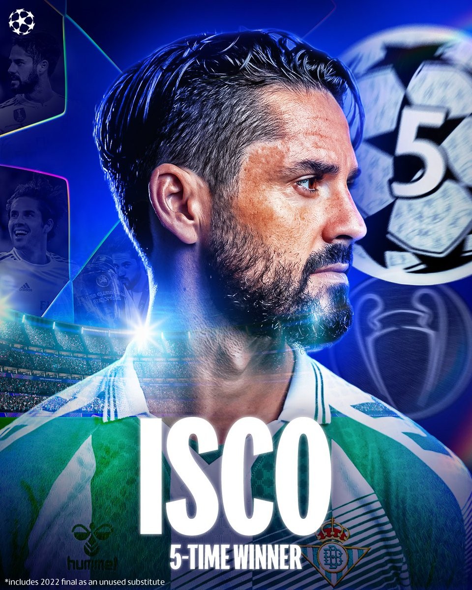
Isco Makes Champions League History With Fifth Different Spanish Club
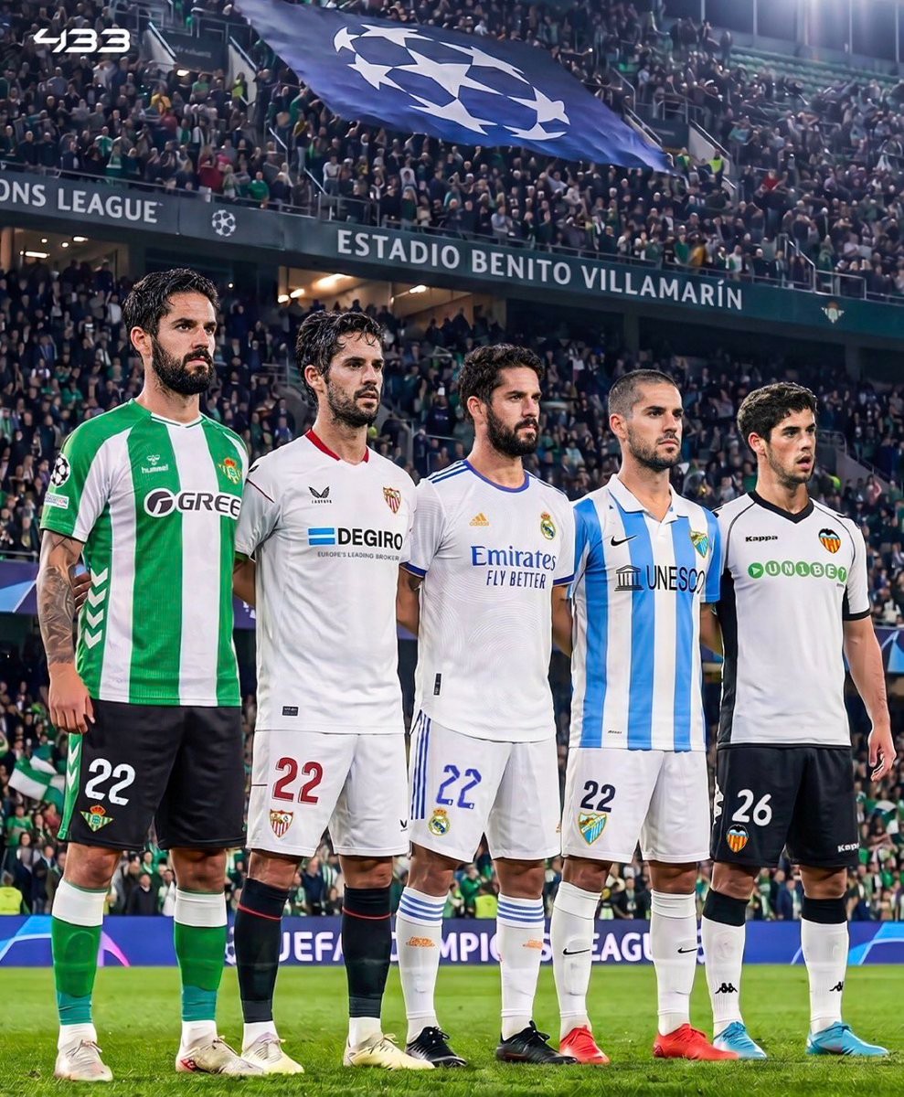
Real Betis captain Isco made European history during his side's return to the UEFA Champions League, inspiring Los Verdiblancos to an exciting 3-2 away victory against Lille. By taking the pitch in Betis' opening fixture, the veteran playmaker became the first footballer in history to appear in the Champions League with five different Spanish clubs, having previously featured in the competition for Valencia, Málaga, Real Madrid, and Sevilla.
Beyond his unique journey across Spanish football, Isco enters the 26-27 campaign holding an unmatched distinction: no active player in this season's competition has won more Champions League titles. The midfielder lifted Europe's most coveted trophy five times during his spell with Real Madrid, triumphing in 2014, 2016, 2017, 2018, and 2022. Betis qualified for the Champions League for the first time in 21 years, and their talisman marked the milestone occasion in style by registering an assist in France to cement his enduring European pedigree.


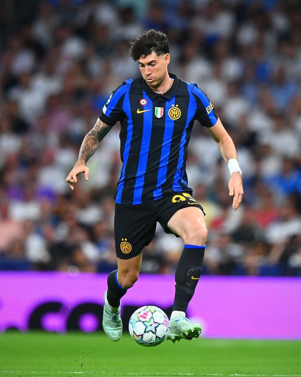
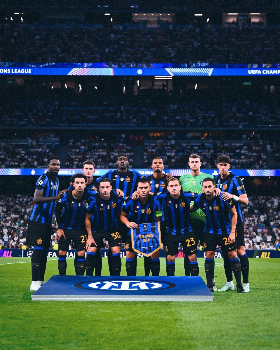
Inter Milan Wears Sponsorless Kit Against Real Madrid Due to Spanish Gambling Ban
Inter Milan took to the pitch at the Santiago Bernabéu for their UEFA Champions League clash against Real Madrid wearing a completely clean, sponsorless version of their 26-27 home shirt. The usual Betsson.sport logo was entirely missing from the chest, providing fans with a rare and striking old-school look for the Nerazzurri's iconic black and blue stripes.
The temporary alteration was made to comply with Spain's strict advertising laws. Under Royal Decree 958/2020, Spain prohibits gambling and betting operators from featuring on sports jerseys or engaging in promotional partnerships with sports teams. While Betsson operates in Italy under the Betsson.sport label as an infotainment platform to navigate the Italian Dignity Decree, Spanish regulatory authorities enforce a much broader interpretation that disallows the brand entirely. Under UEFA equipment regulations, visiting clubs are required to follow host country laws.
Because of the regulation, Inter prepared a sponsor-free run of shirts specifically for their trip to Madrid, leaving only the Nike Swoosh, club crest, and competition sleeve patches in place. The Betsson.sport branding will return to Inter's kits for their upcoming domestic and European matches where local laws permit it.
