All Future FIFA World Cup Logos to Have Same Design?
 May 22, 2023, by Chris

In a groundbreaking development, info suggests that all future FIFA World Cup logos will have a unified design approach starting from the 2026 edition and continuing onward. If the speculations hold true, it would signify a significant departure from the previous logo styles and usher in a new era.

The design language anchors the FIFA World Cup emblem for 2026 and beyond
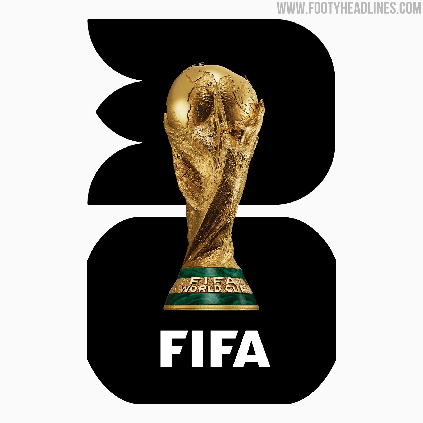
2026 World Cup Logo Branding to Be Used For All Future World Cups?


For the first time in history, the 2026 World Cup logo incorporates an image of the coveted trophy alongside the year of the tournament. According to the press release published by FIFA, the "innovative design language anchors the FIFA World Cup™ emblem for 2026 and beyond". This probably means that every World Cup logo from 2030 will have the realistic trophy with the year behind it.
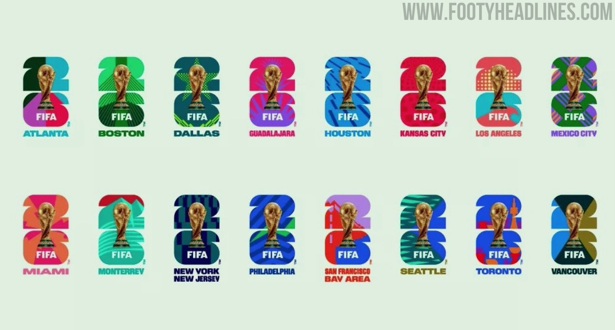


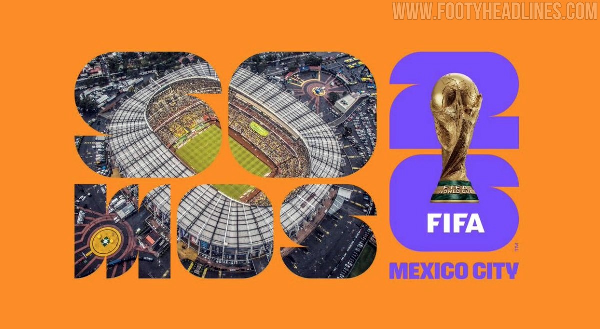
The new 2026 World Cup logo has been already customized for each host city, showing off the great potential of the logo.

According to FIFA, the fresh design language aims to capture the uniqueness of each host country while establishing a recognizable brand structure for future editions. The customization possibilities promise to infuse each logo with elements that celebrate the culture, heritage, and distinctiveness of the host nation.


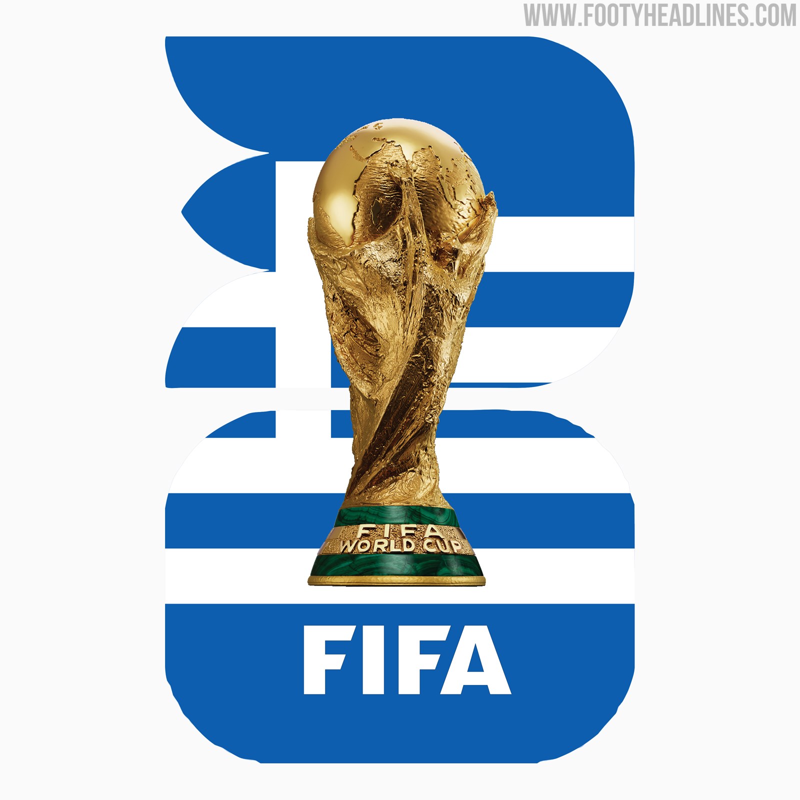
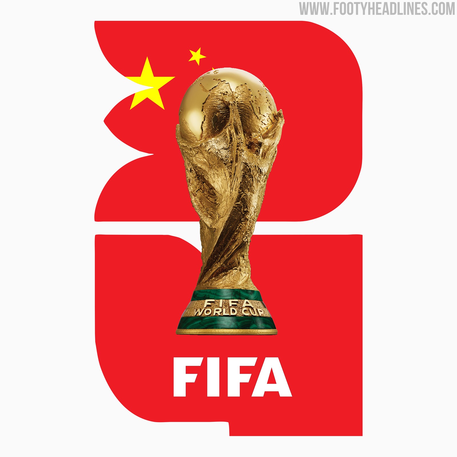
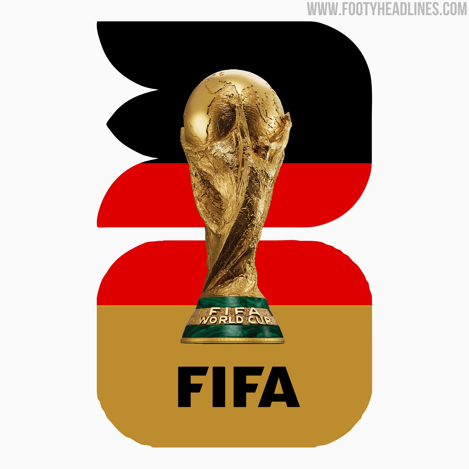
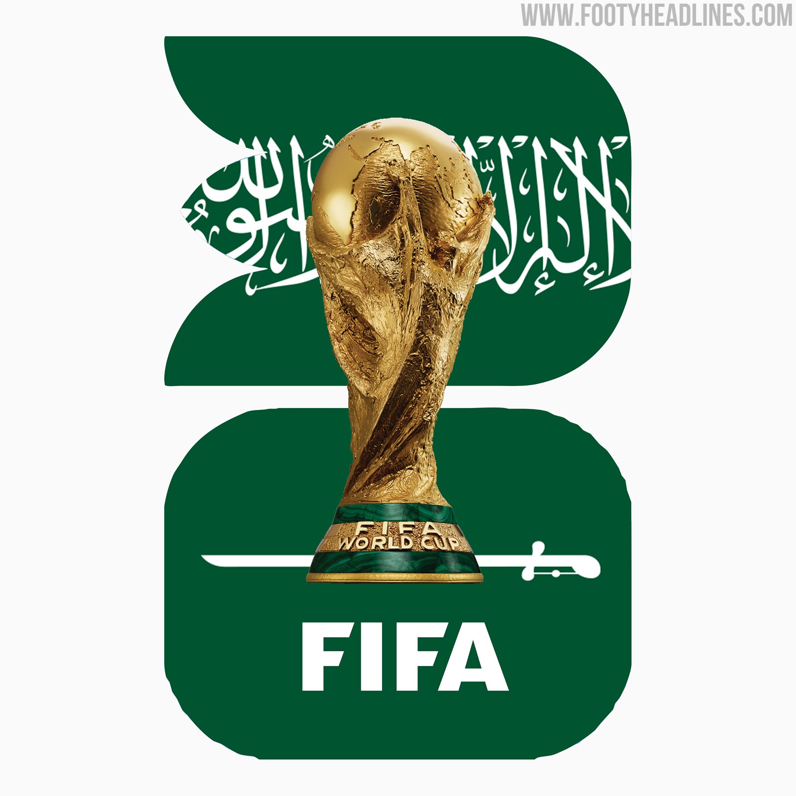
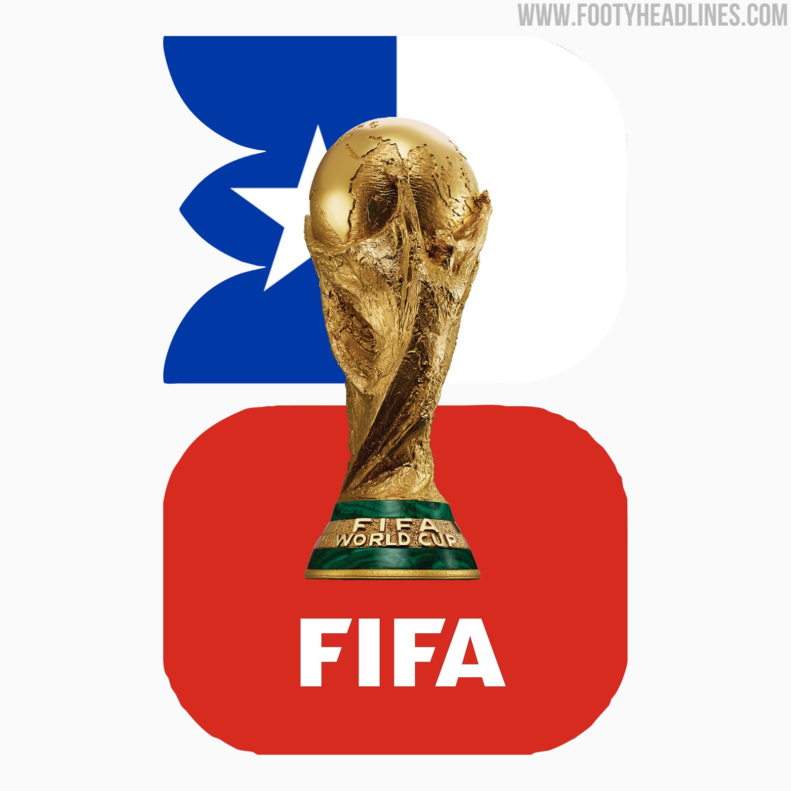
Footy Headlines have taken the initiative to create concept logos for the 2030, 2034, and 2038 editions.
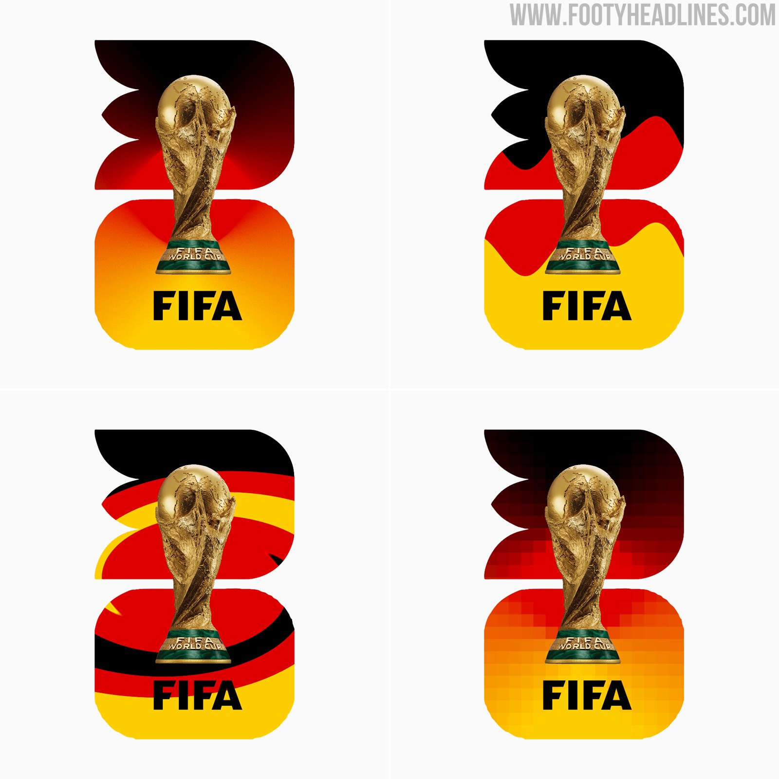
Germany 2030 World Cup Concepts
If the rumors turn out to be accurate, this new direction will mark a significant shift in the branding of the world's most prestigious football tournament. The move toward a consistent design language aims to create a sense of continuity and connection between each edition while allowing for individuality and cultural representation through the use of colors.
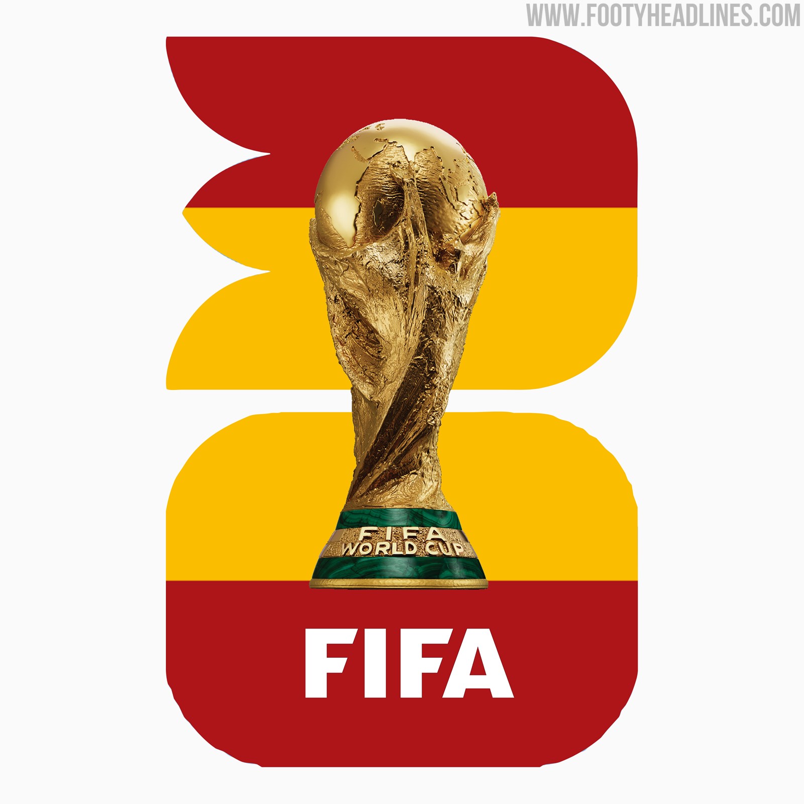

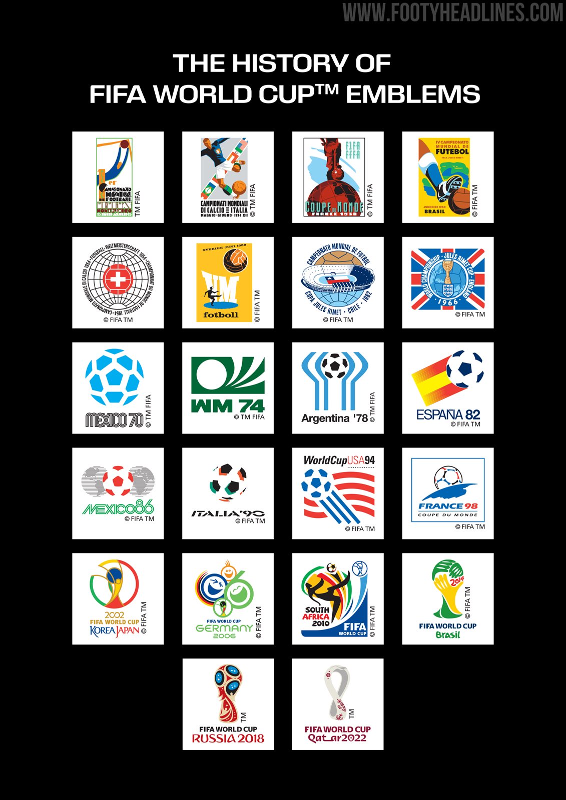
Indeed, previous World Cups already had a streamlined design scheme. This design scheme was the same for several continuous tournaments (e.g. 2014, 2018 & 2022, or 1970 until 1990), but the new logo is an even more streamlined approach.
Indeed, if FIFA would make it a reality, they would take a similar step as the NFL with the Super Bowl logo, which has been using a streamlined design in the past few years. The streamlined look was more customized in the past few years, possibly after fans' critics.


Graphic designer Marito Rodriguez (@marito_plottier) has imagined how the full branding of the new FIFA World Cup logo typeface could look - we created our concept logos using his font.
For now, we have to await official confirmation and further details regarding the potential overhaul of FIFA World Cup logos. If this exciting change comes to fruition, it will undoubtedly transform the visual identity of the tournament.

Do you like the new streamlined design of the FIFA World Cup logos? Let us know in the comments below.

Slovan Liberec 26-27 Home & Away Kits Released
Slovan Liberec have unveiled their new 26-27 home and away kits. Made by Nike in cooperation with teamwear specialist 11teamsports, the new shirts introduce contrasting looks for the Czech First League club.
The Nike Slovan Liberec 26-27 home shirt features a bold black and blue design. This predominantly dark look is directly inspired by the club's newly introduced visual identity, offering a striking and modern aesthetic for their home matches.
In contrast, the Nike Slovan Liberec 26-27 away shirt opts for a much more traditional design. It combines a clean white base with blue details, staying true to the club's classic away colors and providing a perfect alternative to the dark home kit.
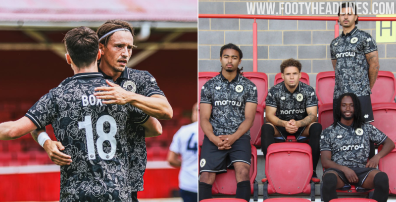
No More Adidas: Decathlon Casertana 26-27 Home & Away Kits Released
Italian Serie C side Casertana FC has officially unveiled its new 26-27 home and away kits, marking the beginning of a new technical partnership with Decathlon. The French sporting goods retailer replaces Adidas, who produced the club's kits for the 25-26 season. The new Decathlon Casertana 26-27 shirts feature bespoke designs.
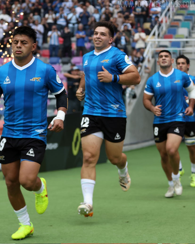
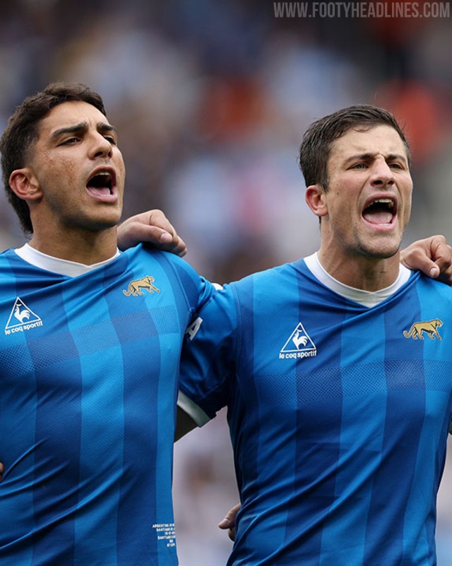
Argentina Rugby Team Wears 1986 World Cup-Inspired Jersey Against England
The Argentina national rugby union team, Los Pumas, took to the pitch in special attire for their international test match against England on July 18, 2026. Instead of their usual shirt, they wore a special edition inspired by the Argentina 1986 FIFA World Cup football kit, famous for its association with Diego Maradona and the national team's triumph in Mexico.

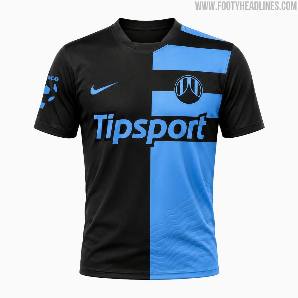
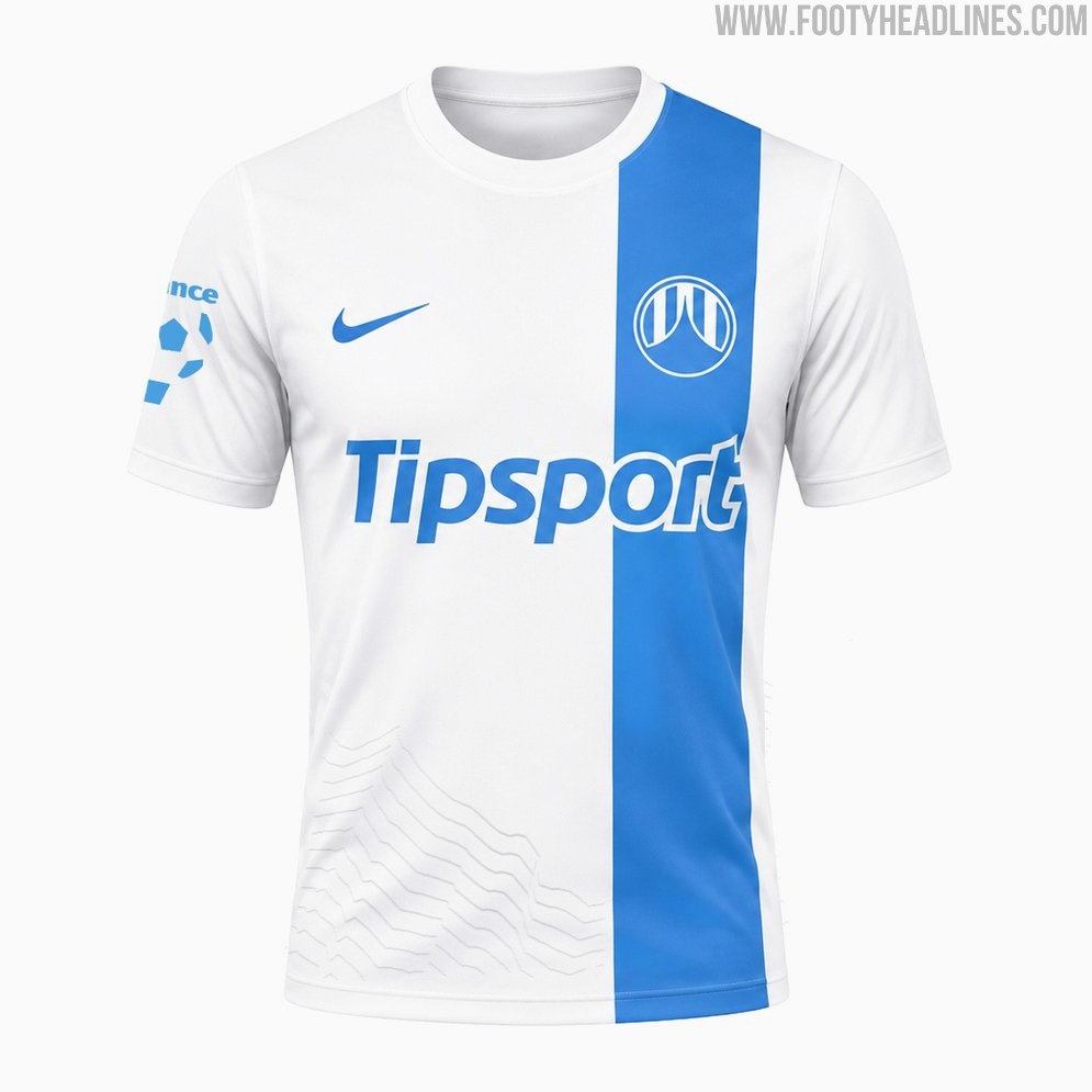
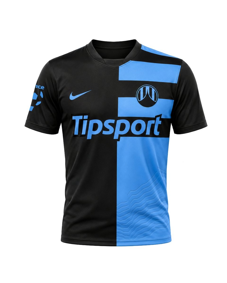
FC Slovan Liberec 26-27 Home & Away Kits Released
The new FC Slovan Liberec 26-27 home and away kits have been officially revealed, produced by Nike in collaboration with 11teamsports.
The home shirt introduces a bold dark black and blue design that aligns with the club's new identity, while the away jersey is white and blue. Both kits will be worn in the upcoming Chance Liga campaign.
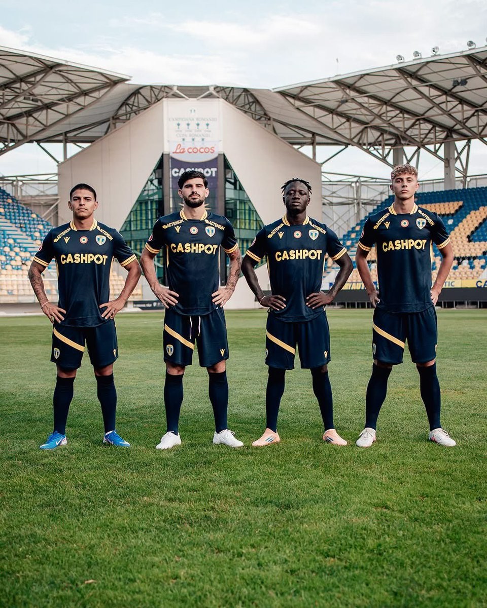
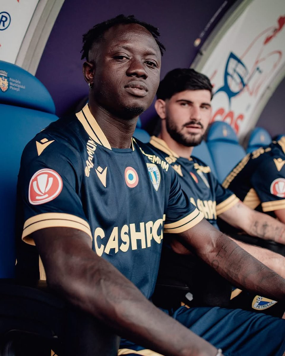
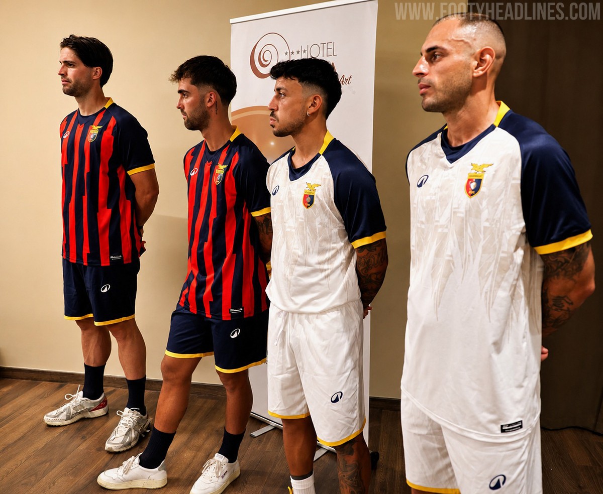
Petrolul Ploiești 26-27 Away Kit Released
The new Petrolul Ploiești 26-27 away kit was released today. It is made by Macron and will be worn in the upcoming 2026-27 Romanian Liga I season.
Manufactured by Italian sportswear brand Macron, the Petrolul Ploiești 2026-2027 away shirt provides a fresh alternative design for the club's travels. It features Macron's standard performance template and detailing, tailored specifically for the Romanian side as they look ahead to their new domestic campaign.
Fans can expect the Macron Petrolul Ploiești 26-27 away uniform to be available for purchase through the club's official physical and online retail channels.