Feyenoord Updated Their Logo, but You Barely See Any Difference
 Jul 22, 2024, by Phan Tich Giay

- Logo Update: Feyenoord has released a new logo with only minor alterations.
- Minimal Changes: The updated logo keeps the same design, with changes including letters being closer together, brighter red color, slight realignment of the letter F, and the removal of the yellow line in the middle.
- Spot the Difference: The differences between the old and new logos are very subtle.
A few hours ago, Feyenoord released a video introducing their new logo. And you'll have a hard time spotting the difference.

The Feyenoord logo: a 𝐅resh look
— Feyenoord Rotterdam (@Feyenoord) July 22, 2024
New Feyenoord Logo
The new Feyenoord logo retains the same design with only minimal changes.

There are 4 changes in the new Feyenoord logo:
- The letters are closer together
- The red is brighter
- The F has been slightly re-aligned
- The yellow line in the middle ( | ) has been removed.

Can you spot the difference between the old and new Feyenoord logo? Let us know in the comments.

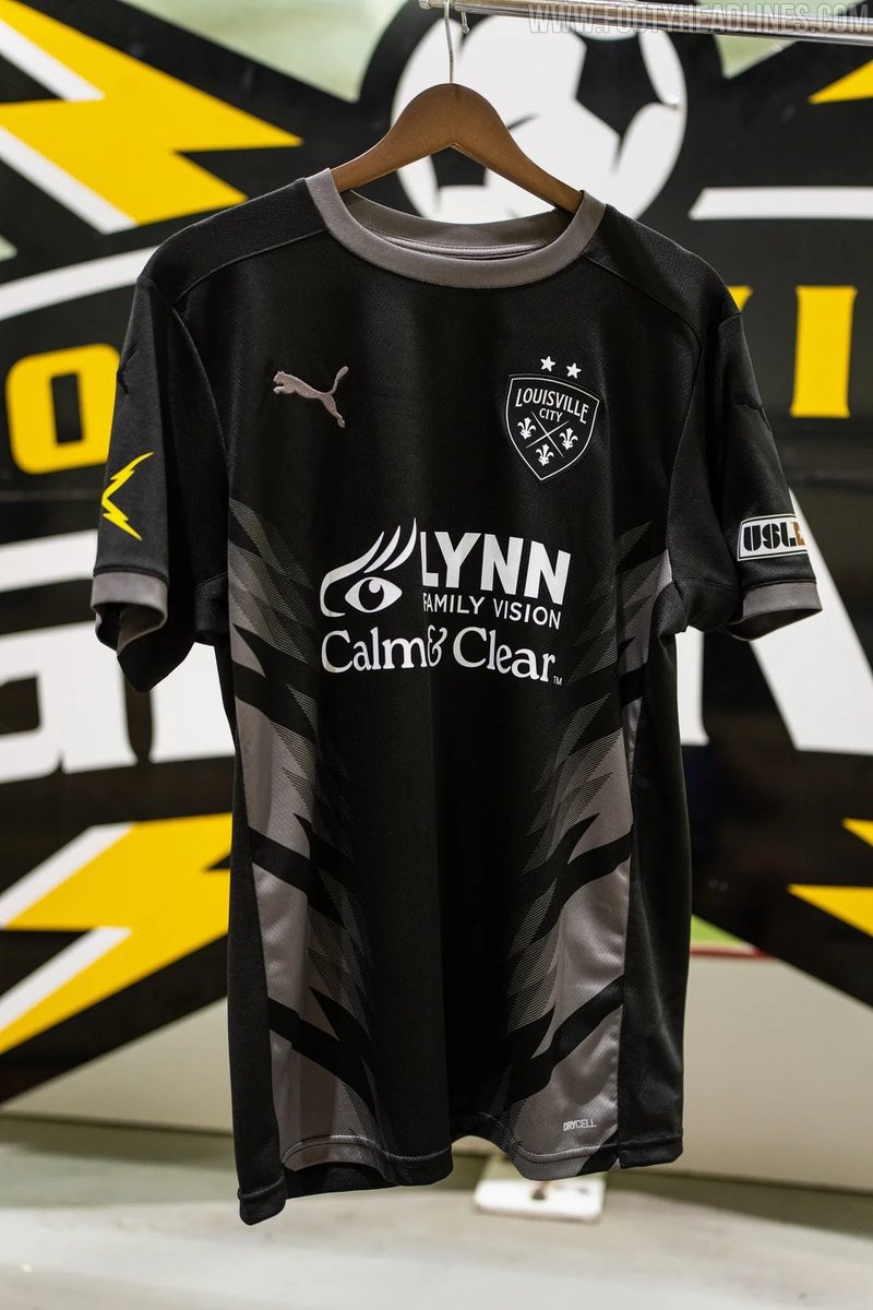
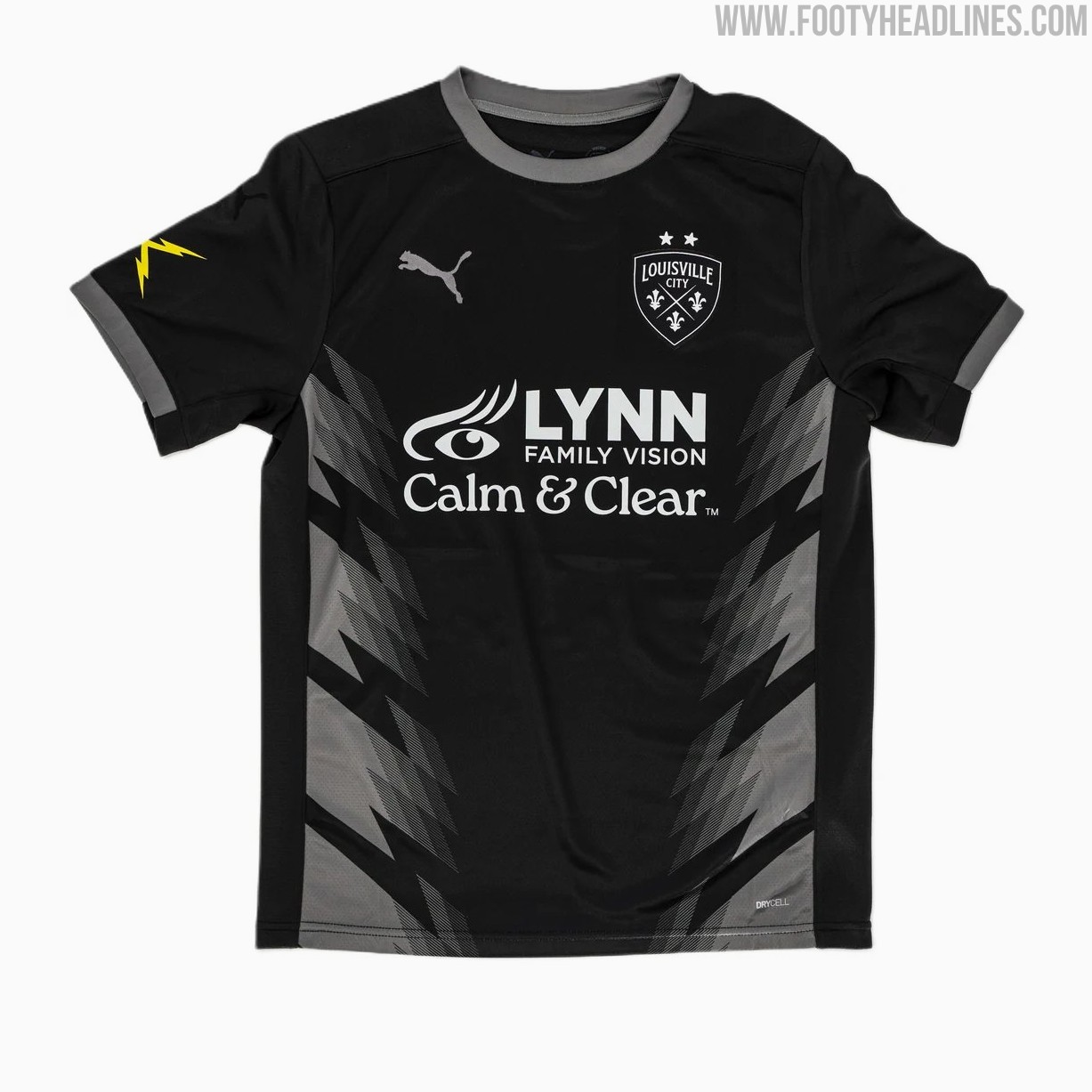
Louisville City 2026 Third Kit Released
USL Championship side Louisville City FC has officially unveiled its new Puma 2026 third kit, completing the team's jersey set for the 2026 season.
Dubbed the "Lightning Kit," the predominantly black uniform honors late club founder Wayne Estopinal and the former Louisville Lightning indoor soccer team that played from 2009 to 2012. The shirt features a subtle chevron stripe pattern across the front inspired by storm clouds, while striking yellow lightning bolts decorate the right sleeve. Rounding out the look with matching black shorts, the 2026 third jersey joins the previously released home and away options and is now available for purchase through the official club store.


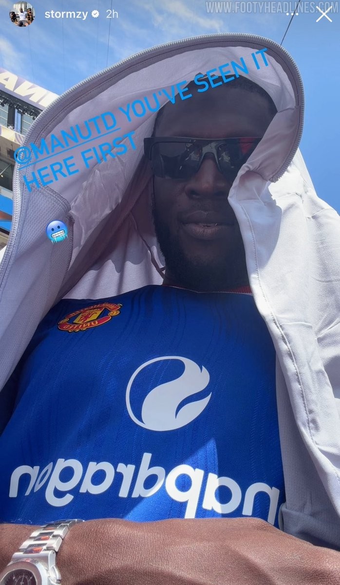
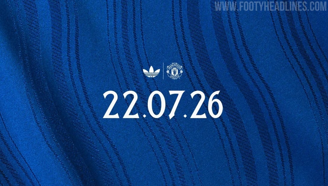
Manchester United 26-27 Away Kit Teased
Manchester United has officially teased its upcoming 26-27 away kit, confirming that the new Adidas shirt will be released on Wednesday, 22 July 2026. Following a series of leaks and an early appearance by British rapper Stormzy wearing the unreleased shirt, the official launch will finally officially unveil the blue design that pays homage to the River Irwell and the club's classic 1988 away kit.
Manchester United 26-27 Away Kit Leaked - 14 Official Images
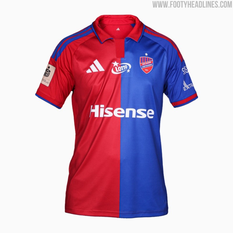
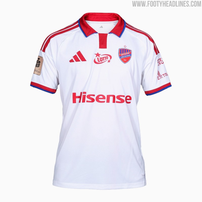
Raków Częstochowa 26-27 Home & Away Kits Released
Polish club Raków Częstochowa has officially released its new 26-27 home and away kits, made by Adidas. Launched under the slogan "Colors that oblige - this is our DNA, this is our identity," the new strips will be worn during the upcoming Ekstraklasa campaign.
The new Adidas Raków Częstochowa 26-27 home and away shirts both feature custom looks with Adidas' 2026 polo collar.