
The German Bundesliga Has a Serious Font Color Issue
 Sep 15, 2024, by Chris

- Bundesliga Font Issues: The German Bundesliga is facing criticism for poor font color choices on player kits, making names and numbers difficult to see.
- Specific Examples: Several teams, including Kaiserslautern, Bayern Munich, and Werder Bremen, have kits with insufficient contrast between numbers/names and jersey colors.
- Contrast Regulations: Unlike the Premier League and UEFA, the Bundesliga lacks strict contrast guidelines, which has lead to this problem.
The German Bundesliga (officially operated by the DFL) has recently faced criticism for its kit font color choices, particularly regarding player names and numbers on jerseys. Thanks to football font experts Sportsfonts for the heads-up.

German DFL Does Not Care About the Visibility of Names & Numbers on Kits
The controversy was heightened during yesterday's 2. Bundesliga match between Hannover 96 and Kaiserslautern, where Kaiserslautern donned its new 24-25 third kit. The problem? Player names and numbers were nearly invisible, as they were white on a light blue background. The situation worsened under the sunlight, making it appear as if no numbers were present at all.


This isn't an isolated incident. Kaiserslautern's kit is just one example of how the DFL has struggled to ensure adequate contrast between player numbers and jersey colors. Other clubs have faced similar issues:
Bayern Munich

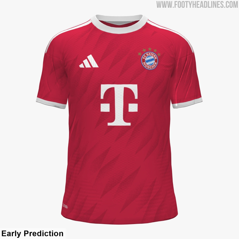
Bayern Munich's 24-25 home kit features dark maroon numbers on red, making them hard to read, especially for commentators and fans in the stadium.
Bremen


Werder Bremen's away kit presents another challenge, with pale green on off-white numbers that are equally difficult to discern.
Hoffenheim

Hoffenheim's 24-25 third kit uses green numbers on a light green background, which is not optimal but rather good in terms of visibility compared to the others.

In comparison, the Premier League has more standardized guidelines featuring large numbers with a visible border available in only a few colors, though this limits design options. Meanwhile, UEFA's regulations are stricter, with Article 54 of the official Equipment Regulations stating that player numbers must maintain a contrast level (Delta L value) of 30 or higher to ensure visibility.

The Bundesliga's inconsistent font contrasts are becoming a practical issue, and many are calling for the DFL to implement clearer guidelines to avoid such problems.
Should the DFL take stricter measures like UEFA? Let us know in the comments below.
Adidas Liverpool 26-27 LFSTLR Collection Leaked
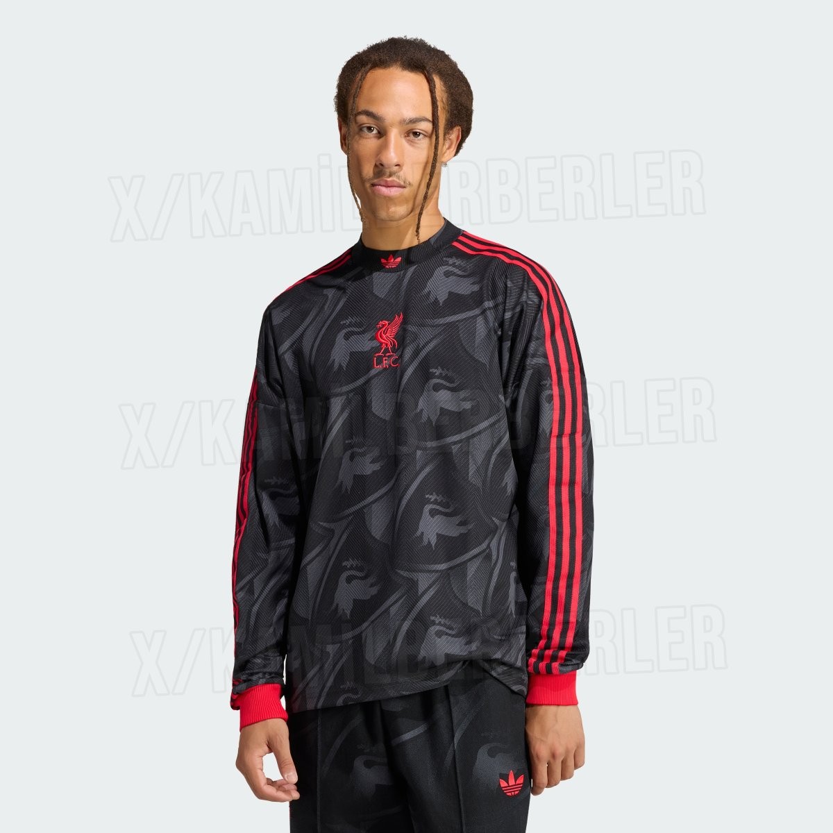
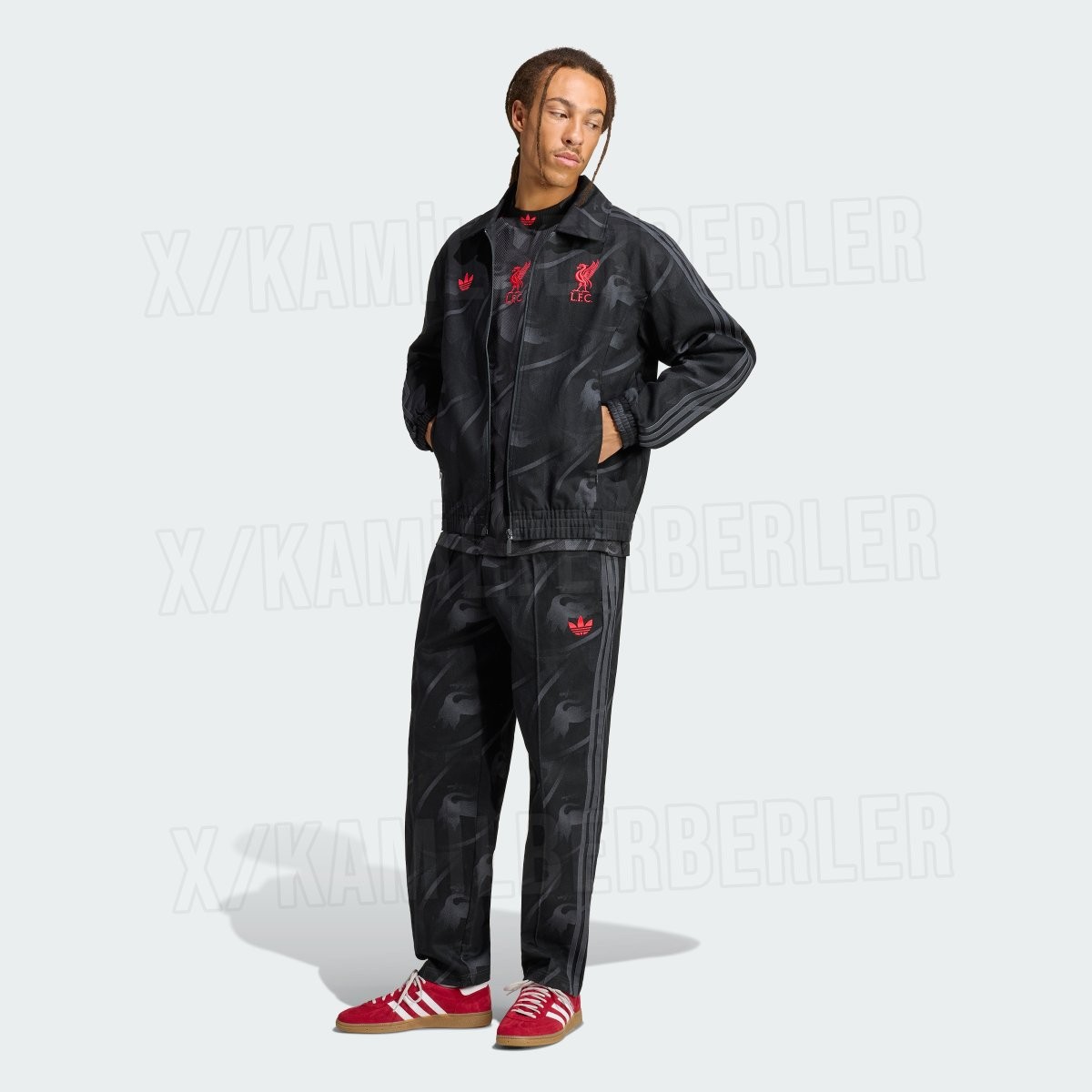
Official images of the upcoming Adidas Liverpool LFSTLR collection for the 26-27 season have surfaced online, courtesy of kit insider @KamilBerberler. Following the popular black and gold capsule from the previous campaign, the newest lifestyle range from Adidas Originals switches direction with a sleek black and vibrant red color palette, merging retro football heritage with contemporary streetwear design.
The standout piece of the collection is a long-sleeve lifestyle jersey finished in a deep black base with a subtle, tonal all-over graphic incorporating the iconic Liver bird. Contrasting vibrant red accents define the look, highlighting the classic Adidas Three Stripes running down the shoulders and sleeves, the ribbed cuffs, and centrally stacked Trefoil and Liver bird logos. A matching full-zip coach track jacket and tailored track pants carry the same stealthy tonal pattern and bright red detailing.
Alongside the tracksuit is a bold red pullover hoodie featuring dark, centered chest emblems and "YNWA" typography printed on the sleeve cuff. Rounding out the lineup is a relaxed-fitting black t-shirt that displays the stacked red logos on the chest, a jacquard "YNWA" pattern knitted into the ribbed crew collar, and an oversized red "YNWA" wordmark across the lower back hem. The new Adidas Liverpool 26-27 LFSTLR range is expected to launch in the coming months.
Black & Gold Liverpool 26-27 Lifestyle Shirt Leaked - Official Images
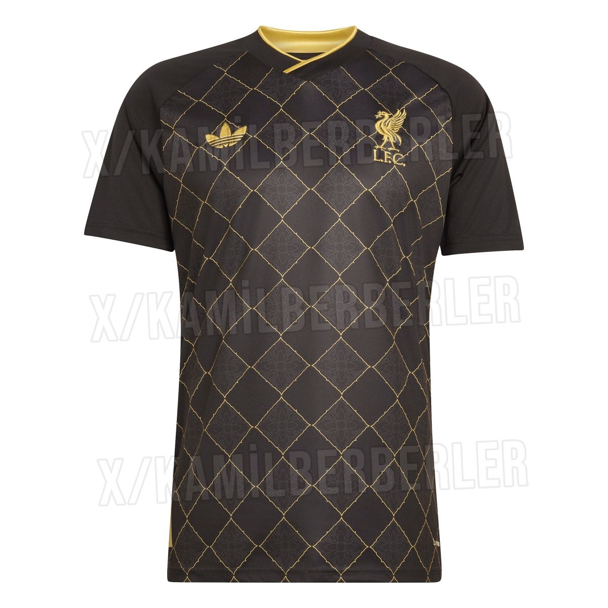
Official images of the upcoming Adidas Liverpool 26-27 special-edition lifestyle and pre-match shirt have surfaced online, providing the clearest look yet at the luxurious black and gold design. Known unofficially as the "Gold Leaf" jersey, the shirt is set to release during the 26-27 season as part of Adidas's off-pitch and culture range for the club. Big thanks to @KamilBerberler.
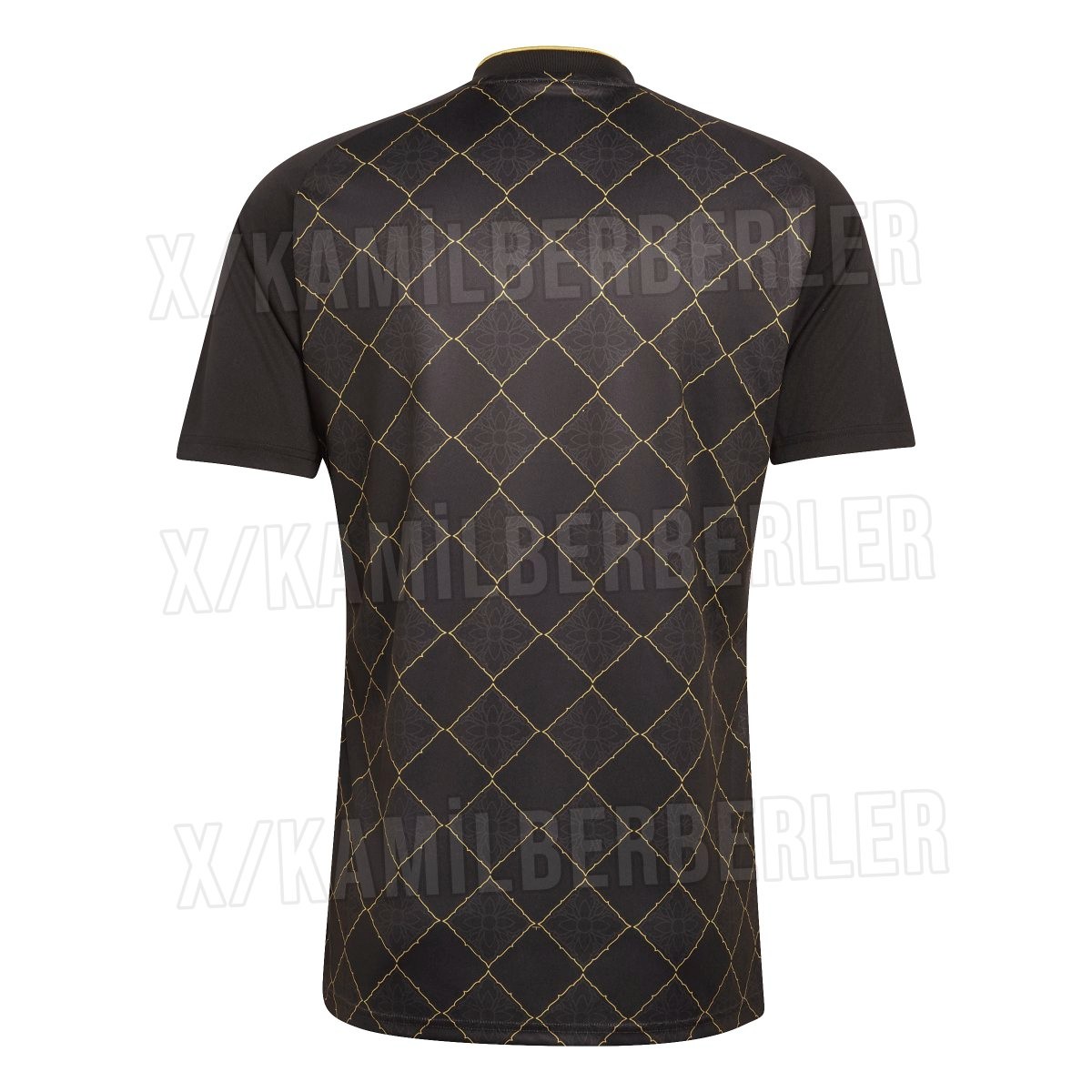
The shirt features a stealth black foundation covered by an intricate metallic gold diamond lattice pattern across the front and back of the torso. Each diamond enclosure contains an ornate floral damask motif inspired by traditional Southeast Asian art, honoring Liverpool's vast Thai fanbase. A classic Adidas Trefoil logo appears on the right chest alongside the Liver bird crest on the left, both applied in matching gold.
Completing the design are solid black sleeves and a crossover V-neck collar detailed with a gold inner trim. Tailored as a high-fashion crossover rather than a competitive match kit, this special-edition pre-match and lifestyle shirt will be available in the 26-27 season.


QPR Kit Clash Against West Brom
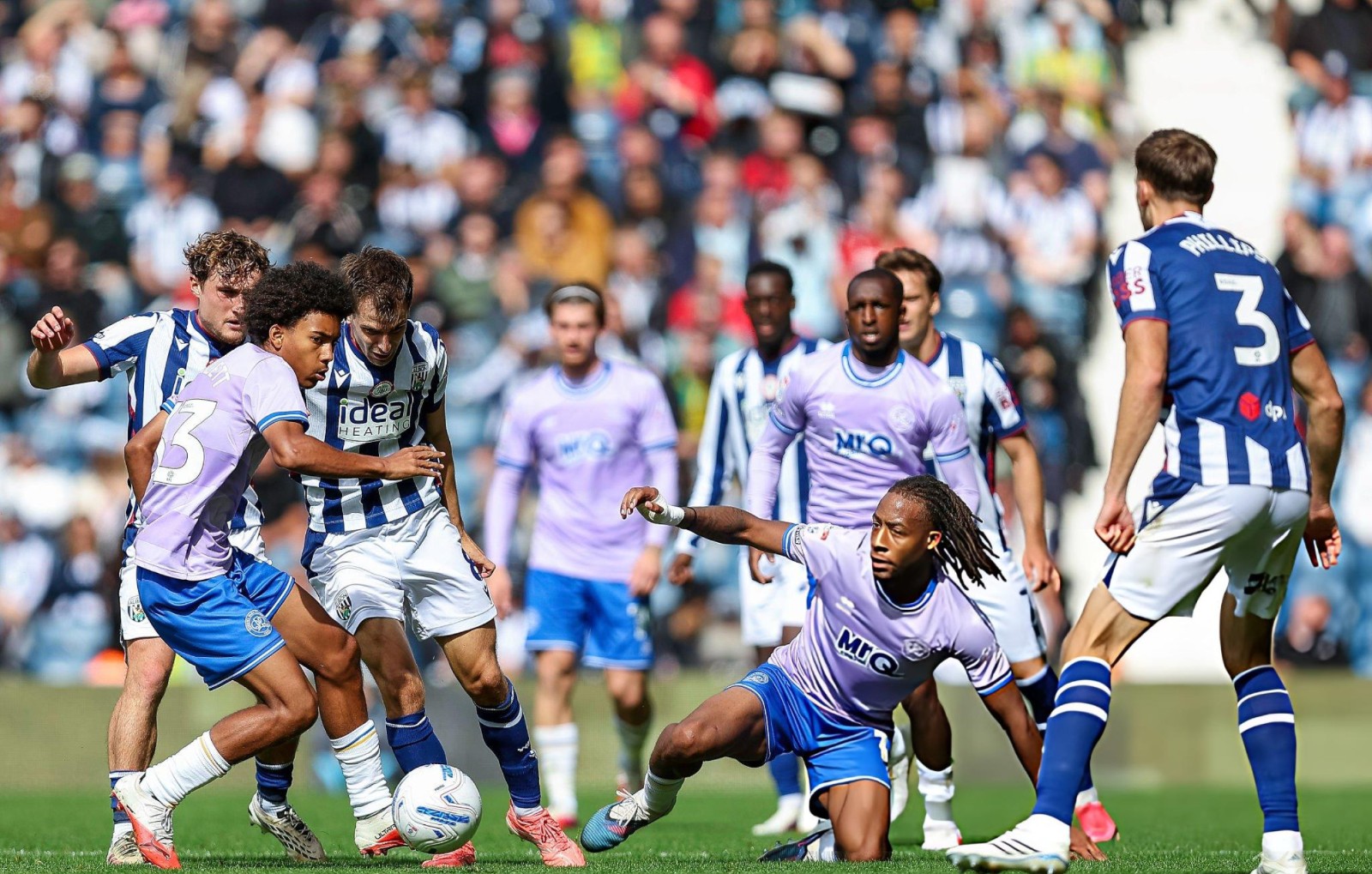
QPR faced a major kit clash in their EFL Championship away game at West Brom, wearing their pink away shirt with blue shorts against West Brom's traditional blue-and-white home shirt.
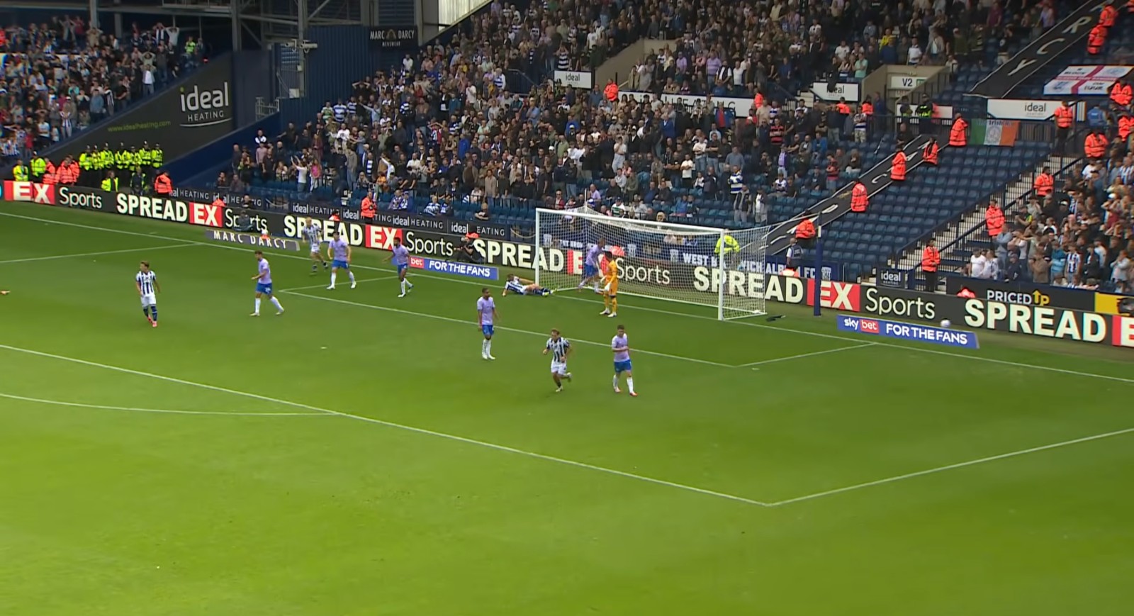
The bright pink of QPR looked surprisingly similar to the white stripes of West Brom on TV, while the blue shorts and dark details made the overall contrast even less clear.
From the wide camera angle, the two teams became difficult to distinguish, creating a frustrating viewing experience for fans.

