Updated New York City FC 2025 Logo Revealed
 Sep 9, 2024, by Chris

- Logo Update: New York City FC has updated its logo for the 2025 MLS season, marking its first-ever logo revision.
- Design Changes: The updated logo features a bolder "NYC" monogram with thicker letters, a custom typeface inspired by NYC subway tiles, and a revised color palette with lighter light blue and darker dark blue.
- Purpose of Redesign: The redesign is a thoughtful evolution of the club's identity, aimed at refreshing the crest while building upon the established brand.
New York City FC has revealed a significant update to its crest ahead of the 2025 Major League Soccer (MLS) season.


New York City FC Updates Badge for 2025 MLS Season
The New York City 2025 crest is the club's first-ever updated logo and replaces the team's original logo.

The redesign represents a thoughtful evolution of the club's identity, with an emphasis on building upon its established brand since joining MLS in 2015. The aim was to refresh the crest without making radical changes, ensuring it reflects the club's growing ambition.
Key New York City FC Badge Changes
The New York City FC.
— New York City FC (@newyorkcityfc) September 9, 2024
A renewal of our Club badge and logo system, honoring our roots while paving the way for our future.
The centerpiece of the new New York City FC badge is an updated "NYC" monogram featuring thicker, flared serif letterforms. The monogram's style has been modified to align with the surrounding text in the badge's roundel, which now occupies more space. This outer text has been set in a custom typeface, inspired by pre-unification New York City Subway tile signage, giving it a distinctly local feel.
Additionally, the white circle surrounding the monogram has been removed, while the light blue and orange outer rings have been thickened. The new color palette, featuring lighter light blue and darker dark blue, provides stronger contrast, making the overall badge bolder.
These updates aim to enhance the club's visual identity, allowing for a more versatile use of the monogram across different branding materials, including modular wordmarks.

Better or worse than the old logo? Do you like the updates New York City FC made to its logo? Let us know in the comments below.
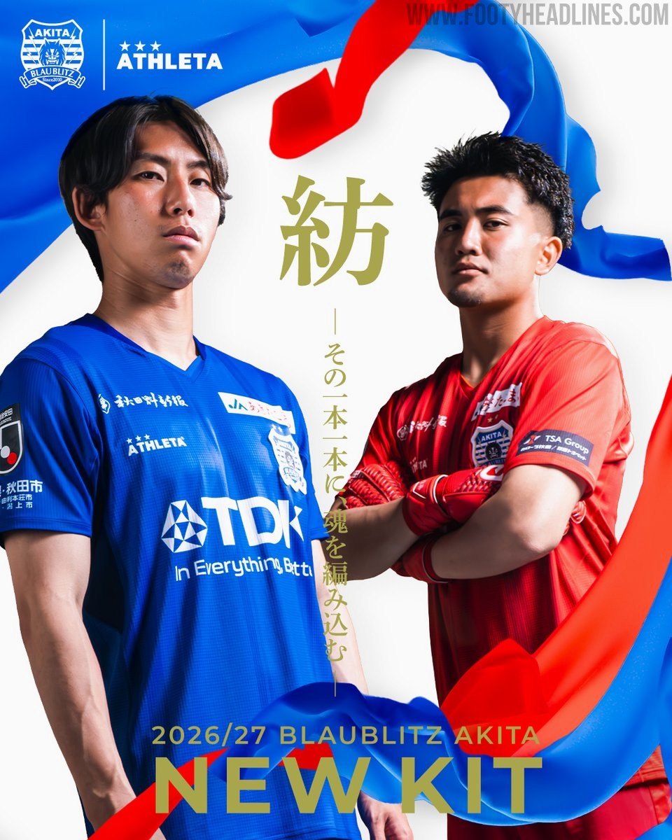
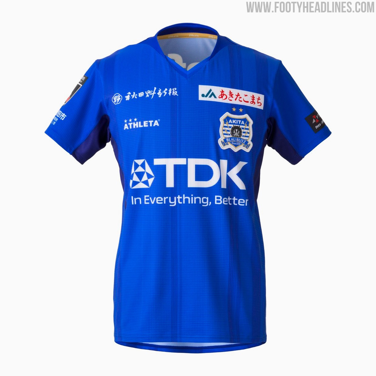
Blaublitz Akita 26-27 Kits Released
Japanese J2 League club Blaublitz Akita have unveiled their new 2026-27 kits. Made by Athleta, the new kits feature a distinct design inspired by the concept of weaving.
The Athleta Blaublitz Akita 2026-27 kits are designed around the theme of weaving, reflected in a woven pattern on the shirts, symbolizing the unity of the stakeholders spinning their efforts onto the pitch.
The new Athleta Blaublitz Akita 2026-27 kits will be available to pre-order starting July 6, 2026, with deliveries planned ahead of the start of the new league season.


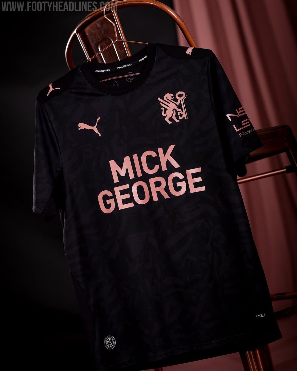
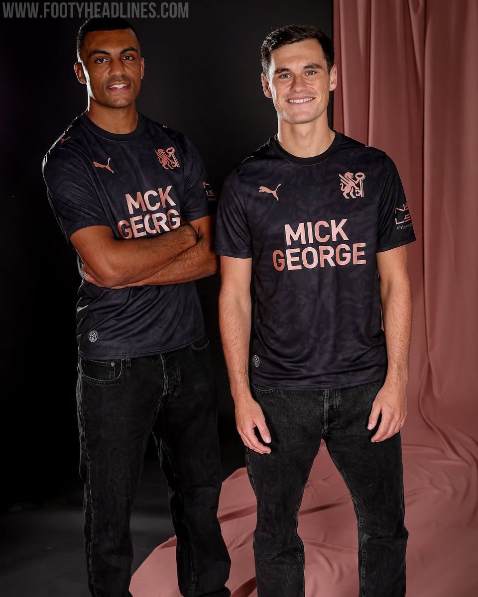
Peterborough United 26-27 Away Kit Released
League One side Peterborough United have officially launched their new Puma away kit for the 2026-27 season. The strip was unveiled during the club's Fan Zone Fun Day event on July 4, following the release of their home kit earlier in the summer.
The Peterborough United 2026-27 away shirt showcases a contemporary design that aligns with the club's new direction. It features a black base with rose gold accents. It also prominently features the club's newly introduced crest, marking a fresh chapter for the team.
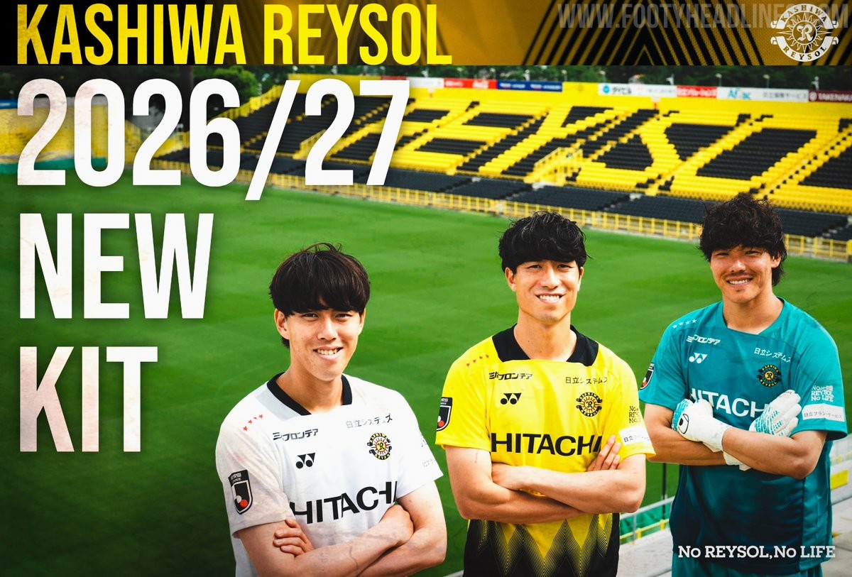
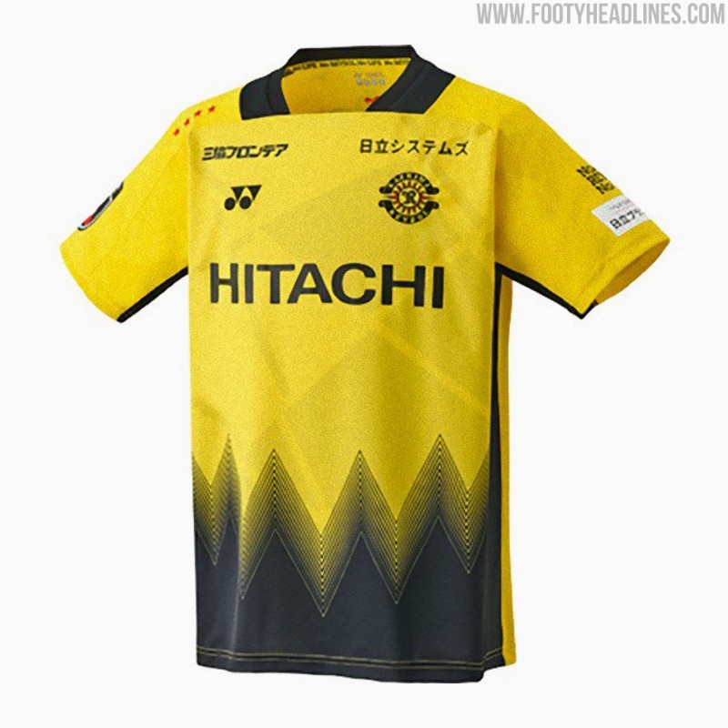
Kashiwa Reysol 26-27 Kits Released
Japanese J1 League club Kashiwa Reysol has officially unveiled its new 2026-27 kits, which are once again designed and manufactured by Yonex. The official launch on July 4 follows a short teaser video released earlier in the week and coincided with the announcement of the club's squad and player numbers for the upcoming season.
The Kashiwa Reysol 2026-27 kits feature a striking design centered around the concept of "Break the Light." The home shirt incorporates the club's traditional yellow and black colors, separated by dynamic geometric patterns that symbolize moving through the light. The away and keeper kits mirror the design in different colors.
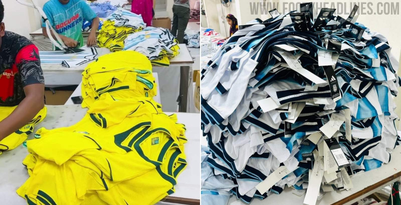
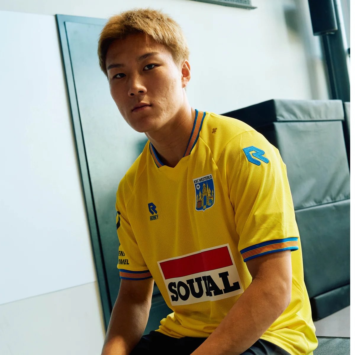
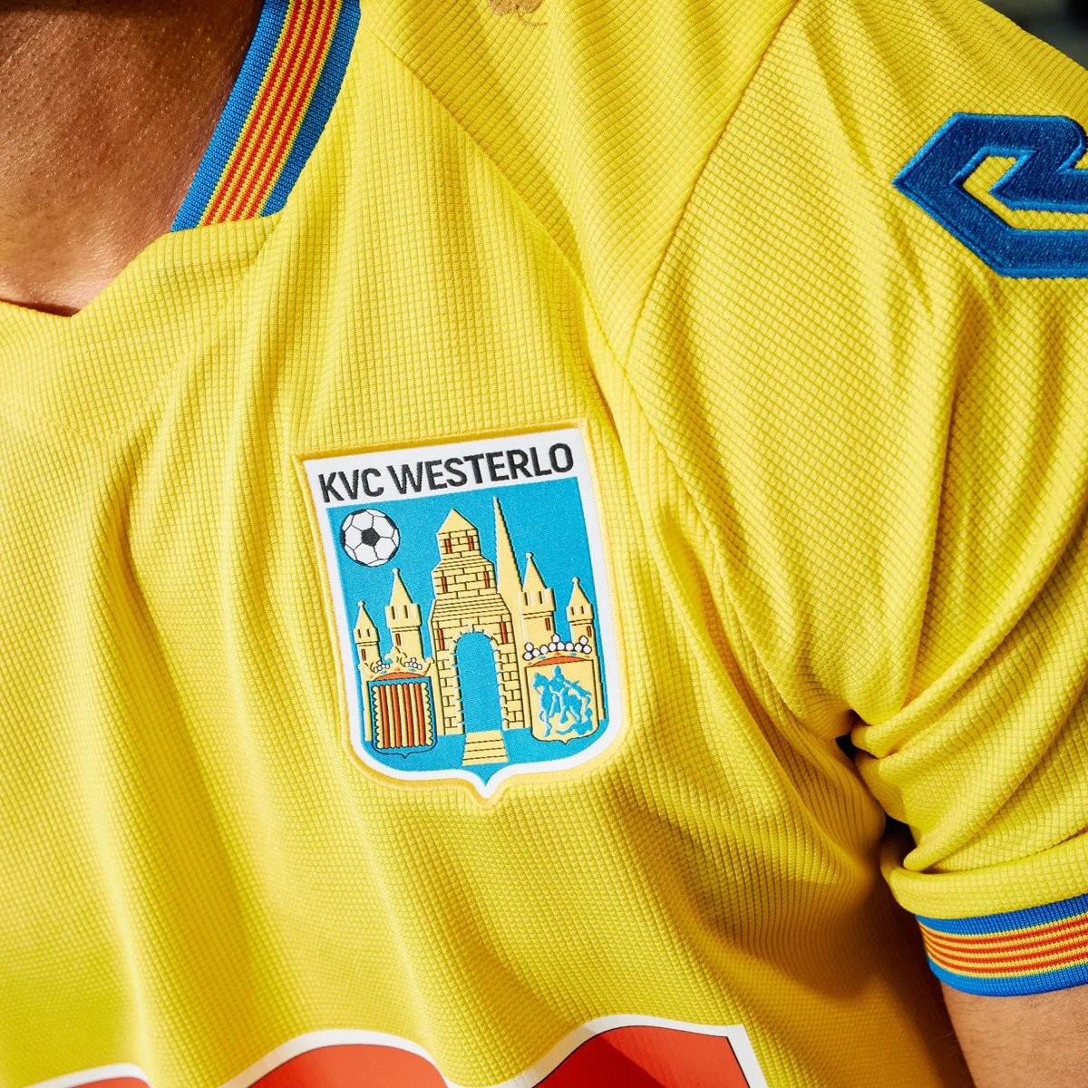
Robey KVC Westerlo 26-27 Home Kit Released - No More Nike
Belgian club KVC Westerlo has unveiled their new 2026-27 home kit, marking the beginning of a new partnership with Robey Sportswear. The Dutch brand takes over from Nike, which had supplied the club's kits since 2022.
The Robey KVC Westerlo 2026-27 home shirt features the club's traditional yellow and blue colors. Launched with the slogan 'Designed for you. Worn by you. Because you are Westel,' the design aims to celebrate the strong bond between the team, its supporters, and the local Kempen region.