Did Bayern Munich Get It Wrong With Its Logo Update?
 Oct 22, 2024, by Chris

- Logo Color Update
- Contrast Issues
- Misunderstanding
Following Bayern München’s recent announcement of a logo color update to comply with Germany’s Accessibility Improvement Act (Barrierefreiheitsstärkungsgesetz), Footy Headlines' research suggests that the change might not have been necessary after all.

Text that is part of a logo or brand name has no contrast requirement
Bayern München Logo Update Was Not Required Under Accessibility Act
First and foremost, the Accessibility Improvement Act does not impose contrast requirements on logotypes or logos. This means that there is no obligation for Bayern or any other company to adjust the color contrast of their logos for accessibility purposes.

Previous Colors Offered Better Contrast

Interestingly, the original colors of Bayern’s logo—deeper shades of red and blue—actually offered a better contrast than the new, lighter hues. According to the WCAG (Web Content Accessibility Guidelines) Color Contrast, which measures readability and visibility for users with visual impairments, the new colors are less accessible than the previous palette.
The brighter colors are less accessible than the previous ones - they now exactly match the minimum contrast for texts on a background
Interestingly, the new colors almost exactly meet the minimum criteria of 4.5 - the red has a contrast ratio of 4.51, and the blue of 4.52.
Did Bayern misunderstand the minimum requirement and thought it would be the required one?
The question arises as to whether Bayern misunderstood the minimum requirement. Everything indicates so.
Bayern München 24-25 Home Kit Heavily Fails Accessibility Act Guidelines

Meanwhile, Bayern München is no prime example of accessibility when it comes to its kits. The Bayern 24-25 home kit names and numbers clearly fail the usual contrast guidelines - the very dark red is hardly readable on the red from the stands.
No Mandate for Clubs or Companies to Update Logo
Logotypes are not affected by the law

As far as we know, no rules in the Accessibility Improvement Act require companies or sports clubs like Bayern to change their logos. If such rules did exist, many other companies and organizations would also need to adjust their branding, which is not the case.
A misunderstanding of the club?
All in all, the logo update appears to be more of a misunderstanding than a legal necessity.
What do you think of Bayern's logo color update? Did Bayern get it wrong? Let us know in the comments below.

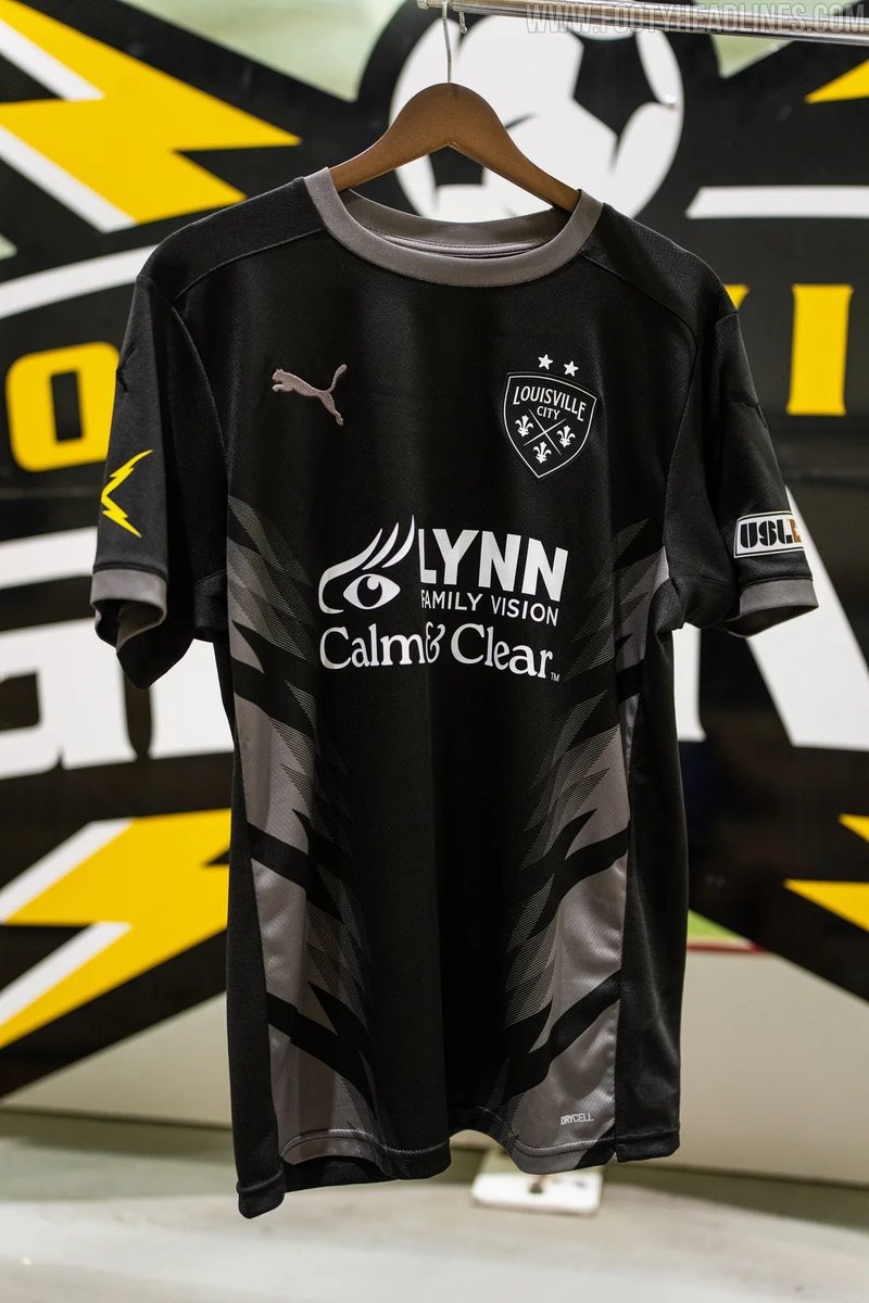
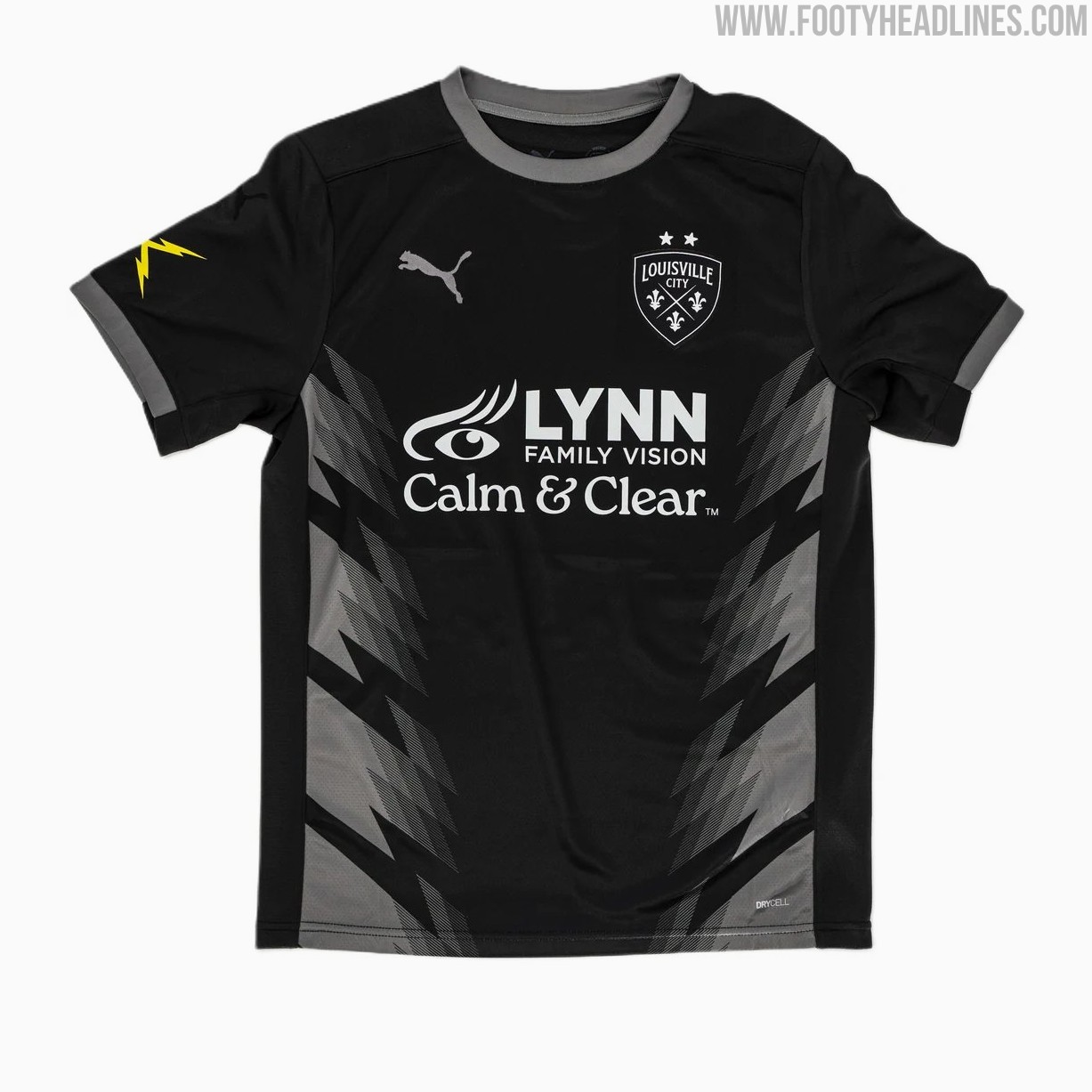
Louisville City 2026 Third Kit Released
USL Championship side Louisville City FC has officially unveiled its new Puma 2026 third kit, completing the team's jersey set for the 2026 season.
Dubbed the "Lightning Kit," the predominantly black uniform honors late club founder Wayne Estopinal and the former Louisville Lightning indoor soccer team that played from 2009 to 2012. The shirt features a subtle chevron stripe pattern across the front inspired by storm clouds, while striking yellow lightning bolts decorate the right sleeve. Rounding out the look with matching black shorts, the 2026 third jersey joins the previously released home and away options and is now available for purchase through the official club store.


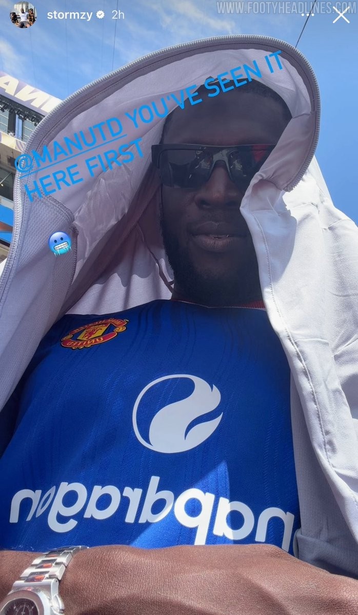
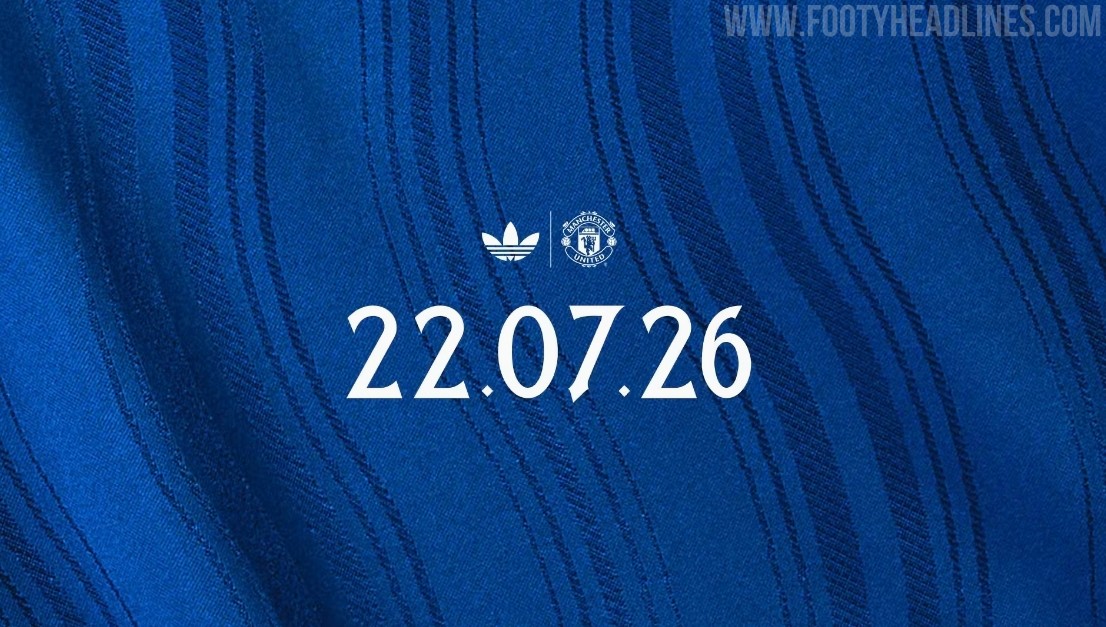
Manchester United 26-27 Away Kit Teased
Manchester United has officially teased its upcoming 26-27 away kit, confirming that the new Adidas shirt will be released on Wednesday, 22 July 2026. Following a series of leaks and an early appearance by British rapper Stormzy wearing the unreleased shirt, the official launch will finally officially unveil the blue design that pays homage to the River Irwell and the club's classic 1988 away kit.
Manchester United 26-27 Away Kit Leaked - 14 Official Images
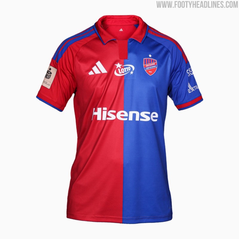
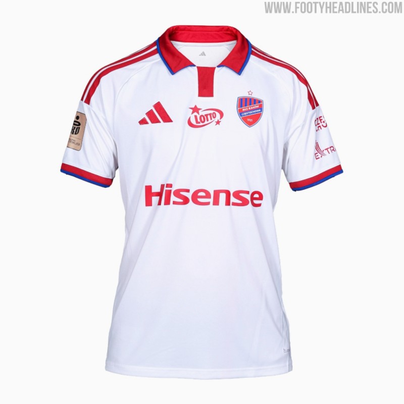
Raków Częstochowa 26-27 Home & Away Kits Released
Polish club Raków Częstochowa has officially released its new 26-27 home and away kits, made by Adidas. Launched under the slogan "Colors that oblige - this is our DNA, this is our identity," the new strips will be worn during the upcoming Ekstraklasa campaign.
The new Adidas Raków Częstochowa 26-27 home and away shirts both feature custom looks with Adidas' 2026 polo collar.