
Bayern München Updates Logo Colors "To Comply With New German Accessibility Improvement Act"
 Oct 19, 2024, by Phan Tich Giay

- Logo Update: Bayern München has updated its logo with brighter colors.
- Reason for Change: The color change is to comply with Germany's new Accessibility Improvement Act.
- Implementation: The new logo is being rolled out across the brand, starting with social media.
Update: Four days after changing its logo on social media platforms, Bayern München yesterday (18 October) officially announced the modernization of its brand image, including the Bayern logo. It has been adapted to a brighter color scheme in order to meet the requirements of the new Accessibility Improvement Act, which aims to offer people with disabilities a better user experience.
Two days ago (14 October), Bayern München changed their avatar on social media platforms to a new logo with a slight color update.

New Bayern München Logo Colors
The new Bayern München logo keeps the same design and only has a change in color. Both the red and blue tones have been adjusted to be slightly brighter than the old logo.

Bayern has modernized the color palette of its logo and adjusted the contrast ratio between the text and background colors to comply with the guidelines of Germany’s new Accessibility Improvement Act (Barrierefreiheitsstärkungsgesetz), which will come into force in June 2025.
This color change is aimed at providing accessibility and a better experience for people with disabilities. The new designs for the entire brand identity are currently being rolled out step by step.


Do you like the new colors of the Bayern Munich logo? Comment below.

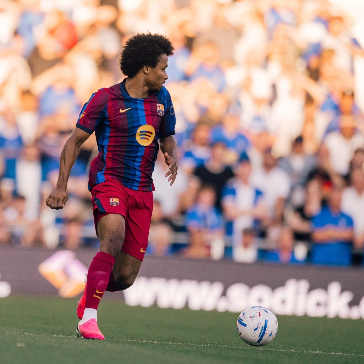
Barcelona Debut 26-27 Home Kit With Red Shorts & Socks vs Birmingham
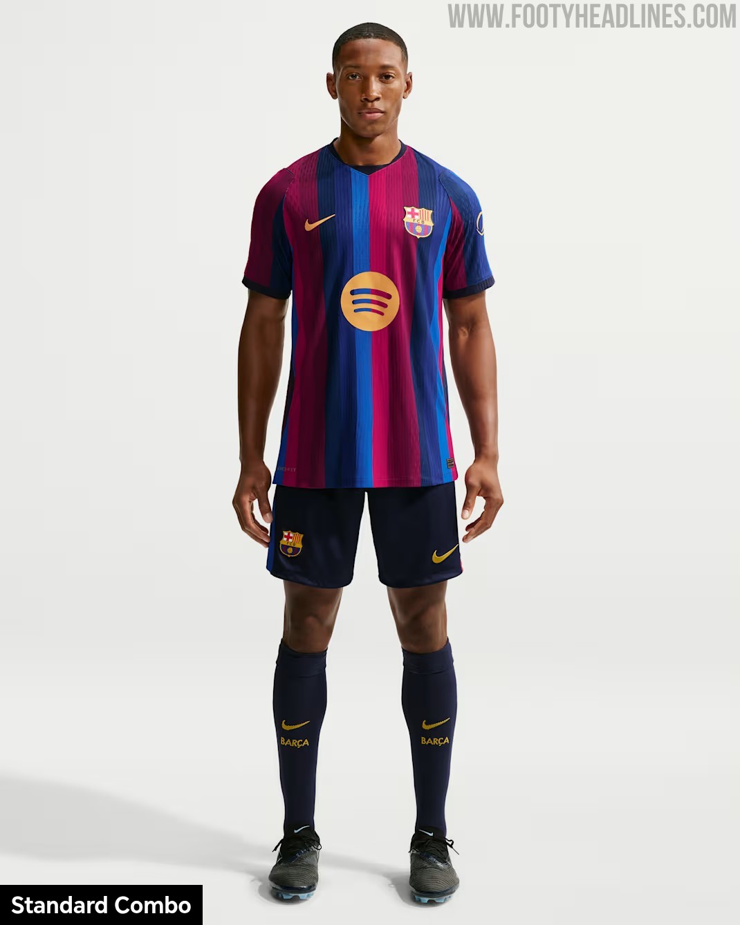
FC Barcelona debuted their new Nike 26-27 home shirt during a pre-season friendly match against Birmingham City. However, rather than wearing the primary dark shorts standard for the design, the Catalan side took to the pitch in an alternative combination featuring red shorts and red socks.
The choice to pair the striped 26-27 home jersey with red shorts created a striking, predominantly red lower half. This alternative configuration might was used to avoid a socks clash with Birmingham City, but it was not really needed9
Port Vale 26-27 Away Kit Revealed
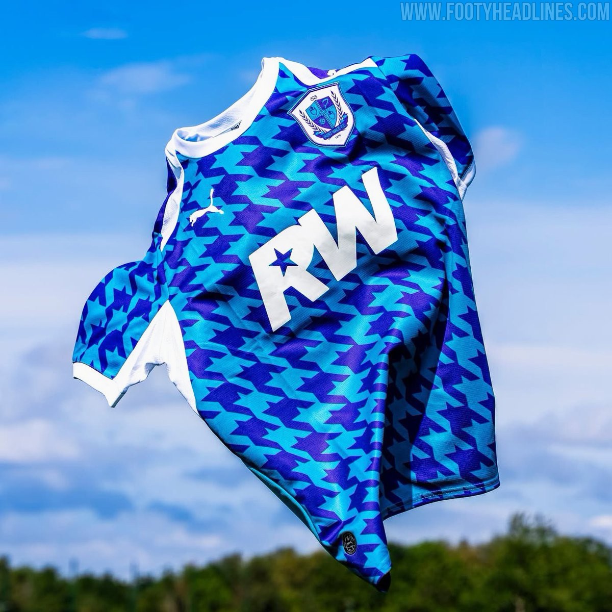
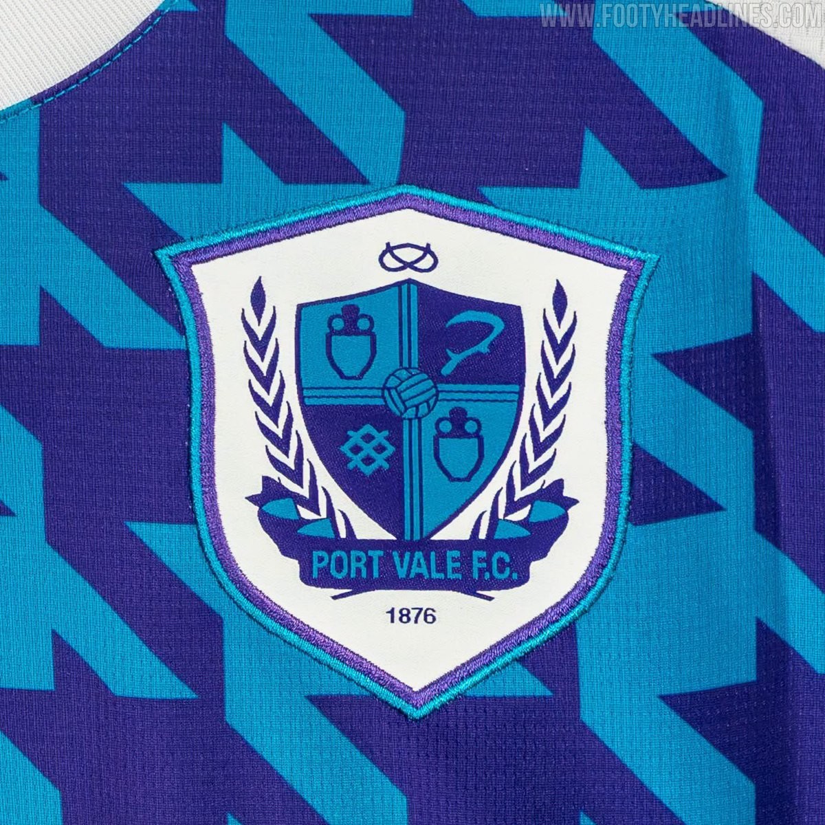
Puma and English League Two side Port Vale have officially launched their new away kit for the 26-27 season.
The shirt features an eye-catching geometric pattern in vibrant shades of purple and cyan, paired with clean white accents along the collar, side panels, and sleeve cuffs. Pop star and lifelong supporter Robbie Williams sponsors the jersey, featuring his 'RW' logo prominently on the chest in solid white to complete a standout look for the club on the road.
Santa Clara 26-27 Away Kit Leaked
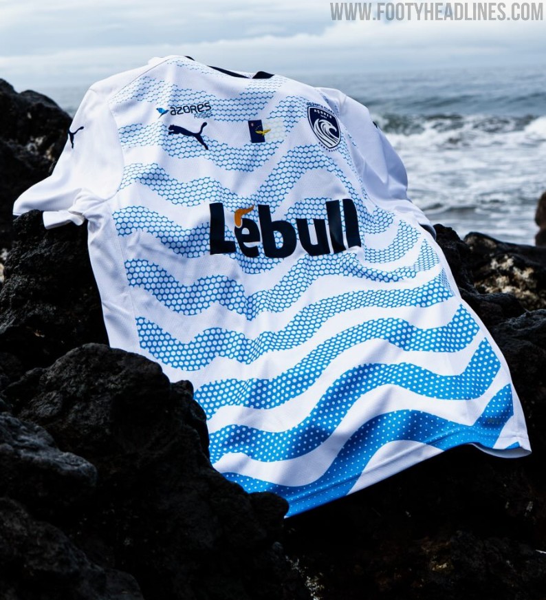
The new CD Santa Clara 26-27 away kit produced by Puma has been officially released, showcasing a unique look inspired by the club's Azorean roots.
Built on a white base, the jersey features striking blue wavy graphic patterns across the front to represent the ocean surrounding the archipelago, complemented by dark navy logos, the regional Azores flag, and sponsor branding from Lebull.
Darlington FC 26-27 Home & Away Kits Released
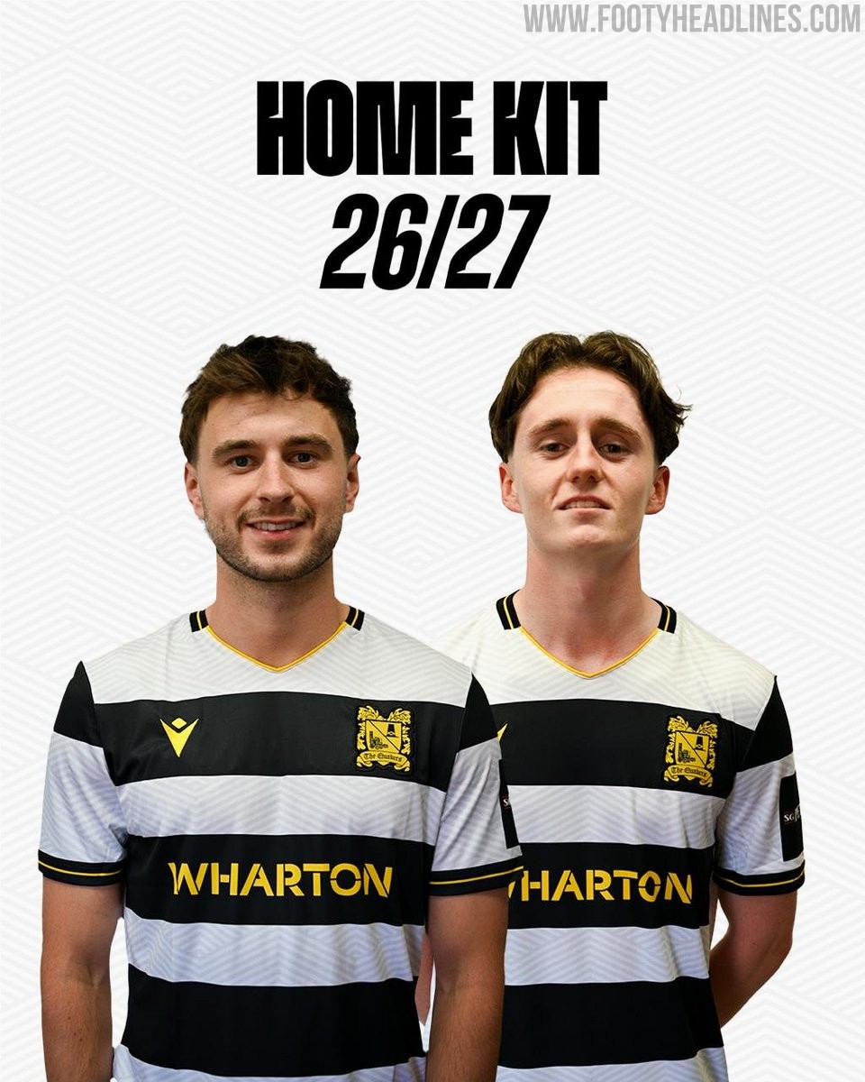
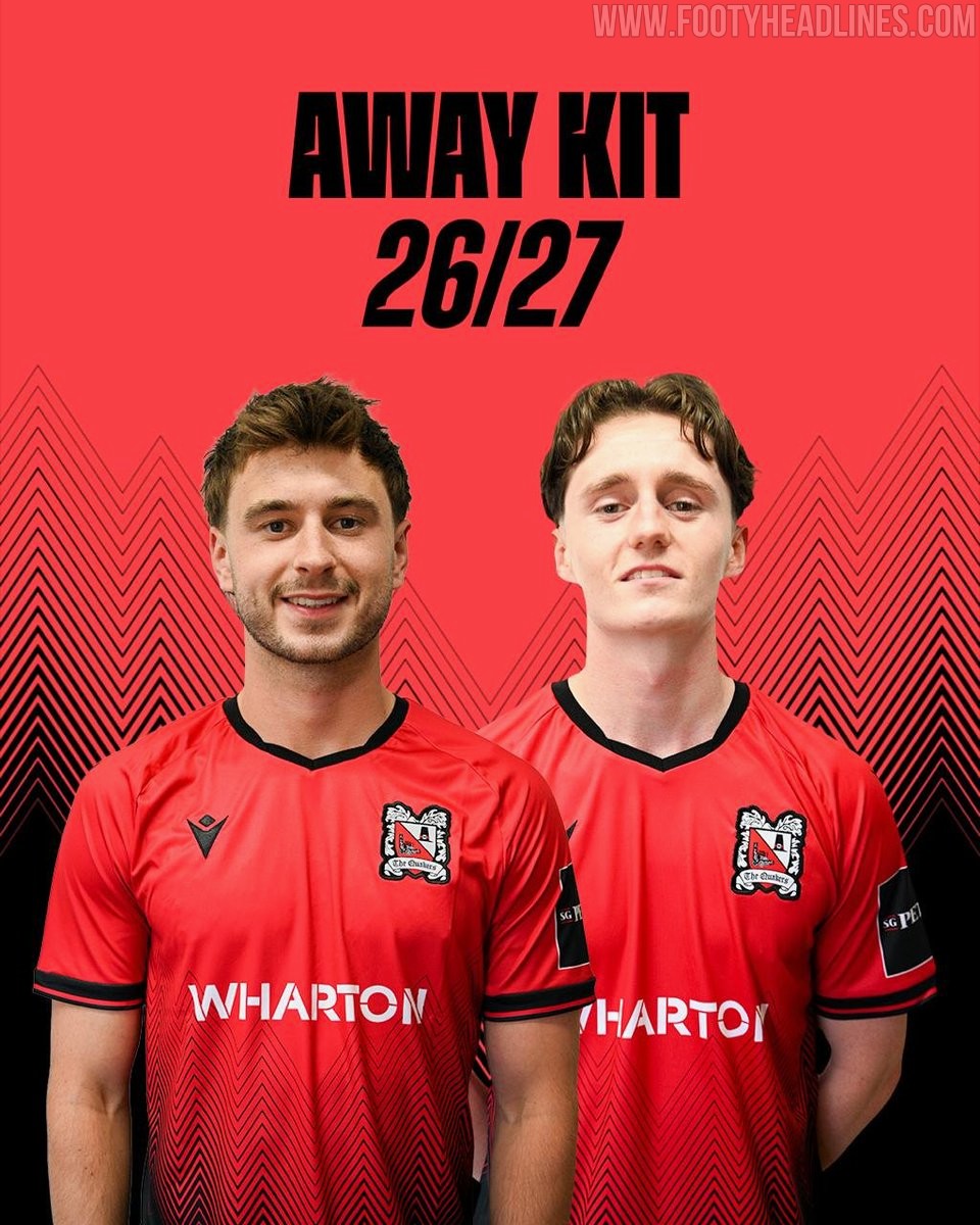
English National League North side Darlington FC and Macron have officially unveiled the club's new home and away kits for the 26-27 season. The home jersey features Darlington's classic black and white hooped design complemented by yellow accents, including a yellow collar trim, Macron hero logos, and a monochromatic yellow club crest. The away kit introduces a bold red shirt highlighted by a black geometric chevron pattern fading into the lower body alongside black collar and sleeve trim.
Oldham Athletic 26-27 Away Kit Released
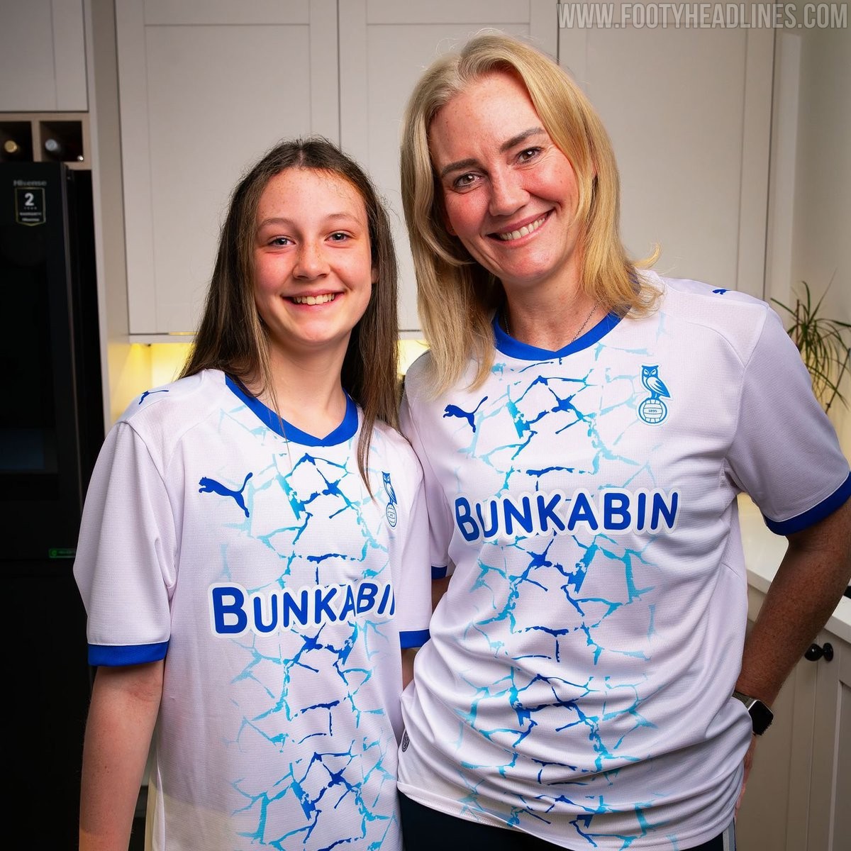
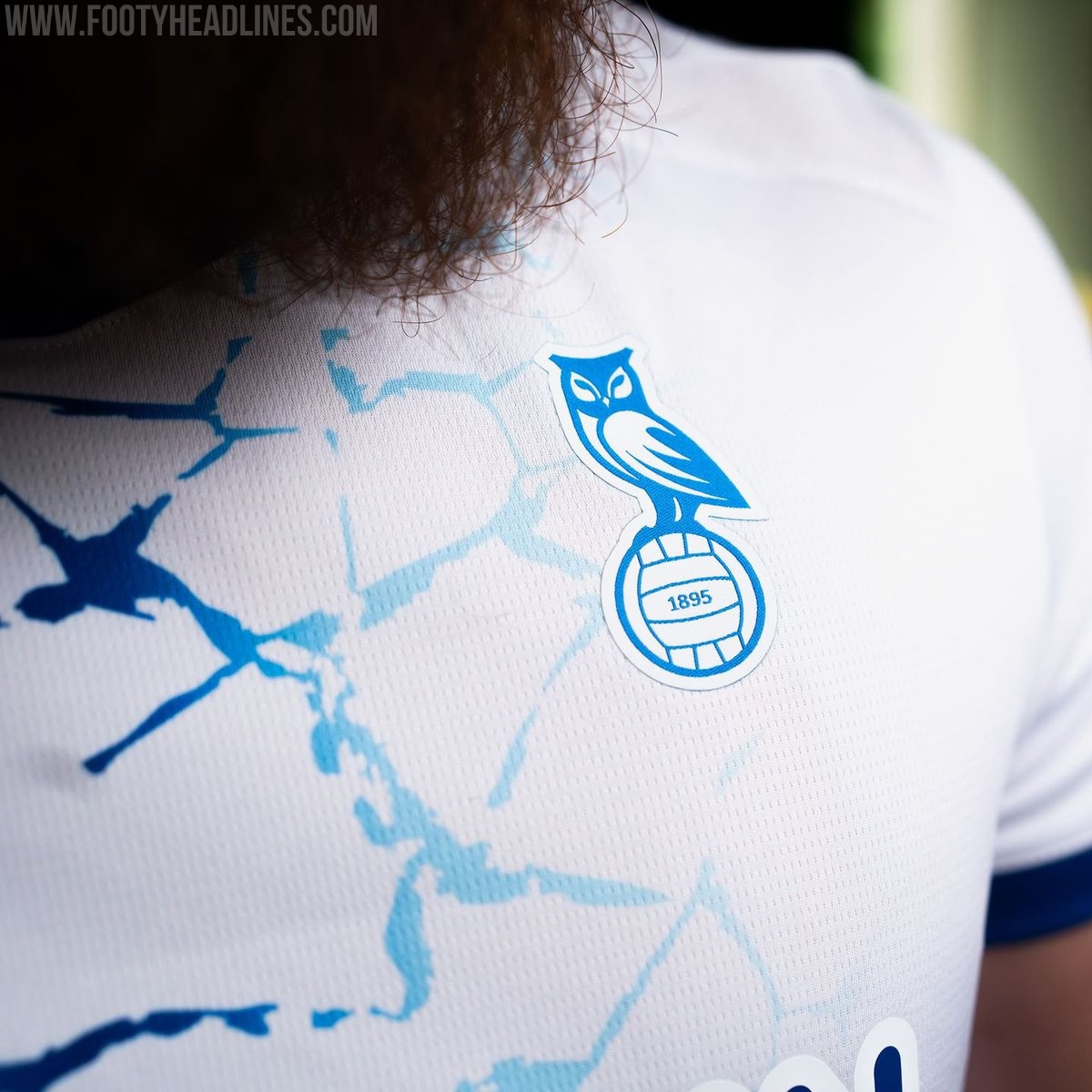
Oldham Athletic and Puma have officially unveiled the club's new away kit for the 26-27 season. Inspired by the nickname Ice Station Zebra, which references the freezing cold conditions often felt at Boundary Park, the new strip brings an icy visual theme to the pitch.
The Puma Oldham Athletic 26-27 away shirt is predominantly white with an eye-catching blue cracked-ice graphic pattern running down the center of the front. Royal blue accents trim the collar and sleeve cuffs, while the Puma cat logos, chest sponsor, and monochrome owl crest are applied in matching blue.
The new Oldham Athletic 26-27 away kit will be available to purchase online and in physical club stores starting August 1, 2026.
Žilina 26-27 Away Kit Released
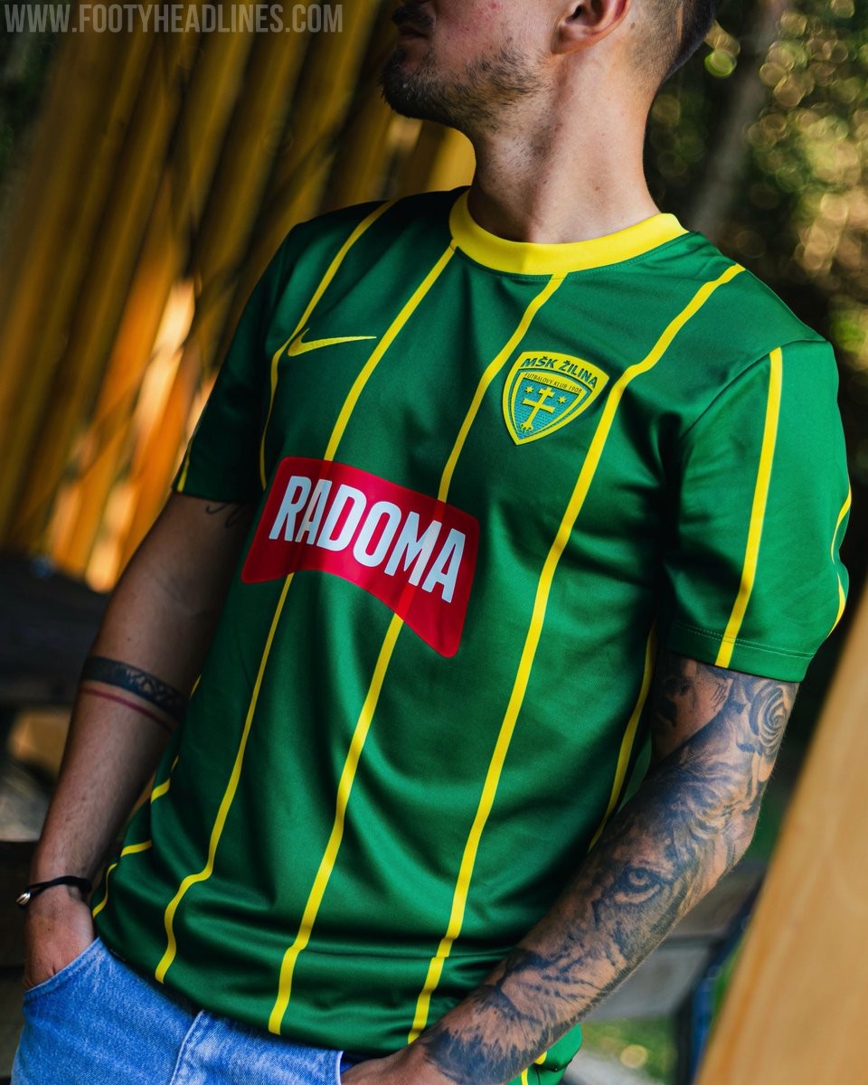
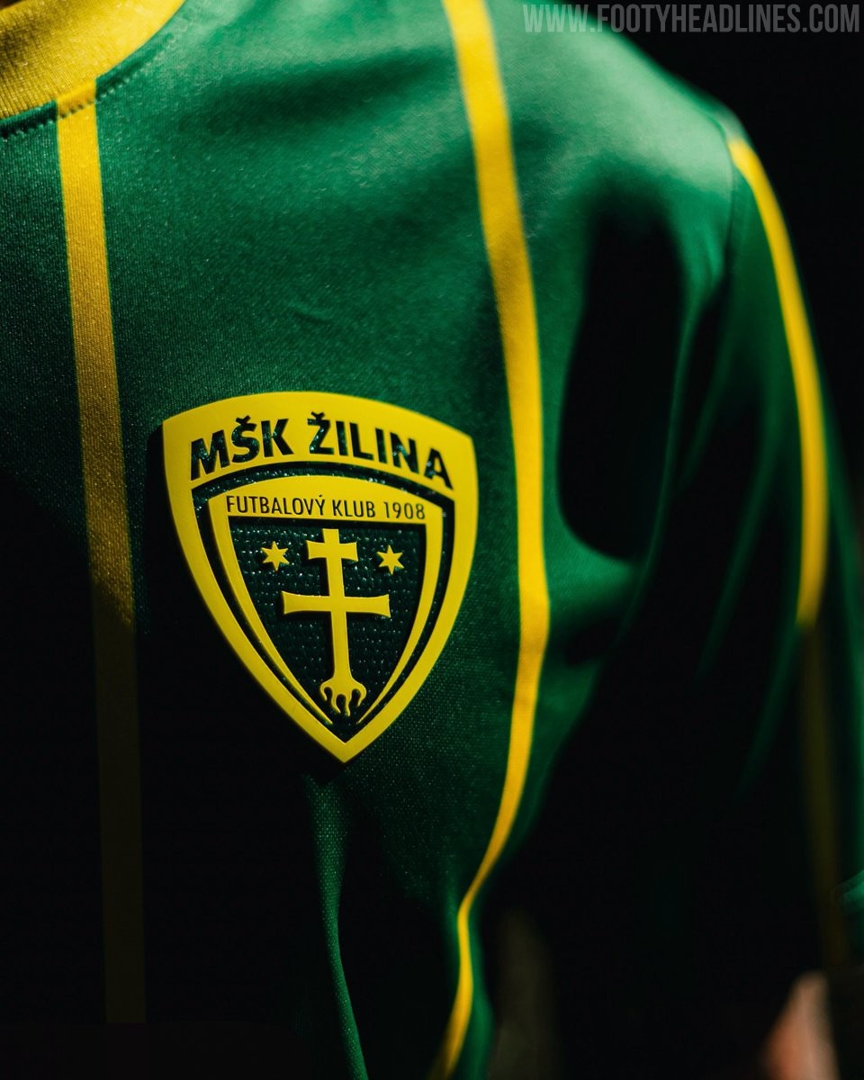
Slovak club MŠK Žilina and Nike have officially unveiled the team's new away kit for the 26-27 season. Reversing the primary colors of their home uniform, the new shirt features a dark green base decorated with thin yellow vertical pinstripes. A solid yellow crew collar and yellow Nike Swoosh complete the design, while the club's detailed crest is positioned on the left chest alongside the unfitting red Radoma sponsor logo across the front.
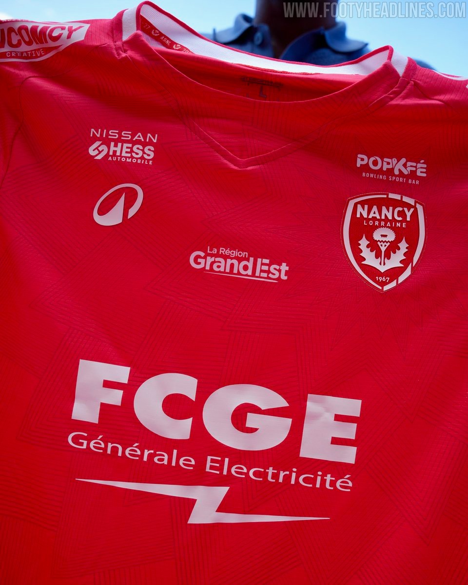
AS Nancy-Lorraine 26-27 Away Kit Released
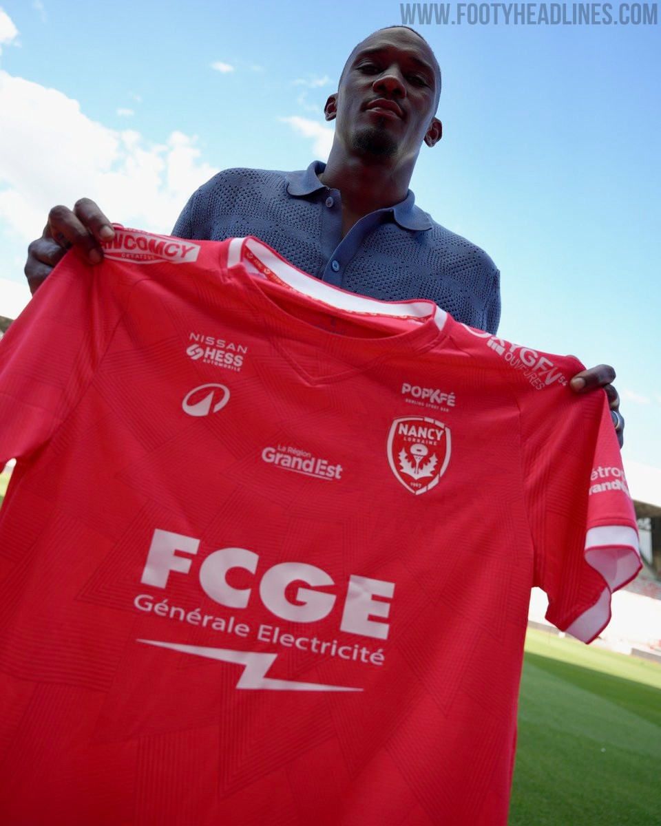
French club AS Nancy-Lorraine has officially unveiled its new 26-27 away kit, manufactured by Decathlon.
The new uniform features a modern design with fine geometric lines and an abstract pattern incorporating the club's iconic thistle emblem from the crest. Accentuated with subtle red detailing on the collar and sleeve cuffs, the jersey also includes a special tribute on the nape of the neck paying homage to the 100th anniversary of the Stade Marcel Picot.
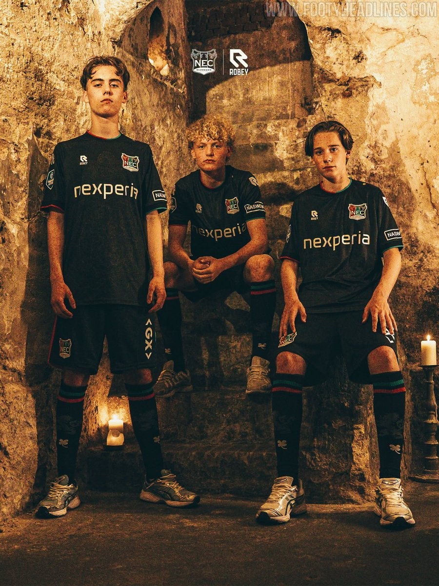
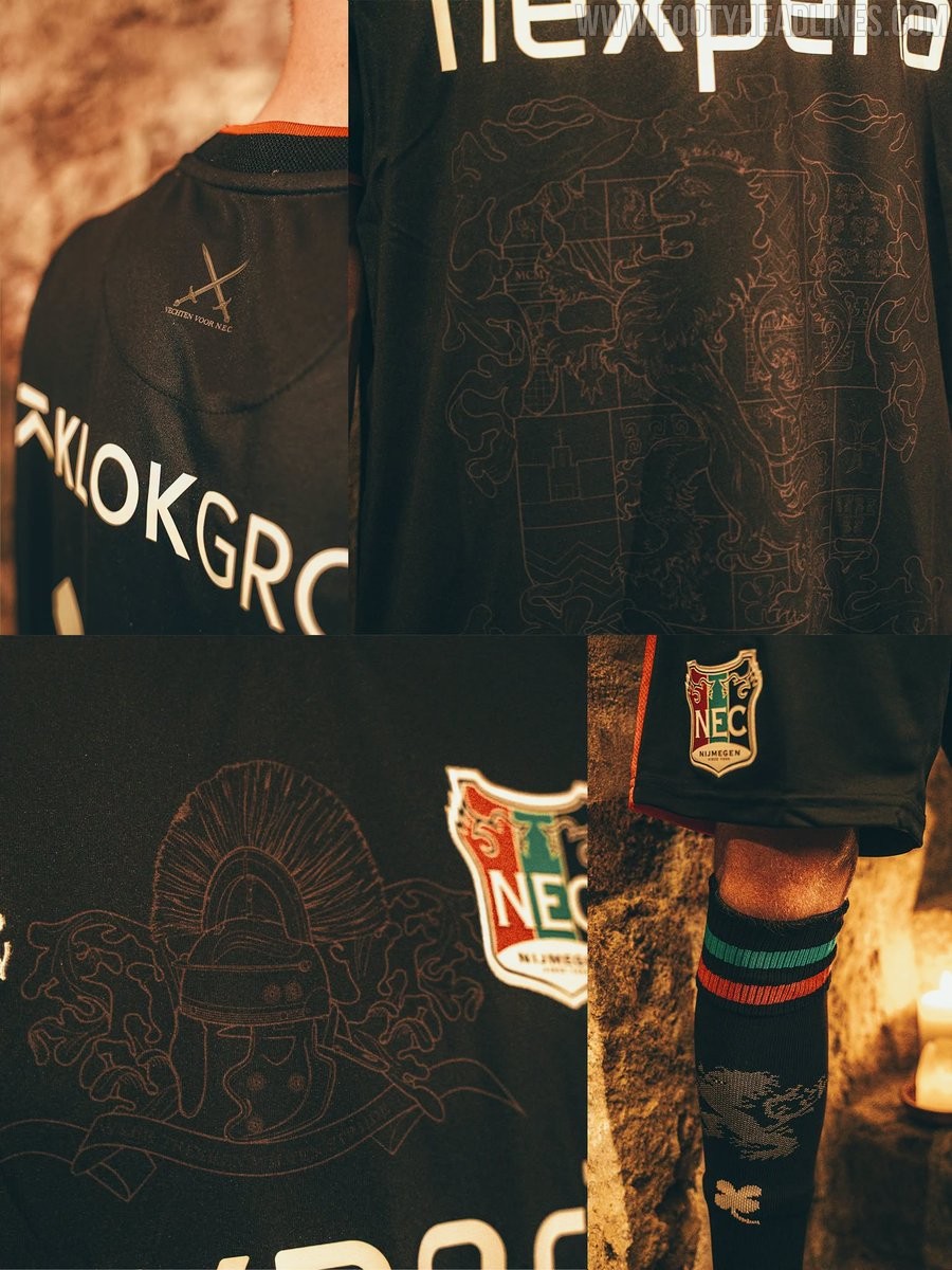
Nijmegen 26-27 Away Kit Released
Dutch Eredivisie club NEC Nijmegen and kit supplier Robey have officially unveiled the new 26-27 away kit.
Predominantly black, the jersey features subtle red and green trims on the crew collar and sleeve cuffs in honor of the club's traditional identity. The front showcases intricate tonal graphics embossed with historical crest elements and a Roman helmet motif, while the upper back displays two crossed swords alongside the slogan "Vechten voor N.E.C." White sponsor logos on the chest and gold gothic typography for the player names and numbers complete the design, which is paired with matching black shorts and socks.
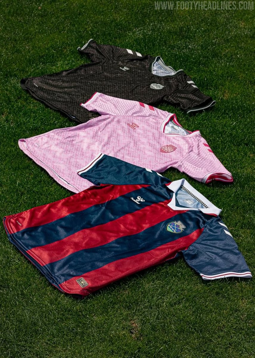
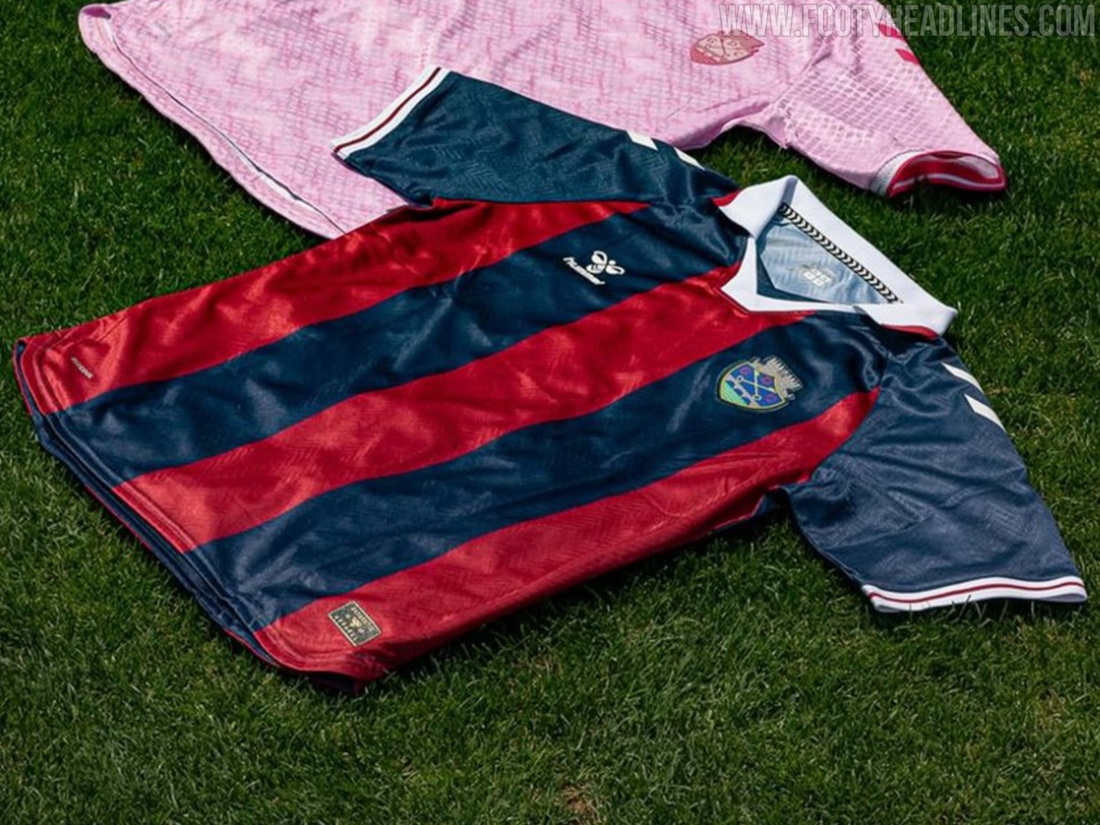
Chaves 26-27 Home, Away & Third Kits Released
GD Chaves and Hummel have officially unveiled the club's new kit collection for the 26-27 season, presenting a complete lineup of home, away, and third shirts.
The GD Chaves 26-27 home kit stays true to tradition, featuring classic red and navy blue vertical stripes across the front and back. It comes with a white polo collar finished with red and navy trim, navy sleeves, and white Hummel chevrons on the shoulders. A subtle graphic pattern is woven into the fabric to add texture to the traditional look.
For the alternative options, the 26-27 away kit features a distinct light pink base with a tonal geometric graphic throughout, completed by vibrant magenta logos and a matching monochromatic club crest. The third kit adopts a dark charcoal and black palette with an intricate tonal pattern, complemented by sleek silver accents for the Hummel logo, shoulder chevrons, and club badge.