All-New FC Ryukyu Okinawa Logo Released - Third New Logo Within One Year After Fan Protests
 Nov 24, 2024, by Chris

- New Logo Unveiled: FC Ryukyu has revealed a new logo, set to be implemented in 2025, reflecting a response to fan discontent.
- Multiple Logo Changes: This new design is the third logo change within a single year due to fan pushback against prior redesigns.
- Design Elements & Symbolism: The new logo includes both a male (men's team) and female (women's team) shisa lions, and retains the club's iconic red color, and the Ryukyu Dynasty crown to represent heritage and ambition.
Japanese club FC Ryukyu today unveiled its new emblem. The new FC Ryukyu logo will be used from January 1, 2025, and is part of the club's "continued evolution and commitment to its Okinawan roots."

The new Ryukyu logo is marking the third logo change within a year. This decision comes after widespread criticism and dissatisfaction with the club's recent rebranding efforts, which fans and stakeholders overwhelmingly rejected. For 2024, the club has retained the original emblem but with an updated colorway.

FC Ryukyu Announces New Logo for 2025 Season and Beyond
FC Ryukyu was established in 2003.
The new FC Ryukyu logo is totally different from the previous crest. While it maintains some features and elements of the old emblem, it is much more modern and simple.


Key Highlights of the New Emblem
Women’s and Men’s team logos.

- FC Ryukyu Okinawa Emblem (Men’s Team): Features a fierce male shisa lion with bared fangs and the Ryukyu Dynasty crown, symbolizing the club’s aggressive football and determination to rise to the top of the J.League.
- FC Ryukyu Sakura Emblem (Women’s Team): Showcases a graceful female shisa adorned with the traditional Uchina Kampu hairstyle and cherry blossom petals, representing the club’s aspiration to bring joy and inspiration, much like Okinawa's early-blooming sakura.
Design Elements
The updated emblem retains key elements from its predecessor:
- Bengala Red: The club’s iconic color.
- Shisa Lions: A symbol of Okinawan victory and protection.
- Ryukyu Dynasty Crown (Gyokukan): A mark of pride, tradition, and authority.

What do you think of the new FC Ryukyu Okinawa logo? Let us know in the comments below.
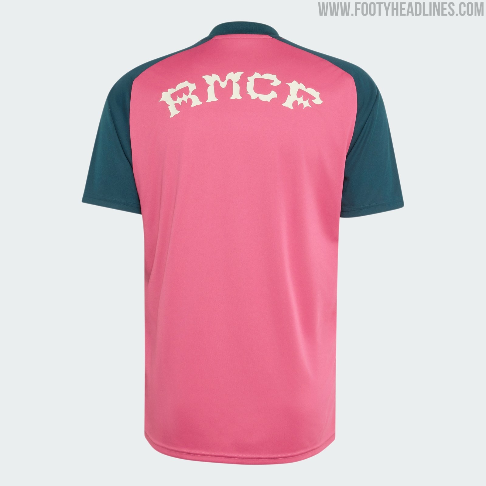
Real Madrid 26-27 Away Pre-Match Shirt Released
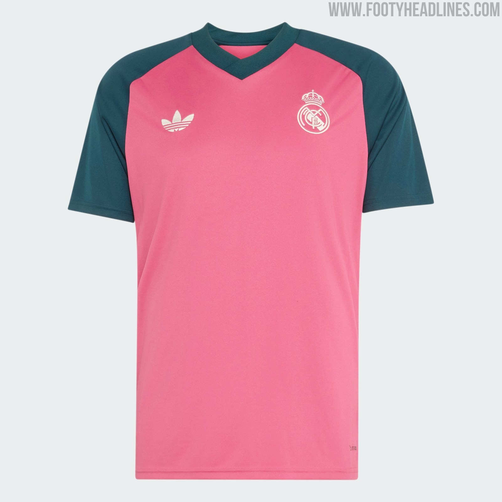
Alongside the away kit, Real Madrid have officially unveiled their new 2026-27 away pre-match jersey.
The new Real Madrid 26-27 away pre-match shirt features a predominantly pink main color with dark green raglan sleeves, a color combination inspired by the club's home and away kits.
The new Adidas Real Madrid 26-27 away pre-match shirt is available from 23 July, alongside the official launch of the club's 26-27 away kit.


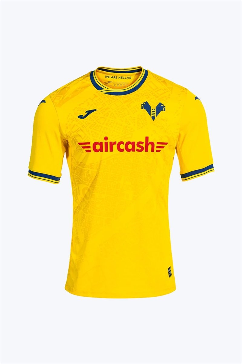
Hellas Verona 26-27 Away Kit Released
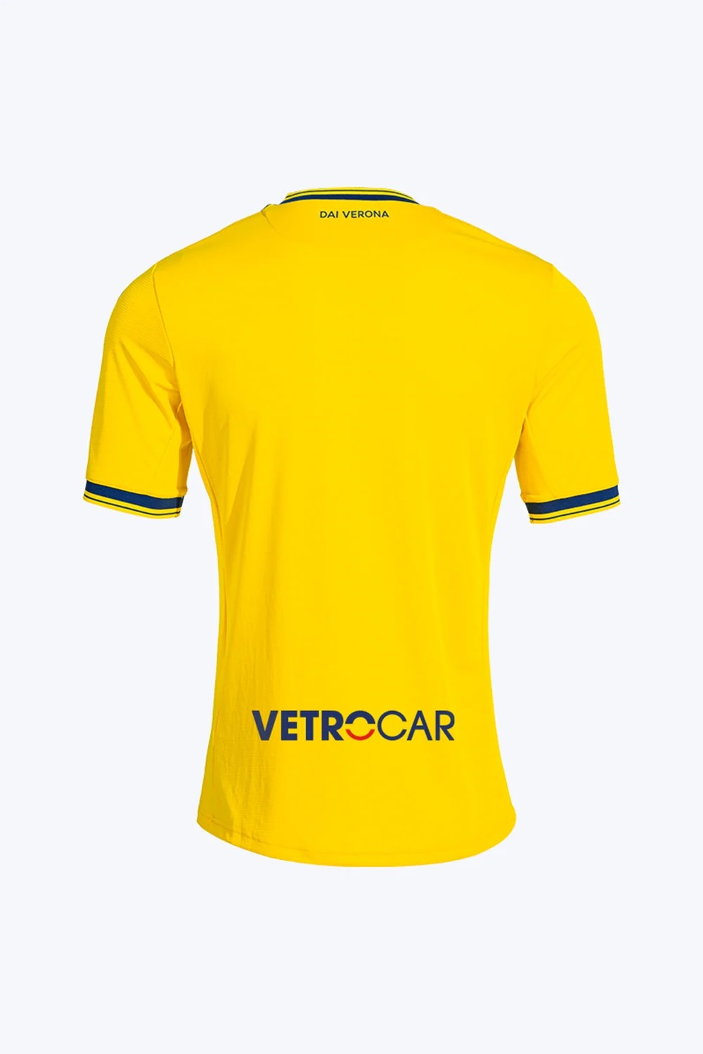
Hellas Verona and Joma have officially unveiled the club's new away kit for the 26-27 season. The release is accompanied by the slogan "Sopra tutto Verona" (Above all Verona), highlighting the strong connection between the team and its home city.
The Joma Hellas Verona 26-27 away jersey reverses the traditional home colors, featuring yellow as the primary base with contrasting blue accents on the collar and cuffs. The standout element of the design is a bespoke front graphic pattern that depicts a bird's-eye view of Verona's urban layout and streets. This print maps the city directly onto the shirt, emphasizing the club's local identity. The team crest is applied as a thermosealed silicone badge, while the fabric features a jacquard finish for added texture.
Yellow shorts and socks complete the new Hellas Verona 26-27 away strip.

FC Südtirol 26-27 Home Kit Released
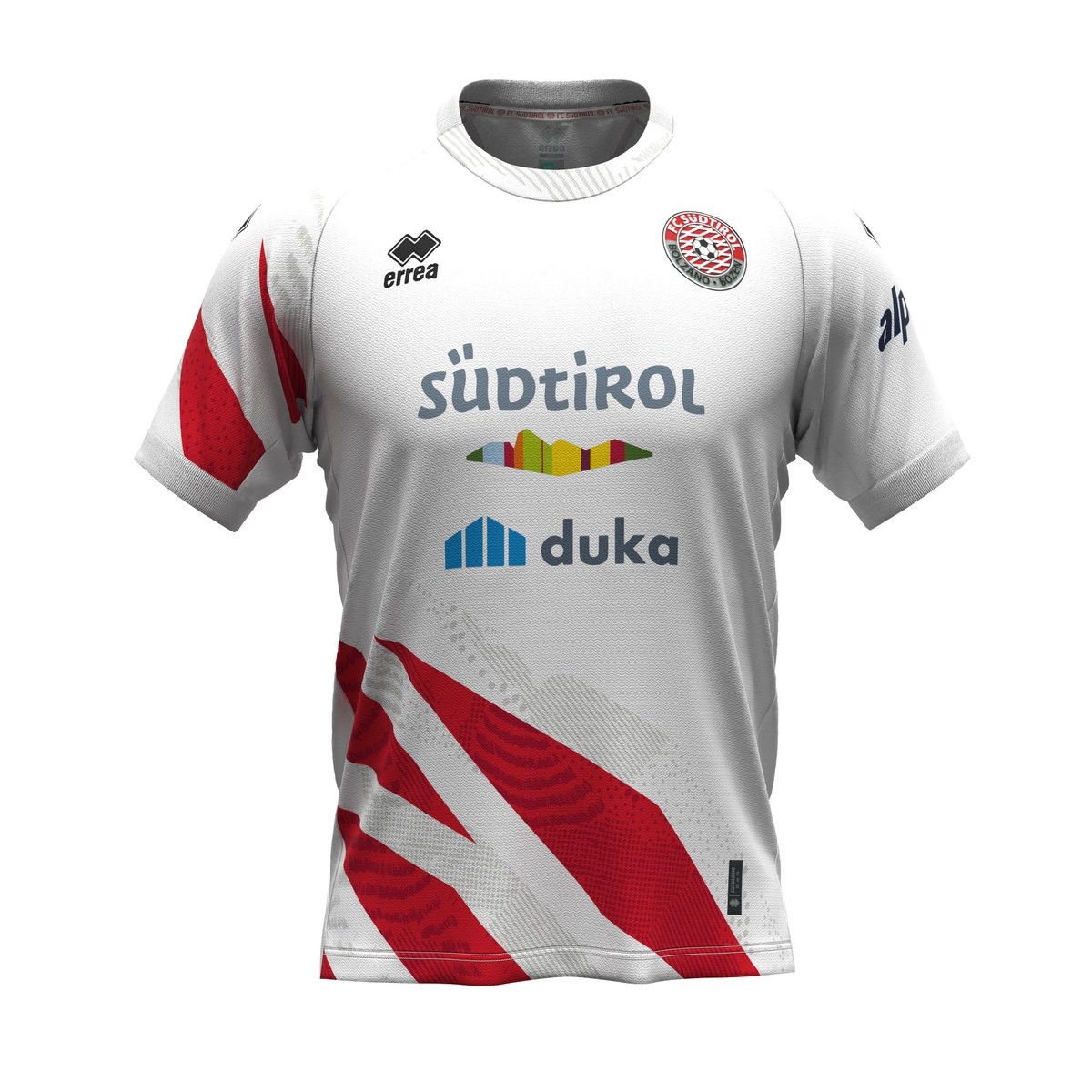
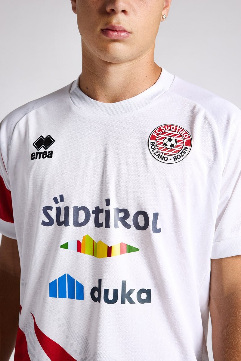
Italian Serie B club FC Südtirol has officially released its new 26-27 home kit. Made by technical sponsor Erreà, the jersey celebrates the deep connection between the team, its supporters, and the local region while bringing back a beloved design from the club's recent history.
The Erreà FC Südtirol 26-27 home shirt takes direct inspiration from the iconic kit worn by the team between 2013 and 2017. It features a clean white base highlighted by an asymmetrical, dynamic pattern of red rhombuses crossing the front. These geometric shapes, derived from the club's crest, rise from the bottom toward the center of the shirt, while a delicate faded gray texture fills the spaces in between. Two additional red rhombuses decorate the right sleeve to complete the modern reinterpretation of the classic look.
Complementing the bespoke design, the official club crest sits on the left chest, with the team's name featured in red on the back of the collar over a faded gray panel. Inside the collar, a custom red sweatband repeats the FC Südtirol text in white to round off the refined details of the new kit.
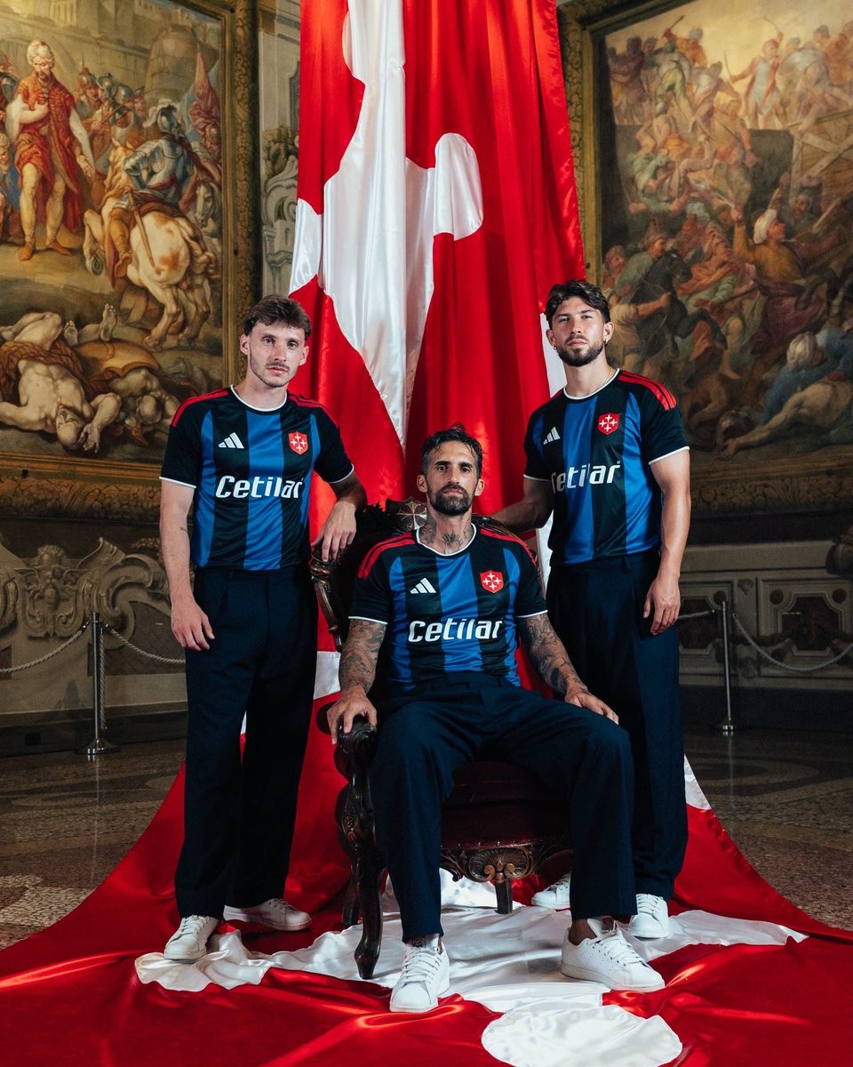
Pisa 26-27 Home Kit Released
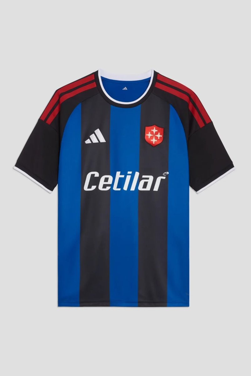
Italian side Pisa Sporting Club have officially unveiled their new 26-27 home kit. Made by Adidas, the jersey will be worn during the upcoming Serie B campaign and introduces a traditional design with a notable historical modification.
The Adidas Pisa 26-27 home shirt brings back the classic Nerazzurro look, featuring the traditional black and blue vertical stripes running across the entire body. The standout element of the new design is the crest; the standard club badge has been replaced by the historical Pisa Cross, or Croce Pisana, set on a red shield. This special emblem will serve as the primary logo for the entirety of the season.
Red linear accents frame the kit, complementing the prominent red cross on the left chest. The standard Adidas logo and shoulder stripes are prominently featured, while Cetilar continues its partnership as the main front-of-shirt sponsor.