All-New MK Dons 2025 Logo Released - Roundel Shape 'Nod to Iconic Roundabouts'

- New Logo Release: Milton Keynes Dons have unveiled a new roundel-shaped club crest for the 2025-26 season, intended to reflect heritage, ambition, and modernity.
- Design Inspiration: The circular design is inspired by the iconic Milton Keynes roundabouts, and the crest includes elements like the "MK Chalice," the founding year in Roman numerals, and a red dot referencing the city's promotional video.
- Rollout and Reception: The new crest will be implemented gradually from the upcoming season and will feature on all kits from 2025-26, though supporter reactions to the design and the continued use of "Dons" have been mixed.
League Two club Milton Keynes Dons have officially revealed a brand-new club crest, set to be implemented fully from the 2025-26 season. The redesigned badge aims to reflect the club's "heritage, ambition, and modernity" and even includes a subtle nod to the city's famous roundabouts.

The new MK Dons crest marks a significant visual shift for MK Dons, moving to a circular design. This evolution comes after consultation with the MK Dons Supporters’ Board and season ticket holders, with the club stating there was a "clear mandate for an evolution of the club’s branding" following the takeover by a Kuwait-based consortium in August.

MK Dons 2025 Logo
The design incorporates several key elements. The circular shape itself is said to represent "unity and strength" and is also a deliberate reference to the iconic roundabouts of Milton Keynes, described as "a symbol of connection, movement, and identity within our unique city."

Typography sees "Milton Keynes" now spelled out in full, replacing the shorter "MK" to make a "clear statement of pride in our city and its identity." Below this, "Football Club" reinforces the club's purpose. The brand colours of White, Black, Red, and Champagne (Gold) are retained, symbolizing tradition, pride, and progress.

At the heart of the crest is the "MK Chalice," where the 'MK' lettering is styled to form a chalice embossed in champagne gold, representing celebration and legacy. The club's founding year, 2004, is inscribed at its base in Roman numerals (MMIV). A distinct red dot positioned between "Milton Keynes" and "Dons" pays tribute to the "famous red balloon" featured in the original Milton Keynes promotional video, serving as a nod to the city's visionary beginnings.


Club Chairman Fahad Al Ghanim stated, “The evolution of our club crest marks a new era for Milton Keynes Dons. We’re so excited about the direction the club is heading in... this, and we believe marks a new dawn for the football club.”


CEO Neil Hart added, “We believe it’s the right time to do this, it is an evolution, and supporters will start to see that brand and crest appear physically around the stadium and digitally across all of our platforms over the course of the summer.”
The new crest will be rolled out digitally and across Stadium MK ahead of the upcoming season and will feature on all MK Dons kits from the start of the 2025-26 campaign, across all club teams including Men’s, Women’s, Academy, and Disability teams.

Reactions from supporters have been mixed, with some appreciating the nod to the club's past and the retention of "Dons," while others have questioned the "roundabout link" and the continued use of the "Dons" name, a point of contention since Wimbledon FC's relocation to Milton Keynes in 2003.
What do you think of the new Milton Keynes Dons club crest? Share your opinion in the comments below.


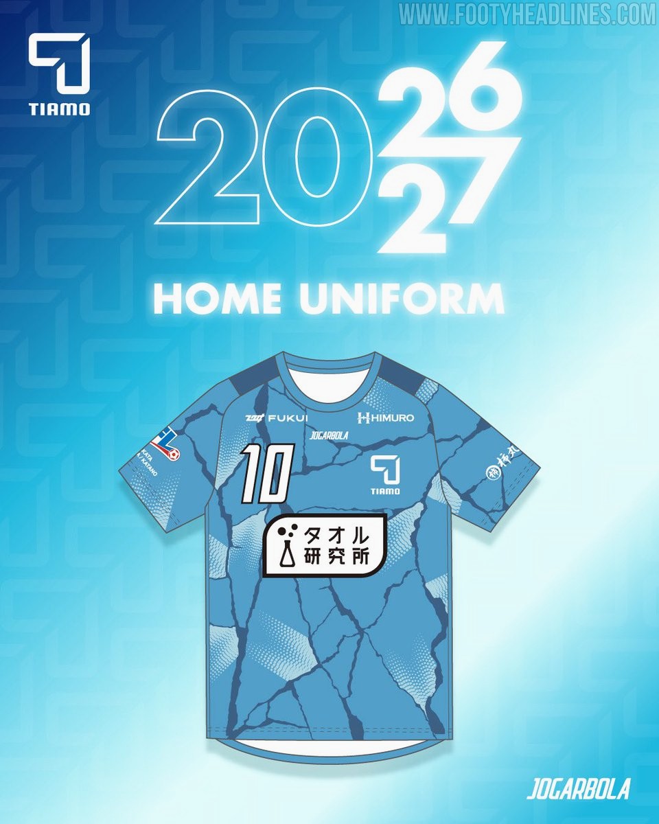
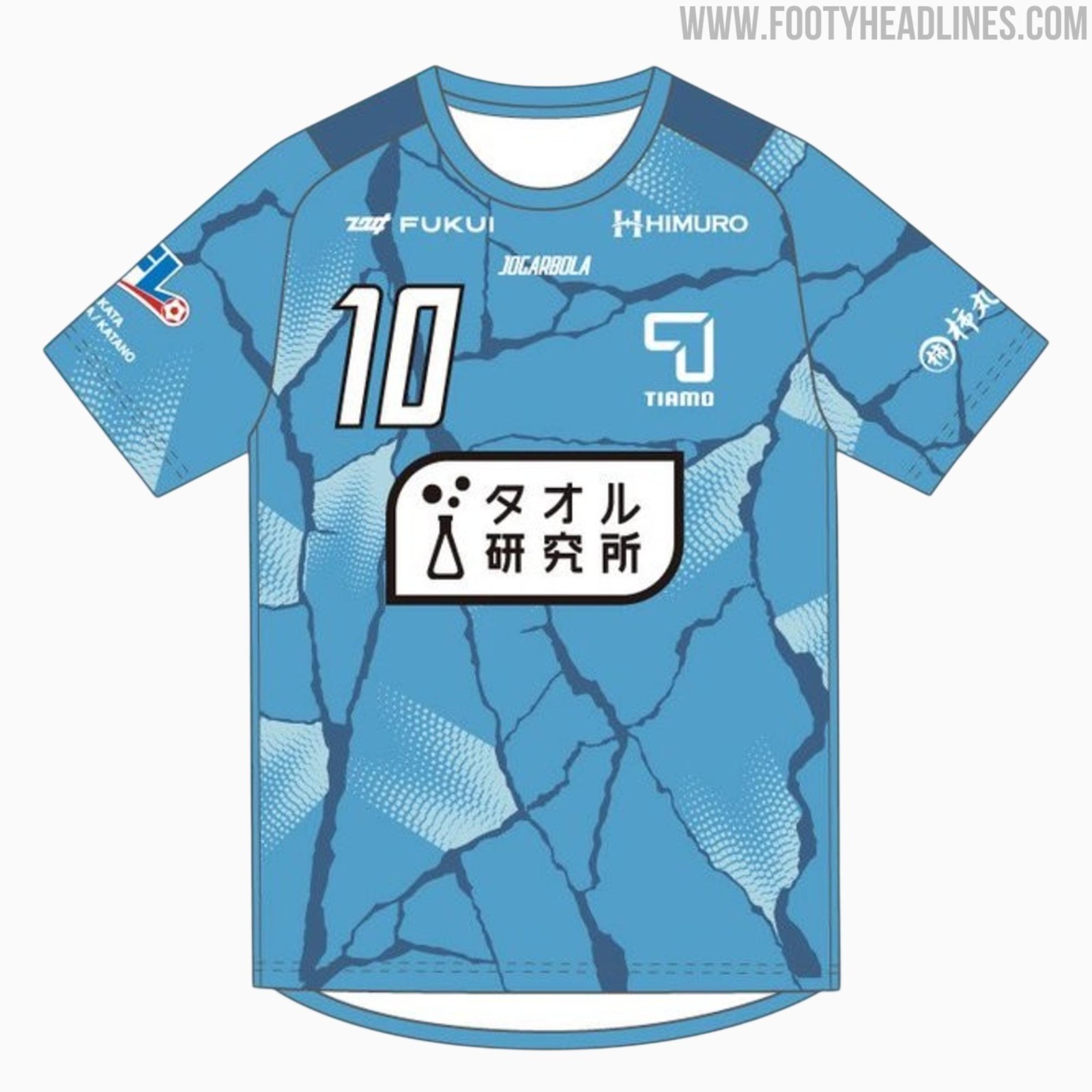
FC Tiamo Hirakata 26-27 Home Kit Released
Japanese Football League side FC Tiamo Hirakata has officially unveiled their new 2026-27 home kit, produced by sportswear brand Jogarbola. The release introduces a cracking design under the club's Reborn campaign for the upcoming JFL season, symbolizing a new beginning for the club.


Brighton to Wear 125th Anniversary Kit Against Arsenal
Brighton & Hove Albion have confirmed they will wear their limited-edition Nike 125th anniversary kit during their 2026-27 match against Arsenal in September 2026. The special shirt, which was initially released in May 2026 and draws inspiration from the club's original 1901 kit, will be showcased on the pitch to celebrate the club's founding milestone. Although the official anniversary falls on June 24, the commemorative fixture against the Gunners has been selected as the dedicated anniversary match where the team will debut the historic design.
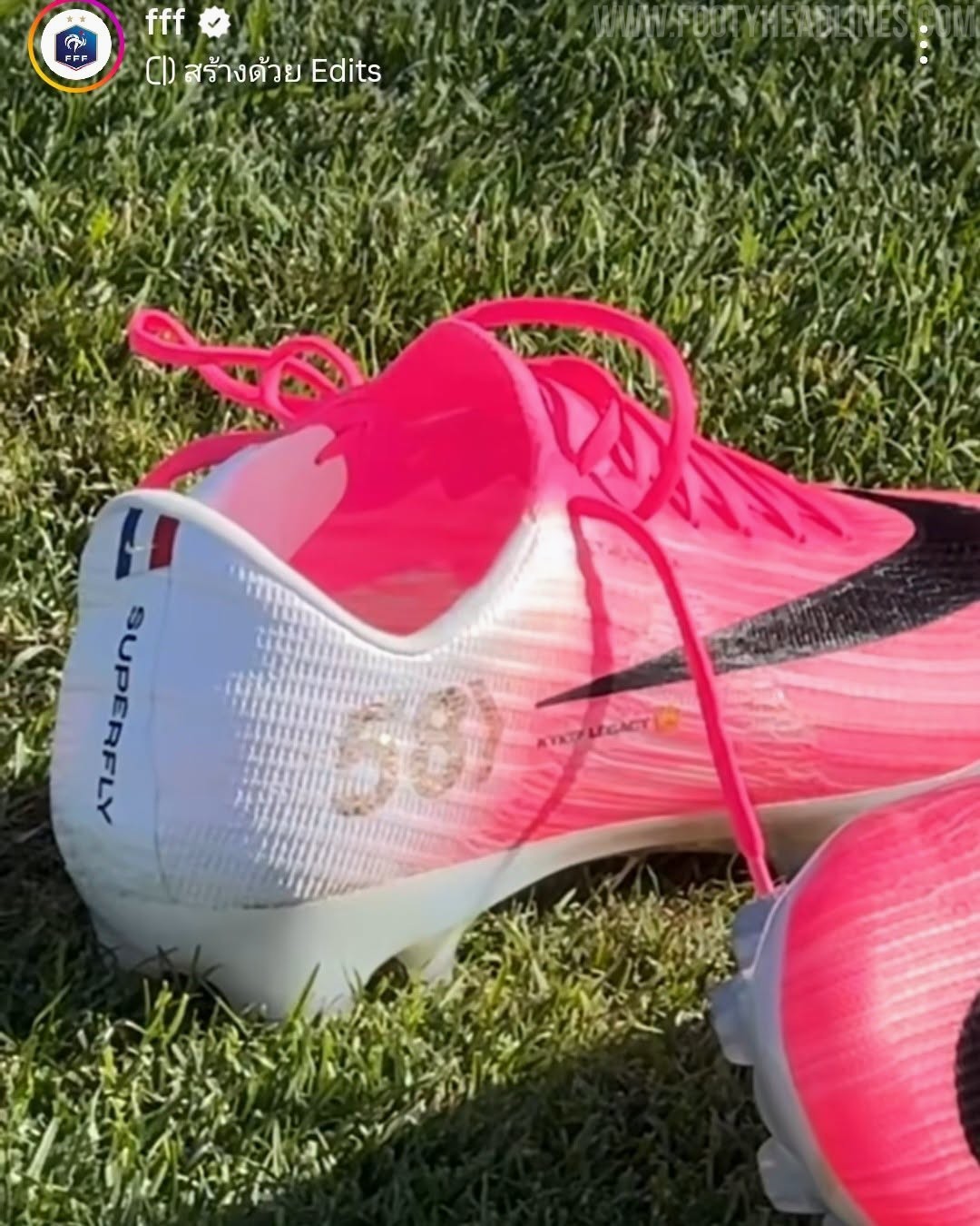
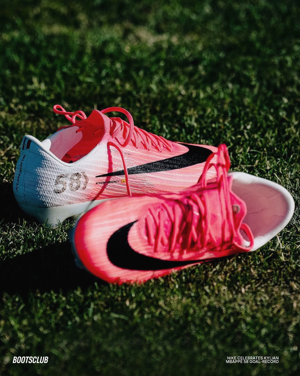
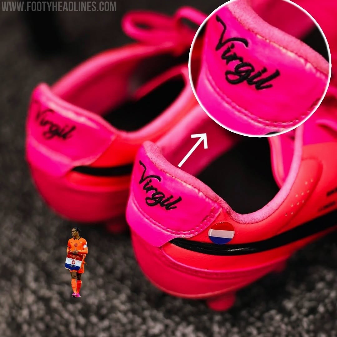
Nike Creates Personalized Mercurial 2026 World Cup Boots for Kylian Mbappé's France Goalscoring Record
Kylian Mbappé has officially cemented his legacy as the greatest goalscorer in the history of the French national team, surpassing Olivier Giroud to take the top spot. To celebrate this historic milestone of reaching 58 international goals, Nike has presented the star forward with a personalized pair of Mercurial Superfly 11 boots. This special edition footwear arrives just in time as Mbappé prepares to make his 100th appearance for Les Bleus.
The custom Nike Mercurial Superfly 11 Mbappé 2026 World Cup boots features a distinct "58" lightly printed on the lateral side of the heel, representing his record-breaking goal tally. Additionally, a small French tricolor flag is prominently positioned near the heel collar, paying direct homage to his national team.


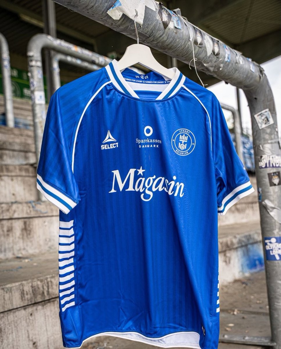
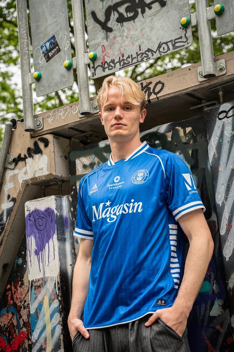
Lyngby Boldklub 2026-27 Home Kit Revealed
The new Lyngby Boldklub home kit for the 2026-27 season has been revealed. Made by Select, the new shirt will be worn by the team during the upcoming Danish Superliga campaign.
The Select Lyngby Boldklub 2026-27 home shirt introduces a clean design tailored for the club. It features the club crest on the left chest alongside the Select logo, maintaining the traditional aesthetic expected by the fans.
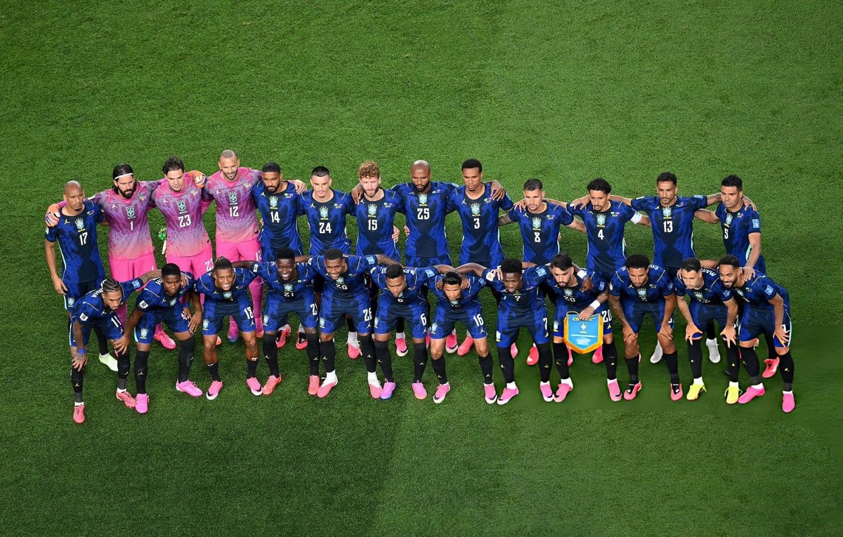

Jordan Brand Makes Historic World Cup Debut With Brazil 2026 Away Kit
The Jordan Brand has officially made its FIFA World Cup debut, partnering with the Brazilian national team for their 2026 away kit. This landmark collaboration marks the first time the iconic Jumpman logo has appeared on a national football team's jersey on the global stage, replacing the traditional Nike Swoosh. The kit has already seen on-pitch action during Brazil's opening matches of the tournament, cementing a historic crossover between basketball streetwear and international football.
The Jordan Brazil 2026 World Cup away kit features a striking royal blue base with black detailing, drawing inspiration from the vivid colors of the Amazonian poison dart frog.