Kit Clash Nightmare: USA and Belgium Cause Broadcast Chaos With Near-Identical Shirts
 Mar 28, 2026, by Chris

- Kit Clash Nightmare: The World Cup warm-up match between the USA and Belgium was a visual disaster due to their near-identical light-colored kits.
- Kit Color Issues: Belgium's light blue away kit appeared much lighter under stadium lights, resembling the USA's off-white home kit, leading to confusion.
- Third Kit Solution: FIFA encourages national teams to have a third kit to avoid such clashes, which could have been prevented if the USA had worn their away kit.
Saturday's World Cup warm-up friendly match between the United States and Belgium turned into an absolute visual disaster. As soon as the players took the pitch at Mercedes-Benz Stadium in Atlanta, viewers at home and fans in the stands immediately realized there was a massive problem: they couldn't really tell the two teams apart from afar.

The Ultimate "FIFA Glitch" in Real Life


Despite strict equipment regulations meant to prevent exactly this scenario, both the USMNT and the Belgian Red Devils took to the field wearing predominantly light-colored kits. The USMNT lined up in their new off-white 'Sail' & red striped home jersey (paired with blue shorts and white socks). Belgium, meanwhile, opted to debut their brand-new, René Magritte-inspired away kit.
This is where the major issue arose. In official Adidas promotional and store images, the Belgian away kit's light sky blue base ("Frozen Blue") and pink graphic accents appeared much darker and more saturated. However, under the bright stadium lights and from the wide broadcast camera angle, those colors completely washed out. The result? Belgium's kit looked incredibly similar to the USA's white tops.


The best way to tell the two teams apart from a distance was by looking at the shorts-blue for the US and black for Belgium.
Do We Need Third Kits for National Teams?

In international friendlies, the home team (USA) generally dictates the primary kit choice, meaning the visiting team (Belgium) is required to wear a contrasting alternate kit.
Many fans asked why Belgium simply didn't switch to their home kit. The problem? Belgium's 2026 home kit is red. If Belgium had worn red, it would have also clashed with the USMNT's "Stripes" home kit, which features prominent, thick red wavy lines across the front.

The visual nightmare could only have been avoided if the USA had worn their away kit.
This exact scenario highlights exactly why FIFA updated their Equipment Regulations back in 2022, strongly encouraging all national teams to have a "second Alternative Playing Kit" (a third kit). If this match were to happen in the 2026 World Cup, the USA would likely have to wear their away kit, while Belgium would need to wear their light blue away.
What did you think of the kit clash between the USA and Belgium? Let us know your thoughts in the comments below!
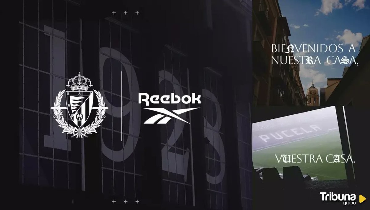
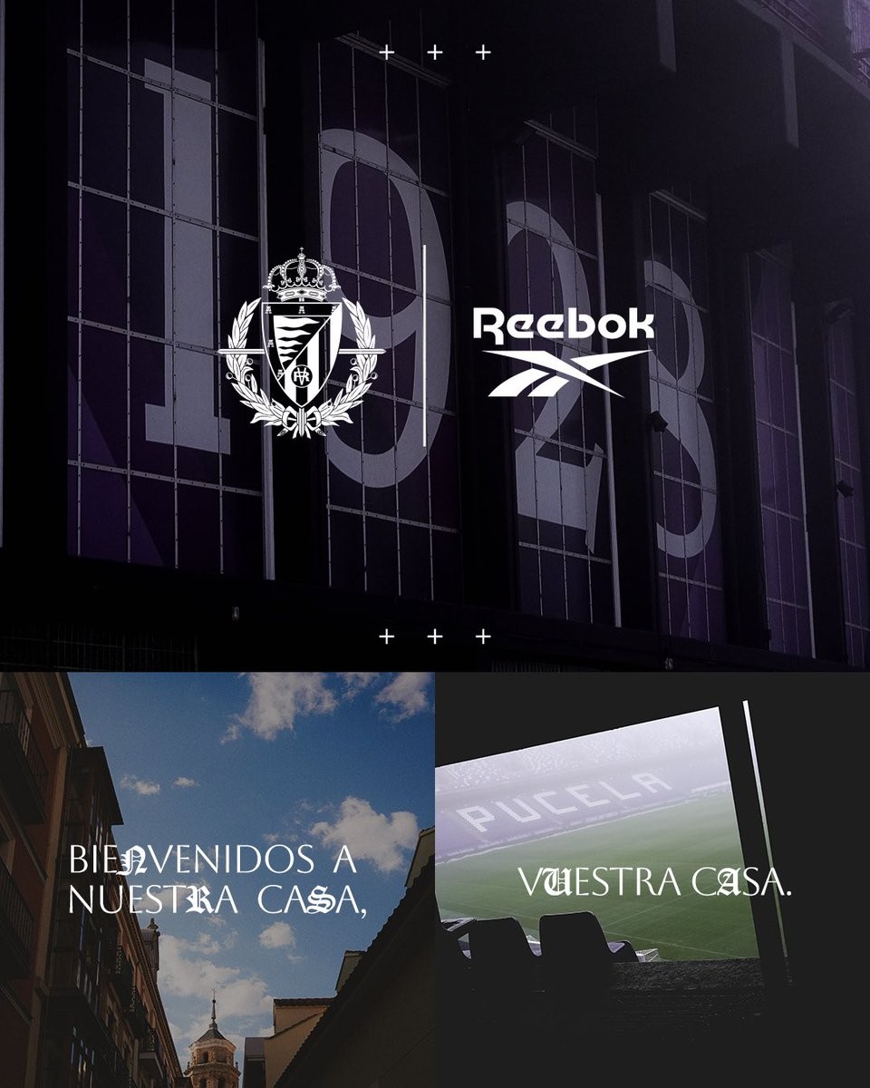
No More Kappa: Real Valladolid Announce Reebok Kit Deal
Real Valladolid has officially announced a new kit supplier agreement with Reebok, replacing Kappa. The partnership marks a significant return for the brand to Spanish football and will see Reebok serve as the club's technical sponsor until the summer of 2029. This three-year deal will officially commence from the 2026-27 season.
The announcement event took place on July 4, 2026, at the historic Valladolid Cathedral. To celebrate the start of this new era, the presentation featured a special live performance by the Escuela Municipal de Música de Valladolid, who played a symphonic rendition of the club's anthem.
As part of the agreement brokered via SportsHubGroup, Reebok will manufacture all match and training kits for Real Valladolid. Additionally, the brand will release exclusive fan products and lifestyle collections for the club's supporters over the course of the next three seasons.
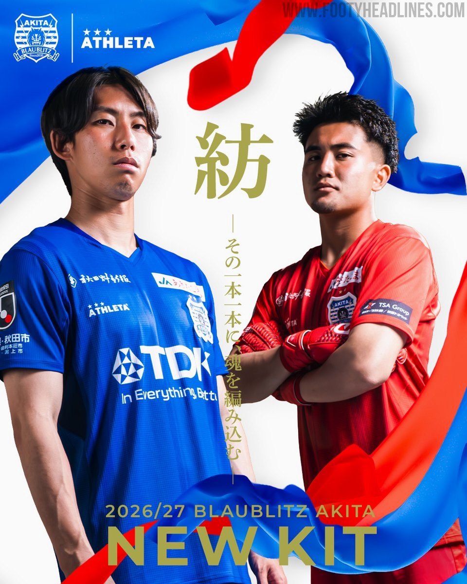
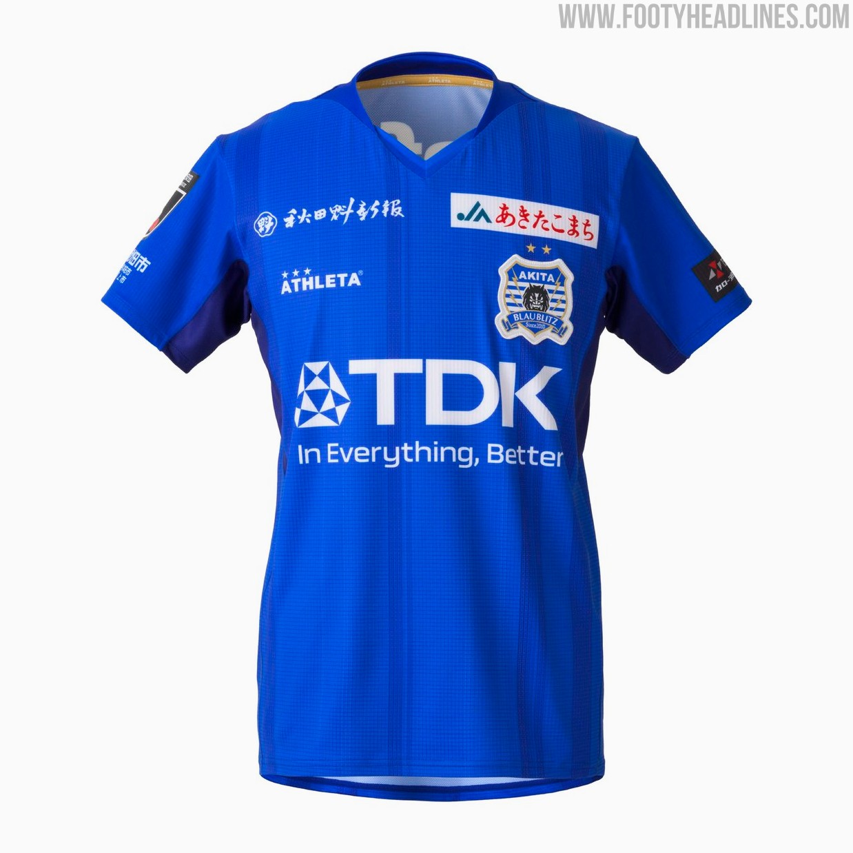
Blaublitz Akita 26-27 Kits Released
Japanese J2 League club Blaublitz Akita have unveiled their new 2026-27 kits. Made by Athleta, the new kits feature a distinct design inspired by the concept of weaving.
The Athleta Blaublitz Akita 2026-27 kits are designed around the theme of weaving, reflected in a woven pattern on the shirts, symbolizing the unity of the stakeholders spinning their efforts onto the pitch.
The new Athleta Blaublitz Akita 2026-27 kits will be available to pre-order starting July 6, 2026, with deliveries planned ahead of the start of the new league season.


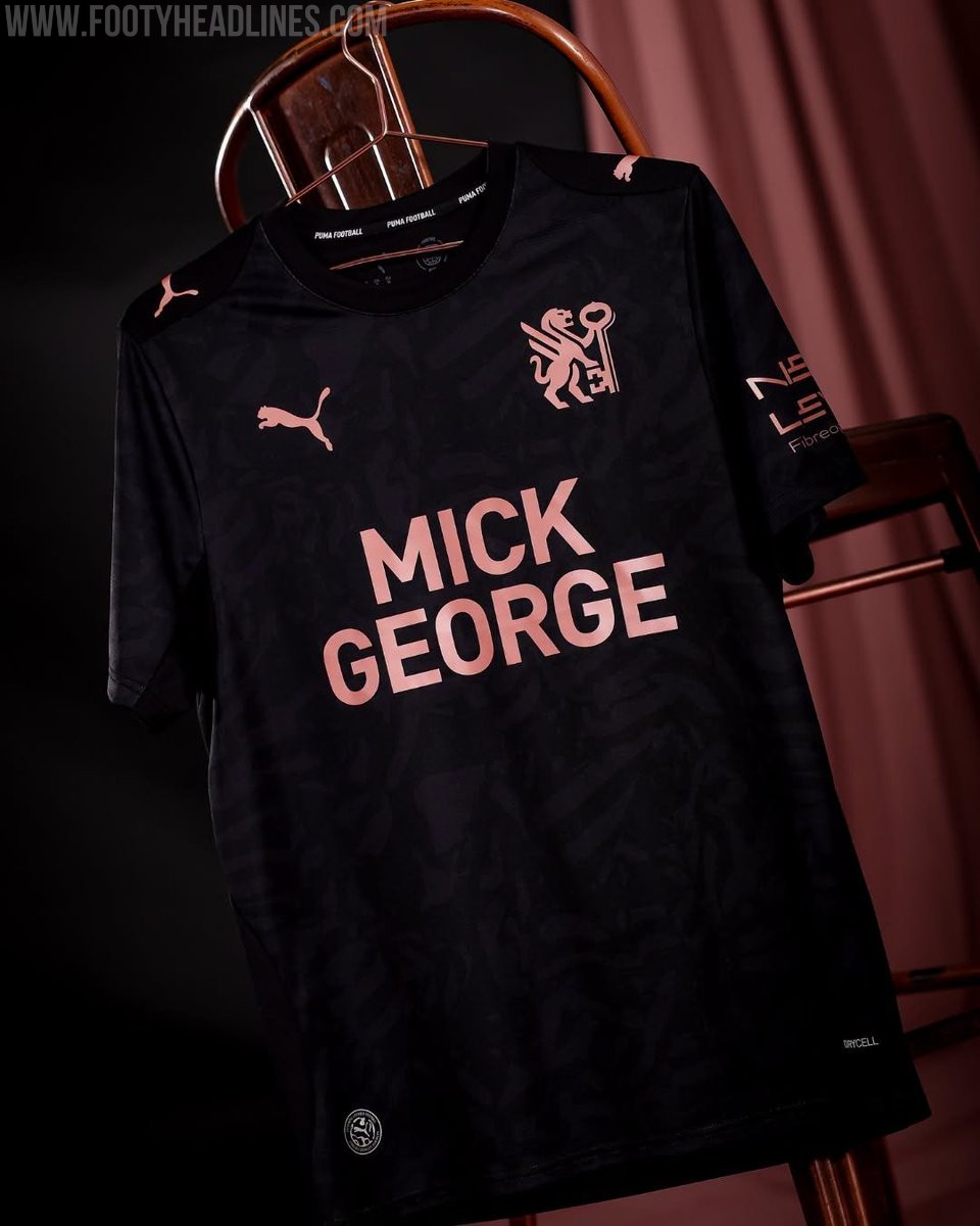
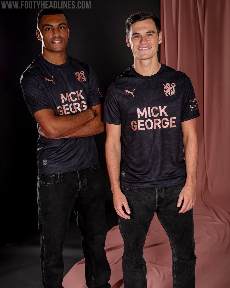
Peterborough United 26-27 Away Kit Released
League One side Peterborough United have officially launched their new Puma away kit for the 2026-27 season. The strip was unveiled during the club's Fan Zone Fun Day event on July 4, following the release of their home kit earlier in the summer.
The Peterborough United 2026-27 away shirt showcases a contemporary design that aligns with the club's new direction. It features a black base with rose gold accents. It also prominently features the club's newly introduced crest, marking a fresh chapter for the team.
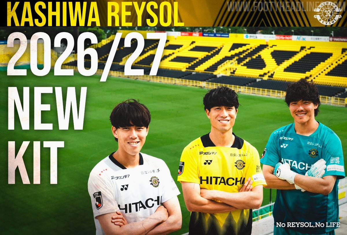
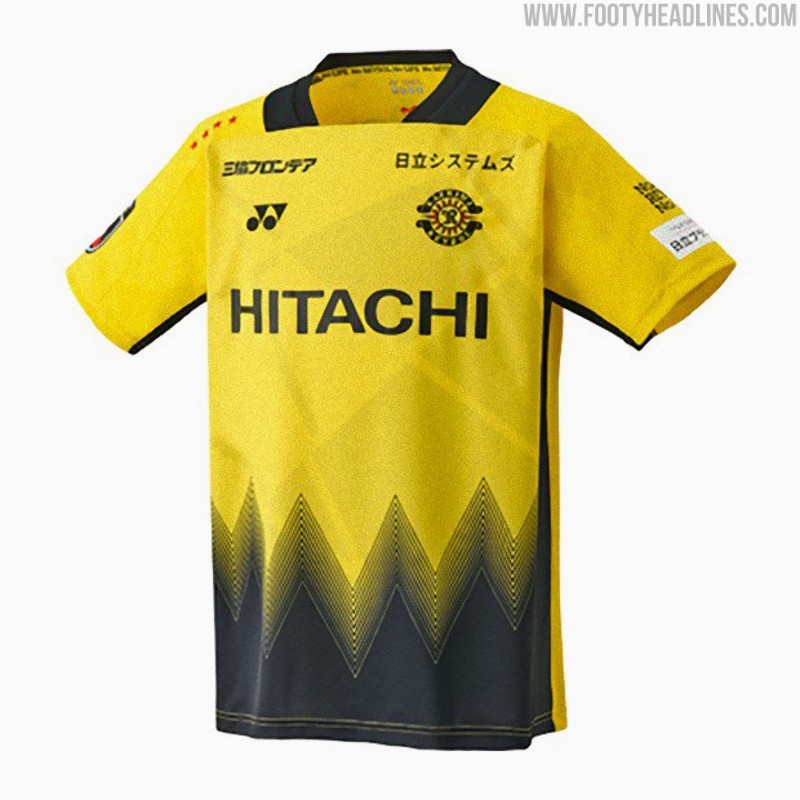
Kashiwa Reysol 26-27 Kits Released
Japanese J1 League club Kashiwa Reysol has officially unveiled its new 2026-27 kits, which are once again designed and manufactured by Yonex. The official launch on July 4 follows a short teaser video released earlier in the week and coincided with the announcement of the club's squad and player numbers for the upcoming season.
The Kashiwa Reysol 2026-27 kits feature a striking design centered around the concept of "Break the Light." The home shirt incorporates the club's traditional yellow and black colors, separated by dynamic geometric patterns that symbolize moving through the light. The away and keeper kits mirror the design in different colors.