

West Ham 26-27 Kit Mashups Cause Crest Mismatch
- Kit Mismatch Issue: West Ham United's 2026-27 kits from New Balance exhibit an awkward badge mismatch between the shirt and shorts whenever home and away uniform components are combined during matches.
- Root Cause of Inconsistency: The mismatch occurs because the home kit features a traditional full-colour shield crest on both shirt and shorts, while the away kit uses a cleaner, retro-style standalone Crossed Hammers motif on its shirt and shorts, leading to conflicting emblems when mixed.
- Specific Combination Examples: For instance, an all-claret ensemble pairs the home shirt's full shield with the away shorts' minimalist Hammers, and an all-white look combines the away shirt's Hammers with the home shorts' full shield.
West Ham United's 2026-27 kits from New Balance have generally been well received, but sharp-eyed kit enthusiasts have spotted an awkward visual quirk during recent matches. Whenever the team mixes and matches components between their home and away uniforms, it creates an unmistakable badge mismatch between the shirt and the shorts. Big thanks to @Dadsourjobtv.
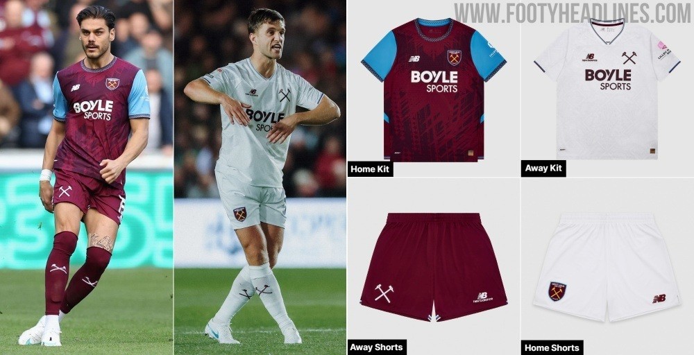
West Ham 26-27 Kit Combinations Feature Mismatched Badges
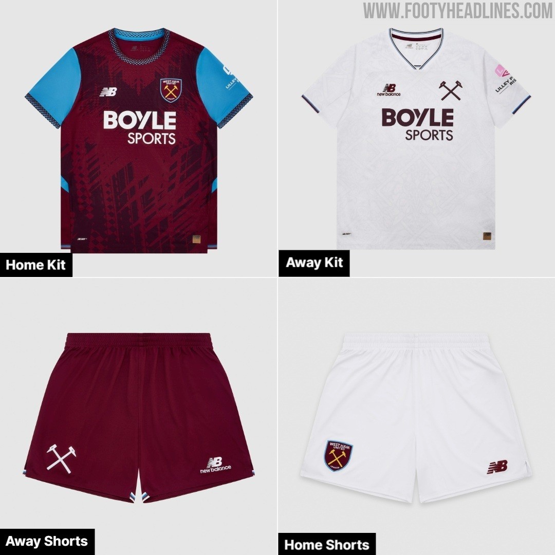
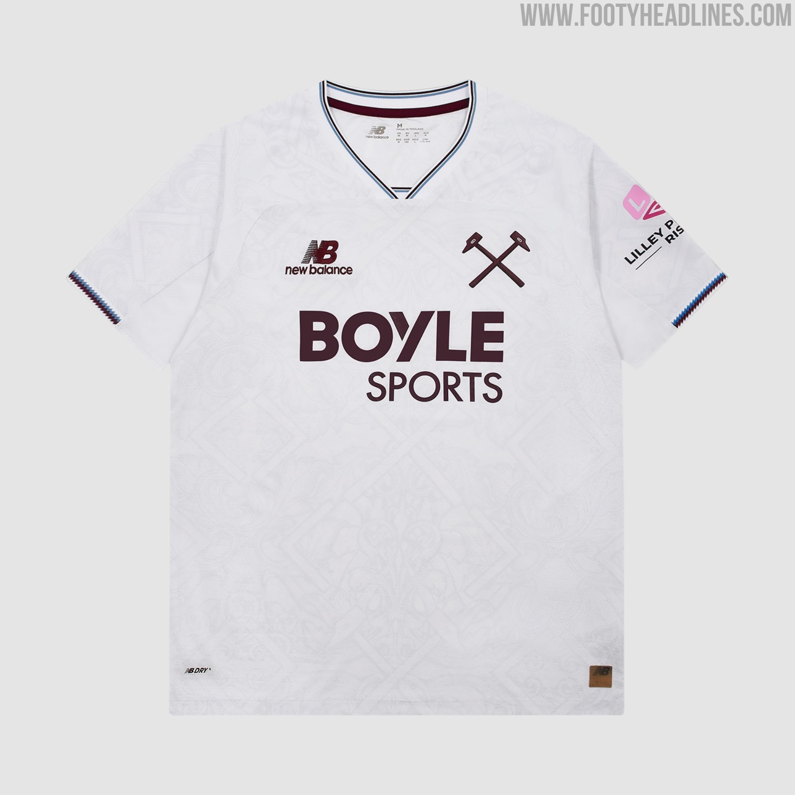
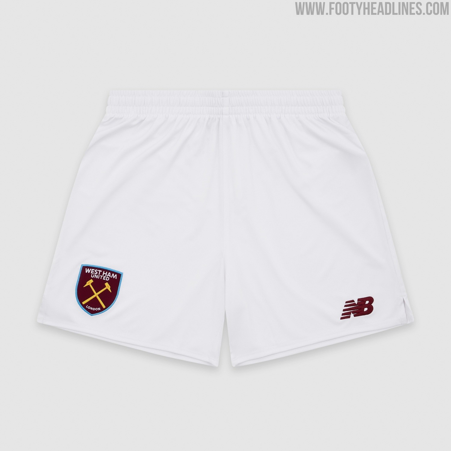
The inconsistency stems from the contrasting design approaches chosen for West Ham's primary strips this season. The home kit relies on the club's traditional full-colour shield crest, placed on both the claret-and-blue jersey and the standard white home shorts. In contrast, the away kit adopts a cleaner retro aesthetic, utilizing only the standalone Crossed Hammers motif across the white shirt and claret away shorts.
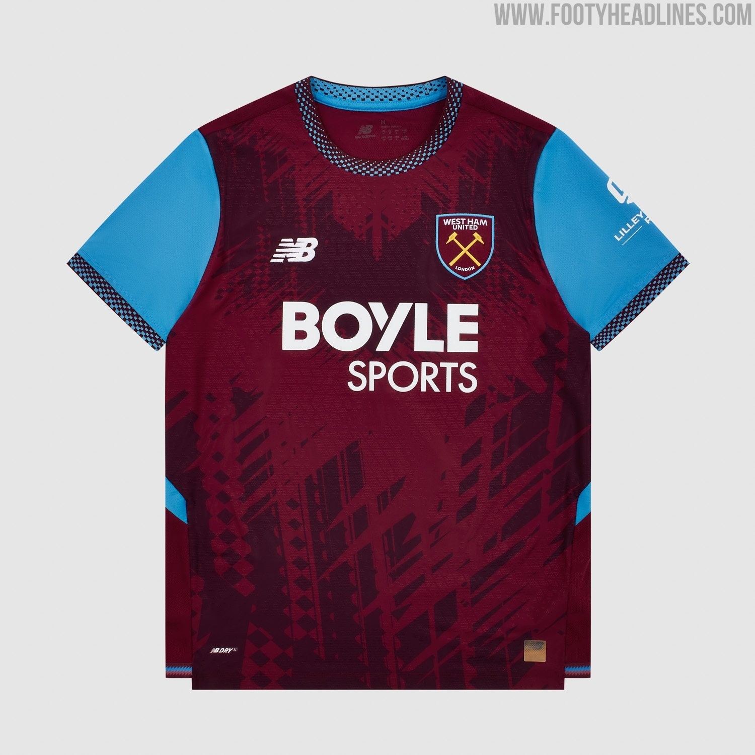
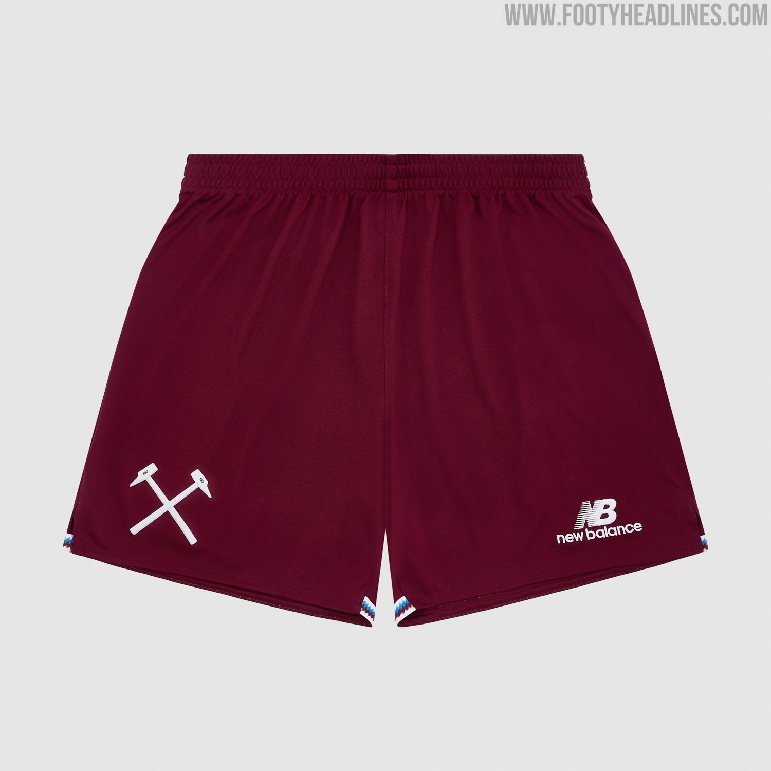
Because each set of shorts was manufactured strictly to complement its respective shirt, mix-and-match combinations create a visible clash.
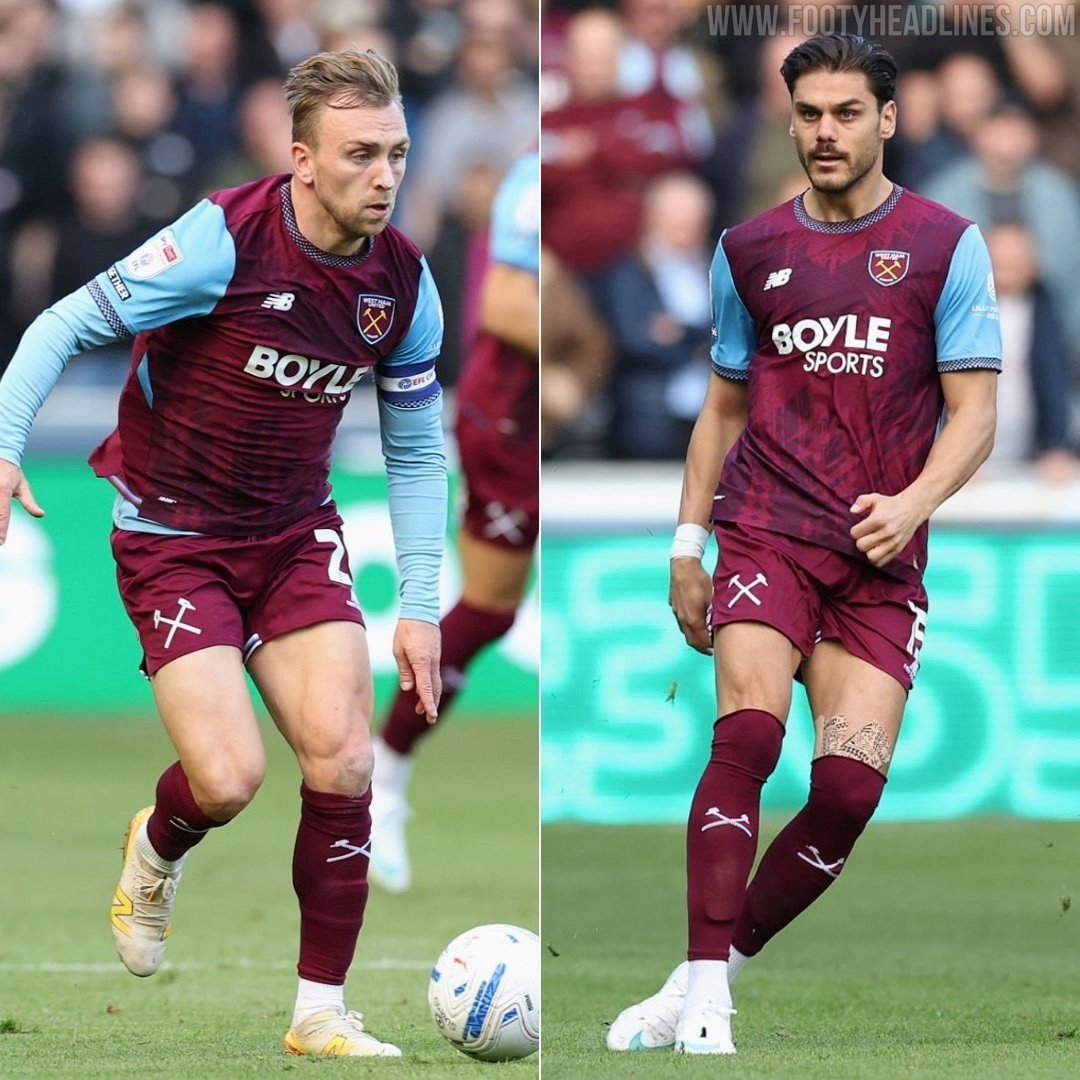
When West Ham switch to an all-claret ensemble, pairing their home shirt with the claret away shorts and socks, players take to the pitch sporting the full shield crest on their chest and the minimalist Crossed Hammers icon on their thigh.
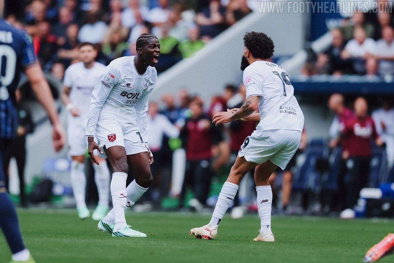
The reverse issue occurs whenever the Hammers opt for an all-white look on the road. Combining the white away shirt with the primary white home shorts results in the standalone Crossed Hammers on the chest paired with the full-colour shield crest on the shorts.

While mixing shorts and socks to prevent colour clashes is standard practice across football, such mashups increasingly produce odd results as brands alternate between full club badges and minimalist retro emblems across different kits.

For detail-oriented supporters and kit purists, it is an unusual inconsistency that is hard to unsee.
What do you think about the inconsistency in the logos on West Ham’s jerseys? Let us know in the comments below.