
Fixing English Shirt Sponsors
 , by Chris
- Problem with Sponsor Colors: Many football shirt sponsors do not adapt their corporate colors to match a team's kit, which often detracts significantly from the shirt's overall aesthetic.
- Proposed Solution by The Kit Parade: Kit illustrator The Kit Parade demonstrated the visual improvement achieved when sponsors' colors are adjusted to blend seamlessly with the team's shirt aesthetic through redesigned kits.
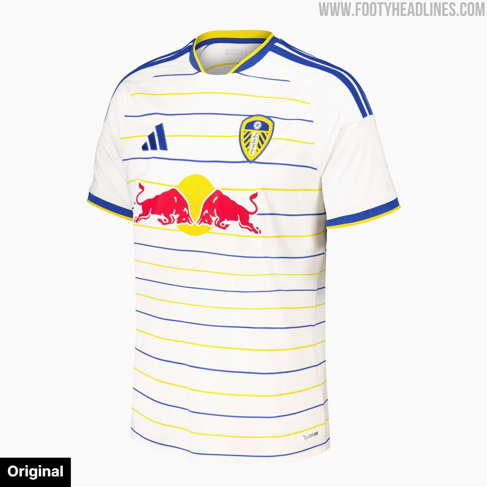
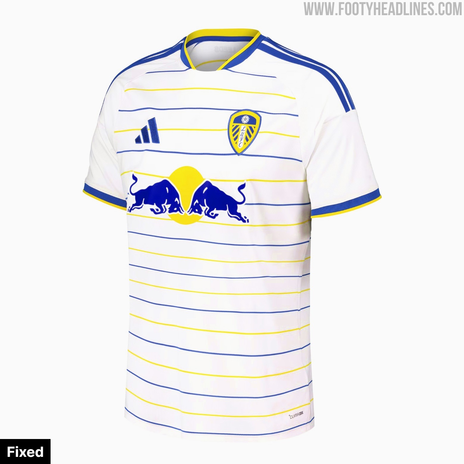
- Examples of Color Adjustments: Specific redesigns included changing Leeds United's Red Bull logo to blue, Tottenham Hotspur's red AIA logo to navy, and Bournemouth's pink Vitality badge to white script, among others.
In today's football, most sponsors do adapt their corporate color schemes to match a team's shirt. However, if not, a shirt's aesthetic is often more than slightly worsened by it. Kit illustrator The Kit Parade redesigned several shirts to demonstrate how much better kits look when sponsors are color-adjusted to blend into the overall aesthetic.
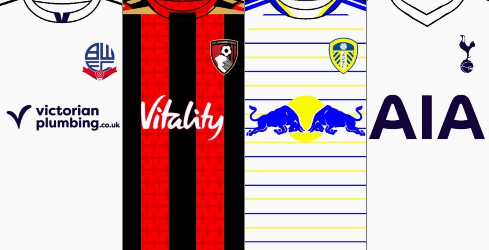
Color-Matched Sponsor Concepts
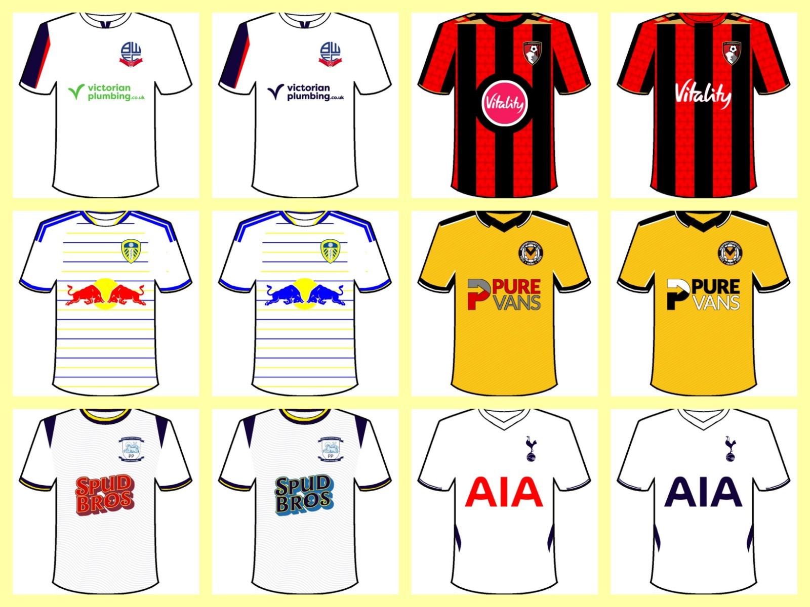
The digital edits show direct before-and-after comparisons across several well-known kits. Notable tweaks include recoloring Leeds United's Red Bull bulls from bright red to club blue, switching Tottenham Hotspur's long-standing red AIA logo to traditional navy, and replacing Bournemouth's stark pink Vitality circular badge with simplified white script. Other adjustments streamline Bolton Wanderers' green Victorian Plumbing logo into sleek navy and refine the bold Spud Bros branding on Preston North End.
Do you know an example of a corporate-colored sponsor that enhances a kit? Comment below.