
Benfica 26-27 Away Kit is Horrible in Person
 Jul 7, 2026, by Phan Tich Giay
- Initial High Expectations Dashed: Benfica's 2026-27 away kit, initially highly rated based on its launch, has completely disappointed fans after being seen in real life due to its harsh pattern shading.
- Deceptive Promotional Material: Official promotional materials showcased the kit's geometric patterns as subtle and faded, creating an illusion of a refined and elegant design.
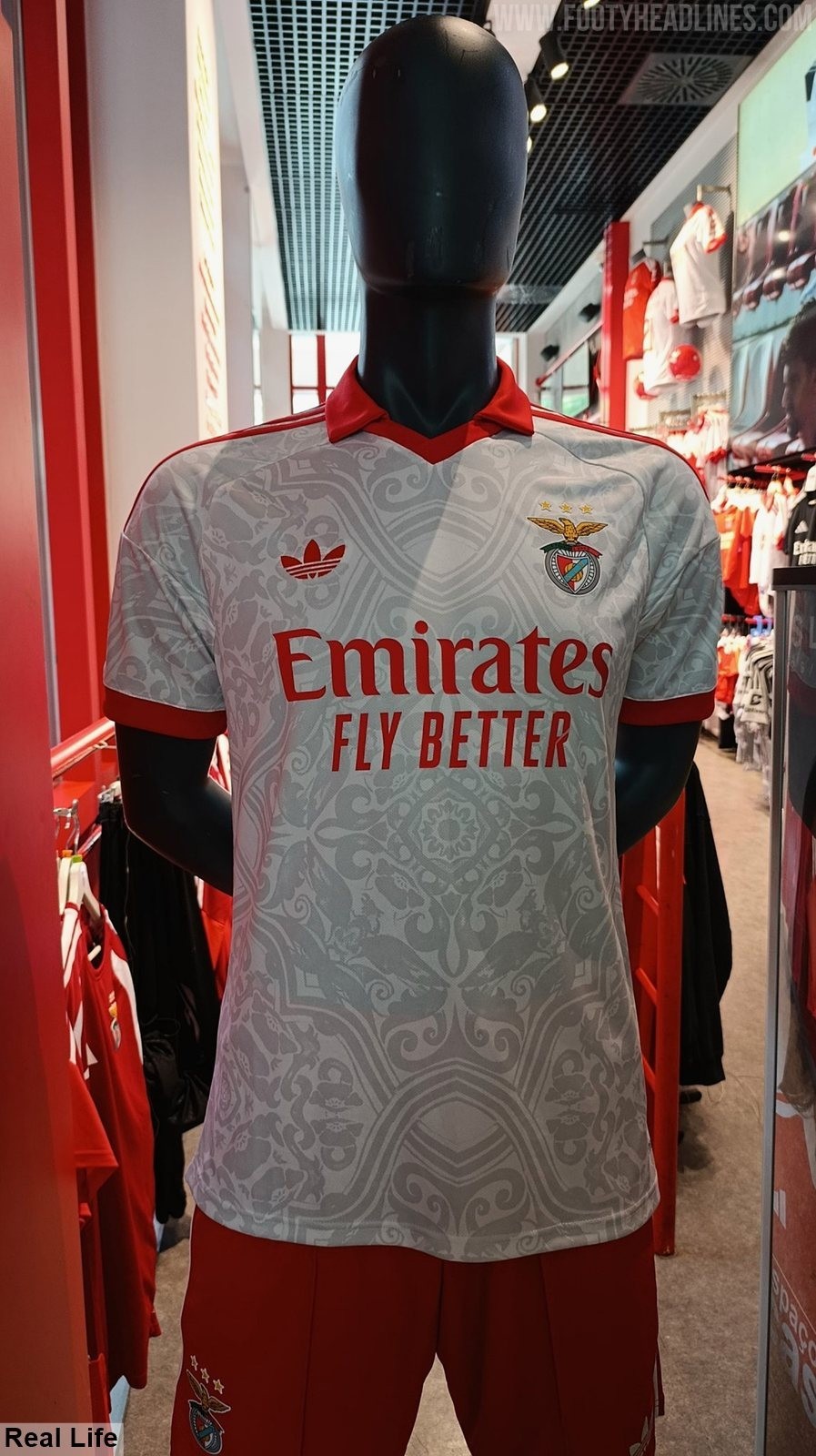
- Disastrous Real-Life Appearance: Contrary to advertisements, the kit's real-life appearance features stark, prominent, and heavy dark grey graphics that create a cluttered and messy design, widely regarded by fans as a "genuine disaster."
Two days ago, Benfica launched their new 2026-27 away kit featuring a design that was initially highly rated by the community. However, contrary to those high expectations, fans have been left completely disappointed after seeing the shirt in real life, as the overall aesthetic has been ruined by the harsh shading of the kit's pattern. Big thanks to @MisticaUnum.
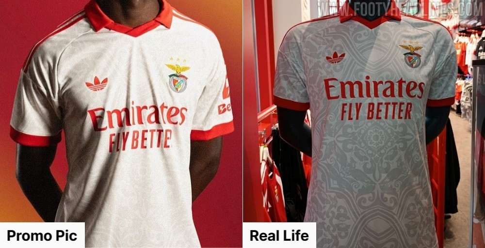
Benfica 26-27 Away Kit is Horrible in Person - The Promotional Illusion
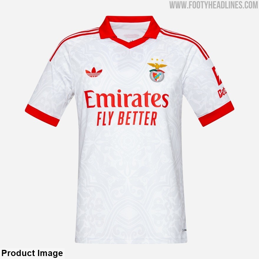
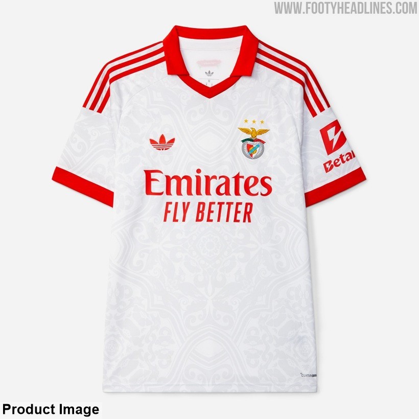
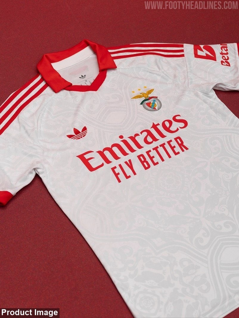
In the official promotional materials and product shots, the architectural geometric patterns on the Benfica 2026-27 away shirt were presented as a subtle, faded print. This delicate detailing was supposed to add a layer of depth, making the jersey look highly refined and elegant.
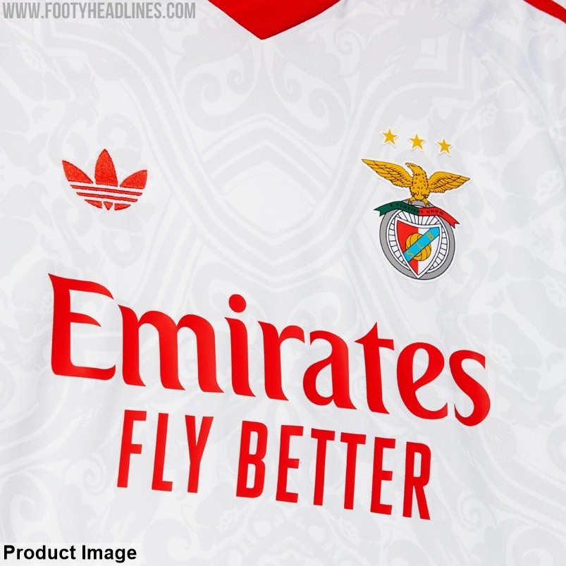
Despite the appealing advertisements, the real-life images paint a completely different and frustrating picture. The subtle watermarks seen in the promo shots are incredibly stark and prominent in person.
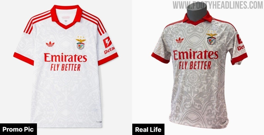
The graphics appear in a heavy dark grey tone, creating a cluttered and messy web of lines that completely breaks the overall design harmony of the shirt.
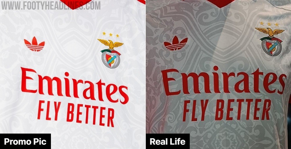
Unsurprisingly, many fans and kit enthusiasts are calling this a "genuine disaster" when comparing the misleading promotional shots to the physical product.
What are your thoughts on this massive difference between the promo pictures and the real-life Benfica 26-27 away kit? Do you agree that the dark, prominent pattern ruins the design? Let us know in the comments below.




Bayern München 26-27 Oktoberfest Kit Spotted for Sale
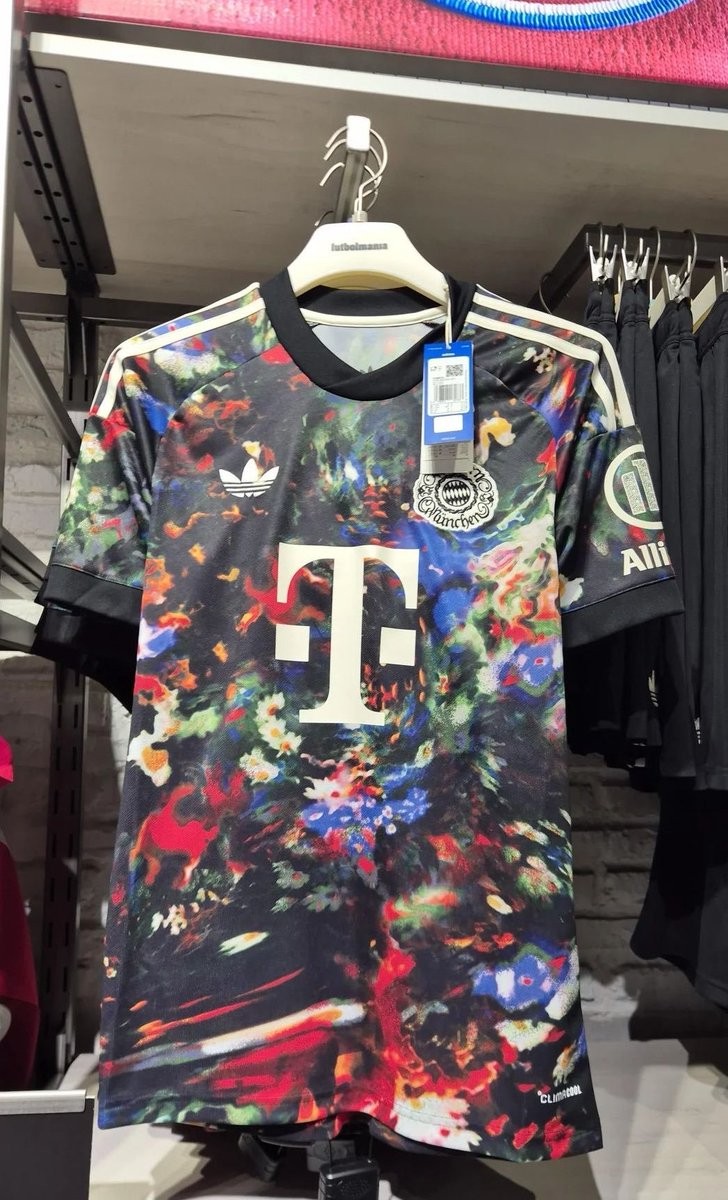
The upcoming Adidas Bayern München 26-27 Oktoberfest jersey has been spotted hanging on retail racks ahead of its official launch in September.
Moving away from the club's traditional Bavarian-inspired palettes and subtle motifs of previous years, the new Wiesn shirt introduces a radical look featuring a vibrant, multicolored abstract graphic set against a black base. The energetic design is complemented by off-white Three Stripes on the shoulders, the classic Adidas Trefoil logo, an ornate heritage Bayern Munich crest, and cream sponsor detailing.

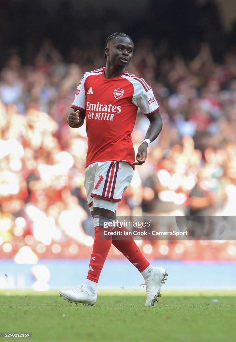
Bukayo Saka and Yan Diomande Debut Whiteout New Balance Furon V9 Boots
Arsenal talisman Bukayo Saka and Real Madrid signing Yan Diomande have both taken to the pitch wearing all-white New Balance Furon V9 boots at the start of the 26-27 campaign. Thanks to @volkyfootballboots.v2 for spotting.
As two of the primary headline athletes for New Balance's flagship speed silo, their synchronized switch away from standard on-pitch colorways to a whiteout look points toward an upcoming limited-edition pack or special release from the American brand in the near future.
It’s normal that brands hide their new flagship-shoes with a whiteout colorway until their release takes place officially, so competitors can’t already get an early glimpse into their newest design.


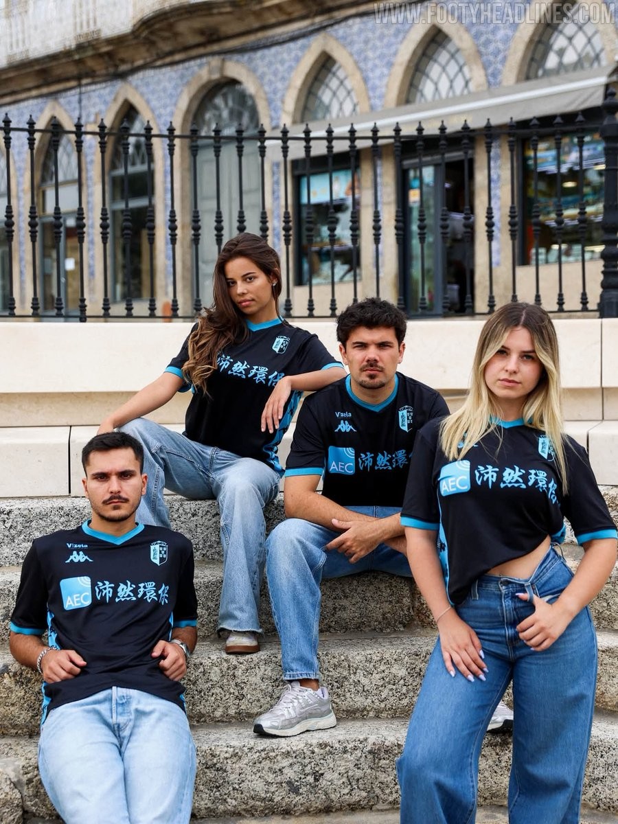
FC Vizela 26-27 Away Kit Released
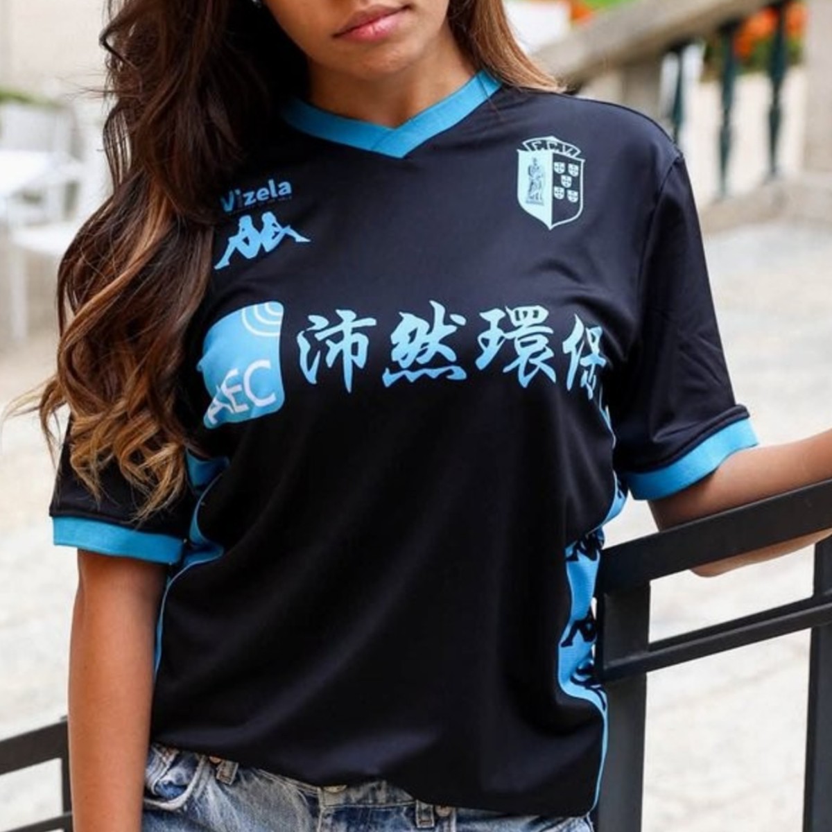
Liga Portugal 2 side FC Vizela has officially launched its new away kit for the 26-27 campaign, manufactured by Kappa. The jersey introduces a black base complemented by vibrant light blue accents across the V-neck collar, sleeve cuffs, and club crest. A standout element of the design is Kappa's signature Omini logo tape running down the side panels, paired with monochrome light blue sponsor detailing for a cohesive look.