
Inter Milan Crest System Concept Proposes Return of Historic Badges
 , by Phan Tich Giay
- Proposed Crest System: Creative designer Alberto Mariani (Rupertgraphic) has unveiled a concept for Inter Milan featuring a modular "Jersey Crest System" to reintroduce historical badges to official match kits.
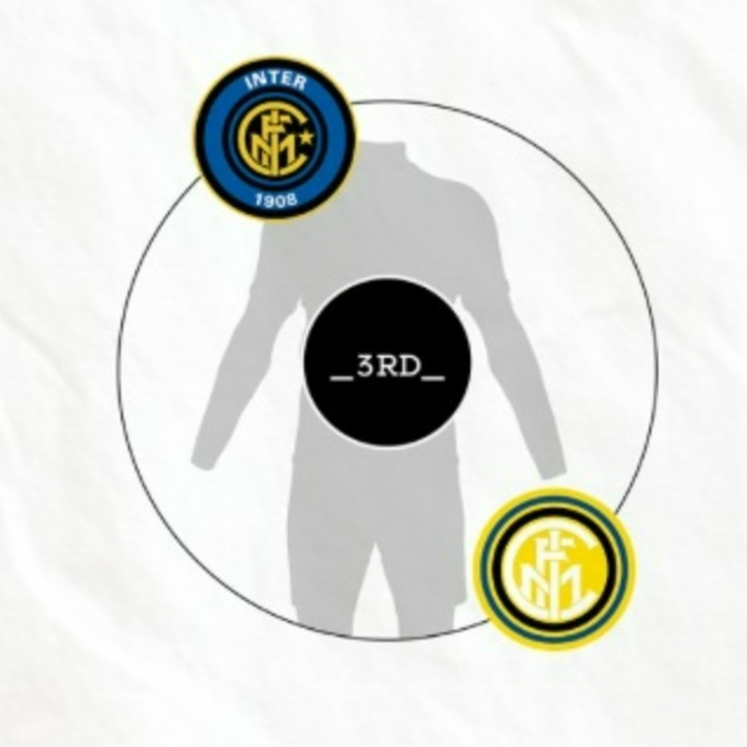
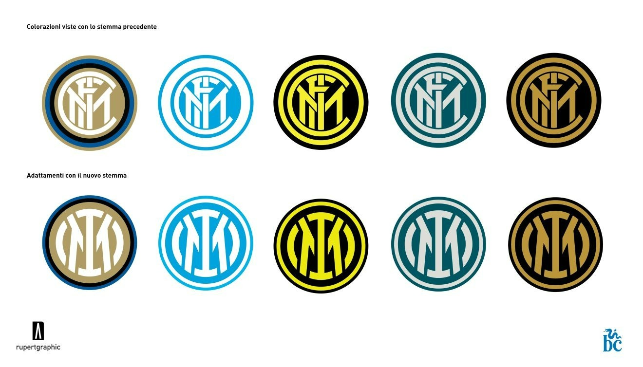
- System Functionality: The concept proposes keeping the modern "IM" emblem on home shirts for brand consistency, while utilizing away and third kits to rotate and showcase the club's celebrated historical badges like the biscione shield or traditional FCIM roundel.
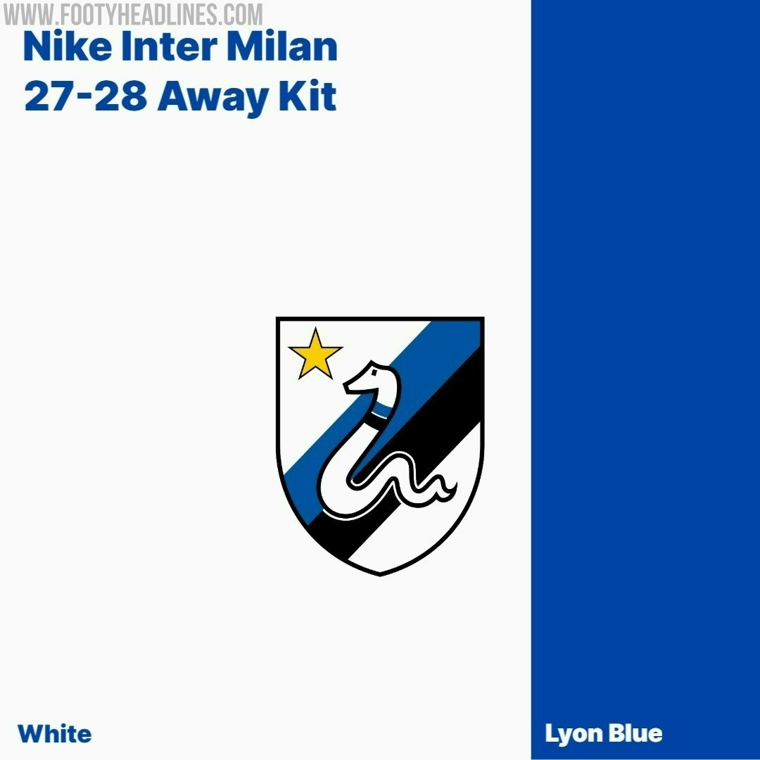
- Strategic Rationale: This approach balances modern visual identity with heritage romance, mirroring successful kit strategies by other major European clubs, and is timely given reports that Inter Milan is preparing to feature the 1979-1988 biscione shield on their upcoming 27-28 away kit.
Italian creative designer and lifelong Nerazzurri supporter Alberto Mariani, better known as Rupertgraphic, has unveiled an intriguing concept exploring a modular "Jersey Crest System" for Inter Milan. The project addresses a common debate among modern football fans: while Inter successfully streamlined their visual identity in 2021 with the minimalist "IM" monogram, the club's deep catalog of iconic historical badges has largely been left off official match kits.
Modular Crest System: Bringing Back Historical Badges
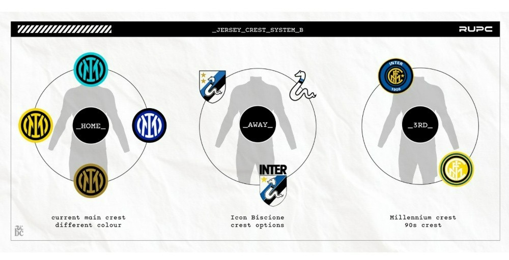
Rather than campaigning for a complete rebrand or purely nostalgic indulgence, Rupertgraphic proposes a structured, functional brand architecture. Under the concept, Inter's match jerseys would follow a flexible crest system across home, away, and third kits each season.
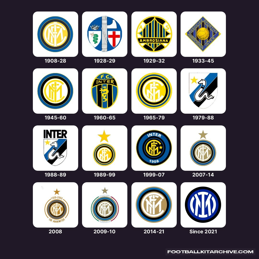
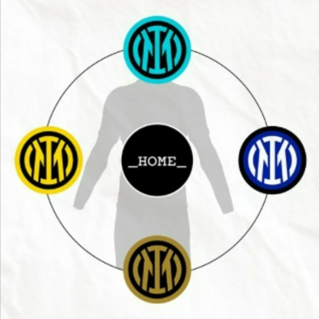
The modern IM emblem would remain the central anchor on the home shirt, either in full color or sleek tonal variations, ensuring brand consistency. Meanwhile, the alternate kits would become dynamic canvases to rotate the club's most celebrated historical stemmi.
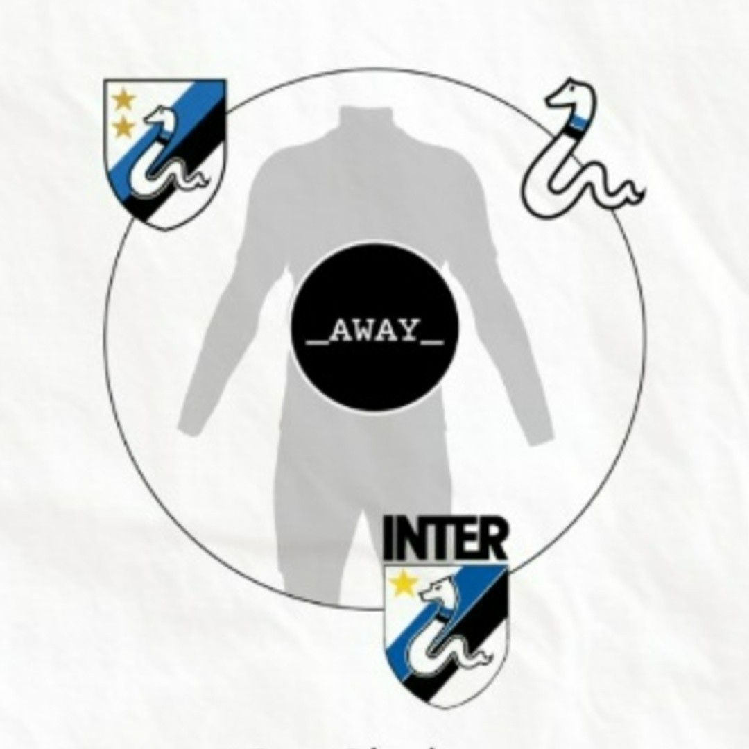
The proposal outlines dedicated roles for different eras across the kit collection. Away shirts could regularly feature the beloved 1979–1988 biscione shield, standalone serpent graphics, or the traditional intertwined "FCIM" roundel.
For third kits, the framework suggests using the late-1990s "millennium" badge or vintage yellow-and-black roundels.
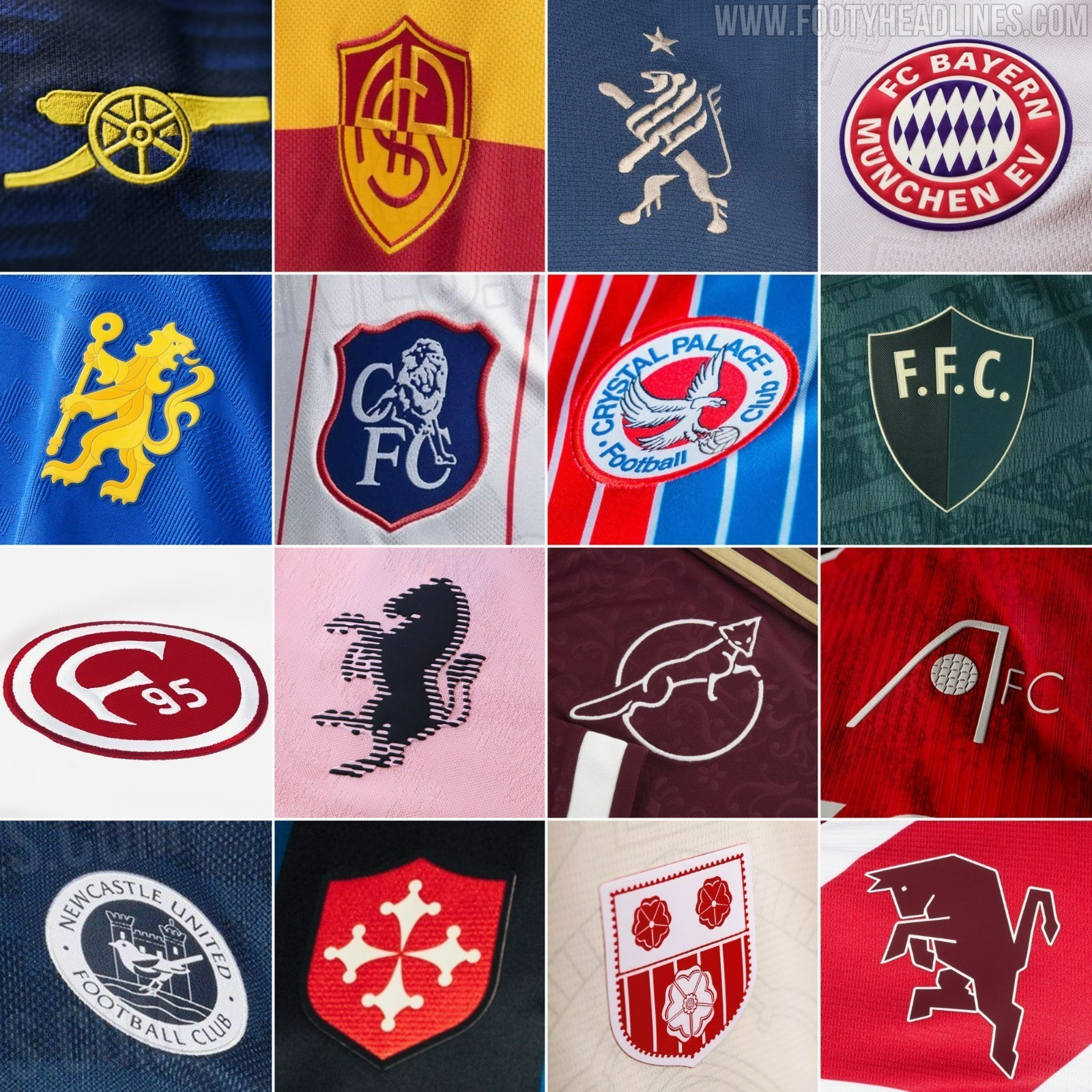
This modular philosophy mirrors the successful kit strategies already adopted across Europe by clubs like Arsenal, AS Roma, Liverpool, and Bayern Munich, where archival emblems and heritage symbols breathe genuine personality into alternate shirts.
To demonstrate the practical appeal, Rupertgraphic published detailed, high-fidelity mockups of the 1979-1988 shield rendered as an embroidered patch on textured white jersey fabric.
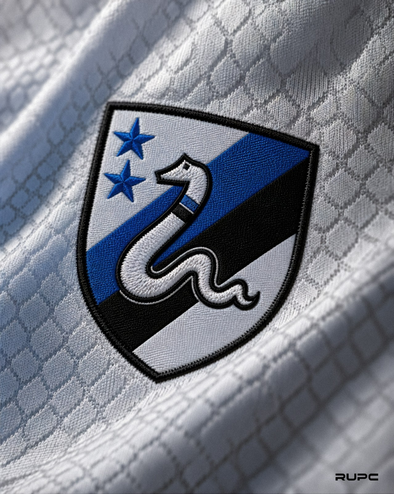
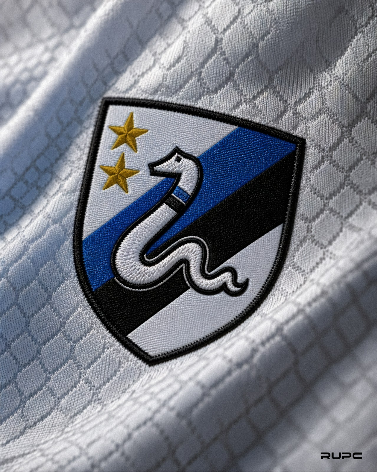
The execution features the coiled white snake across diagonal black, blue, and white stripes, crowned with two stars in both gold and royal blue variants to reflect Inter's 20th Scudetto.
The timing of the concept is particularly apt, as Inter Milan is reported to be preparing a return of the 1979-1988 biscione shield for their upcoming 27-28 away kit.
Rupertgraphic's project makes a compelling case that modern club marketing and heritage romance do not have to compete, proving that a thoughtful crest system can elevate an entire kit collection.
Do you agree with rupertgraphic’s proposed logo system for Inter’s home, away, and third kits? Let us know in the comments below.