

Liverpool 26-27 Away Kit Features Black Premier League Font
- Kit Design and Branding: Liverpool's 26-27 away kit, crafted by Adidas, is retro-inspired with an off-white base, red accents, the classic Trefoil logo, and a heritage 1980s Liver Bird crest.
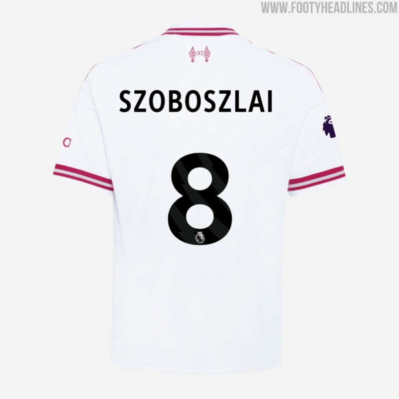
- Premier League Font Choice: For Premier League matches, the 26-27 away kit will feature black lettering and numbering on the back, a surprising choice attributed to a potential shade mismatch with the streamlined red EPL font.
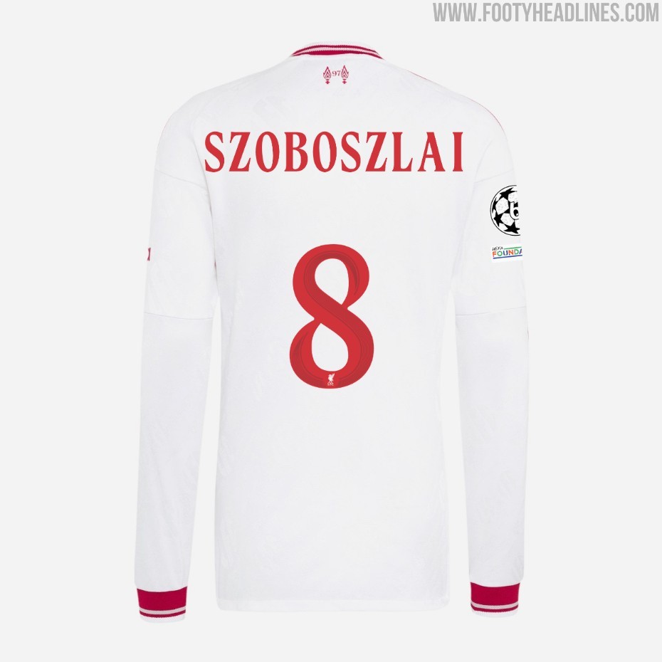
- Cup Match Font Details: In cup matches, Liverpool will use a new red cup font that matches the kit, although it oddly includes the regular Liverbird logo with LFC lettering instead of the kit's classic crest.
Liverpool has officially launched its retro-inspired 26-27 away kit, crafted by Adidas and featuring the classic Trefoil logo alongside a heritage 1980s Liver Bird crest. The choice of colors for the font surprised many - thanks to ++Jay Pearson++ from Tops of the Kop for the spot.
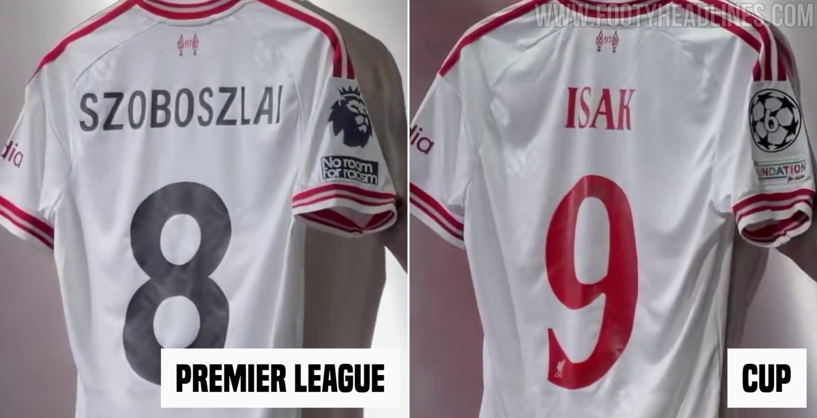
Liverpool 26-27 Away Kit Font
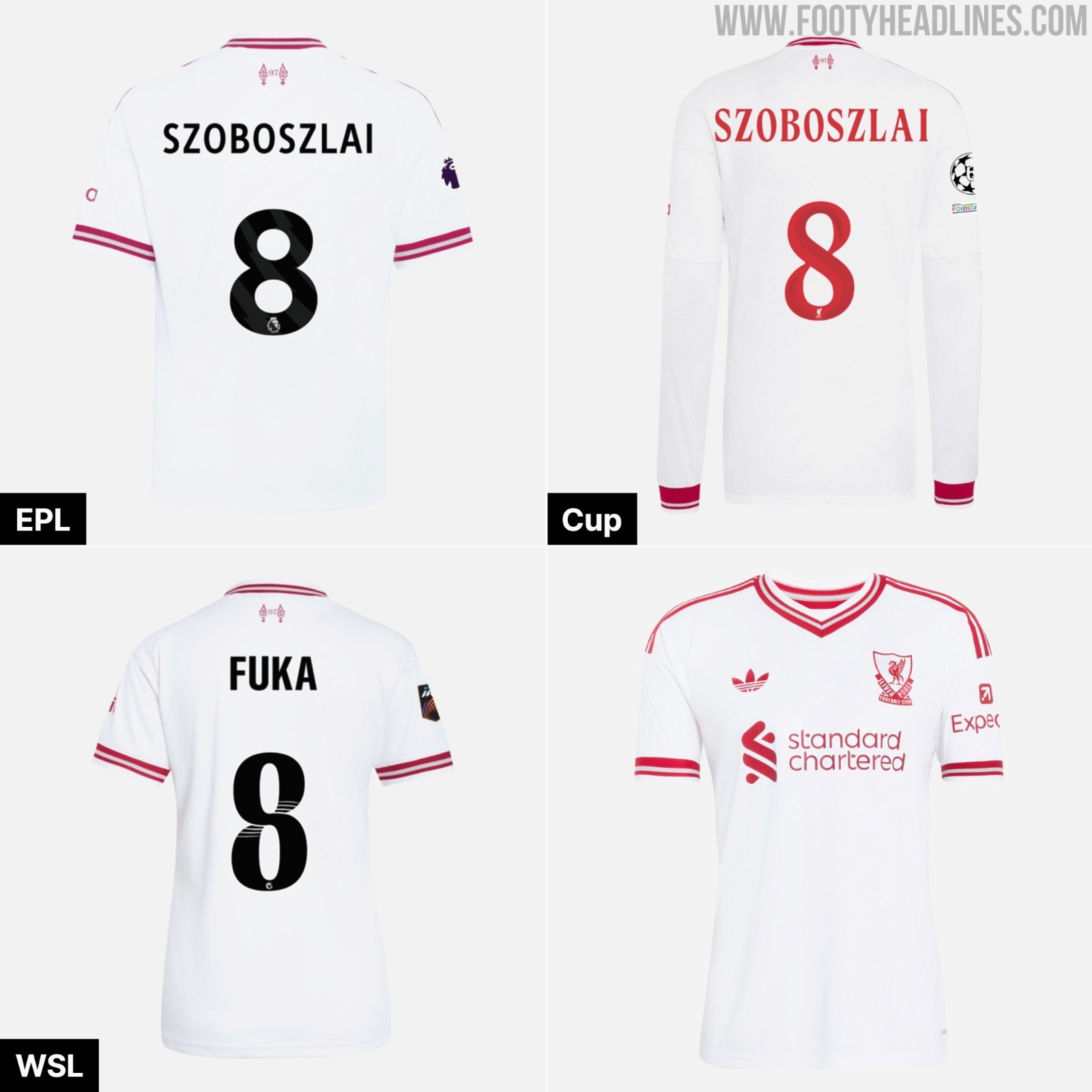
The Liverpool 26-27 away shirt design displays an off-white base highlighted by bold red accents across the collar, shoulder stripes, and sleeve cuffs. There are only these two colors, plus gray for detailing. However, the kit will have a fourth color on the pitch in league matches.
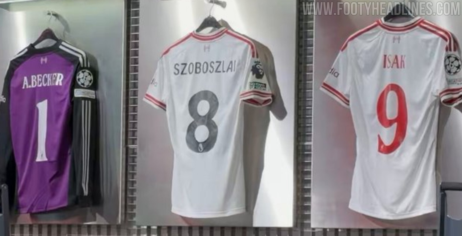
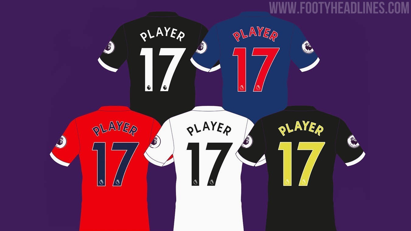
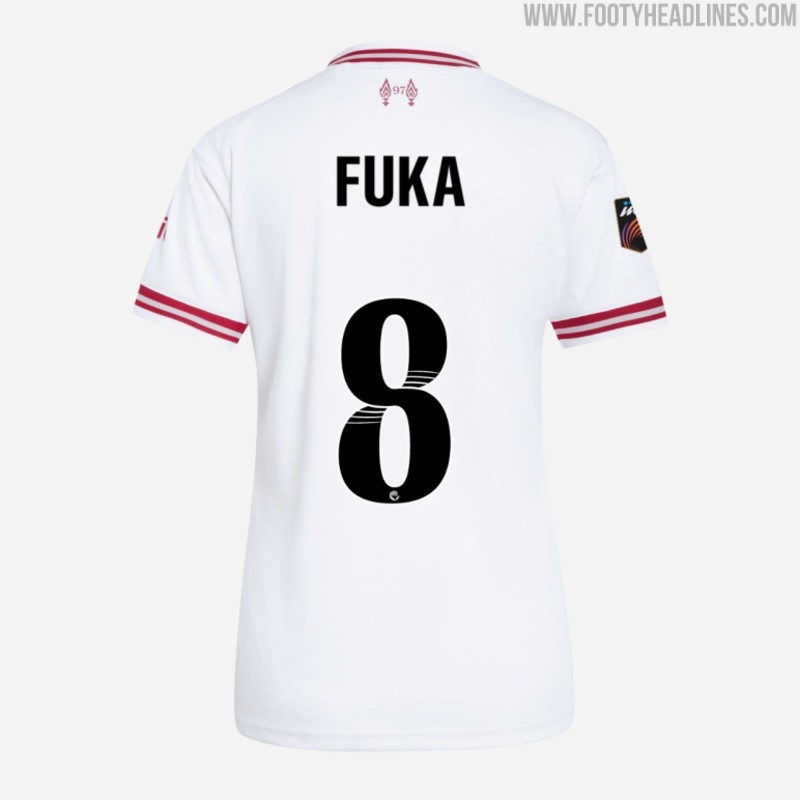
For Premier League matches, the Liverpool 2026-2027 away kit features black lettering and numbering on the back, and not the red one available as one of the 5 presets. This is probably because the streamlined red EPL font has a different shade of red than the kit. The WSL version also sees a black font.
In cup matches, Liverpool will use their new cup font, in a matching red. Oddly, the font comes with the regular Liverbird logo with LFC lettering, even though the kit has a classic one.
Should they have used a red font in the EPL, even though the shades would not have matched perfectly? Comment below.