

Liverpool 26-27 Third Kit Font Contrast: Bespoke Silver in Champions League, Generic White in Premier League
- Liverpool Kit Font Discrepancy: Liverpool's 26-27 third kit features bespoke metallic silver fonts for UEFA Champions League and domestic cup matches, but generic white fonts for Premier League games.
- Premier League Color Regulations: Premier League rules restrict font colors to five standard options (white, black, navy, red, hi-vis yellow), which prevents Liverpool from using their metallic silver font in league matches.
- Visual Mismatch and Call for Rule Relaxation: The Premier League's rigid font color rules create visual mismatches on kits, unlike other major leagues that allow color-matching, suggesting a need for the Premier League to relax its restrictions to enhance kit aesthetics.
Liverpool's newly launched 26-27 third kit by Adidas has drawn attention not just for its black and maroon pattern inspired by European nights at Anfield, but also for the sharp contrast between its cup and domestic font applications. For non-league fixtures such as the UEFA Champions League and domestic cups, the jersey is paired with Liverpool's bespoke metallic silver club font. The shimmering silver finish perfectly matches the shirt's monochrome crest, Adidas logo, chest sponsor, and shoulder stripes.
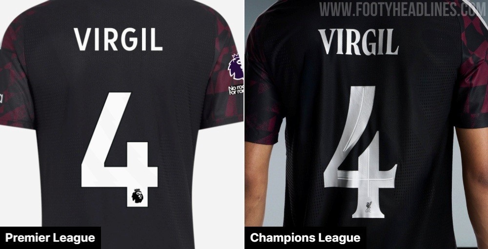
Premier League Font Color Restrictions
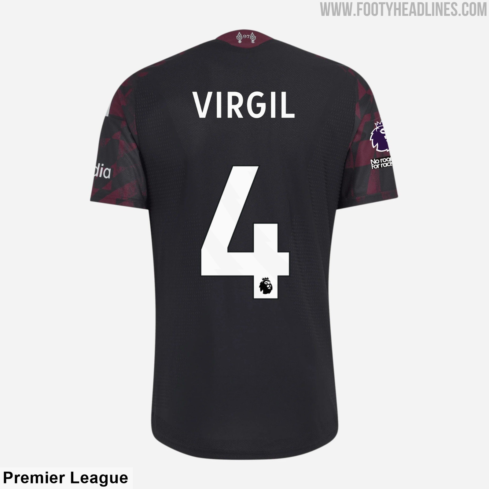
Under current Premier League equipment regulations, clubs are restricted to choosing namesets and numbers from just five standardized color options: white, black, navy, red, and hi-vis yellow. Because metallic silver is not an approved option in the league's color palette, Liverpool have to use standard white printing on their black and maroon third strip during English top-flight fixtures.
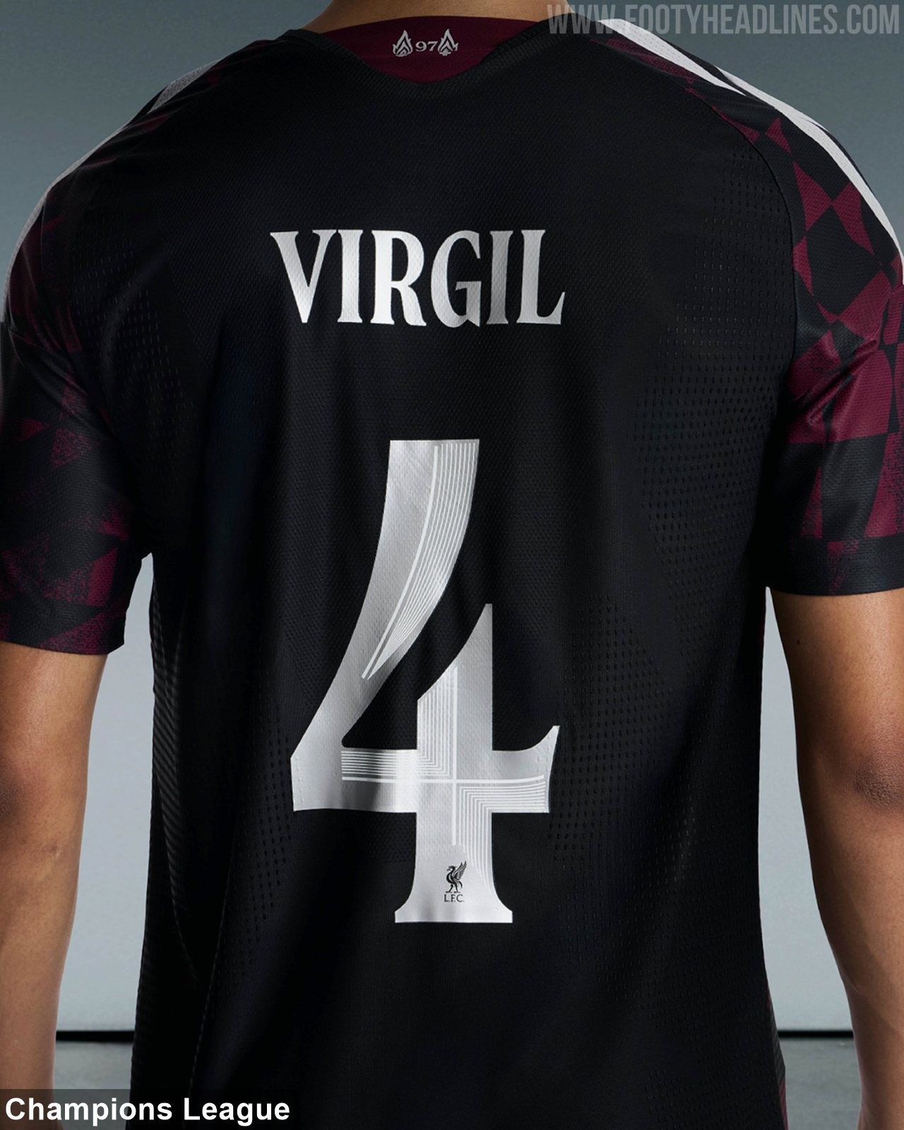
This rigid color rule creates a noticeable visual mismatch. The bespoke club font in metallic silver perfectly matches the accents, logos, and trims across the shirt. In contrast, the plain white Premier League numbers feel generic and disconnected from the intended aesthetic of the jersey.
This is far from an isolated incident. Over recent seasons, numerous Premier League clubs have suffered from the same issue whenever their kit colorways deviate from primary primary tones. Teams featuring gold, off-white, mint, or bespoke maroon detailing are constantly forced into standard white or black printing for league matches, diluting the bespoke design work created by sportswear manufacturers.
Other major leagues have already demonstrated a better approach. Competitions such as Serie A, La Liga, and MLS maintain a uniform league typeface while granting clubs the freedom to color-match numbers and lettering to their kit trims. A similar relaxation of the Premier League's restrictive five-color rule would easily preserve league branding while allowing shirts to look their absolute best on the pitch.
Do you think the Premier League should relax its rules on kit fonts? Comment below.