

Werder Bremen Unveils New Visual Identity for 26-27 Season and Beyond - Crest Remains the Same
- New Visual Identity Launch: Werder Bremen has officially unveiled a comprehensive new visual identity that will be introduced ahead of the 26-27 season.
- Crest Preservation: Significantly for traditionalists, the club's iconic diamond crest (Werder-Raute) remains entirely unchanged as part of the rebrand.
- Key Design Elements: The rebrand introduces an exclusive custom serif typeface called Bruckmeyer Neue, an intensified 'Werder Green' color, and a layout structure inspired by the classic diamond logo to create a consistent design system.
German Bundesliga club SV Werder Bremen has officially revealed a comprehensive new visual identity ahead of the 26-27 season. Crucially for traditionalists, the club's iconic diamond crest (Werder-Raute) remains completely untouched. Rather than altering the crest, the rebrand focuses on creating a consistent design system across all touchpoints, including the Weserstadion, digital channels, merchandise, and daily communications.
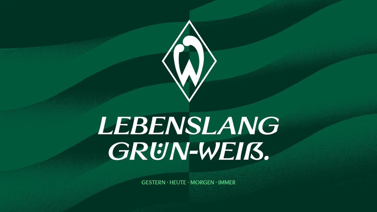
Bremen Reveals Modernized Design System for 26-27 and Beyond
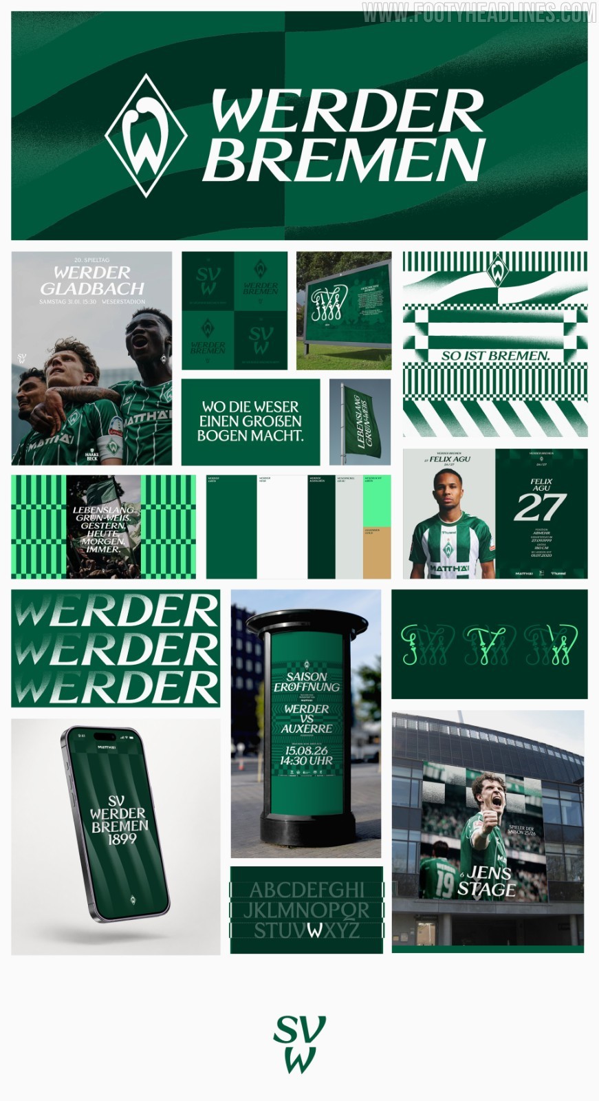
Developed in collaboration with Munich-based design agency Societas, the new identity introduces an exclusive custom serif typeface named Bruckmeyer Neue. The font pays tribute to Günther Bruckmeyer, the graphic artist who designed the first Werder "W" in 1924.
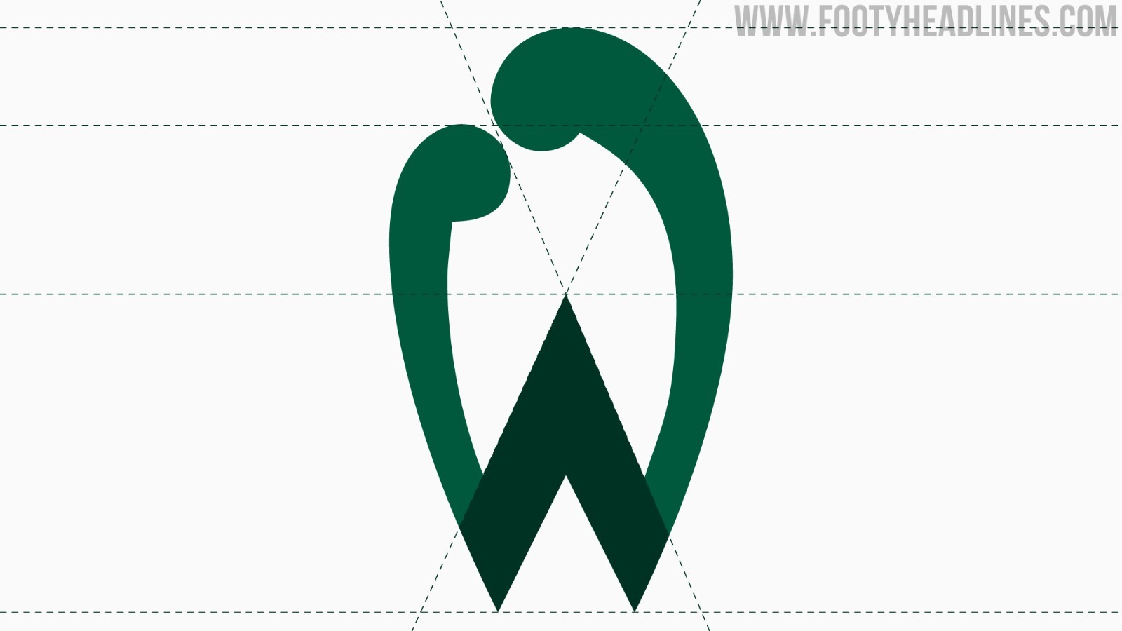
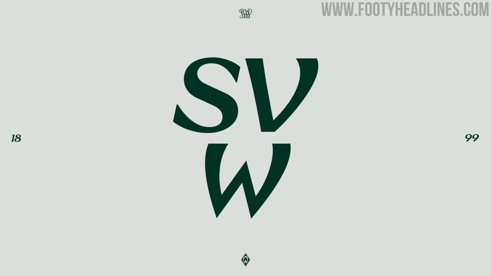
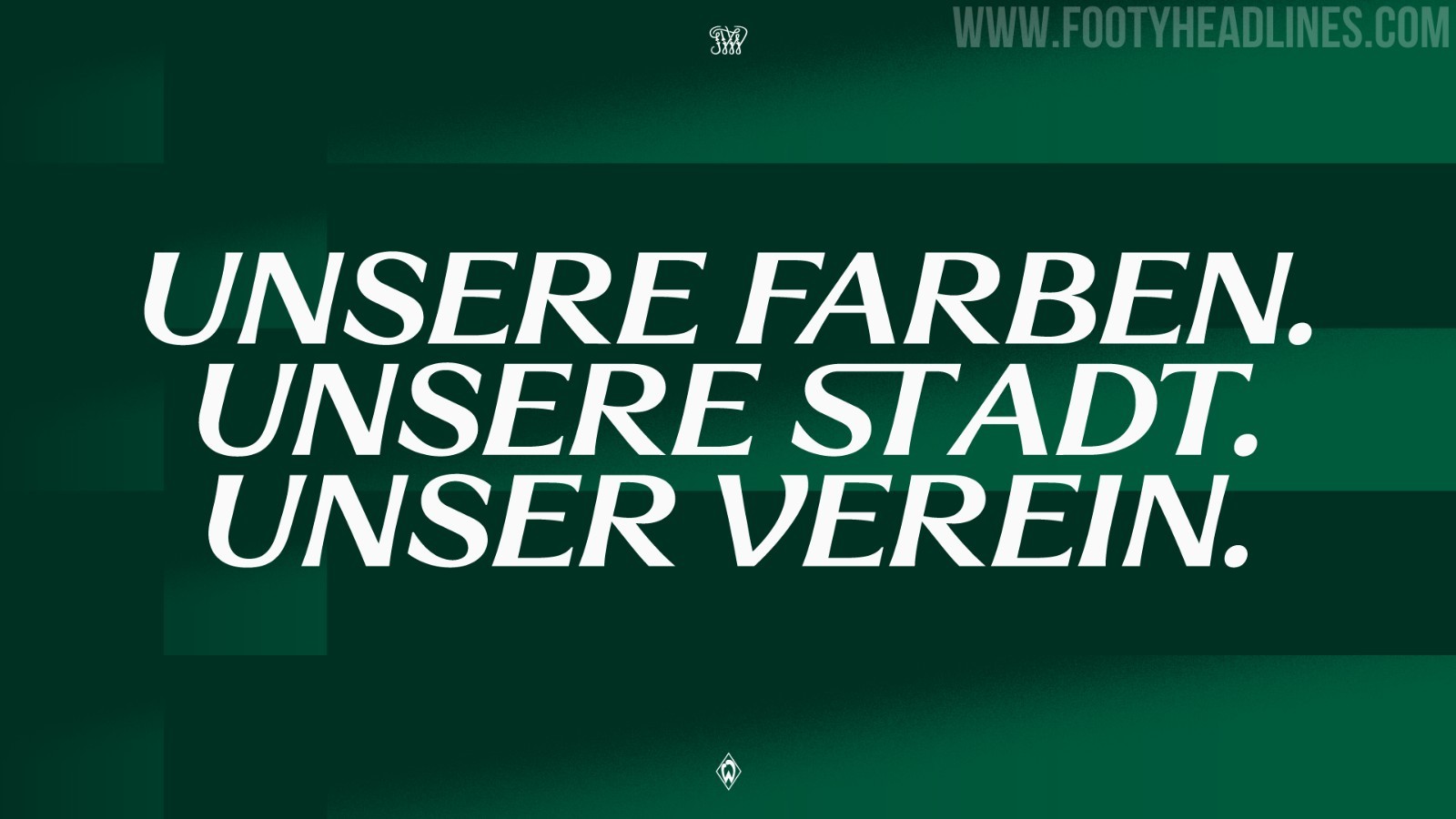
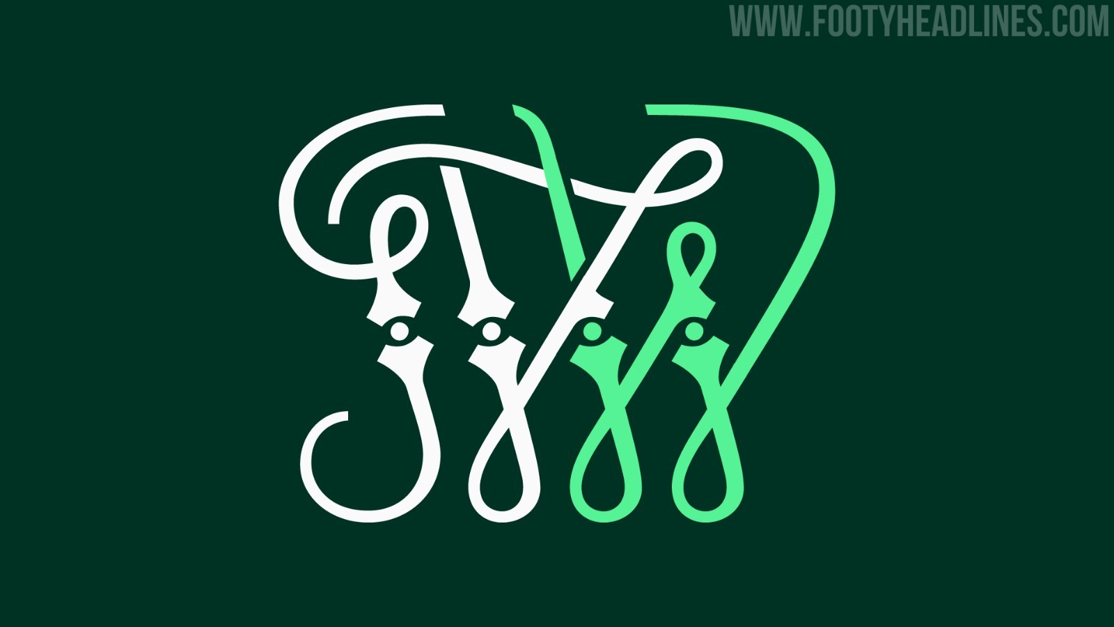
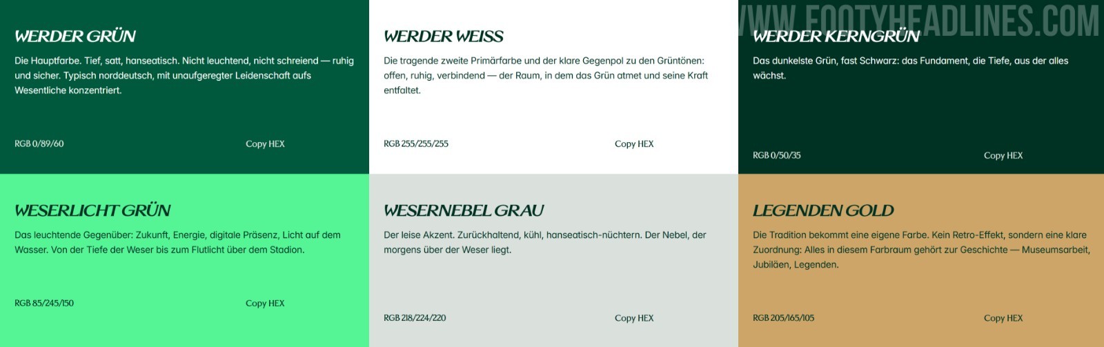
Complementing the new typography is an intensified, richer shade of "Werder Green" and a layout structure built directly around the geometric proportions of the classic diamond logo.
The updated visual framework will be introduced gradually across physical and digital platforms over the next two to three years.
You can check everything about the new Bremen visual identity on a dedicated page.