Our Top 10 Worst 2015-16 Kits
 Aug 23, 2015, by Chris
We rank the 10 worst football kits of the 2015-16 season. And while many football kits of the summer are beautiful, there are some kits we don't like at all.

Whether it's the wrong mixture of colors, a striking graphic-pattern on the front, or an oversized sponsor logo, there are many reasons for hideous soccer jerseys. Here are our ten worst kits you will see across Europe this season.
10 | New Balance Porto 15-16 Away Kit

Cacao brown. The New Balance Porto 2015-2016 Away Jersey is brown for the first time in the rich history of the club. New Balance combines the unusual color with bold blue sleeve cuffs and light brown horizontal stripes on the front. It just doesn't look good.
9 | Daen Guijuelo 15-16 Away Kit


Following the tradition of the beer, broccoli and tuxedo Football Kits of other Spanish regional teams, third division club CD Guijuelo released a bold 'Ham' Away Kit. Drawing inspiration from the Jamón de Guijuelo ham, the shirt and the shorts of the Guijuelo Kit boast an all-over ham print.
8 | Kelme Rayo 15-16 Third Kit

While Rayo's 2015-16 Away Rainbow Sash Kit made it in our Top 10 list this season, we include Rayo Vallecano's 15-16 Third Kit in our Top 10 of the worst kits. Released in support of those who fight against cancer, Kelme combines a light grey shirt with a pink Sash - the colors just don't work together.
7 | Kappa Wolfsburg 15-16 Away Kit

"That Wolfsburg Kit is horrid". When the German club entered pitch against Arsenal wearing the bold green, blue and white away kit, Arsenal fans put all blame on them. And while the official images released by the club are anything but bad, the on-pitch impression is definitely horrid. We can't wait to see Wolfsburg's Kit in the Champions League this season.

6 | Uhlsport Kaiserslautern 15-16 Third Kit

German 2. Bundesliga club Kaiserslautern revealed their 2015-16 Kits featuring a unique checker racing pattern. And while you may thing it has anything to do with the history of the club, it's just a random design to boost sales - but it didn't work at all as their fans urge for a new shirt supplier.
5 | Adidas Juventus 15-16 Away Kit

We would have loved the pink Juventus 2015-2016 Away Jersey. Inspired by the very-first kits of the club, the Juventus 2015-2016 Away Kit features the traditional color pale pink. The unity of the design is destroyed by the striking pink sleeve cuffs and the sponsor logo covering the white and pink horizontal band design.
4 | Ajax Amsterdam 15-16 Away Kit

The new Ajax Amsterdam 2015-2016 Away Jersey boasts the modern color Solar Green to stand out. Adidas combines the flashy main color with a black Ajax crest, white Three stripes and black-and-red on the bottom of the shirt. It didn't worked out well.
3 | Lotto Sturm Graz 15-16 Home Kit

The new Sturm Graz Kit breaks with the traditional black and white stripes design of the club. It boasts a water-inspired graphic print towards the bottom in white, which is used for various Lotto 2015-16 Shirts, so it's not even unique. Lotto combines the black and white shirt with flashy green sleeve cuffs. Could you imagine that Juventus would wear the new Sturm Graz Kits?
2 | Puma Düsseldorf 15-16 Third Kit

The new Puma Fortuna Düsseldorf 2015-2016 Third Kit has everything that makes a shirt bad. It uses the horrid color combination of dark green and pink, and features the infamous Puma 'turtle-pattern' in dark green. It's one of the worst kits this season.
1 | Errea Norwich City 15-16 Home Kit

It's not Errea's fault. While Errea designed a classic Norwich City 2015-2016 Home Kit, the large yellow block for the Aviva sponsor logo destroys the smart design. Norwich even released a horrid 15-16 Third Kit, designed "to be hated", but we think that Norwich City's 2015-2016 Home Kit should top our list.
You probably won't agree with each kit of our ranking. So let us know what's your least favorite kit of the 2015-16 season in the comments below.


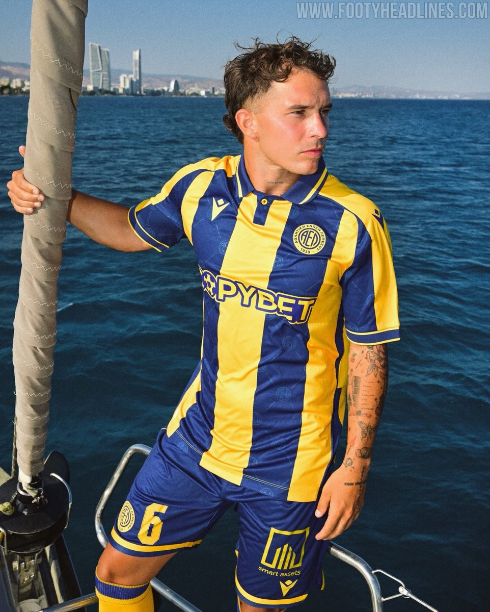
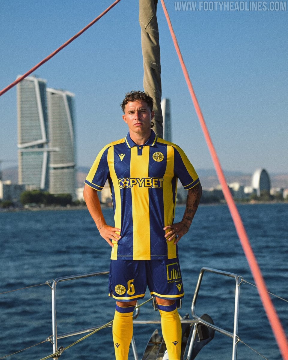
AEL Limassol 26-27 Home Kit Revealed
The new AEL Limassol 26-27 home kit has been revealed. Manufactured by Macron, the new AEL Limassol 26-27 home jersey introduces a stylish design for the Cypriot First Division club's upcoming campaign.

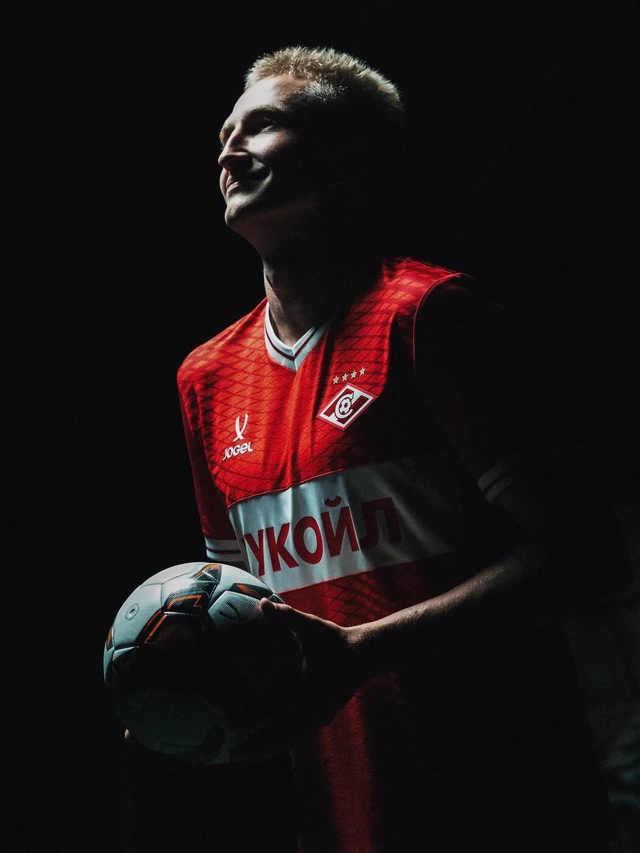
Spartak Moscow 26-27 Home & Away Kits Released
Russian club Spartak Moscow have officially released their new home and away kits for the 26-27 season. The new kits are made by Russian sportswear brand Jogel, which continues to supply kits for the team.
The launch of the Spartak Moscow 26-27 kits took place on the exact same day as the release of the new Zenit Saint Petersburg 26-27 kits. Both sets of jerseys were unveiled concurrently by Jogel in a coordinated drop for two of the most prominent clubs in the Russian Premier League.
The new Jogel Spartak Moscow 26-27 home and away shirts will be worn throughout the upcoming domestic campaign. The simultaneous release highlights the manufacturer's growing presence across Russian football.
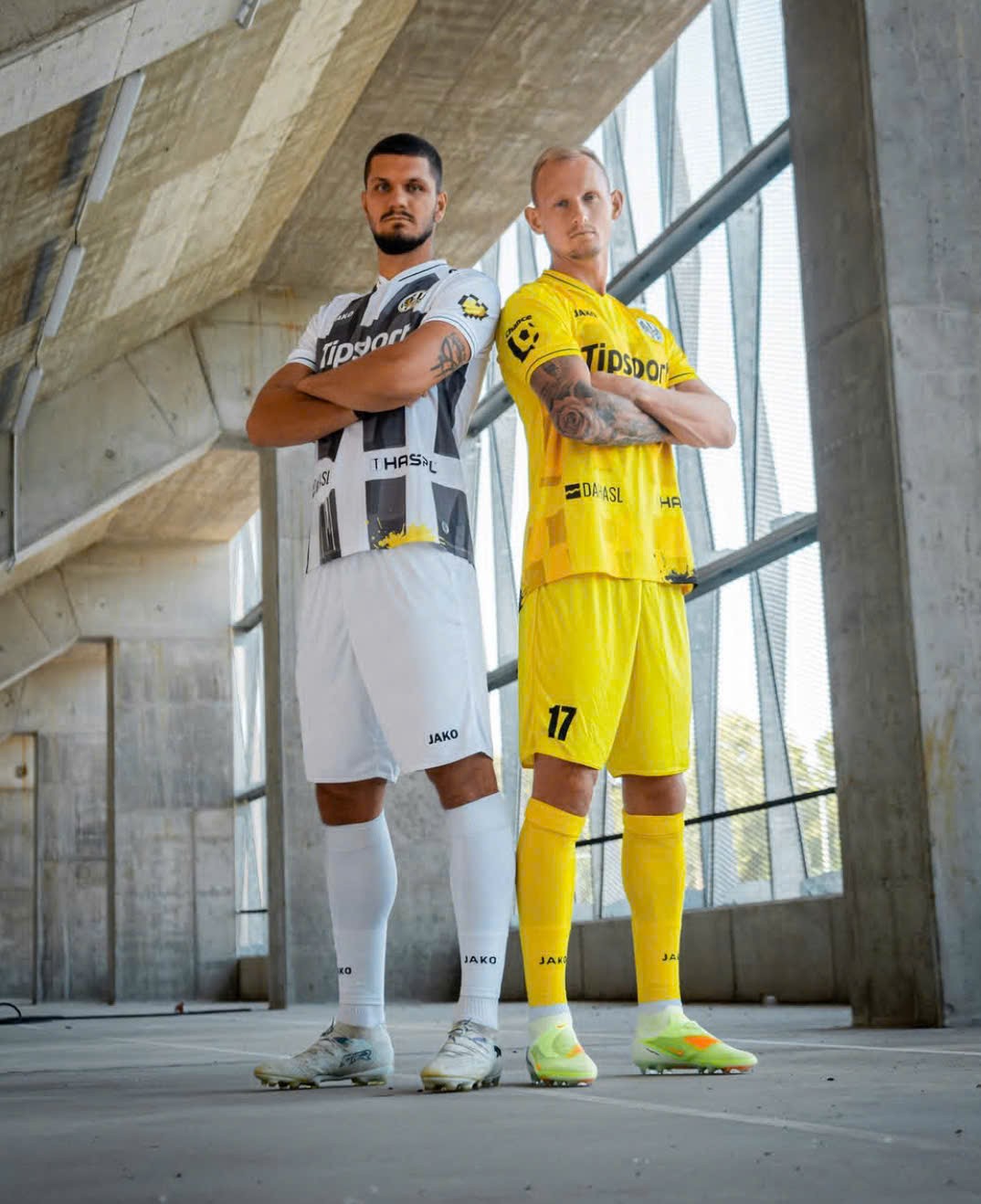
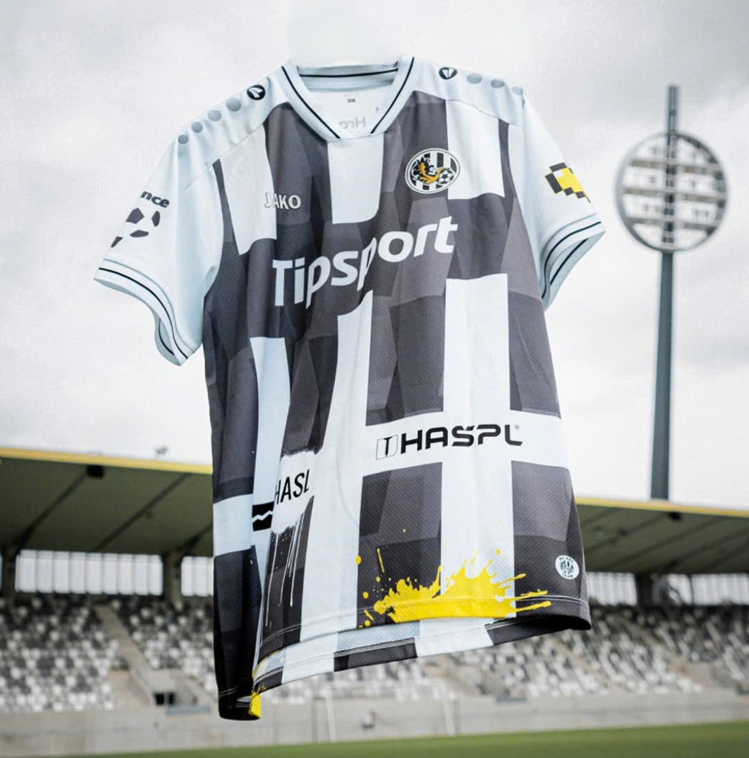
Hradec Králové 26-27 Home & Away Kit Released
Czech First League side Hradec Králové have unveiled their new home and away kit, made by Jako and to be worn in the upcoming 2026-27 season.
The two kits bring contrast approaches: The home kit is an interesting take on the traditional black and white stripes, with subtle abstract inside each stripe and a horizontal black band for sponsor placement. The away kit, on the other hand, is a simple yellow design with similar graphic and black accents.
What do you think of Hradec Králové 2026-27 home and away kits? Leave your thoughts in the comment below.
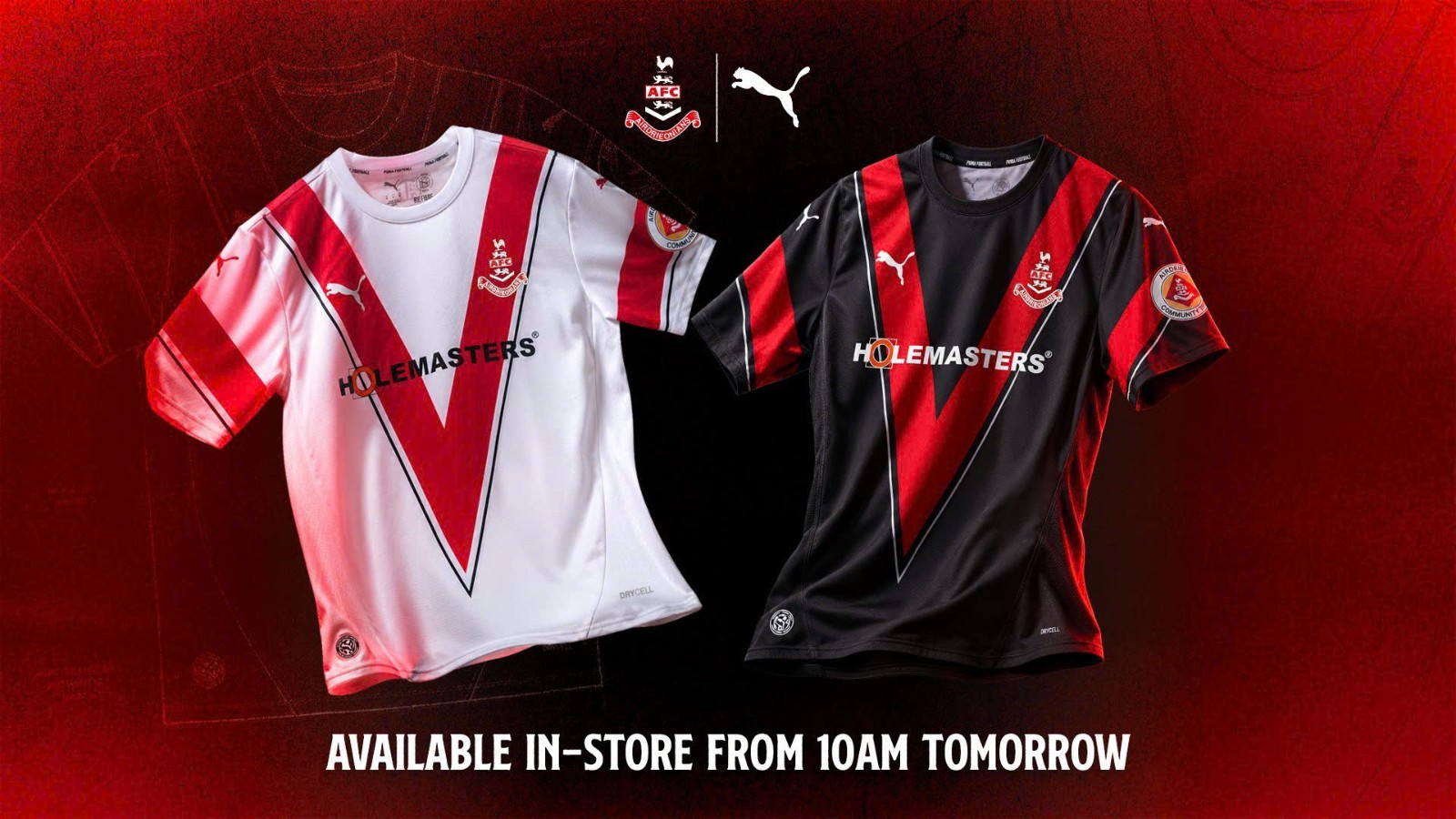
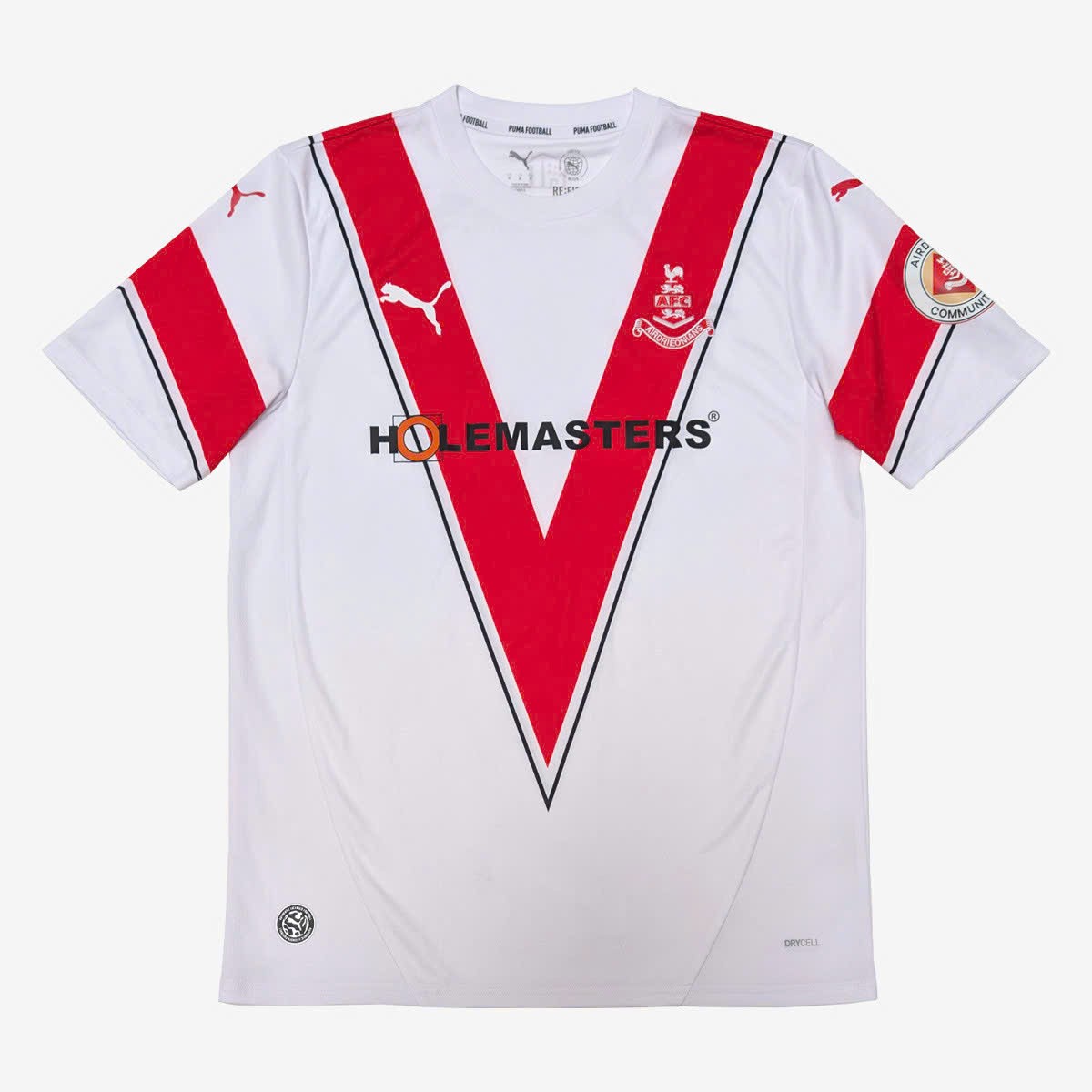
Airdrieonians FC 26-27 Home & Away Kit Released
Scottish League One side Airdrieonians FC have introduced their new looks for the upcoming 2026-27 season, made by Puma.
Both of the new designs share one identical idea: a huge red V-shaped band across the chest - which is also the club's signature graphic. Similar feature also appear on the sleeves, creating a matching full looks. While the home kit use traditional white base, the away kit is in all black.
What do you think about Airdrieonians FC 2026-27 home and away kits? Leave your thoughts in the comment below.

Aston Villa Announces Visit Rwanda as Front-of-Shirt Sponsor
Aston Villa have officially announced Visit Rwanda as the club's new Principal Partner, Official Tourism Partner, and Official Coffee Provider.
Starting from the 26-27 season, the Visit Rwanda logo will appear on the front of all men's, women's, and academy team shirts. The partnership expands the Rwanda Development Board's strategy of utilizing high-profile football sponsorships to promote global tourism.
Described as the most lucrative sponsorship deal in Aston Villa's history, reports indicate the agreement is worth up to £20 million per year including bonuses.
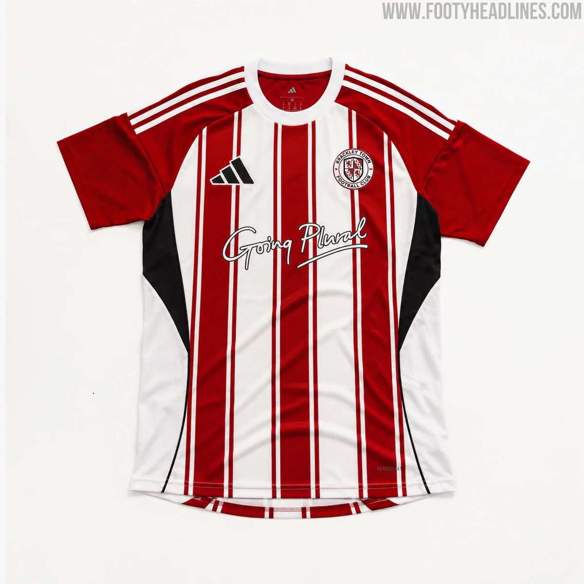
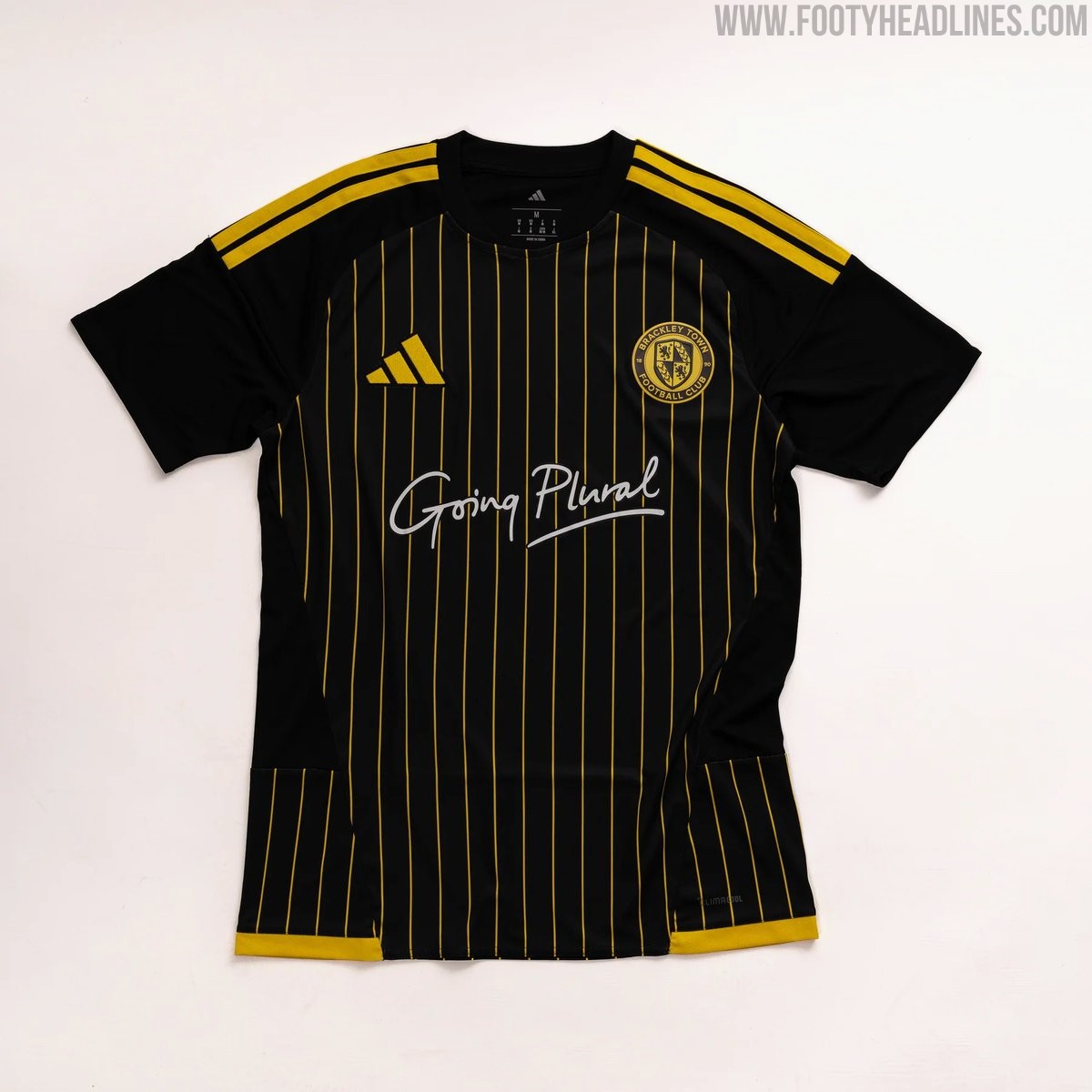
Brackley Town 26-27 Home & Away Kits Released
National League North side Brackley Town FC have officially launched their new Adidas home and away kits for the 26-27 season.
Produced in collaboration with Pro Direct Soccer, the Brackley Town 26-27 home shirt features the club's traditional red and white stripes. The Brackley Town 26-27 away shirt introduces a sleek look with a black base complemented by striking golden-yellow pinstripes.
Both the new home and away kits are available to purchase online, retailing at £50 for adult sizes and £45 for youth sizes.