New UEFA Champions League 2018-2021 Branding Revealed
 Jun 10, 2018, by Chris

UEFA this week revealed the new branding for the UEFA Champions League. The UEFA Champions League brand for the 2018/19 season has a vibrant new look, based on a concept called 'Highlighting moments that make the ultimate stage'.

UEFA revisits its competition brand identity every three years, in sync with the commercial cycle of broadcast and sponsorship rights. Compared with previous brand identity updates, the new design is a bigger change. While the 'starball' visual gains importance in the new identity, the distinct and successful 'ultimate stage' arena still features in the branding package. This provides an extended range of key visuals that can be used for communication purposes, both internally as well as by UEFA's partners.

New UEFA Champions League 2018-2021 Branding & Identity
The connected stars from the 'starball' in the UEFA Champions League logo are the centrepiece of this new brand identity. The concept captures the iconic moments of extraordinary feats of skill and ability that make UEFA Champions League matchnights so special.
The branding has been designed to be more flexible, while building on established elements such as the anthem, the stadium and the trophy. The blue colour palette deriving from UEFA Champions League matchnights has been enriched with new accent colours – magenta and cyan – to support the fresher look. The UEFA Champions League has expanded to become part of the global entertainment environment, rather than just solely being a sports event.


Guy-Laurent Epstein, marketing director, UEFA Events SA: "The UEFA Champions League is a globally recognised brand in football, sports and entertainment. This brand refresh maximises the opportunities to engage with fans and stakeholders across new technologies and platforms."


Mark Hyde, head of design, BT Sport: "Confident, contemporary and courageous. With refined elegance and a vibrant injection of colour, the UEFA Champions League brand upholds its position as possibly the most iconic of sporting identities."

The new identity offers a new, more flexible colour co-branding system to give commercial partners the opportunity to tailor the brand identity to their own needs.


Hans Erik Tuijt, global sponsorship director, Heineken: "The branding is fresh and appealing. It gives the competition a new, contemporary look while remaining premium."

The identity has been developed in collaboration with UEFA's marketing partner, TEAM Marketing AG, and the London-based creative agency DesignStudio.


What do you think of the updated UEFA Champions League branding? Let us know in the comments below.
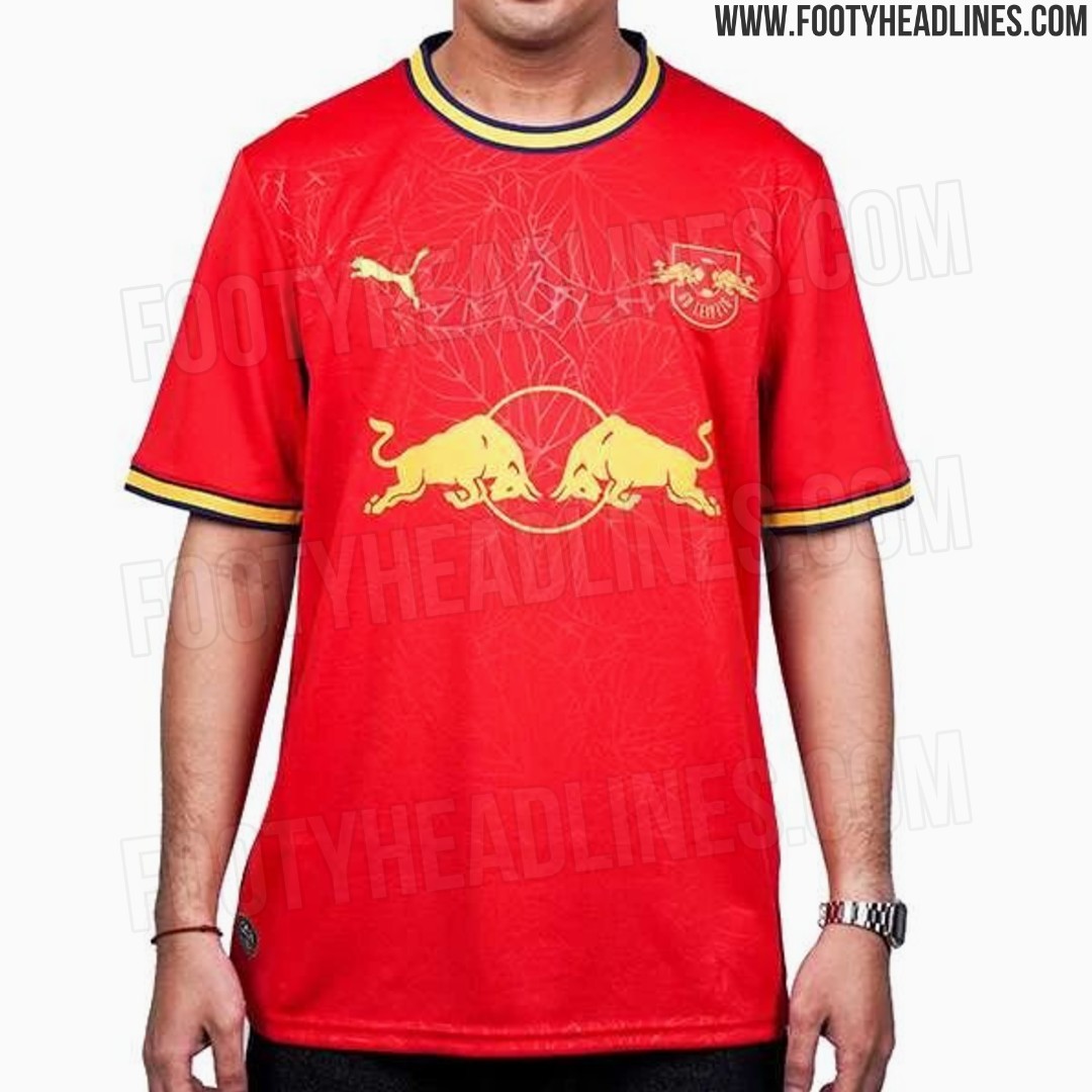
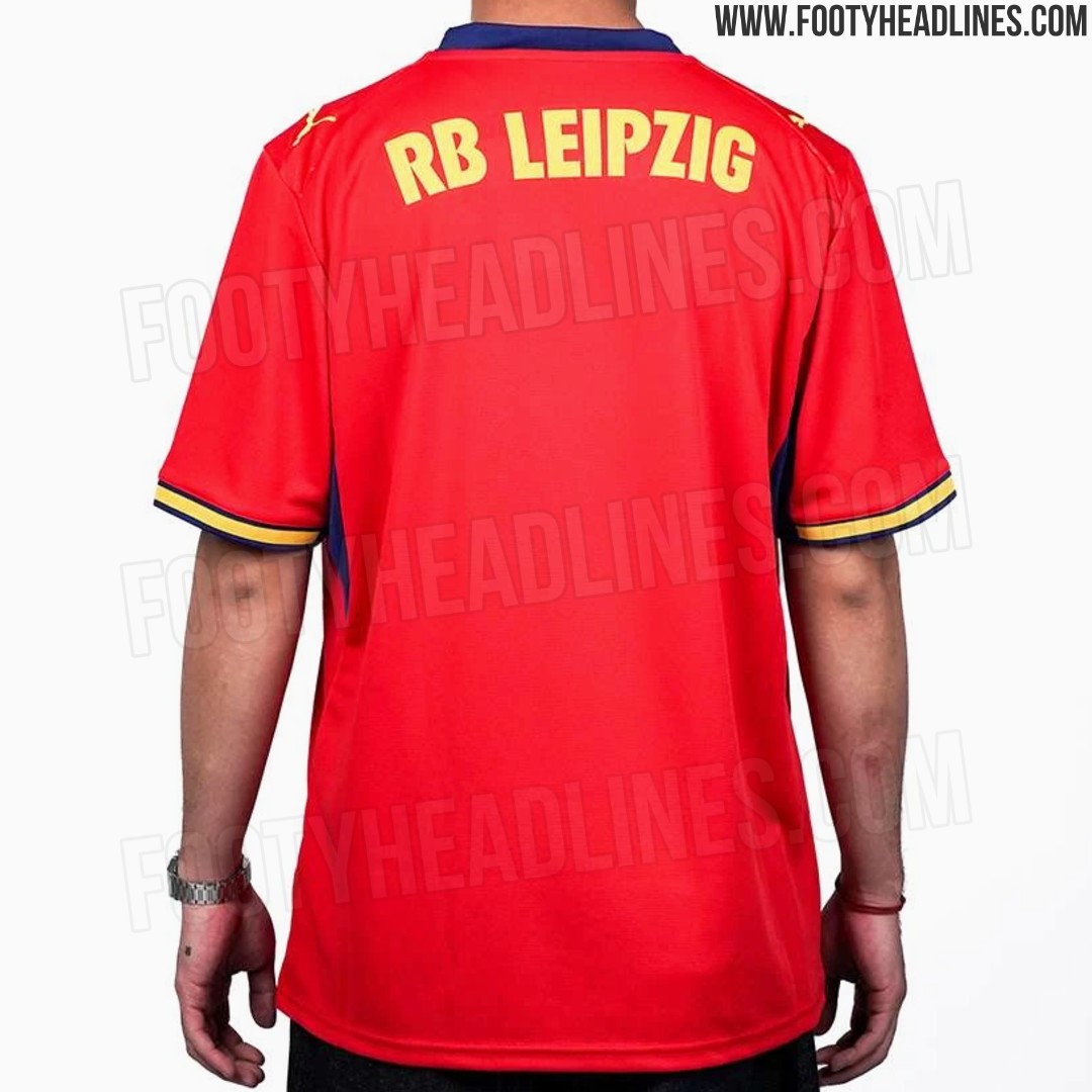
Leipzig 26-27 Away Kit Leaked - 5 New Images
The leaked RB Leipzig 2026–27 away kit features a bold red base with yellow logos and trim, plus a subtle tonal leaf-inspired graphic across the front that may reference the Leipzig Botanical Garden. The striking colorway gives the shirt a distinctive, high-energy look.


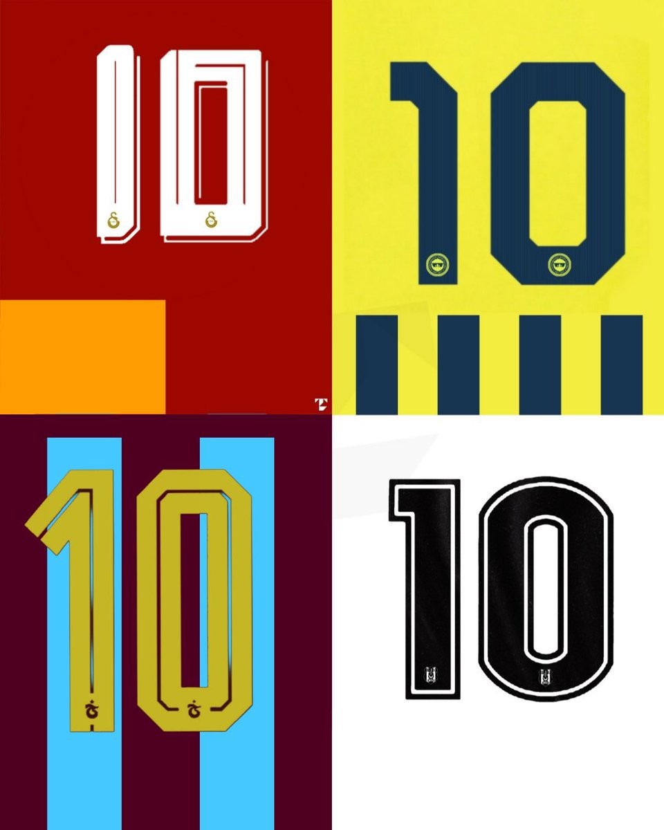
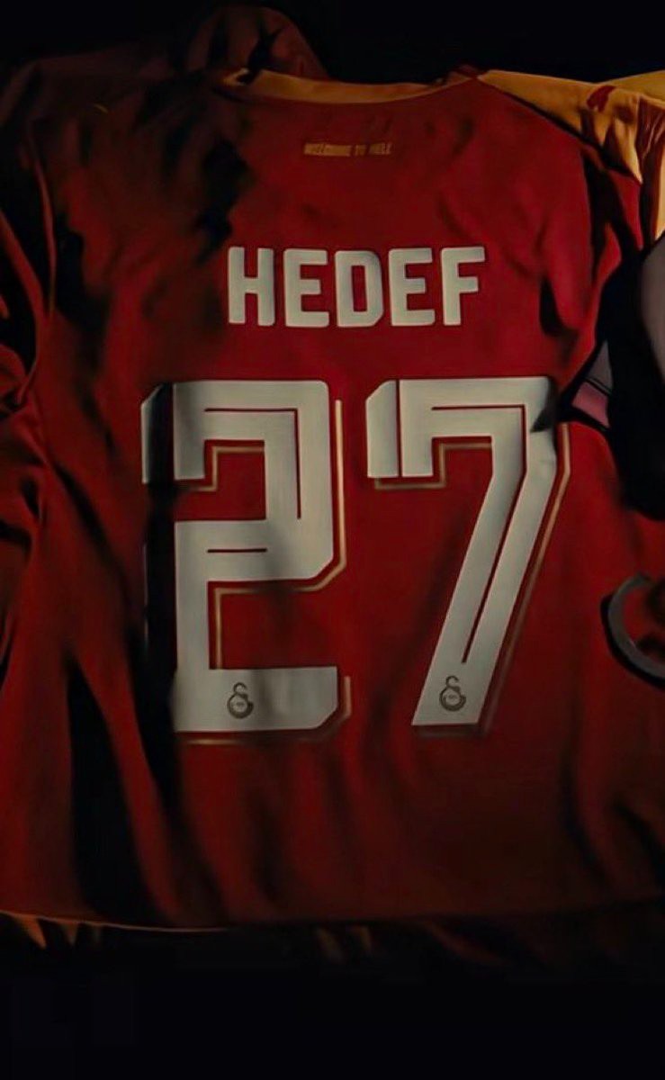
Turkish Süper Lig 2026-27 Big Four Kit Fonts Revealed
Following the Turkish Football Federation's decision to abolish the mandatory league-wide Arial font, Turkey's biggest clubs have unveiled their custom typography for the 2026-27 season. Football kits specialist @TheTLdesign has shared the new number fonts that will be adopted by Fenerbahçe, Galatasaray, Beşiktaş, and Trabzonspor, marking a definitive end to the unified font era and giving each club a distinct visual identity on the pitch.
The revealed designs showcase unique approaches for each of the four teams. Galatasaray introduces a modern, angular typeface that answers long-standing supporter requests for a bespoke look, while Fenerbahçe, Beşiktaş, and Trabzonspor have also opted for stylized numbers that align with their respective club branding. The move to individualized fonts allows the teams to fully customize the backs of their shirts for both domestic and European competitions.
This shift represents a significant aesthetic upgrade for the Süper Lig. Fans have widely praised the transition away from the generic numbers used in previous years, with many expressing a preference for these unique designs that better reflect the character of Turkey's top football institutions.
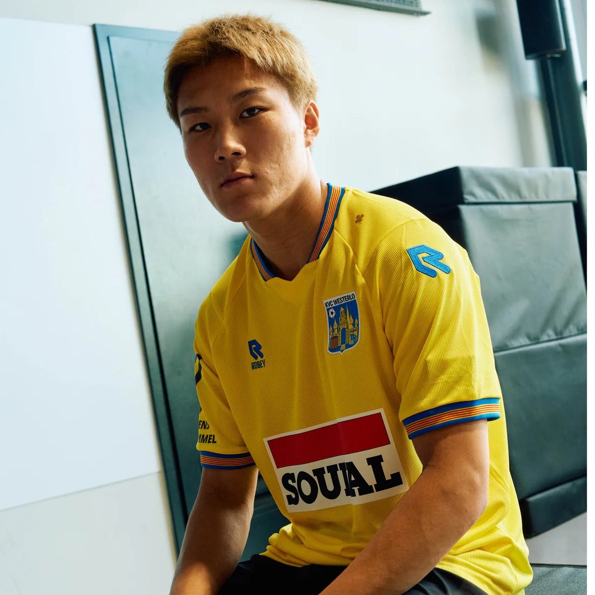
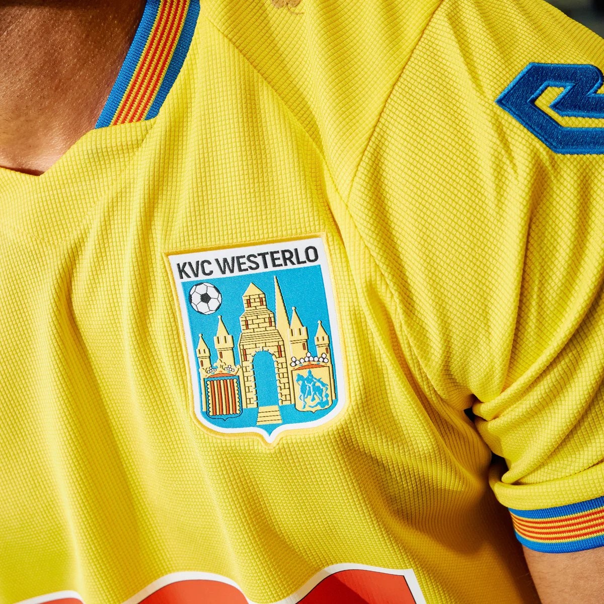
No More Nike: Robey KVC Westerlo 26-27 Home Kit Released
KVC Westerlo have officially unveiled the KVC Westerlo 2026-27 home kit. Made by Robey Sportswear, it is the club's first kit since the Dutch brand replaced Nike, ending the American brand's four-year spell as Westerlo's official kit supplier (2022-2026).
The home shirt stays true to Westerlo's traditional yellow and blue colors while celebrating the club's strong bond with its supporters. Unveiled under the slogan 'Designed for you. Worn by you. Because you are Westel' the custom-made design highlights the connection between the club and the Kempen region.
The KVC Westerlo 2026-27 home kit is now available through the club's official online store.
What do you think of the new KVC Westerlo 2026-27 home kit? Let us know your thoughts in the comments below.
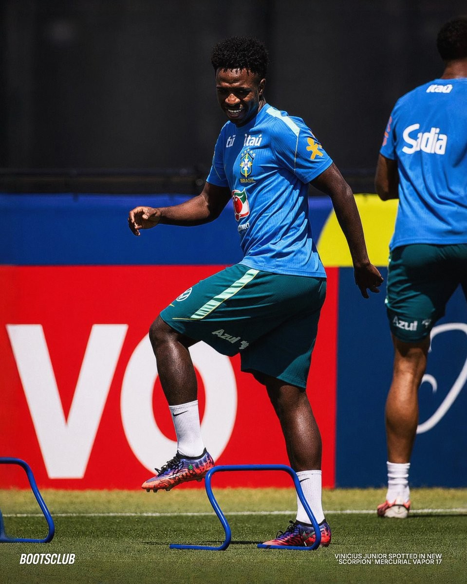
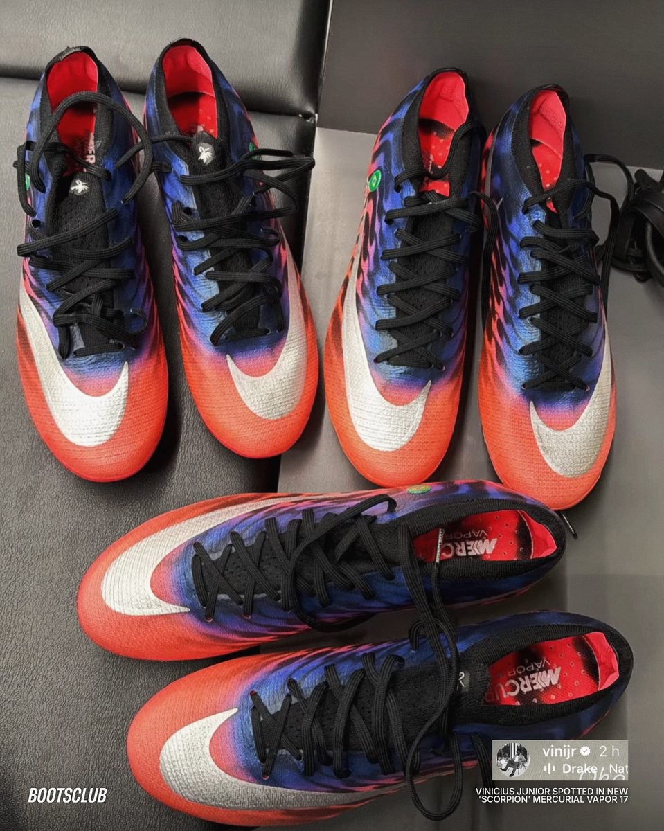
Vinicius Jr Joins Mbappé in Nike Mercurial 2026 Scorpion Boots
Following Kylian Mbappé's recent appearances in the new boots, Vinicius Junior has now also taken the Nike Mercurial Scorpion Pack to the pitch. While Mbappé opts for the Superfly 11 version, Vinicius Junior was spotted wearing the low-cut Vapor 17 model. These special edition boots are completely exclusive to the two superstars for the knockout stages of the 2026 World Cup. Big thanks to Bootsclub & @sdmlinks.
The design of the new Nike Mercurial Scorpion Pack is heavily inspired by Nike's iconic 2002 Scorpion campaign. The collection brings the classic aesthetic into the modern era, applying it to the latest generation of Nike's speed boots.
Fans looking to get their hands on the boots will not have to wait long. The Nike Mercurial Scorpion Pack, including both the Superfly 11 and Vapor 17 versions, is scheduled to drop on July 9, 2026.
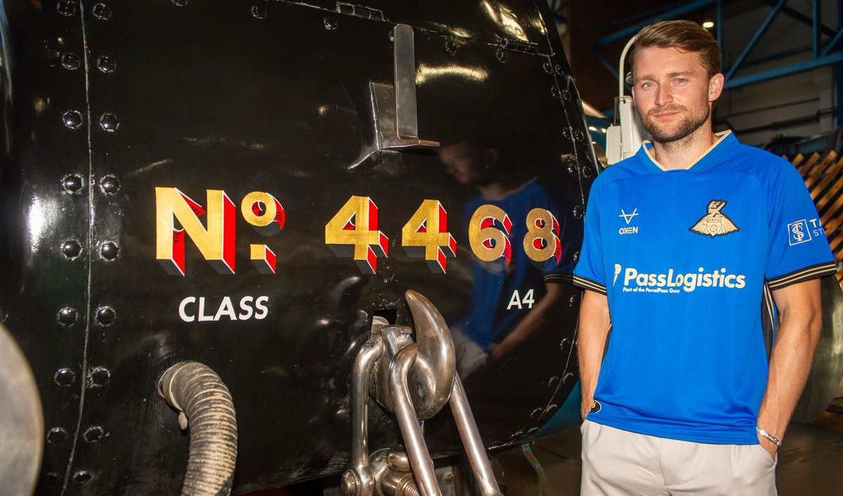
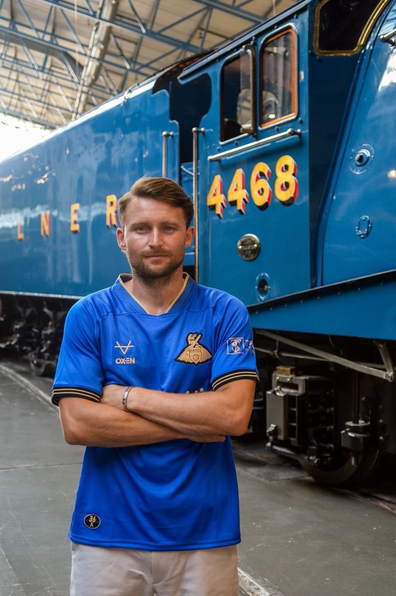
Doncaster Rovers 2026-27 Away Kits Released
Doncaster Rovers have officially revealed their new 2026-27 away kit for the 26-27 League One campaign. Made by local manufacturer Oxen, the new jerseys feature custom designs that pay tribute to the club's history and the city's engineering heritage.
The Doncaster Rovers 2026-27 away kit is heavily inspired by the iconic Mallard steam locomotive. The design draws its color palette directly from the historic train built in Doncaster, and features a bespoke train ticket swing tag as a special nod to the theme.

