Inspired by Premier League? AFF Suzuki Cup 2018 Logo Revealed
 Nov 12, 2018, by Chris

The 2018 AFF Suzuki Cup, the football championship of nations affiliated to the ASEAN (Association of South East Asian Nations) Football Federation (AFF), started last week. we take a look at the logo of the tournament.

The AFF Suzuki Cup 2018 logo was revealed on May 2, 2018, during the official draw of the AFF Suzuki Cup 2018.
AFF Suzuki Cup 2018 Logo
This is the AFF Suzuki Cup 2018 logo.
Completely different to the logo of the 2016 AFF Suzuki Cup, the 2018 AFF Suzuki Cup logo features a vibrant look that merges three elements - A goal frame, fans with raised hands and a (beating) heart.

A goal frame:

Fans with raised hands:

A (beating) heart:

All in all, with the elements combined, they are joined to form a sort of tapestry that represents pride, loyalty, football, rivalry and passion.

Four colour schemes were developed for the logo: magenta (depicting passion and energy), cyan (represents a fresh beginning), green (the vibrancy of a football pitch) as well as blue (topography of the region).
The new AFF Suzuki Cup branding was developed by sports and entertainment agency Lagardère Sports.

“Lagardère Sports were thrilled to be entrusted with the mandate to reinvent the AFF Suzuki Cup’s brand while honouring its legacy and preeminent status as the crown jewel of ASEAN football,” said Tom Smith, President, Football – Asia at Lagardère Sports. “As we enter a new era where premium content and fan-focused strategies are the keys to winning the hearts of fans, it was necessary to deploy new tournament visuals that resonate with supporters and reflect the true worth of ASEAN’s football championship. Along with a new tournament format, we will also be implementing a digital-first content strategy that will enable the AFF Suzuki Cup to engage deeper with the legion of football fans worldwide.”
Do you like the AFF Suzuki Cup 2018 logo? Comment below.
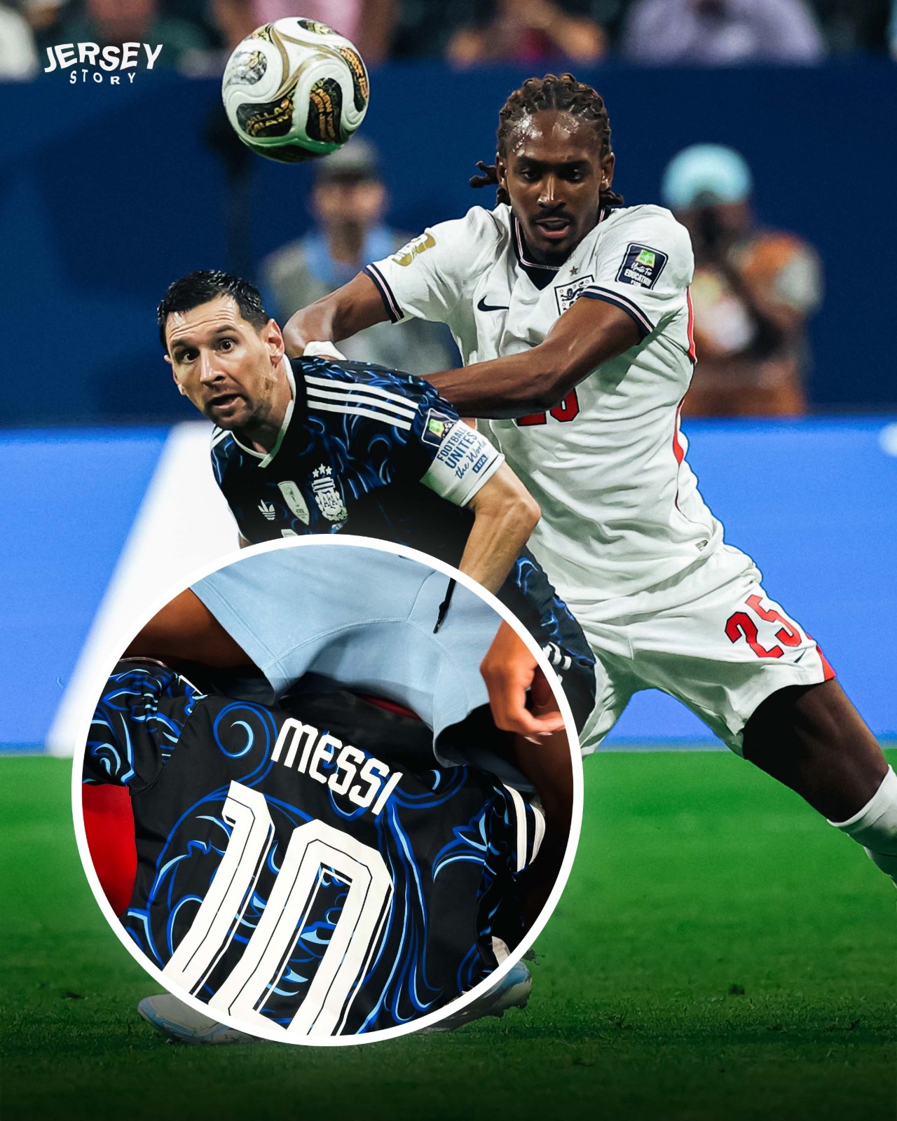
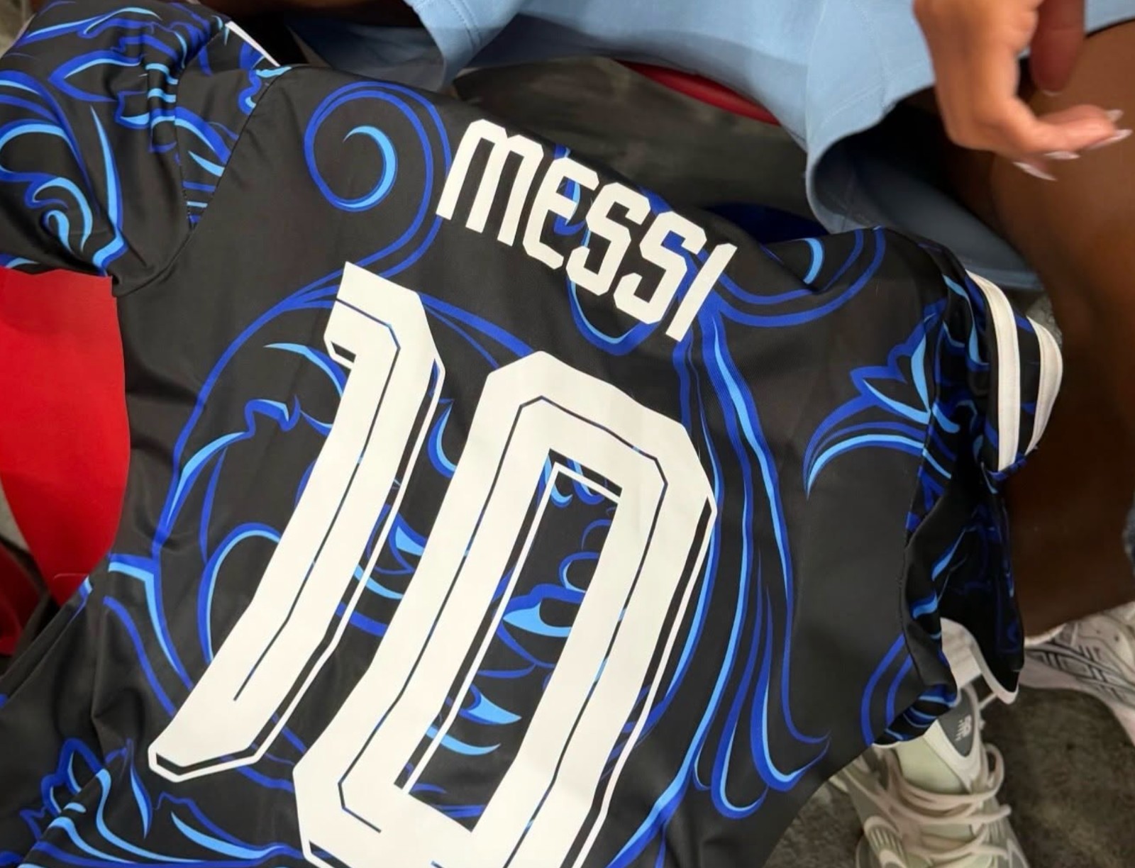
Djed Spence Receives Shirt From Lionel Messi
Bri Spence, sister of Djed Spence, has shared a photo of her brother receiving a special gift from Lionel Messi after the 2026 World Cup Semi-Final - an Argentina away shirt.
However, our Vietnamese partner @jerseystory_vn spotted that this was not a match-worn jersey, but actually a replica shirt instead.
It is highly likely that Messi and his staff prepared a batch of replica shirts specifically to give away as gifts to opponents and fans after each match.
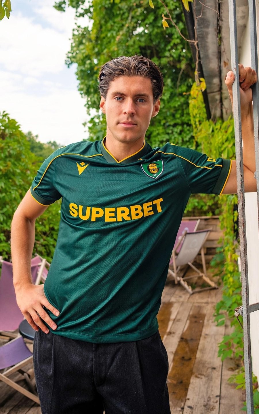
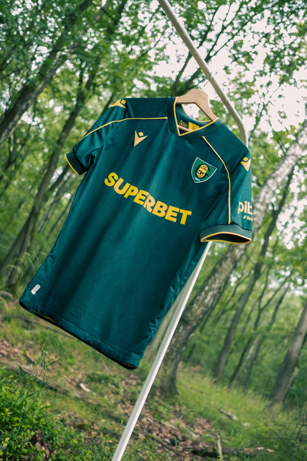
GKS Katowice 26-27 Away Kit Released
Polish Ekstraklasa club GKS Katowice have officially unveiled the 2026-27 away kit. Made by Macron, the new shirt draws inspiration from both the club's identity and the natural surroundings of the new Arena Katowice.
The Macron GKS Katowice 2026-27 away shirt features a dark green base complemented by yellow trim on the collar, sleeve cuffs and piping across the shoulders. Subtle tonal graphic detailing is woven into the fabric, while the bold yellow sponsor logo and Macron branding create a sharp contrast. The green colourway also references the Załęski Forest, located next to Arena Katowice, symbolizing the connection between the club's new home and its surrounding parklands.
What do you think of the new GKS Katowice 2026-27 away kit? Let us know your thoughts in the comments below.
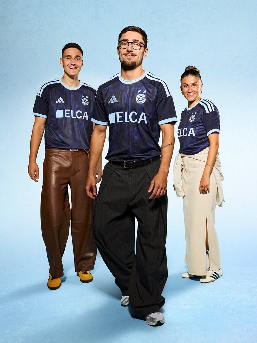
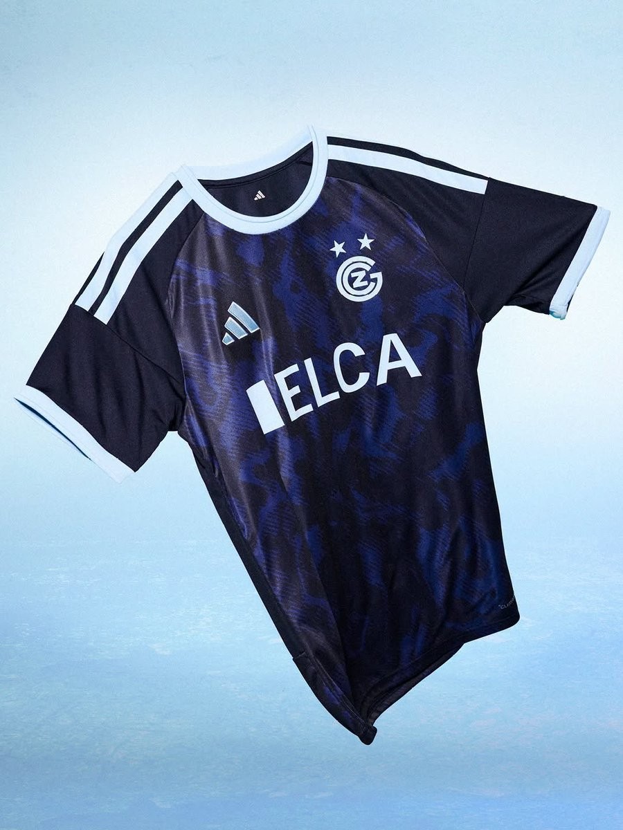
No More Capelli: Adidas Grasshopper Zürich 26-27 Away Kit Released
The new Grasshopper Club Zürich 2026-27 away kit has been released. Made by Adidas, it marks the beginning of the brand's partnership with the Swiss club, replacing Capelli Sport after two seasons.
The Adidas Grasshopper Club Zürich 2026-27 away shirt features a dark navy base with an abstract tonal graphic across the front. White Three Stripes on the shoulders, a white crew neck and matching sleeve cuffs provide a clean contrast, completing the first Adidas away kit for Grasshopper Club Zürich's new era.
What do you think of the new Grasshopper Club Zürich 2026-27 away kit? Let us know your thoughts in the comments below.

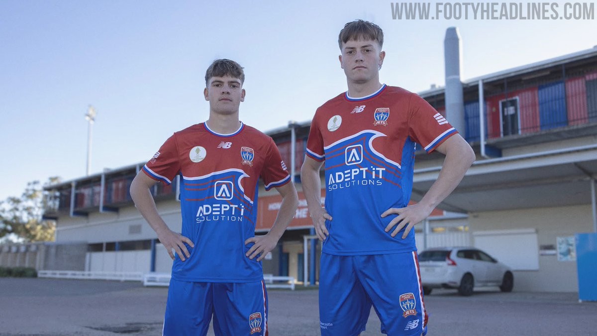
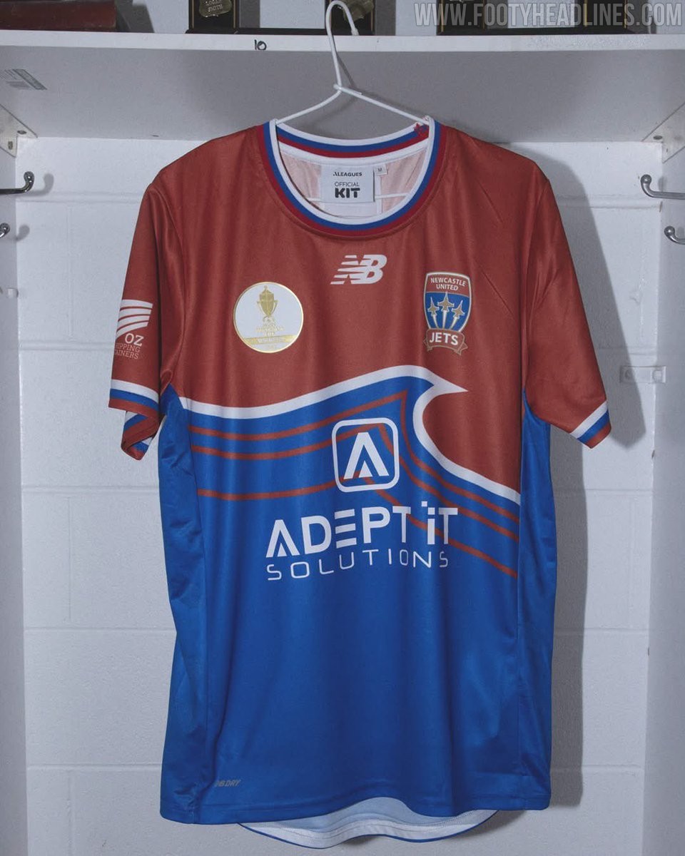
New Balance Newcastle Jets 2026 Australia Cup Kits Released
The new Newcastle Jets 2026 Australia Cup home and away kits have been officially released. Made by New Balance and introduced as a limited release for the club's cup defense, the new Newcastle Jets 2026 Australia Cup shirts feature striking bespoke designs.