Redesigned AC Milan 2019-20 Logo Concept
Today, we are able to present you with an overhauled version of Milan's renowned crest, which was created by @Palmroos10.
Overhauled AC Milan 19-20 Logo
This image shows PMsport's revamped AC Milan 2019-2020 crest.
In comparison to today's AC Milan logo, PMsport's redesigned AC Milan logo features several gold applications such as a golden border around the shield-like design, whereas the color is also incorporated as means of a slimmer outer curve for the club's colors and the flag of Milan.
Current AC Milan logo, used since 1998
Otherwise, the redesigned AC Milan logo features a wider red outer line as well as generally smaller shape, which potentially fits better to the 'ACM' and '1899' writings.
How do you feel about PMsport's overhauled AC Milan 2019-20 logo? Let us know your thoughts in the comments down below.

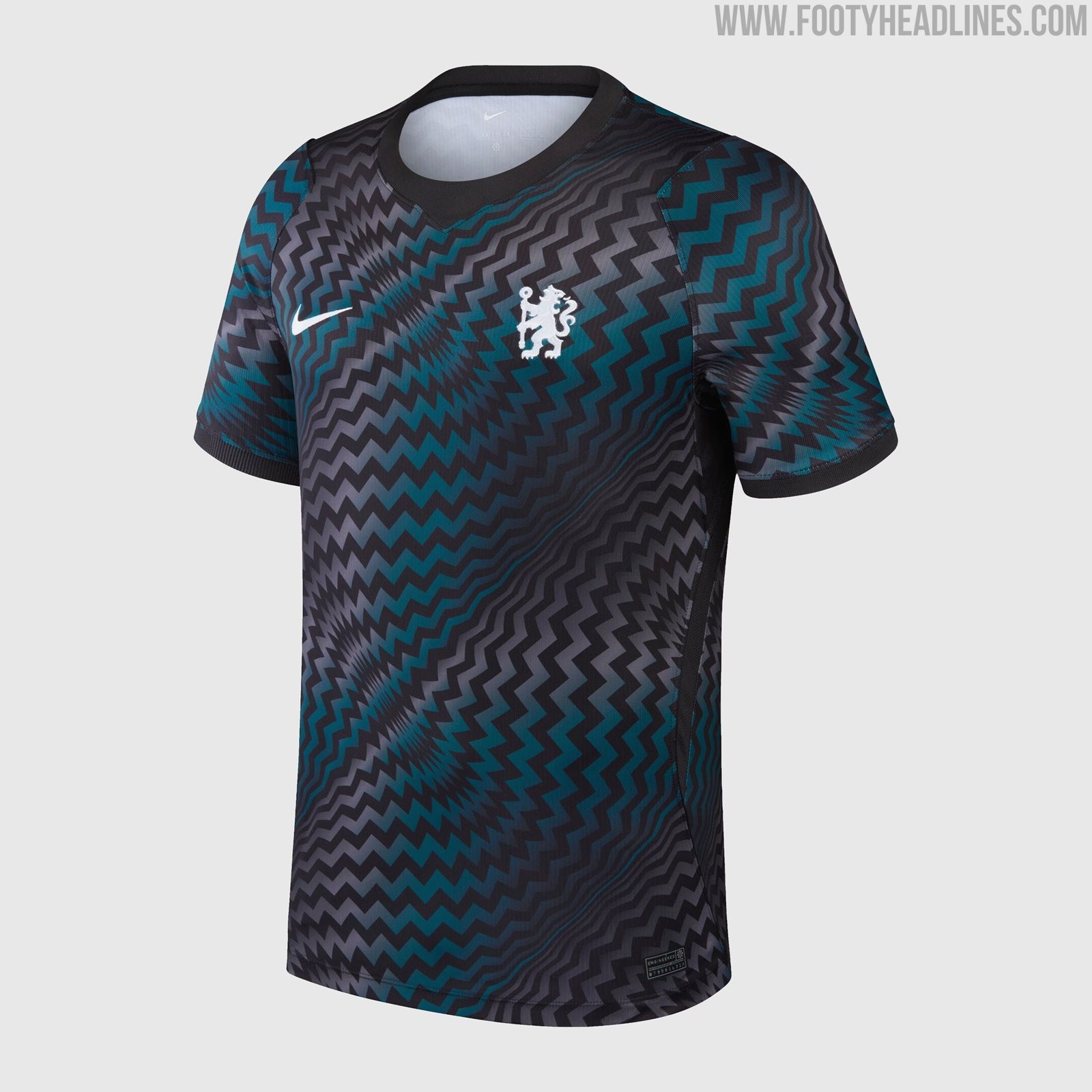
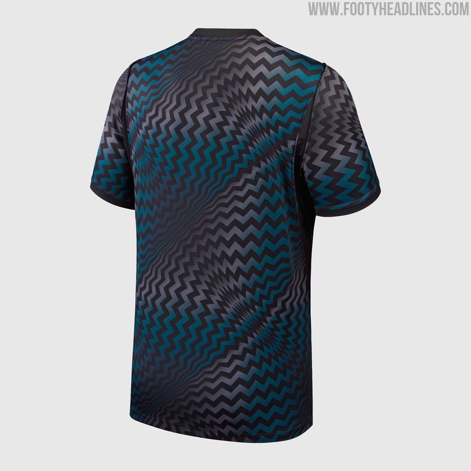
Chelsea 26-27 Goalkeeper Kit Released
Chelsea have released their new goalkeeper kit for the 2026-27 season. The design uses Nike's streamlined global template rather than a custom club-specific look. This follows the same approach seen with other Nike club teams goalkeeper kits this season.


Canada National Team Debuts Drake Nocta Tracksuit
Canada's men's national team has debuted their tracksuit from the Drake NOCTA x Nike collaboration. The apparel forms part of a special lifestyle collection for the 2026 FIFA World Cup, which includes jerseys, hoodies, track jackets and a Cryoshot sneaker for seven Nike national teams, with the full range set for release on 11 June.
https://www.footyheadlines.com/2026/04/leaked-nike-to-launch-crazy-7-brand.html
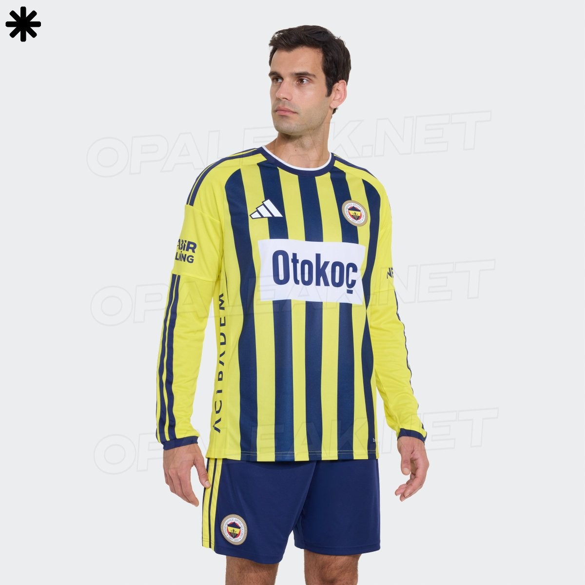
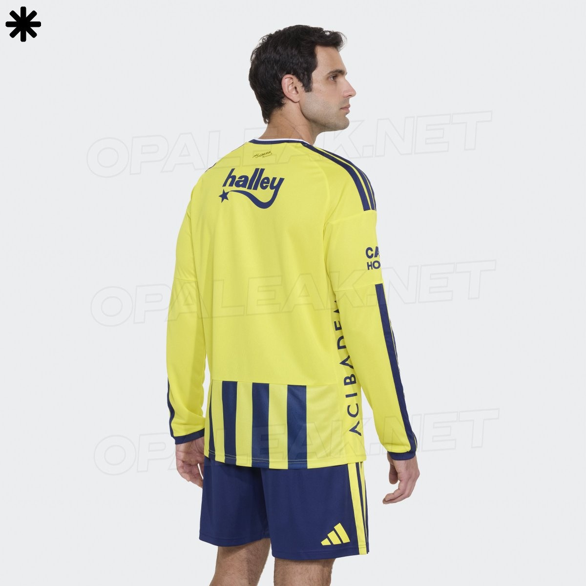
Fenerbahçe 26-27 Home Kit Long Sleeve Version Leaked
Account Opaleak has shared photos of the long sleeve version of Fenerbahçe's new 2026-27 home kit. The Adidas jersey features the club's traditional yellow and navy blue vertical stripes along with a retro-style white sponsor patch as part of the 120th anniversary designs.
It is set to release tomorrow, June 3.

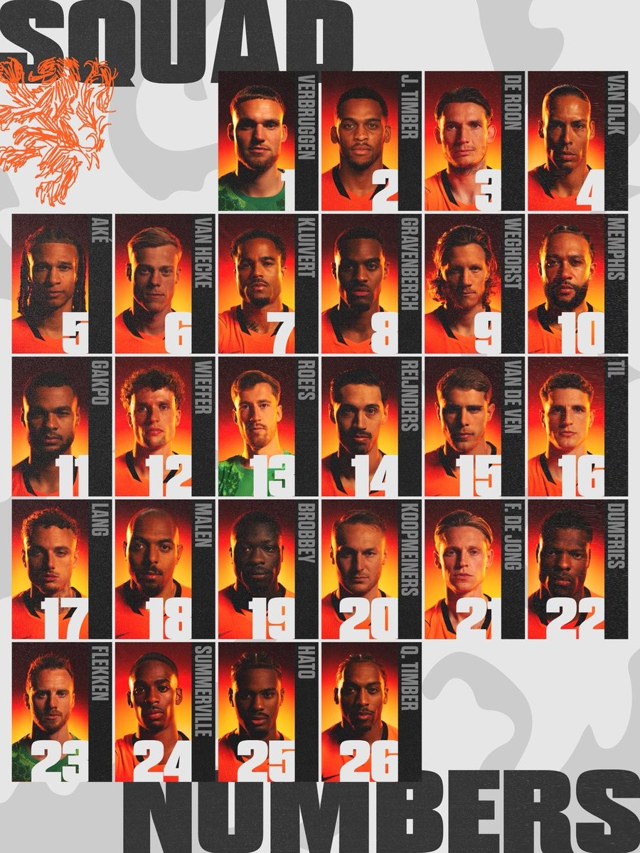
Netherlands 2026 World Cup Squad & Numbers Revealed
The Netherlands have named their 26-player squad for the 2026 FIFA World Cup.
1: Bart Verbruggen
2: Jurriën Timber
3: Marten de Roon
4: Virgil van Dijk
5: Nathan Aké
6: Denzel Dumfries
7: Jorrel Hato
8: Micky van de Ven
9: Jan Paul van Hecke
10: Frenkie de Jong
11: Ryan Gravenberch
12: Teun Koopmeiners
13: Robin Roefs
14: Tijjani Reijnders
15: Guus Til
16: Quinten Timber
17: Mats Wieffer
18: Cody Gakpo
19: Memphis Depay
20: Donyell Malen
21: Brian Brobbey
22: Wout Weghorst
23: Mark Flekken
24: Justin Kluivert
25: Noa Lang
26: Crysencio Summerville

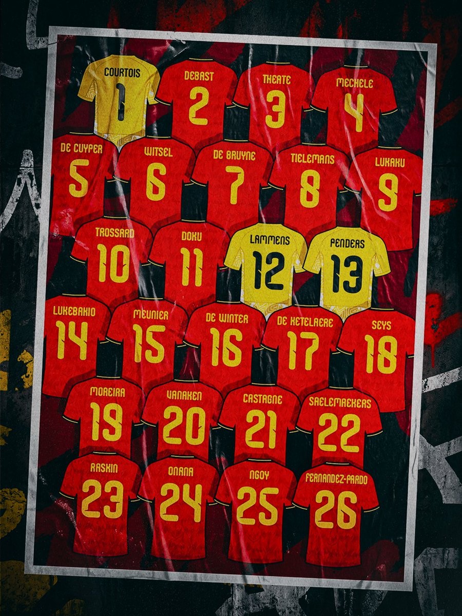
Belgium 2026 World Cup Squad Numbers Released
The Belgian Red Devils have officially announced their squad numbers for the 2026 FIFA World Cup. Kevin De Bruyne will wear the number 7 shirt, Leandro Trossard takes the number 10, Romelu Lukaku retains the 9, and Jeremy Doku is assigned the 11. Thibaut Courtois keeps the number 1 as the starting goalkeeper, with Senne Lammens on 12 and Mike Penders on 13.
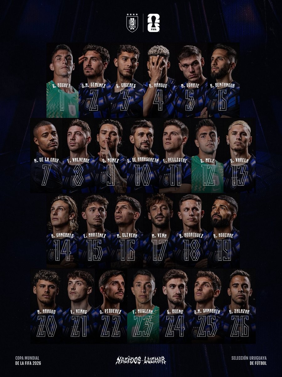
Uruguay 2026 World Cup Squad Numbers Released
Uruguay have confirmed the jersey numbers for their players ahead of the 2026 FIFA World Cup.
The announcement follows the release of the final 26-man squad by coach Marcelo Bielsa on May 31. The roster includes a record seven players from Brazilian clubs, such as Giorgian de Arrascaeta of Flamengo, Federico Valverde, and others, highlighting the close ties between Uruguayan talent and the Brazilian league.

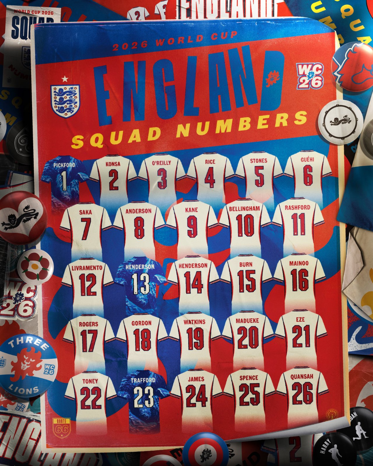
England Release Squad Numbers for 2026 World Cup
England have released their squad numbers for the 2026 World Cup.
1: Jordan Pickford
2: Ezri Konsa
3: Nico O'Reilly
4: Declan Rice
5: John Stones
6: Marc Guehi
7: Bukayo Saka
8: Elliot Anderson
9: Harry Kane
10: Jude Bellingham
11: Marcus Rashford
12: Tino Livramento
13: Dean Henderson
14: Jordan Henderson
15: Dan Burn
16: Kobbie Mainoo
17: Morgan Rogers
18: Anthony Gordon
19: Ollie Watkins
20: Noni Madueke
21: Eberechi Eze
22: Ivan Toney
23: James Trafford
24: Reece James
25: Djed Spence
26: Jarell Quansah

