Is Real Madrid's 19-20 Home Kit Font Bad?

Some days ago, Real Madrid presented its new 2019-20 kit and typeface. The new Adidas Real Madrid 2019-20 home kit was well received by fans, but the typeface was not very popular amongst our followers. Now sport fonts experts sportsfonts.com argued why the new Real Madrid 19-20 font for the home kit is bad.


Real Madrid 2019-20 Home Jersey Font
According to sportsfonts.com, there are several bad things about the typeface - it would not really suit a football (soccer) club as it would be a US sport style, it would be not elegant ans classy enough for 'Los Galacticos' and also not unique in the world of football. Other problems, according to sportsfonts.com, are wrong proportions of several letters and numbers.
The author of sportsfonts.com, German font engineer Christoph Koeberlin, also suggested a fixed version of the Adidas Real Madrid 19-20 kit typeface.

The Real Madrid 2019-2020 font will be used for all of the club's 2019-20 jerseys, just in different colors. In La Liga, Real Madrid will use a streamlined font, just as all other 19 teams.
Do you agree with the criticism? What do you think of the new Real Madrid 2019-2020 typeface? Share your thoughts in the comments below.
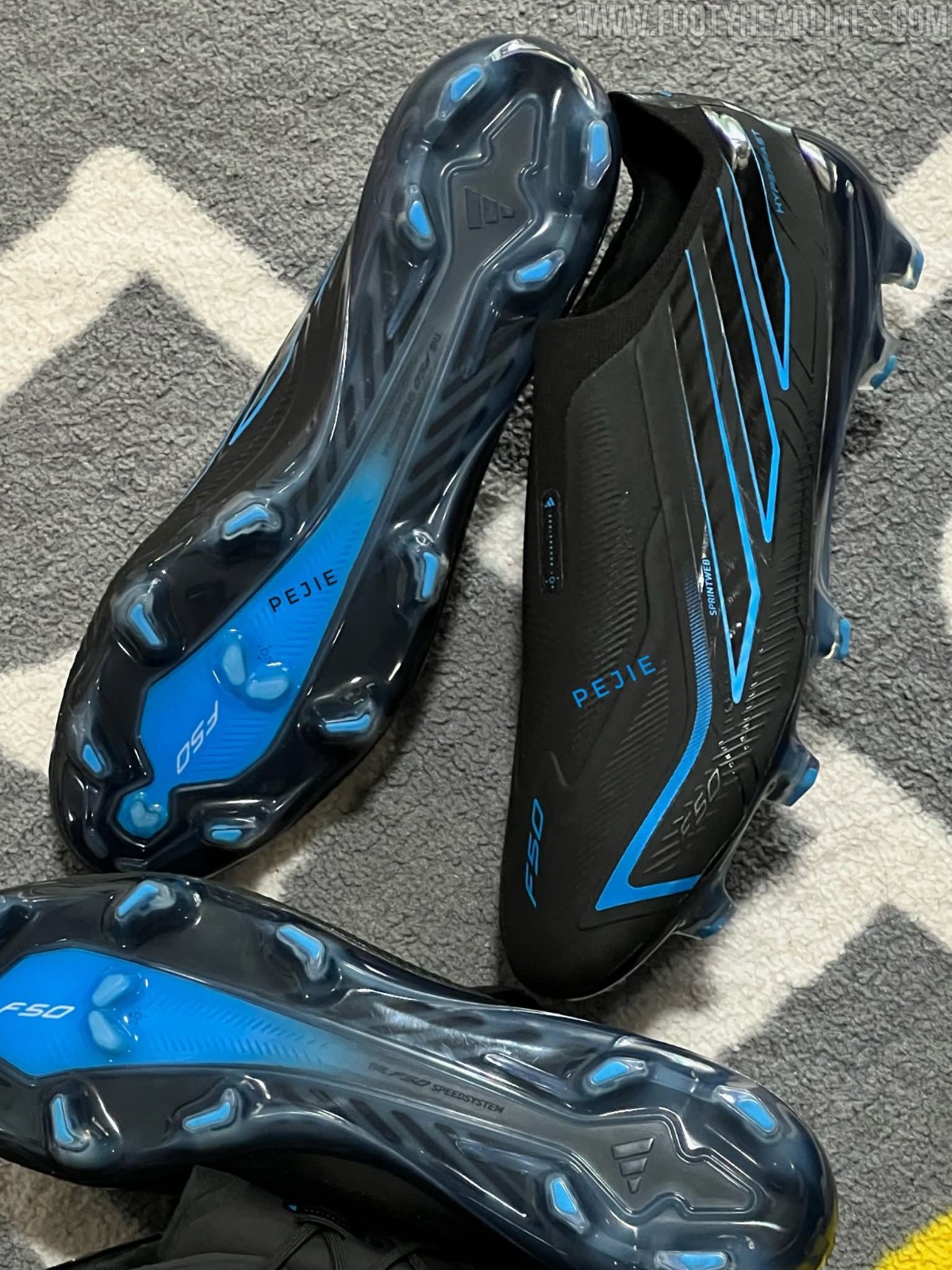
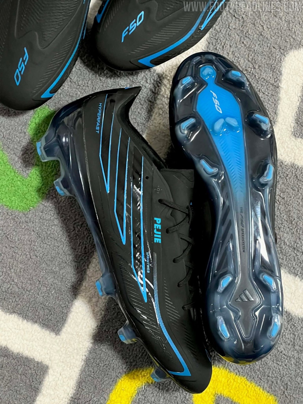
First Real Images: Adidas F50 Hyperfast 26-27 Black Pack Boots Leaked
The first real-life images of the upcoming Adidas F50 Hyperfast Elite boots in a stealthy black colorway have surfaced online, courtesy of Pejie.
Set to be part of a black pack for the 2026-27 season, the boots feature a predominantly black upper highlighted by striking light blue accents across the branding and soleplate.
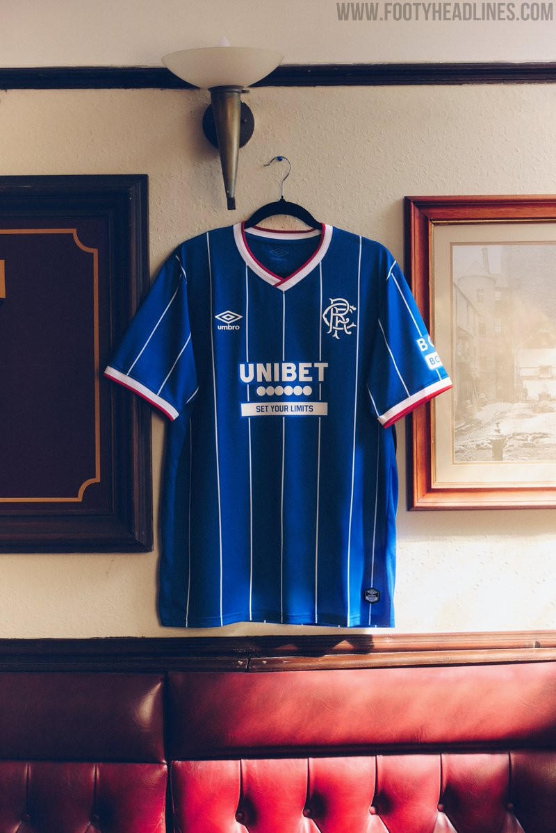
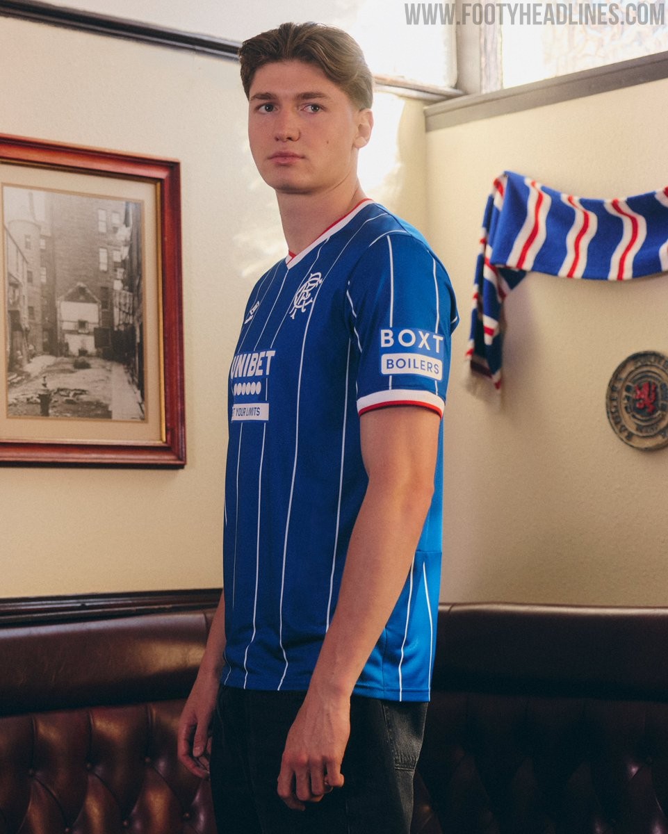
Rangers 26-27 Home Kit Released
Rangers FC and Umbro have officially unveiled the club's new home kit for the 2026-27 season. The launch is centered around the theme "Bound By Blue," celebrating the strong connection between the club and its supporters.
The Umbro Rangers 2026-27 home jersey features the club's iconic royal blue base, enhanced by subtle pinstripe detailing incorporated into the fabric. The design utilizes modern Umbro craftsmanship to deliver a clean and traditional look that stays true to the club's heritage.
The new Umbro Rangers 26-27 home kit is available to purchase in stores and online starting Wednesday, June 24.
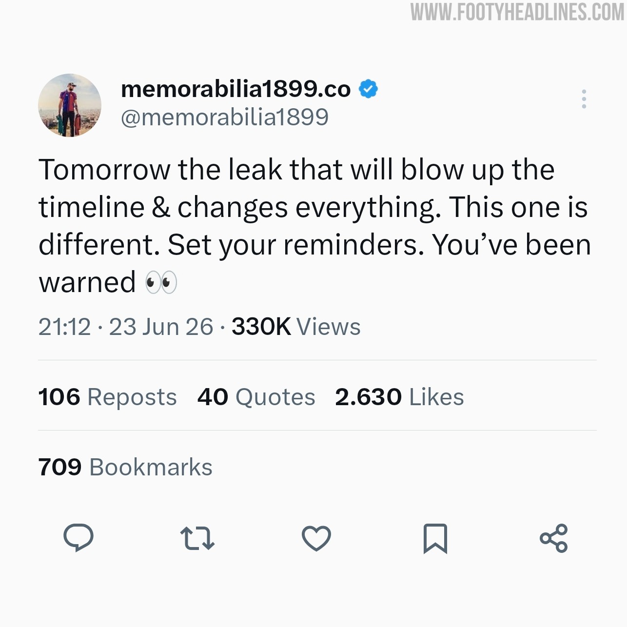
FC Barcelona Kit Insider Teases Massive Leak
FC Barcelona kit collector and insider @memorabilia1899 has teased a major leak scheduled for today, June 24, stating that it will blow up the timeline and change everything.
While the account is primarily known for highly accurate early information and images of upcoming Barcelona kits, the cryptic nature of the announcement has led to widespread speculation among fans.
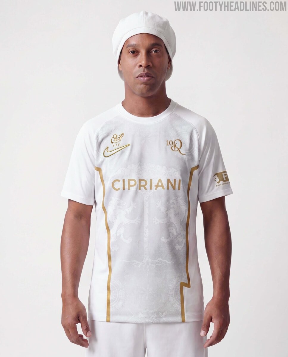
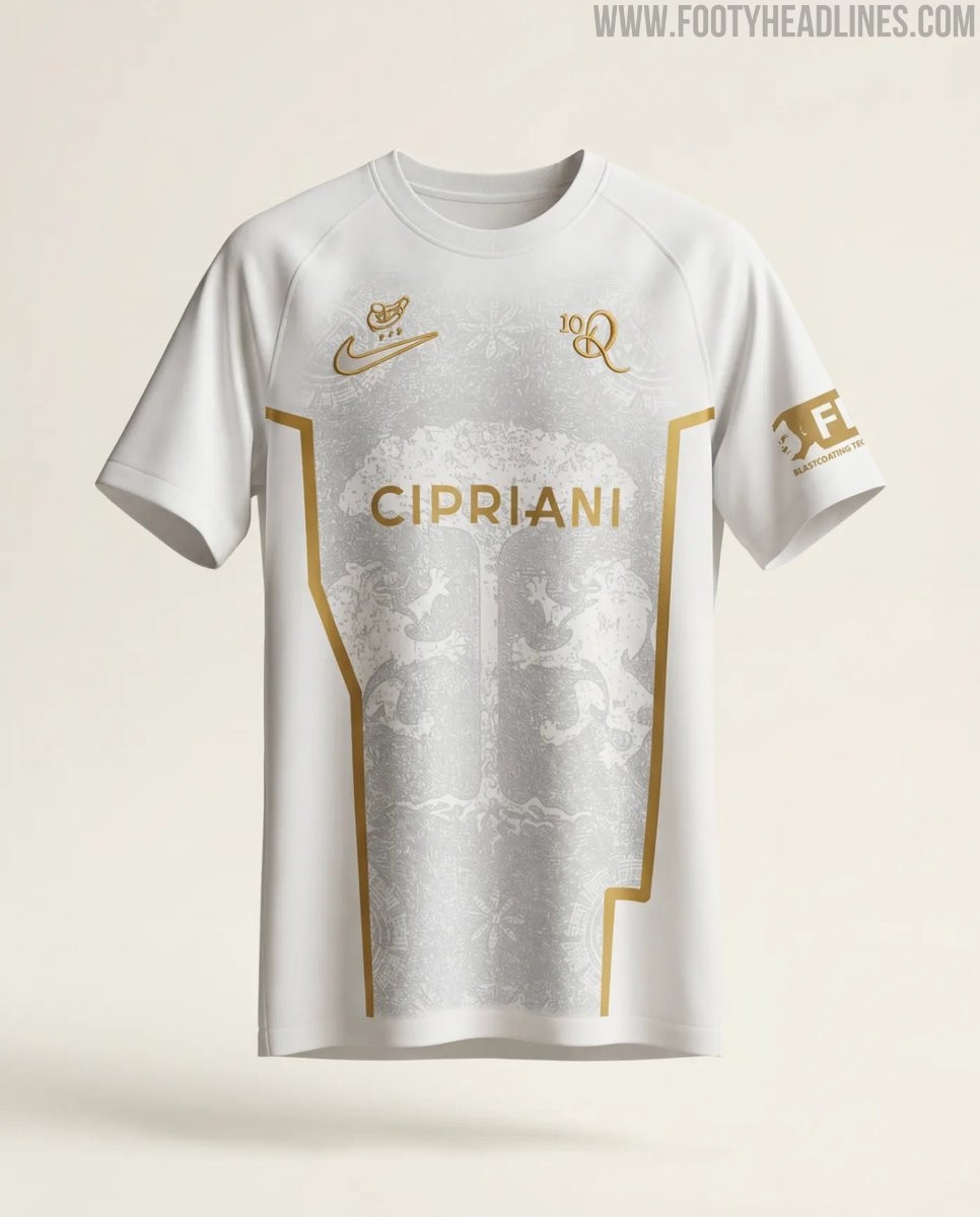
Ravenna FC 26-27 Ronaldinho Collaboration Kit Released
Italian Serie C club Ravenna FC has released a special collaboration kit with Brazilian football legend Ronaldinho, who is set to be registered as a player for the 2026-27 season. The announcement, made in Miami, revealed Ronaldinho's multifaceted role as a shareholder, global promotional face, and player aiming to score his final professional goal.
The Nike Ravenna FC 2026-27 Ronaldinho special jersey features a white base paired with elegant gold accents. The standout design element is an enlarged club crest graphic prominently displayed across the front of the shirt. It features Ronaldinho's logo on the left chest instead of the club crest and his iconic number 10.
The Nike Ravenna 2026-27 Ronaldinho collaboration kit is currently available to purchase through the club's dedicated online store.
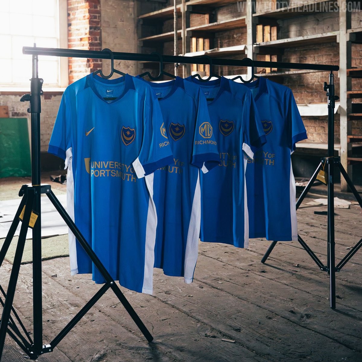
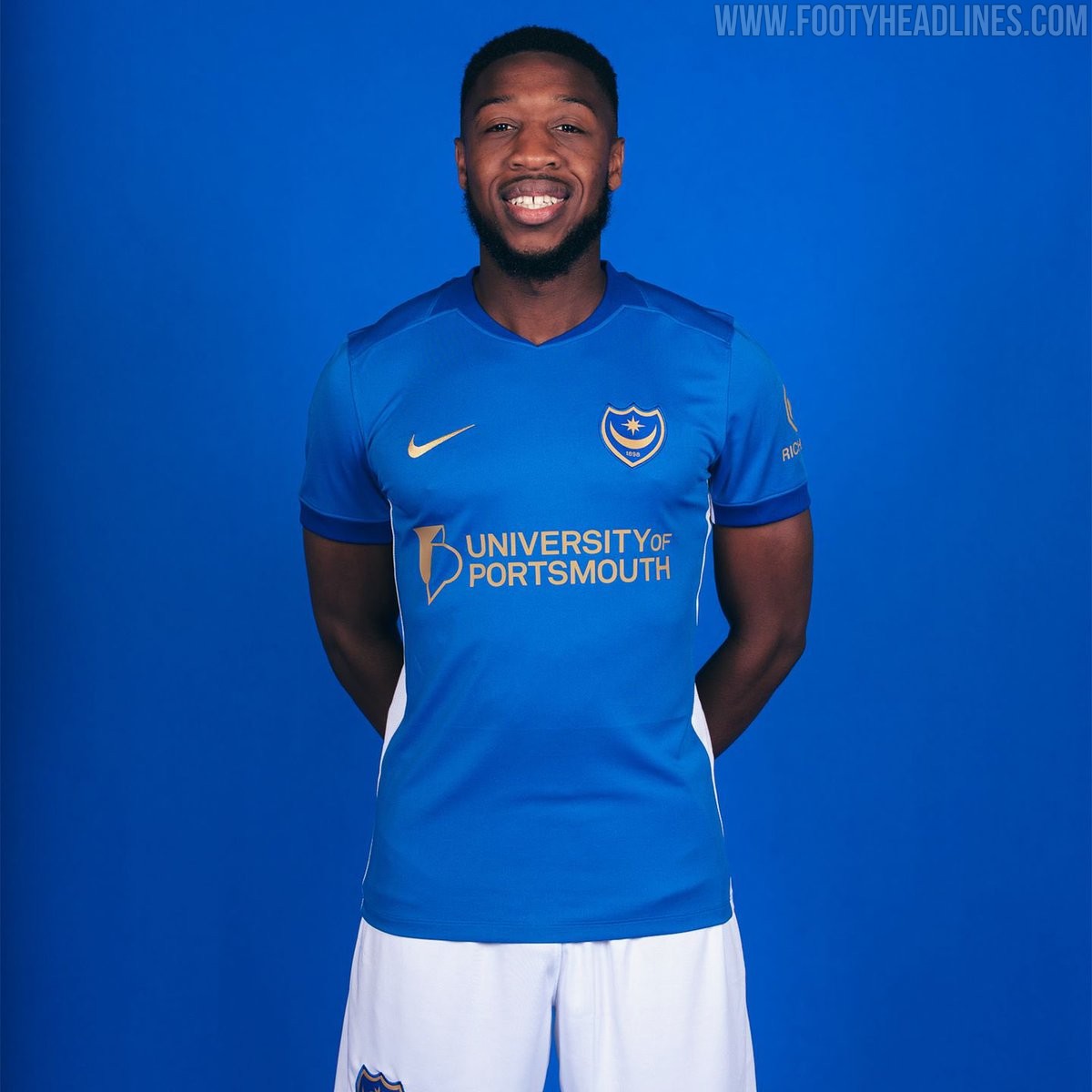
Portsmouth 26-27 Home Kit Released
The new Portsmouth FC 2026-27 home kit was officially unveiled, preparing the club for the upcoming Championship season. Produced by Nike, the latest shirt celebrates a significant milestone for the local community, honoring 100 years since Portsmouth was granted city status. The launch was accompanied by the official club tagline, "A century of pride, a future of possibility."
Nike's Portsmouth 2026-27 home shirt features the club's traditional blue base, combined with golden logos for a standout look.
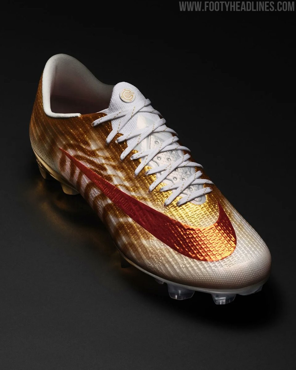
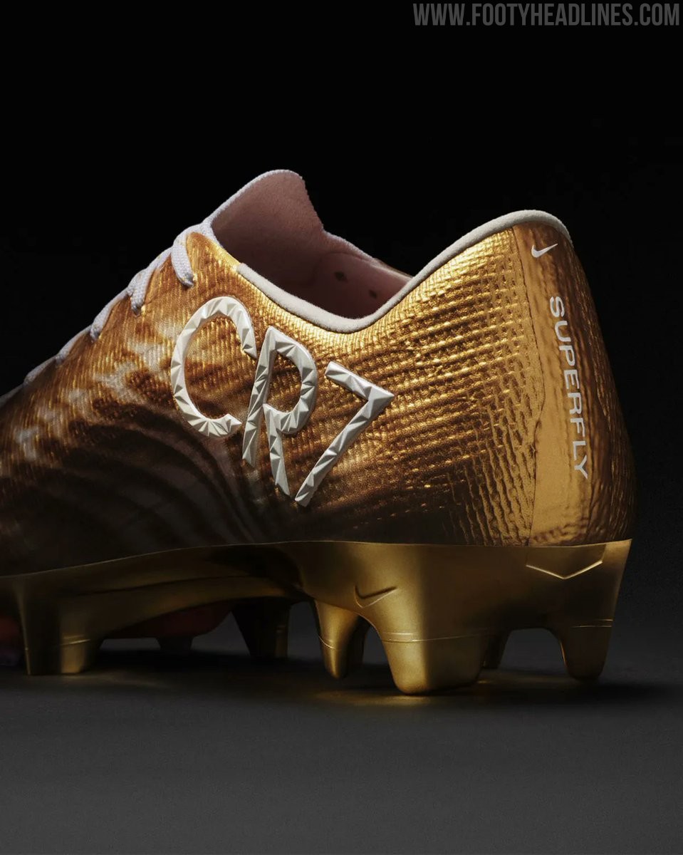
Nike Mercurial Superfly 11 CR7 "Gold Scorpion" Boots Leaked
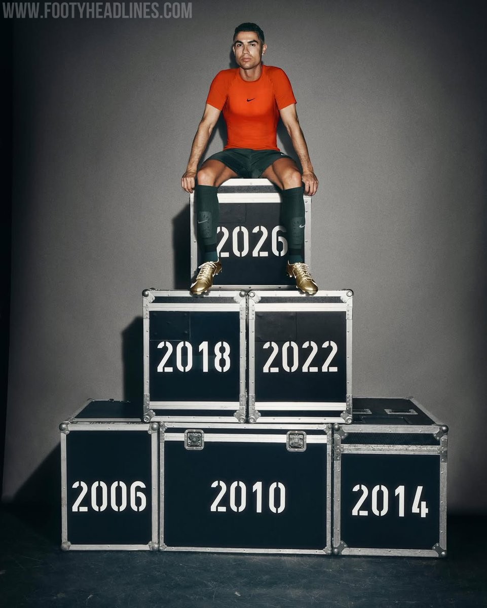
Nike has officially released the limited-edition Mercurial Superfly 11 "Gold Scorpion" football boots to celebrate Cristiano Ronaldo's historic achievement. The Portuguese forward recently became the first player in history to score in six consecutive World Cups, prompting Nike to honor his legacy with this special release.
The Nike Mercurial Superfly 11 CR7 "Gold Scorpion" boots feature a striking gold upper accented with bold red details and a large white Swoosh. The design prominently displays "CR7" branding on the heel area, alongside the signature Superfly details. The golden aesthetic pays homage to Ronaldo's remarkable career and his latest World Cup scoring record.
Targeted at collectors and fans, the Nike Mercurial Superfly 11 "Gold Scorpion" is strictly limited to exactly 2,026 pairs worldwide, referencing the year of the tournament. The boots are available on the Nike SNKRS app starting June 24, 2026.

Nike Cristiano Ronaldo 'Gold' Mercurial Superfly RGN Boots Released
Nike has officially released the special edition Gold Mercurial Superfly RGN football boot to celebrate Cristiano Ronaldo's remarkable 20-year career and his legacy on the international stage. The metallic gold and white boots commemorate his unprecedented achievement of scoring in six different World Cup tournaments.
Officially named the Nike Mercurial Superfly RGN SE FG, the boots feature a striking metallic gold base with white accents. Tech-wise, they are based on the latest Mercurial Superfly, incorporating a 3/4-length Air Zoom unit, Flywire support, and a tacky soft upper finish for optimal ball control.
The Cristiano Ronaldo Nike Gold Mercurial Superfly RGN boots are available from today, June 24, 2026, retailing at 300 USD.
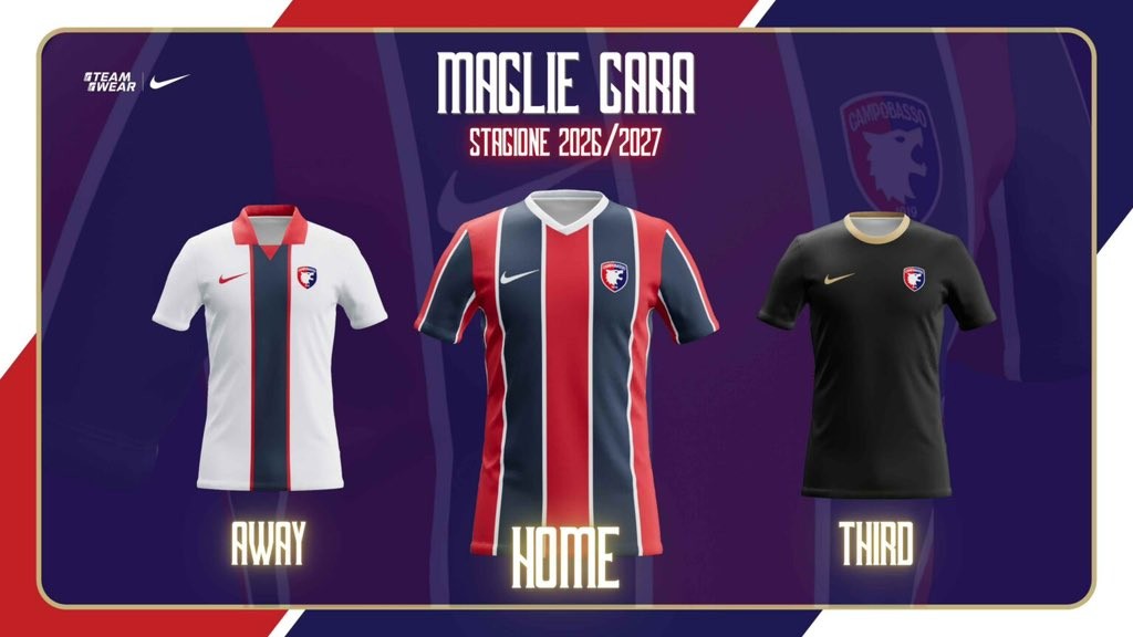
Campobasso 26-27 Home, Away & Third Kits Revealed
Italian Serie C side Campobasso FC have officially unveiled their new Nike home, away, and third kits for the 2026-27 season.
They introduce designs based on teamwear but nicely customised by the team.
The home retains the classic stripes, the away comes with a navy vertical stripe, while the third is black and gold.


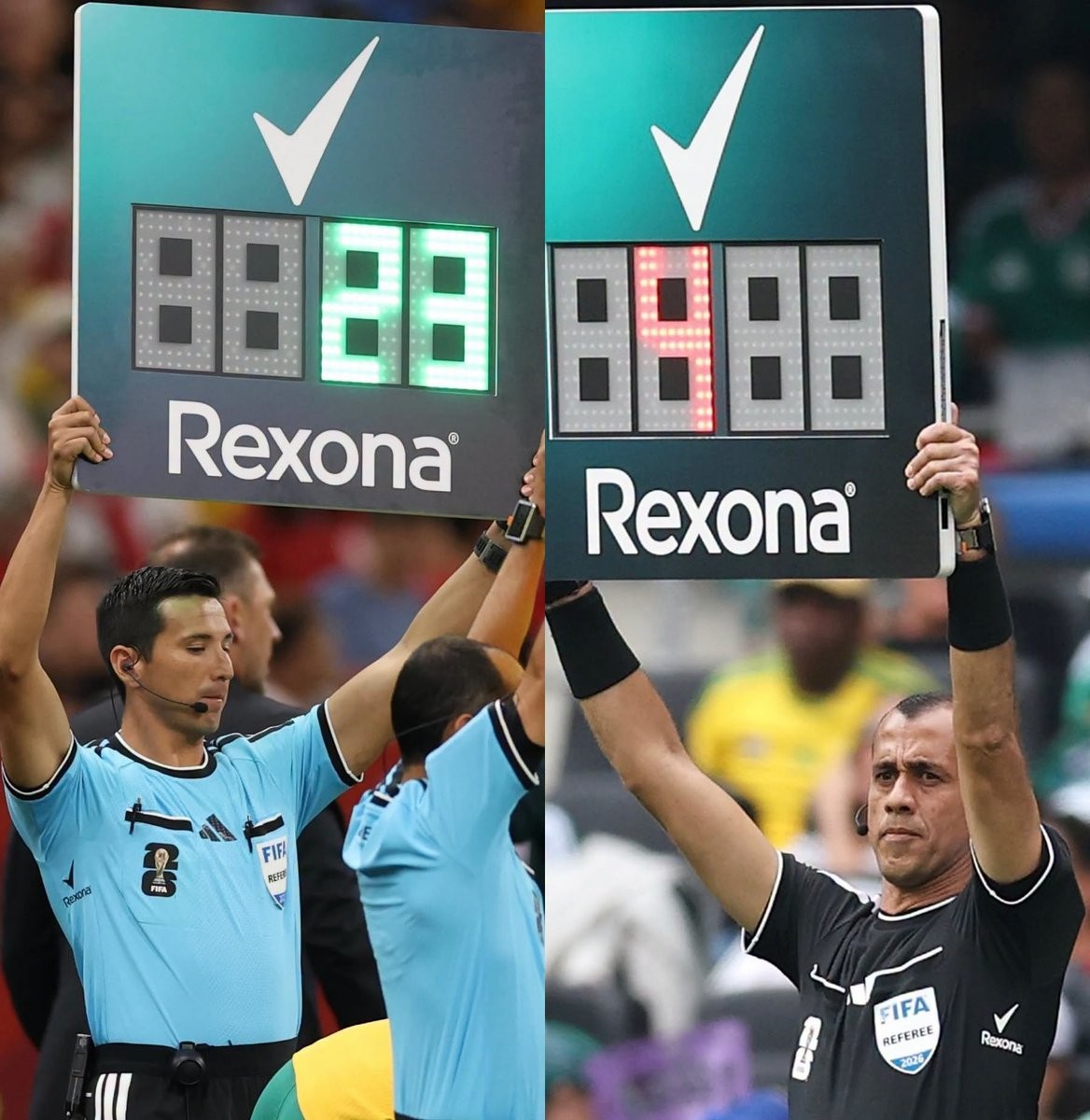
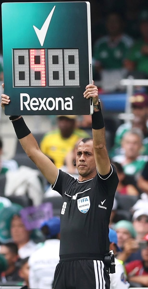
Good or Bad? Rexona Armpit Sponsorship on 2026 World Cup Referee Shirts
Update - Tuesday, June 23, 2026: Following our publication, Rexona contacted us to provide additional context on the activation.
According to Ben Curtis, Global Brand Vice President for Rexona at Unilever, the sponsorship is intended to highlight fourth officials, who "may not always be the focus of attention but are at the centre of some of football's most intense and anticipated moments," as part of Rexona's "It Won't Let You Down" campaign during the FIFA World Cup 2026. "They need to remain cool and calm under pressure - That's exactly why this partnership is such a natural fit for Rexona."
The 2026 World Cup referee shirts feature one of the most amusing and strategic sponsorship placements seen in football. Deodorant brand Rexona has their logo positioned directly under the armpits of the match officials' jerseys, creating a highly contextual advertising opportunity.
The Rexona logo remains largely hidden during regular play but becomes clearly visible whenever a referee raises their arms to signal a free kick, award a penalty, or issue a card. This placement perfectly matches the deodorant product being advertised, resulting in a memorable piece of marketing on the sport's biggest stage.
While this specific placement has caught the attention of fans during the 2026 tournament, it is not entirely unprecedented. A similar concept was previously executed in Brazil, where Avanço deodorant sponsored the armpits of Corinthians. However, Rexona's execution at a World Cup brings the clever concept to a massive global audience.