All-New Chicago Fire FC Logo & Brand Identity Revealed
Confirming yesterday's leak, MLS club Chicago Fire just unveiled its new identity, revealing the club’s new primary badge and brand. Article via mlssoccer.com.

𝐎𝐮𝐫 𝐬𝐭𝐨𝐫𝐲 𝐢𝐬 𝐂𝐡𝐢𝐜𝐚𝐠𝐨'𝐬 𝐬𝐭𝐨𝐫𝐲. pic.twitter.com/uCpz211gjs
— Chicago Fire FC (@ChicagoFire) November 21, 2019
Chicago Fire FC 2020 Logo

The club will now be formally known as Chicago Fire Football Club, with Chicago Fire FC serving as the moniker on first reference and on the badge itself. Inspired by "the story and spirit of Chicagoans," the new badge’s imagery reflects a key moment in the Windy City’s history, the Great Chicago Fire of 1871 that laid the foundations for the metropolis’ modern identity as it rose from the ashes.

“The mirrored icon – with flames inverted to become a crown, hence the Fire Crown – tells the story of a dramatic rebirth and a city’s triumph,” explained a club release, while “the change from ‘soccer’ to ‘football’ reflects a long-term vision for the club as Chicago’s global ambassador to the world’s game.”

Chicago Flag To Feature In Future Brand Elements And Kit Designs

The badge’s oval shape is the first of its kind in MLS. Fire FC have retained the red and blue primary colors that date back to their debut in 1998, while replacing the previous gray secondary color with gold and adding new secondary colors of ivory and “flag blue,” a nod to the city’s beloved flag that will feature in future brand elements and kit designs.

“As a Chicagoan, it was important to me that our new brand identity reflect the power of our city’s origin,” said the Fire’s new owner Joe Mansueto. “I’ve always loved the Chicago Fire name. I think of the people who rolled up their sleeves and committed to rebuild what would become a world-class city, one that my family and I love so much. The new badge including the Fire Crown represents that spirit.”

Chicago’s new look is the product of an 18-month process that included consultation, focus groups and surveys with fans, partners and staff and “considered the original context of the club’s name, crest and colors and the needs of a team building for future decades in a rapidly expanding league,” in the words of Fire FC’s release. The badge, secondary marks and new typeface were designed by creative agency Doubleday & Cartwright.


Merchandise featuring the new badge is available for purchase in the club's online store. Future kit designs will be announced at a later date.
On Thursday the club also launched their new “Stand for Chicago” campaign, a storytelling series “which will celebrate the extraordinary people who call Chicago home,” with the first installment featuring Fire FC defender Johan Kappelhof, Chicago Red Stars defender Sarah Gorden and her son Caiden, a member of the Chicago Fire Juniors youth program.


Chicago’s new identity will make its official on-field debut on March 21, when Fire FC host Atlanta United in their 2020 MLS home opener. It will be the inaugural match of their return to Soldier Field, the historic downtown venue they called home from 1998–2001 and 2003–2005.


Share your thoughts in the comments below.

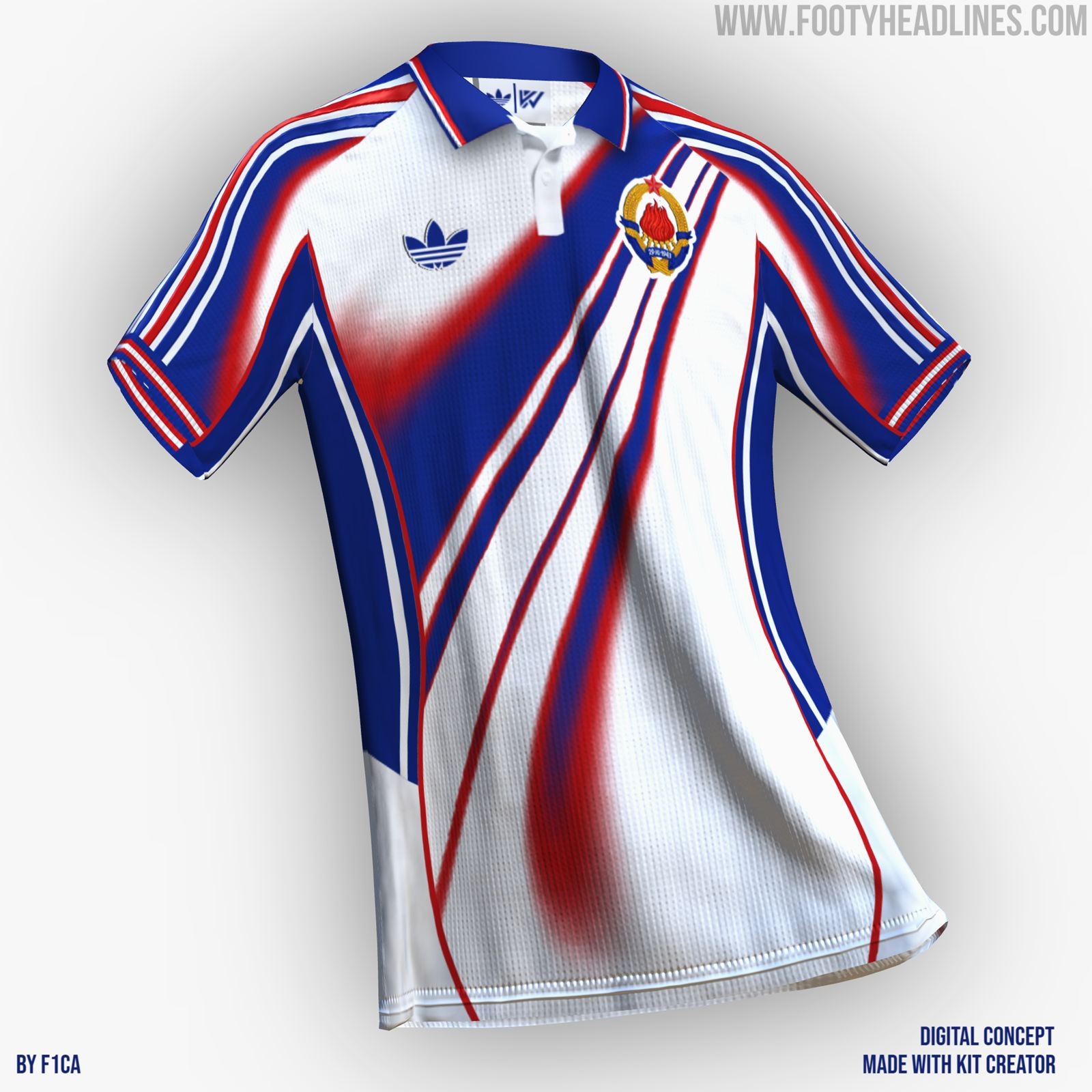
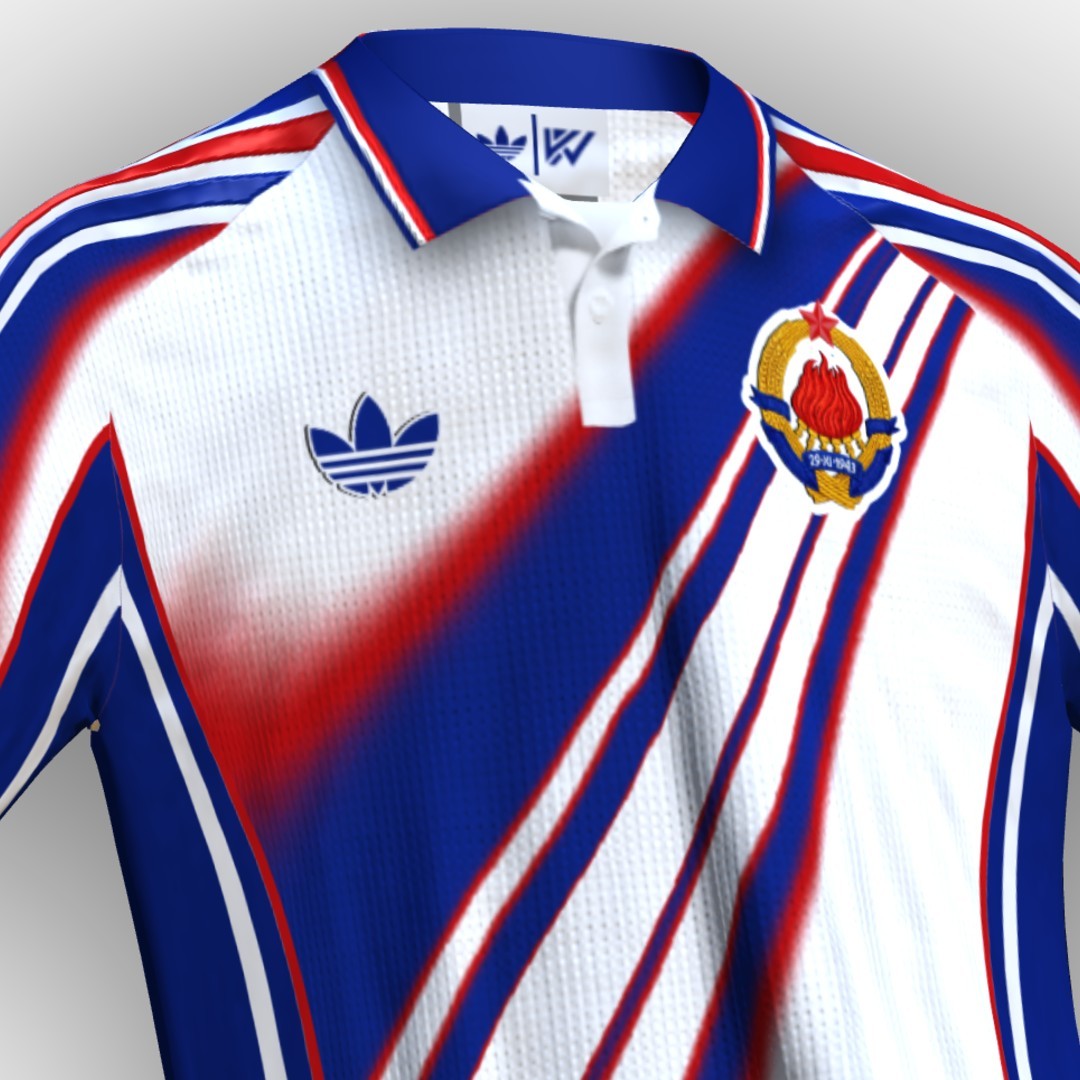
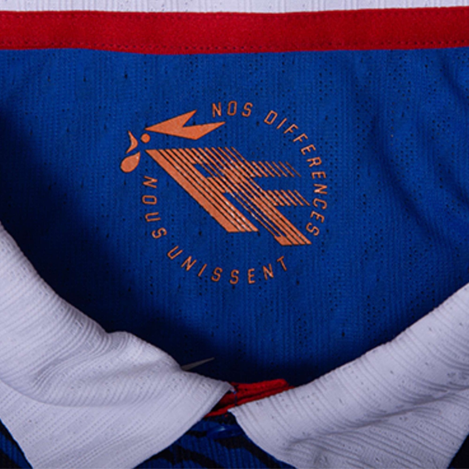
What if? Adidas x Yugoslavia
Designer F1CA has imagined how Adidas x Yugoslavia could look like in 2026, if Yugoslavia still existed. He used Kit Creator to create and share his design.

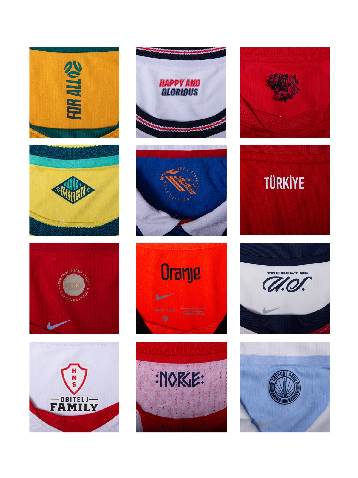
Adidas Teams Twinned by Product Code & Design
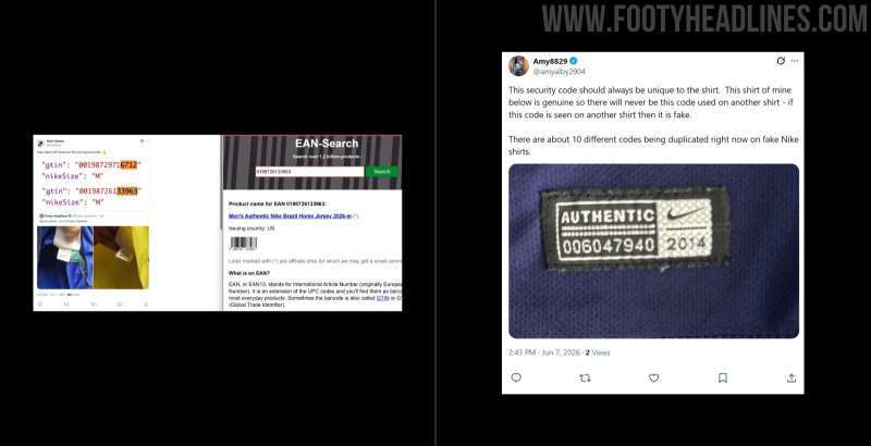
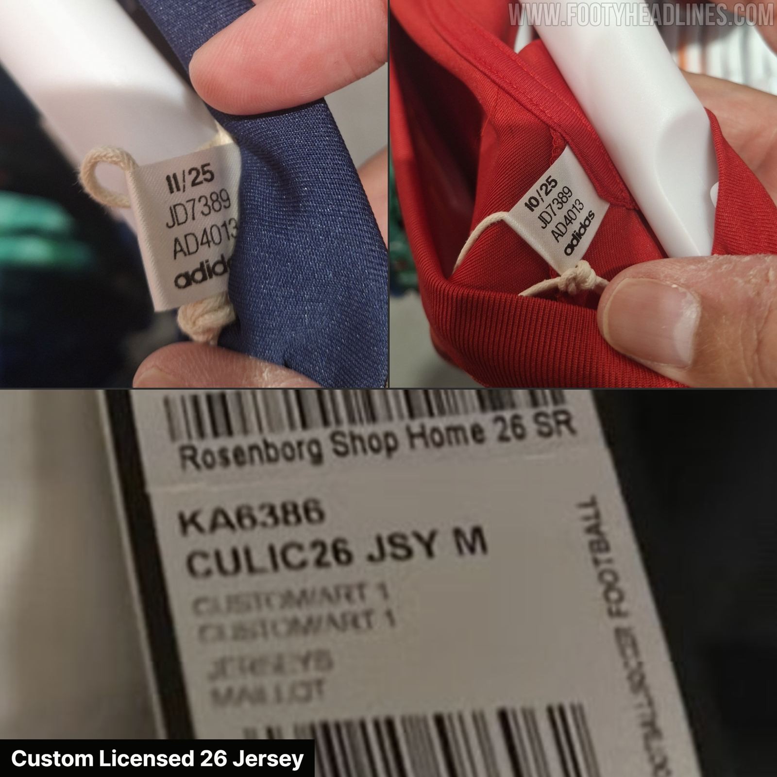
Update - Sunday, June 7, 2026: As spotted Indonesian jersey experts @Jerseyforum, Adidas teams with the same design also share the product. In particular, they do not have the usual Team + Shirt Type Name (e.g. FCB A 26 JSY), but are called Custom Licensed Jersey (CULIC26 JSY).
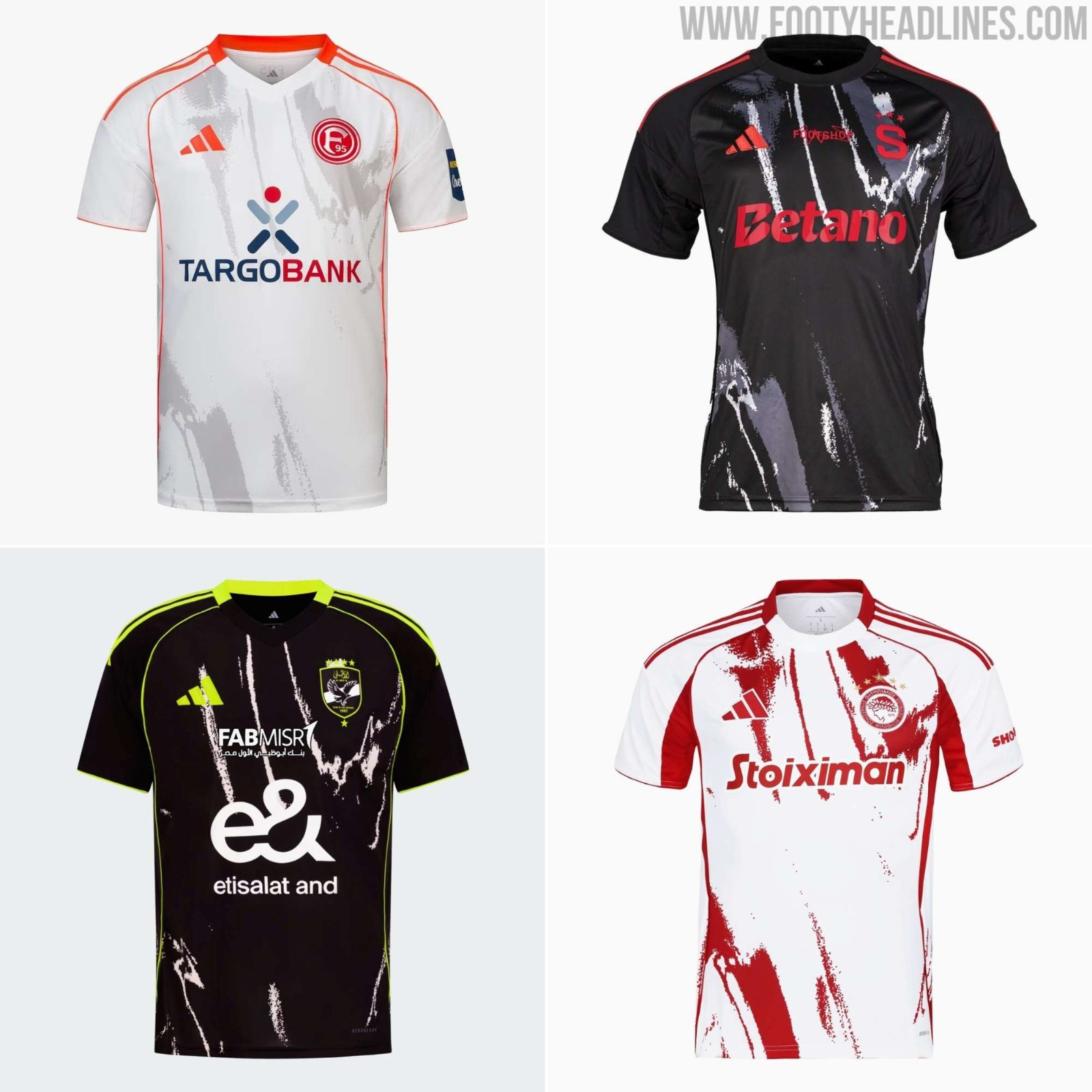
Templates are not as common as they were in the past, but smaller Adidas teams still do not have custom designs always. In the outgoing 25-26 season, teams such as Düsseldorf, Al Ahly, and Sparta Praha all used the same Locker Room design with custom colors.
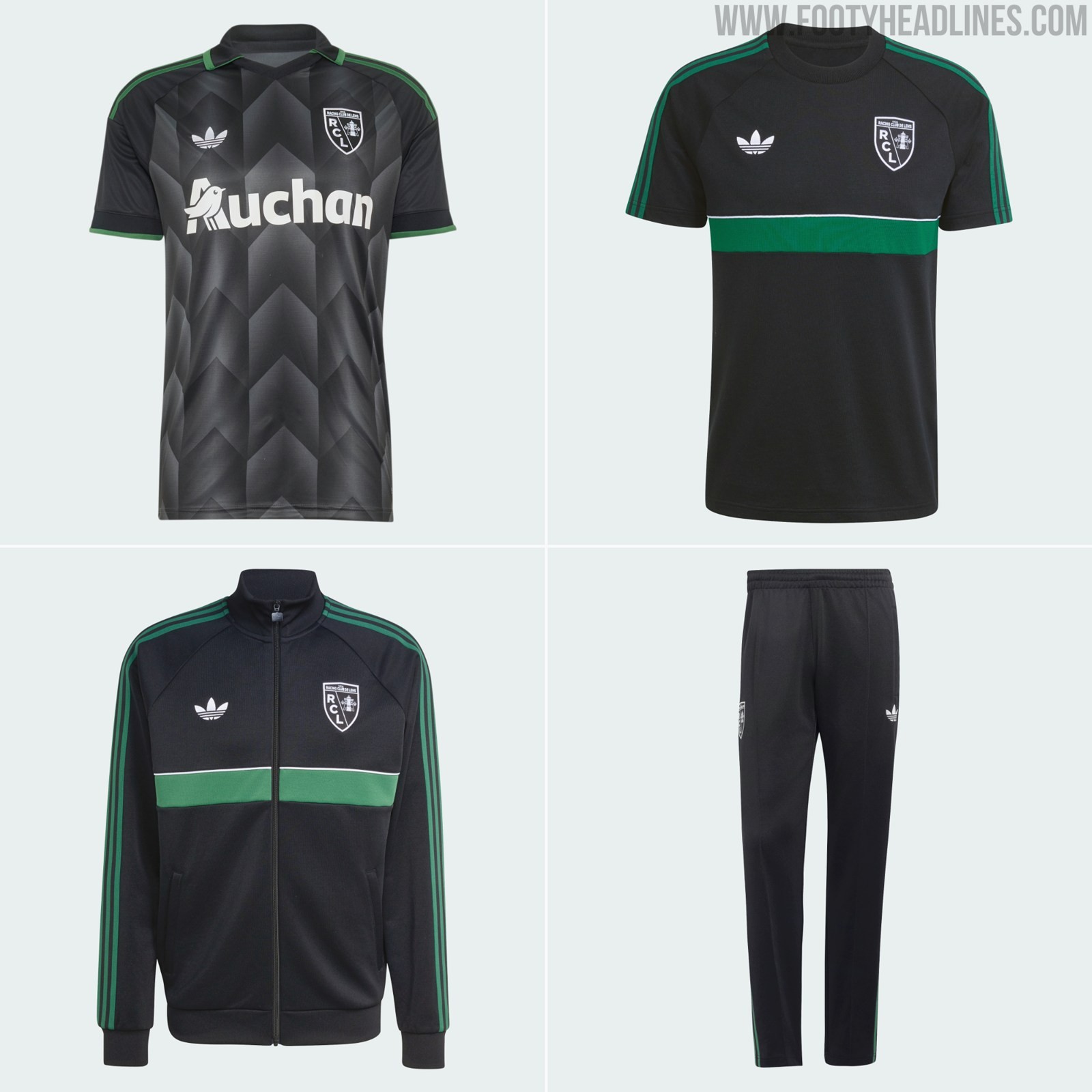
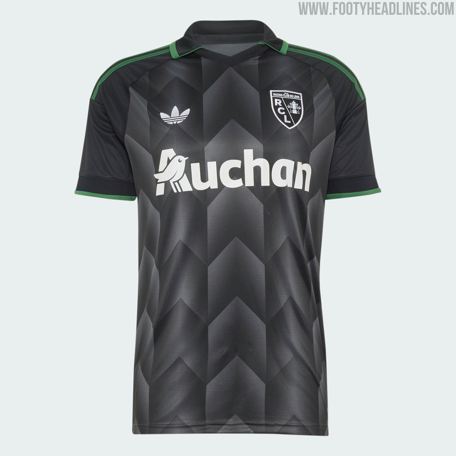
RC Lens 26-27 Originals Collection Released - Away Kit + 3 Items
As other Adidas teams, RC Lens is getting a nice collection with their 2026-27 away kit.
\[Explore every Racing Club de Lens jersey on Football Kit Archive\]([https://www.footballkitarchive.com/rc-lens-kits-t418/](https://www.footballkitarchive.com/rc-lens-kits-t418/))
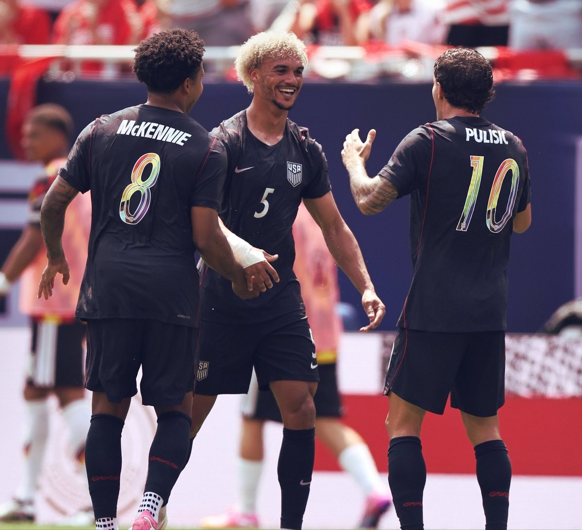
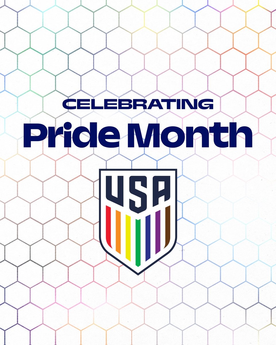
USA Wear Special Rainbow Numbers Against Germany
The United States men's national soccer team wore special rainbow-colored namesets during their friendly match against Germany on June 6, 2026, in support of Pride Month. The unique multicolored design was applied exclusively to the names and numbers on the back of the players' jerseys, while the front of the kits retained their standard gray appearance.
The USA Women's Team also used the Pride numbers in the friendly match against 2027 Women's World Cup hosts Brazil in São Paulo where they were defeated 2-1.
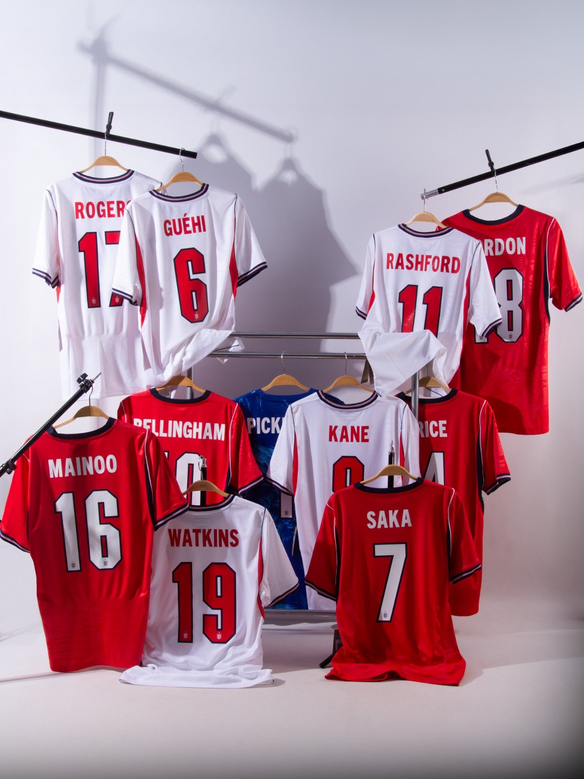
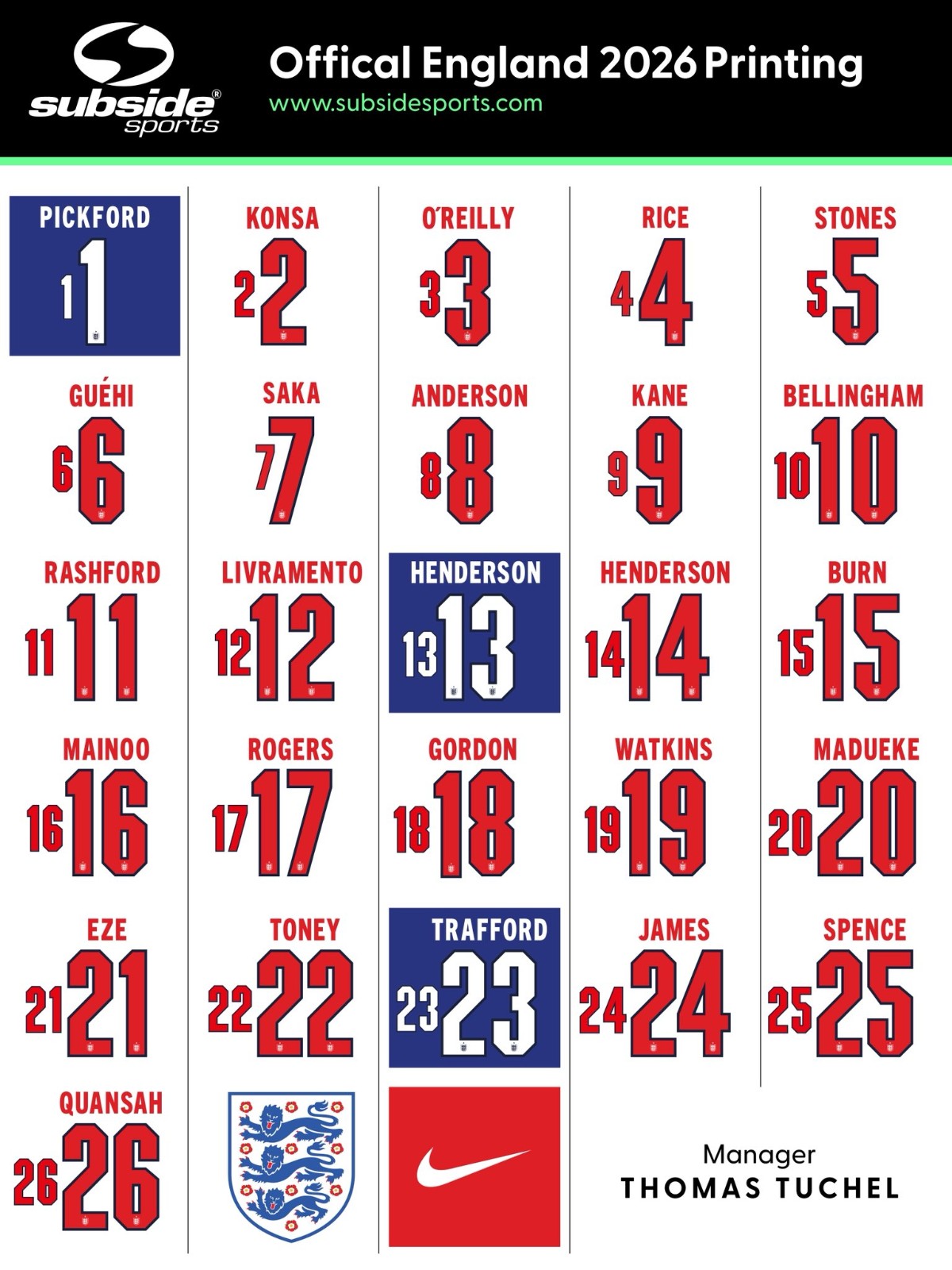
England Release Squad Numbers for 2026 World Cup
Update - Sunday, June 7, 2026: Subside Sports have created two nice images showing the Nike England 2026 World Cup font applied on the kits and the full squad.
England have released their squad numbers for the 2026 World Cup.
1: Jordan Pickford
2: Ezri Konsa
3: Nico O'Reilly
4: Declan Rice
5: John Stones
6: Marc Guehi
7: Bukayo Saka
8: Elliot Anderson
9: Harry Kane
10: Jude Bellingham
11: Marcus Rashford
12: Tino Livramento
13: Dean Henderson
14: Jordan Henderson
15: Dan Burn
16: Kobbie Mainoo
17: Morgan Rogers
18: Anthony Gordon
19: Ollie Watkins
20: Noni Madueke
21: Eberechi Eze
22: Ivan Toney
23: James Trafford
24: Reece James
25: Djed Spence
26: Jarell Quansah