Here Is What Inspired Manchester United's 20-21 Third Kit - Kit Designer Interview
It is nothing new that adidas is looking to push boundaries with their kit designs by creating unprecedented, imaginative and, quite logically, controversial jersey designs for their top-tier clubs like Arsenal FC, Bayern Munich, Juventus FC, Manchester United or Real Madrid every now and then.
Today, we want to find out what exactly Adidas' responsible design team imagined when they created Man Utd's new 2020-21 third shirt by consulting Design Director Inigo Turner. Inigo, a Man Utd fan since day 1, already gave detailed insights into the design process of the first-ever Adidas Manchester United kits of the modern era back in 2015.

This is a shortened version including the most important passages of the original interview. Thanks to Soccerbible for taking the time.


What words would you use to describe Man United's new 3rd shirt?
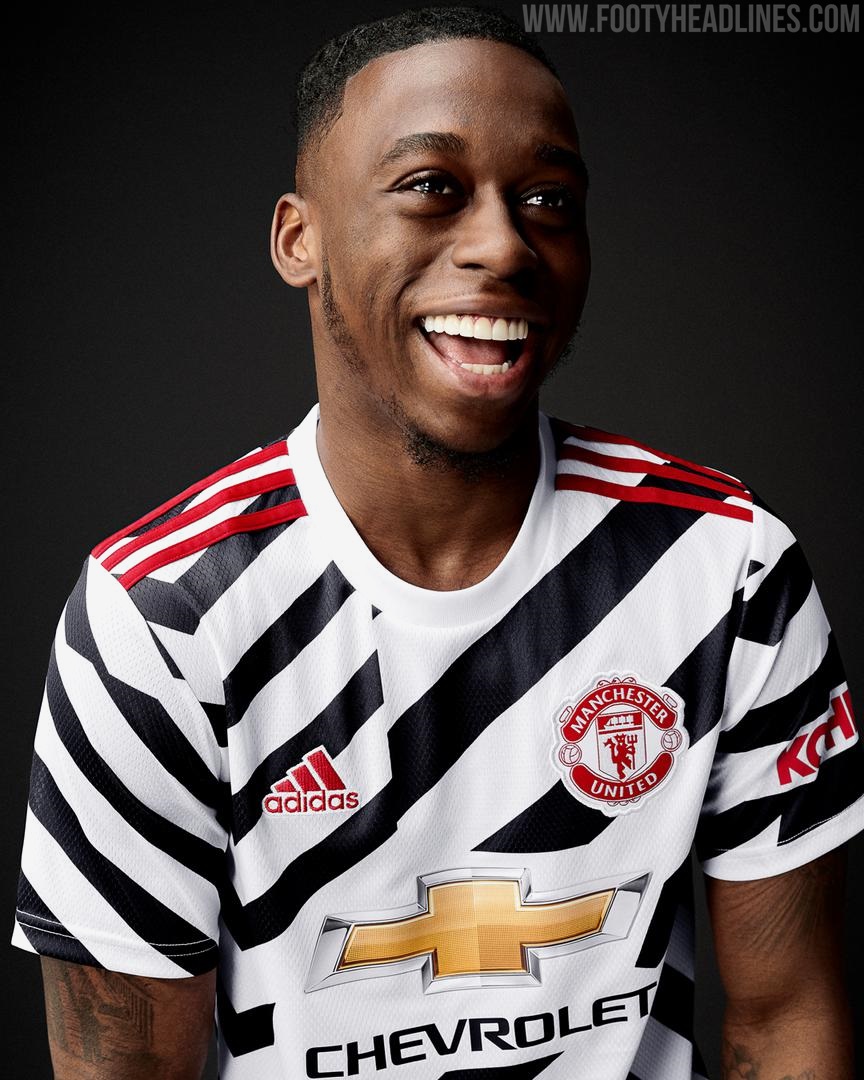
I would say it’s a bold, progressive and disruptive design leaning on authentic stories from the clubs history which have been re-interpreted for 2020 and a new generation of United fans.
We want to create new icons
What message to the football world would you say this kit sends?
That was definitely discussed during the creation phase. We wanted to do something that would disrupt and which would lead. You have to take risks if you want to lead. There’s a lot of people out there doing a lot of different things right now and we definitely wanted to take a lead and make a bold statement and be iconic. To some extent we wanted to cut through the noise. We’re hopeful that this will achieve that.


How would you describe the Manchester United brand in today’s era – does this kit almost symbolise where the club wants to be as a brand?
We work together with Manchester United as a partnership. We have a great relationship with the club. We both want to be leaders, we want to be the best and that philosophy is reflected in this kit. [...] Looking back five years ago and paying homage to the relationship adidas and Manchester United previously had, that was the starting point. Since then however, it’s about growing that relationship and not just looking back but pushing forward. We want to create our own, new visual legacy for the club so that it’s not just those iconic shirts from the late 80s and early 90s that people look back on. We want to create new icons.
Can you describe the journey with this kit?
I think we approach all the kits, from all of the clubs fairly openly. It’s a little bit dependent on what’s going on in each of the club’s. I think now was the time to do something like this on the third for United. Having done a pretty bold Manchester United home kit in 2018 and a fairly loud Arsenal away shirt recently as two examples, they have changed perspectives and also shown the appetite for more abstract designs. They’ve moved us into a territory of creating new icons again – that’s what it’s all about for us.
we’re challenging conventional football shirts and conventional design
Across football in general, home kits can be a little safer, a little more in keeping with a club’s DNA but we’re definitely finding an acceptance around third kits where you can try and do more creative things. We don’t start the season and say, home kits we’ll do this, third kits we’ll do that – it’s all born out of the creative process we go through with each club. It’s always quite a collaborative process between different departments on both our side and the respective club’s side. Looking at art as a starting point and inspiration for this season as a whole, it fits what we do in an organic way. I think it’s been an interesting season to design for.


What did the journey look like with this one?
We had this design from the start and we landed on it quickly. We went through a process in mapping out the story and then interpreting that into design but we got to this decision pretty quickly because there was a lot of love for it. Sometimes you see a shirt completely change halfway through the journey but this one pretty much stayed true from the moment it was born.
The use of black, white and accents of red “United” the design
Do you see it as a chance to break new ground and almost stick a finger up to the ordinary that’s out there?
[laughs] I wouldn’t use those words but we definitely challenge conservative thinking. There’s a lot of people out there who are conservative thinkers. We want to do something that’s really progressive, that was the goal from the start. You don’t move things forward without challenging things, without challenging people and without challenging perceptions and we know a shirt like this would create a certain amount of online chat. That’s why it’s important to have these types of conversations because the story needs to be told. It’s not like we’ve thrown a random design out there because we want to do something wild. There’s a story and a process behind the kit. It’s not something that has been made up retrospectively and made to fit the kit release. This is the outcome of the creative process and the way designers have interpreted this story. At the same time, we’ve created something bold and provocative and we’re challenging conventional football shirts and conventional design. We’re really excited by this.


What about the trends that are in the football world right now and how have you brought them into consideration?
I think two years ago, when we started this process, we were looking at trends in youth culture, or “creator culture” as adidas calls it. We looked at jersey customisation and that movement. You see individual people doing it and it’s really interesting. Our design team and the creative team here are no different to anyone else in the world in that we all use resources to pick up inspiration. How we interpret and translate that into design is the art.
Looking at this “do it yourself” design approach we were looking at the use of patterns and different techniques and enjoying how two things coming together can make something completely different. That’s informed our design process a lot. It was the almost clothes hacking approach that felt right here. Mashing up designs to create something new.


We made this shirt black and white so that we made this surface into one entity. It brought it back to the clubs colour palette. The use of black, white and accents of red “United” the design so to say.

What do you think of Inigo Turner's statements concerning the shirt's inspirations and Adidas' overall strategy to keep pushing boundaries and challenge conservative thinking? Let us know your thoughts in the comments down below.
Vintage Football Shirts
from Cult Kits
2011/12 France M'Vila #17 *Player Issue* Away Shirt (M) Nike

2001/02 Real Madrid Centenary Rain Jacket (M) Adidas

2024/25 RC Lens Home Shirt (M) Puma

2010/11 England Gerrard #4 Home Shirt (S) Umbro

2015/16 Raith Rovers Polo Shirt (S) Puma

2004/05 Real Madrid Zidane #5 Home Shirt (M) Adidas

2002/04 Spain Joaquin #22 Third Shirt (L) Adidas

2002/03 Sweden Ibrahimovic #21 Home Shirt (L) Adidas

1996/98 Club America C.Blanco #10 Home Shirt (XL) Adidas

2004/05 Etzella Ettelbruck #3 Home Shirt (XL) Nike


MLS Players Wear Their National Flags on Kits Ahead of 2026 World Cup
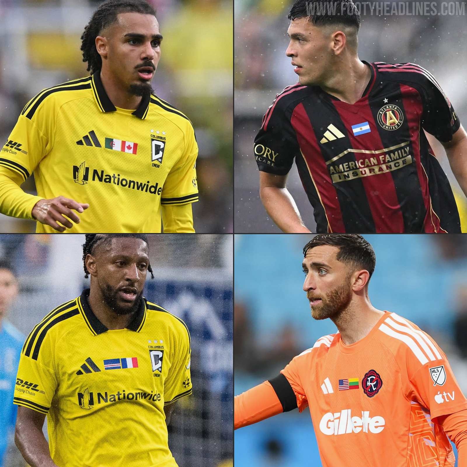
Major League Soccer last weekend hosted a dedicated "Farewell Week" to send off its international stars. To mark the occasion, all clubs across the domestic league took to the pitch wearing specially customized kits that honored the various nations represented within their squads.
The most prominent visual update to the MLS uniforms was the addition of official national flags printed directly on the chest for all players and coaching staff. In a highly thoughtful and personalized touch, the league provided specialized double-flag variations for athletes holding dual citizenship. This bespoke detail allowed these specific players to proudly represent both their current homelands and their heritage simultaneously before joining their respective national team camps.
Beyond the chest graphics, teams also sported a unique set of squad numbers on the back of their shirts, featuring a custom pattern made up of the flags of all 48 countries participating in this summer's World Cup.
What do you think of this customized flag concept for the MLS World Cup Farewell Week? Let us know your thoughts in the comments below.


