The 5 Best And 5 Worst Premier League Kits Of 2025/26 - By Phil Delves
 Aug 22, 2025, by Phil Delves

- Premier League Kits: The article reviews the best and worst Premier League kits for the 2025/26 season.
- Author: Phil Delves, a football shirt authority and Head of Content for Cult Kits, wrote the article.
- Best and Worst Kits: The article highlights the author's top 5 and bottom 5 Premier League kits, providing specific details on design elements and color choices.
One down, 37 to go.

The Premier League made its much anticipated return last week and in many ways we’re just getting warmed up. This summer has been a busy one and between the Club World Cup, Women’s Euros and the multiple gameweeks in the books for the lower leagues already we’ve not exactly had much of a break. But, with the big leagues now returning it truly feels like the 2025/26 season is underway.
5 Best & Worst Premier League 25/26 Kits
After much discussion amongst the football kit community we are finally able to see many of the new 25/26 kits in competitive fixtures for the first time. It’s hard to compare any given season with what’s gone before but there are some fantastic creations across England’s top division in particular. The bar has been anecdotally raised with more hits than misses with just a few third kits left to be released (and likely several special edition shirts, but we’ll save that story for another day).
Man City's grey affair is an eyesore full of missed opportunities
Here are my personal best 5 Premier League kits of 2025/26. And, in the interests of balance, I’ll also highlight my 5 worst Premier League kits at the start of the season.
5 Best 2025/26 Premier League Kits


2025/26 Brentford Away Shirt


I’m not sure if this qualifies as a hot take, but there are simply not enough brown kits in football. Brentford’s new away shirt is a personal favourite of mine, and the brown and gold design alleviates any fears that we would see a drop-off as The Bees made the switch to Joma as their kit manufacturer.


It would’ve been easy to run with a black and gold colourway as many have done before them, but the look we ended up with is far superior. The fractal bee crest is another highlight amongst highlights, with the (mercifully recoloured) gambling sponsor being my only real negative.
There are simply not enough brown kits in football
2025/26 Arsenal Third Shirt


Everyone knows that Arsenal are the apple of adidas’ eye, and The Gunners new third kit exemplifies just how good they’ve had it since the adidas reunion of 2019.


From a design perspective the shirt hits on most of the trends I covered in our recent article, with a “cloud white” base, subliminal pattern and the continued usage of the alternate cannon crest. This shirt is greater than the sum of its parts though, as it combines what makes each of those elements so strong into the total package.
Crystal Palace's new home kit has a Brazilian vibe, and that's a good thing.
2025/26 Nottingham Forest away shirt


Notting Forest aren’t part of adidas’ elusive ‘elite’ tier, but they have one of the better adidas shirts this season. I hate how much I like the sponsor here, but the logo of gambling company “Bally’s” is the undeniable cherry on top of a classy cake.


Though the subliminal pattern is not part of the fabric itself as a jacquard or embossed design, it works extremely well in giving the shirt interest up close without distracting from afar. And the aforementioned sponsor logo is joined by the other applications by all being coloured in navy.
2025/26 Crystal Palace Home Shirt


It’s hard to get excited about home shirts most of the time, but Crystal Palace’s 25/26 home is sneakily good in my opinion. Far from being just a run-of-the-mill Palace home kit, the introduction of white pinstripes to frame the red and blue is a stroke of genius.


I hate how much I like the new sponsor of the Nottingham Forest
I usually associate this sort of pinstripes+stripe aesthetic with Brazilian teams (think Fluminense, Gremio, etc.), and the move here from Macron is one of many good decisions the brand have made this season. Surprisingly it’s not something Crystal Palace have utilised before either, marking this one out in the club’s history.


2025/26 Wolves Home Shirt

Another strong home shirt which has caught my attention, you’d be forgiven for thinking there is nothing special about the new Wolves home. The collar alone is worth highlighting in my opinion though, as the contrasting black cutout triangle on the neckline perfectly complements the angular nature of the Wolves crest. There’s a little bit of the 2003/04 home (of Doritos sponsor fame) about it, and small decisions like the collar here made a big difference.


Though the betting sponsor is a letdown, the pattern in the body more than makes up for it. The rise to prominence of subliminal patterns has been a very welcome trend, and the fact that even the ‘smaller’ brands are getting involved has made a big difference in the kit game.
5 Worst 2025/26 Premier League Kits


2025/26 Burnley Third Shirt


Burnley’s third shirt brings absolutely nothing to the table. The black and gold colourway is tired; any brand or team that tries to jump on the bandwagon is too late and ends up looking out of touch as a result. Worse than the colours is the hexagonal pattern. I would rather have a blank shirt than a cheap-looking pattern like this.
The black and gold colourway feels tired - Burnley’s third shirt doesn't add anything
If there is one saving grace with this design it’s the fact that the applications have been recoloured to match the shirt, but even then I could complain about the size of the betting sponsor.
2025/26 Newcastle Away Shirt


The adoption of Saudi green as a recurring character on Newcastle alternate kits is a mistake. Despite repeated attempts to make the colour relevant, it has done more harm than good from a design perspective in my opinion.


There is nothing offensive about the 25/26 away kit. Sure, the arched pattern inspired by the Tyne Bridge might as well be a catalogue look, but it doesn’t get in the way like some patterns do. It’s impossible to separate the final product from the brazen attempt to embrace green though, and it’s becoming a running gag at this point.
2025/26 Manchester City Third Shirt


City’s new third shirt has been crowned by many as the worst football shirt of all time. Though I would push back against this reactionary take, there’s no denying that the grey affair is an eyesore full of missed opportunities.


A shirt inspired by rain is one thing but the overly literal pattern does the final shirt no favours. The gradient that runs from the Puma logo to the club crest might be even worse. With so many advancements in applications technology, something iridescent or lenticular would have landed far better in my opinion.
I avoid the “looks like a training shirt" comment, often repeated after kit launches, but for Aston Villa’s 25/26 away kit, the criticism is justified.
2025/26 Aston Villa away shirt


I try my best to avoid the “looks like a training shirt” comment which is parroted ad nauseam in response to any kit launch, but in the case of Aston Villa’s 25/26 away the criticism is justified.

This feels like a shirt designed to be forgotten, with no outstanding features to give it any sort of identity. Something like the checkerboard pattern of the 2010/11 would’ve given us something to hang out hats on.
2025/26 Bournemouth Third Shirt


Pink shirts divide opinion no matter how well executed, but in the case of Bournemouth’s 25/26 third shirt I’m struggling to find positives. Though the club described the shade of pink as “vibrant” in the official press release this is about as dull as a pink shirt can be.
In the case of Bournemouth’s 25/26 third shirt I’m struggling to find positives


The most pink kits make good use of a secondary colour, but the choice of purple from Umbro falls decidedly flat. Give me white or a Palermo-esque black, though admittedly there is plenty of black between Bournemouth’s home and away.

This article has been written by Phil Delves, football shirt authority and Head of Content of Cult Kits, a seller of genuine classic items shirts. Phil Delves' engagement is a crucial part of enhancing our football kit coverage and content.


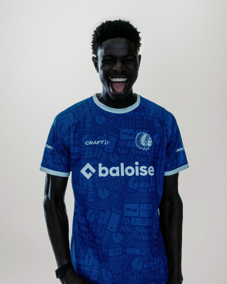
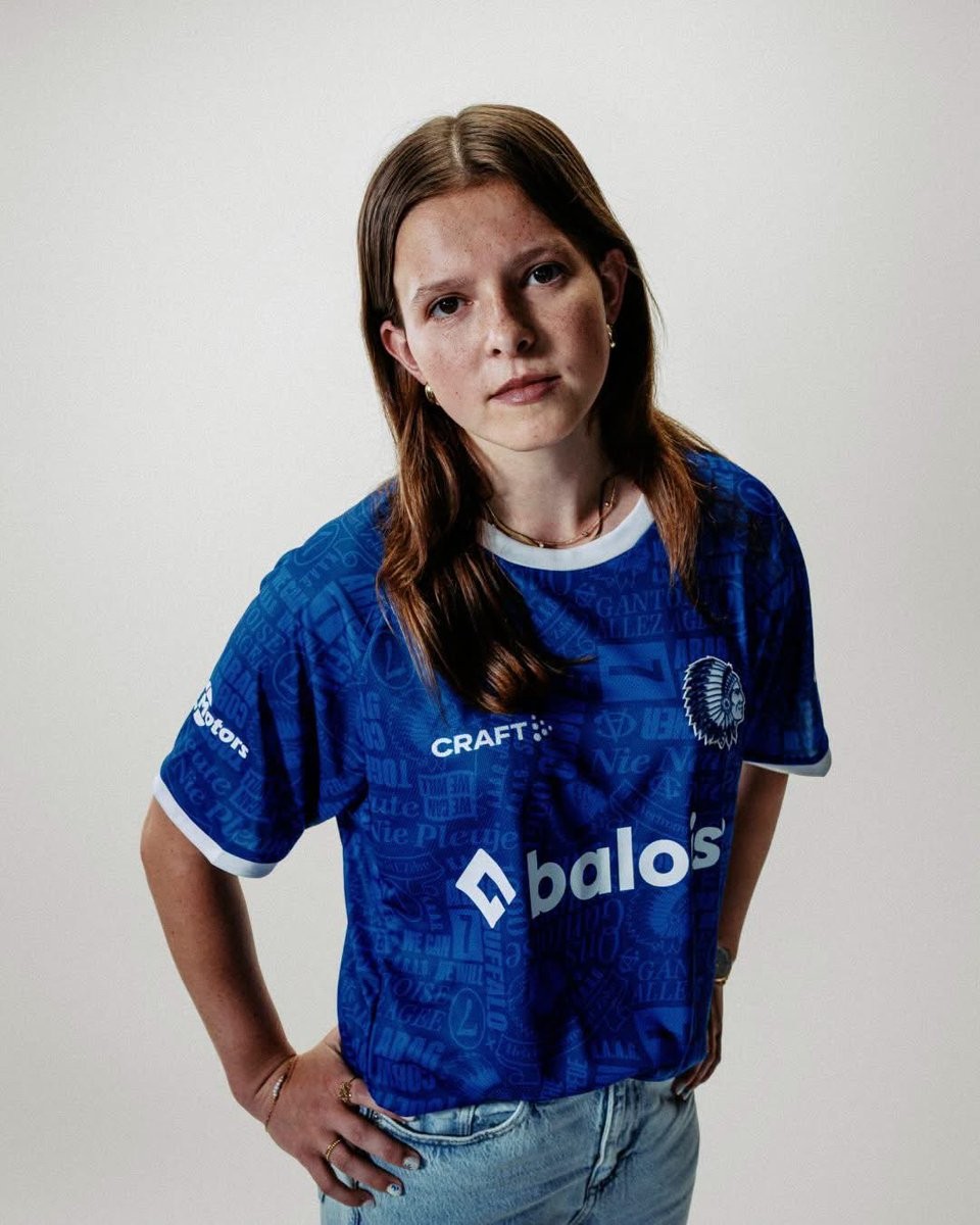
KAA Gent 26-27 125-Year Anniversary Home Kit Released
The new KAA Gent 2026-27 home kit was officially unveiled today. Made by Craft, the new home shirt celebrates the 125th anniversary of the Belgian club, honoring its tradition, pride, and history.
Promoted under the theme "De tweede huid van de Buffalo" (The second skin of the Buffalo), the KAA Gent 2026-27 home jersey is designed to be more than just a shirt. It weaves 125 years of club heritage into its design, offering a special look for the team and supporters during this milestone season.
The Craft KAA Gent 2026-27 home shirt is currently available for pre-order through the official club website.
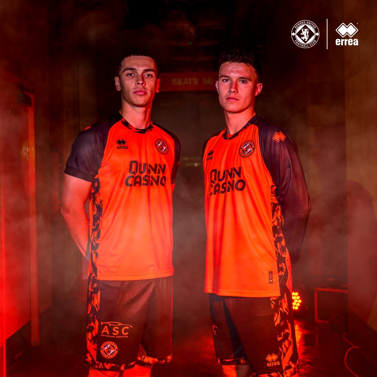
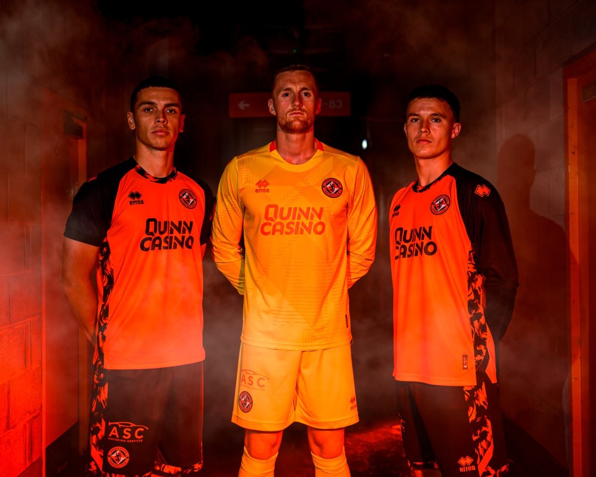
Dundee United 26-27 Home Kit Released
Dundee United and Erreà have officially unveiled the club's new home kit for the 2026-27 Scottish Premiership season. Launched under the tagline "Woven Into Our Identity," the latest release brings a fresh and contemporary update to the team's traditional look.
The Dundee United 2026-27 home shirt returns to a classic tangerine body, which is prominently contrasted by bold black sleeves. A standout feature of the design is a bespoke black and tangerine graphic that wraps around the collar and flows down the side panels of both the shirt and the matching shorts.
The kit displays the logo of principal partner QuinnCasino on the front and is constructed from Erreà's Future fabric, a lightweight and breathable material made entirely from recycled fibers.

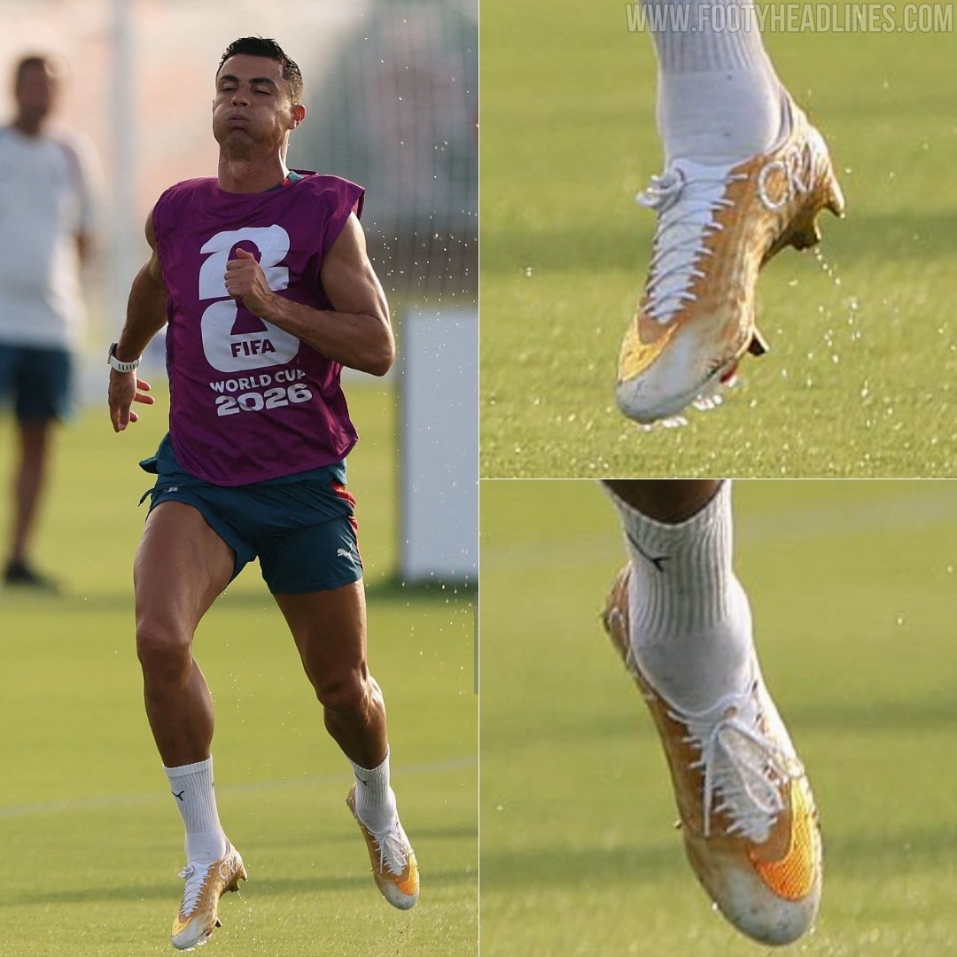
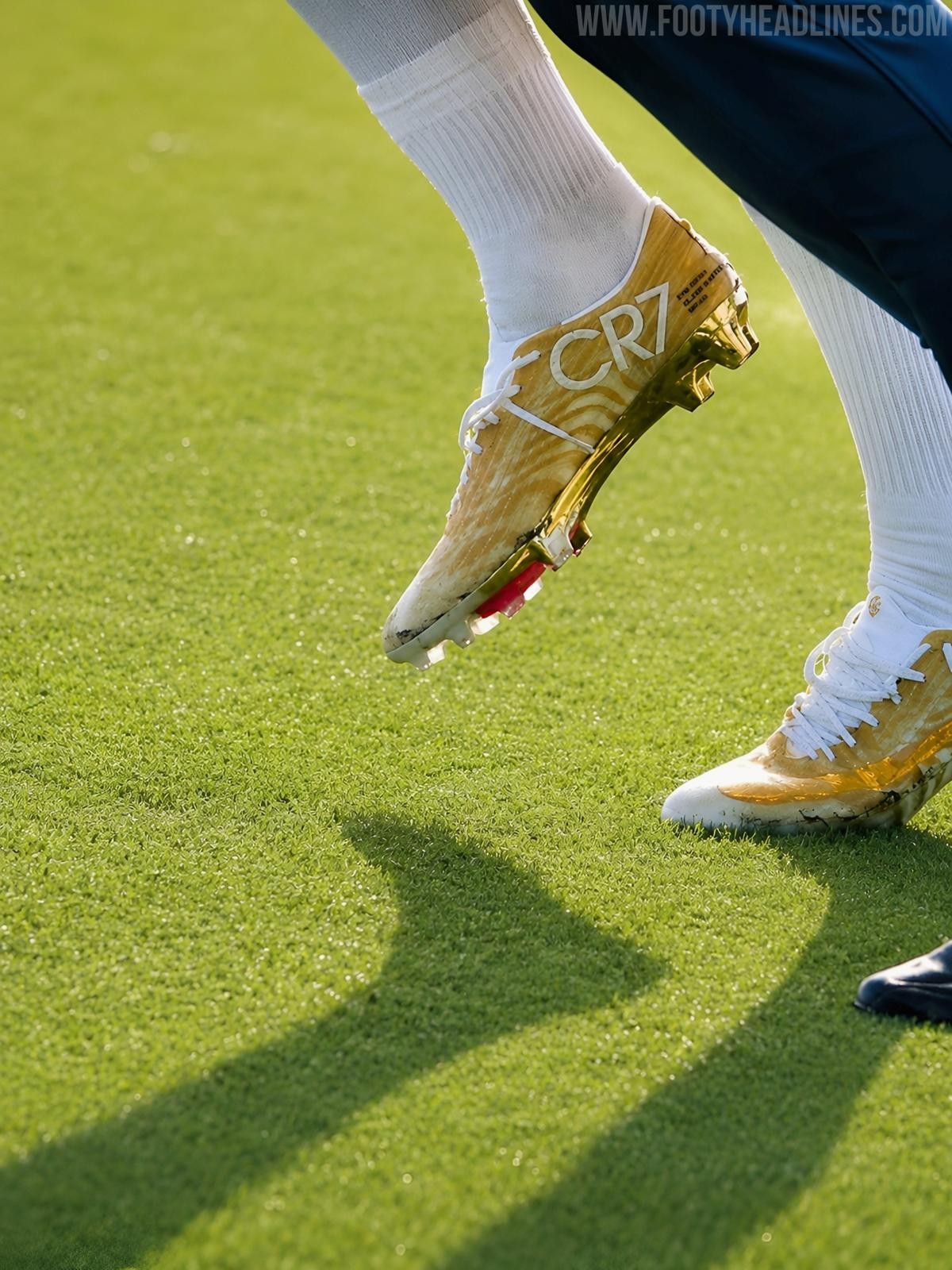
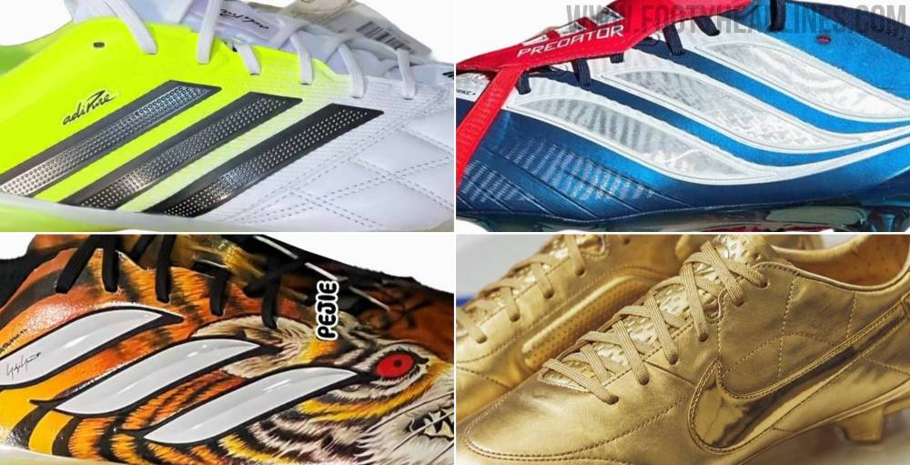
Cristiano Ronaldo Trains in Limited-Edition Nike Mercurial Superfly 11 'Gold Scorpion' Boots
Cristiano Ronaldo has been spotted at the training ground wearing a brand-new, limited-edition Nike Mercurial Superfly 11 boot. Dubbed the "Gold Scorpion," the boots feature a metallic gold coin and white colorway, serving as a nostalgic tribute to Nike's iconic 2002 "Secret Tournament" campaign. Ronaldo is confirmed to wear these exact boots for the remainder of the 2026 World Cup.
The release of the Gold Scorpion edition celebrates a monumental milestone for the Portuguese forward, honoring his achievement as the first player to score in six different World Cup editions. Nike has produced exactly 2,026 pairs globally to commemorate the year and the tournament. The limited-edition boots drop on June 27, 2026, via SNKRS Reserve.

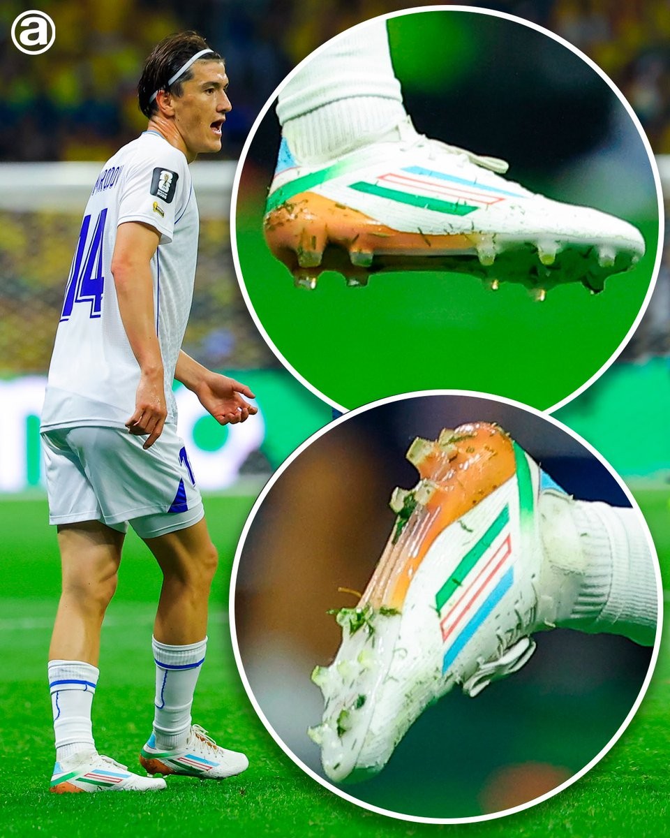
Eldor Shomurodov Wears Custom Adidas F50 Uzbekistan Flag Boots
During Uzbekistan's 2026 World Cup opener against Colombia, captain Eldor Shomurodov caught the eye with a pair of beautifully customized football boots. The striker took to the pitch in a personalized edition of the Adidas F50 that proudly displayed the colors of the Uzbekistan national flag. Thanks to @abcdefutbol for the spot.
Shomurodov opted for a clean white base for his Adidas F50 boots, featuring a clever lateral customization. The iconic Adidas three stripes were specifically recolored to represent the national flag, incorporating the distinct blue, white, and green bands separated by thin red borders. This subtle modification seamlessly integrated his national identity directly into the brand's recognized logo, resulting in a clean and highly professional look for the tournament.
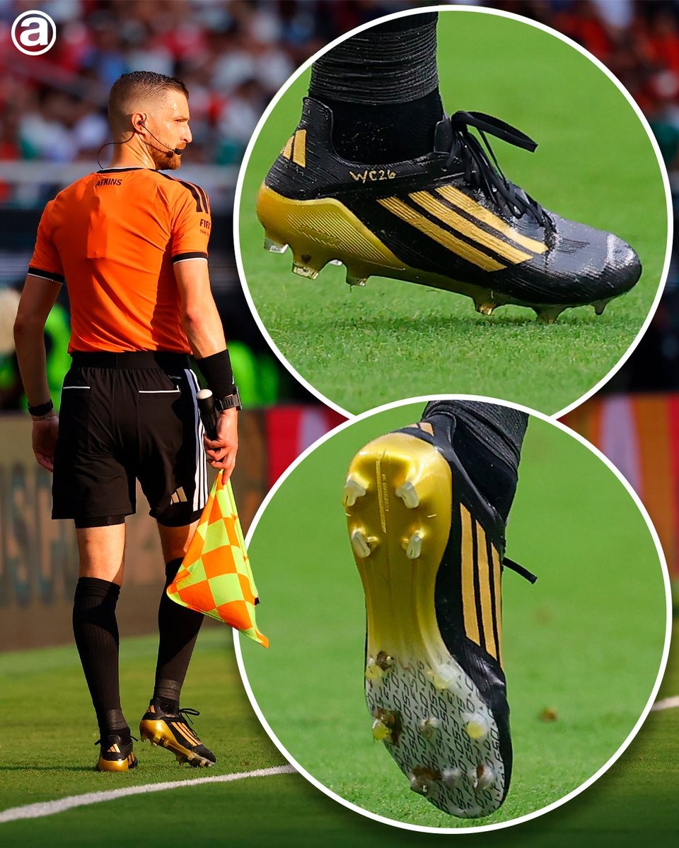
Custom Adidas F50 2026 World Cup Referee Boots Spotted
Assistant referee Kyle Atkins has been spotted wearing a heavily customized pair of Adidas F50 boots during the 2026 World Cup. Originally part of the Adidas 2025 'Road to Glory' pack, the boots were modified to suit the traditional blackout aesthetic typically expected of match officials.
The standard Road to Glory Adidas F50 boots feature a predominantly white upper, but Atkins' custom pair has been blacked out for a stealthy look on the pitch. The boots also feature a personalized detail on the side reading 'tierno WC26', highlighting their specific creation for the 2026 tournament. Thanks to @abcdefutbol for the spot.

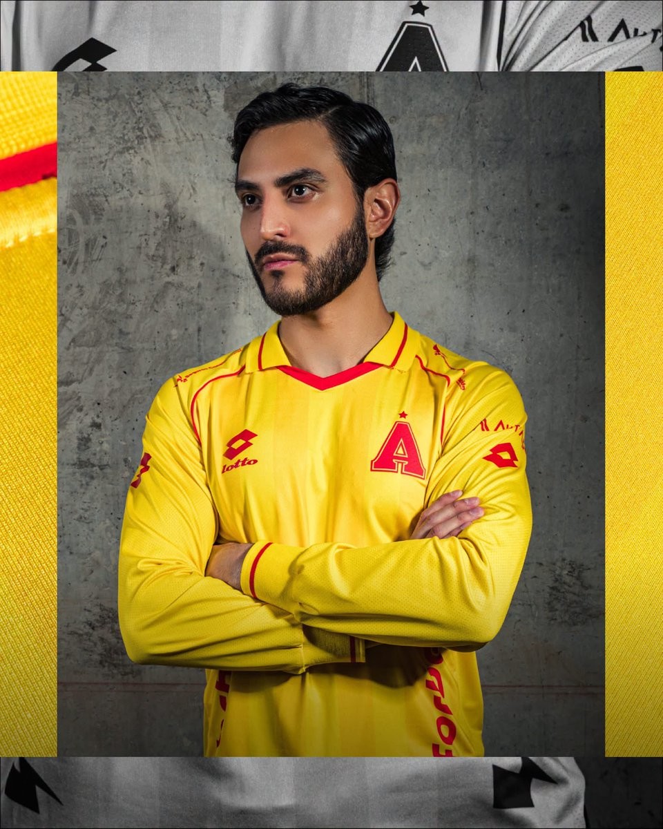
SD Aucas 2026 Anniversary Kit Released
Ecuadorian Serie A side SD Aucas has officially launched its new 2026 anniversary kit. Made by Lotto, the special edition jersey is designed to celebrate the history and heritage of the club during the current campaign.
The new Lotto SD Aucas 2026 anniversary shirt introduces a bespoke look that stands apart from the team's standard matchday options. It serves as a commemorative addition to the regular 2026 home, away, and third kits that Lotto released for the club earlier in February.
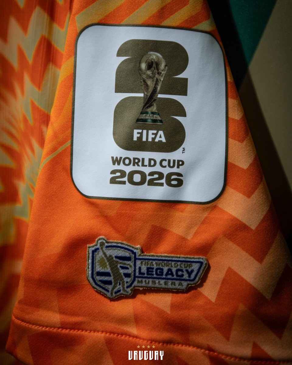
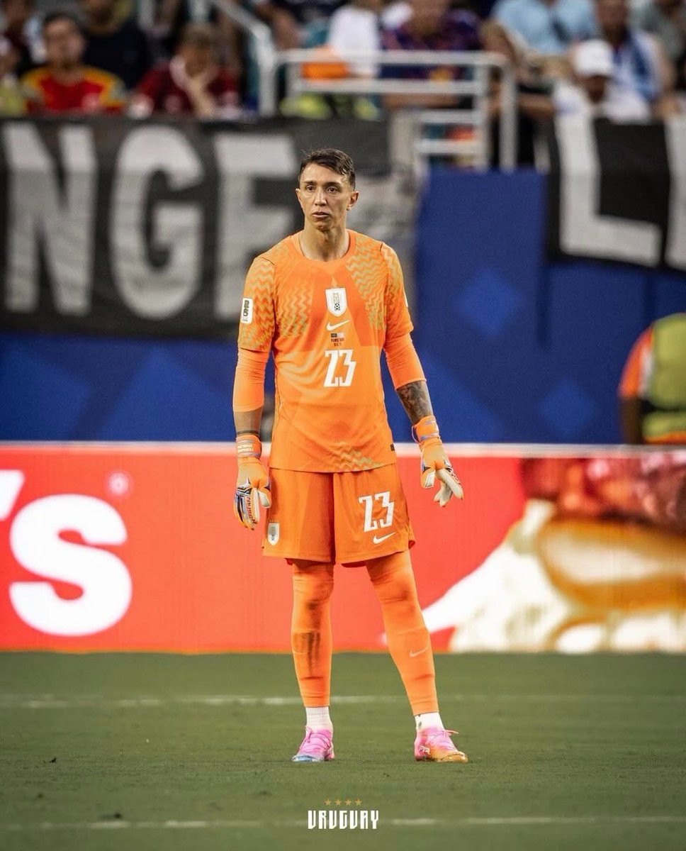
FIFA Approves Special Legacy Patch for Muslera at 2026 World Cup
During Uruguay's 2026 World Cup match against Spain, goalkeeper Fernando Muslera took to the pitch wearing a special Legacy Patch on his jersey. This exclusive badge is reserved by FIFA for players who have participated in at least five World Cup tournaments. Muslera's appearance at the 2026 tournament marks his fifth inclusion in a World Cup squad, following his selections for South Africa 2010, Brazil 2014, Russia 2018, and Qatar 2022.
The inclusion of the badge was initially in doubt, as Muslera did not play any minutes during the 2022 World Cup in Qatar, where Sergio Rochet started in goal. However, the Uruguayan Football Association submitted a formal petition to FIFA to recognize his squad selection as a full participation. FIFA officially approved the request, allowing the veteran goalkeeper to sport the Legacy Patch.
https://www.footyheadlines.com/1581325232/uruguay-requests-fifa-legacy-patch-for-muslera-s-2026-world-cup-kit.html
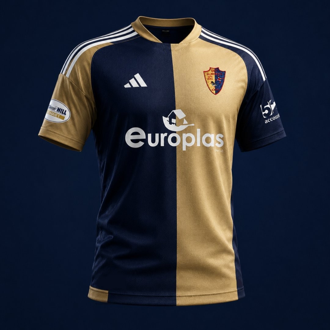
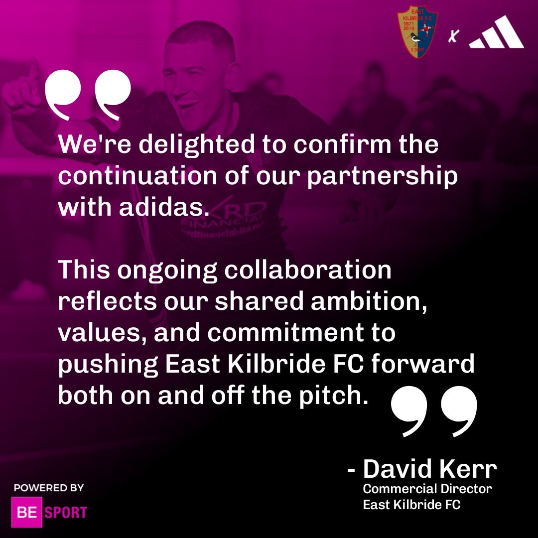
East Kilbride FC 26-27 Home Kit Revealed
Scottish League One side East Kilbride FC have officially unveiled their new 2026-27 home kit. Made by Adidas, the release was teased under the slogan "Building our Fortress," as the club prepares for the upcoming campaign in the SPFL.
The launch of the new home shirt follows the extension of East Kilbride’s partnership with Adidas via BE Sport, which was announced earlier this year in April 2026. The deal ensures that the German sportswear giant will continue to supply the club's kits until at least 2030.