Fits The Recent Trend... Controversial All-New Pyramids FC Logo Revealed
Egyptian Premier League club Pyramids FC unveiled its new logo yesterday. It is a simplified version of the previous one and also introduces a new circular shape that perfectly fits the recent trend of circular football logos taking over.

Pyramids FC is a club from Cairo and exists since 2008 when the club was founded under the name Al Assiouty Sport. Since 2018 the club is known as Pyramids FC, hence the Est. 2018 writing in the old logo.
The new Pyramids FC logo maintains 3 Egyptian pyramids that were placed at the lower end of the old logo and now take the center stage. In favor of the new logo and its shape the sphinx is gone. Instead, there is now an outer shape of the circle that reads 'Pyramids Football Club'. Another outer circle in white rounds off the simple look.
In terms of colour, the all-new Pyramids FC logo also simplifies affairs by utilizing a two-colour-scheme of navy and white.
Are you a fan of the new Pyramids FC logo? Drop us a line below.
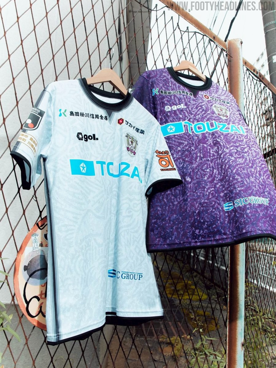
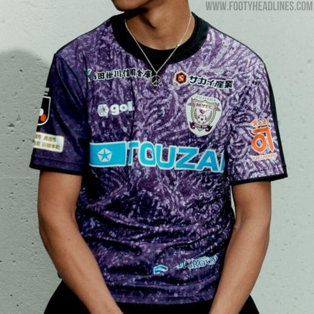
Fujieda MYFC 26-27 Kits Released
Japanese J2 League club Fujieda MYFC have officially unveiled their new 2026-27 kits, produced by sportswear brand Gol. Designed under the theme "Merge," the new shirts symbolize the fusion of the ball, boots, players' spirit, fans, and partners uniting for the upcoming season. The collection features bespoke graphic patterns across the home, away, and goalkeeper jerseys, with sponsor logos cleanly integrated throughout the designs. The new Fujieda MYFC 2026-27 kits will be available to purchase starting in late June 2026 via the official J.League online store.
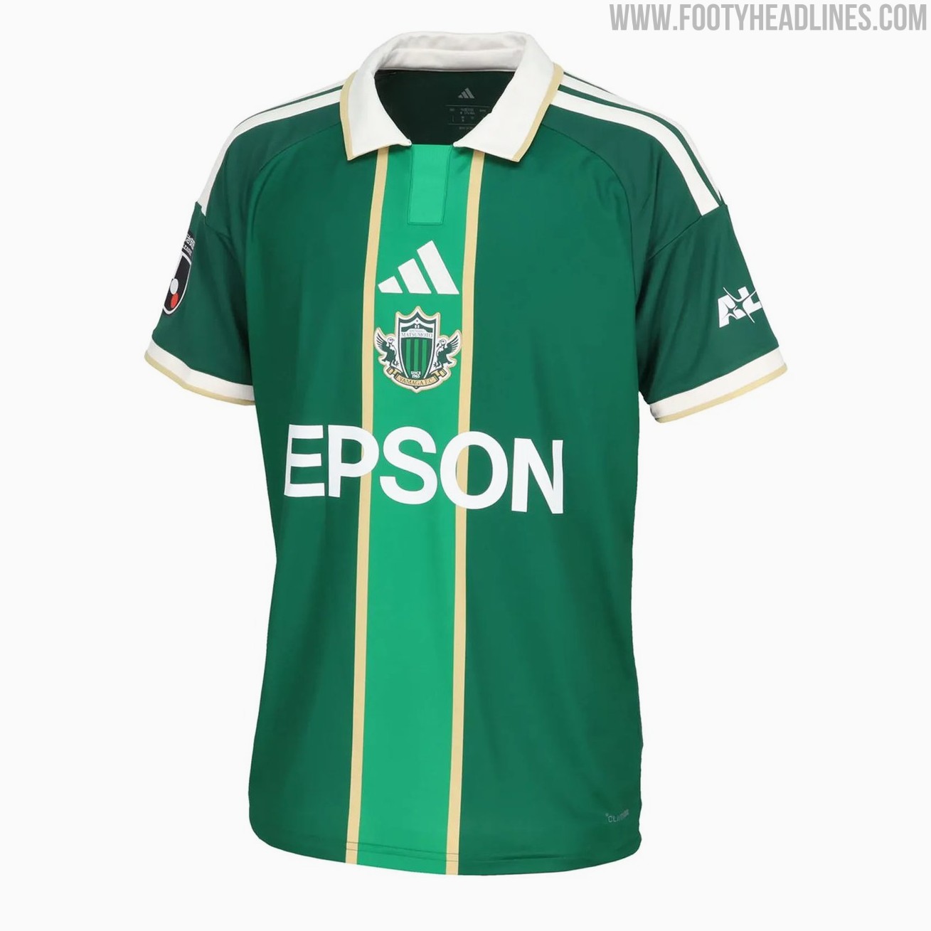
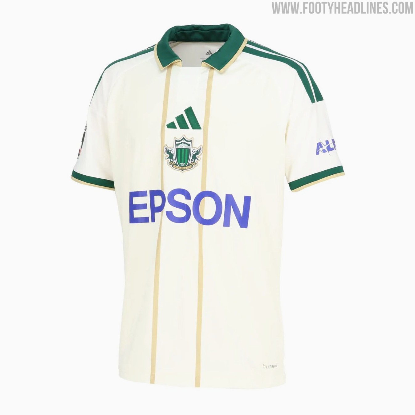
Matsumoto Yamaga 26-27 Home & Away Kits Released
Japanese J3 League club Matsumoto Yamaga FC have revealed their new 2026-27 home and away kits. The new Adidas Matsumoto Yamaga 2026-27 shirts introduce bespoke designs for the club.
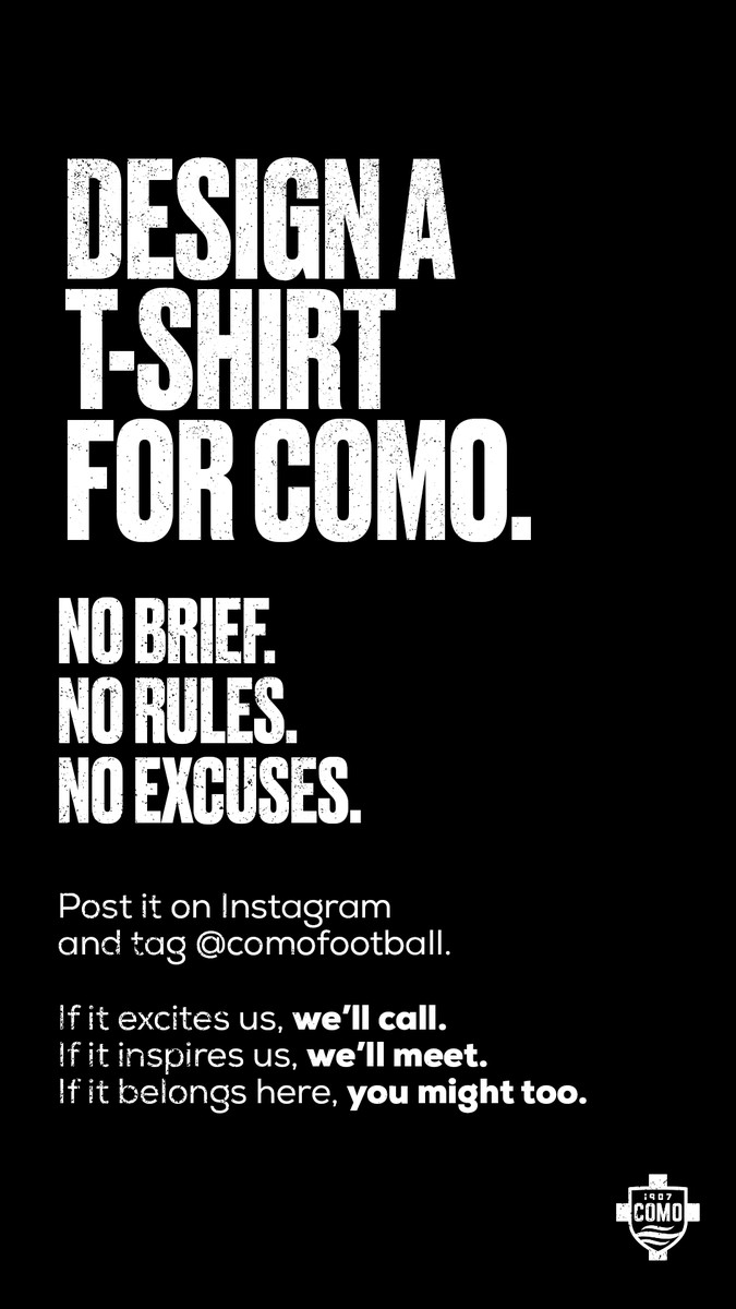
Como 1907 Announce Kit Design Contest
Italian club Como 1907 has launched a new design contest, inviting fans and designers to create a new look for the team. While the official announcement asked supporters to design a t-shirt for Como, it is likely that the club is referring to a football kit, given the context of the post and the reactions from the fanbase.
The club has kept the instructions incredibly open, stating there is no brief, no rules, and no excuses. To enter the competition, fans simply need to create their design, post it on Instagram, and tag the official Como 1907 account.
The announcement has already sparked significant interest online, with numerous supporters sharing their concepts and ideas. Whether the winning design will be produced as an official match kit, a pre-match shirt, or a special edition lifestyle item remains to be seen, but it offers a unique opportunity for fans to leave their mark on the club's visual identity.
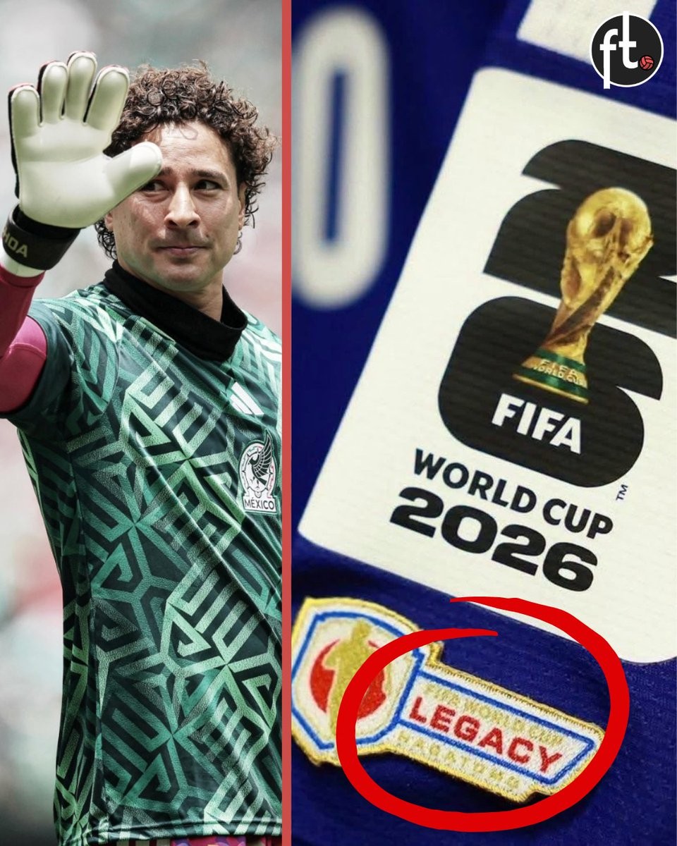
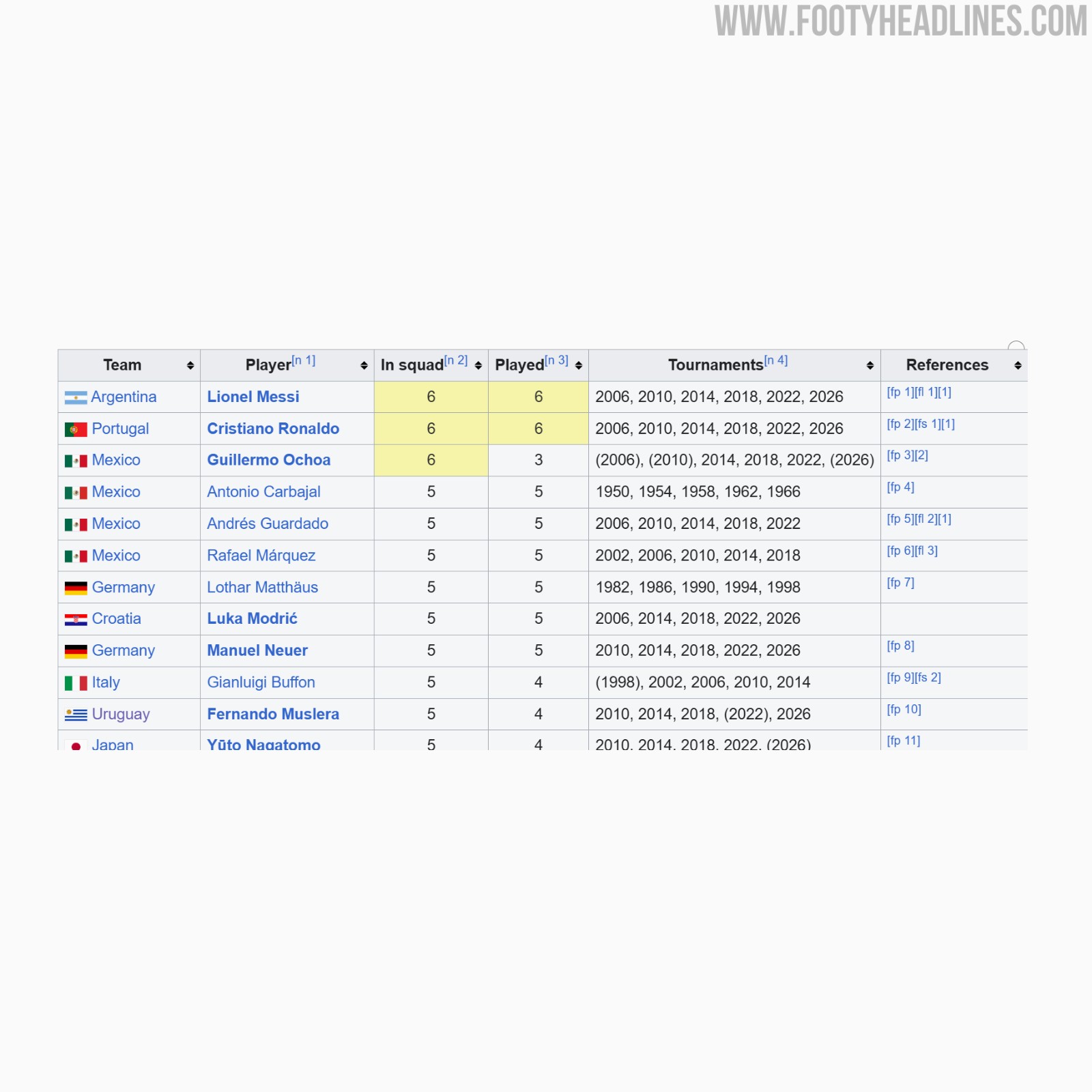
FIFA Denies Guillermo Ochoa 2026 World Cup Legacy Patch Over Appearance Rules
Guillermo Ochoa has been denied the chance to wear FIFA's new legacy patch at the 2026 World Cup. Despite being selected for six World Cup tournaments spanning from 2006 to 2026, the Mexican goalkeeper does not meet the strict criteria set by FIFA. The governing body requires players to have made on-pitch appearances in at least five different World Cups to qualify for the special badge.
Ochoa did not play any minutes during the 2006 and 2010 tournaments, meaning he has only registered on-pitch appearances in three World Cups prior to the 2026 edition. Because of this, FIFA officially refused to award him the patch. Other veterans playing in the tournament, such as Lionel Messi, Cristiano Ronaldo, Luka Modric, Manuel Neuer, and Yuto Nagatomo, have received the legacy patch for meeting the five-tournament appearance threshold.
The Mexican Football Federation is reportedly planning to push for a reconsideration of the ruling. If Ochoa features in a match during the 2026 tournament, the federation intends to appeal FIFA's decision in hopes of securing the legacy patch for the veteran goalkeeper.

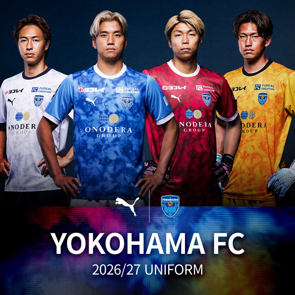
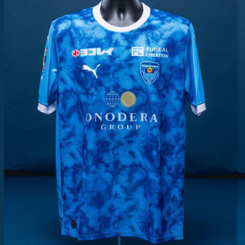
Yokohama FC 26-27 Home & Away Kits Released
Japanese J2 League club Yokohama FC have officially released their new Puma 2026-27 home, away, and goalkeeper kits. The new Yokohama FC 26-27 shirts feature an abstract graphic design that represents flow and movement across all the jerseys. The home jersey is predominantly blue, while the away kit is white. The goalkeeper kits complete the collection in red and yellow colorways. The Puma Yokohama FC 2026-27 kits are available to purchase via the club's online store.


