
4 Inter Milan Concept Logos & How They Look On Kits
 Jan 19, 2021, by Chris

In less than two months, Inter Milan will reveal a whole new logo and visual identify. Following the news of Inter changing their crest, Inter fans and graphic designers have imagined how the new Inter logo could look like.

Inter Milan Logo Redesigns
The concept designs for the new Inter logo incorporate the I and the M of Inter Milan, as it was leaked the official new logo will feature. Some of them keep traditional elements of the Inter crest, while the one of FrancooC07 ditches all of the current Inter logo for just an intertwined I and M.


Inter concept logo by @FrancooC07 on current kits


As revealed by newspaper Gazzetta dello Sport, the official new Inter logo will "play on the I and the M, winking at a modern Milan".
Inter Milan Redesign I by @andreagranieri


Inter Milan Redesign II by @andreagranieri

Inter Milan Redesign by @ilpecoranera

Inter Milan Redesign by @FrancooC07


Do you like these Inter Milan concept logos? Which would you accept as new Inter logo? Comment below.
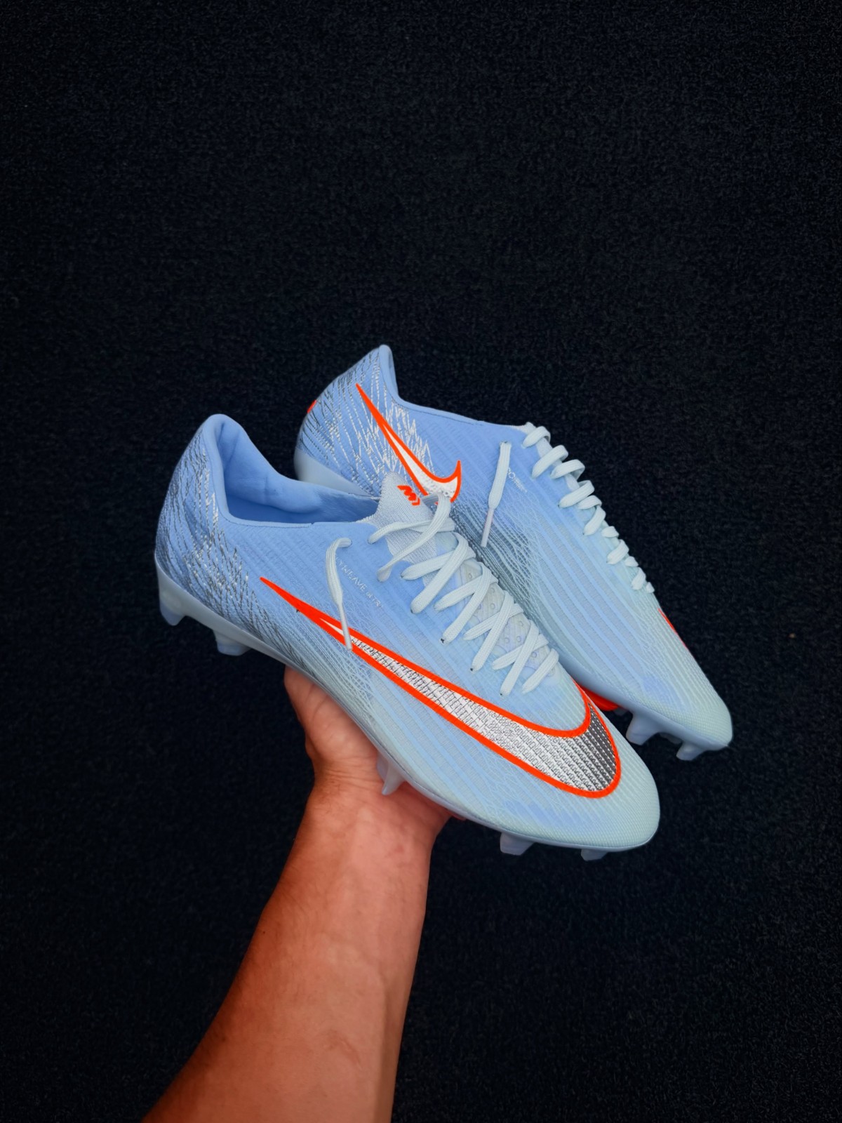
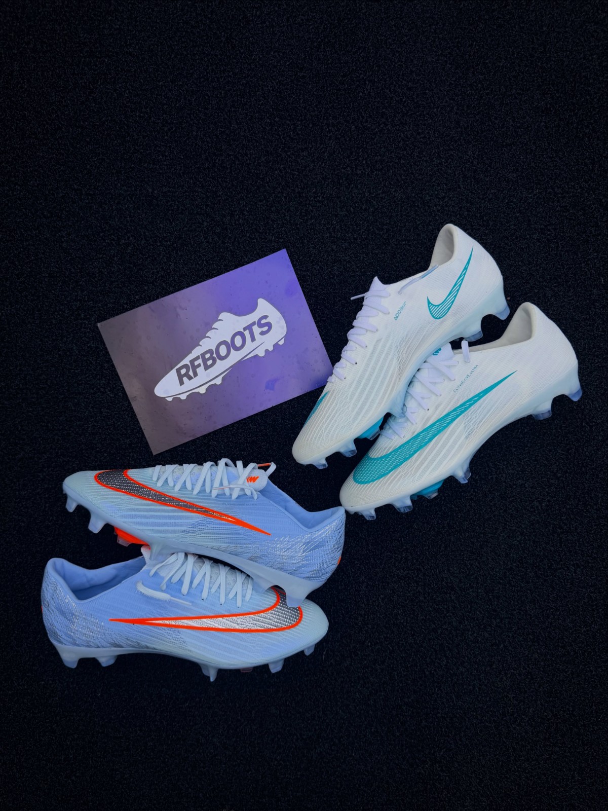
Nike Mercurial 26-27 'United' Pack 4 Boots Leaked - 3 New Pictures
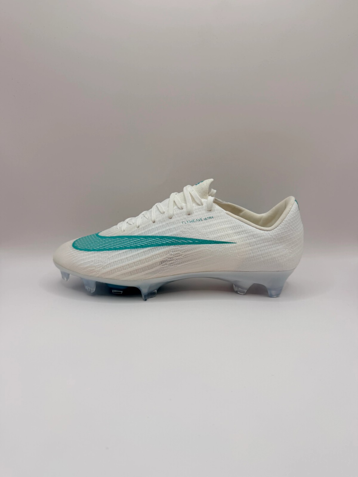
rfboots has leaked new images of the new Nike Mercurial Superfly 11 boots, part of the United 004 collection, which will be released soon.
The boots feature a fresh light blue primary color with vibrant orange details, including a silver Swoosh with orange outlining and an orange Nike United logo on the heel.


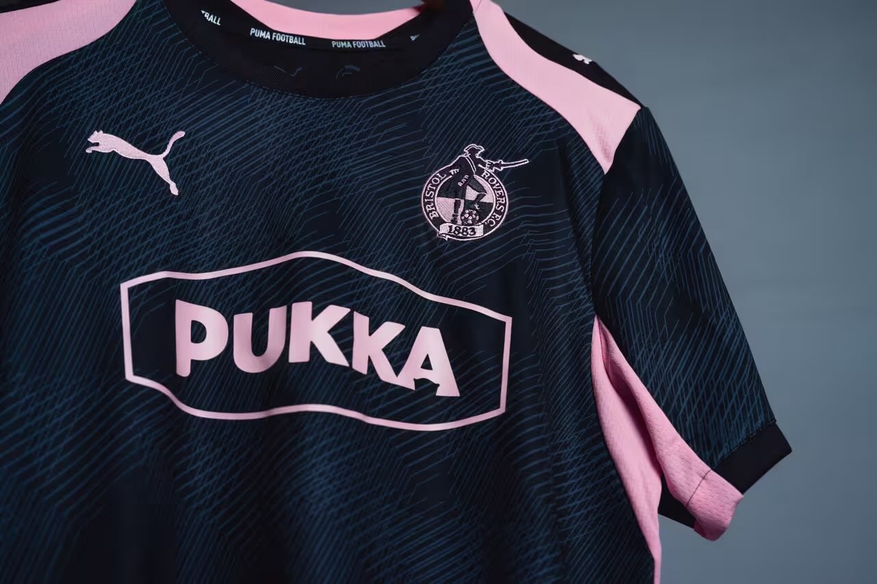
Bristol Rovers 26-27 Third Kit Released
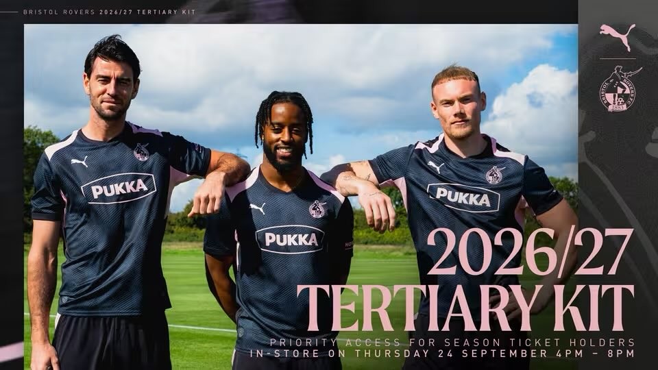
Bristol Rovers have officially unveiled their new 26-27 third kit, produced by Puma. The tertiary strip was already given an on-pitch debut by the squad during their recent League Two away match against Gillingham.
The Puma Bristol Rovers 26-27 third shirt introduces a stylish look with a black base and soft pink accents. A subtle tonal line pattern covers the front and back of the torso, complemented by contrasting pink inserts along the shoulders, side panels, and collar. The monochrome club crest, Puma cat branding, and front-of-shirt sponsor Pukka are all finished in the same matching pink shade.
Black shorts and black socks with pink detailing complete the new Puma Bristol Rovers 26-27 third uniform. Season ticket holders will have early access to purchase the strip at an exclusive club shop event on September 24, followed by a general in-store release on September 25 and online sales starting September 28.
Colombia's DIMAYOR Mandates Standard Helvetica Font for All Teams From 2027
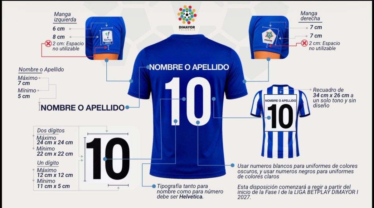
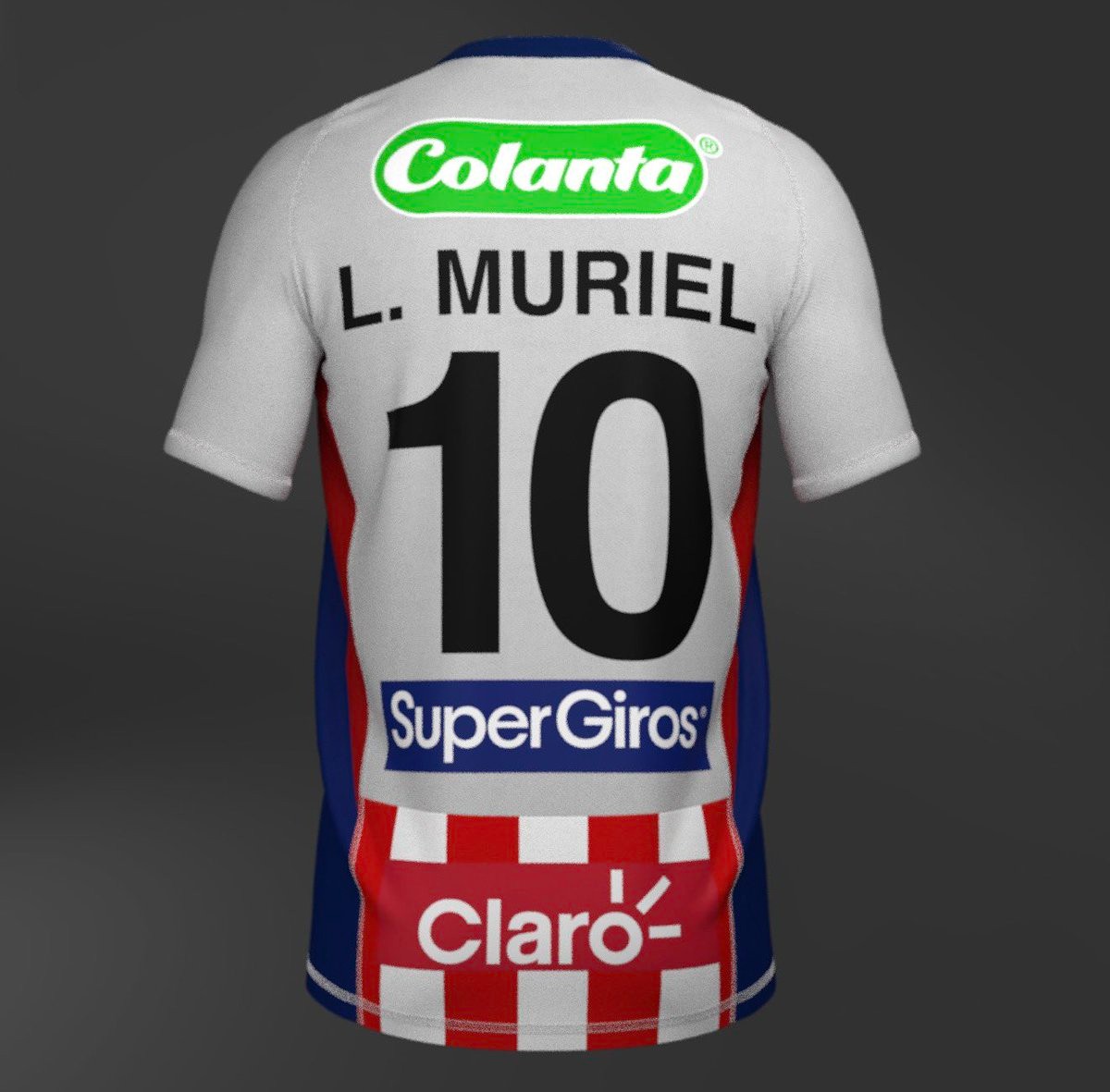
Colombian football governing body DIMAYOR is set to introduce sweeping kit branding regulations starting with the 2027 Liga BetPlay season. An official circular distributed to professional clubs outlines strict new rules for shirt names, numbering, and sleeve badges. Most notably, the league will mandate Helvetica as the sole official typeface for player names and squad numbers across all participating teams, stripping clubs and kit manufacturers of the ability to use custom fonts. Big thanks to @cdfactoryco.
Beyond standardizing the typography, the regulations strictly govern visibility and colors. All names and numbers must appear either in solid black on light-colored kits or solid white on dark-colored kits, with no additional accent colors or outlines permitted. For shirts featuring stripes or graphic patterns, clubs must integrate a blank, single-tone rectangle measuring exactly 34 cm by 26 cm on the back to host the number. Player names must be positioned directly above the number with a font height between 5 cm and 7 cm, while DIMAYOR and competition sleeve badges will have designated dimensions and mandatory placement below club sponsor patches.
DIMAYOR is also putting an end to unconventional squad numbers. Players will only be allowed to wear consecutive integers from 1 up to the total number of registered squad members, outlawing high numbers such as 77, 88, or 99. The drastic move has sparked backlash among Colombian football fans and kit designers, who have criticized the choice of a standard office typeface and the loss of distinctive club identity on the pitch.
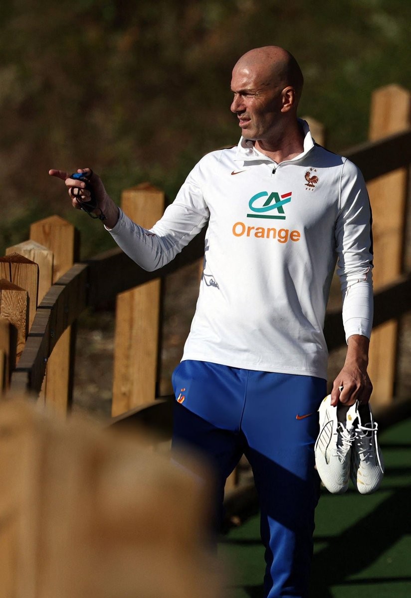
Zinedine Zidane Wears Limited-Edition Adidas "Zidane x Adidas" 30-Year Anniversary Boots in France Training
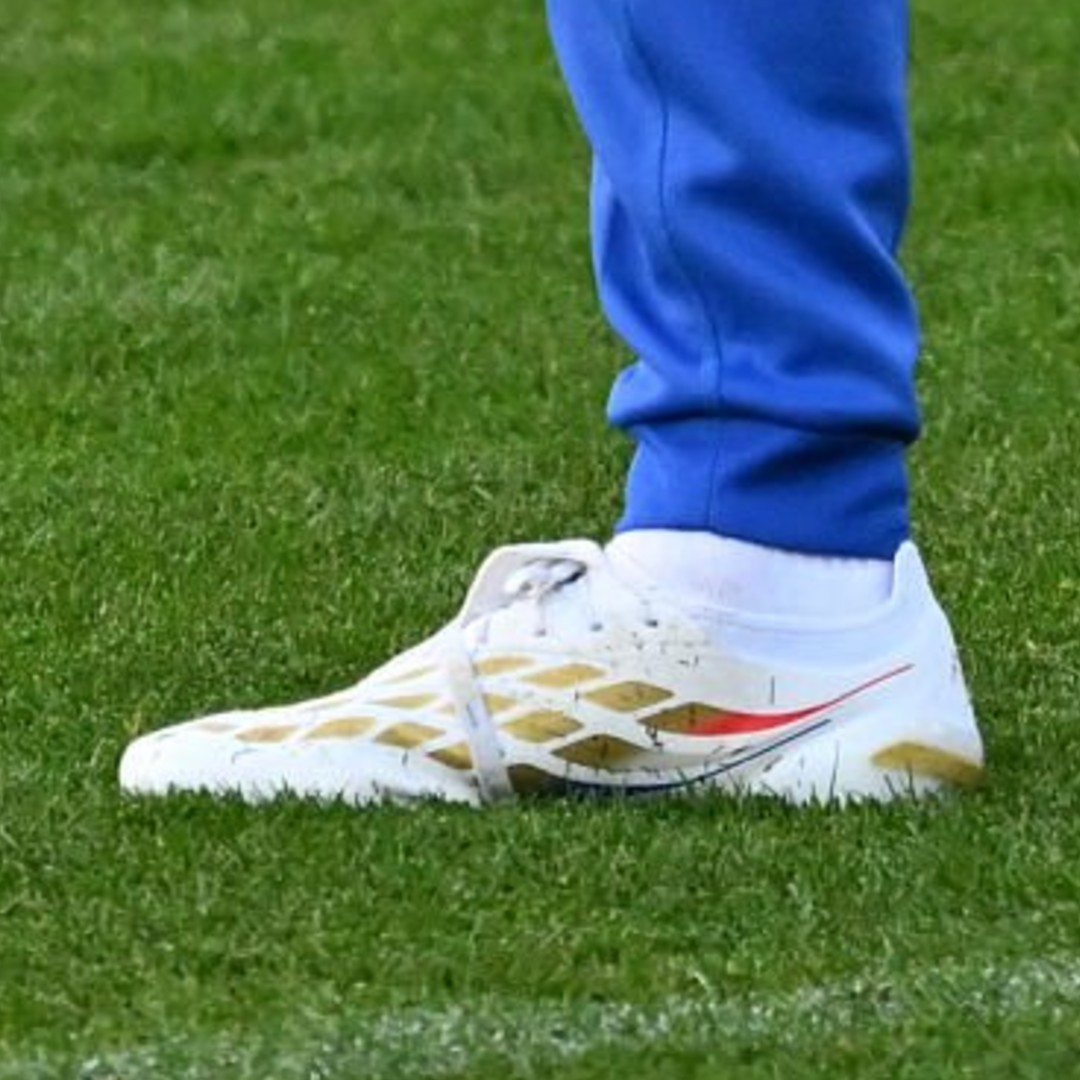
France head coach Zinedine Zidane was spotted lacing up his limited-edition Adidas Predator 26 'ZZ30' 30-Year Anniversary boots during Les Bleus' training session at Clairefontaine. Leading the squad onto the pitch ahead of their upcoming fixtures, the French maestro gave his latest signature boots an on-pitch debut in classic Zizou fashion.
Officially launched in September 2026, the boots mark three decades since Zidane first joined forces with Adidas ahead of Euro 1996. The boot features a clean Cloud White base highlighted by metallic gold detailing, accompanied by French Tricolore accents on the heel. Personal touches celebrating his iconic career are visible throughout the design, including 'ZZ30' branding, references to cities that shaped his journey, and a graphic paying tribute to his famous 2002 Champions League final volley.
Bespoke details include a classic folded tongue with the number '30', the stylized nickname 'ZI30U' on the soleplate and insole, and a graphic depiction of Zidane's legendary 2002 Champions League final volley on the heel counter.
Inter Miami Announce American Airlines as First-Ever Airline Partner
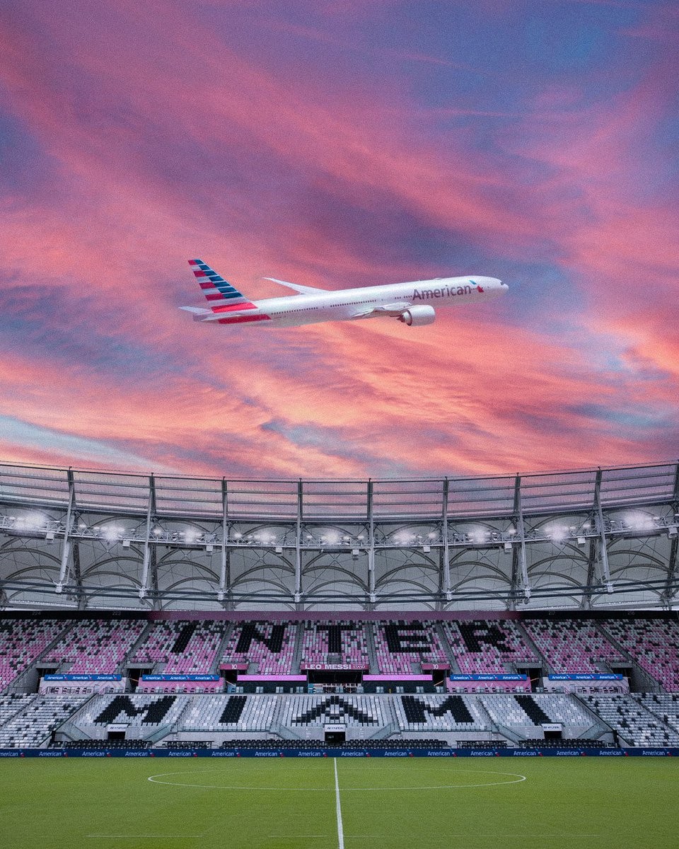
Inter Miami CF have officially announced a multi-year partnership with American Airlines, naming the carrier the club's first-ever Official Airline Partner. Under the extensive agreement, American Airlines becomes an Official Partner of Inter Miami as well as a Founding Partner of both Nu Stadium and the broader Miami Freedom Park district.
As part of the deal, the premium hospitality West Club inside the new venue will be rebranded as the American Lounge. Covering more than 14,500 square feet across the entire west stand and seating over 1,800 fans, the lounge will anchor the airline's presence on matchdays. The stadium site sits adjacent to Miami International Airport, which serves as American Airlines' third-largest hub.
The collaboration also introduces bespoke fan experiences through the carrier's AAdvantage loyalty program, offering members pitchside access for the second half of matches, away-game travel packages, and the ability to redeem miles for tickets and VIP experiences. The club will additionally host an annual American Airlines Theme Night, with the first celebration scheduled for October 14, 2026.
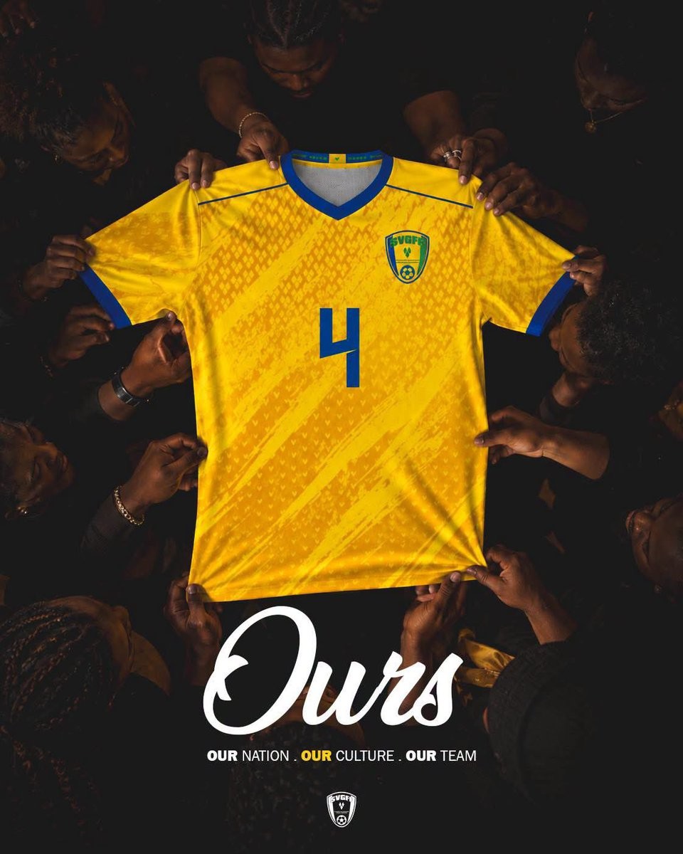
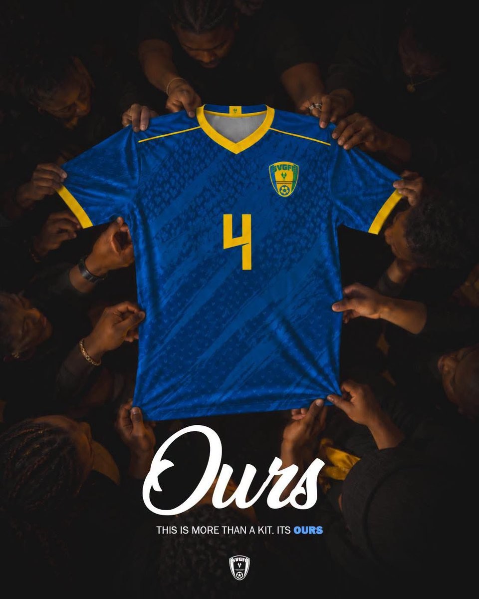
In-House Saint Vincent and the Grenadines 2026 Kits Released
The Saint Vincent and the Grenadines Football Federation (SVGFF) has officially unveiled a brand-new set of in-house kits for the national football team, nicknamed Vincy Heat. Opting out of a deal with a traditional sportswear brand, the federation designed and produced the collection internally under a dedicated campaign titled "Ours."
The launch showcases three distinct colourways celebrating the island nation's flag: yellow, royal blue, and emerald green. All three jerseys share an identical template characterized by a sharp V-neck collar, fine contrast shoulder piping, and matching sleeve cuffs. Across the torso, each shirt features a dynamic diagonal brushstroke pattern embedded with micro-motifs reminiscent of the three diamonds seen on the national flag.
Contrasting details complete the look, with royal blue accents adorning the primary yellow jersey, and vivid yellow trims framing both the blue and green alternatives. Centered around themes of national pride and identity, the collection is headlined by slogans such as "Our Nation. Our Culture. Our Team" and "Wherever we go, we carry home."