UEFA Kit Color Blindness Simulation - Why Dark vs Light Is The Ideal
 Jan 16, 2021, by Chris

Have you ever wondered why FIFA and other football government organizations are so strict with the color of kit and the light / dark kit rule? This is not only for TV but also for color blind people.

As part of a campaign to maximise awareness and improve the experience of colour blind people in football, the English Football Association and UEFA have joined forces with the Colour Blind Awareness organisation to produce a guide booklet.
One in 12 men (8%) inherit red/green colour blindness

What Is Colour Blindness?

Colour blindness is the inability to perceive colours normally. It is one of the world’s most common genetic conditions. However, colour blindness is under-recognised and poorly understood.
How Likely Is It To Be Colour Blind?

Approximately one in 12 men (8%) inherit red/green colour blindness but only 1 in 200 (0.5%) of women do. Colour blindness is very common in men because it’s carried on the X-chromosome. Men only have one X chromosome, but women have two. For a woman to be colour blind she must inherit colour blindness on both of her X-chromosomes.
UEFA Simulates How Color Blind People See Kits

UEFA released various images that show how we (non-colorblind) see and how a colorblind sees the game - the ideal is to always have a light and a dark team.
It is actually impossible for colorblind people to distinguish some teams in some matches

It is actually impossible for colorblind people to distinguish some teams when they are wearing certain kit colors - the kit combinations which cause the greatest problems for colour-blind people are:

- Red v black
- Red v green v orange
- Bright green v yellow
- White v pastel colours
- Blue v deep purple/pink
Below is another example illustrating the difference in how a non-colorblind and a colorblind see uniforms.

Color Blindness - Issues in Football
- Kit clashes - between players, goalkeepers, match officials, the playing surface
- Equipment - balls, bibs, training cones, line markings
- Venues - facilities, way-finding, safety signage, lighting
- Information - digital, ticket purchasing, matchday programmes
- TV coverage - graphics, long-distance camera angles
Best-practice kit combinations:

UEFA also made a short overview of which kit combos are good to distinguish for color blind people.
The more colour combinations there are in a kit, the more likely it is that kit clashes will arise. This can be an issue for your own players as well as spectators, so it’s important to avoid kit clashes as far as possible. For example, blue v white kit can easily be distinguished, as the photo below shows.

Good kit colour combinations for people with colour blindness
- White v black
- Red v yellow
- Black v yellow
- Blue v bright reds
- Blue v yellow


Do you now understand why FIFA is so strict regarding their light / dark kit rule? Were you aware of color blind people and their issues in football? Comment below.
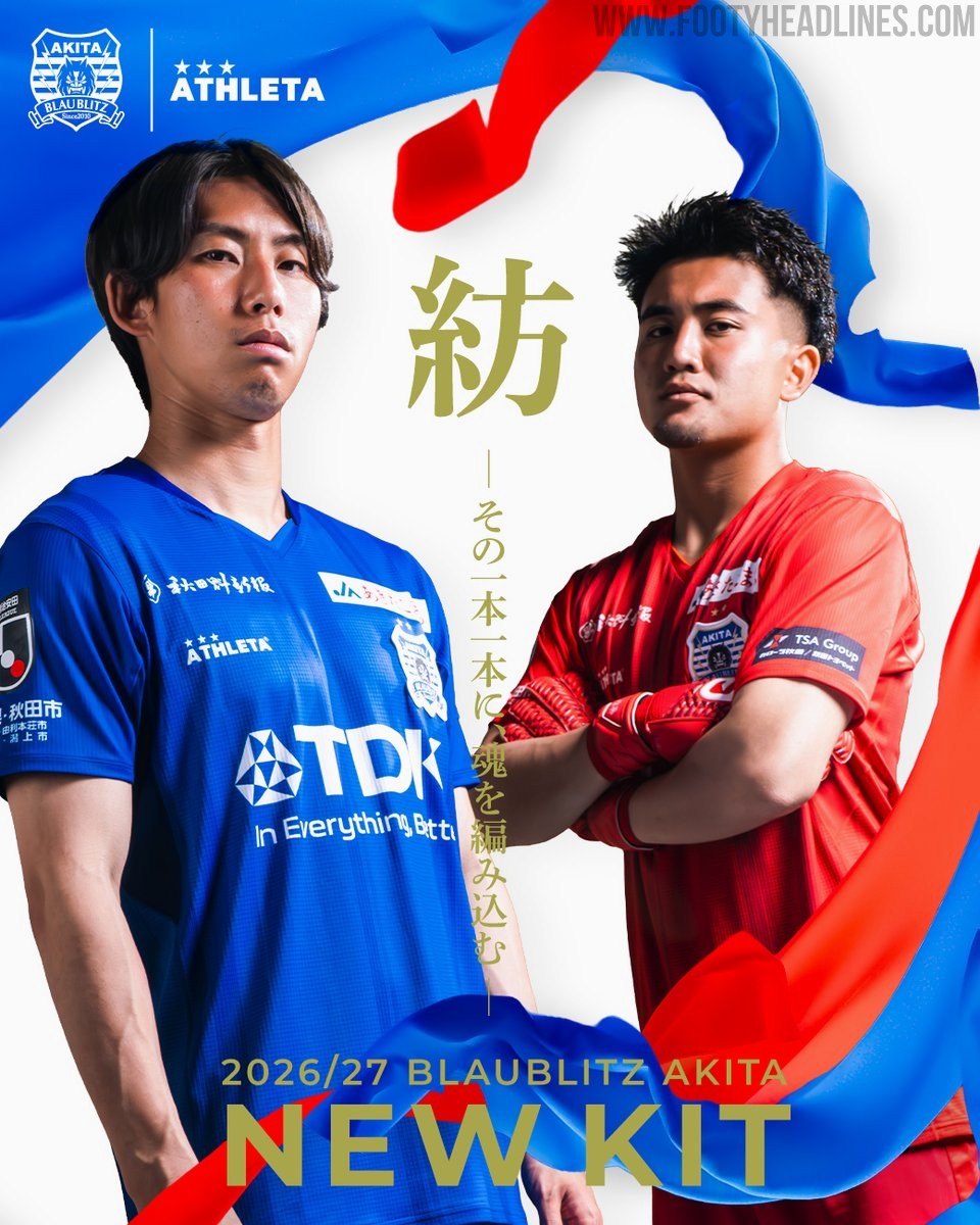
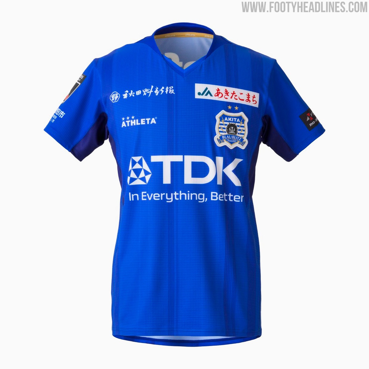
Blaublitz Akita 26-27 Kits Released
Japanese J2 League club Blaublitz Akita have unveiled their new 2026-27 kits. Made by Athleta, the new kits feature a distinct design inspired by the concept of weaving.
The Athleta Blaublitz Akita 2026-27 kits are designed around the theme of weaving, reflected in a woven pattern on the shirts, symbolizing the unity of the stakeholders spinning their efforts onto the pitch.
The new Athleta Blaublitz Akita 2026-27 kits will be available to pre-order starting July 6, 2026, with deliveries planned ahead of the start of the new league season.


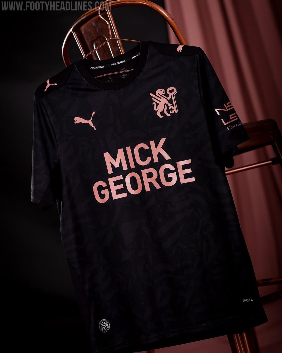
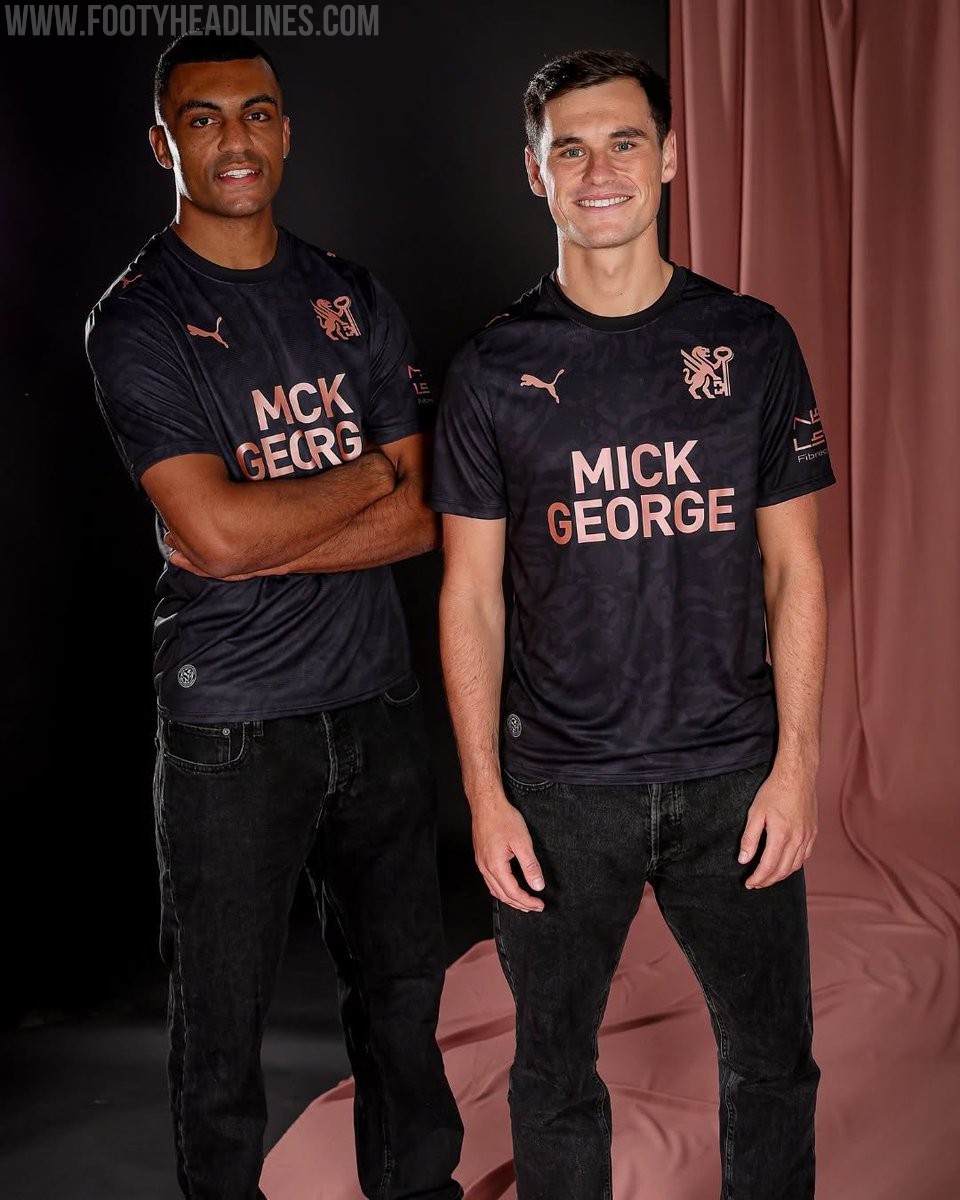
Peterborough United 26-27 Away Kit Released
League One side Peterborough United have officially launched their new Puma away kit for the 2026-27 season. The strip was unveiled during the club's Fan Zone Fun Day event on July 4, following the release of their home kit earlier in the summer.
The Peterborough United 2026-27 away shirt showcases a contemporary design that aligns with the club's new direction. It features a black base with rose gold accents. It also prominently features the club's newly introduced crest, marking a fresh chapter for the team.
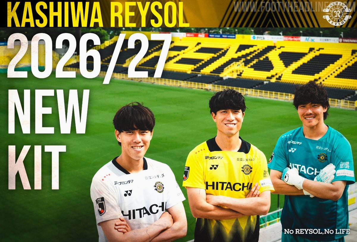
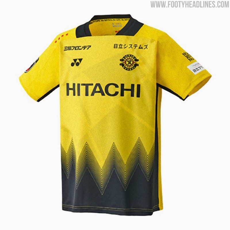
Kashiwa Reysol 26-27 Kits Released
Japanese J1 League club Kashiwa Reysol has officially unveiled its new 2026-27 kits, which are once again designed and manufactured by Yonex. The official launch on July 4 follows a short teaser video released earlier in the week and coincided with the announcement of the club's squad and player numbers for the upcoming season.
The Kashiwa Reysol 2026-27 kits feature a striking design centered around the concept of "Break the Light." The home shirt incorporates the club's traditional yellow and black colors, separated by dynamic geometric patterns that symbolize moving through the light. The away and keeper kits mirror the design in different colors.
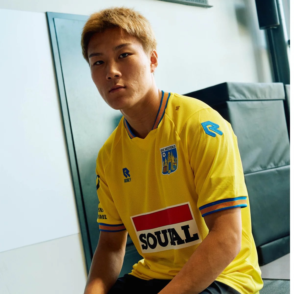
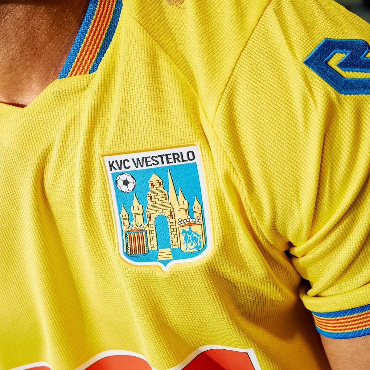
Robey KVC Westerlo 26-27 Home Kit Released - No More Nike
Belgian club KVC Westerlo has unveiled their new 2026-27 home kit, marking the beginning of a new partnership with Robey Sportswear. The Dutch brand takes over from Nike, which had supplied the club's kits since 2022.
The Robey KVC Westerlo 2026-27 home shirt features the club's traditional yellow and blue colors. Launched with the slogan 'Designed for you. Worn by you. Because you are Westel,' the design aims to celebrate the strong bond between the team, its supporters, and the local Kempen region.