8 Champions League Teams Who Could / Should Update Their Logo
 Feb 17, 2021, by Chris

When watching the UEFA Champions League yesterday night and seeing an overview of the matches of the Round of 16, a thought flashed through our mind - a few teams have somehow outdated logos that did not look greatly on the screen. We take a look at the teams we think could update their logo.
Logo changes are often very controversial, as is this article

We are aware that this topic is very controversial. Our article is only meant to contribute to the discussion of teams changing their logos and is not a call for any team to change the logo at all.
UEFA Champions League Last Sixteen Teams - Logos
In the past few months, not only many football teams have introduced new logos - most of the big companies updated their visual identities to match better the digital age.
3D effects were a think of the early 2000s
In fact, some of the current football logos have styles that are surely out of date - mainly 3D effects.
In fact, not only many football teams have introduced new logos in the past few years - most of the big companies updated their visual identities to match better the digital age.


Oddly enough, in the world of fashion and luxury, most brands already ditched their old-styled San Serif logos. This was made to shift their image from the old-world luxury, to a fresher and simpler ethos.


Atalanta BC

The Atalanta Bergamo logo was last updated in 1983 - the removal of the inner circle and a larger head would enhance the look.

FC Barcelona

The club already wanted to update their crest in 2018 - the elements itself (St. George's cross, Catalan flag, Blaugrana stripes) and shape would all have been kept, but the fans protested against the removal of the FCB lettering.

We think that a small update of the crest would work wonders - see the concept below, which greatly keeps the iconic design while adapting to the "new technologies".

Chelsea

Chelsea could remove the shadow effect of the lion and it would look better - just as it is on the kits.
Liverpool FC

Liverpool's branding has been inconsistent since they opted just for LFC crest instead of the regular club logo. We like the current club logo, however, so we do not think an update is needed in terms of design.

SS Lazio

Lazio's crest has some great elements but the ratio of them just are not perfect. A new logo boasting the eagle could look much better.
FC Porto

FC Porto's crest is one of those logos that feature a 3D gradient effect and a general early 2000s style. We think an update would be appropriate.
Paris Saint-Germain

There is nothing wrong with the PSG logo for us except one thing - the 3D gradient effect...
Manchester United (Not In Last 16)

Last updated in 1998, Manchester United's iconic crest includes some gradient designs and design styles that just look outdated. We think an updated crest could look better - their kits already come without all those gradient effects, and already with that it actually looks better.


Which of the last 16 Champions League teams will be the first to change their logo? Should Man Utd update their logo? Comment your guess below.

Atalanta 26-27 Third Kit Released
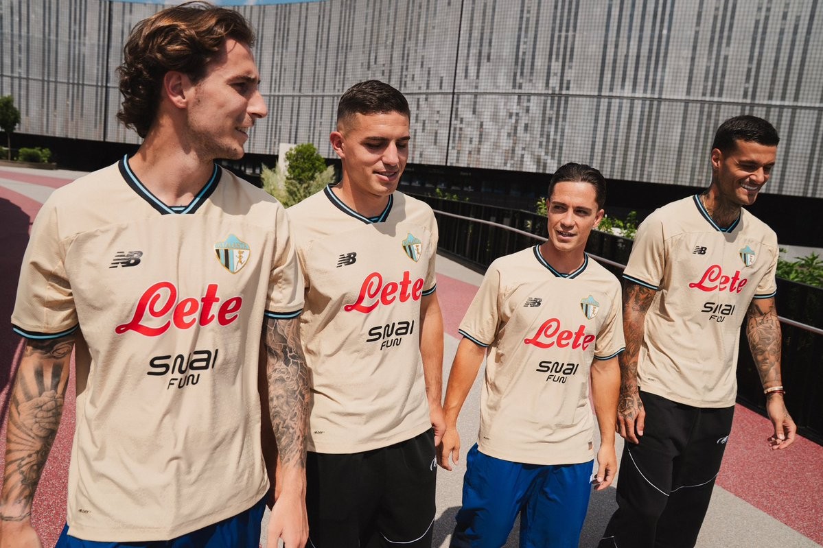
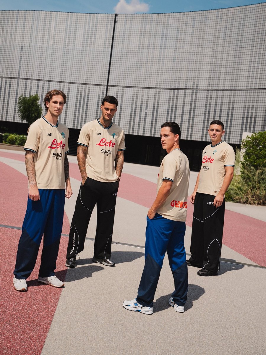
Atalanta and New Balance have officially unveiled the club's new third kit for the 26-27 season. Completing the Italian side's set alongside the previously launched home and away strips, the jersey introduces an elegant aesthetic rooted in the architectural heritage of Bergamo.
The New Balance Atalanta 26-27 third shirt is finished in a warm beige base officially dubbed 'Toasted Sesame', accented by black and 'Taffy Blue' trim on the V-neck collar and sleeve cuffs. Subtly woven across the body is a geometric jacquard pattern inspired by the famous sundial of Bergamo's Palazzo della Ragione. The chest prominently features Atalanta's retro 1964 crest, which depicts the running goddess alongside traditional black and blue stripes.
The New Balance branding appears in black, while Lete's red logo and SNAIFUN complete the front sponsorship. Inside the collar, a bespoke graphic highlights the Bergamo skyline accompanied by the motto 'LA MAGLIA SUDATA SEMPRE'. Crafted with breathable NB DRYx technology, the new kit is available now via the club's official channels.
Thailand Forced to Change Kits at 2026 FIFA ASEAN Cup
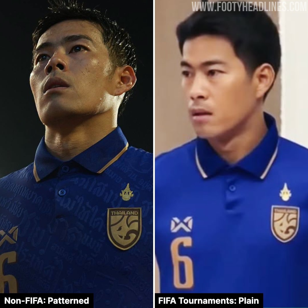
According to Ball Stand Thailand, the Thailand national team and Warrix must modify their kits for the 2026 FIFA ASEAN Cup, as the current uniform violates FIFA regulations.
Laws 4 of the IFAB players' equipment prohibits any political, religious, or personal slogans, statements, or images on match shirt.
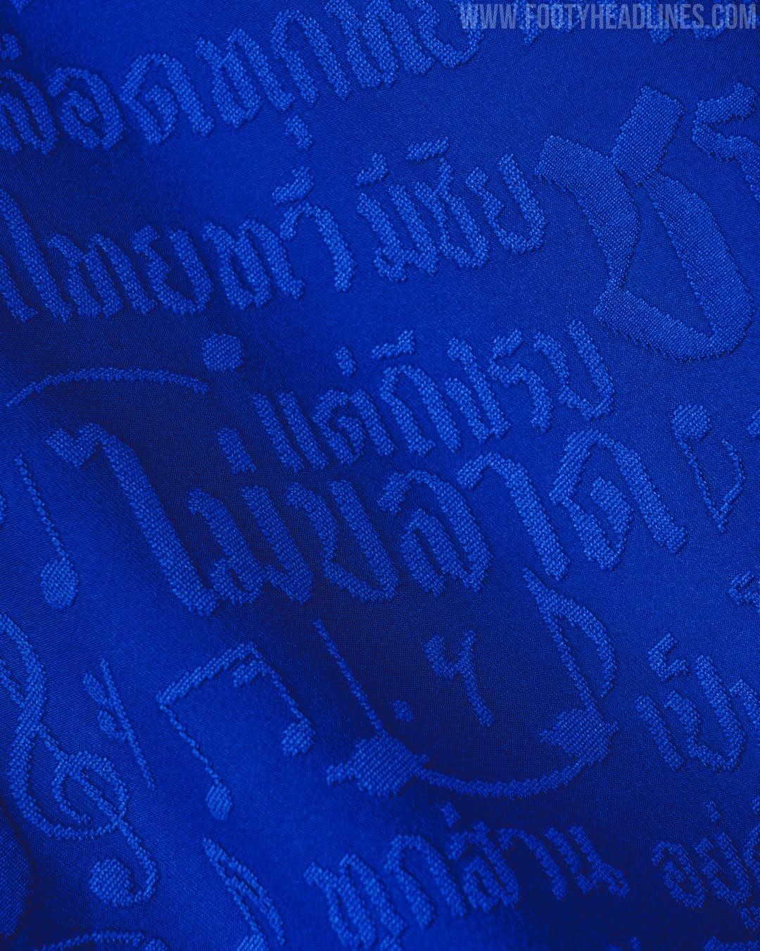
Thailand’s 2026–27 kits by Warrix feature an pattern of the national anthem lyrics. Although national anthem lyrics are not explicitly classified as prohibited text, incorporating a full sentence from the anthem or extracts with ideological undertones onto the kit is still considered a violation of slogan regulations.

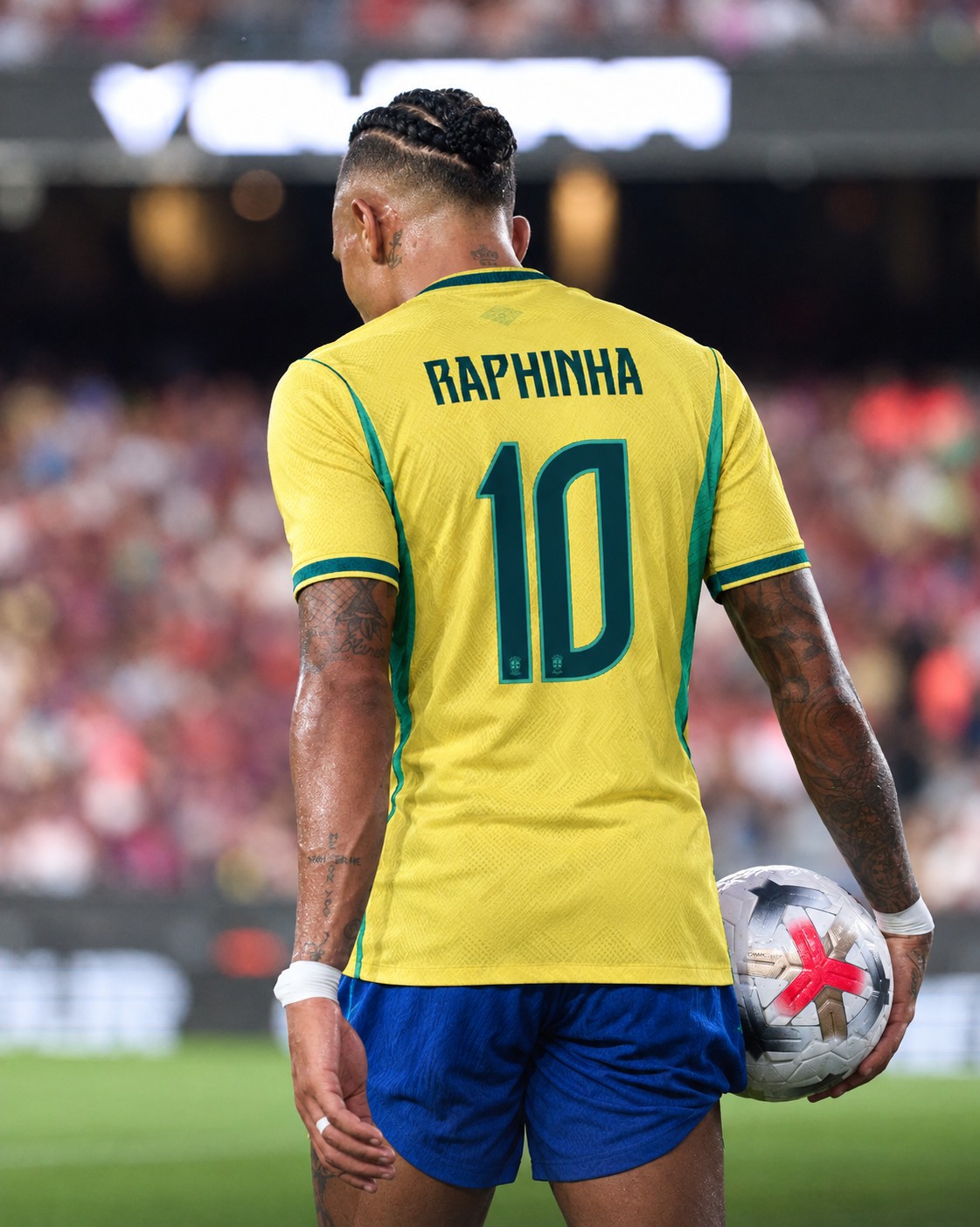
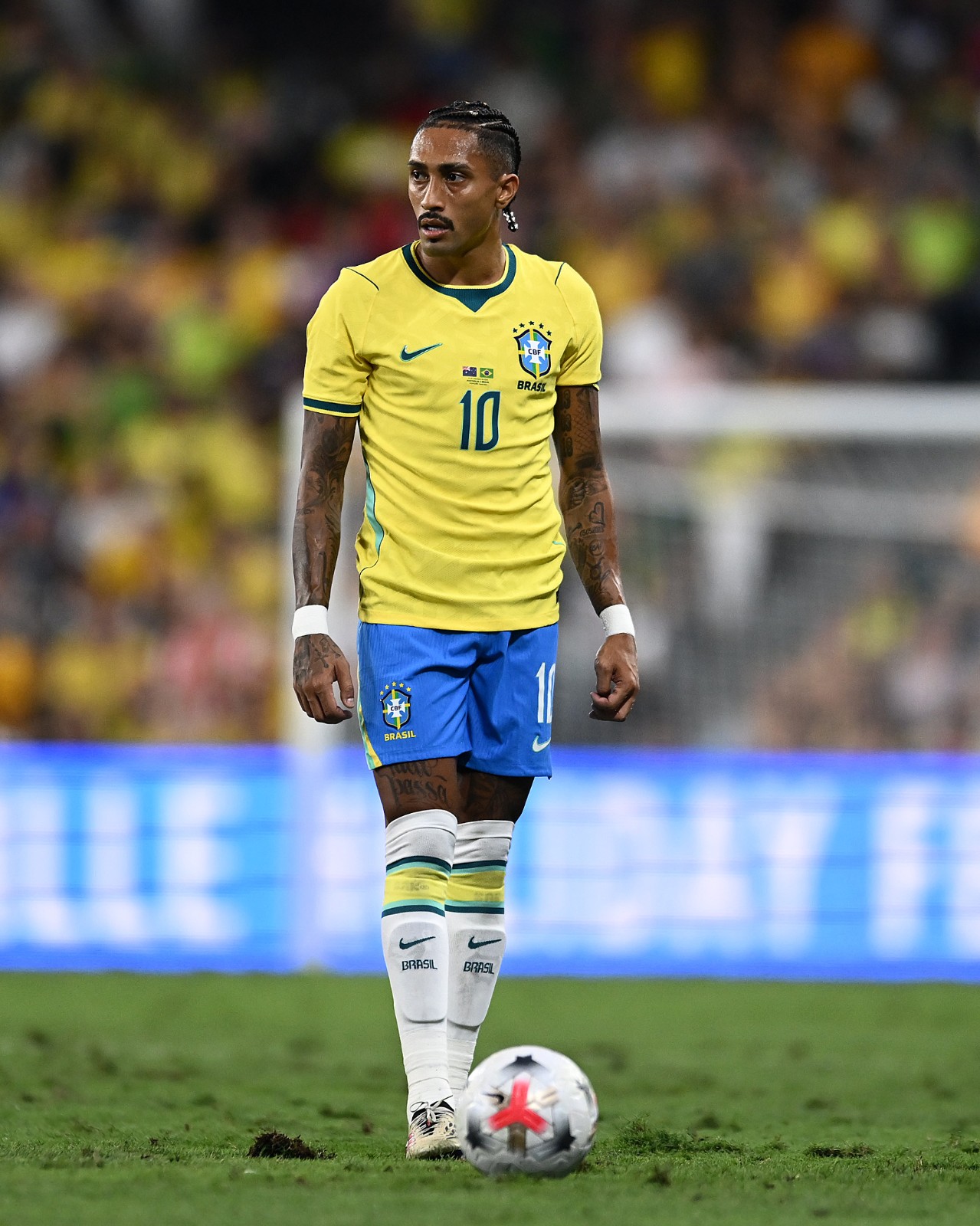
Raphinha Becomes Brazil's New Number 10
Raphinha officially wore Brazil's iconic No. 10 shirt for the first time in a friendly against Australia, becoming the latest player to inherit the famous number following Neymar's departure from the national team after the 2026 World Cup.
The Barcelona forward is no stranger to the shirt, having already worn No. 10 several times during Brazil's 2026 World Cup qualifying campaign when Neymar was unavailable.
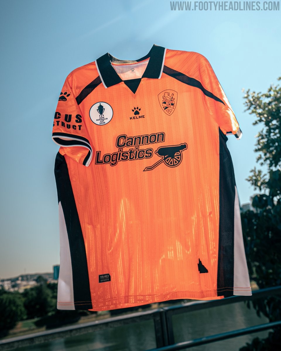
Kelme Brisbane Roar 26-27 Home, Away, Third & Goalkeeper Kits Released - No More Cikers
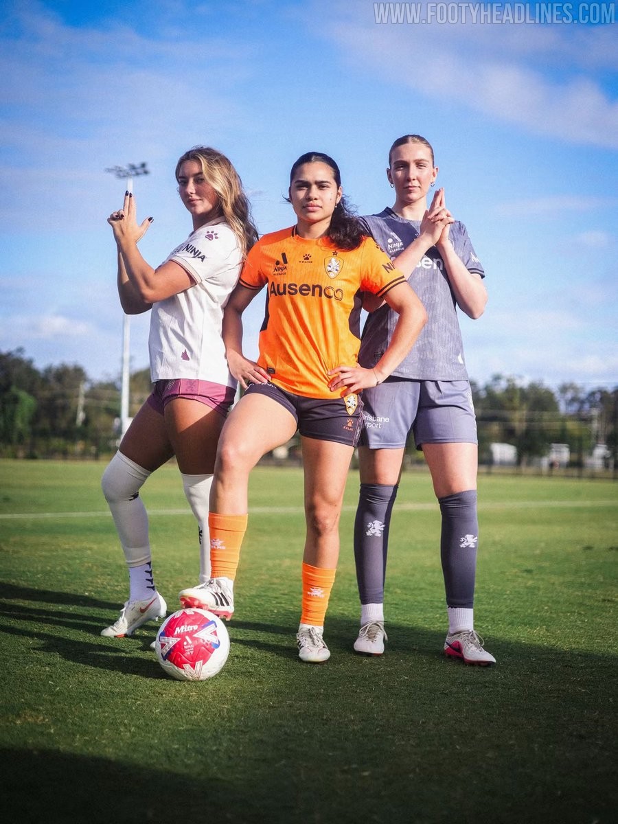
Brisbane Roar and Spanish brand Kelme have officially launched the club's new kit collection for the 26-27 A-Leagues campaign. The drop represents the manufacturer's first full league set for the Queensland side after signing a three-year technical partnership earlier this year, succeeding previous supplier Cikers.
The 26-27 home kit marks a return to the club's traditional orange and black combination. The jersey features a textured orange base, black trim along the collar and cuffs, and is completed with black shorts and orange socks. The away jersey provides a crisp contrast with an off-white base accented by maroon detailing and shorts, celebrating Queensland's traditional sporting colour. Across the jerseys, the men's team features new primary partner Focus Construct on the front, while the women's shirts display Ausenco.
A major highlight of the release is the retro theme seen across the alternate designs. The vibrant blue third kit revives Brisbane Roar's original 2005 logo above an embossed lion graphic sweeping across the bottom front, accented with orange details. The retro crest also takes center stage on the maroon goalkeeper shirt, which features an elegant polo collar framed by orange piping.
Leicester City 26-27 Third Kit Released
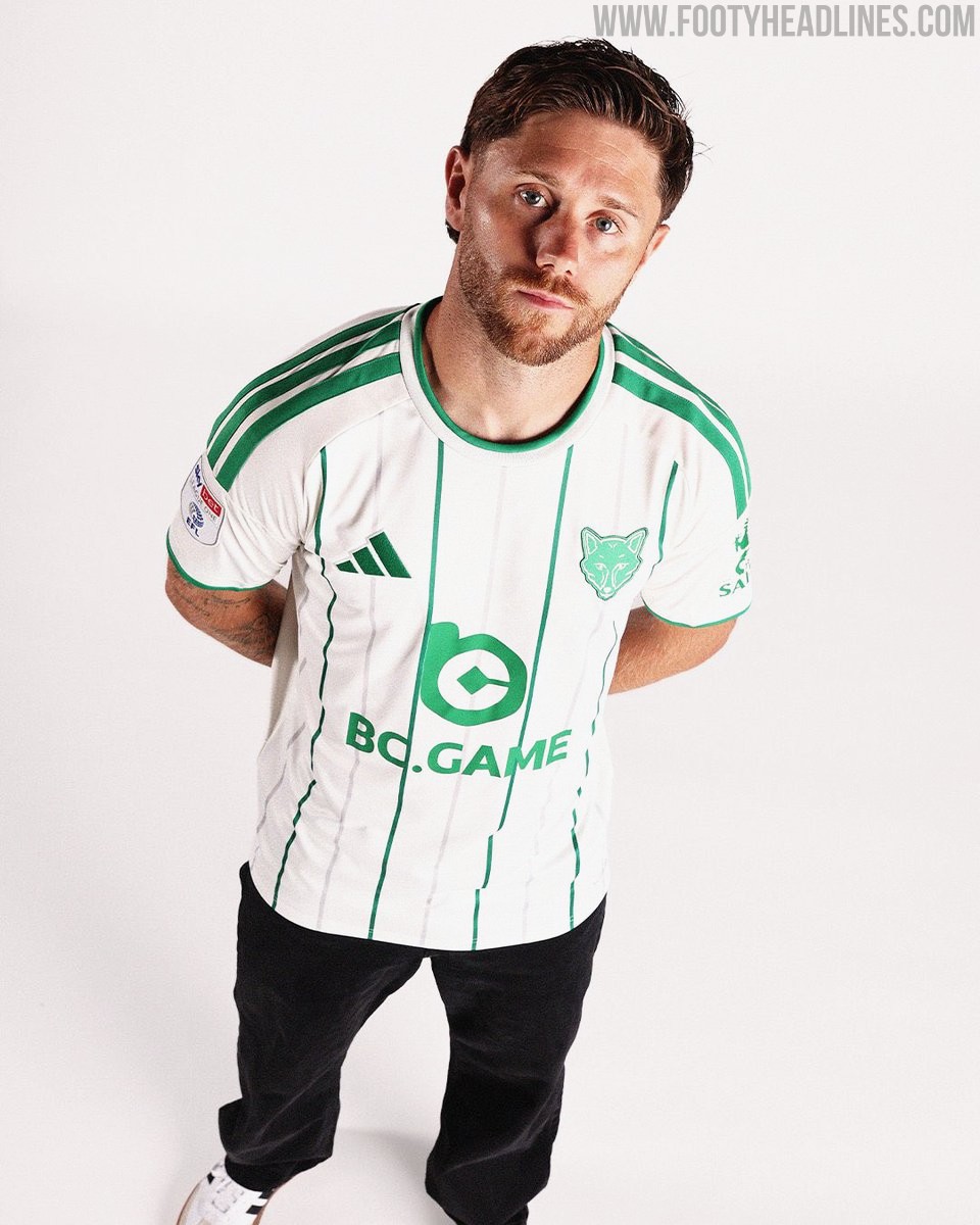
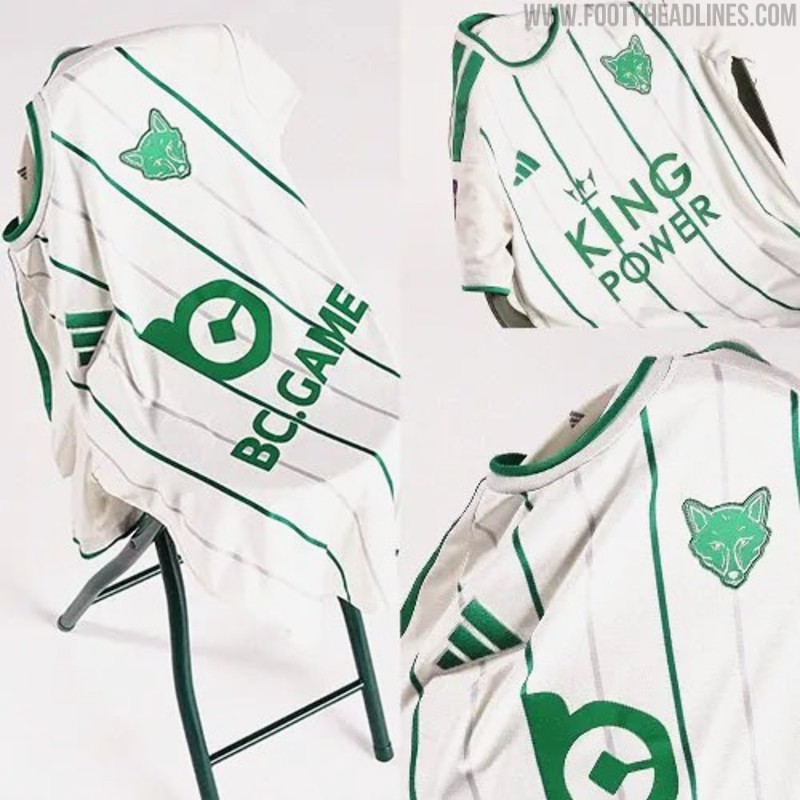
Leicester City and Adidas have officially unveiled their new third kit for the 26-27 season. Arriving seven weeks into the campaign, the fresh strip introduces a distinct look that rounds off the Foxes' wardrobe for the year, joining the blue home and maroon away shirts.
The Adidas Leicester City 26-27 third jersey pairs an off-white base with green vertical pinstripes running down the front. The collar, sleeve cuffs, and signature Three Stripes on the shoulders are also finished in matching green. The standout element of the shirt is the club crest, which replaces the standard full-color badge with a minimalist green fox head emblem. The Adidas Performance logo sits opposite in matching green, while the men's version features BC.GAME and the women's team kit showcases King Power sponsorship.
White shorts and socks with green accents complete the full strip. The Leicester City 26-27 third kit is currently available for pre-order via the club's official online store, with deliveries scheduled to commence in October.
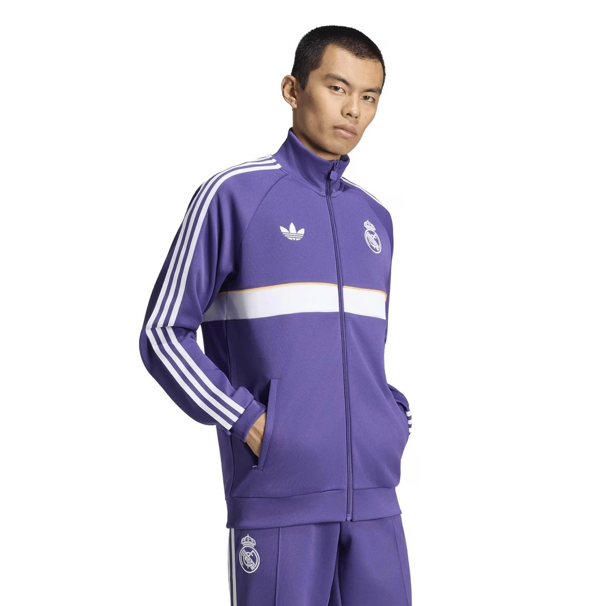
Purple Real Madrid 26-27 Originals Collection Leaked
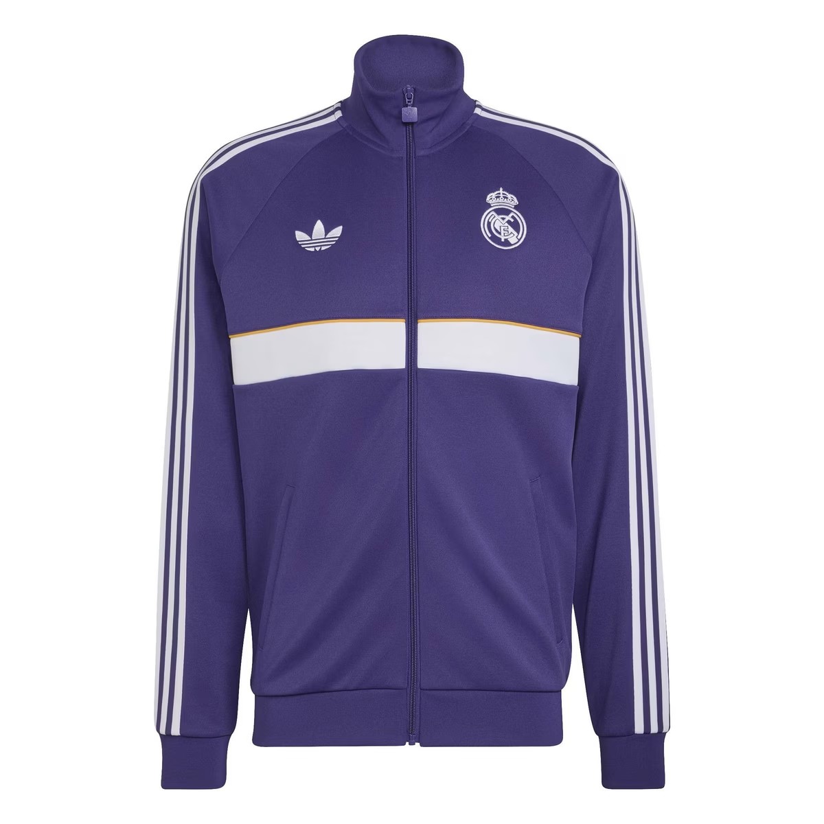
A brand new lifestyle collection from Real Madrid and Adidas have been leaked via online stores, giving a full look onto its purple Originals tracksuit.
The design of the jacket is identical to away anthem jacket range from the German brand this season, featuring a white horizontal band with a yellow/orange trim. Both logos are displayed in monochrome white, match with the shoulder three-stripes. The full tracksuit is expected to be used as pre-match outfit or anthem jacket, depending the club's own intention.
What do you think of the new Real Madrid 26-27 Originals collection? Let us know in the comments below.