New Montedio Yamagata Logo Presented
 Dec 10, 2021, by John
Recently, J2 League club Monedio Yamagata presented their new logo. We wanted to take a look at all the changes that were made.

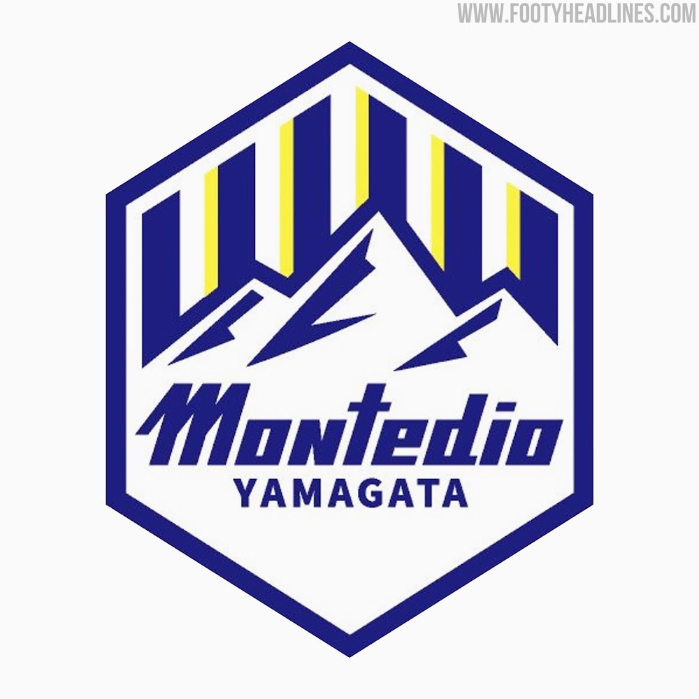
New Montedio Yamagata Logo
The new Montedio Yamagata logo presents several alterations compared to the old one.
Firstly, it removes all red from the badge, retaining the other colors, blue, white and yellow. The blue tone is slightly darker on the new logo, with the yellow remaining virtually the same shade.
Another major change is the shape of the club crest, which is now a hexagon rather than an oval. The border of this hexagon is blue and there is also a small gap between the blue, white and yellow stripes and the border.
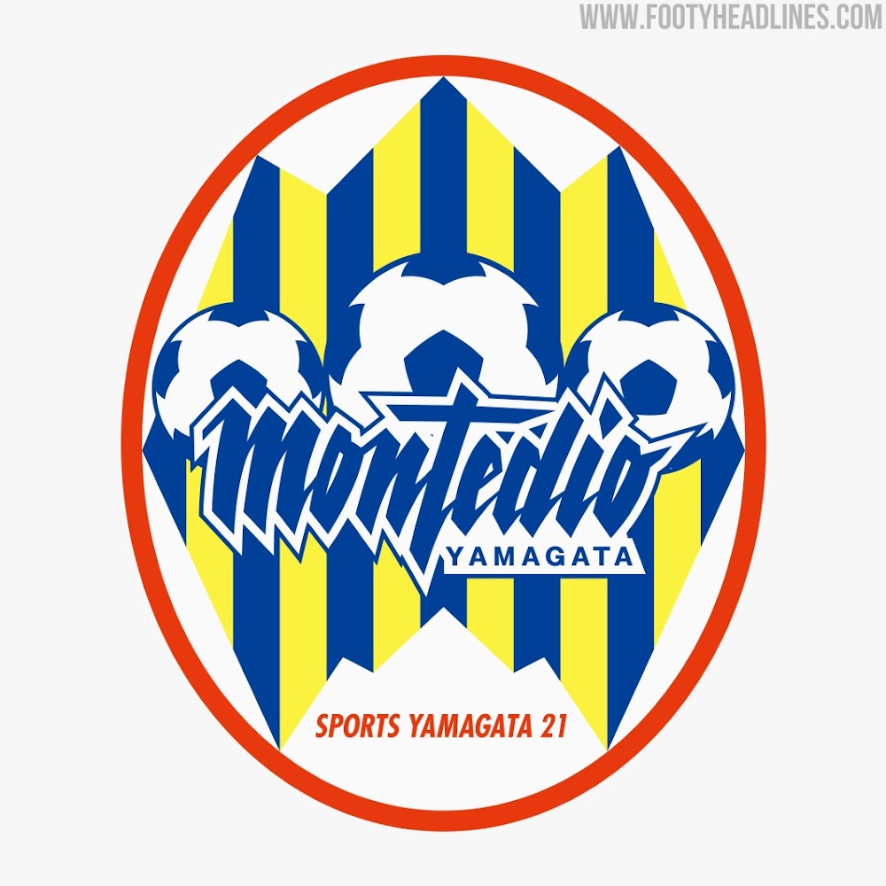
The central element of the logo is now a small mountain range rather than three footballs. The font in which "Montedio" is written was also changed slightly, retaining the slanted look of the original, but without the curves.
Overall, the new club badge features a lot less yellow and red than the older one, restricting itself to a more blue and white design.
What do you think of Montedio Yamagata's new club logo? Comment below.


Top 9 Kit Creator Designs of the Week
Creators have been cooking during the 2026 World Cup.
Create and share your own kits with Kit Creator now on https://fifakitcreator.com & https://fifakitcreator.com/showcase/
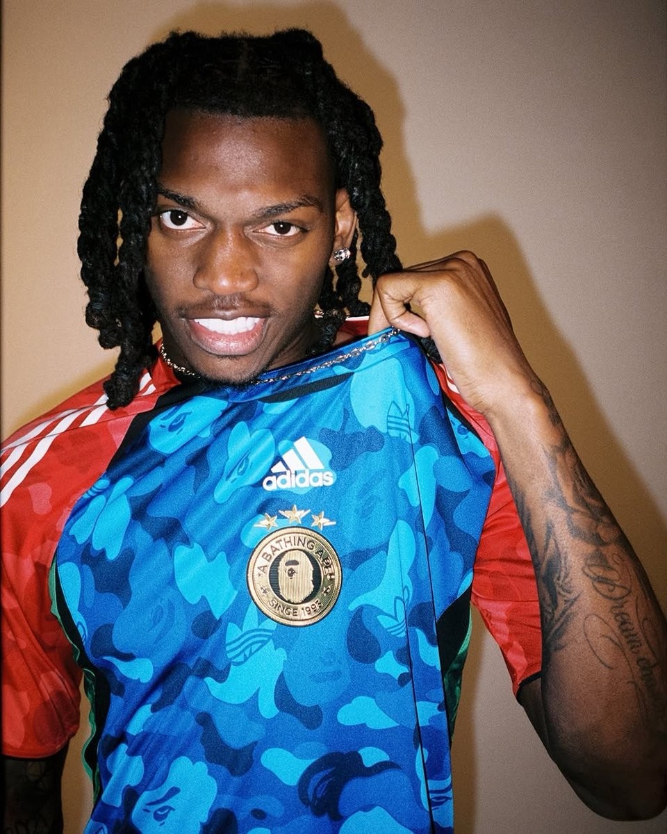
Adidas x BAPE Teamgeist 2026 Collection Released
Adidas and BAPE have joined forces to release a special Teamgeist capsule collection, launched in time for the 2026 FIFA World Cup. The new collection brings back the iconic 2006 Adidas Teamgeist template, combining the classic football design with BAPE's signature streetwear aesthetic.
The standout piece of the collaboration is the Adidas Originals x BAPE Teamgeist jersey. It features BAPE's famous ABC CAMO pattern subtly integrated into the design, alongside a co-branded Adidas Trefoil and BAPE Ape Head logo on the center of the chest. The shirt pays homage to the mid-2000s era of football apparel, serving as a stylish tournament fan uniform for the summer.
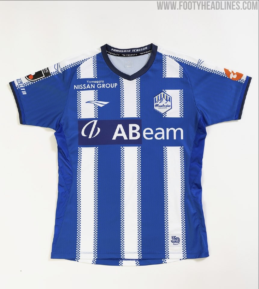
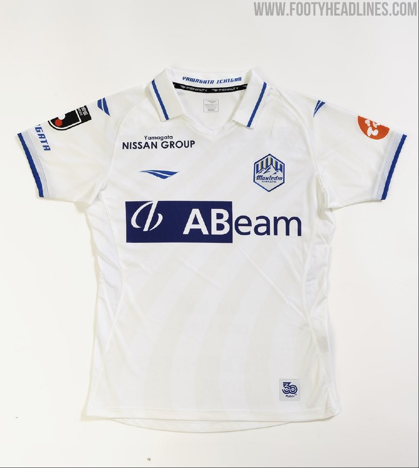
Montedio Yamagata 26-27 Kits Released
J2 League club Montedio Yamagata have officially unveiled their new home, away, and goalkeeper kits for the 2026-27 season. Produced by Penalty, the new shirts are launched under a slogan emphasizing the club's history and the dawn of a new era as Japanese football transitions to a fall-spring calendar.
The complete collection, featuring the traditional blue and white home shirt plus a white away kit alongside goalkeeper designs, will be available for purchase starting July 1.

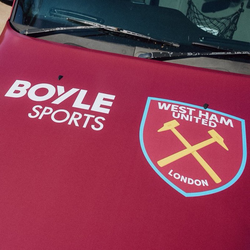
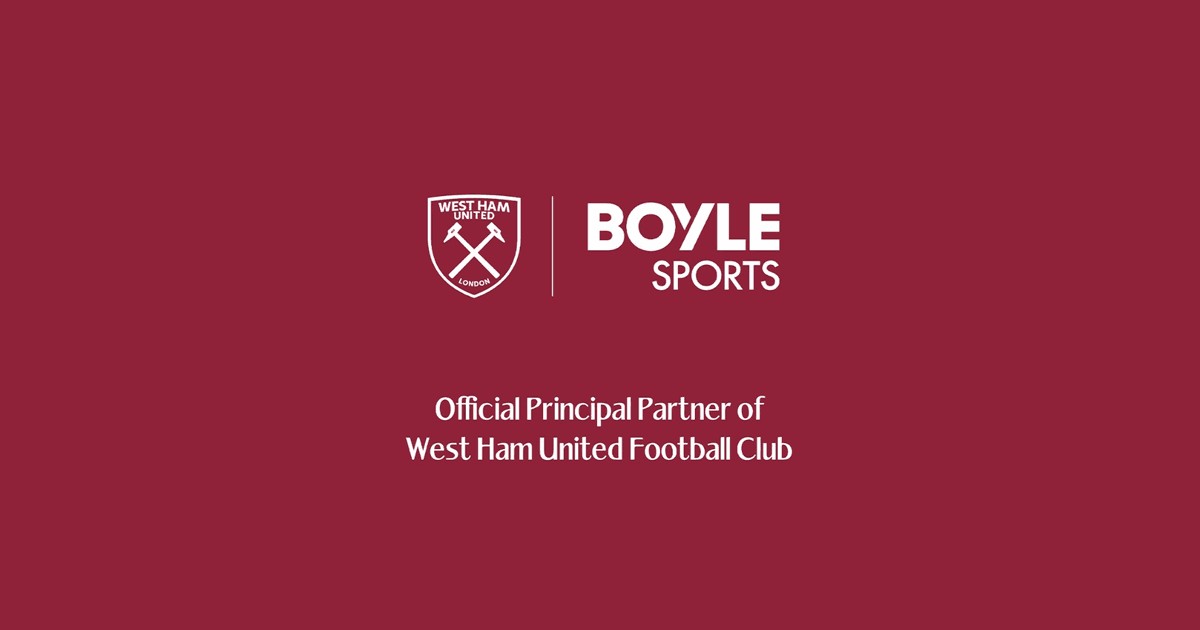
No Betting Ban in Championship: West Ham Keeps Boyle Sports as 26-27 Kit Sponsor Following Relegation
Following their relegation to the Championship, West Ham United have officially confirmed that Boyle Sports will continue as their front-of-shirt sponsor for the 2026-27 season.
The betting company's logo will feature on the men's and women's home, away, third, and training kits, a move made possible because the English Football League does not currently enforce the Premier League's restrictions on gambling sponsors.
The continuation of the partnership, which was valued at around £12 million last season, comes after talks with the Tourism Authority of Thailand regarding an "Amazing Thailand" sponsorship collapsed due to the club's drop from the top flight.
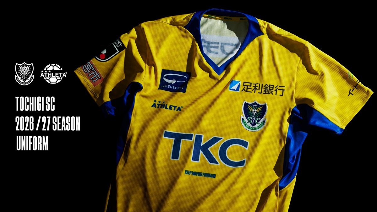
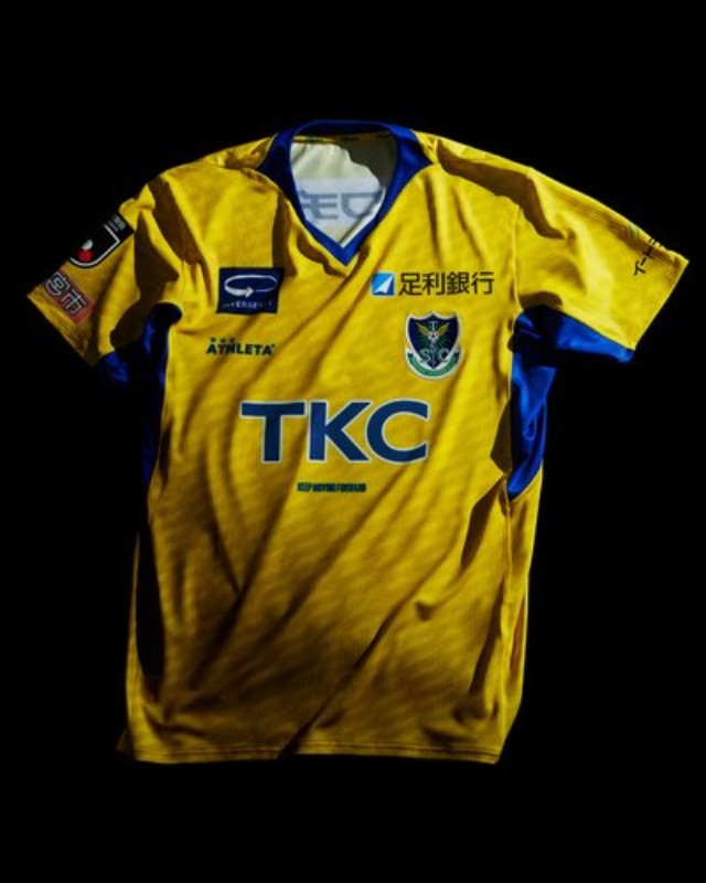
Tochigi SC 26-27 Kits Released
Japanese J3 League club Tochigi SC and their kit supplier Athleta have officially revealed the team's new kits for the 2026-27 season.
The Athleta Tochigi SC 2026-27 shirts feature a bespoke design centered around a pattern of multiple overlapping 'T' lines. According to the club, this graphic symbolizes the trajectory of accumulated challenges and forward progress, ultimately forming a strong upward arrow that represents their push for promotion back to the J2 League.
The Tochigi SC 2026-27 uniforms will be available to purchase starting July 1, 2026, via the club's official online store and the local furusato nozei tax donation program.
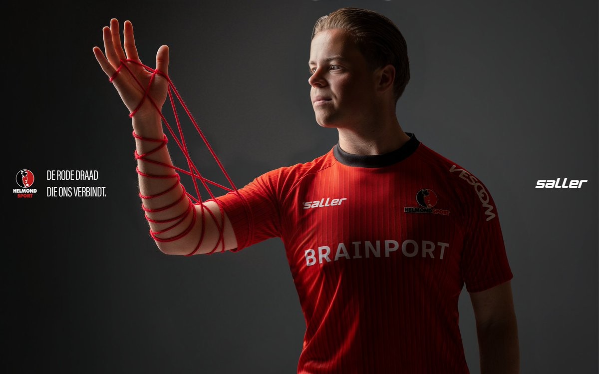
Helmond Sport 26-27 Home Kit Released
Dutch Eerste Divisie side Helmond Sport have unveiled their new home kit for the 2026-27 season. The new shirt is made by Saller.
The Helmond Sport 2026-27 home shirt is launched under the slogan "De rode draad die ons verbindt" (The red thread that connects us). According to the club, the design is meant to be more than just a football shirt, aiming to tell the story of the supporters and their enduring connection to the team.
Fans will be able to pre-order the new Saller Helmond Sport 2026-27 home kit starting from July 1.

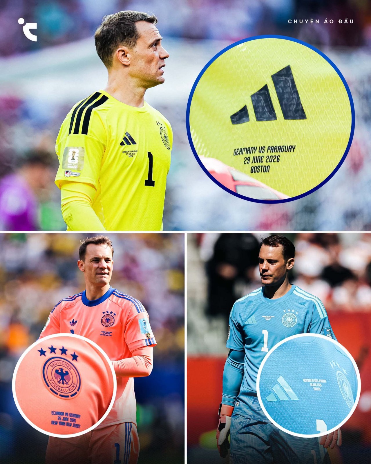
Manuel Neuer's 2026 World Cup Kits Feature Different Match Detail Placements
During Germany's 2026 World Cup campaign, goalkeeper Manuel Neuer wore shirts with three distinct match detail placements across his four appearances. The 40-year-old's Adidas kits featured unusual variations in where the opponent, date, and venue text was printed.
In the first two group stage matches, Neuer's blue goalkeeper shirt displayed the match details in the standard central position on the chest. For the final group game against Ecuador, the text on his pink kit was moved underneath the German national team crest. This adjustment was reportedly made to align with the outfield players' shirts, which featured the match details under the Adidas Trefoil logo to balance the chest layout.
A third variation appeared in the Round of 32 against Paraguay. On Neuer's yellow shirt, the match details were placed directly underneath the Adidas logo on the right side of the chest. This final unique placement marked Neuer's last World Cup appearance, as Germany was eliminated following a 3-4 defeat.
Huge thanks to Jersey Story for the observation and collage.